<?xml version="1.0" encoding="utf-8"?><feed xmlns="http://www.w3.org/2005/Atom" ><generator uri="https://jekyllrb.com/" version="4.4.1">Jekyll</generator><link href="https://dariorodighiero.com/feed/publications.xml" rel="self" type="application/atom+xml" /><link href="https://dariorodighiero.com/" rel="alternate" type="text/html" /><updated>2026-05-23T21:36:54+00:00</updated><id>https://dariorodighiero.com/feed/publications.xml</id><title type="html">Dario Rodighiero | Publications</title><subtitle>Design, Data, and Humanities</subtitle><entry><title type="html">Archives, Museums, and Installations: Aldo Rossi’s Legacy in Digital Transition</title><link href="https://dariorodighiero.com/archives-museums-and-installations-aldo-rossi-s-legacy-in-digital-transition" rel="alternate" type="text/html" title="Archives, Museums, and Installations: Aldo Rossi’s Legacy in Digital Transition" /><published>2026-01-01T23:59:01+00:00</published><updated>2026-01-01T23:59:01+00:00</updated><id>https://dariorodighiero.com/archives-museums-and-installations-aldo-rossi-s-legacy-in-digital-transition</id><content type="html" xml:base="https://dariorodighiero.com/archives-museums-and-installations-aldo-rossi-s-legacy-in-digital-transition"><![CDATA[<p>This article offers a theoretical reflection grounded in curatorial analysis and supported by a case study. It examines how Aldo Rossi’s legacy is redefined through archives, exhibitions, and installations, with a focus on the transformations of his Analogous City. Drawing on scholarly concepts from Paul Ricœur, Bruno Latour, and Umberto Eco, the article considers how memory, mediation, and interpretation work together as a process of meaning-making in cultural heritage. It shows how this process shapes the ways Rossi’s work is preserved and reimagined across different forms of display. Rather than treating cultural heritage as static, the article presents it as a process formed through editorial choices, curatorial practices, and participatory engagement. Rossi’s case study shows how architectural memory can remain open and responsive, especially when activated through digital and spatial forms of display.</p>

<!--more-->

<p><strong>Keywords:</strong> Aldo Rossi; digital heritage; experimental museology</p>

<h2 id="introduction">Introduction</h2>

<p>Laurajane Smith describes cultural heritage as a process shaped by remembering, storytelling, and meaning making. It unfolds when people engage with the past to understand the present, relying on memory to make sense of society. “The real sense of heritage […] is […] in the act of passing on and receiving memories and knowledge” (Smith 2006, 2). This view resonates with historian Pierre Nora’s observation that modern societies have lost the communal settings in which memory once circulated – such as villages, religious rituals, or oral traditions (Nora 1989). In response, communities create new symbolic sites of memory that attempt to preserve what can no longer be experienced directly, such as monuments and commemorative rituals. While Smith focuses on the cultural work of remembering, Nora emphasizes the rupture that makes such work necessary. Both underscore that heritage emerges from efforts to retain meaning when memory becomes unstable. From this shared perspective, institutions play a vital role in preserving and transmitting memory. They offer frameworks where fragmented histories can be collected, reinterpreted, and kept active. “The role of preserving symbolic sites of memory is formalized through international instruments, such as UNESCO’s Convention on the Protection of the World Cultural and Natural Heritage” (UNESCO 1972). These frameworks task states and cultural bodies with identifying, protecting, and promoting heritage as a living process – one that supports identity, diversity, and knowledge over time.</p>

<p>The process of heritage-making is increasingly shaped by digital technologies. In 2003, UNESCO introduced the concept of “digital heritage” in its Charter on the Preservation of Digital Heritage. The document, later released in a revised online version, defines digital heritage as “resources of information and creative expression” that are “produced, distributed, accessed and maintained in digital form” (UNESCO 2009). This marks a broader transformation in cultural institutions, where digitization affects not only access but also the ways heritage is produced and consumed. As Burdick et al. (2012) argue in <em>Digital_Humanities</em>, digital practices challenge more widely established disciplines and roles, calling for more reflective and design-driven approaches to knowledge. Cameron and Kenderdine (2007) note that digital technologies do not simply enhance cultural capital – they reshape the internal cultures and practices of the institutions that care for it. These changes are both technological and institutional, driving shifts within organizations such as museums, libraries, and archives. As Paul (2015) observes, technological development often outpaces the critical vocabulary needed to assess it, requiring institutions to invent new ways of speaking about the social, economic, and aesthetic implications of digital work.</p>

<p>The shift toward digital heritage intersects meaningfully with the legacy of architect Aldo Rossi (1931–1997). Born in Milan and primarily active in Italy, Rossi shaped how memory is understood within the built environment. After receiving the Pritzker Prize in 1990, his influence expanded internationally through projects such as the Quartier Schützenstraße in Berlin and the Bonnefanten Museum in Maastricht. Rossi did not view the city as a neutral setting for modern life but as a layered structure where buildings and forms retain the memory of past meanings (Rossi 1996). His notion of the “urban artifact” highlights how certain structures – by virtue of their form, history, or symbolism – anchor collective identity. As Peter Eisenman writes in his introduction to <em>The Architecture of the City</em>, Rossi’s ideas continue to inform how cultural memory is revisited and reinterpreted over time (Eisenman 1996). Although this article does not follow Rossi’s theoretical model, his legacy serves as a valuable entry point for examining how heritage is shaped today. The ways his work has been archived, displayed, and transformed into installations offer a concrete perspective on the changing role of institutions in the digital age.</p>

<p>Rossi’s legacy provides a useful lens for examining the digital transition in cultural heritage. This article approaches the topic through three interrelated practices: archiving, curating, and displaying. Archives are where heritage begins to take form, as curators and researchers select, organize, and preserve materials, turning them into collections that support memory and interpretation. Museums build on this foundation by creating narratives that connect these materials to broader historical and cultural contexts. Installations present these narratives in spatial form, shaping how audiences encounter heritage – often through hybrid formats that combine physical display with digital interaction. Taken together, these practices show how heritage is preserved, interpreted, and reimagined in the digital age. A clear example is the work of MAXXI in Rome, which houses Aldo Rossi’s archive (Zhara Buda et al. 2020) and has recently presented both a physical exhibition (MAXXI 2021) and a digital one (MAXXI 2022) dedicated to his work. These initiatives demonstrate how a cultural institution engages archival material through conservation, exhibition, and digital reinterpretation, making Rossi’s legacy accessible and relevant to contemporary audiences (Rodighiero 2022).</p>

<p>The article is structured around three main sections, each corresponding to a key site where Rossi’s legacy is shaped and reinterpreted: archives, exhibitions, and installations. These are interwoven with theoretical insights from Paul Ricœur (1977), Latour (2005), and Eco (1989), whose perspectives illuminate different moments in the process of meaning-making. Ricœur helps frame how memory is assembled, Latour clarifies how mediation transforms materials as they circulate, and Eco shows how interpretation keeps the work open to new readings. Together, they support the central argument of the article. Rather than following a purely chronological order, the article moves between empirical cases and conceptual reflections, culminating in a discussion of heritage as a dynamic and mediated process.</p>

<h2 id="memory-mediation-and-interpretation">Memory, Mediation, and Interpretation</h2>

<p>Understanding how heritage takes shape requires attention to how memory is formed, how meanings are mediated, and how interpretation unfolds. These three dimensions – memory, mediation, and interpretation – provide the conceptual framework for exploring Aldo Rossi’s digital legacy. 1) Memory is not given in full but constructed through acts of selection and omission, especially in the collection and preservation of traces from the past. Paul Ricœur (1977) describes memory as a process of reconstruction, shaped by the needs of the present and the expectations of the future. 2) Mediation is often treated as neutral, yet it actively transforms what it conveys. It links subjects, objects, and meanings, shaping how knowledge is structured and circulated. Latour (2005) reframes the social as a network of associations, where mediation works by assembling and translating these relations. 3) Interpretation extends beyond the curator’s choices. It continues through the viewer, who brings their own position to the encounter. Eco (1989) defines the artwork as an “open work,” inviting multiple readings rather than a fixed message. Together, these perspectives allow us to understand cultural heritage as a dynamic process – curated, mediated, and interpreted.</p>

<p>Memory plays a central role in the construction of heritage, yet it is always partial and shaped by the conditions of its transmission. For Paul Ricœur, memory is not a retrieval of the past but a reconfiguration shaped by present concerns. In <em>Memory, History, Forgetting</em>, he writes that “memory remains the guardian of the ultimate dialectic constitutive of the pastness of the past, namely, the relation between the ‘no longer,’ which marks its character of being elapsed, abolished, superseded, and the ‘having-been,’ which designates its original and, in this sense, indestructible character” (Ricœur 1977, 498). This tension is not only personal but institutional, embedded in archival practices that influence what is remembered and what is left out. Ricœur underscores that memory is vulnerable – not only to loss but to distortion and manipulation – making its ethical handling essential. Archives, in this view, are not neutral repositories but sites of reconstruction, where traces are selected to serve contemporary needs. This perspective aligns with the evolving role of heritage institutions, which no longer merely preserve objects but actively shape how memory is assembled. Remembering, then, is never neutral: it demands critical awareness of how forgetting works and how narratives emerge from incomplete materials.</p>

<p>Mediation is often seen as a background process, a technical means of transmitting content. Bruno Latour challenges this assumption by placing mediation at the core of social life. In <em>Reassembling the Social</em>, he writes: “Mediators transform, translate, distort, and modify the meaning or the elements they are supposed to carry” (Latour 2005, 39). Every act of mediation alters what is being transmitted; nothing remains unchanged. For Latour, the social is not a fixed domain but a process of assembling associations among human and nonhuman actors. This view reframes heritage institutions as active agents, shaping what becomes culturally meaningful. Cataloging, digitizing, and exhibiting are all forms of mediation that alter how materials are interpreted. This perspective shifts attention away from content alone and toward the networks through which it gains form and value. Mediation is not a neutral layer between origin and reception – it is the space where meaning takes shape. Recognizing its role allows us to follow how heritage is constructed and reframed in the digital environments where memory now circulates.</p>

<p>Interpretation plays a central role in how heritage is experienced and understood. As Umberto Eco writes in <em>The Open Work</em>, “the ‘openness’ and dynamism of an artistic work consist in factors which make it susceptible to a whole range of integrations […] structural vitality is still seen as a positive property of the work, even though it admits of all kinds of different conclusions and solutions for it” (Eco 1989, 20). This openness is not arbitrary; it is guided by the internal structure and form of the work itself. In the context of exhibitions and installations, this perspective is particularly relevant. Visitors interpret meaning rather than simply receive it, bringing their own knowledge, expectations, and context to the encounter. This participatory dimension is integral to how cultural artifacts acquire significance. Interpretation happens within frameworks that allow for variation while preserving coherence, shaping how meaning unfolds across audiences and platforms.</p>

<p>Together, Ricœur, Latour, and Eco offer a way to understand heritage as a living process shaped by how memory is handled, how meanings are mediated, and how interpretations unfold. These dimensions are closely connected: memory depends on forms of mediation, and each mediation creates space for interpretation. Applied to the legacy of Aldo Rossi, this framework highlights how his work is continually reshaped as it moves through archives, exhibitions, and installations. In the following sections, we explore these three settings to examine how Rossi’s legacy is assembled and reinterpreted across both physical and digital environments.</p>

<h2 id="archives">Archives</h2>

<p>
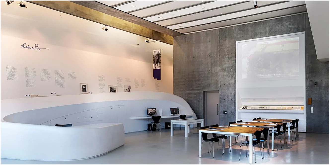
The Centro Archivi at MAXXI was created to preserve, study, and activate the documentary legacies of contemporary architects (MAXXI 2002). Unlike traditional archives that focus on classification and storage, this center functions as a living infrastructure, supporting both academic research and curatorial work. One of its first and most important acquisitions was the archive of Aldo Rossi (Zhara Buda et al. 2020). This addition contributed to shaping how post-war Italian architecture could be documented and institutionalized. Rossi left behind a wide-ranging body of material, including architectural projects, theoretical writings, and teaching documents. Housing his archive at MAXXI positioned the museum as more than a repository of objects – it became a site where architecture is studied for its cultural meanings as well as its forms. As Margherita Guccione notes, the Rossi archive helped define the research identity of the Centro Archivi from the beginning, offering a case where architecture, biography, and legacy are closely connected (Zhara Buda et al. 2020, 8). In this setting, the archive becomes more than a collection: it is a reference point for how architectural memory is curated today.</p>

<p>The Aldo Rossi archive was deposited at the Centro Archivi in 2001, but its development unfolded gradually over nearly two decades. Initial efforts focused on securing and partially inventorying the materials. A more systematic approach began in 2015, when a team led by Centro Archivi di Architettura undertook a full cataloging project, resulting in the 2020 publication of the <em>Inventario Aldo Rossi</em> (Zhara Buda et al. 2020). This work required curatorial decisions about how to represent the complexity of Rossi’s practice. The team organized the material into a series and sub-series that reflected his overlapping roles as architect, designer, writer, and teacher. Each item was documented with attention to its context, drawing on both internal references and secondary sources. As Guccione notes, the process required a balance between archival precision and interpretive care, particularly in addressing gaps and the fluid boundary between Rossi’s personal and professional life (Zhara Buda et al. 2020, 18–21). Equally important has been the network of institutions involved in the valorization of the Rossi archive – not only the Fondazione Aldo Rossi but also the Canadian Centre for Architecture in Montreal, the Getty Research Institute in Los Angeles, the Deutsches Architekturmuseum in Frankfurt, the Centre Pompidou in Paris, and the Bonnefantenmuseum in Maastricht – which has amplified the archive’s relevance through exhibitions, publications, and research collaborations. The resulting inventory offers a way to navigate Rossi’s legacy, shaped through deliberate acts of selection and organization. In this light, the archive functions as a site of historiographic interpretation.</p>

<p>The Aldo Rossi archive stands out for the range and variety of its materials. It contains over 13,000 items, including architectural drawings, design sketches, notebooks, correspondence, photographs, publications, and architectural models. This diversity reflects the breadth of Rossi’s work – from urban plans and buildings to furniture and theoretical writing. Many of the documents reveal his process rather than finished projects: conceptual sketches, diagrams, and handwritten notes that trace ideas over time and across media. His <em>quaderni azzurri</em> (Rossi 1999), a series of blue notebooks filled with reflections and drawings, are especially revealing of the fluid boundary between thinking and making in his practice. The archive also holds material from his teaching in Milan, Zurich, and Venice, offering insight into his pedagogical approach and intellectual exchanges. Importantly, the collection is not limited to canonical projects. It includes fragmentary and unfinished works that point to an evolving, open-ended body of thought. As the <em>Inventario</em> shows, the selection criteria aimed for coherence within each subseries while allowing overlaps that reflect the complexity of Rossi’s identity, as noted by Alberto Ferlenga (Zhara Buda et al. 2020). Rather than a static repository, the archive becomes a layered space where different aspects of Rossi’s legacy remain visible and connected.</p>

<p>As Paul Ricœur argues, memory is not simply a recollection of the past but a reconstruction shaped by present concerns and future aims. Archival work, in this view, is not neutral preservation – it is an active process of remembering and forgetting. The Rossi archive reflects this dynamic. Its structure reflects choices about how to represent his legacy, emphasizing particular narratives and relationships. What is remembered – through description, preservation, and access – is shaped by curatorial decisions. As Ricœur writes, archives are sites of “inscription,” where traces are fixed in ways that make them available to historical consciousness (Ricœur 1977, 120). In Rossi’s case, the <em>Inventario</em> (Zhara Buda et al. 2020) becomes a key tool for shaping his architectural memory and influencing future interpretations. The tension between what is preserved and what remains elusive reflects the fragility of memory itself. The archive, in this sense, is a framework that renders Rossi’s legacy legible while inevitably narrowing its complexity. It is within this tension that the significance of the archive emerges – as a curated and evolving space of cultural memory.</p>

<p>Today, the Aldo Rossi archive functions as more than a scholarly resource; it has become a platform for curatorial and public engagement. Its materials support research, exhibitions, educational programs, design reinterpretations, and digital initiatives. The archive’s visibility has expanded through curated selections, collaborations, and an online catalog that now serves as a reference point for architecture historians and curators (MAXXI 2023). MAXXI’s approach treats the archive as a source in active use, emphasizing circulation over storage. It serves as a practical resource for developing new narratives and engaging new audiences. By integrating Rossi’s materials into institutional programs, the archive is maintained as a living structure – adaptable to evolving questions, formats, and publics. This orientation brings archival practice closer to cultural production, where memory is not only preserved but continually enacted. It also prepares the ground for the following sections on exhibitions and installations, which trace how the archive enters the public sphere and shapes contemporary interpretations of Rossi’s work.</p>

<figure>
  <img src="/images/archives-museums-and-installations/fig_001.webp" alt="Figure 1. The sala studio of the architecture archives centre at MAXXI in Rome, designed by Zaha Hadid, where visitors and researchers can directly consult architectural archives. The space hosts materials from twentieth- and twenty-first-century architects, including Aldo Rossi's archive, alongside over 60,000 drawings, 75,000 photographs, models, letters, documents, and publications. Beyond serving as a repository, the sala studio functions as a workshop for research, conservation, and cataloguing and as a venue for educational programs and curatorial experimentation. Photo: Courtesy of MAXXI." loading="lazy" />
  <figcaption>Figure 1. The sala studio of the architecture archives centre at MAXXI in Rome, designed by Zaha Hadid, where visitors and researchers can directly consult architectural archives. The space hosts materials from twentieth- and twenty-first-century architects, including Aldo Rossi's archive, alongside over 60,000 drawings, 75,000 photographs, models, letters, documents, and publications. Beyond serving as a repository, the sala studio functions as a workshop for research, conservation, and cataloguing and as a venue for educational programs and curatorial experimentation. Photo: Courtesy of MAXXI.</figcaption>
</figure>

<h2 id="exhibitions">Exhibitions</h2>

<p>Exhibitions have played an important role in shaping the public memory of Aldo Rossi at MAXXI. While archives preserve material traces, exhibitions bring them into view – translating drawings, models, and documents into curated narratives that engage different audiences. Since its founding, MAXXI Architettura has approached exhibitions as interpretive practices that connect historical material with contemporary reflection. Rossi’s work, both visual and conceptual, fits well within this approach. From early displays like <em>Rossi. L’archivio personale</em> (MAXXI 2004) to the major retrospective <em>Aldo Rossi: L’architetto e le città</em> (MAXXI 2021), MAXXI has returned to his work to explore new curatorial strategies, including digital formats. These exhibitions offer a way to mediate archival content and bring it into public conversation. They reflect the museum’s broader aim to preserve architectural memory while fostering new readings of its relevance. Rossi’s exhibitions, in this context, become spaces where interpretation takes shape and heritage is continually redefined.</p>

<p>
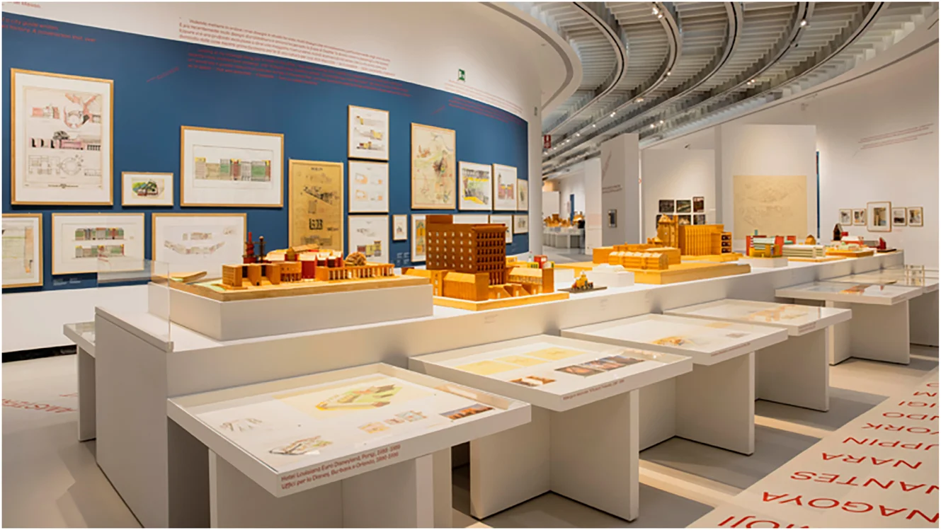
Two major exhibitions at MAXXI have recently shaped the museum’s curatorial engagement with Aldo Rossi’s legacy. The first, <em>Aldo Rossi: L’architetto e le città</em> (MAXXI 2021), brought together more than 800 works from his archive – drawings, models, photographs, notebooks, and letters – offering a layered view of his career. Curated by Alberto Ferlenga, the exhibition was organized thematically and chronologically, guiding visitors through key phases of Rossi’s work while allowing space for visual associations and digressions. Alongside these archival materials, the curators also included Rossi’s own words, presented in a dedicated section of the display: these fragments of text underscored how the archive brings to light ideas and reflections, foregrounding the intellectual and poetic dimensions of his work. The display echoed Rossi’s own poetics, presenting cities as accumulations of memory and form. The exhibition design emphasized continuity across time, blending architectural imagination with personal traces. Rather than presenting Rossi’s work as a static legacy, the exhibition invited viewers into an active encounter, situating his archive within a living context of interpretation.</p>

<p>The second initiative, <em>Aldo Rossi Digital</em> (MAXXI 2022), reimagined this work as an interactive online exhibition. Developed by the curatorial team that worked on both the exhibition and the inventory, with the creative agency Dinamica Studio – and then landed on MAXXI’s Know-How – the platform reorganized Rossi’s archive into thematic clusters, such as The Analogous City and Typologies, and enabled non-linear navigation across various media. Instead of replicating the structure of the physical show, the digital version made use of the web’s affordances: fluid associations, multiple pathways, and open-ended exploration. Visitors could follow their own trajectories through sketches, photographs, and texts, engaging directly with Rossi’s imagery and thought. This format emphasized accessibility and participation, opening the archive to a broader audience beyond the museum. It demonstrates how digital exhibitions can support reinterpretation by enabling multiple modes of engagement and reading.</p>

<p>For Bruno Latour, mediation is never neutral – it transforms what it transmits. As objects and knowledge circulate through networks, they are translated, redirected, and reshaped (Latour 2005). In Rossi’s exhibitions, mediation takes place on multiple levels. The archive is not simply moved into the gallery or online; it is reassembled through curatorial choices, exhibition design, and digital interface. Each step affects how Rossi’s work is perceived. These exhibitions act as mediating spaces, producing new associations and inviting different forms of engagement. For example, in <em>Aldo Rossi: L’architetto e le città</em> (MAXXI 2021), the exhibition layout turned the archive into a spatial narrative that invited active exploration. The digital version extended this further, highlighting mediation through tools like filters, thematic tags, and open navigation. In Latour’s terms, these are not secondary processes – they are central to how heritage is shaped and circulated. Rossi’s exhibitions, then, are not passive displays but sites where his legacy is continuously adapted and reinterpreted.</p>

<p>Taken together, these exhibitions show that Aldo Rossi’s legacy is not shaped by simply presenting archival content to the public but by the interaction of curatorial direction, exhibition design, and institutional context. The physical exhibition at MAXXI used spatial sequencing and thematic groupings to guide engagement, while the digital platform relied on modular navigation and visual links. Both created settings where heritage is experienced as an evolving process of interpretation. This combined strategy reflects changing patterns of audience engagement, offering continuity across media while adapting to different formats and rhythms. It also illustrates the role of institutions like MAXXI in shaping how memory is made accessible and meaningful. Rather than presenting a definitive image, these exhibitions treat Rossi’s work as an open collection of forms and ideas. In doing so, they frame exhibition-making as an active part of heritage work – one that contributes to the ongoing reinterpretation of the archive.</p>

<figure>
  <img src="/images/archives-museums-and-installations/fig_002.webp" alt="Figure 2. Installation view of the exhibition Aldo Rossi: The architect and the cities (MAXXI, Rome, 2021), curated by Alberto Ferlenga. The retrospective brought together more than 800 works from Rossi's archive and international collections, including drawings, notebooks, photographs, letters, and a spectacular series of architectural models. Displayed thematically and chronologically, the exhibition emphasized Rossi's idea of the city as an accumulation of memory and form. Photo: Courtesy of MAXXI." loading="lazy" />
  <figcaption>Figure 2. Installation view of the exhibition Aldo Rossi: The architect and the cities (MAXXI, Rome, 2021), curated by Alberto Ferlenga. The retrospective brought together more than 800 works from Rossi's archive and international collections, including drawings, notebooks, photographs, letters, and a spectacular series of architectural models. Displayed thematically and chronologically, the exhibition emphasized Rossi's idea of the city as an accumulation of memory and form. Photo: Courtesy of MAXXI.</figcaption>
</figure>

<h2 id="installations">Installations</h2>

<p>
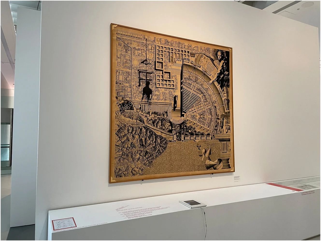
Installations provide a way to engage with Aldo Rossi’s Analogous City as an open and evolving space of interpretation. First conceived for the 1976 Venice Biennale with Eraldo Consolascio, Bruno Reichlin, and Fabio Reinhart (Ghirardo 2019, 16–23), the large collage combines drawings, references, and imagined architectural forms into a single, poetic composition. It is neither a plan nor a project in the traditional sense but rather a cartographic exploration shaped by resonance and association. Over time, the Analogous City has been studied and reproduced as a key expression of Rossi’s architectural imagination. However, when adapted as an installation, it reveals additional layers. Moving beyond its two-dimensional form, the work becomes an environment – something visitors can navigate physically and conceptually. These spatial versions invite engagement with its analogies, layers, and juxtapositions through movement in space. Instead of simply reproducing the collage, the installation opens new paths of interpretation, making the act of viewing itself part of the work’s meaning.</p>

<p>The Map of the Analogous City (Rodighiero 2015) was developed at EPFL as part of an exhibition at the Bonnefantenmuseum in Maastricht (Celant and Huijts 2015). It revisits Rossi’s collage through a curatorial and editorial approach focused on spatial reasoning. The project began with a close study of Rossi’s visual and textual references, including fragments from his notebooks, sketches, photographs, and publications. These elements were identified, collected, and assembled into a large-format printed map that expands and reframes the original panel. In this version, the Analogous City becomes an open archive – a network of references and associations. The editorial design emphasized the collage’s associative structure, enabling new relationships to emerge across its parts. Through its layout and visual clarity, the map invites viewers to explore the city’s logic as something fluid rather than fixed – encouraging reflection with Rossi’s ideas rather than about them. As Fabio Reinhart noted, the map is “an interpretation of the picture panel, a sort of re-invention within the framework of a new social and cultural reality” (Reinhart 2015). In this way, the Map of the Analogous City acts as a curatorial tool that renders architectural memory accessible through spatial exploration, while retaining the openness of the original work.</p>

<p>The Map of the Analogous City was also developed in digital form, enabling it to be presented in multiple exhibition contexts (Rodighiero 2022). At MAXXI, it appeared in the exhibition <em>Aldo Rossi. L’architetto e le città</em> (MAXXI 2021), where an interactive version allowed visitors to explore its internal network of references. Using touch-based navigation, viewers could follow visual links and recurring motifs drawn from Rossi’s notebooks and drawings. A year later, the digital installation was adapted for <em>Aldo Rossi Digital</em>, the museum’s online exhibition (MAXXI 2022), offering remote access and encouraging a slower, more reflective form of engagement. In both settings, the digital map transformed the collage into an exploratory environment, where viewers could navigate fragments, connections, and layered meanings. Instead of substituting for the physical installation, the digital version expanded its potential – inviting new forms of interaction while preserving the complexity and ambiguity at the core of the Analogous City.</p>

<p>Rossi’s installations invite interpretation rather than prescribe a single meaning. As Umberto Eco argues in <em>The Open Work</em>, some artworks derive their value from their capacity to support multiple readings, with meaning unfolding through the viewer’s active engagement (Eco 1989). John Dewey offers a complementary view: in <em>Art as Experience</em>, he describes how art becomes alive when it forms a unified event that reorganizes perception and draws the viewer into an active encounter (Dewey 1980). The Map of the Analogous City reflects these approaches. Its composition of drawn fragments – both real and imagined – does not offer a fixed narrative. Instead, it invites viewers into a process shaped by their own associations, memories, and spatial understanding. Each experience becomes a form of reconstruction, where meaning emerges through navigation and reflection. This openness aligns with Rossi’s view of architecture as a poetic and interpretive discipline. As Eco writes, open works “are brought to their conclusion by the performer at the same time as he experiences them on an aesthetic plane” (Eco 1989, 3). In this context, the performer is the visitor, who reads the map not as a finished object but as a space for ongoing interpretation.</p>

<p>The continuing reinterpretation of the Analogous City – across exhibitions, formats, and audiences – shows how installations can activate cultural heritage by reshaping how it is experienced. Whether printed, constructed, or digital, the work continues to evolve through each new presentation. These variations do not diminish Rossi’s legacy; they expand its relevance. Instead of fixing the past in place, the Analogous City keeps it in motion, creating a space where historical imagination, curatorial practice, and public engagement intersect. In this way, the installation functions not only as a site of preservation but as a space for reactivation. Rossi’s work thus contributes to a broader perspective on heritage – as something dynamic, negotiated, and performed over time.</p>

<figure>
  <img src="/images/archives-museums-and-installations/fig_003.webp" alt="Figure 3. Digital installation of Aldo Rossi's La Città Analoga (the Analogous City) at MAXXI, Rome. The original 1976 collage – created with Eraldo Consolascio, Bruno Reichlin, and Fabio Reinhart – is displayed here alongside a tablet device that allowed visitors to explore the work's references and fragments through digital navigation. This hybrid presentation illustrates how Rossi's emblematic collage has been reinterpreted in physical-digital form, inviting new modes of exploration and participation. Photo: Courtesy of MAXXI." loading="lazy" />
  <figcaption>Figure 3. Digital installation of Aldo Rossi's La Città Analoga (the Analogous City) at MAXXI, Rome. The original 1976 collage – created with Eraldo Consolascio, Bruno Reichlin, and Fabio Reinhart – is displayed here alongside a tablet device that allowed visitors to explore the work's references and fragments through digital navigation. This hybrid presentation illustrates how Rossi's emblematic collage has been reinterpreted in physical-digital form, inviting new modes of exploration and participation. Photo: Courtesy of MAXXI.</figcaption>
</figure>

<h2 id="discussion">Discussion</h2>

<p>Understanding Aldo Rossi’s heritage requires attention to how it is continually shaped – through archival processing, curatorial design, and installation practice. These mediations do not simply preserve; they reconfigure. Rossi’s work has remained culturally resonant not because it was stabilized but because it was continually opened up to new readings and audiences. In what follows, we reflect on three modalities of mediation – archival, curatorial, and performative – drawing on theoretical perspectives that help us grasp the interpretive nature of heritage-making. Rather than isolating these modes, we consider how they interact and contribute to a dynamic process of cultural transmission.</p>

<p>The archive of Aldo Rossi, particularly the work done by MAXXI in structuring and cataloguing his materials, exemplifies how institutional memory is constructed. Drawing on Paul Ricoeur’s notion of refiguration, we can see this archival process not as passive preservation but as an active recomposition of meaning. The inventory of Rossi’s papers and drawings is not merely a finding aid – it is a narrative structure. Through choices about inclusion, categorization, and description, the curators at MAXXI shaped how Rossi’s intellectual world would be encountered. This editorial work mediates between raw traces and historical understanding, offering a curated map of Rossi’s legacy that remains open to reinterpretation.</p>

<p>Exhibitions, as shown in <em>L’architetto e le città</em> (2021) and its digital counterpart <em>Aldo Rossi Digital</em> (2022), move Rossi’s legacy from the archive into public view. Bruno Latour’s concept of mediation helps frame this transition. Exhibitions are not neutral stages – they transform the meanings of the materials they present. The scenography, thematic structure, and even navigation paths all contribute to how Rossi’s work is made legible to new audiences. The exhibitions at MAXXI created environments where visitors do not merely observe but engage, constructing their own paths through Rossi’s concepts and images. These curatorial acts do not simplify the work – they amplify its interpretive depth by situating it in contemporary discourse.</p>

<p>Installations, especially those involving the Analogous City, extend this curatorial logic into participatory space. Here, Umberto Eco’s theory of the open work becomes relevant. Rossi’s ideas are not transmitted in a closed form but made available for interaction and recomposition. Whether experienced in the museum or online, the installations invite audiences to navigate spatially and intellectually. Each engagement is different, shaped by the viewer’s background, interest, and movement. These works do not fix Rossi’s meaning; they activate it, allowing the past to resonate through acts of reading, walking, and interpretation.</p>

<p>Together, the archival, curatorial, and performative mediations of Aldo Rossi’s work demonstrate that heritage is not a matter of fixing meaning but of enabling its rearticulation. Each mode engages memory differently: the archive organizes and reframes, the exhibition composes and translates, and the installation activates and invites. Through these layered practices, Rossi’s legacy remains in motion – open to reconfiguration without losing its integrity. This dynamic view of heritage challenges traditional distinctions between conservation and interpretation. Instead of treating mediation as a secondary layer, we see it as constitutive of meaning itself. Rossi’s case reveals how cultural memory is shaped by those who curate, design, and experience it. Far from diminishing the past, these mediations expand its reach. They suggest a model of heritage not as a closed inheritance but as a collective, ongoing work of reactivation.</p>

<h2 id="conclusions">Conclusions</h2>

<p>Aldo Rossi’s legacy endures through the ongoing work of mediation. From archival reconstruction to curatorial framing and spatial installation, each mode of engagement reshapes how his work is understood, accessed, and remembered. The archive, carefully cataloged and made public, offers more than a resource – it becomes a structure of thought. Exhibitions and installations extend this structure into embodied and digital spaces, creating encounters that are interpretive rather than didactic.</p>

<p>What emerges from these practices is not a singular portrait of Rossi but a living body of work open to reconfiguration. His architecture, deeply reflective and formally poetic, lends itself to this openness. As this study has argued, heritage does not reside in preservation alone. It is sustained through acts of reactivation – through choices made by archivists, curators, and viewers alike.</p>

<p>These reflections speak more broadly to the work of heritage institutions and digital curatorship. As collections move across physical and digital environments, the process of meaning-making becomes more visible and more distributed. Institutions are asked to design settings where memory can be assembled, mediated, and interpreted with care, while digital formats open new paths for participation and access. Rossi’s case suggests directions for future research, inviting further attention to how digital tools shape curatorial practice, how audiences engage with hybrid forms of display, and how mediation can support more open and adaptive understandings of the past.</p>

<p>In this light, the past is not simply kept – it is made present, again and again, through thoughtful engagement and creative interpretation.</p>

<h2 id="references">References</h2>

<ul>
  <li>Burdick, Anne, Johanna Drucker, Peter Lunenfeld, Todd Presner, and Jeffrey Schnapp. 2012. <em>Digital_Humanities</em>. Cambridge, MA: MIT Press.</li>
  <li>Cameron, Fiona, and Sarah Kenderdine, eds. 2007. <em>Theorizing Digital Cultural Heritage: A Critical Discourse</em>. Cambridge, MA: MIT Press.</li>
  <li>Celant, Germano, and Stijn Huijts, eds. 2015. <em>Aldo Rossi: Opera Grafica: Etchings Lithographs Silkscreen Prints</em>. Cinisello Balsamo: Silvana Editoriale.</li>
  <li>Dewey, John. (1934) 1980. <em>Art as Experience</em>. New York: Perigee Books.</li>
  <li>Eco, Umberto. 1989. <em>The Open Work</em>. Translated by Anna Cancogni with David Robey. Cambridge, MA: Harvard University Press.</li>
  <li>Eisenman, Peter. (1966) 1982. “The Houses of Memory: The Texts of Analogy.” In <em>The Architecture of the City</em>. Cambridge, MA: MIT Press.</li>
  <li>Ghirardo, Diane. 2019. <em>Aldo Rossi and the Spirit of Architecture</em>. New Haven: Yale University Press.</li>
  <li>Latour, Bruno. 2005. <em>Reassembling the Social: An Introduction to Actor-Network-Theory</em>. Oxford: Oxford University Press.</li>
  <li>MAXXI. 2002. “Centro Archivi di Architettura.” MAXXI.</li>
  <li>———. 2004. “Aldo Rossi. L’Archivio Personale.” MAXXI.</li>
  <li>———. 2021. “Aldo Rossi: L’Architetto e la città.” MAXXI.</li>
  <li>———. 2022. “Aldo Rossi Digital.” MAXXI.</li>
  <li>———. 2023. “Collezione di architettura.” MAXXI.</li>
  <li>Nora, Pierre. 1989. “Between Memory and History: Les Lieux de Mémoire.” <em>Representations</em> 26: 7–24.</li>
  <li>Paul, Christiane. 2015. <em>Digital Art</em>. 3rd ed. London: Thames &amp; Hudson.</li>
  <li>Reinhart, Fabio. 2015. “From Picture Panel to City-Map.” In <em>The Analogous City, the Map</em>. Lausanne: EPFL Archizoom.</li>
  <li>Ricœur, Paul. 1977. <em>Memory, History, Forgetting</em>. Translated by Kathleen Blamey and David Pellauer. Chicago: University of Chicago Press.</li>
  <li>Rodighiero, Dario. 2015. <em>The Analogous City, the Map</em>. Lausanne: EPFL Archizoom.</li>
  <li>———. 2022. “Extending Museum beyond Physical Space: A Data-Driven Study of Aldo Rossi’s Analogous City as a Mobile Museum Object.” <em>International Journal for Digital Art History</em> 6: 3.34–3.47. <a href="https://doi.org/10.11588/DAH.2021.6.77681">https://doi.org/10.11588/DAH.2021.6.77681</a>.</li>
  <li>Rossi, Aldo. (1966) 1982. <em>The Architecture of the City</em>. Translated by Diane Ghirardo and Joan Ockman. Edited by Peter Eisenman. Cambridge, MA: MIT Press.</li>
  <li>———. 1999. <em>I Quaderni Azzurri</em>. Edited by Francesco Dal Co. Milano: Electa Editrice.</li>
  <li>Smith, Laurajane. 2006. <em>Uses of Heritage</em>. 1st ed. London: Routledge.</li>
  <li>UNESCO. 1972. <em>Convention Concerning the Protection of the World Cultural and Natural Heritage</em>.</li>
  <li>———. 2009. “Charter on the Preservation of the Digital Heritage.”</li>
  <li>Zhara Buda, Carla, Veronica Vignoli, Angela Parente, and Caterina Torrini. 2020. <em>L’archivio Aldo Rossi nelle collezioni del MAXXI architettura: L’Inventario</em>. Roma: MAXXI.</li>
</ul>]]></content><author><name>Dario Rodighiero and Carla Zhara Buda and Angela Parente</name></author><summary type="html"><![CDATA[This article offers a theoretical reflection grounded in curatorial analysis and supported by a case study. It examines how Aldo Rossi’s legacy is redefined through archives, exhibitions, and installations, with a focus on the transformations of his Analogous City. Drawing on scholarly concepts from Paul Ricœur, Bruno Latour, and Umberto Eco, the article considers how memory, mediation, and interpretation work together as a process of meaning-making in cultural heritage. It shows how this process shapes the ways Rossi’s work is preserved and reimagined across different forms of display. Rather than treating cultural heritage as static, the article presents it as a process formed through editorial choices, curatorial practices, and participatory engagement. Rossi’s case study shows how architectural memory can remain open and responsive, especially when activated through digital and spatial forms of display.]]></summary></entry><entry><title type="html">Four Guiding Principles for Rethinking Organizational Charts</title><link href="https://dariorodighiero.com/four-guiding-principles-for-rethinking-organizational-charts" rel="alternate" type="text/html" title="Four Guiding Principles for Rethinking Organizational Charts" /><published>2026-01-01T23:59:00+00:00</published><updated>2026-01-01T23:59:00+00:00</updated><id>https://dariorodighiero.com/four-guiding-principles-for-rethinking-organizational-charts</id><content type="html" xml:base="https://dariorodighiero.com/four-guiding-principles-for-rethinking-organizational-charts"><![CDATA[<p>This chapter explores the transformative impact of digital tools on visualizing large organizations, highlighting the shortcomings of traditional organizational charts in capturing the interconnected nature of human dynamics. Emphasizing a respectful distance from simplistic managerial logic, it discusses four guiding principles for rethinking organizational charts with careful consideration of digital traces and the valuable information employees leave during daily practice. These principles aim to reconsider the centrality of individuals and the complex dynamics of the whole organization. The first principle stresses comprehensive representation of every employee, promoting concepts like inclusivity and irreductionism. The second principle fosters a sense of community through mutual and collective self-recognition. The third challenges traditional hierarchical structures in favor of equal representation in network-based models. The fourth underscores transparency and bottom-up collaboration in design. The chapter combines theoretical insights with practical examples, including the Affinity Map case study. This approach, in the light of opportunities offered by datafication, as described by Brinton (1939, 59-67), reimagines organizational charts to be more accurate, realistic, and useful. It serves as a guide for using digital data and computational tools to better understand and design large organizations.</p>

<!--more-->

<h2 id="introduction">Introduction</h2>

<p>A few years ago, a Zurich company adopted a business model aimed at optimizing office space. When working from home was recognized as an efficient method to lower energy costs, the company realized that rents could be reduced by optimizing occupancy in smaller office spaces. As a result, employees were no longer bound to personal desks, instead changing their positions daily, based on their activities: a quiet room was appropriate when concentration was required, while an open-plan area suited teamwork. The choice of an appropriate desk could be made at the office entrance through a tablet computer providing an overview of available spaces. In addition, the tablet computer displayed the identities of employees already in the office, fostering opportunities for collaboration and enhancing the creation of a dynamic workspace.</p>

<p>This example illustrates how everyday working life can be influenced by guiding employees’ behaviors (Hatch 2011, 22–50). When technology is involved, as in the case above, it must be supported by real-time data collected through sensors, in a process frequently referred to as <em>datafication</em> (van Dijck 2014). Datafication relies on digital infrastructures that sense human activity in societal environments, providing data to implement recommendation engines for decision-making (Schrage 2020). This digital turn has enabled the development of more accurate and sophisticated tools, which have already been integrated into the field of organizational theory. This text specifically examines how the datafication of working environments can lead to more accurate organizational charts, transforming them into digital tools better suited for understanding private companies and public institutions.</p>

<h2 id="digital-traces-in-decision-making">Digital Traces in Decision-Making</h2>

<p>Looking closer at tools that shape human behaviors, the digital turn has led to an information overload, triggering new ways of creating, organizing, and analyzing information, as Rob Kitchin extensively discusses in <em>The Data Revolution</em> (2014). The advent of the internet and the spread of digital devices have resulted in a continuous production of digital traces that describe daily practices with greater accuracy (Severo and Romele 2015). While datafication may benefit society, it is crucial to understand how digital traces can improve workplace dynamics. This chapter focuses on how digital tools enable a deeper understanding of large organizations by utilizing information design (Lima 2011) within organizational theory (Hatch and Cunliffe 2013). In particular, these pages investigate the tension between individuals and their communities in organizational charts, focusing on how employees and their collaborative dimension are represented (Rodighiero 2021).</p>

<p>The business model discussed earlier illustrates how digital tools support organizational theory. The Zurich company optimized office space using a recommendation system capable of “mathematically predicting personal preference” (Schrage 2020, 3), similar to how platforms like Spotify and Netflix suggest content based on past consumption. In medium and large companies, anticipating employee preferences requires first collecting digital traces. These traces can come from objects such as identity cards, smartphones, or laptops. For example, an employee’s position can be inferred when their identity card opens a door, their smartphone accesses an email application, or their laptop connects to the local network. Similar outcomes can also be achieved using more invasive technologies like facial recognition, which is spreading quickly for security purposes (Roussi 2020). Although this chapter does not delve into the various methods of producing digital traces, it is important to note that personal behaviors can be captured in many ways. Without this collection process, there would be no data to power recommendation systems and better understand an organization’s internal dynamics.</p>

<p>Datafication is a process with distinct phases that provide a stream of continuous information. While data creation, organization, and use might seem linear, as famously illustrated by Nathan Shedroff (1999), the process is actually circular: data describes an iterative life cycle that continually accumulates information, represented as a ring (Leonelli 2019). This perpetual flow of information presents organizations as dynamic entities shaped by data, able to react when internal conditions change (Hatch 2011, 1–21). Digital traces from employees act as signals that help adjust the organization in real time, functioning like a living organism—much as the body begins digestion after eating or the immune system responds to a virus.</p>

<p>According to psychologist Kurt Lewin’s field theory (1951), employees function as forces that maintain organizational equilibrium, which can be disrupted by events that lead to a renewed balance (Hatch and Cunliffe 2013, 290). In this context, real-time data serve as agents, accelerating the process of reorganization in terms of speed and optimization. The flow of employee data creates a symbiotic relationship between individuals and the organization through decision-making systems.</p>

<p>This mutual relationship between individuals and the organization paints a more sophisticated picture than Shedroff and Leonelli’s diagrams. Drawing on Boris Groys’ (2008) theory of self-design, which describes how social networks shape personal identity, the datafication diagram is complete when the flow of information and the end users overlap as two sides of the same coin. In organizational settings, this means that recommendation systems shape employees, who in turn shape these systems with their digital traces. This interpretation turns the circular life cycle of data into a lemniscate, connecting two rings: one for the organization and one for the employees within it. As illustrated in Figure 1, although these two processes share the same flow, they remain distinct (Rodighiero 2021, 106; Rodighiero and Romele 2020, 367).</p>

<figure>
  <img src="/images/four-guiding-principles/fig_001.webp" alt="Figure 1. The data life cycle comprises two iterative loops concerning the device and user. The user's behaviors are captured in data, successively computed, and presented on the device. The lemniscate is completed when the users modify behavior by interpreting the device's recommendation. Source: Rodighiero 2021, 106; Rodighiero and Romele 2020, 367." loading="lazy" />
  <figcaption>Figure 1. The data life cycle comprises two iterative loops concerning the device and user. The user's behaviors are captured in data, successively computed, and presented on the device. The lemniscate is completed when the users modify behavior by interpreting the device's recommendation. Source: Rodighiero 2021, 106; Rodighiero and Romele 2020, 367.</figcaption>
</figure>

<h2 id="organizational-decisions-through-digital-traces">Organizational Decisions Through Digital Traces</h2>

<p>The metaphor of adaptive organisms is often used to describe resilience to market volatility, where organizations must navigate rapid changes, but it also highlights the competition for authority that shapes internal power dynamics (Hatch 2011, 1–21). Authority creates disparities in control and salaries among employees, significantly influencing how organizations are governed. For this reason, sensitive matters such as promotions are of great interest to both employees and the organization. Promotions confer authority, which translates into more influence over organizational management. As a result, promotions are tightly regulated by bureaucratic mechanisms designed to ensure fairness, as noted by sociologist Max Weber (2019, pp. 335–447), who argued that bureaucracy favors more impartial management.</p>

<p>If promotions rely on bureaucratic documents summarizing candidates’ profiles, it is worth considering the future role of digital traces in this decision-making process. Should digital traces influence organizational decisions, new empirical ways of integrating algorithmic thinking into decision-making could emerge, particularly through digital tools. For instance, examining the impact of digital traces on academic careers provides an illustrative scenario. Citation analysis, frequently used by academic institutions and research centers, not only serves as an evaluation tool but also influences recruitment—especially in technical fields like computer science, where citing is the primary way to demonstrate professional recognition. Recognizing that operational rules vary across organizations, the next section introduces an academic case study to lay the groundwork for broader generalizations applicable to medium and large organizations.</p>

<h2 id="rethinking-organizational-charts">Rethinking Organizational Charts</h2>

<p>One of the opportunities offered by datafication is revisiting organizational charts, diagrams used by management to visualize hierarchies and plan internal activities (Brinton 1939, 59–67). Organizational charts have been part of organizational studies since the early twentieth century, when consulting engineer Willard C. Brinton published <em>Graphic Methods for Presenting Facts</em> (1919), reflecting industry interest in visual planning. However, since Daniel McCallum’s detailed mid-nineteenth-century visualization, visible in Figure 2 (Rosenthal 2013), organizational charts have been underestimated and drastically simplified (Rodighiero 2021, 28). This simplification has diminished their ability to represent the sociotechnical dimensions of human complexity (Latour 2005) and the diversity that makes each individual unique (Elias 1991). Rethinking organizational charts requires moving away from simplistic managerial logic and carefully considering the use of digital traces. Left by employees during daily practices, these traces are vital for refocusing on individuals and capturing the complex dynamics of the entire organization.</p>

<p>Moreover, digital traces might finally resolve the tension between individual elements and the whole, precisely reflecting the relationship between employees and the organization. A thoughtful organigram must carefully account for both an organization’s complexity and its members’ identities, shaping a comprehensive form constituted by individuals. Philosophically speaking, this question dates back to ancient times, initially examined by Aristotle (Cohen and Reeve 2020) and more recently reformulated by Gestalt theory (King and Wertheimer 2005). When Christian von Ehrenfels (1937, 523) famously wrote that the whole is more than the sum of its parts, he could never have imagined that his philosophical insight would inspire designers representing complexity (Bürdek 2015). Reframing this tension between the elements and the whole in organizational studies provides a novel perspective for rethinking organizational charts. Just as typographers carefully balance the weights of text, images, and negative spaces in a page layout, organigrams must be accurately designed to represent the social dynamics regulating organizations rather than static hierarchies. Indeed, organizational charts today are primarily used to depict hierarchy—a limitation that hinders understanding of organizational mechanisms and dynamics. This reflection calls for abandoning pyramidal or tree-shaped diagrams in favor of visual models that capture the richness of each individual and the complexity of human relationships. In this context, digital traces offer raw material to mold such complexity in unprecedented ways.</p>

<figure>
  <img src="/images/four-guiding-principles/fig_002.webp" alt="Figure 2. In the mid-nineteenth century, Daniel McCallum drew an incredibly detailed organizational chart to reorganize the company. Representing all the employees, the diagram looks like a tree where the board of directors is the root and the rail tracks are the branches. Source: Rosenthal 2013." loading="lazy" />
  <figcaption>Figure 2. In the mid-nineteenth century, Daniel McCallum drew an incredibly detailed organizational chart to reorganize the company. Representing all the employees, the diagram looks like a tree where the board of directors is the root and the rail tracks are the branches. Source: Rosenthal 2013.</figcaption>
</figure>

<p>Today, network visualizations are among the most common methods for decoding societal complexity using digital traces. Although their scientific popularity is relatively recent (Scott 2000), networks originated in the eighteenth century when mathematician Leonhard Euler (1953) developed graph theory. Euler’s work, addressing the Königsberg bridges problem—whether all city bridges could be crossed without repeating any—created a mathematical object called the graph. Over time, this abstraction evolved into network visualizations, beginning with psychiatrist Jacob L. Moreno in the twentieth century. Moreno, using tabular questionnaires to investigate friendships among schoolchildren, devised sociograms: nodes represented children, and directed lines indicated friendships (Moreno 1934, 32). This innovation translated Euler’s mathematical abstraction into an intuitive visual grammar, presenting complex data more clearly to readers.</p>

<p>Decades after sociograms, the computational turn significantly expanded Moreno’s diagrams, enabling the analysis of large social structures in a research field coined “computational social science” by American scholars (Lazer et al. 2009). Beyond sociologists, graphic designers were also drawn to the visual complexity of large networks, experimenting with elaborate visualizations, as exemplified by Manuel Lima’s archival work (2011). This shared interest in network visualizations culminated in two groundbreaking laboratories: Albert-László Barabási’s lab at Northeastern University (Barabási et al. 2020) and Bruno Latour’s médialab at Sciences Po Paris (Venturini et al. 2017). These research initiatives established network visualizations (see Figure 3) as essential tools for analyzing human behavior by merging social sciences, computer science, and digital design (Romele and Rodighiero 2020, 111–119).</p>

<figure>
  <img src="/images/four-guiding-principles/fig_003.webp" alt="Figure 3. This network visualization created for the Digital Humanities conference 2014 embodies the effort to represent a scientific community's human dynamics. Each node is an author, and relations are based on shared keywords. Source: Rigal and Rodighiero 2015." loading="lazy" />
  <figcaption>Figure 3. This network visualization created for the Digital Humanities conference 2014 embodies the effort to represent a scientific community's human dynamics. Each node is an author, and relations are based on shared keywords. Source: Rigal and Rodighiero 2015.</figcaption>
</figure>

<h2 id="organizational-charts-after-datafication">Organizational Charts After Datafication</h2>

<p>The redesign of organizational charts using data is possible due to the convergence of four key factors. First, the widespread production of digital traces addresses the loss of complexity often found in traditional organizational charts (Rodighiero 2021, 28). Second, advancements in digital design allow experts to create more sophisticated, interactive visualizations (Löwgren and Stolterman 2004). Third, information design has emerged as a recognized field of research, uniting specialists from diverse disciplines (Meirelles 2013; Tufte 1997). Fourth, significant improvements in network algorithms enable the handling of larger datasets while offering flexible, web-based solutions to engage broader audiences (Bostock, Ogievetsky, and Heer 2011).</p>

<p>These four factors form a foundation for rethinking organizational charts, culminating in the development of four design principles. These principles stem from insights gained during my doctoral and postdoctoral research, particularly the collaborative creation of the Affinity Map (Rodighiero 2021). Revisiting and refining personal research is a gradual process, as demonstrated in this chapter, where earlier findings have been restructured into a practical framework for use by private companies and public organizations. Refined over the postdoctoral years, this list of observations was formulated and presented for the first time at Université de Liège during a seminar with Frederik Stjernfelt titled <em>Images Today: Archives, Identities, and Algorithms</em> and organized by Enzo D’Armenio and Maria Giulia Dondero (Rodighiero 2022).</p>

<h3 id="1-represent-every-employee">1. Represent Every Employee</h3>

<p>As mentioned above, organizational charts have been overly simplified in recent decades. In the mid-nineteenth century, Daniel McCallum realized an incredibly detailed organigram (see Figure 2) to reorganize approximately 800 kilometers of New York and Erie Railroads (Rosenthal 2013). The fascinating capacity of McCallum’s diagram is that it entirely represents each individual working for the railway company, from the directors on the board to the workers distributed along the rails. Although the format is not large enough for displaying full names, everyone is equally represented in what can be defined as a more egalitarian organigram when compared to more recent diagrams representing only the management. In addition, McCallum’s diagram is oriented like a tree whose roots are represented by the board and leaves by workers, while today’s organizational charts present the president at the top of a pyramid, like a pharaoh or a divinity in a panoptic position. This common representation adds an unhealthy sense of superiority into the organization’s dynamics.</p>

<p>Digital traces allow us to draw a more democratic way to represent employees as if datafication is returning an objective, honest signal (Pentland 2008). For example, digital traces do not lie when mapping workers’ presence in the office space: they will show who is in the office and who is not by using identity cards or Wi-Fi connections. Also, imagine the richness that email conversations can leave behind: today’s privacy rules do not let us use this kind of information, but they would reveal connectivity different from hierarchical relations.</p>

<h3 id="2-convey-a-sense-of-community">2. Convey a Sense of Community</h3>

<p>One issue related to the presence of all employees in a diagram concerns the feeling of being part of the same community. Often, private organizations publish websites where only high-ranked employees have a dedicated web page. Why does this happen? Creating a web page for each employee is costless and does not affect the company’s environment. When some employees—also a tiny part—are excluded from organigrams, their identity is not part of something bigger and is automatically excluded.</p>

<p>It is essential to realize that organizational charts, like group pictures of student classes, are not mere visual representations but powerful instruments for mutual recognition (Rodighiero and Cellard 2019, 10). If we are not represented, we cannot be recognized; consequently, the sentiment of belonging cannot be developed. The mirror metaphor cannot reduce organigrams, allowing one only to recognize the self. Mutual recognition requires reciprocal connectivity between individuals, establishing peer-to-peer connections between employees to be part of a community. The overall connectivity can be described only through these personal connections. The whole and its elements are based on elementary relationships, embodying the whole community’s glue.</p>

<p>Inclusiveness in organizational charts, as much as in working environments, can be achieved through a democratic use of technology. When datafication is put in place, the process has to interest all the employees. For example, when an employee scans a badge to enter the office, this is true for the office worker as well as for the manager, and this is something that unites individuals. Another good example is given by the internal dynamics that happen equally at all levels of the organization, showing that connectivity is a characteristic that should be used in organizational charts to give a sense of community. If all the employees have networked with each other, it is simple to imagine an organigram where all the elements are part of the same picture.</p>

<h3 id="3-avoid-evaluation-and-comparison">3. Avoid Evaluation and Comparison</h3>

<p>One of the most challenging issues in designing an organizational chart is the risk of comparison that characterizes hierarchical structures, and network visualizations offer a more democratic solution. For example, when describing the Actor-Network Theory, Bruno Latour always pointed out the flatness of networks, capable of situating all human and non-human actors on the same level (Latour 2005, 171–172). As a result, network visualizations are more egalitarian representations than trees because of the absence of orientation or predominant positions—pharaohs would be represented not at the apex of the pyramid but rather at the center of the network.</p>

<p>Individuals are not comparable when represented with the same symbol. However, representing individuals with symbols of different sizes according to the employees’ salaries, for example, stresses quantitative differences that reduce individual complexity. Try to imagine an organizational chart in which the size of individuals is represented by their salary or their seniority; even though the information is correct, these values do not represent the overall importance of individuals, which can be demonstrated by other dimensions like connectivity or recognition. This example proves why financial data are often unavailable and sets a threshold to understand what has to be kept in the private sphere (Rancière 2000). However, other information, like the collaborations we experience daily in the working environment, should be visible as an activity taking place in public spaces.</p>

<h3 id="4-support-transparency-and-inclusion">4. Support Transparency and Inclusion</h3>

<p>When creating an organizational chart, it is essential to disclose the methodology by making visible the process of decision-making that is brought to finalize the map. For example, employee network visualization for representing employees also means disclosing the metric employed in the visual. Transparency is essential to reveal the thought behind creating a representation, as it typically happens in politics today.</p>

<p>When the Affinity Map was presented to one thousand individuals represented (see the case study below), it was necessary to be as inclusive as possible from datafication to the presentation throughout the design process. At the beginning of the project, employees were asked if they wanted to be part of the organizational chart, and the design process was modified after employees expressed interest in being part of it.</p>

<p>The agreement with the individuals represented is part of the disclosure of an organigram. In the Affinity Map, for example, the agreement was probably one of the most challenging steps of the design process. Some individuals expressed discomfort in displaying their names to the public at a certain point but were okay with sharing information internally. This bifurcation caused the creation of two maps: one for the employees with their identities and one for the public with just the names of laboratory members.</p>

<h2 id="digitalization-in-academia">Digitalization in Academia</h2>

<p>Like most organizations, universities must cope with digitalization. The daily practice of scholars and employees has been increasingly translated into data over the years, radically changing how academia works. An excellent example of how datafication affected academia is represented by the considerable attention that citation impact received in the last decades. Initially conceived to provide innovative tools to help librarians with journal subscriptions (Garfield 1970), the citation metric suddenly became a decision-making tool to assess scholars through scientific publications (Garfield 2006). Although the value of such a measure to find the most relevant scientific literature is not questioned, its widespread use has heavily distorted the job market of universities and research centers (Gingras 2014). This distortion is visible, for example, in the unappealing prospects of minor topics whose coverage is bound to receive fewer citations than popular research, such as the more attractive artificial intelligence (Dick 2019). When the citation index became crucial in academic recruitment, scholars became interested in increasing the number of citations to be more attractive to employers.</p>

<p>This citation-based evaluation undoubtedly relies on a reductive model that ignores many dimensions of academic practice, focusing on literature. “Scientific and academic practices are more complex than the sole scientific literature. They are heterogeneous, multidimensional, and as rich as human nature” (Rodighiero 2021, 20). This contradictory example shows how digitalization can affect employees positively and negatively.</p>

<p>Recent initiatives from educational institutions opposed this unequal simplification by establishing impartial rules, as in the case of the career diversity proposed in the Netherlands (VSNU et al. 2019). This initiative draws attention to how academic practice is much more diversified than what is currently revealed by digitalization. This variety is immediately evident when observing scientists through the eyes of an ethnographer (Latour and Woolgar 1986) or when looking at organizations as complex relational systems where individuals are connected by collaboration at different levels (Rodighiero 2021). In the past few decades, the academic world has been harmed by excessive attention to citations in recruitment, triggered by a fragmentary translation of everyday practice into data. Although technological distortions also occurred in the private sector where, for example, managers monitored employees during the lockdown (Satariano 2020), digitalization brought enormous benefits to companies (Parviainen et al. 2022). While severe issues concerning the right to privacy are tackled by recent regulations (UNESCO 2022, 21), it is crucial to make the most of digitalization by understanding its incomplete and progressive translation from society. As stated by José van Dijck, “Datafication as a legitimate means to <em>access</em>, <em>understand</em> and <em>monitor</em> people’s behavior is becoming a leading principle, not just amongst techno-adepts, but also amongst scholars who see datafication as a revolutionary research opportunity to investigate human conduct” (van Dijck 2014, 198).</p>

<h2 id="the-case-study-of-affinity-map">The Case Study of Affinity Map</h2>

<p>The Affinity Map (see Figure 4) is a project focusing on mapping academic institutions through the metric of collaboration. Initially conceived as an instrument for decision-making for managers and directors of the ENAC school, a public assembly unanimously decided to transform it into an instrument for all employees. Starting with an investigation regarding available digital traces and network visualization, the Affinity Map was developed to show the identity of all the employees to make the representation as inclusive as possible. Additionally, the metric based on collaborations in publications, courses, and supervisions—collected by institutional information systems—was offered as an alternative to citation indexes not only to foster interdisciplinarity among scholars but also to raise awareness about the dynamics within the faculty.</p>

<p>The double connectivity level is one of the Affinity Map’s most distinctive aspects. When networks typically connect elements on a unique sole surface, the Affinity Map introduces nodes containing a network. The result is a network of laboratories in which each node is a network of laboratory members. This graphic solution simplifies the overall connectivity, avoiding the noisy overlapping of thousands of lines and protecting individuals. Academic newcomers represent the most visible example of this latter consequence. When, for example, doctoral students join a laboratory, they often do not have collaborations because they have just started. The result in mapping is a detached node at the edges of the network visualization that creates a sense of not being part of the community. Laboratory nodes, in this sense, work like cocoons that protect the identity of individuals under the responsibility of the laboratory director.</p>

<figure>
  <img src="/images/four-guiding-principles/fig_004.webp" alt="Figure 4. The Affinity Map shows the ENAC Faculty as a constellation of laboratories, connected by a multidimensional metric inspired by the idea of actual and potential collaborations. Employees are equally represented within the laboratories and visible after zooming. Source: Rodighiero 2021." loading="lazy" />
  <figcaption>Figure 4. The Affinity Map shows the ENAC Faculty as a constellation of laboratories, connected by a multidimensional metric inspired by the idea of actual and potential collaborations. Employees are equally represented within the laboratories and visible after zooming. Source: Rodighiero 2021.</figcaption>
</figure>

<p>Another dimension of inclusiveness was achieved by unveiling the design process to the employees represented on the map. As in the academic environment, evaluation is a serious topic of discussion, and the Affinity Map would not be another academic metric for assessing the work of scholars. Instead, the map was disclosed during a public event to demonstrate the willingness to include all the employees in the design process. For example, a large version of it, measuring 15 by 15 meters, was printed on tarpaulin and placed on the floor of a large hall in the ENAC schools (Rodighiero 2018). During the event, employees were invited to walk on the Affinity Map and speak with the team collaborating to design it. This knowledge transmission was beneficial in unveiling the design process and listening to the employees’ reactions and suggestions. The design process became collective, and all the individuals represented on the map were able to contribute. For example, a member concerned with the map’s output to the generic public asked for a higher threshold of privacy of identities. Finally, the design team considered this comment so seriously that when the map went online, all users’ identities were revealed only through logging into the institution, and, consequently, not accessible outside.</p>

<p>Along with these concerns that affected the design process, we finally realized that the Affinity Map was an instrument and a symbol of representation. From the beginning, all the school members had to be part of the organigram. In addition, the lack of orientation in network visualizations removed the pyramidal view from the director’s point of view but introduced the centrality problem. At a certain point, we realized that individuals at the edges of the networks were unhappy with such a positioning. After the doctoral studies, this issue was analyzed more thoroughly, envisioning mapping on continuous spherical surfaces.</p>

<p>One of the most promising outcomes of the Affinity Map was the linguistic distance between individuals. Such a digital trace was probably the most promising because language is a dimension that impacts every individual, but only the latest advancements in artificial intelligence allowed for the implementation of solutions from the computation of large corpora that were not available before (Moretti 2005). For example, if one cannot be connected to other colleagues because he is working individually, he still belongs to the community. Language and the words scholars use in publications and presentations are essential metrics to describe organigrams where no one is disconnected from the community. In addition, the linguistic dimension can reveal more hidden dimensions in daily working practices; for example, uncovering potential collaborations between individuals, which in a large organization, may have never had the opportunity to meet.</p>

<h2 id="conclusion">Conclusion</h2>

<p>Scholars of organizational studies have to look at digital traces and network design to advance their studies at a moment when technology pervades organizations. Digital traces can extend the perception of the discipline by providing a more detailed level of information and revealing some unexpected patterns in human behavior. However, as demonstrated by the case study of the Affinity Map, some criticalities still have to be resolved, starting from the inaccuracy of datafication. The window of opportunity that computational means provide offers new solutions and challenging problems. The question of representing the dynamics of medium and large organizations is fascinating and helps to reflect on the current limits and future perspectives as the process of datafication is under development.</p>

<p>If you want to read more, you can discover the further scope of the Affinity Map by reading <em>Mapping Affinities</em>, published by Métis Presses (Rodighiero 2021). Further studies about the democratization of organizational charts can be found in publications by the MIT Press (Rodighiero et al. 2022), IEEE (Rodighiero 2020), and De Gruyter (Rodighiero et al. 2024). A more recent review of the last ten years of research in mapping scientific communities has been published by Sage in open access (Rodighiero 2024).</p>

<h2 id="references">References</h2>

<ul>
  <li>Barabási, A.-L., M. Bello, J. Kluge-Fabényi, K. Forde, J. Készman, I. Meirelles, C. G. Ratti, M. Ritchie, A. Szántó, P. Weibel, and A. Stang. 2020. <em>Hidden Patterns: Visualizing Networks at BarabásiLab</em>. Berlin: Hatje Cantz Verlag.</li>
  <li>Bostock, M., V. Ogievetsky, and J. Heer. 2011. “D3: Data-Driven Documents.” <em>IEEE Transactions on Visualization and Computer Graphics</em> 17 (12): 2301–2309. https://doi.org/10.1109/TVCG.2011.185</li>
  <li>Brinton, W. C. 1919. <em>Graphic Methods for Presenting Facts</em>. New York: The Engineering Magazine Company.</li>
  <li>———. 1939. <em>Graphic Presentation</em>. New York: Brinton Associates.</li>
  <li>Bürdek, B. E. 2015. <em>Design: History, Theory and Practice of Product Design</em>. Berlin: Birkhäuser.</li>
  <li>Cohen, S. M., and C. D. C. Reeve. 2020. “Aristotle’s Metaphysics.” In <em>The Stanford Encyclopedia of Philosophy</em>, edited by E. N. Zalta. https://plato.stanford.edu/archives/win2020/entries/aristotle-metaphysics/</li>
  <li>Dick, S. 2019. “Artificial Intelligence.” <em>Harvard Data Science Review</em>, July 1. https://doi.org/10.1162/99608f92.92fe150c</li>
  <li>Elias, N. 1991. <em>The Society of Individuals</em>. Edited by M. Schröter. Oxford: Basil Blackwell.</li>
  <li>Euler, L. 1953. “Leonhard Euler and the Koenigsberg Bridges.” <em>Scientific American</em> 189 (1): 66–72.</li>
  <li>Garfield, E. 1970. “Citation Indexing for Studying Science.” <em>Nature</em> 227 (5259): 669–671. https://doi.org/10/b9962z</li>
  <li>———. 2006. “The History and Meaning of the Journal Impact Factor.” <em>JAMA</em> 295 (1): 90–93. https://doi.org/10/bgvhsf</li>
  <li>Gingras, Y. 2014. <em>Les dérives de l’évaluation de la recherche: du bon usage de la bibliométrie</em>. Paris: Raisons d’agir éditions.</li>
  <li>Groys, B. 2008. “The Obligation to Self-Design.” <em>E-Flux</em>, November 1. http://www.e-flux.com/journal/00/68457/the-obligation-to-self-design/</li>
  <li>Hatch, M. J. 2011. <em>Organizations: A Very Short Introduction</em>. Vol. 264. New York: Oxford University Press.</li>
  <li>Hatch, M. J., and A. L. Cunliffe. 2013. <em>Organization Theory: Modern, Symbolic, and Postmodern Perspectives</em>. 3rd ed. Oxford: Oxford University Press.</li>
  <li>King, D. B., and M. Wertheimer. 2005. <em>Max Wertheimer &amp; Gestalt Theory</em>. New Brunswick: Transaction Publishers.</li>
  <li>Kitchin, R. 2014. <em>The Data Revolution: Big Data, Open Data, Data Infrastructures and Their Consequences</em>. London: SAGE Publications.</li>
  <li>Latour, B. 2005. <em>Reassembling the Social: An Introduction to Actor-Network-Theory</em>. Oxford: Oxford University Press.</li>
  <li>Latour, B., and S. Woolgar. 1986. <em>Laboratory Life: The Construction of Scientific Facts</em>. Princeton, NJ: Princeton University Press.</li>
  <li>Lazer, D. M. J., A. Pentland, L. Adamic, S. Aral, A.-L. Barabási, D. Brewer, N. Christakis, N. Contractor, J. Fowler, M. Gutmann, T. Jebara, G. King, M. Macy, D. Roy, and M. V. Alstyne. 2009. “Computational Social Science.” <em>Science</em> 323 (5915): 721–723. https://doi.org/10.1126/science.1167742</li>
  <li>Leonelli, S. 2019. “Data Governance Is Key to Interpretation: Reconceptualizing Data in Data Science.” <em>Harvard Data Science Review</em>, July 1. https://doi.org/10.1162/99608f92.17405bb6</li>
  <li>Lewin, K. 1951. <em>Field Theory in Social Science: Selected Theoretical Papers</em>. Oxford: Halpers.</li>
  <li>Lima, M. 2011. <em>Visual Complexity: Mapping Patterns of Information</em>. New York: Princeton Architectural Press.</li>
  <li>Löwgren, J., and E. Stolterman. 2004. <em>Thoughtful Interaction Design: A Design Perspective on Information Technology</em>. Cambridge, MA: MIT Press.</li>
  <li>Mayer-Schonberger, V., and K. Cukier. 2013. <em>Big Data: A Revolution That Will Transform How We Live, Work, and Think</em>. London: John Murray.</li>
  <li>Meirelles, I. 2013. <em>Design for Information: An Introduction to the Histories, Theories, and Best Practices behind Effective Information Visualizations</em>. Beverly, MA: Rockport.</li>
  <li>Moreno, J. L. 1934. <em>Who Shall Survive?</em> Washington: Nervous and Mental Disease Publishing Co.</li>
  <li>Moretti, F. 2005. <em>Graphs, Maps, Trees: Abstract Models for a Literary History</em>. London: Verso.</li>
  <li>Parviainen, P., M. Tihinen, J. Kääriäinen, and S. Teppola. 2022. “Tackling the Digitalization Challenge: How to Benefit from Digitalization in Practice.” <em>International Journal of Information Systems and Project Management</em> 5 (1): 63–77. https://doi.org/10.12821/ijispm050104</li>
  <li>Pentland, A. 2008. <em>Honest Signals: How They Shape Our World</em>. Cambridge, MA: MIT Press.</li>
  <li>Rancière, J. 2000. <em>Le partage du sensible: esthétique et politique</em>. Paris: La Fabrique-éditions.</li>
  <li>Rigal, A., and D. Rodighiero. 2015. “Trajectoire d’une représentation cartographique en réseau.” <em>Cartes &amp; Géomatique</em> 225: 33–41.</li>
  <li>Rodighiero, D. 2018. “Printing Walkable Visualizations.” In <em>Proceedings of the 5th Biennial Research Transdisciplinary Imaging Conference</em>, 58–73. https://doi.org/10.6084/m9.figshare.6104693.v2</li>
  <li>———. 2020. “Drawing Network Visualizations on a Continuous, Spherical Surface.” <em>Proceedings of the 24th International Conference Information Visualisation (IV)</em>, 573–580. https://doi.org/10.1109/IV51561.2020.00097</li>
  <li>———. 2021. <em>Mapping Affinities: Democratizing Data Visualization</em>. Open-access English edition. Geneva: Métis Presses. https://doi.org/10.37866/0563-99-9</li>
  <li>———. 2022. “The Lemniscate of Data Visualization: Production and Consumption of Data from an Actor-Network Perspective.” Paper presented at <em>Images Today: Archives, Identities, and Algorithms</em>, Université de Liège, March 29.</li>
  <li>———. 2024. “In Praise of Visual Representation: An Inquiry into Text Analysis and Network Visualization for Charting Scientific Communities.” <em>Visual Communication</em> 23 (3): 513–526. https://doi.org/10.1177/14703572241248408</li>
  <li>Rodighiero, D., and L. Cellard. 2019. “Self-Recognition in Data Visualization: How Individuals See Themselves in Visual Representations.” <em>EspacesTemps.Net</em>, August. https://doi.org/10.26151/espacestemps.net-wztp-cc46</li>
  <li>Rodighiero, D., and A. Romele. 2020. “The Hermeneutic Circle of Data Visualization: The Case Study of the Affinity Map.” <em>Techné: Research in Philosophy and Technology</em> 24 (3): 357–375. https://doi.org/10/gg6w5p</li>
  <li>Rodighiero, D., P. Rivière, and S. Kenderdine. 2024. “Super-Vision: Tracing EPFL History through 8,000 Doctoral Theses.” <em>Journal of Digital History</em> 3 (1).</li>
  <li>Rodighiero, D., E. Wandl-Vogt, and E. Carsenat. 2022. “A Visual Translation of the Pandemic.” <em>Leonardo</em> 55 (3): 297–303. https://doi.org/10.1162/leon_a_02203</li>
  <li>Romele, A., and D. Rodighiero. 2020. “Digital Habitus or Personalization without Personality.” <em>HUMANA.MENTE Journal of Philosophical Studies</em> 13 (37): 98–126. https://doi.org/10/ghm6cn</li>
  <li>Rosenthal, C. 2013. “Big Data in the Age of the Telegraph.” <em>McKinsey Quarterly</em>, March 1. http://www.mckinsey.com/business-functions/organization/our-insights/big-data-in-the-age-of-the-telegraph</li>
  <li>Roussi, A. 2020. “Resisting the Rise of Facial Recognition.” <em>Nature</em> 587 (7834): 350–353. https://doi.org/10.1038/d41586-020-03188-2</li>
  <li>Satariano, A. 2020. “How My Boss Monitors Me While I Work from Home.” <em>The New York Times</em>, May 6. https://www.nytimes.com/2020/05/06/technology/employee-monitoring-work-from-home-virus.html</li>
  <li>Schrage, M. 2020. <em>Recommendation Engines</em>. Cambridge, MA: MIT Press.</li>
  <li>Scott, J. 2000. <em>Social Network Analysis: A Handbook</em>. 2nd ed. London: SAGE Publications.</li>
  <li>Severo, M., and A. Romele, eds. 2015. <em>Traces numériques et territoires</em>. Paris: Presses de Mines. https://doi.org/10.4000/books.pressesmines.1984</li>
  <li>Shedroff, N. 1999. “Information Interaction Design: A Unified Field Theory of Design.” In <em>Information Design</em>, edited by R. Jacobson. Cambridge, MA: MIT Press.</li>
  <li>Tufte, E. R. 1997. <em>Visual Explanations: Images and Quantities, Evidence and Narrative</em>. Cheshire, CT: Graphics Press.</li>
  <li>UNESCO. 2022. <em>Recommendation on the Ethics of Artificial Intelligence</em>. Programme and Meeting Document SHS/BIO/PI/2021/1. Paris. https://unesdoc.unesco.org/ark:/48223/pf0000381137.locale=en</li>
  <li>van Dijck, J. 2014. “Datafication, Dataism and Dataveillance: Big Data between Scientific Paradigm and Ideology.” <em>Surveillance &amp; Society</em> 12 (2): 197–208. https://doi.org/10.24908/ss.v12i2.4776</li>
  <li>Venturini, T., M. Jacomy, A. Meunier, and B. Latour. 2017. “An Unexpected Journey: A Few Lessons from Sciences Po Médialab’s Experience.” <em>Big Data &amp; Society</em> 4 (2). https://doi.org/10/gf7tk2</li>
  <li>Von Ehrenfels, C. 1937. “On Gestalt-Qualities.” <em>Psychological Review</em> 44 (6): 521–524. https://doi.org/10/bd8dpw</li>
  <li>VSNU, NFU, KNAW, NWO, and ZonMw. 2019. <em>Room for Everyone’s Talent: Towards a New Balance in the Recognition and Rewards of Academics</em>. https://www.nwo.nl/en/position-paper-room-for-everyones-talent</li>
  <li>Weber, M. 2019. <em>Economy and Society: A New Translation</em>. Edited by K. Tribe. Cambridge, MA: Harvard University Press.</li>
</ul>]]></content><author><name>Dario Rodighiero</name></author><summary type="html"><![CDATA[This chapter explores the transformative impact of digital tools on visualizing large organizations, highlighting the shortcomings of traditional organizational charts in capturing the interconnected nature of human dynamics. Emphasizing a respectful distance from simplistic managerial logic, it discusses four guiding principles for rethinking organizational charts with careful consideration of digital traces and the valuable information employees leave during daily practice. These principles aim to reconsider the centrality of individuals and the complex dynamics of the whole organization. The first principle stresses comprehensive representation of every employee, promoting concepts like inclusivity and irreductionism. The second principle fosters a sense of community through mutual and collective self-recognition. The third challenges traditional hierarchical structures in favor of equal representation in network-based models. The fourth underscores transparency and bottom-up collaboration in design. The chapter combines theoretical insights with practical examples, including the Affinity Map case study. This approach, in the light of opportunities offered by datafication, as described by Brinton (1939, 59-67), reimagines organizational charts to be more accurate, realistic, and useful. It serves as a guide for using digital data and computational tools to better understand and design large organizations.]]></summary></entry><entry><title type="html">AI-Generated Images for Representing Individuals: Navigating the Thin Line Between Care and Bias</title><link href="https://dariorodighiero.com/ai-generated-images-for-representing-individuals-navigating-the-thin-line-between-care-and-bias" rel="alternate" type="text/html" title="AI-Generated Images for Representing Individuals: Navigating the Thin Line Between Care and Bias" /><published>2025-01-01T23:59:08+00:00</published><updated>2025-01-01T23:59:08+00:00</updated><id>https://dariorodighiero.com/ai-generated-images-for-representing-individuals-navigating-the-thin-line-between-care-and-bias</id><content type="html" xml:base="https://dariorodighiero.com/ai-generated-images-for-representing-individuals-navigating-the-thin-line-between-care-and-bias"><![CDATA[<p>This research discusses the figurative tensions that arise when using portraits to represent individuals behind a dataset. In the broader effort to communicate European data related to depression, the Kiel Science Communication Network (KielSCN) team attempted to engage a wider audience by combining interactive data graphics with AI-generated images of people. This article examines the project’s decisions and results, reflecting on the reaction from the audience when information design incorporates figurative representations of individuals within the data.</p>]]></content><author><name>Julia C. Ahrend and Björn Döge and Tom M. Duscher and Dario Rodighiero</name></author><summary type="html"><![CDATA[This research discusses the figurative tensions that arise when using portraits to represent individuals behind a dataset. In the broader effort to communicate European data related to depression, the Kiel Science Communication Network (KielSCN) team attempted to engage a wider audience by combining interactive data graphics with AI-generated images of people. This article examines the project’s decisions and results, reflecting on the reaction from the audience when information design incorporates figurative representations of individuals within the data.]]></summary></entry><entry><title type="html">Choreography, Design, and Technology: An Interview with Lins Derry from the metaLAB (at) Harvard</title><link href="https://dariorodighiero.com/choreography-design-and-technology-an-interview-with-lins-derry-from-the-metalab-at-harvard" rel="alternate" type="text/html" title="Choreography, Design, and Technology: An Interview with Lins Derry from the metaLAB (at) Harvard" /><published>2025-01-01T23:59:07+00:00</published><updated>2025-01-01T23:59:07+00:00</updated><id>https://dariorodighiero.com/choreography-design-and-technology-an-interview-with-lins-derry-from-the-metalab-at-harvard</id><content type="html" xml:base="https://dariorodighiero.com/choreography-design-and-technology-an-interview-with-lins-derry-from-the-metalab-at-harvard"><![CDATA[<p>In this enlightening interview with Lins Derry, a pioneering researcher at the intersection of dance, design, and technology, we explore the evolution of her groundbreaking work from its conception to its implementation in academia. Derry discusses her journey from professional dancer to leading figure at metaLAB (at) Harvard, emphasizing the integration of choreographic principles into interaction design. Through projects like the choreographic interface and data embodiment, she illustrates the potential of movement as a medium for interpreting and interacting with abstract data. Her work challenges traditional disciplinary boundaries, advocating for a more integrated approach to teaching and research that leverages the expressive power of the body in digital environments. This interview not only highlights Derry’s innovative contributions but also reflects on the broader implications of her work for enhancing sensory and expressive experiences with technology.</p>]]></content><author><name>Lins Derry and Dario Rodighiero</name></author><summary type="html"><![CDATA[In this enlightening interview with Lins Derry, a pioneering researcher at the intersection of dance, design, and technology, we explore the evolution of her groundbreaking work from its conception to its implementation in academia. Derry discusses her journey from professional dancer to leading figure at metaLAB (at) Harvard, emphasizing the integration of choreographic principles into interaction design. Through projects like the choreographic interface and data embodiment, she illustrates the potential of movement as a medium for interpreting and interacting with abstract data. Her work challenges traditional disciplinary boundaries, advocating for a more integrated approach to teaching and research that leverages the expressive power of the body in digital environments. This interview not only highlights Derry’s innovative contributions but also reflects on the broader implications of her work for enhancing sensory and expressive experiences with technology.]]></summary></entry><entry><title type="html">Experiments of Network Literacy for Urban Designers: Bridging Information Design and Spatial Morphology</title><link href="https://dariorodighiero.com/experiments-of-network-literacy-for-urban-designers-bridging-information-design-and-spatial-morphology" rel="alternate" type="text/html" title="Experiments of Network Literacy for Urban Designers: Bridging Information Design and Spatial Morphology" /><published>2025-01-01T23:59:06+00:00</published><updated>2025-01-01T23:59:06+00:00</updated><id>https://dariorodighiero.com/experiments-of-network-literacy-for-urban-designers-bridging-information-design-and-spatial-morphology</id><content type="html" xml:base="https://dariorodighiero.com/experiments-of-network-literacy-for-urban-designers-bridging-information-design-and-spatial-morphology"><![CDATA[<p>Urban morphology has long been studied through typologies, spatial configurations, and historical change, yet cities are not static artifacts but dynamic environments continually reshaped by people, infrastructures, and politics. This article brings Actor–Network Theory (ANT) into dialogue with Aldo Rossi’s notion of the locus to rethink urban design as both enduring form and relational process. Building on Manuel Lima’s taxonomy, the study develops a methodological workflow that translates street networks into visualizations, pairing embeddings with topographic maps to highlight structural patterns. Applied to a comparative set of cities, the analysis distinguishes three broad morphological tendencies—archetypal, geometrical, and relational—each reflecting different logics of urban organization. The results show how scale and connectivity condition the interpretability of embeddings, revealing both alignments and divergences between cartographic and topological representations. Beyond empirical findings, the article frames network literacy as a meeting ground for design theory, science and technology studies, and information visualization. It concludes by proposing that advancing urban morphology today requires not only new computational tools but also sustained interdisciplinary collaboration across design, urban studies, and data science.</p>]]></content><author><name>Dario Rodighiero</name></author><summary type="html"><![CDATA[Urban morphology has long been studied through typologies, spatial configurations, and historical change, yet cities are not static artifacts but dynamic environments continually reshaped by people, infrastructures, and politics. This article brings Actor–Network Theory (ANT) into dialogue with Aldo Rossi’s notion of the locus to rethink urban design as both enduring form and relational process. Building on Manuel Lima’s taxonomy, the study develops a methodological workflow that translates street networks into visualizations, pairing embeddings with topographic maps to highlight structural patterns. Applied to a comparative set of cities, the analysis distinguishes three broad morphological tendencies—archetypal, geometrical, and relational—each reflecting different logics of urban organization. The results show how scale and connectivity condition the interpretability of embeddings, revealing both alignments and divergences between cartographic and topological representations. Beyond empirical findings, the article frames network literacy as a meeting ground for design theory, science and technology studies, and information visualization. It concludes by proposing that advancing urban morphology today requires not only new computational tools but also sustained interdisciplinary collaboration across design, urban studies, and data science.]]></summary></entry><entry><title type="html">Grounding AI Map: The Consequences of Living with the Trouble of an Irreductionist Map</title><link href="https://dariorodighiero.com/grounding-ai-map-the-consequences-of-living-with-the-trouble-of-an-irreductionist-map" rel="alternate" type="text/html" title="Grounding AI Map: The Consequences of Living with the Trouble of an Irreductionist Map" /><published>2025-01-01T23:59:05+00:00</published><updated>2025-01-01T23:59:05+00:00</updated><id>https://dariorodighiero.com/grounding-ai-map-the-consequences-of-living-with-the-trouble-of-an-irreductionist-map</id><content type="html" xml:base="https://dariorodighiero.com/grounding-ai-map-the-consequences-of-living-with-the-trouble-of-an-irreductionist-map"><![CDATA[<p>Data visualizations are often seen as tools to make expert knowledge more accessible. Yet, without careful design, they risk simplifying or misrepresenting complex ideas. This case study examines the Grounded AI Map, a 100 m² floor installation at the Danish Technical Museum that visualizes millions of scientific articles on artificial intelligence. Visitors navigate this mapped knowledge physically, aided by automated bots that summarize and interpret content using large language models. These bots serve not just as guides but as mediators, prompting users to question and reinterpret the mapped knowledge through their own perspectives. By inviting interaction and critique, the map becomes a participatory space where knowledge is co-constructed. A quali-quantitative framework assesses this mediation by analyzing app data, observing visitor behavior, and conducting interviews. The study highlights how visualization, when combined with reflexive AI tools, can create more inclusive and situated ways of engaging with scientific knowledge.</p>]]></content><author><name>Matilde Ficozzi and Mathieu Jacomy and Dario Rodighiero and Anne Beaulieu and Anders Kristian Munk</name></author><summary type="html"><![CDATA[Data visualizations are often seen as tools to make expert knowledge more accessible. Yet, without careful design, they risk simplifying or misrepresenting complex ideas. This case study examines the Grounded AI Map, a 100 m² floor installation at the Danish Technical Museum that visualizes millions of scientific articles on artificial intelligence. Visitors navigate this mapped knowledge physically, aided by automated bots that summarize and interpret content using large language models. These bots serve not just as guides but as mediators, prompting users to question and reinterpret the mapped knowledge through their own perspectives. By inviting interaction and critique, the map becomes a participatory space where knowledge is co-constructed. A quali-quantitative framework assesses this mediation by analyzing app data, observing visitor behavior, and conducting interviews. The study highlights how visualization, when combined with reflexive AI tools, can create more inclusive and situated ways of engaging with scientific knowledge.]]></summary></entry><entry><title type="html">Living Library of Trees: Mapping Knowledge Ecology in Arnold Arboretum</title><link href="https://dariorodighiero.com/living-library-of-trees-mapping-knowledge-ecology-in-arnold-arboretum" rel="alternate" type="text/html" title="Living Library of Trees: Mapping Knowledge Ecology in Arnold Arboretum" /><published>2025-01-01T23:59:04+00:00</published><updated>2025-01-01T23:59:04+00:00</updated><id>https://dariorodighiero.com/living-library-of-trees-mapping-knowledge-ecology-in-arnold-arboretum</id><content type="html" xml:base="https://dariorodighiero.com/living-library-of-trees-mapping-knowledge-ecology-in-arnold-arboretum"><![CDATA[<p>As biodiversity loss and climate change accelerate, botanical gardens serve as vital infrastructures for research, education, and conservation. This project focuses on the Arnold Arboretum of Harvard University, a 281-acre living museum founded in 1872 in Boston. Drawing on more than a century of curatorial data, the research combines historical analysis with computational methods to visualize the biographies of plants and people. The resulting platform reveals patterns of care and scientific observations, along with the collective dimensions embedded in botanical data. Using techniques from artificial intelligence, geospatial mapping, and information design, the project frames the arboretum as a system of shared agency—an active archive of more-than-human affinities that records the layered memory of curatorial labor, the situated nature of knowledge production, and the potential of design to bridge archival record and future care.</p>]]></content><author><name>Johan Malmstedt and Giacomo Nanni and Dario Rodighiero</name></author><summary type="html"><![CDATA[As biodiversity loss and climate change accelerate, botanical gardens serve as vital infrastructures for research, education, and conservation. This project focuses on the Arnold Arboretum of Harvard University, a 281-acre living museum founded in 1872 in Boston. Drawing on more than a century of curatorial data, the research combines historical analysis with computational methods to visualize the biographies of plants and people. The resulting platform reveals patterns of care and scientific observations, along with the collective dimensions embedded in botanical data. Using techniques from artificial intelligence, geospatial mapping, and information design, the project frames the arboretum as a system of shared agency—an active archive of more-than-human affinities that records the layered memory of curatorial labor, the situated nature of knowledge production, and the potential of design to bridge archival record and future care.]]></summary></entry><entry><title type="html">Moving Pictures of Thought: Extracting Visual Knowledge in Charles S. Peirce’s Manuscripts with Vision-Language Models</title><link href="https://dariorodighiero.com/moving-pictures-of-thought-extracting-visual-knowledge-in-charles-s-peirce-s-manuscripts-with-vision-language-models" rel="alternate" type="text/html" title="Moving Pictures of Thought: Extracting Visual Knowledge in Charles S. Peirce’s Manuscripts with Vision-Language Models" /><published>2025-01-01T23:59:03+00:00</published><updated>2025-01-01T23:59:03+00:00</updated><id>https://dariorodighiero.com/moving-pictures-of-thought-extracting-visual-knowledge-in-charles-s-peirce-s-manuscripts-with-vision-language-models</id><content type="html" xml:base="https://dariorodighiero.com/moving-pictures-of-thought-extracting-visual-knowledge-in-charles-s-peirce-s-manuscripts-with-vision-language-models"><![CDATA[<p>Diagrams are crucial yet underexplored tools in many disciplines, demonstrating the close connection between visual representation and scholarly reasoning. However, their iconic form poses obstacles to visual studies, intermedial analysis, and text-based digital workflows. In particular, Charles S. Peirce consistently advocated the use of diagrams as essential for reasoning and explanation. His manuscripts, often combining textual content with complex visual artifacts, provide a challenging case for studying documents involving heterogeneous materials. In this preliminary study, we investigate whether Visual Language Models (VLMs) can effectively help us identify and interpret such hybrid pages in context. First, we propose a workflow that (i) segments manuscript page layouts, (ii) reconnects each segment to IIIF-compliant annotations, and (iii) submits fragments containing diagrams to a VLM. In addition, by adopting Peirce’s semiotic framework, we designed prompts to extract key knowledge about diagrams and produce concise captions. Finally, we integrated these captions into knowledge graphs, enabling structured representations of diagrammatic content within composite sources.</p>]]></content><author><name>Carlo Teo Pedretti and Davide Picca and Dario Rodighiero</name></author><summary type="html"><![CDATA[Diagrams are crucial yet underexplored tools in many disciplines, demonstrating the close connection between visual representation and scholarly reasoning. However, their iconic form poses obstacles to visual studies, intermedial analysis, and text-based digital workflows. In particular, Charles S. Peirce consistently advocated the use of diagrams as essential for reasoning and explanation. His manuscripts, often combining textual content with complex visual artifacts, provide a challenging case for studying documents involving heterogeneous materials. In this preliminary study, we investigate whether Visual Language Models (VLMs) can effectively help us identify and interpret such hybrid pages in context. First, we propose a workflow that (i) segments manuscript page layouts, (ii) reconnects each segment to IIIF-compliant annotations, and (iii) submits fragments containing diagrams to a VLM. In addition, by adopting Peirce’s semiotic framework, we designed prompts to extract key knowledge about diagrams and produce concise captions. Finally, we integrated these captions into knowledge graphs, enabling structured representations of diagrammatic content within composite sources.]]></summary></entry><entry><title type="html">Network Literacy: How to Understand, Design, and Read a Visual Relational Model</title><link href="https://dariorodighiero.com/network-literacy-how-to-understand-design-and-read-a-visual-relational-model" rel="alternate" type="text/html" title="Network Literacy: How to Understand, Design, and Read a Visual Relational Model" /><published>2025-01-01T23:59:02+00:00</published><updated>2025-01-01T23:59:02+00:00</updated><id>https://dariorodighiero.com/network-literacy-how-to-understand-design-and-read-a-visual-relational-model</id><content type="html" xml:base="https://dariorodighiero.com/network-literacy-how-to-understand-design-and-read-a-visual-relational-model"><![CDATA[<p>Models help us navigate the complexity of social life, offering simplified structures that make invisible dynamics legible. Networks stand out for their ability to represent relations directly: nodes and links reduce society to actors and their connections, exposing patterns that often remain hidden in linear accounts. Since the eighteenth century, networks have evolved from mathematical curiosities to essential tools across disciplines. Early sociograms revealed classroom friendships, sociological diagrams exposed social reproduction and inequality, and computational studies now map everything from recipes to scientific collaborations. With their visual grammar, networks invite comparison, clustering, and interpretation across diverse domains. Yet their ubiquity also introduces risks: layouts may be mistaken for objective spaces, central nodes assumed to be more important, and dense graphs admired more for aesthetics than insight. To address these challenges, a new form of literacy is required. Network literacy can be defined as the ability to understand, design, and read visual relational models, combining conceptual knowledge of complex systems with practical skills of visualization and critical interpretation. This paper develops the notion of network literacy as a civic and professional competency, bridging traditions of data literacy and visual literacy. It traces the history of networks from their mathematical and sociological origins to their integration into digital media and design, showing how they reconfigure the codex into a relational mode of reading. It then explores three dimensions: design choices that shape meaning, spatial thinking that guides interpretation, and experimental projects that turn visualization into performative practice. By situating networks at the intersection of information design, critical inquiry, and cultural practice, the paper argues that cultivating network literacy is essential for engaging responsibly with the relational fabric of contemporary knowledge.</p>]]></content><author><name>Dario Rodighiero</name></author><summary type="html"><![CDATA[Models help us navigate the complexity of social life, offering simplified structures that make invisible dynamics legible. Networks stand out for their ability to represent relations directly: nodes and links reduce society to actors and their connections, exposing patterns that often remain hidden in linear accounts. Since the eighteenth century, networks have evolved from mathematical curiosities to essential tools across disciplines. Early sociograms revealed classroom friendships, sociological diagrams exposed social reproduction and inequality, and computational studies now map everything from recipes to scientific collaborations. With their visual grammar, networks invite comparison, clustering, and interpretation across diverse domains. Yet their ubiquity also introduces risks: layouts may be mistaken for objective spaces, central nodes assumed to be more important, and dense graphs admired more for aesthetics than insight. To address these challenges, a new form of literacy is required. Network literacy can be defined as the ability to understand, design, and read visual relational models, combining conceptual knowledge of complex systems with practical skills of visualization and critical interpretation. This paper develops the notion of network literacy as a civic and professional competency, bridging traditions of data literacy and visual literacy. It traces the history of networks from their mathematical and sociological origins to their integration into digital media and design, showing how they reconfigure the codex into a relational mode of reading. It then explores three dimensions: design choices that shape meaning, spatial thinking that guides interpretation, and experimental projects that turn visualization into performative practice. By situating networks at the intersection of information design, critical inquiry, and cultural practice, the paper argues that cultivating network literacy is essential for engaging responsibly with the relational fabric of contemporary knowledge.]]></summary></entry><entry><title type="html">VISAP 2025 Catalog</title><link href="https://dariorodighiero.com/visap-2025-catalog" rel="alternate" type="text/html" title="VISAP 2025 Catalog" /><published>2025-01-01T23:59:01+00:00</published><updated>2025-01-01T23:59:01+00:00</updated><id>https://dariorodighiero.com/visap-2025-catalog</id><content type="html" xml:base="https://dariorodighiero.com/visap-2025-catalog"><![CDATA[<p>Care is easy to recognize on a personal level,especially when it appears in the small, attentivegestures woven into daily life. We see it whensomeone nurses a sick friend, tends a garden,or stitches a quilt by hand. Each act is markedby presence, patience, and a quiet commitmentexpressed through attention. It takes form throughdeliberate actions that often go unnoticed yet carryenduring meaning. But what does care look likewhen it scales up across complex systems wherethe risks are greater, the people more dispersed,and the consequences harder to trace?</p>]]></content><author><name></name></author><summary type="html"><![CDATA[Care is easy to recognize on a personal level,especially when it appears in the small, attentivegestures woven into daily life. We see it whensomeone nurses a sick friend, tends a garden,or stitches a quilt by hand. Each act is markedby presence, patience, and a quiet commitmentexpressed through attention. It takes form throughdeliberate actions that often go unnoticed yet carryenduring meaning. But what does care look likewhen it scales up across complex systems wherethe risks are greater, the people more dispersed,and the consequences harder to trace?]]></summary></entry></feed>