Dario Rodighiero is an Assistant Professor of Science and Technology Studies at the University of Groningen, where he is involved in programs that bridge data science with society. Based at the interdisciplinary faculty Campus Fryslân, he coordinates the minor Data Wise and teaches data and visual literacy within the Data Science and Society Bachelor’s program. He maintains active collaborations with Harvard University, where he is a faculty associate at the Berkman Klein Center for Internet & Society and a principal at metaLAB—a research and teaching laboratory dedicated to experimenting with digital technologies in the arts and humanities.
Combining computational techniques with design, Dario investigates how complex information can be revealed. Grounded in Science and Technology Studies, his research focuses on the mapping of science: he is the author of Mapping Affinities: Democratizing Data Visualization, which proposes new ways to design organizational charts. His work further engages with digital cultural archives, exploring questions of representation, interpretation, and self-identification. Visualization is approached as a method for knowledge design, bridging critical inquiry and design practice to foster reflection and dialogue by opening new visual modes of understanding.
Dario holds a PhD from the École polytechnique fédérale de Lausanne (EPFL), where he attended the doctoral program Architecture and Sciences of the City. He has held research and teaching positions at MIT, the European Commission, Paris-Sorbonne University, and Sciences Po. The collaboration with Bruno Latour at the médialab shaped his engagement with digital platforms as tools for philosophical inquiry and collective exploration. He lectured at venues such as CERN and Ars Electronica, and exhibited his work at the MAXXI and Harvard Art Museums, reflecting a sustained commitment to public engagement and interdisciplinary collaboration.
Handbook of Digital and Computational Research Methods
2026
https://doi.org/10.4337/9781802208993.00012
2026
Four Guiding Principles for Rethinking Organizational Charts
Rodighiero, Dariohttps://doi.org/10.4337/9781802208993.00012
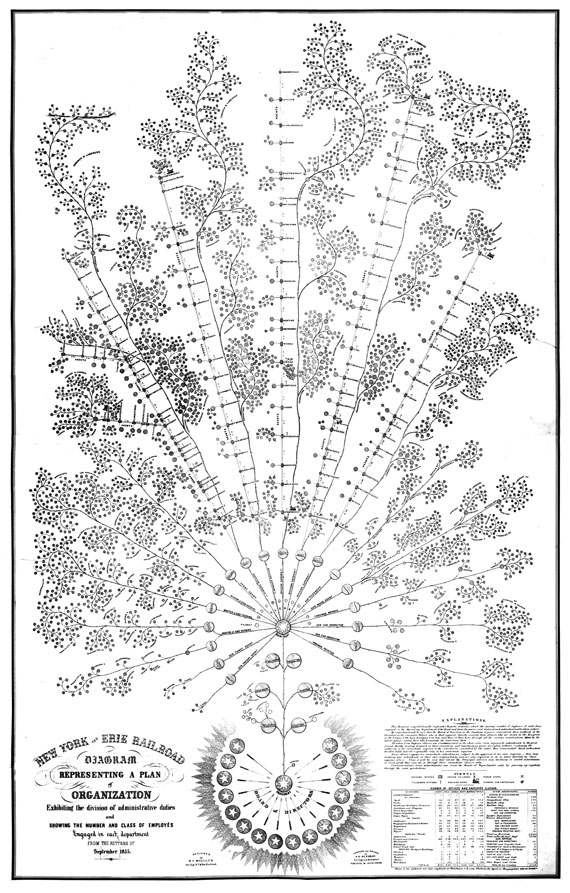
This chapter explores the transformative impact of digital tools on visualizing large organizations, highlighting the shortcomings of traditional organizational charts in capturing the interconnected nature of human dynamics. Emphasizing a respectful distance from simplistic managerial logic, it discusses four guiding principles for rethinking organizational charts with careful consideration of digital traces and the valuable information employees leave during daily practice. These principles aim to reconsider the centrality of individuals and the complex dynamics of the whole organization. The first principle stresses comprehensive representation of every employee, promoting concepts like inclusivity and irreductionism. The second principle fosters a sense of community through mutual and collective self-recognition. The third challenges traditional hierarchical structures in favor of equal representation in network-based models. The fourth underscores transparency and bottom-up collaboration in design. The chapter combines theoretical insights with practical examples, including the Affinity Map case study. This approach, in the light of opportunities offered by datafication, as described by Brinton (1939, 59-67), reimagines organizational charts to be more accurate, realistic, and useful. It serves as a guide for using digital data and computational tools to better understand and design large organizations.

Per–Forming Spaces
2025
https://hdl.handle.net/11370/d7e556b3-06df-4c6d-b8fa-5c21003734af
2025
Choreography, Design, and Technology: An Interview with Lins Derry from the metaLAB (at) Harvard
Derry, Lins, Dario Rodighierohttps://hdl.handle.net/11370/d7e556b3-06df-4c6d-b8fa-5c21003734af
In this enlightening interview with Lins Derry, a pioneering researcher at the intersection of dance, design, and technology, we explore the evolution of her groundbreaking work from its conception to its implementation in academia. Derry discusses her journey from professional dancer to leading figure at metaLAB (at) Harvard, emphasizing the integration of choreographic principles into interaction design. Through projects like the choreographic interface and data embodiment, she illustrates the potential of movement as a medium for interpreting and interacting with abstract data. Her work challenges traditional disciplinary boundaries, advocating for a more integrated approach to teaching and research that leverages the expressive power of the body in digital environments. This interview not only highlights Derry’s innovative contributions but also reflects on the broader implications of her work for enhancing sensory and expressive experiences with technology.

Zoomland
2023
Weather Map: A Diachronic Visual Model for Controversy Mapping
Rodighiero, Dario, and Jean Daniélou
https://doi.org/10.1515/9783111317779-017
2023
Weather Map: A Diachronic Visual Model for Controversy Mapping
Rodighiero, Dario, and Jean Daniélouhttps://doi.org/10.1515/9783111317779-017
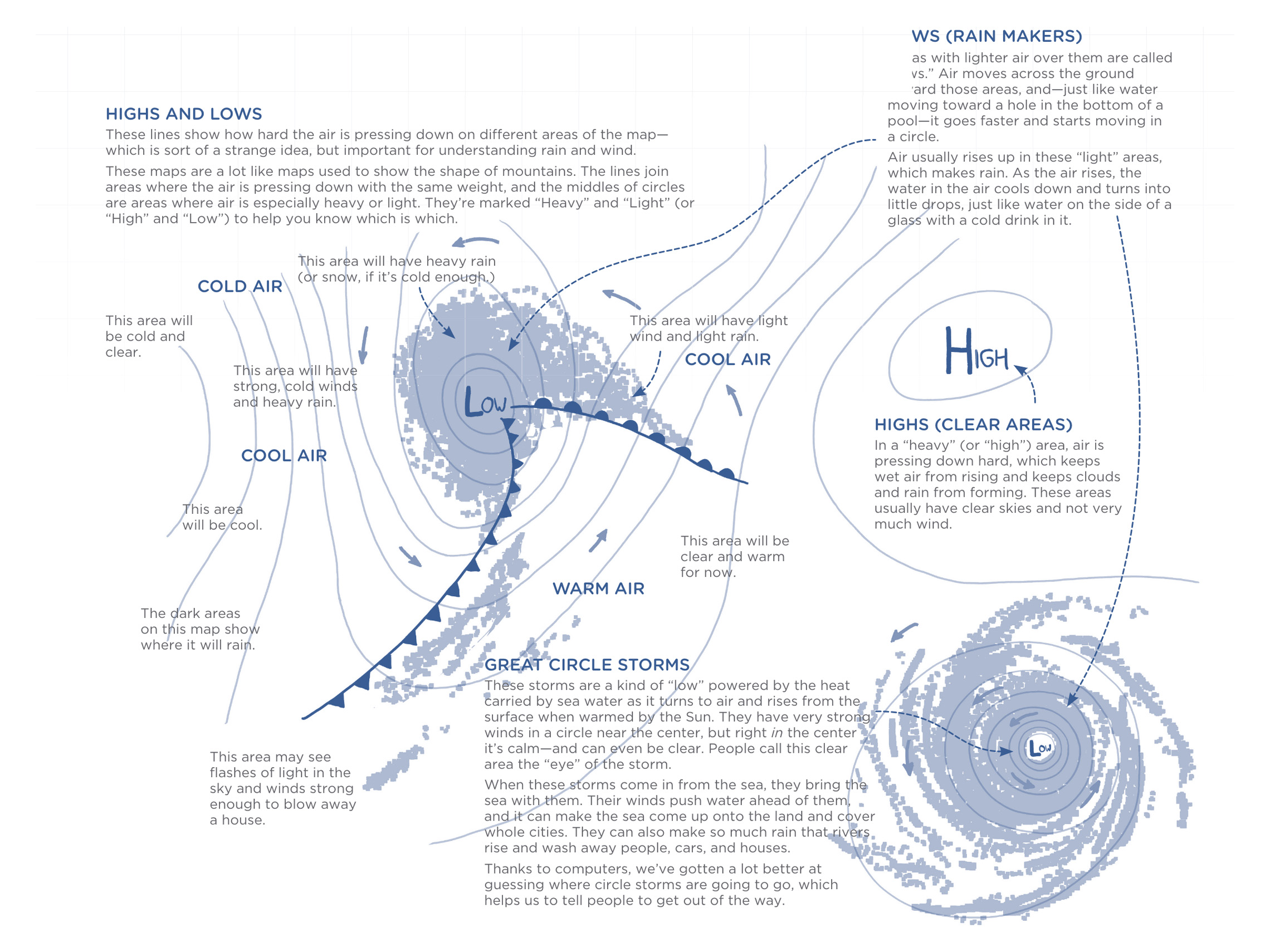
The Weather Map is a visual model to investigate public debates onmedia. Relying on the Media Cloud archives, the visual model transforms a simplequery into a sophisticated visualization by employing the visual grammar of synop-tic weather charts. Peaks of pressure and clashes between airmasses are used to de-scribe the conflicts in media through the temporal dimension, diving into thehuman and non-human dynamics that make the controversy alive. The WeatherMap was conceived as a digital tool to help students and scholars analyze publicdebates, according to the controversy mapping field founded by Bruno Latour. Inparticular, the visual model pushes the boundaries of network visualization, explor-ing advanced techniques of graphic design. The outcome is a web-based applicationdeveloped in JavaScript and Python at the disposal of education and research.
