
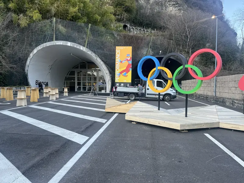
The Data Storytelling project presents a novel approach to visual historiography, using interactive data visualization to reinterpret the history of the Winter Olympic Games. Developed as part of the Performance exhibition at the Gallerie di Piedicastello in Trento, this project transforms historical records into immersive narratives, allowing audiences to explore macro-level patterns alongside micro-level athlete trajectories. By bridging digital curation with historical analysis, Data Storytelling challenges conventional representations of Olympic history, shifting focus from national achievements to personal stories and institutional change. Through two interactive applications, All Together Now and One by One, the project extends the historical exploration into an immersive, spatial experience. The design foregrounds the role of data in structuring historical narratives, making visible the geopolitical, social, and cultural dynamics that shape the winter sports. By embedding curation within visualization, the project also raises critical questions about the inclusivity and selectivity of data-driven storytelling. In doing so, Data Storytelling not only redefines how Olympic records are accessed and understood but also demonstrates the broader potential of digital tools in rethinking historical knowledge and visual historiography.
This article offers a theoretical reflection grounded in curatorial analysis and supported by a case study. It examines how Aldo Rossi’s legacy is redefined through archives, exhibitions, and installations, with a focus on the transformations of his Analogous City. Drawing on scholarly concepts from Paul Ricœur, Bruno Latour, and Umberto Eco, the article considers how memory, mediation, and interpretation work together as a process of meaning-making in cultural heritage. It shows how this process shapes the ways Rossi’s work is preserved and reimagined across different forms of display. Rather than treating cultural heritage as static, the article presents it as a process formed through editorial choices, curatorial practices, and participatory engagement. Rossi’s case study shows how architectural memory can remain open and responsive, especially when activated through digital and spatial forms of display.
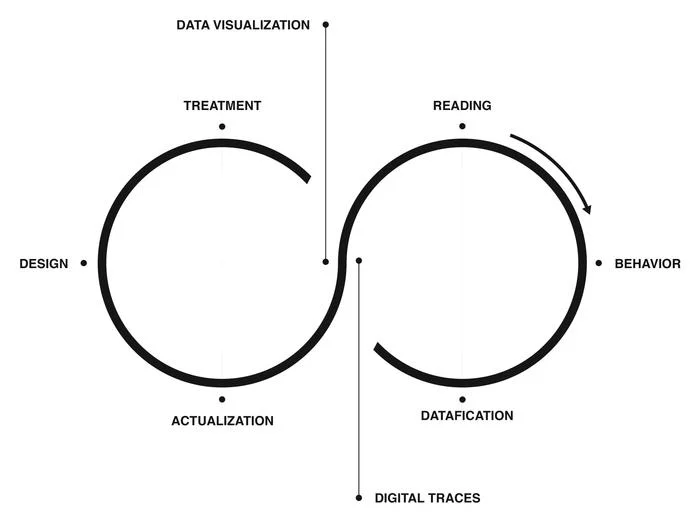
This chapter explores the transformative impact of digital tools on visualizing large organizations, highlighting the shortcomings of traditional organizational charts in capturing the interconnected nature of human dynamics. Emphasizing a respectful distance from simplistic managerial logic, it discusses four guiding principles for rethinking organizational charts with careful consideration of digital traces and the valuable information employees leave during daily practice. These principles aim to reconsider the centrality of individuals and the complex dynamics of the whole organization. The first principle stresses comprehensive representation of every employee, promoting concepts like inclusivity and irreductionism. The second principle fosters a sense of community through mutual and collective self-recognition. The third challenges traditional hierarchical structures in favor of equal representation in network-based models. The fourth underscores transparency and bottom-up collaboration in design. The chapter combines theoretical insights with practical examples, including the Affinity Map case study. This approach, in the light of opportunities offered by datafication, as described by Brinton (1939, 59-67), reimagines organizational charts to be more accurate, realistic, and useful. It serves as a guide for using digital data and computational tools to better understand and design large organizations.
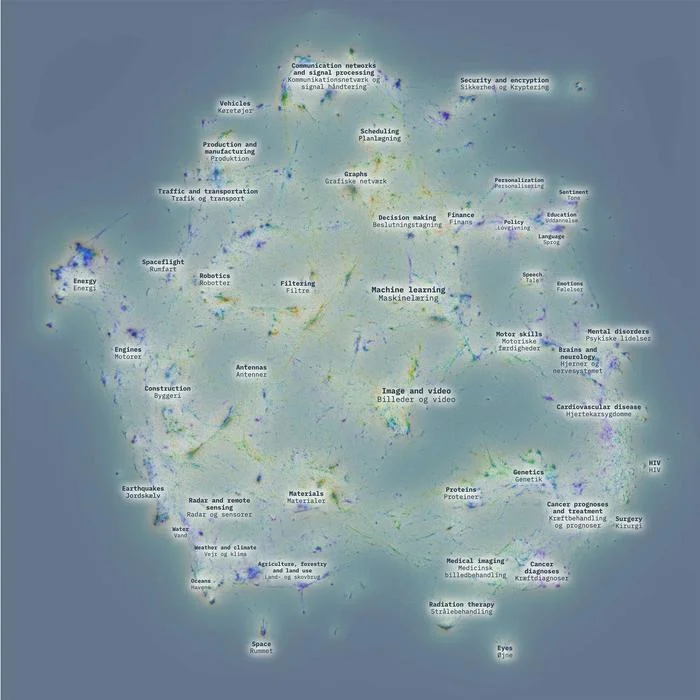
You are seeing a map — but not of streets or cities. This is a map of two million scientific papers about artificial intelligence, machine learning, and algorithms, where each dot is a paper and each cluster is a conversation happening in science about how algorithms are being put to work in the world. Like any city map, it invites you to explore: zoom in on a neighborhood, follow a path, or simply wander, and the further you walk the more the landscape changes — from medicine to education, from language to vision, from prediction to control. Take your time with it, asking yourself which of these applications you had heard of, which ones surprised you, and whether more of them should be part of the public conversation we are all having about AI.
This paper presents a workflow-oriented approach to interpreting Charles S. Peirce’s manuscripts through computational methods. Building on recent high-resolution digitization of the Peirce archive, it combines probabilistic transcription, text analysis, semantic modeling, and data visualization to examine how automation reshapes archival access and interpretive practice. Rather than treating computation as a means of producing static objects, the workflow frames digital archives as mediating research infrastructures that expand the interpretive space while preserving scholarly judgment. By approaching Peirce’s manuscripts as multimodal objects—integrating text, diagrams, and revisions—the paper reflects on philosophical patterns, continuities, and tensions that become visible only at corpus scale. The contribution situates itself within current Digital Humanities debates on openness, mediation, and interpretive accountability, and argues that digitization and automation function as enabling conditions for shared, reflexive interpretation.
Surprise Machines è un progetto di museologia sperimentale che rende visibile l’insieme delle immagini d’archivio conservate nei musei d’arte dell’Università di Harvard, in inglese Harvard Art Museums. Con l’idea di rendere visibile ai visitatori dei musei una collezione di più di 200.000 oggetti, la ricerca esplora potenzialità e limiti dell’intelligenza artificiale nel rappresentare un grande insieme di immagini. Inserito nell’esposizione Curatorial A(i)gents, organizzata dal metaLAB (at) Harvard, il progetto ha il fine ultimo di stupire rivelando l’estensione di un archivio non direttamente accessibile ai visitatori dei musei. Per amplificare questo effetto di sorpresa, l’installazione museale è arricchita da un’interfaccia coreografica che collega la gestualità dei visitatori a sguardi unici sulla collezione di immagini.
Le processus de datafication qui est en train de transformer la société nous permet d’observer la pandémie d’un point de vue global. Cet article fournit un exemple d’architecture immersive dans laquelle la littérature scientifique sur le coronavirus a été révélée pendant le festival Ars Electronica 2021. Tel un ciel étoilé, une visualisation en réseau représentant plus de 600 000 articles a été présentée dans le théâtre Deep Space 8K, où les spectateurs ont été accompagnés dans le sujet. L’étude de cas de la Cartographie 3D du COVID-19 illustre une nouvelle façon de présenter les données dans l’espace public pour encourager les conversations et les réflexions, invitant ainsi le lecteur à s’interroger quant aux nouvelles formes de muséologie expérimentale liées à la data.
Abstraction is an operation that makes sense of complex phenomena by making things graspable and open to understanding. In design, abstraction often takes the form of a mental model that guides the process, helping us navigate ideas and possibilities. When abstraction becomes visual, it changes function: it becomes a way to create and share meaning. Visual abstraction is, above all, a form of communication that offers a common ground to discuss complex ideas. This can be seen with the internet, abstracted in the 1970s through the ARPANET diagrams that sketched a network before it existed, and again in 2010 through Paul Butler’s visualization of Facebook friendships, which redrew the world through patterns of connection and absence.

This research discusses the figurative tensions that arise when using portraits to represent individuals behind a dataset. In the broader effort to communicate European data related to depression, the Kiel Science Communication Network (KielSCN) team attempted to engage a wider audience by combining interactive data graphics with AI-generated images of people. This article examines the project’s decisions and results, reflecting on the reaction from the audience when information design incorporates figurative representations of individuals within the data.
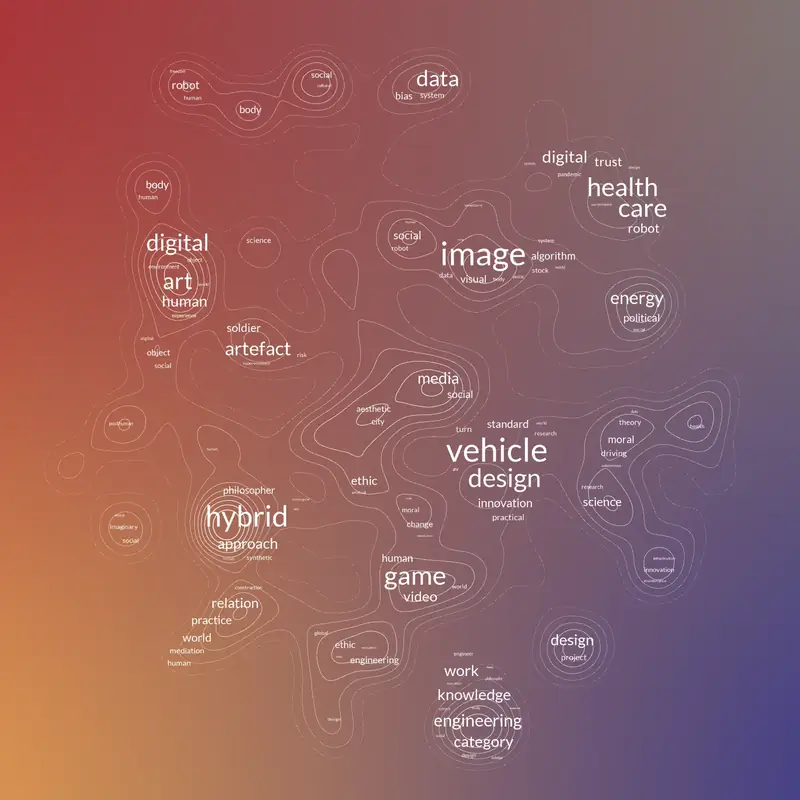
I modelli ci aiutano a capire la complessità offrendo strutture semplificate che rendono leggibili le dinamiche sociali altrimenti invisibili. In questo contesto, le reti si distinguono per la loro capacità di rappresentare informazioni relazionali: nodi e collegamenti riducono la società ad attori e connessioni, facendo emergere schemi che spesso restano nascosti ai nostri occhi. Dal XVIII secolo le reti sono passate dall’essere curiosi oggetti matematici a strumenti essenziali in molte discipline. Le prime visualizzazioni di rete rivelavano schemi di amicizia in classe mettendo in luce legami sociali, mentre oggi gli studi computazionali mappano una grande diversità di dati, dalle ricette di cucina alle collaborazioni scientifiche. Con la loro grammatica visuale, le reti oggi invitano al confronto, alla classificazione e all’interpretazione in una moltitudine di discipline. La loro diffusione, però, porta anche rischi: le reti possono essere scambiate per spazi oggettivi, i nodi centrali per più importanti, e la densità ammirata per l’estetica. Per affrontare queste sfide serve una nuova forma di alfabetizzazione. L’alfabetizzazione delle reti può essere definita come la capacità di comprendere, progettare e leggere modelli relazionali visivi, unendo conoscenze concettuali di sistemi complessi a competenze pratiche di visualizzazione e interpretazione critica. Questo articolo sviluppa l’idea di alfabetizzazione delle reti come competenza civica e professionale, mettendo in dialogo le tradizioni di alfabetizzazione dei dati e visiva. Ripercorre la storia delle reti dalle origini matematiche fino alla loro integrazione nei media digitali, mostrando una nuova modalità di lettura relazionale. L’articolo esplora tre dimensioni delle reti: le scelte progettuali che plasmano il significato, il pensiero spaziale che guida l’interpretazione e i progetti sperimentali che trasformano la visualizzazione in pratica performativa. Collocando le reti all’incrocio tra design dell’informazione, ricerca critica e pratica culturale, l’articolo sostiene che diffondere l’alfabetizzazione delle reti sia essenziale per confrontarsi con il design della conoscenza nel tessuto sociale di oggi.
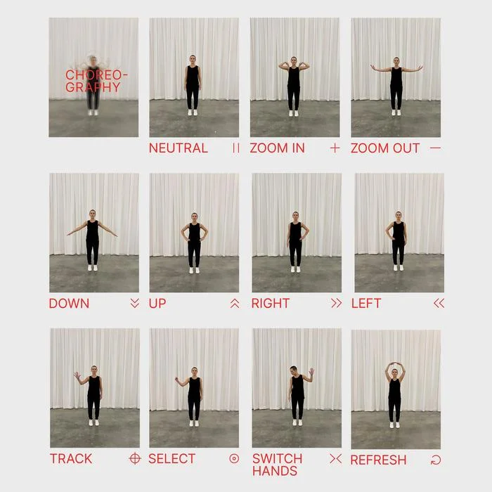
In this enlightening interview with Lins Derry, a pioneering researcher at the intersection of dance, design, and technology, we explore the evolution of her groundbreaking work from its conception to its implementation in academia. Derry discusses her journey from a professional dancer to a leading figure at metaLAB (at) Harvard, emphasizing the integration of choreographic principles into interaction design. Through projects like the choreographic interface and data embodiment, Derry illustrates the potential of movement as a medium for interpreting and interacting with abstract data. Her work challenges traditional boundaries between disciplines, advocating for a more integrated approach to teaching and research that leverages the expressive power of the body in digital environments. This interview not only highlights Derry’s innovative contributions but also reflects on the broader implications of her work for enhancing sensory and expressive experiences with technology.
Care is easy to recognize on a personal level, especially when it appears in the small, attentive gestures woven into daily life. We see it when someone nurses a sick friend, tends a garden, or stitches a quilt by hand. Each act is marked by presence, patience, and a quiet commitment expressed through attention. It takes form through deliberate actions that often go unnoticed yet carry enduring meaning. But what does care look like when it scales up across complex systems where the risks are greater, the people more dispersed, and the consequences harder to trace?
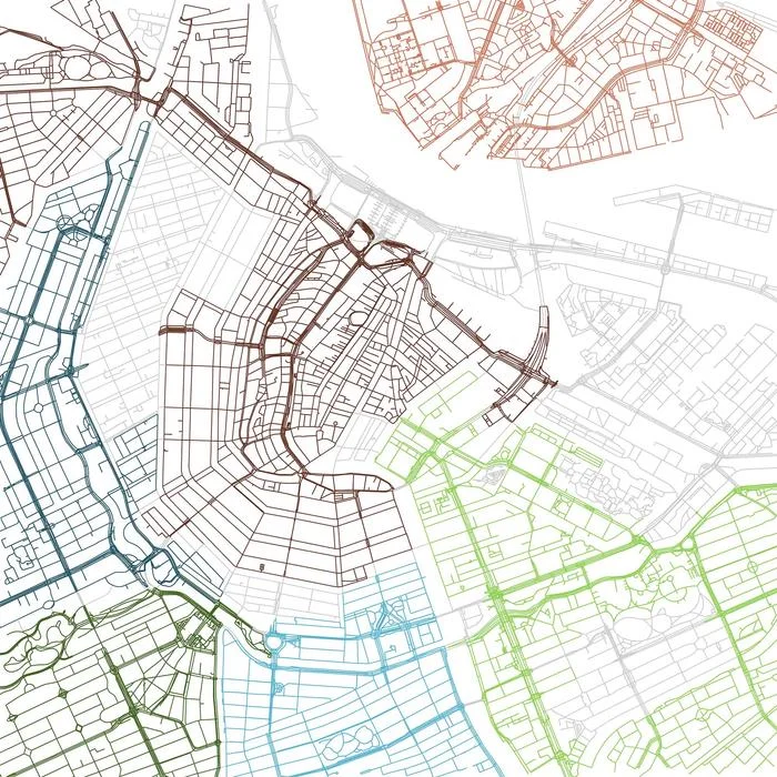
Urban morphology has long been studied through typologies, spatial configurations, and historical change, yet cities are not static artifacts but dynamic environments continually reshaped by people, infrastructures, and politics. This article brings Actor–Network Theory (ANT) into dialogue with Aldo Rossi’s notion of the locus to rethink urban design as both enduring form and relational process. Building on Manuel Lima’s taxonomy, the study develops a methodological workflow that translates street networks into visualizations, pairing embeddings with topographic maps to highlight structural patterns. Applied to a comparative set of cities, the analysis distinguishes three broad morphological tendencies—archetypal, geometrical, and relational—each reflecting different logics of urban organization. The results show how scale and connectivity condition the interpretability of embeddings, revealing both alignments and divergences between cartographic and topological representations. Beyond empirical findings, the article frames network literacy as a meeting ground for design theory, science and technology studies, and information visualization. It concludes by proposing that advancing urban morphology today requires not only new computational tools but also sustained interdisciplinary collaboration across design, urban studies, and data science.
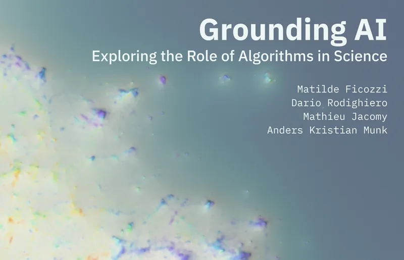
Data visualizations are often seen as tools to make expert knowledge more accessible. Yet, without careful design, they risk simplifying or misrepresenting complex ideas. This case study examines the Grounding AI Map, a 100 m² floor installation at the Danish Technical Museum that visualizes millions of scientific articles on artificial intelligence. Visitors navigate this mapped knowledge physically, aided by automated bots that summarize and interpret content using large language models. These bots serve not just as guides but as mediators, prompting users to question and reinterpret the mapped knowledge through their own perspectives. By inviting interaction and critique, the map becomes a participatory space where knowledge is co-constructed. A quali-quantitative framework assesses this mediation by analyzing app data, observing visitor behavior, and conducting interviews. The study highlights how visualization, when combined with reflexive AI tools, can create more inclusive and situated ways of engaging with scientific knowledge.
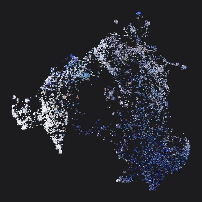
As biodiversity loss and climate change accelerate, botanical gardens serve as vital infrastructures for research, education, and conservation. This project focuses on the Arnold Arboretum of Harvard University, a 281-acre living museum founded in 1872 in Boston. Drawing on more than a century of curatorial data, the research combines historical analysis with computational methods to visualize the biographies of plants and people. The resulting platform reveals patterns of care and scientific observations, along with the collective dimensions embedded in botanical data. Using techniques from artificial intelligence, geospatial mapping, and information design, the project frames the arboretum as a system of shared agency—an active archive of more-than-human affinities that records the layered memory of curatorial labor, the situated nature of knowledge production, and the potential of design to bridge archival record and future care.
Diagrams are crucial yet underexplored tools in many disciplines, demonstrating the close connection between visual representation and scholarly reasoning. However, their iconic form poses obstacles to visual studies, intermedial analysis, and text-based digital workflows. In particular, Charles S. Peirce consistently advocated the use of diagrams as essential for reasoning and explanation. His manuscripts, often combining textual content with complex visual artifacts, provide a challenging case for studying documents involving heterogeneous materials. In this preliminary study, we investigate whether Vision-Language Models (VLMs) can effectively help us identify and interpret such hybrid pages in context. First, we propose a workflow that (i) segments manuscript page layouts, (ii) reconnects each segment to IIIF-compliant annotations, and (iii) submits fragments containing diagrams to a VLM. In addition, by adopting Peirce’s semiotic framework, we designed prompts to extract key knowledge about diagrams and produce concise captions. Finally, we integrated these captions into knowledge graphs, enabling structured representations of diagrammatic content within composite sources.
Models help us navigate the complexity of social life, offering simplified structures that make invisible dynamics legible. Networks stand out for their ability to represent relations directly: nodes and links reduce society to actors and their connections, exposing patterns that often remain hidden in linear accounts. Since the eighteenth century, networks have evolved from mathematical curiosities to essential tools across disciplines. Early sociograms revealed classroom friendships, sociological diagrams exposed social reproduction and inequality, and computational studies now map everything from recipes to scientific collaborations. With their visual grammar, networks invite comparison, clustering, and interpretation across diverse domains. Yet their ubiquity also introduces risks: layouts may be mistaken for objective spaces, central nodes assumed to be more important, and dense graphs admired more for aesthetics than insight. To address these challenges, a new form of literacy is required. Network literacy can be defined as the ability to understand, design, and read visual relational models, combining conceptual knowledge of complex systems with practical skills of visualization and critical interpretation. This paper develops the notion of network literacy as a civic and professional competency, bridging traditions of data literacy and visual literacy. It traces the history of networks from their mathematical and sociological origins to their integration into digital media and design, showing how they reconfigure the codex into a relational mode of reading. It then explores three dimensions: design choices that shape meaning, spatial thinking that guides interpretation, and experimental projects that turn visualization into performative practice. By situating networks at the intersection of information design, critical inquiry, and cultural practice, the paper argues that cultivating network literacy is essential for engaging responsibly with the relational fabric of contemporary knowledge.
Care is easy to recognize on a personal level, especially when it takes the form of small, attentive gestures woven into daily life. We see it in how someone nurses a sick friend, tends a garden, or stitches a quilt by hand. Each act, marked by presence, patience, and the quiet commitment to care through touch, time, and attention. It takes shape through quiet, deliberate acts that often go unnoticed, yet carry lasting weight and meaning. But what does care look like when it scales up—across complex systems where the risks are higher, the people more dispersed, and the consequences harder to see?
In this article, the authors deal with stock images depicting AI as a face or a body that undergoes a process of fragmentation into particles, pixels, or voxels. These images, they contend, are the symptoms of a datafied worldview. In the first section, the authors discuss stock images of AI and account for their qualitative-quantitative analyses of about 7,500 images from the online catalog of Shutterstock. These analyses have brought out datafied faces and bodies as one of the main themes among stock images of AI. In the second part, the authors elaborate on the notion of datafication of the worldview and offer some examples from architecture and design. This second section includes a methodological detour, in which the authors propose articulating Panofsky’s iconology and Didi-Huberman’s “symptomatic” perspective. In conclusion, the authors reflect on an apparently marginal aspect of stock images of AI: the abundant use of blue.
This article provides a visual investigation into scientific communities through the lens of language. Inspired by actor-network theory, the study examines how individuals establish connections through shared vocabularies and, consequently, how communities organize themselves into linguistic groups. Using scientific texts to map the lexical dimension, the premise posits that research communities can be visually represented by their members and the words they employ, favouring the comprehension of social structures. The research draws from a decade-long personal experimentation with language-based visual models, to explore how research communities appear according to their lexicon, in which each individual is intricately intertwined. Employing cutting-edge techniques of text analysis and network visualization, the study analyses, organizes and maps scientific communities, clustering individuals into thematic groups based on their language use. The findings are presented through a series of projects that delve into the analytical power of images and unveil novel visual methods to better understand the spatial dynamics of language and communities.

This paper introduces an innovative analytical method for visualising research libraries, overcoming the limitations of the assumptions made by their classification systems. The approach combines user loan data with deep mapping techniques to graphically display usage patterns and thematic clusters. Dimensionality reduction is used to visualise the catalogue by book loans, and prompt engineering with large language models is used to describe loan clusters with detailed summaries and titles. This approach was applied to the library collection owned by Bibliotheca Hertziana, a renowned research institute for art history based in Rome. The final output was assessed by a group of experts through interviews supported by an atlas providing statistical information on clusters. This yielded promising results towards a more general framework for visually mapping textual collections and capturing their transformation and usage from an interdisciplinary perspective.
The fiftieth anniversary of EPFL (École Polytechnique Fédérale de Lausanne) offered the opportunity to retrace its history through the digital archives housed by the institute itself. Part of the exhibition Infinity Room 2, the Super-Vision project investigates the practice of academic advising by visualizing 8,000 doctoral theses in a work at the intersection of art, science, and technology. Inaugurated in September 2019 at EPFL Pavilions, Super-Vision presents a diachronic mapping that uses artificial intelligence to shed light on an institutional dataset that would be unobservable otherwise. To achieve such a goal, 8,000 doctoral theses are analysed with natural language processing and mapped with techniques of dimensionality reduction, combining language and time within in an interactive visualization accessible to the public. The project title has a twofold meaning: on the one hand, it refers to the educational practice that connects doctoral students to supervisors; on the other hand, it employs information design like a macroscope to grasp complex phenomena from a distant standpoint. The result offers EPFL employees and museum visitors an original perspective to look at the institute with different eyes.
This article introduces a proposal for an experimental interface design that uses the International Image Interoperability Framework (IIIF) to facilitate the exploration of image collections, relying on the relationships created by the scholarly practice of annotation. Within the project “From Data to Wisdom,” an innovative digital tool was designed by harnessing IIIF resources and leveraging close and distant reading on three levels of connectivity: micro, meso, and macro. The proposed tool integrates annotation features that enable scholars to analyze individual images as well as interpret broader connections and patterns across image sets. This article outlines the interface’s theoretical framework and design principles, highlighting the potential to support interdisciplinary research and advance digital art tools.
This preliminary study introduces an innovative approach to the analysis and organization of cultural heritage materials, focusing on the archive of Charles S. Peirce. Given the diverse range of artifacts, objects, and documents comprising cultural heritage, it is essential to efficiently organize and provide access to these materials for the wider public. However, Peirce’s manuscripts pose a particular challenge due to their extensive quantity, which makes comprehensive organization through manual classification practically impossible. In response to this challenge, our paper proposes a methodology for the automated analysis and organization of Peirce’s manuscripts. We have specifically tested this approach on the renowned 115-page manuscript known as PAP. This study represents a significant step forward in establishing a research direction for the development of a larger project. By incorporating novel computational methods, this larger project has the potential to greatly enhance the field of cultural heritage organization.
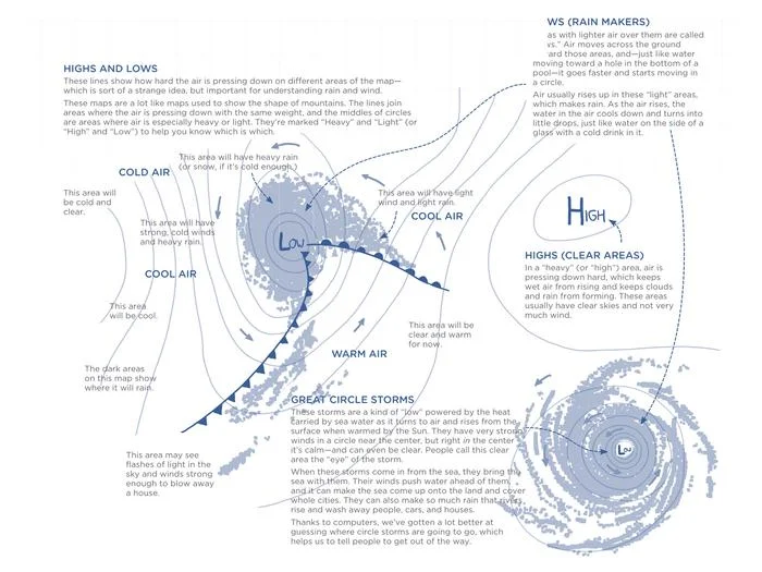
The Weather Map is a visual model to investigate public debates on media. Relying on the Media Cloud archives, the visual model transforms a simple query into a sophisticated visualization by employing the visual grammar of synoptic weather charts. Peaks of pressure and clashes between airmasses are used to describe the conflicts in media through the temporal dimension, diving into the human and non-human dynamics that make the controversy alive. The Weather Map was conceived as a digital tool to help students and scholars analyze public debates, according to the controversy mapping field founded by Bruno Latour. In particular, the visual model pushes the boundaries of network visualization, exploring advanced techniques of graphic design. The outcome is a web-based application developed in JavaScript and Python at the disposal of education and research.

In 1923, Walter Benjamin published translations of Baudelaire’s poetry with a prefatory essay developing the idea that translation is not only the practice of addressing foreign readerships, but rather a process of authorship in which the original text is amplified with further significance. The authors use the term translation with a meaning that is not only linguistic but also visual. They analyze the coronavirus pandemic by translating scientific literacy through the techniques of natural language processing and data visualization. The Cartography of COVID-19 results from a visual translation that invites readers to explore the current pandemic from a different point of view that extends their perception.
Journalists and psychologists claim we are more narcissistic than ever because of the extensive use of social networks and digital tools. They are wrong: social networks and other digital tools don’t increase our self-love but amplify our quest for the approval of others. René Girard’s theory contradicts Sigmund Freud’s psychoanalysis by stating that digital users are not narcissistic but pseudo-narcissistic, opening a new era of pseudo-narcissism.
We describe the COVID-19 Online Visualization Collection (COVIC), its goals, how it came to be, and why we propose such a collection as a new path for design research. The COVIC database contains a collective visualization response to the COVID-19 pandemic gathered from approximately 3,000 articles, each containing one or more visualizations (about 12,000 in total). We have sought to create a resource for design research—a boundary object—that will be useful to any of the disciplines brought together through their response to the pandemic event.
Malgré la grande littérature concernant les visualisations de réseau, leur représentation graphique n’est guère un objet d’investigation. Parfois, cela mérite plus d’attention, surtout lorsque des individus sont représentés. Traduire visuellement des communautés en réseau, par exemple, implique que certains individus soient positionnés aux frontières de la représentation. Cette hypothèse apparaît injuste, surtout si chaque individu de la communauté est connecté avec tout le monde.
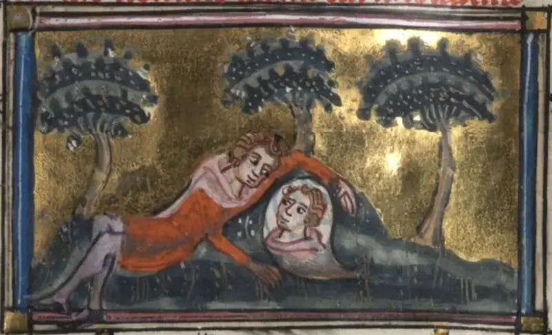
Aldo Rossi composed the famous collage known as Analogous City for the Venice Biennale in 1976. This text presents a visual study of the collage through both physical and digital means: a mobile app works in conjunction with a reprint of the Analogous City in the format of a city map. Forty years after its creation, the collage’s original elements are finally identified and collected, and the mechanisms of composition are disclosed thanks to Fabio Reinhart’s contribution. The map of the Analogous City is analyzed in both historical and museum viewpoints, focusing on the reflections that emerged when exhibiting in Maastricht, Milan, Lausanne, Bergamo, and Rome. Although the map was designed as an interactive installation for these exhibitions, it has turned out to be also an educational tool useful outside museums. If Aldo Rossi created an artwork to think about the reconstruction of the city, likewise, the map of the Analogous City helps to rethink museums by designing their objects in a way they can leave the exhibition for a second life in the city.
This book collects results from the research project “From Data to Wisdom. Philosophizing Data Visualizations in the Middle Ages and Early Modernity,” funded by the FCT (Fundação para a Ciência e a Tecnologia), POCI-01-0145-FEDER-029717. The project had a double purpose: (1) to create a repository of medieval visualizations of information and knowledge, proposing a distinction between different kinds of representation: relational schemes, knowledge-experience simulations, data (storage/indices/tables/charts), elemental schemes, text-diagrams, and demonstrative graphics; and (2) to make these visualizations interact with modern and contemporary visualizations, in particular contemporary data visualizations. More generally, the aim of the project was to show how the history of Western thought is not only a history of texts but also (and perhaps increasingly) a history of images and visual representations of concepts and knowledge.

The datafication process transforming society enables us to witness the pandemic from a global perspective. This article provides an example of immersive architecture in which coronavirus-related scientific literature was revealed during Ars Electronica 2021. Like a starry sky, a network visualization representing more than 600,000 articles was showcased in the Deep Space 8K theater, where spectators were accompanied in reading insights. The case study of 3D Cartography of COVID-19 illustrates a novel way to present data in public spaces to foster conversations and reflects on how visual data literacy can be addressed in museums.
De nombreux journalistes et des psychologues affirment que nous sommes plus narcissiques que jamais, du fait de l’usage intensif des réseaux sociaux et des outils numériques en général. Et s’ils avaient tort ? Les réseaux sociaux et d’autres outils ne font pas croître l’amour-propre. Au contraire, ils amplifient notre recherche de l’approbation des autres. La théorie de René Girard (1923–2015) explique ce phénomène et contredit la théorie psychanalytique de Freud et ses prolongements contemporains. Avec les réseaux sociaux, nous serions entrés dans l’ère du pseudo-narcissisme.
Network diagrams have met frequent improvements in terms of computing time and layout algorithms, but the same cannot be said for their graphic design and aesthetics. Taking the Cartography of SPT2021 as a case study, this article discusses how alternative visual grammars—removing links, and adding contour lines and word clouds—can make dense relational structures more readable by shifting the reader’s focus from nodes to clusters.
Surprise Machines is a project of experimental museology that sets out to visualize the entire image collection of the Harvard Art Museums, intending to open up unexpected vistas on more than 200,000 objects usually inaccessible to visitors. Part of the exhibition Curatorial A(i)gents organized by metaLAB (at) Harvard, the project explores the limits of artificial intelligence to display a large set of images and create surprise among visitors. To achieve such a feeling of surprise, a choreographic interface was designed to connect the audience’s movement with several unique views of the collection.
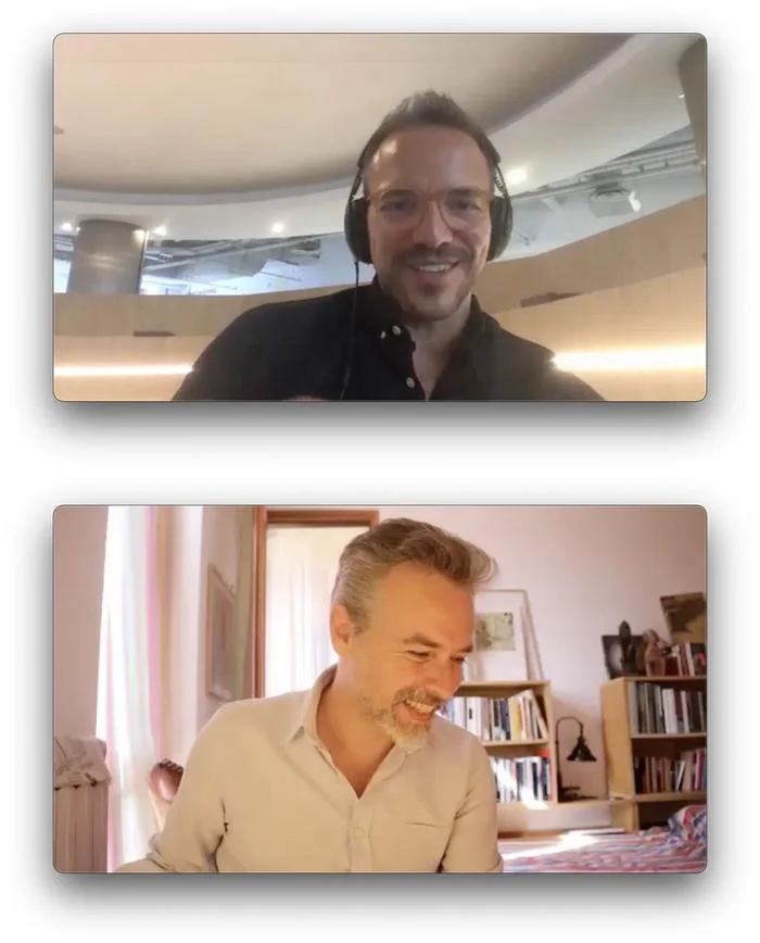
Manuel Lima is one of the most prominent figures of data visualization since the publication of Visual Complexity (Lima 2011). In this conversation, Manuel Lima traces back the origin of data visualization to Ars Memorativa, an ancient mnemonic technique to organize information and facilitate its recall. Going back to the origins is an obsession that brought him to collect and arrange into books images of information design from both physical and digital archives. By doing this, Manuel Lima tackled issues related to digital objects and their creation, use, and preservation, with a point of view capable of combining the passion for visualizing information and the profession of UX designer.
De nos jours, nombre de nos actions sont transformées en informations digitales, que nous pouvons utiliser pour dessiner des diagrammes qui décrivent des fonctionnements complexes, tels ceux des institutions. La visualisation de données permet de démêler cette complexité. L’ouvrage nous introduit à la lecture des systèmes complexes par le biais du concept d’affinité : l’alchimie qui réunit les personnes et les rend créatives et productives. La cartographie des affinités est une méthode de visualisation des données permettant d’observer les dynamiques d’une organisation subdivisée en systèmes complexes : institutions, universités, gouvernements, etc. Il s’agit d’un outil graphique fondé sur la variable de la collaboration. Cartographier les affinités est, selon l’auteur, un instrument pour déchiffrer des organisations complexes et les améliorer, mais également, par l’insertion des individus sur ces cartes, une manière de les aider à comprendre comment évoluer dans la vie au sein d’une institution. L’ouvrage affronte cette problématique avec un cas d’étude concernant l’École polytechnique fédérale de Lausanne. Les données provenant des actions des chercheurs de l’institution lausannoise sont réunies et transformées en une carte innovatrice et attrayante.
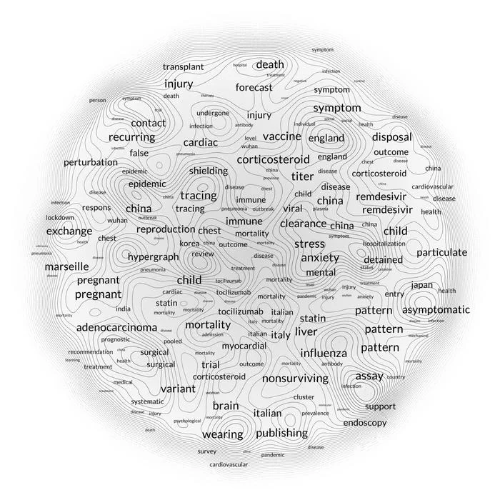
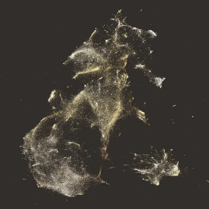
Despite the perceptibility of the effects they impart on their hosts, the most incredible capacity of viruses is in their invisibility. Invisibility is the most frightening side of the current pandemic, and invisible is also the work of the scientists striving to find a solution. This proposal presents a data visualization that aims to give visibility to those scientists working on COVID-19. Their scientific publications have been computationally analyzed and transformed into a relational structure based on lexical similarity. The result is a network of scientists whose proximity is given by their closeness in writing. An innovative visual method that hybridizes network visualizations and word clouds shows the scientists in a deep space, explorable through keywords. In such a space, individuals are situated according to their lexical similarity, and keywords are used to clarify their proximity. By zooming, the visualization reveals more information about scientists and their clusters. While a lot of visualizations during the pandemic focused on showing the spread of infection, causing anxiety among the readers, this visualization reveals the efforts of science in eradicating the virus. Making visible the enormous number of scientists working on COVID-19 research will contribute to coping more positively with the pandemic.
Nowadays, many of our actions are transformed into digital information, which we can use to draw diagrams that describe complex operations, such as those of institutions. This book introduces us to the reading of complex systems through the concept of affinity: the alchemy that brings people together and makes them creative and productive. Affinity’s mapping is a data visualization method that allows us to observe the dynamics of an organization subdivided into complex systems: institutions, universities, governments, etc. It is a graphical tool based on the collaboration variable. Mapping Affinities is, according to the author, an instrument for deciphering complex organizations and improving them. By inserting individuals on these maps, it is also a way of helping them to understand how to evolve in life within an institution. The book tackles this problem with a case study concerning the École Polytechnique Fédérale de Lausanne. Data from the actions of researchers at the Lausanne institution are brought together and transformed into an innovative and attractive map.
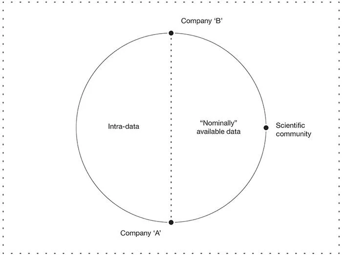
Starting from an analysis of frequently employed definitions of big data, it will be argued that, to overcome the intrinsic weaknesses of big data, it is more appropriate to define the object in relational terms. The excessive emphasis on volume and technological aspects of big data, derived from their current definitions, combined with neglected epistemological issues gave birth to an objectivistic rhetoric surrounding big data as implicitly neutral, omni-comprehensive, and theory-free. This rhetoric contradicts the empirical reality that embraces big data: (1) data collection is not neutral nor objective; (2) exhaustivity is a mathematical limit; and (3) interpretation and knowledge production remain both theoretically informed and subjective. Addressing these issues, big data will be interpreted as a methodological revolution carried over by evolutionary processes in technology and epistemology. By distinguishing between forms of nominal and actual access, we claim that big data promoted a new digital divide changing stakeholders, gatekeepers, and the basic rules of knowledge discovery by radically shaping the power dynamics involved in the processes of production and analysis of data.
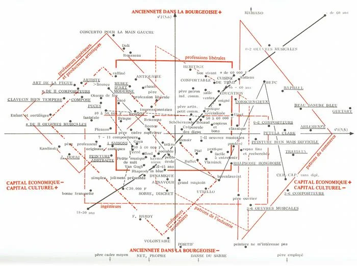
This article aims to offer an original framework to understand the ontological structure of digital media and technologies, along with their effects of subjectivation. In the first section, we confront Bourdieu’s and Latour’s social theories. Indeed, Latour and Bourdieu offered two almost opposite social theories, and both of them can be used to understand digital media and technologies. Our hypothesis is that the digital of today is less Latourian than Bourdieusian. In the second section, we introduce the concept of digital habitus. In particular, we contend that digital machines such as algorithms of machine learning are habitus machines. Although their results present a greater granularity with respect to the standard techniques of the past, these algorithms still reduce individuals to categories, general trends, classes, and behaviors. Such a reduction has flattening effects on the individuals’ self-understanding, especially in terms of identity and interaction with the social world. This is the phenomenon described as the “personalization without personality.” In the third section, we look for proof of our previous insights through a qualitative and comparative analysis between three kinds of data and information visualization. More specifically, we show that contemporary techniques for data visualization with machine learning algorithms are closer to Bourdieu’s use of correspondence analysis (CA) and multiple correspondence analysis (MCA) than to Latour-inspired network visualizations.
Despite the great literature regarding network visualizations, their graphic representation is hardly an object of investigation. Sometimes it deserves more attention, especially when individuals are represented. Visually translating communities in networks, for example, implies that some individuals are always situated at the borders of the representation. This assumption is clearly unfair, especially if each individual in the community is connected with everybody else. To address this lack of design justice, the community is represented on a spherical network where the surface is continuous. In that space, individuals can be situated in a sparse area, but never on the edges. The spherical network is then projected onto a flat surface to improve readability by making use of cartographic projections.
Potrebbe esserci qualcosa di inappropriato nel guardare all’era post-crisi quando gli operatori sanitari sono ancora “in prima linea”, milioni di persone stanno perdendo il lavoro, e molte famiglie in lutto non possono nemmeno seppellire i loro morti. Eppure, è proprio questo il momento di lottare affinché la ripresa economica, una volta terminata la crisi, non ci riporti allo stesso vecchio regime climatico contro il quale finora abbiamo tentato, senza successo, di combattere. In effetti, la crisi sanitaria è inserita in quella che non è una crisi – sempre passeggera per definizione – ma piuttosto una mutazione ecologica duratura e irreversibile. Se abbiamo delle buone possibilità di “uscire” dalla prima, ne abbiamo ben poche di “uscire” dalla seconda. Le due situazioni non sono alla stessa scala di grandezza, ma resta illuminante articolarle l’una con l’altra. In ogni caso, sarebbe un peccato non riflettere sulla crisi sanitaria per scoprire altri modi di entrare nella mutazione ecologica, piuttosto che farlo alla cieca.
This article presents a case study analyzing submissions from the Digital Humanities 2019 conference by visualizing a network of authors situated according to their shared lexicon. This new form of summarizing a conference is an effective way to grasp the whole conference at once. The hope is that this method of visualization will not be employed merely as a retroactive way to reflect on past events, but rather as an instrument to prepare the visit and orientate the attendees during the conference.
In this article, we show how postphenomenology can be used to analyze the Affinity Map: a data visualization that reveals the hidden dynamics that exist between individuals within large organizations. We make use of the Affinity Map to expand the classic postphenomenology that privileges a ‘linear’ understanding of technological mediations and introduce the notions of ‘iterativity’ and ‘collectivity.’ In the first section of the paper, we discuss both classic and more recent descriptions of human-technology-world relations in order to transcendentally approach the discipline of data visualization. In the second section, we use the Affinity Map case study to consider three elements: 1) the collection of data and the design process; 2) the visual grammar of the data visualization, and 3) the process of self-recognition for the map ‘reader.’ In the third section, we introduce the hermeneutic circle of data visualization. Finally, we suggest that the Affinity Map, because of its ethical and political multistability, might be seen as a material encounter between postphenomenology, actor-network theory (ANT), and hermeneutics.
This article explores how readers recognize their personal identities represented through data visualizations. The recognition is investigated starting from three definitions captured by the philosopher Paul Ricœur: the identification with the visualization, the recognition of someone in the visualization, and the mutual recognition that happens between readers. Whereas these notions were initially applied to study the role of the book reader, two further concepts complete the shift to data visualization: the digital identity stays for the present-day passport of human actions and the promise is the intimate reflection that projects readers towards their own future. This article reflects on the delicate meaning of digital identity and the way of representing it according to this structure: From Personal Identity to Media is a historical introduction to self-recognition, Data Visualization for Representing Identities moves the focus to visual representation, and The Course of Recognition breaks the self-recognition in through the five concepts above, just before the conclusion.
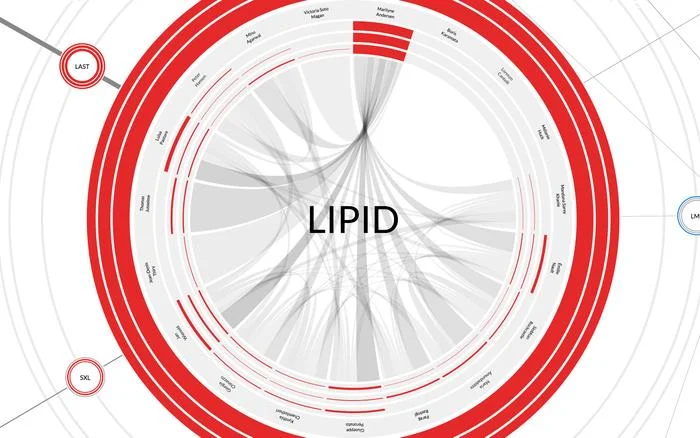
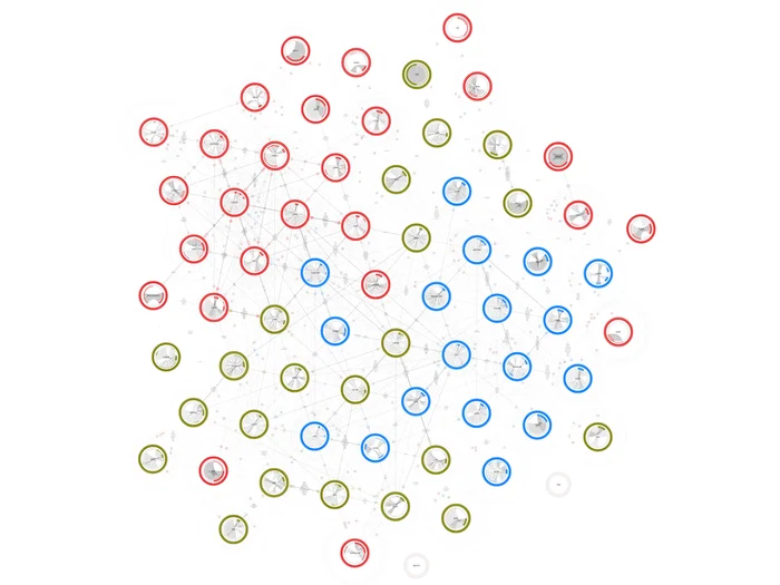
Scholarly affinities are one of the most fundamental hidden dynamics that drive scientific development. Some affinities are actual, and consequently can be measured through classical academic metrics such as co-authoring. Other affinities are potential, and therefore do not leave visible traces in information systems; for instance, some peers may share interests without actually knowing it. This article illustrates the development of a map of affinities for academic collectives, designed to be relevant to three audiences: the management, the scholars themselves, and the external public. Our case study involves the School of Architecture, Civil and Environmental Engineering of EPFL, hereinafter ENAC. The school consists of around 1,000 scholars, 70 laboratories, and 3 institutes. The actual affinities are modeled using the data available from the information systems reporting publications, teaching, and advising scholars, whereas the potential affinities are addressed through text mining of the publications. The major challenge for designing such a map is to represent the multi-dimensionality and multi-scale nature of the information. The affinities are not limited to the computation of heterogeneous sources of information; they also apply at different scales. The map, thus, shows local affinities inside a given laboratory, as well as global affinities among laboratories. This article presents a graphical grammar to represent affinities. Its effectiveness is illustrated by two actualizations of the design proposal: an interactive online system in which the map can be parameterized, and a large-scale carpet of 250 square meters. In both cases, we discuss how the materiality influences the representation of data, in particular the way key questions could be appropriately addressed considering the three target audiences: the insights gained by the management and their consequences in terms of governance, the understanding of the scholars’ own positioning in the academic group in order to foster opportunities for new collaborations and, eventually, the interpretation of the structure from a general public to evaluate the relevance of the tool for external communication.
This article concerns a specific actor in the actualization process, the media. The conventional media for visualizations is the computer screen, a visual device that supports the practices of design and reading. However, visualizations also appear in other ways, for example as posters, articles, books, or projections. This article focuses, in particular, on a pretty unusual medium called floor or walkable visualization.
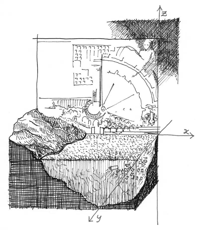
Questa nuova pubblicazione de La Città Analoga, opera realizzata da Aldo Rossi, Eraldo Consolascio, Bruno Reichlin e Fabio Reinhart per la Biennale di Architettura di Venezia del 1976, fa parte di un’installazione museografica per la mostra Aldo Rossi – La finestra del Poeta (Celant e Huijts 2015) al museo Bonnefanten di Maastricht. Per esplorare e approfondire quest’opera fondamentale, Archizoom si è affidata a Dario Rodighiero, dottorando nel programma di Architettura e Scienze delle Città e designer presso il Digital Humanities Lab (DHLAB) dell’EPFL. Concepita come un vero e proprio progetto urbano, La Città Analoga mostra un’aggregazione di architetture tratte dalla memoria collettiva e personale. Cosa succede se isoliamo le forme che Aldo Rossi e i suoi amici hanno posto così consapevolmente in relazione tra loro? Rodighiero l’ha semplicemente scomposta nei riferimenti originali per poi restituire i frammenti all’opera, permettendo così di vedere simultaneamente il lavoro e il suo vocabolario visivo. Un’applicazione basata sulla realtà aumentata è stata creata per accompagnare questa pubblicazione, mostrando i riferimenti completi del collage su diversi strati sospesi sopra l’opera. Scaricando l’applicazione gratuita e installandola sul proprio tablet o telefono, è possibile ricreare l’esperienza museale ovunque e in qualsiasi momento.
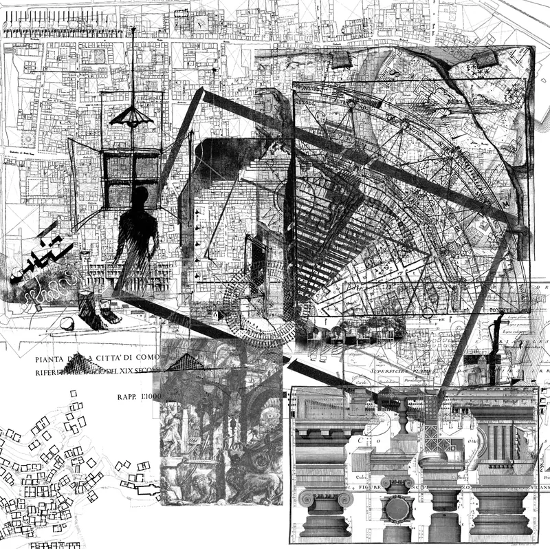
This new publication of The Analogous City, an artwork produced by Aldo Rossi, Eraldo Consolascio, Bruno Reichlin and Fabio Reinhart for the Venice Biennale of Architecture in 1976, is part of a museographic installation for the exhibition Aldo Rossi – The Window of the Poet (Celant and Huijts 2015) at the Bonnefanten Museum in Maastricht. To gauge and explore this seminal work, Archizoom relied on Dario Rodighiero, candidate in the Doctoral Programme for Architecture and Sciences of the Cities, and designer at the Digital Humanities Lab (DHLAB) at EPFL. Conceived as a genuine urban project, The Analogous City displays an aggregation of architectures drawn from collective and personal memories. What happens if we isolate the forms that Aldo Rossi and his friends so consciously placed in relation to each other? Rodighiero simply decomposed it into the original references and then returned the pieces to the artwork, thus allowing us to simultaneously see the work and its visual vocabulary. An application based on augmented reality has been created to work in tandem with this publication by displaying the complete references belonging to the collage on different layers suspended over the artwork. By downloading the free application and installing it on your tablet or mobile phone, you can recreate the museum experience whenever and wherever you are.
This paper discusses the design process of a multi-index, multi-source information retrieval system (SIRS). SIRS provides comprehensive visualization of different document types for the JRC working environment. The interface design is based on elastic window management and on the Focus+Context method to browse large amounts of information without losing its contextual relevance. Source integration was achieved by mapping techniques, on which we applied methods, degree-of-separation and closure, to provide advanced relational context for objects.
We aim at describing the mediation language between users and indexers in a document retrieval system for a big scientific community intimately related to European Union policies. We argue that this mediation can be represented at three levels by thesauri. At the first level, thesauri are sets of indexes coordinating searches by means of term-to-term relations such as Narrower Term and Related Term. At a higher level, person-to-term relations follow from the use of thesauri for indexing and retrieval, while person-to-person relations are embodied in a thesaurus through the implicit representation of the organization it serves. In this way, thesauri constitute a network of mediation with historical, social, scientific and technological perspectives, the latter two owing to the scientific community they serve — and, in particular, to the network originally proposed by the Euratom Thesaurus (1966, 1967) and to a more recent thesaurus designed for the Joint Research Centre of the European Commission.
No publications match your search.