Four Guiding Principles for Rethinking Organizational Charts
@incollection{rodighiero2026four,
  author      = {Dario Rodighiero},
  editor      = {Anders Koed Madsen and Anders Kristian Munk},
  title       = {Four Guiding Principles for Rethinking Organizational Charts},
  booktitle   = {Handbook of Digital and Computational Research Methods},
  publisher   = {Edward Elgar Publishing},
  address     = {Cheltenham},
  year        = {2026},
  url         = {https://hdl.handle.net/11370/6021c844-43e3-4fe8-b3c2-b8afa1361872}
}
This chapter explores the transformative impact of digital tools on visualizing large organizations, highlighting the shortcomings of traditional organizational charts in capturing the interconnected nature of human dynamics. Emphasizing a respectful distance from simplistic managerial logic, it discusses four guiding principles for rethinking organizational charts with careful consideration of digital traces and the valuable information employees leave during daily practice. These principles aim to reconsider the centrality of individuals and the complex dynamics of the whole organization. The first principle stresses comprehensive representation of every employee, promoting concepts like inclusivity and irreductionism. The second principle fosters a sense of community through mutual and collective self-recognition. The third challenges traditional hierarchical structures in favor of equal representation in network-based models. The fourth underscores transparency and bottom-up collaboration in design. The chapter combines theoretical insights with practical examples, including the Affinity Map case study. This approach, in the light of opportunities offered by datafication, as described by Brinton (1939, 59-67), reimagines organizational charts to be more accurate, realistic, and useful. It serves as a guide for using digital data and computational tools to better understand and design large organizations.
Introduction
A few years ago, a Zurich company adopted a business model aimed at optimizing office space. When working from home was recognized as an efficient method to lower energy costs, the company realized that rents could be reduced by optimizing occupancy in smaller office spaces. As a result, employees were no longer bound to personal desks, instead changing their positions daily, based on their activities: a quiet room was appropriate when concentration was required, while an open-plan area suited teamwork. The choice of an appropriate desk could be made at the office entrance through a tablet computer providing an overview of available spaces. In addition, the tablet computer displayed the identities of employees already in the office, fostering opportunities for collaboration and enhancing the creation of a dynamic workspace.
This example illustrates how everyday working life can be influenced by guiding employees’ behaviors (Hatch 2011, 22–50). When technology is involved, as in the case above, it must be supported by real-time data collected through sensors, in a process frequently referred to as datafication (van Dijck 2014). Datafication relies on digital infrastructures that sense human activity in societal environments, providing data to implement recommendation engines for decision-making (Schrage 2020). This digital turn has enabled the development of more accurate and sophisticated tools, which have already been integrated into the field of organizational theory. This text specifically examines how the datafication of working environments can lead to more accurate organizational charts, transforming them into digital tools better suited for understanding private companies and public institutions.
Digital Traces in Decision-Making
Looking closer at tools that shape human behaviors, the digital turn has led to an information overload, triggering new ways of creating, organizing, and analyzing information, as Rob Kitchin extensively discusses in The Data Revolution (2014). The advent of the internet and the spread of digital devices have resulted in a continuous production of digital traces that describe daily practices with greater accuracy (Severo and Romele 2015). While datafication may benefit society, it is crucial to understand how digital traces can improve workplace dynamics. This chapter focuses on how digital tools enable a deeper understanding of large organizations by utilizing information design (Lima 2011) within organizational theory (Hatch and Cunliffe 2013). In particular, these pages investigate the tension between individuals and their communities in organizational charts, focusing on how employees and their collaborative dimension are represented (Rodighiero 2021).
The business model discussed earlier illustrates how digital tools support organizational theory. The Zurich company optimized office space using a recommendation system capable of “mathematically predicting personal preference” (Schrage 2020, 3), similar to how platforms like Spotify and Netflix suggest content based on past consumption. In medium and large companies, anticipating employee preferences requires first collecting digital traces. These traces can come from objects such as identity cards, smartphones, or laptops. For example, an employee’s position can be inferred when their identity card opens a door, their smartphone accesses an email application, or their laptop connects to the local network. Similar outcomes can also be achieved using more invasive technologies like facial recognition, which is spreading quickly for security purposes (Roussi 2020). Although this chapter does not delve into the various methods of producing digital traces, it is important to note that personal behaviors can be captured in many ways. Without this collection process, there would be no data to power recommendation systems and better understand an organization’s internal dynamics.
Datafication is a process with distinct phases that provide a stream of continuous information. While data creation, organization, and use might seem linear, as famously illustrated by Nathan Shedroff (1999), the process is actually circular: data describes an iterative life cycle that continually accumulates information, represented as a ring (Leonelli 2019). This perpetual flow of information presents organizations as dynamic entities shaped by data, able to react when internal conditions change (Hatch 2011, 1–21). Digital traces from employees act as signals that help adjust the organization in real time, functioning like a living organism—much as the body begins digestion after eating or the immune system responds to a virus.
According to psychologist Kurt Lewin’s field theory (1951), employees function as forces that maintain organizational equilibrium, which can be disrupted by events that lead to a renewed balance (Hatch and Cunliffe 2013, 290). In this context, real-time data serve as agents, accelerating the process of reorganization in terms of speed and optimization. The flow of employee data creates a symbiotic relationship between individuals and the organization through decision-making systems.
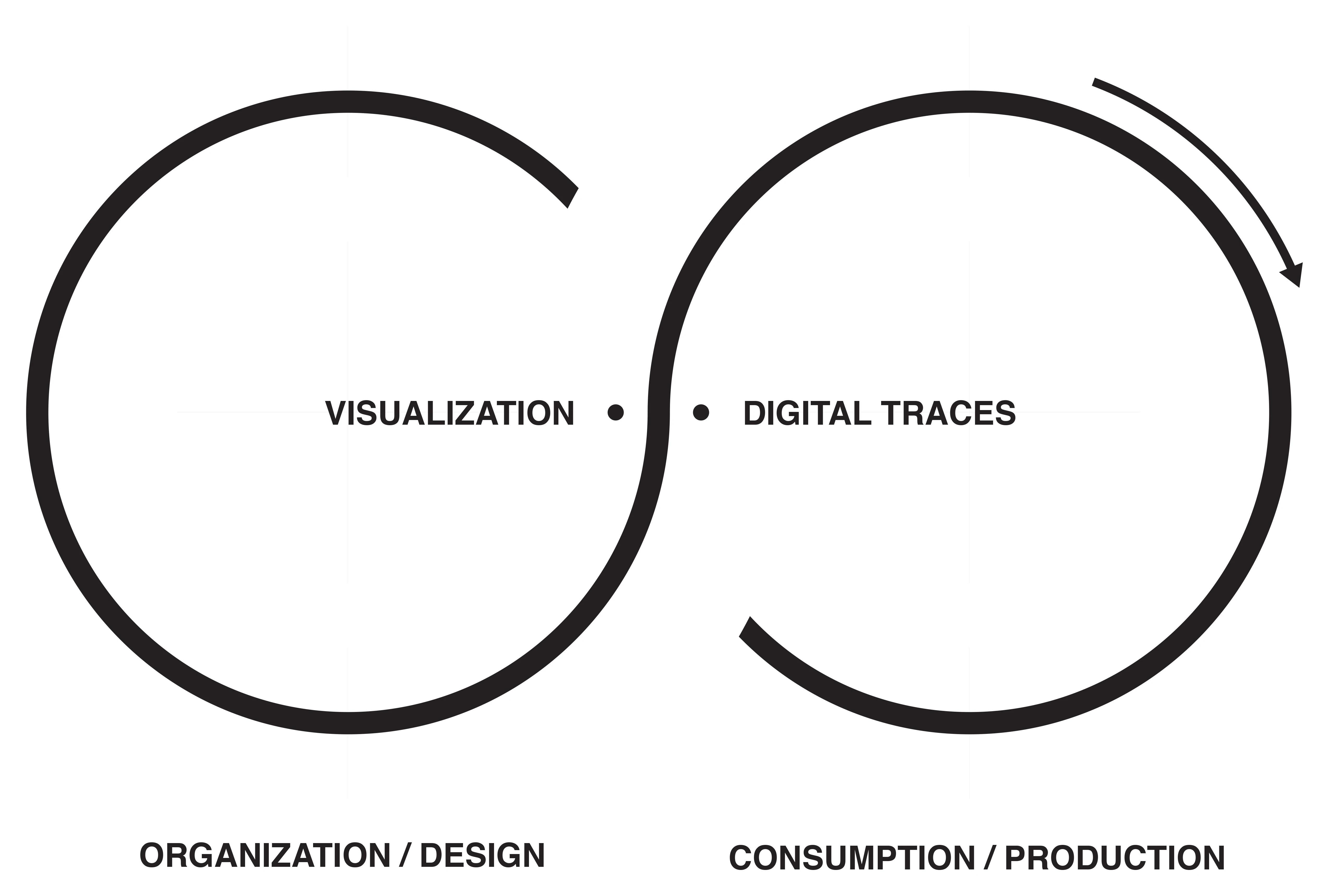
This mutual relationship between individuals and the organization paints a more sophisticated picture than Shedroff and Leonelli’s diagrams. Drawing on Boris Groys’ (2008) theory of self-design, which describes how social networks shape personal identity, the datafication diagram is complete when the flow of information and the end users overlap as two sides of the same coin. In organizational settings, this means that recommendation systems shape employees, who in turn shape these systems with their digital traces. This interpretation turns the circular life cycle of data into a lemniscate, connecting two rings: one for the organization and one for the employees within it. As illustrated in Figure 1, although these two processes share the same flow, they remain distinct (Rodighiero 2021, 106; Rodighiero and Romele 2020, 367).
Organizational Decisions Through Digital Traces
The metaphor of adaptive organisms is often used to describe resilience to market volatility, where organizations must navigate rapid changes, but it also highlights the competition for authority that shapes internal power dynamics (Hatch 2011, 1–21). Authority creates disparities in control and salaries among employees, significantly influencing how organizations are governed. For this reason, sensitive matters such as promotions are of great interest to both employees and the organization. Promotions confer authority, which translates into more influence over organizational management. As a result, promotions are tightly regulated by bureaucratic mechanisms designed to ensure fairness, as noted by sociologist Max Weber (2019, pp. 335–447), who argued that bureaucracy favors more impartial management.
If promotions rely on bureaucratic documents summarizing candidates’ profiles, it is worth considering the future role of digital traces in this decision-making process. Should digital traces influence organizational decisions, new empirical ways of integrating algorithmic thinking into decision-making could emerge, particularly through digital tools. For instance, examining the impact of digital traces on academic careers provides an illustrative scenario. Citation analysis, frequently used by academic institutions and research centers, not only serves as an evaluation tool but also influences recruitment—especially in technical fields like computer science, where citing is the primary way to demonstrate professional recognition. Recognizing that operational rules vary across organizations, the next section introduces an academic case study to lay the groundwork for broader generalizations applicable to medium and large organizations.
Rethinking Organizational Charts
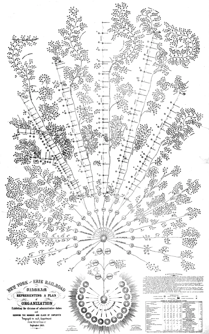
One of the opportunities offered by datafication is revisiting organizational charts, diagrams used by management to visualize hierarchies and plan internal activities (Brinton 1939, 59–67). Organizational charts have been part of organizational studies since the early twentieth century, when consulting engineer Willard C. Brinton published Graphic Methods for Presenting Facts (1919), reflecting industry interest in visual planning. However, since Daniel McCallum’s detailed mid-nineteenth-century visualization, visible in Figure 2 (Rosenthal 2013), organizational charts have been underestimated and drastically simplified (Rodighiero 2021, 28). This simplification has diminished their ability to represent the sociotechnical dimensions of human complexity (Latour 2005) and the diversity that makes each individual unique (Elias 1991). Rethinking organizational charts requires moving away from simplistic managerial logic and carefully considering the use of digital traces. Left by employees during daily practices, these traces are vital for refocusing on individuals and capturing the complex dynamics of the entire organization.
Moreover, digital traces might finally resolve the tension between individual elements and the whole, precisely reflecting the relationship between employees and the organization. A thoughtful organigram must carefully account for both an organization’s complexity and its members’ identities, shaping a comprehensive form constituted by individuals. Philosophically speaking, this question dates back to ancient times, initially examined by Aristotle (Cohen and Reeve 2020) and more recently reformulated by Gestalt theory (King and Wertheimer 2005). When Christian von Ehrenfels (1937, 523) famously wrote that the whole is more than the sum of its parts, he could never have imagined that his philosophical insight would inspire designers representing complexity (Bürdek 2015). Reframing this tension between the elements and the whole in organizational studies provides a novel perspective for rethinking organizational charts. Just as typographers carefully balance the weights of text, images, and negative spaces in a page layout, organigrams must be accurately designed to represent the social dynamics regulating organizations rather than static hierarchies. Indeed, organizational charts today are primarily used to depict hierarchy—a limitation that hinders understanding of organizational mechanisms and dynamics. This reflection calls for abandoning pyramidal or tree-shaped diagrams in favor of visual models that capture the richness of each individual and the complexity of human relationships. In this context, digital traces offer raw material to mold such complexity in unprecedented ways.
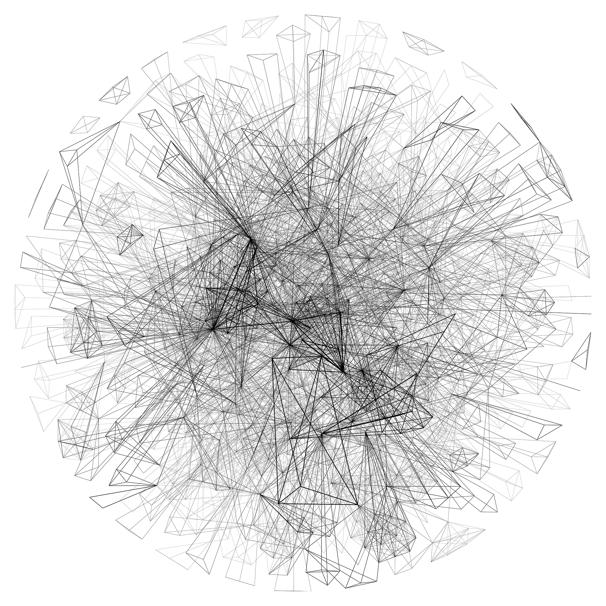
Today, network visualizations are among the most common methods for decoding societal complexity using digital traces. Although their scientific popularity is relatively recent (Scott 2000), networks originated in the eighteenth century when mathematician Leonhard Euler (1953) developed graph theory. Euler’s work, addressing the Königsberg bridges problem—whether all city bridges could be crossed without repeating any—created a mathematical object called the graph. Over time, this abstraction evolved into network visualizations, beginning with psychiatrist Jacob L. Moreno in the twentieth century. Moreno, using tabular questionnaires to investigate friendships among schoolchildren, devised sociograms: nodes represented children, and directed lines indicated friendships (Moreno 1934, 32). This innovation translated Euler’s mathematical abstraction into an intuitive visual grammar, presenting complex data more clearly to readers.
Decades after sociograms, the computational turn significantly expanded Moreno’s diagrams, enabling the analysis of large social structures in a research field coined “computational social science” by American scholars (Lazer et al. 2009). Beyond sociologists, graphic designers were also drawn to the visual complexity of large networks, experimenting with elaborate visualizations, as exemplified by Manuel Lima’s archival work (2011). This shared interest in network visualizations culminated in two groundbreaking laboratories: Albert-László Barabási’s lab at Northeastern University (Barabási et al. 2020) and Bruno Latour’s médialab at Sciences Po Paris (Venturini et al. 2017). These research initiatives established network visualizations (see Figure 3) as essential tools for analyzing human behavior by merging social sciences, computer science, and digital design (Romele and Rodighiero 2020, 111–119).
Organizational Charts After Datafication
The redesign of organizational charts using data is possible due to the convergence of four key factors. First, the widespread production of digital traces addresses the loss of complexity often found in traditional organizational charts (Rodighiero 2021, 28). Second, advancements in digital design allow experts to create more sophisticated, interactive visualizations (Löwgren and Stolterman 2004). Third, information design has emerged as a recognized field of research, uniting specialists from diverse disciplines (Meirelles 2013; Tufte 1997). Fourth, significant improvements in network algorithms enable the handling of larger datasets while offering flexible, web-based solutions to engage broader audiences (Bostock, Ogievetsky, and Heer 2011).
These four factors form a foundation for rethinking organizational charts, culminating in the development of four design principles. These principles stem from insights gained during my doctoral and postdoctoral research, particularly the collaborative creation of the Affinity Map (Rodighiero 2021). Revisiting and refining personal research is a gradual process, as demonstrated in this chapter, where earlier findings have been restructured into a practical framework for use by private companies and public organizations. Refined over the postdoctoral years, this list of observations was formulated and presented for the first time at Université de Liège during a seminar with Frederik Stjernfelt titled Images Today: Archives, Identities, and Algorithms and organized by Enzo D’Armenio and Maria Giulia Dondero (Rodighiero 2022).
1. Represent Every Employee
As mentioned above, organizational charts have been overly simplified in recent decades. In the mid-nineteenth century, Daniel McCallum realized an incredibly detailed organigram (see Figure 2) to reorganize approximately 800 kilometers of New York and Erie Railroads (Rosenthal 2013). The fascinating capacity of McCallum’s diagram is that it entirely represents each individual working for the railway company, from the directors on the board to the workers distributed along the rails. Although the format is not large enough for displaying full names, everyone is equally represented in what can be defined as a more egalitarian organigram when compared to more recent diagrams representing only the management. In addition, McCallum’s diagram is oriented like a tree whose roots are represented by the board and leaves by workers, while today’s organizational charts present the president at the top of a pyramid, like a pharaoh or a divinity in a panoptic position. This common representation adds an unhealthy sense of superiority into the organization’s dynamics.
Digital traces allow us to draw a more democratic way to represent employees as if datafication is returning an objective, honest signal (Pentland 2008). For example, digital traces do not lie when mapping workers’ presence in the office space: they will show who is in the office and who is not by using identity cards or Wi-Fi connections. Also, imagine the richness that email conversations can leave behind: today’s privacy rules do not let us use this kind of information, but they would reveal connectivity different from hierarchical relations.
2. Convey a Sense of Community
One issue related to the presence of all employees in a diagram concerns the feeling of being part of the same community. Often, private organizations publish websites where only high-ranked employees have a dedicated web page. Why does this happen? Creating a web page for each employee is costless and does not affect the company’s environment. When some employees—also a tiny part—are excluded from organigrams, their identity is not part of something bigger and is automatically excluded.
It is essential to realize that organizational charts, like group pictures of student classes, are not mere visual representations but powerful instruments for mutual recognition (Rodighiero and Cellard 2019, 10). If we are not represented, we cannot be recognized; consequently, the sentiment of belonging cannot be developed. The mirror metaphor cannot reduce organigrams, allowing one only to recognize the self. Mutual recognition requires reciprocal connectivity between individuals, establishing peer-to-peer connections between employees to be part of a community. The overall connectivity can be described only through these personal connections. The whole and its elements are based on elementary relationships, embodying the whole community’s glue.
Inclusiveness in organizational charts, as much as in working environments, can be achieved through a democratic use of technology. When datafication is put in place, the process has to interest all the employees. For example, when an employee scans a badge to enter the office, this is true for the office worker as well as for the manager, and this is something that unites individuals. Another good example is given by the internal dynamics that happen equally at all levels of the organization, showing that connectivity is a characteristic that should be used in organizational charts to give a sense of community. If all the employees have networked with each other, it is simple to imagine an organigram where all the elements are part of the same picture.
3. Avoid Evaluation and Comparison
One of the most challenging issues in designing an organizational chart is the risk of comparison that characterizes hierarchical structures, and network visualizations offer a more democratic solution. For example, when describing the Actor-Network Theory, Bruno Latour always pointed out the flatness of networks, capable of situating all human and non-human actors on the same level (Latour 2005, 171–172). As a result, network visualizations are more egalitarian representations than trees because of the absence of orientation or predominant positions—pharaohs would be represented not at the apex of the pyramid but rather at the center of the network.
Individuals are not comparable when represented with the same symbol. However, representing individuals with symbols of different sizes according to the employees’ salaries, for example, stresses quantitative differences that reduce individual complexity. Try to imagine an organizational chart in which the size of individuals is represented by their salary or their seniority; even though the information is correct, these values do not represent the overall importance of individuals, which can be demonstrated by other dimensions like connectivity or recognition. This example proves why financial data are often unavailable and sets a threshold to understand what has to be kept in the private sphere (Rancière 2000). However, other information, like the collaborations we experience daily in the working environment, should be visible as an activity taking place in public spaces.
4. Support Transparency and Inclusion
When creating an organizational chart, it is essential to disclose the methodology by making visible the process of decision-making that is brought to finalize the map. For example, employee network visualization for representing employees also means disclosing the metric employed in the visual. Transparency is essential to reveal the thought behind creating a representation, as it typically happens in politics today.
When the Affinity Map was presented to one thousand individuals represented (see the case study below), it was necessary to be as inclusive as possible from datafication to the presentation throughout the design process. At the beginning of the project, employees were asked if they wanted to be part of the organizational chart, and the design process was modified after employees expressed interest in being part of it.
The agreement with the individuals represented is part of the disclosure of an organigram. In the Affinity Map, for example, the agreement was probably one of the most challenging steps of the design process. Some individuals expressed discomfort in displaying their names to the public at a certain point but were okay with sharing information internally. This bifurcation caused the creation of two maps: one for the employees with their identities and one for the public with just the names of laboratory members.
Digitalization in Academia
Like most organizations, universities must cope with digitalization. The daily practice of scholars and employees has been increasingly translated into data over the years, radically changing how academia works. An excellent example of how datafication affected academia is represented by the considerable attention that citation impact received in the last decades. Initially conceived to provide innovative tools to help librarians with journal subscriptions (Garfield 1970), the citation metric suddenly became a decision-making tool to assess scholars through scientific publications (Garfield 2006). Although the value of such a measure to find the most relevant scientific literature is not questioned, its widespread use has heavily distorted the job market of universities and research centers (Gingras 2014). This distortion is visible, for example, in the unappealing prospects of minor topics whose coverage is bound to receive fewer citations than popular research, such as the more attractive artificial intelligence (Dick 2019). When the citation index became crucial in academic recruitment, scholars became interested in increasing the number of citations to be more attractive to employers.
This citation-based evaluation undoubtedly relies on a reductive model that ignores many dimensions of academic practice, focusing on literature. “Scientific and academic practices are more complex than the sole scientific literature. They are heterogeneous, multidimensional, and as rich as human nature” (Rodighiero 2021, 20). This contradictory example shows how digitalization can affect employees positively and negatively.
Recent initiatives from educational institutions opposed this unequal simplification by establishing impartial rules, as in the case of the career diversity proposed in the Netherlands (VSNU et al. 2019). This initiative draws attention to how academic practice is much more diversified than what is currently revealed by digitalization. This variety is immediately evident when observing scientists through the eyes of an ethnographer (Latour and Woolgar 1986) or when looking at organizations as complex relational systems where individuals are connected by collaboration at different levels (Rodighiero 2021). In the past few decades, the academic world has been harmed by excessive attention to citations in recruitment, triggered by a fragmentary translation of everyday practice into data. Although technological distortions also occurred in the private sector where, for example, managers monitored employees during the lockdown (Satariano 2020), digitalization brought enormous benefits to companies (Parviainen et al. 2022). While severe issues concerning the right to privacy are tackled by recent regulations (UNESCO 2022, 21), it is crucial to make the most of digitalization by understanding its incomplete and progressive translation from society. As stated by José van Dijck, “Datafication as a legitimate means to access, understand and monitor people’s behavior is becoming a leading principle, not just amongst techno-adepts, but also amongst scholars who see datafication as a revolutionary research opportunity to investigate human conduct” (van Dijck 2014, 198).
The Case Study of Affinity Map
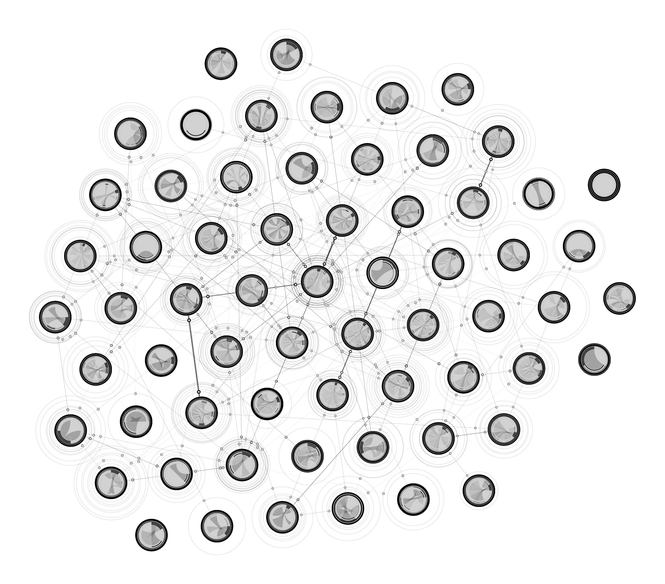
The Affinity Map (see Figure 4) is a project focusing on mapping academic institutions through the metric of collaboration. Initially conceived as an instrument for decision-making for managers and directors of the ENAC school, a public assembly unanimously decided to transform it into an instrument for all employees. Starting with an investigation regarding available digital traces and network visualization, the Affinity Map was developed to show the identity of all the employees to make the representation as inclusive as possible. Additionally, the metric based on collaborations in publications, courses, and supervisions—collected by institutional information systems—was offered as an alternative to citation indexes not only to foster interdisciplinarity among scholars but also to raise awareness about the dynamics within the faculty.
The double connectivity level is one of the Affinity Map’s most distinctive aspects. When networks typically connect elements on a unique sole surface, the Affinity Map introduces nodes containing a network. The result is a network of laboratories in which each node is a network of laboratory members. This graphic solution simplifies the overall connectivity, avoiding the noisy overlapping of thousands of lines and protecting individuals. Academic newcomers represent the most visible example of this latter consequence. When, for example, doctoral students join a laboratory, they often do not have collaborations because they have just started. The result in mapping is a detached node at the edges of the network visualization that creates a sense of not being part of the community. Laboratory nodes, in this sense, work like cocoons that protect the identity of individuals under the responsibility of the laboratory director.
Another dimension of inclusiveness was achieved by unveiling the design process to the employees represented on the map. As in the academic environment, evaluation is a serious topic of discussion, and the Affinity Map would not be another academic metric for assessing the work of scholars. Instead, the map was disclosed during a public event to demonstrate the willingness to include all the employees in the design process. For example, a large version of it, measuring 15 by 15 meters, was printed on tarpaulin and placed on the floor of a large hall in the ENAC schools (Rodighiero 2018). During the event, employees were invited to walk on the Affinity Map and speak with the team collaborating to design it. This knowledge transmission was beneficial in unveiling the design process and listening to the employees’ reactions and suggestions. The design process became collective, and all the individuals represented on the map were able to contribute. For example, a member concerned with the map’s output to the generic public asked for a higher threshold of privacy of identities. Finally, the design team considered this comment so seriously that when the map went online, all users’ identities were revealed only through logging into the institution, and, consequently, not accessible outside.
Along with these concerns that affected the design process, we finally realized that the Affinity Map was an instrument and a symbol of representation. From the beginning, all the school members had to be part of the organigram. In addition, the lack of orientation in network visualizations removed the pyramidal view from the director’s point of view but introduced the centrality problem. At a certain point, we realized that individuals at the edges of the networks were unhappy with such a positioning. After the doctoral studies, this issue was analyzed more thoroughly, envisioning mapping on continuous spherical surfaces.
One of the most promising outcomes of the Affinity Map was the linguistic distance between individuals. Such a digital trace was probably the most promising because language is a dimension that impacts every individual, but only the latest advancements in artificial intelligence allowed for the implementation of solutions from the computation of large corpora that were not available before (Moretti 2005). For example, if one cannot be connected to other colleagues because he is working individually, he still belongs to the community. Language and the words scholars use in publications and presentations are essential metrics to describe organigrams where no one is disconnected from the community. In addition, the linguistic dimension can reveal more hidden dimensions in daily working practices; for example, uncovering potential collaborations between individuals, which in a large organization, may have never had the opportunity to meet.
Conclusion
Scholars of organizational studies have to look at digital traces and network design to advance their studies at a moment when technology pervades organizations. Digital traces can extend the perception of the discipline by providing a more detailed level of information and revealing some unexpected patterns in human behavior. However, as demonstrated by the case study of the Affinity Map, some criticalities still have to be resolved, starting from the inaccuracy of datafication. The window of opportunity that computational means provide offers new solutions and challenging problems. The question of representing the dynamics of medium and large organizations is fascinating and helps to reflect on the current limits and future perspectives as the process of datafication is under development.
If you want to read more, you can discover the further scope of the Affinity Map by reading Mapping Affinities, published by Métis Presses (Rodighiero 2021). Further studies about the democratization of organizational charts can be found in publications by the MIT Press (Rodighiero et al. 2022), IEEE (Rodighiero 2020), and De Gruyter (Rodighiero et al. 2024). A more recent review of the last ten years of research in mapping scientific communities has been published by Sage in open access (Rodighiero 2024).
References
- Barabási, A.-L., M. Bello, J. Kluge-Fabényi, K. Forde, J. Készman, I. Meirelles, C. G. Ratti, M. Ritchie, A. Szántó, P. Weibel, and A. Stang. 2020. Hidden Patterns: Visualizing Networks at BarabásiLab. Berlin: Hatje Cantz Verlag.
- Bostock, M., V. Ogievetsky, and J. Heer. 2011. “D3: Data-Driven Documents.” IEEE Transactions on Visualization and Computer Graphics 17 (12): 2301–2309. https://doi.org/10.1109/TVCG.2011.185
- Brinton, W. C. 1919. Graphic Methods for Presenting Facts. New York: The Engineering Magazine Company.
- ———. 1939. Graphic Presentation. New York: Brinton Associates.
- Bürdek, B. E. 2015. Design: History, Theory and Practice of Product Design. Berlin: Birkhäuser.
- Cohen, S. M., and C. D. C. Reeve. 2020. “Aristotle’s Metaphysics.” In The Stanford Encyclopedia of Philosophy, edited by E. N. Zalta. https://plato.stanford.edu/archives/win2020/entries/aristotle-metaphysics/
- Dick, S. 2019. “Artificial Intelligence.” Harvard Data Science Review, July 1. https://doi.org/10.1162/99608f92.92fe150c
- Elias, N. 1991. The Society of Individuals. Edited by M. Schröter. Oxford: Basil Blackwell.
- Euler, L. 1953. “Leonhard Euler and the Koenigsberg Bridges.” Scientific American 189 (1): 66–72.
- Garfield, E. 1970. “Citation Indexing for Studying Science.” Nature 227 (5259): 669–671. https://doi.org/10/b9962z
- ———. 2006. “The History and Meaning of the Journal Impact Factor.” JAMA 295 (1): 90–93. https://doi.org/10/bgvhsf
- Gingras, Y. 2014. Les dérives de l’évaluation de la recherche: du bon usage de la bibliométrie. Paris: Raisons d’agir éditions.
- Groys, B. 2008. “The Obligation to Self-Design.” E-Flux, November 1. http://www.e-flux.com/journal/00/68457/the-obligation-to-self-design/
- Hatch, M. J. 2011. Organizations: A Very Short Introduction. Vol. 264. New York: Oxford University Press.
- Hatch, M. J., and A. L. Cunliffe. 2013. Organization Theory: Modern, Symbolic, and Postmodern Perspectives. 3rd ed. Oxford: Oxford University Press.
- King, D. B., and M. Wertheimer. 2005. Max Wertheimer & Gestalt Theory. New Brunswick: Transaction Publishers.
- Kitchin, R. 2014. The Data Revolution: Big Data, Open Data, Data Infrastructures and Their Consequences. London: SAGE Publications.
- Latour, B. 2005. Reassembling the Social: An Introduction to Actor-Network-Theory. Oxford: Oxford University Press.
- Latour, B., and S. Woolgar. 1986. Laboratory Life: The Construction of Scientific Facts. Princeton, NJ: Princeton University Press.
- Lazer, D. M. J., A. Pentland, L. Adamic, S. Aral, A.-L. Barabási, D. Brewer, N. Christakis, N. Contractor, J. Fowler, M. Gutmann, T. Jebara, G. King, M. Macy, D. Roy, and M. V. Alstyne. 2009. “Computational Social Science.” Science 323 (5915): 721–723. https://doi.org/10.1126/science.1167742
- Leonelli, S. 2019. “Data Governance Is Key to Interpretation: Reconceptualizing Data in Data Science.” Harvard Data Science Review, July 1. https://doi.org/10.1162/99608f92.17405bb6
- Lewin, K. 1951. Field Theory in Social Science: Selected Theoretical Papers. Oxford: Halpers.
- Lima, M. 2011. Visual Complexity: Mapping Patterns of Information. New York: Princeton Architectural Press.
- Löwgren, J., and E. Stolterman. 2004. Thoughtful Interaction Design: A Design Perspective on Information Technology. Cambridge, MA: MIT Press.
- Mayer-Schonberger, V., and K. Cukier. 2013. Big Data: A Revolution That Will Transform How We Live, Work, and Think. London: John Murray.
- Meirelles, I. 2013. Design for Information: An Introduction to the Histories, Theories, and Best Practices behind Effective Information Visualizations. Beverly, MA: Rockport.
- Moreno, J. L. 1934. Who Shall Survive? Washington: Nervous and Mental Disease Publishing Co.
- Moretti, F. 2005. Graphs, Maps, Trees: Abstract Models for a Literary History. London: Verso.
- Parviainen, P., M. Tihinen, J. Kääriäinen, and S. Teppola. 2022. “Tackling the Digitalization Challenge: How to Benefit from Digitalization in Practice.” International Journal of Information Systems and Project Management 5 (1): 63–77. https://doi.org/10.12821/ijispm050104
- Pentland, A. 2008. Honest Signals: How They Shape Our World. Cambridge, MA: MIT Press.
- Rancière, J. 2000. Le partage du sensible: esthétique et politique. Paris: La Fabrique-éditions.
- Rigal, A., and D. Rodighiero. 2015. “Trajectoire d’une représentation cartographique en réseau.” Cartes & Géomatique 225: 33–41.
- Rodighiero, D. 2018. “Printing Walkable Visualizations.” In Proceedings of the 5th Biennial Research Transdisciplinary Imaging Conference, 58–73. https://doi.org/10.6084/m9.figshare.6104693.v2
- ———. 2020. “Drawing Network Visualizations on a Continuous, Spherical Surface.” Proceedings of the 24th International Conference Information Visualisation (IV), 573–580. https://doi.org/10.1109/IV51561.2020.00097
- ———. 2021. Mapping Affinities: Democratizing Data Visualization. Open-access English edition. Geneva: Métis Presses. https://doi.org/10.37866/0563-99-9
- ———. 2022. “The Lemniscate of Data Visualization: Production and Consumption of Data from an Actor-Network Perspective.” Paper presented at Images Today: Archives, Identities, and Algorithms, Université de Liège, March 29.
- ———. 2024. “In Praise of Visual Representation: An Inquiry into Text Analysis and Network Visualization for Charting Scientific Communities.” Visual Communication 23 (3): 513–526. https://doi.org/10.1177/14703572241248408
- Rodighiero, D., and L. Cellard. 2019. “Self-Recognition in Data Visualization: How Individuals See Themselves in Visual Representations.” EspacesTemps.Net, August. https://doi.org/10.26151/espacestemps.net-wztp-cc46
- Rodighiero, D., and A. Romele. 2020. “The Hermeneutic Circle of Data Visualization: The Case Study of the Affinity Map.” Techné: Research in Philosophy and Technology 24 (3): 357–375. https://doi.org/10/gg6w5p
- Rodighiero, D., P. Rivière, and S. Kenderdine. 2024. “Super-Vision: Tracing EPFL History through 8,000 Doctoral Theses.” Journal of Digital History 3 (1).
- Rodighiero, D., E. Wandl-Vogt, and E. Carsenat. 2022. “A Visual Translation of the Pandemic.” Leonardo 55 (3): 297–303. https://doi.org/10.1162/leon_a_02203
- Romele, A., and D. Rodighiero. 2020. “Digital Habitus or Personalization without Personality.” HUMANA.MENTE Journal of Philosophical Studies 13 (37): 98–126. https://doi.org/10/ghm6cn
- Rosenthal, C. 2013. “Big Data in the Age of the Telegraph.” McKinsey Quarterly, March 1. https://www.mckinsey.com/capabilities/people-and-organizational-performance/our-insights/big-data-in-the-age-of-the-telegraph
- Roussi, A. 2020. “Resisting the Rise of Facial Recognition.” Nature 587 (7834): 350–353. https://doi.org/10.1038/d41586-020-03188-2
- Satariano, A. 2020. “How My Boss Monitors Me While I Work from Home.” The New York Times, May 6. https://www.nytimes.com/2020/05/06/technology/employee-monitoring-work-from-home-virus.html
- Schrage, M. 2020. Recommendation Engines. Cambridge, MA: MIT Press.
- Scott, J. 2000. Social Network Analysis: A Handbook. 2nd ed. London: SAGE Publications.
- Severo, M., and A. Romele, eds. 2015. Traces numériques et territoires. Paris: Presses de Mines. https://doi.org/10.4000/books.pressesmines.1984
- Shedroff, N. 1999. “Information Interaction Design: A Unified Field Theory of Design.” In Information Design, edited by R. Jacobson. Cambridge, MA: MIT Press.
- Tufte, E. R. 1997. Visual Explanations: Images and Quantities, Evidence and Narrative. Cheshire, CT: Graphics Press.
- UNESCO. 2022. Recommendation on the Ethics of Artificial Intelligence. Programme and Meeting Document SHS/BIO/PI/2021/1. Paris. https://unesdoc.unesco.org/ark:/48223/pf0000381137.locale=en
- van Dijck, J. 2014. “Datafication, Dataism and Dataveillance: Big Data between Scientific Paradigm and Ideology.” Surveillance & Society 12 (2): 197–208. https://doi.org/10.24908/ss.v12i2.4776
- Venturini, T., M. Jacomy, A. Meunier, and B. Latour. 2017. “An Unexpected Journey: A Few Lessons from Sciences Po Médialab’s Experience.” Big Data & Society 4 (2). https://doi.org/10/gf7tk2
- Von Ehrenfels, C. 1937. “On Gestalt-Qualities.” Psychological Review 44 (6): 521–524. https://doi.org/10/bd8dpw
- VSNU, NFU, KNAW, NWO, and ZonMw. 2019. Room for Everyone’s Talent: Towards a New Balance in the Recognition and Rewards of Academics. https://www.nwo.nl/en/position-paper-room-for-everyones-talent
- Weber, M. 2019. Economy and Society: A New Translation. Edited by K. Tribe. Cambridge, MA: Harvard University Press.