The Hermeneutic Circle of Data Visualization: The Case Study of the Affinity Map
Rodighiero, Dario, and Alberto Romele. 2020. “The Hermeneutic Circle of Data Visualization: The Case Study of the Affinity Map.” Techné 24 (3): 357–375. https://doi.org/10.5840/techne202081126.
In this article, we show how postphenomenology can be used to analyze the Affinity Map: a data visualization that reveals the hidden dynamics that exist between individuals within large organizations. We make use of the Affinity Map to expand the classic postphenomenology that privileges a ‘linear’ understanding of technological mediations and introduce the notions of ‘iterativity’ and ‘collectivity.’ In the first section of the paper, we discuss both classic and more recent descriptions of human-technology-world relations in order to transcendentally approach the discipline of data visualization. In the second section, we use the Affinity Map case study to consider three elements: 1) the collection of data and the design process; 2) the visual grammar of the data visualization, and 3) the process of self-recognition for the map ‘reader.’ In the third section, we introduce the hermeneutic circle of data visualization. Finally, we suggest that the Affinity Map, because of its ethical and political multistability, might be seen as a material encounter between postphenomenology, actor-network theory (ANT), and hermeneutics.
Introduction
This article must be understood as a philosophical account of some theoretical aspects of data visualization.1 Our intention is not to focus on the technological solutions suggested by our case study, but rather on its conditions of possibility. In particular, our intention is to turn to postphenomenology, a branch of philosophy of technology that deals with human-technology-world relations (Rosenberger and Verbeek 2015). Postphenomenology is based on the idea that humans and the world are co-constituted by the means of technological mediation. Hermeneutic relations (Ihde 1990) and composite relations (Verbeek 2011) seemed particularly helpful in supporting our analysis.
We have applied this framework to a project called Affinity Map. The Affinity Map is a visual method that reveals the hidden dynamics that exist between individuals within large organizations (Rodighiero 2018a; Rodighiero, Kaplan, and Beaude 2018). The research was carried out at the École Polytechnique Fédérale de Lausanne (EPFL), focusing specifically on the scholars from the School of Architecture, Civil and Environmental Engineering (ENAC). The Affinity Map is an interactive data visualization that represents the ENAC collective identity of one thousand scholars in terms of actual and potential collaborations.
To our surprise, we have discovered that this case study could also be used to expand the classic postphenomenological framework, which is often characterized by a linear understanding of technological mediation. Furthermore, postphenomenology tends to consider just one mediation at a time. Several discussions about the Affinity Map brought us to think of technological mediation in terms of ‘iterativity’ and ‘collectivity.’
The article has been formatted into three sections. The first section presents the classic and somewhat more recent postphenomenological human-technology-world relations, which, in our opinion, are adequate for transcendentally describing data visualizations. The second section is about our case study and stresses three elements: 1) the collection of data and the design process; 2) the visual grammar of the data visualization; and 3) the process of self-recognition for the map ‘reader.’ The third section introduces the notions of ‘iterativity’ and ‘collectivity’ along with the idea of the (double) hermeneutic circle of data visualization.
In the conclusion we argue that a data visualization such as the Affinity Map can be seen as a material encounter between postphenomenology, actor-network theory (ANT), and hermeneutics. We also highlight the ethical and political multistability of this visual method.
1. Postphenomenology
Postphenomenology is a branch of philosophy of technology that deals with technological mediations. Such mediations not only have epistemological consequences for our perceptions of the world, but also ontological impacts on both ourselves and the world. Postphenomenology is a sort of correction of the myopia for technology that affects classic phenomenology and hermeneutics. Indeed, for both of these disciplines, the frontiers between the lifeworld and its understanding are rather static. Postphenomenology, however, suggests that these frontiers change noticeably as sociotechnical conditions vary (Romele 2018).
Don Ihde (1990) distinguished among four kinds of technologically mediated human-world relations. The first is embodied relations: their specificity lies in the fact that, after a certain period of adaptation, technologies become almost transparent in use. This is the case, for instance, of a pair of glasses that almost ‘disappear’ with use. The second is hermeneutic relations, in which technology gives a representation of the world that must be ‘interpreted’ in order to be accessible. Typical cases are maps, thermometers, and flight instruments. The third kind is alterity relations, which is when the relationship with the world is shortly suspended and the technology is treated as the main interlocutor or competitor. This, for example, could be video games or any form of artificial intelligence. Finally, there are background relations, in which the technology establishes the conditions for our relation to the world. For example, heating and lighting systems enable a specific kind of being in the world that would otherwise seem impossible in specific conditions, such as winter, darkness, et cetera. These four relations are graphically represented in Table 1.
| Relation | Diagram |
|---|---|
| Embodied relations | (human-technology) → world |
| Hermeneutic relations | human → (technology-world) |
| Alterity relations | human → technology-(-world) |
| Background relations | technology → (human-world) |
Several critiques and variations of this fourfold distinction have been proposed. Peter-Paul Verbeek (2011, 140) introduced for instance the notion of cyborg relations to describe situations in which the boundaries between technologies and human beings are blurred in a physical way, as in the case of psychopharmaceuticals and neural implants. Such examples represent a radicalization of technological embodiment where technology is not limited to acting as a mediator between humans and the world, but it is incorporated into human bodies so that they constitute new, hybrid beings. Verbeek also spoke of immersion relations, in which technologies do not merge with the human body, but rather with the environment. Toilets, beds, and even cities are examples of smart environments (Rosenberger and Verbeek 2015, 21–22).
| Relation | Diagram |
|---|---|
| Cyborg relations | (human/technology) → world |
| Immersion relations | human ↔ technology/world2 |
| Composite relations | human → (technology → world) |
| Hermeneutic relations (Wiltse’s version) | human → ([trace|substrate] → world) |
| Writing relations | human ← algorithm → text → world3 |
Finally, Verbeek formulated the idea of composite relations. Composite relations represent specific situations of technological mediation in which a double intentionality occurs: one intentionality is of technology toward ‘its’ world and the other is of human beings toward the result of this technological intentionality. Later, Heather Wiltse (2014) suggested that in the case of digital technologies we should distinguish between trace and substrate. In digital environments, the trace and substrate are separated into two different devices that produce and display the content, respectively. For instance, unlike classic thermometers, weather websites show no direct relation between the substrate supporting the inscription and the actual instrument measuring the temperature. More recently, Galit Wellner (2018) introduced the concept of writing relations in order to include the ability of machine learning that would automatically write news for the forecast, stock market, and sporting events. These variations have been graphically represented in Table 2.
This list, of course, is not exhaustive, and other variations have been proposed.4 Our intention is to show how postphenomenology can be used for approaching data visualization.
First, we would say that data visualizations are strongly related to hermeneutic relations. Indeed, data visualizations represent portions of the world, and these representations must be ‘read’ in order to access the world. However, data visualizations imply hermeneutic relations of a specific kind. Indeed, data visualizations are representations of dataworlds (Gray 2018) which is, in turn, a representation (or captation)5 of a world that would remain in great part unperceivable and unintelligible to us because of its complexity. In other words, data visualizations are representations of representations.6 For this reason, they bear a likeness to composite relations in which human and nonhuman double intentionality combine.
Data visualization is as necessary as flight instruments are in case of bad weather conditions. It is aesthetic not only in the cosmetic sense of the term, but also in the sense of aisthesis, the Greek word for perception, because it acts as our ‘eyes’ in order to orient ourselves in the dataworlds—a bit like Merleau-Ponty’s famous white cane.7 The work of data visualization designers is not much different from the work of quantum physicists, or researchers involved in deep-space explorations. Imagination, images, and the imaginary, along with a large dose of math, methods, and technologies, are used to reduce the distance between an alien world and us.
Data visualizations are usually actualized on a computer screen. Yet, as in the case study we present later, they can also be actualized differently—for instance on a poster, a carpet, a bag. Here there is, in sum, a sharp separation between the ‘traces’ and their material ‘substrates,’ and that is why data visualizations can be presented as hermeneutic relations, but distinguishing between trace and substrate as Wiltse suggested. Of course, a certain degree of algorithmic intentionality characterizes most of the current practices of data visualization, so one can consider them as forms of writing relations as well. The TF-IDF algorithm (Salton, Wong, and Yang 1975) used in our case study is a good example.
Postphenomenology is a powerful tool that describes the process of data visualization. One can use postphenomenology for improving the understanding of the design process of data visualization. Conversely, the concrete practices of data visualization can support an ‘expansion’ of the theoretical postphenomenological framework. That is precisely what we have discovered through the case study we will introduce in the next section.
2. Affinity Map as a Case Study
The Affinity Map project (see Figure 1) began as a doctoral thesis that lasted for four years. The result was a dissertation (Rodighiero 2018a), two materializations of the map into the form of a walkable surface (Rodighiero 2018b), and a web-based application.8 As suggested by its name, the project revolves around the concept of affinity, which describes the social relations that drive an academic organization internally. EPFL scholars enjoy a great intellectual freedom that allows them to establish collaborations at will. This self-regulating behavior does not correspond to a tree-shaped organizational structure, but rather to an organic one.
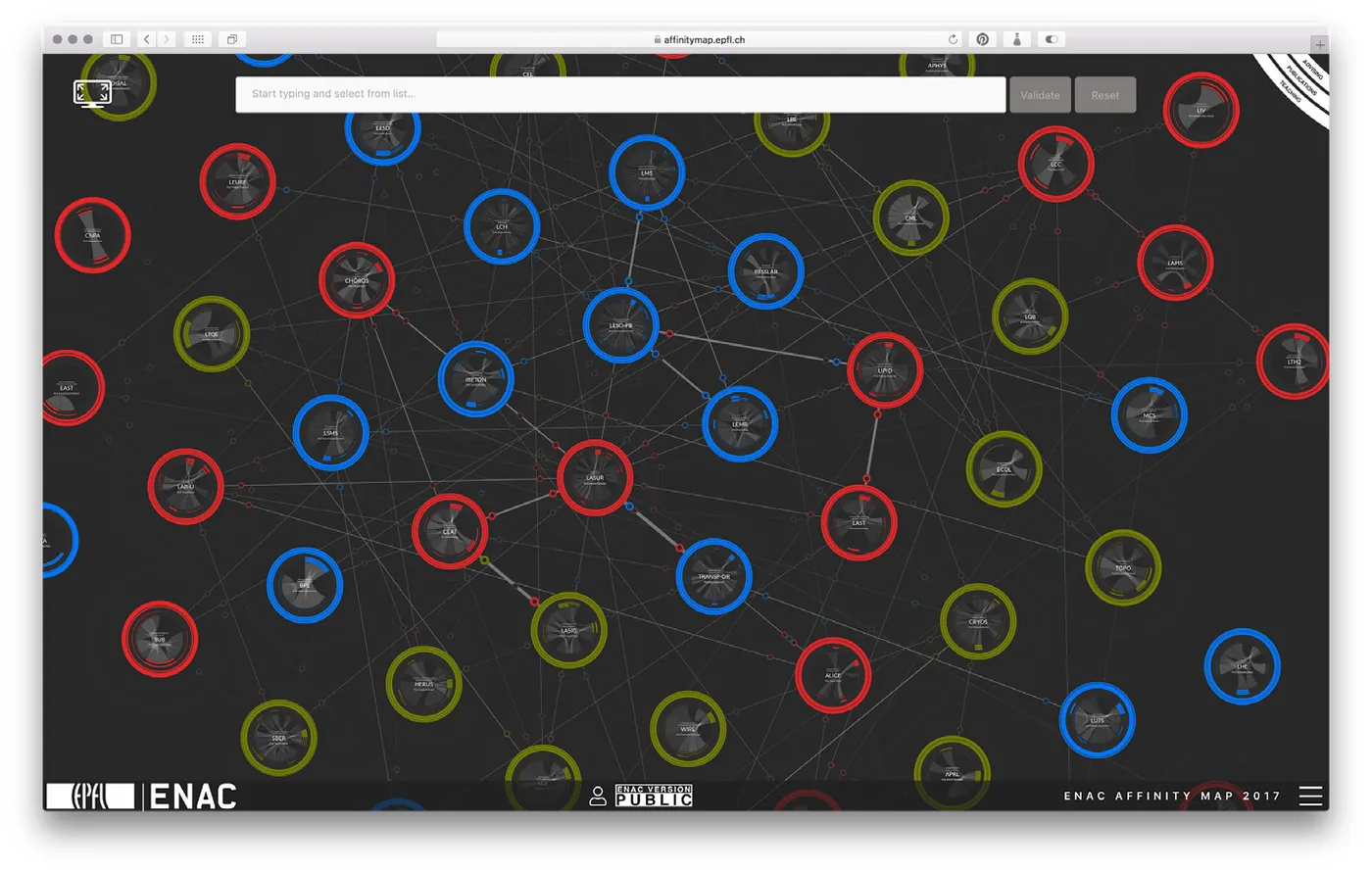
What would be the best way to represent such an organic structure, especially considering the problem of evaluation (Hertig 2016) that concerns scholars? The answer is in the concept of affinity, which describes both actual collaborations and potential synergies between scholars. The Affinity Map is specifically relevant to this article for three aspects: 1) the collection of data and the design process, 2) the visual grammar conceived to protect individual identities, and 3) its actualization (Deleuze and Parnet 2007, 148–52) through a process of materialization that allowed for interactive experience.
The process of design was based on an iterative cycle stirred by a committee composed of the dean of the ENAC, her assistants, the thesis directors, and Dario Rodighiero as a doctoral student. This iterative cycle allowed for a rapid assessment of the data quality of available sources that were identified in teaching courses, supervision, and co-authoring. Potential affinities were created from scratch using the TF-IDF algorithm (Salton, Wong, and Yang 1975), which computed homogeneous sets of keywords using the lexicon employed by authors in their abstracts. Potential affinities correspond to a lexical distance between specific sets of papers, which actually corresponds to laboratories, creating a spatiality based on term frequency.
The Affinity Map changed position while the project was already underway. During the second year of PhD, the ENAC community was publicly asked to give its opinion about the project at the annual general assembly. The result was clear, although unexpected (Rodighiero 2018a, 40–41); the audience attending the assembly was not only favorable to supporting the project, but wanted to be considered as a potential user. As a result, the project took a position according to the logic of governance that facilitates both top-down and bottom-up organization. Although this change was radical, the data collection was not modified, unlike the visual representation, which was redesigned to avoid evaluation as much as possible (see Figure 2). Any possible element that could lead back to an assessment logic was removed; preference was given to a visual grammar based on collaboration only. The Affinity Map, indeed, never shows any figures, like the number of publications or citations, which might suggest a certain logic of comparison. Furthermore, the Affinity Map never shows isolated individuals; it reassembles all the scholars into laboratories that are represented using circles. This strong visual choice led to the creation of a network visualization arranged on two levels, where the macro network shows the laboratories as nodes, and each node hosts a micro network displaying individuals. As a result, this double-structured network arranges collaborations on two levels, respectively filled by laboratories and scholars, while the rings that surround the laboratories are thresholds that divide collective and individual relations.
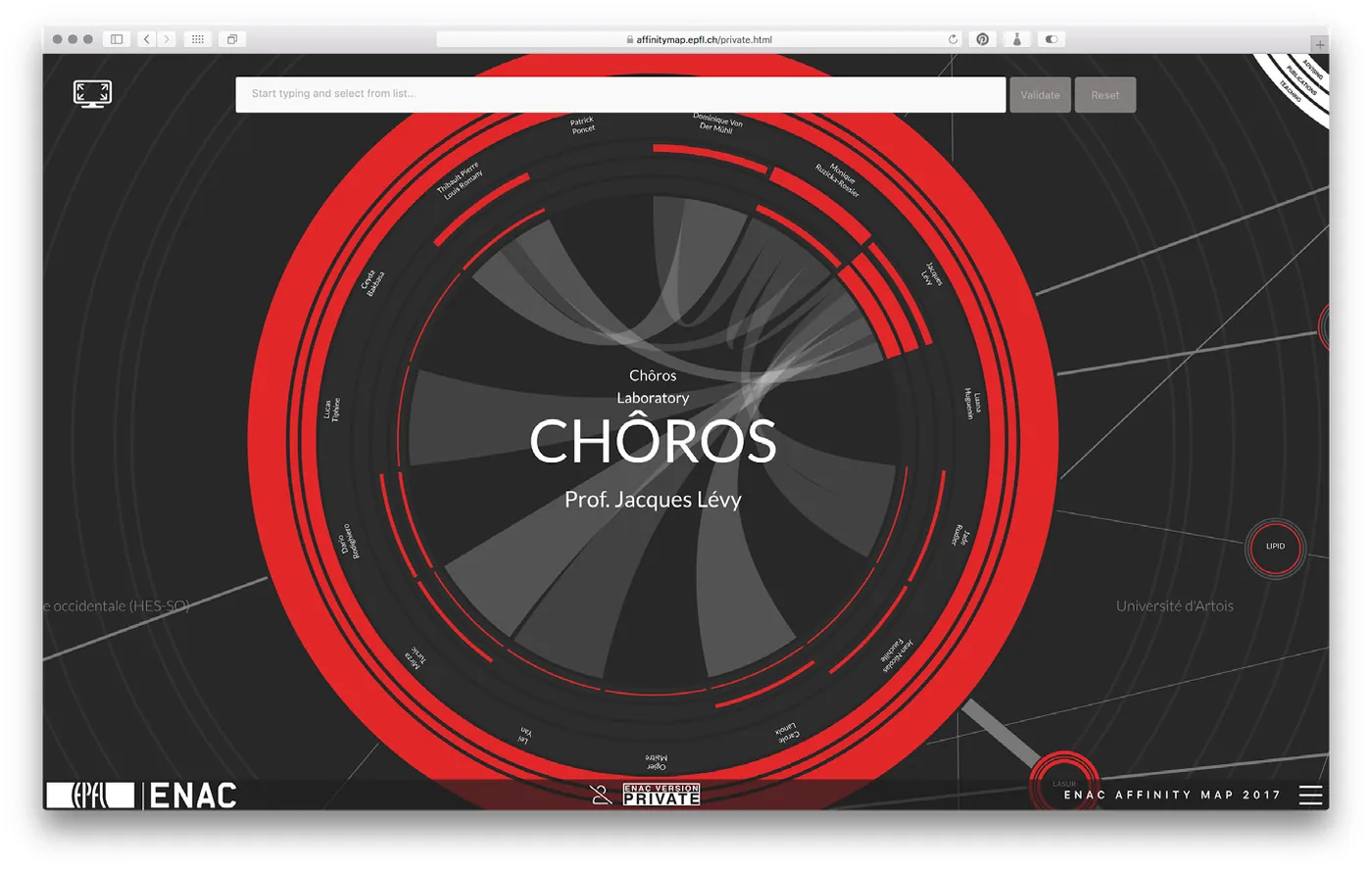
Affinity Map’s visual grammar is one of the main research achievements. Yet another crucial element was that ENAC scholars had to recognize themselves in the visualization. The visualization, which was initially conceived as a tool of management, was transformed into a tool of governance at the disposal of all the ENAC scholars, making personal recognition a sensitive issue. The design process, in this respect, was delicate and difficult to achieve as the Affinity Map represents almost one thousand individuals.
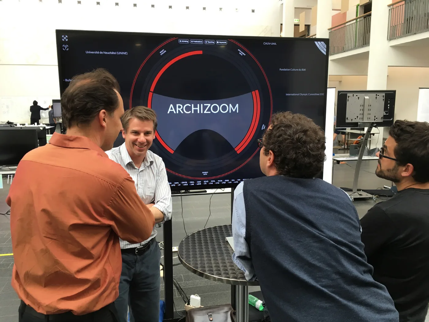
The Affinity Map was revealed at ENAC Research Day, an event in which ENAC members are used to attend. In 2016 the Affinity Map was presented as a 250 square meter walkable visualization. In 2017 and 2018, it was presented as a web-based interactive application. The interaction between the data visualization and the ENAC community enabled discussion, but more than that it was an example of what Ezio Manzini calls dialogic design, which is a collective-driven design process whereby comments and remarks are seriously considered (Manzini 2016). During these events, all the conversations between the Affinity Map’s team and the ENAC members were useful for spotting problems and further improving the data visualization.
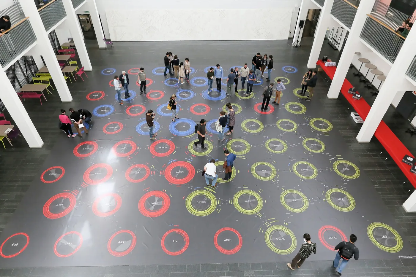
During these events it was also possible to observe how scholars interacted with the Affinity Map. Usually, the first action a reader does with a data visualization is to find something personally relevant. Yet, when the subject of data visualization is its observer, the very first action is an act of self-recognition that connects the individual with their own representation (Rodighiero and Cellard 2019). At the time of the first presentation, the Affinity Map was unveiled as a walkable visualization in a large hall situated within the EPFL. In this specific environment, the first action of the scholars was to find their own laboratory, then to find themselves. The double structure of the map was working as a pathfinder: to find yourself you had to find your laboratory first. This public interaction was performed at the same time by many individuals, walking crossing their paths like the traces animals leave in the soft surface of mud, sand, or snow (Ingold 2007, 43). These walking paths were trajectories that led each individual to their own representation before all else and, at the same time, they were a means to lead to unexpected conversations between peers.
A specific conversation that happened with great frequency during the ENAC Research Days was about the personal representation. Scholars were, foremost, interested in their own visual representation. Indeed, many conversations were oriented toward an understanding of a person’s individual representation, and scholars were actually very useful for discussing the Affinity Map and sensitizing the scholars to their personal data. ENAC scholars were specifically represented with three quantitative indicators—corresponding to teaching courses, supervision, and publications—relative to their laboratory colleagues. Characterizing the identity of individuals using the thickness of three arcs was a way to understand academic roles without showing any figures. Most of the time, the conversation between the Affinity Map’s team and the ENAC members was about the emptiness of the quantitative indicator for publications, which is widely used as an evaluation index in the academic environment. This public design process allowed the identification of many issues related to the Infoscience system, which is the official repository of EPFL publications. Usually the quantitative indicator for publications in each scholar’s individual representation on the Affinity Map was empty because of a problem with metadata. Regardless, the more significant of the conversations between the Affinity Map’s team and the ENAC members were not the correction of these data, but rather that it allowed for the active participation of ENAC scholars to the design process. Scholars were actually able to modify their own visual representations by uploading their research papers in a sort of self-design process. The design process of the Affinity Map is thus characterized by a double iterativity that occurs at the levels of both the steering committee and the single scholar.
3. Iterativity and Collectivity
Postphenomenology uses several diagrams, made in part of dashes and arrows, to translate the mediating role of technologies in human-world relations into visuals. Here, we use the case study of the Affinity Map to show two limits of these diagrams. First of all, human-world relations are depicted as linear, a characteristic that risks visually limiting human thinking (Flusser 2007). Certainly, postphenomenology does not in principle exclude forms of hermeneutic circularity or iterativity. However, such circularity is mostly implicit in current postphenomenological thought, while in our case study it is the first element that explicitly emerges from a transcendental reflection.
The term ‘iterativity’ refers to the fact that technological mediation is neither a mono- nor a bidirectional movement; it is circular. Using technology to approach the world has specific effects on the user and is not a one-shot experience in most cases. Moreover, technology is characterized by an iterative learning process that eventually produces a certain degree of familiarity—that is, technological habits. Children, for instance, learn to deal with tools such as knives and forks by repeating the same sequence of actions several times. The same holds true for body mobility and language, which are probably the first ‘tools’ we have at our disposal.
The Affinity Map shows a circularity that, in some ways, recalls the structure of the hermeneutic circle. In its Heideggerian version, the notion of hermeneutic circle refers to the fact that all of our interpretations of the world are always-already situated. That is, these interpretations are predetermined by both our pre-understanding and expectations. For Martin Heidegger, the hermeneutic circle is not vicious in so far as it opens up the possibility of an authentic self-understanding. In this context, we are referring to the circularity illustrated by Paul Ricoeur through the threefold mimesis in the last volume of Time and Narrative.9
Ricoeur’s three forms of mimesis are prefiguration, configuration, and reconfiguration: 1) Prefiguration has to do with the predisposition of human action to be told and, more precisely, to be textualized (in this context one may say ‘traced’ or ‘datafied’); 2) Configuration corresponds to the emplotment (in French mise en intrigue). Emplotment means that the different textualized, traced, and datafied elements of the human action are combined and recombined according to a certain coherence; 3) Yet, for Ricoeur, narrative is not used for its own glory (‘for its own sake’ using the words of Roman Jakobson). Reconfiguration has to do specifically with the application of the text to the hearer or the reader, but also to the author herself (Ricoeur 1988, 71).
The analogy between the Ricoeurian triple mimesis and the dynamics beyond the Affinity Map is clear. The scientific practice of scholars is disposed to be traced and datafied. The resulting digital traces are then emplotted into information systems and transferred to data visualizations to be diagrammatically revealed. Data visualizations are successively ‘returned’ to the scholars who are not indifferent to their visual representations, just as they are not indifferent to bibliometrics and rankings. In other words, data visualizations induce the reconfiguration of the scholars’ datafied identities as scholars and, consequently, of their scholarly practices. The modification of these practices induces changes in the visualization as new traces are written, iteration after iteration. The most evident difference between the Affinity Map and a classic text is that data visualizations are never static. Indeed, in the case of the hermeneutic circle of data visualization, the ‘reader’ is also one of the authors. In the style of postphenomenological linear diagrams, iterativity might be represented in several ways:
| Diagram |
|---|
| Human → (technology-world) ↩ |
| Human ∞ (technology-world) |
| Human ↻ (technology-world) |
| Human ⥁ (technology-world) |
However powerful the model of the threefold mimesis is, it risks being reductive here. Indeed, the hermeneutic circle of data visualization is, so to speak, a double hermeneutic circle. The hermeneutic circle of the ‘reader’ must always be paired with the circle of the designer (see Figure 3). Digital traces are collected, transformed into data, and emplotted into databases. The designer will then resort to using programming or digital tools to emplot data again in a visual form using a scope that renders them more understandable, and eventually aesthetically appreciable. The design process can lead to different forms of actualization, of which computer screens are the most common option. The production and collection of new digital traces will bring into question these actualizations, and the hermeneutic circle of the designer will start again. The hermeneutic circle of data visualization has, therefore, the form of the lemniscate, or the infinity symbol.10
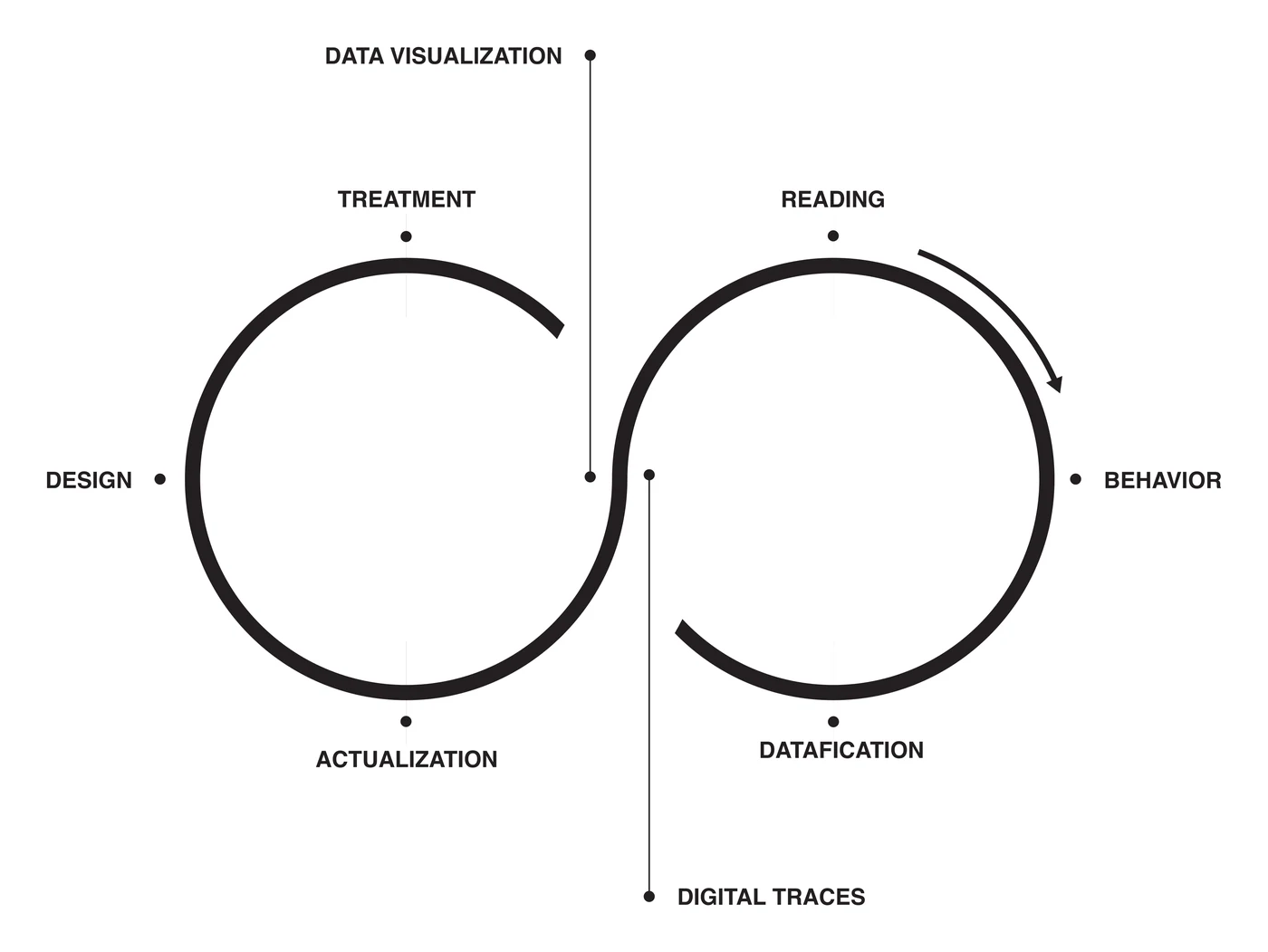
The second aspect that emerges from our case study is what we have called ‘collectivity.’ The Ricoeurian model of triple mimesis suggests that there is one author, one book, and one reader at a time. It is worth noting that even when Ricoeur writes of more than one author (e.g., the Bible), more than one book (e.g., the New Testament), and more than one reader (e.g., the public reading and listening practices in the Christian Churches) he implicitly applies the classic model of solitary, silent writing and reading.
The Affinity Map clearly shows a collective engagement and collectivization in both sides of the hermeneutic circle. Digital traces do not concern one unique, isolated individual. Even when digital traces are collected for quantifying individuals, they are continuously used as touchstones for comparison with someone else as a condition of visual proximity. Digital emplotment implies a series of stratified processes and technology uses that are the result of a mediation between human and nonhuman double intentionality. Not to mention the fact that the designer does not work in solitude; she is usually part of a team, in continuous contact with clients and the audience in a dialogic design (Manzini 2016).
We want, however, to focus on a specific moment of the Affinity Map, that is, when the data visualization ‘reading’ occurs. One aim of the Affinity Map was not to quantify several isolated selves, but rather to develop an overall image of ENAC characterized by the richness of each individual immersed in the complex dynamics of an autonomous arrangement. This collective image was challenging because each of the 1,000 scholars of ENAC had to agree with the graphical representation. For that reason, during the design process a temporary version of the Affinity Map was shared first at the ENAC Research Days and, later, privately on the Internet. Since the representation of each scholar was very delicate, a dialogue with the ENAC community was collectively established.
In 2016, the Affinity Map was presented as a large carpet for the first time in the hall of architecture (see Figure 4). All of the members of the school were invited to look at the data visualization from the balconies in order to grasp the distant view of the laboratories’ arrangement (Rodighiero 2018b). Then, they were invited to walk on the Affinity Map so they would be able to find themselves. The exercise was effective: from the balconies they were able to identify their own unit and, afterward, to go directly there and identify themselves by walking on the Affinity Map. The public presentation of the Affinity Map allowed for the creation of a social space where ENAC members could talk and discuss what they saw. This moment of disclosure actually became a learning activity in which individuals were taken through the visual choices that impacted the ongoing design.
Over the next year commentaries and remarks about the experience were seriously considered in the design process and the results were unveiled during the ENAC Research Day 2017, this time in the form of a web-based application (see Figure 5). This form of actualization allowed for a more accurate discussion that happened exclusively in front of the large screen. However, the idea was always to create an open and constructive dialogue in order to improve the product. The event was also the ideal opportunity to reveal the web-based application that would be open to the ENAC community. During the following year, the design team incorporated the ENAC community’s concerns and comments into the phase of design. During the ENAC Research Day 2018, the Affinity Map was presented on a large screen. It was still undergoing refinement; there continued to be bugs and the contribution of the ENAC community through simple talks was fundamental to finding them. The work was finally published in September 2018.
The Affinity Map is a continuous project. Digital traces are updated yearly through a personal report that professors are requested to fill out each year. This personal report is an important element of quality because it allows us to go over data validated by laboratory directors. As a result, each year the Affinity Map is regularly fed with new data and updated. Although a few years of data are available in the database, it is too early to check if the visual method introduced with the Affinity Map effectively impacts the academic practice of scholars. During the interviews used for the thesis (Rodighiero 2018a), it was implied a sense of assessment especially for the tenure-track positions. However, to solve any problem related to a potential evaluation of scholars, two versions of the Affinity Map were created, one private and one public. The difference between the two versions is that identities are only available in the private version, which is available to the ENAC community only.
Conclusion
From an epistemological and ontological point of view, one can say that the Affinity Map is a material encounter between postphenomenology, ANT, and hermeneutics. Postphenomenology is particularly suitable for ‘in-depth’ analysis of human-technology-world relations, but cannot always account for the ‘quality’ and the ‘intensity’ of these relations. Moreover, postphenomenology discriminates ‘by nature’ between at least three different modes of existence: humans, technologies, and things of the world, but its view is sometimes too narrow, in so far as it considers only one relation at a time. For this reason, it has been proposed to integrate it with the network perspective developed in the context of the ANT, which is more suitable for ‘in-width’ analysis. Verbeek (2005, 165) writes:
While Latour in principle can study the endless number of chains, postphenomenologists seem to be restricted to two. . . . But the difference between the two approaches is more subtle than that, for in these short chains the postphenomenological perspective can bring to light things that remain invisible to actor-network theory. The postphenomenological perspective, for instance, offers a more nuanced look at the connections between the entities in its chains.
— Peter-Paul Verbeek (2005, 165)
Both postphenomenology and ANT have contributed to the ‘empirical turn’ in philosophy of technology. As a consequence, they tend to focus their attention on the most immediate, visible, and touchable aspects of technological mediations. Hermeneutics, through the notion of the hermeneutic circle, is rather oriented toward the silent effects of technology design, and use on the designer and the user themselves. Hermeneutics suggests that part of our attention as philosophers of technology should be focused on the symbolic mediations that always-already mediate the empirical technological mediations, and that render these technological mediations more or less effective on our individual or social existences.
For example, Taina Bucher (2017) has studied the ‘algorithmic imaginary,’ that is to say the ways of thinking and speaking about what algorithms are, which have a generative role for her in molding the algorithm itself. More generally, one can notice a sort of ‘hermeneutic turn’ in philosophy of technology, in which language, signs, symbols, and imaginaries—which were brutally defenestrated by the philosophies of technology of the empirical turn—are readmitted through the main door. See for instance the concept of ‘narrative technologies’ in Mark Coeckelbergh and Wessel Reijers’s (2016) work or, concerning digital technologies (cf. Romele, Severo, and Furia 2018).
In the case of the Affinity Map, the effectiveness of the data visualization on the researcher depends in large part on the importance given in academia to the dynamics of agonistic (helas, often non-mutual) recognition. The Affinity Map actualizes these dynamics, but it must be emphasized that the use of digital traces is radically different from classic bibliometrics because of its aggregation complexity and its advanced visual design. The codification of the Affinity Map is different from standard evaluation indices such as citations, h-index, i10-index, et cetera, and this might explain its popularity among the researchers. The Affinity Map was initially intended as a tool of governmentality, but it succeeded in becoming an instrument of governance, in which the top and bottom members of the organization hierarchy contribute equally to the decision-making (Pierre and Peters 2000).
As with all technologies, the Affinity Map remains ambiguous and ‘multistable’ by nature. Ihde first introduced the notion of multistability in Experimental Phenomenology (2012) with the intention of accounting for illusions and for multistable phenomena exceeding familiar perceptions, such as the Necker cube or the duck-rabbit illusion. More specifically, he resorted to this concept in order to present the potential of the phenomenological approach. In his words, “phenomenological observations do violence to the passivity of ordinary viewing. There is a deliberate probing of the phenomenon for something that does not at first show itself, and a growing sense of control over what is seen” (Ihde 2012, 76). Subsequently, the same notion has begun to be used to account for socially and culturally based variations in technology uses and misuses (Ihde 1990, 144–45). Now, we believe that the ethically and politically fragile position of the Affinity Map (the same holds true for many other technologies) as a means of governance rather than as an apparatus of governmentality depends on the continuous interactions (another hermeneutic circularity?) among the social actors that constitute the collectivity beyond the limits of the sole platform: researchers, tools, methods, designers, institutions, and so on.
References
- Bucher, Taina. 2017. “The Algorithmic Imaginary: Exploring the Ordinary Affects of Facebook Algorithm.” Information, Communication & Society 20 (1): 30–44.
- Callon, Michel, Pierre Lascoumes, and Yannick Barthe. 2009. Acting in an Uncertain World: An Essay on Technical Democracy. Cambridge, MA: MIT Press.
- Coeckelbergh, Mark, and Wessel Reijers. 2016. “Narrative Technologies: A Philosophical Investigation of the Narrative Capacities of Technologies by Using Ricoeur’s Narrative Theory.” Human Studies 39 (3): 325–46.
- Deleuze, Gilles, and Claire Parnet. 2007. Dialogues II. New York: Columbia University Press.
- Flusser, Vilém. 2007. “Crisis of Linearity.” Boot Print 1 (1): 19–21.
- Giardino, Valeria, and Gabriel Greenberg. 2015. “Introduction: Varieties of Iconicity.” Review of Philosophy and Psychology 6 (1): 1–25.
- Gray, Jonathan. 2018. “Three Aspects of Data Worlds.” Krisis: Journal for Contemporary Philosophy. http://krisis.eu/three-aspects-of-data-worlds/ (archived).
- Hertig, Hans-Peter. 2016. Universities, Rankings and the Dynamics of Global Higher Education. London: Palgrave Macmillan.
- Ihde, Don. 1990. Technology and the Lifeworld: From Garden to Earth. Bloomington: Indiana University Press.
- Ihde, Don. 1998. Expanding Hermeneutics: Visualism in Science. Evanston, IL: Northwestern University Press.
- Ihde, Don. (1977) 2012. Experimental Phenomenology: Multistabilities. 2nd ed. New York: State University of New York Press.
- Ingold, Tim. 2007. Lines: A Brief History. London: Routledge.
- Liberati, Nicola. 2016. “Augmented Reality and Ubiquitous Computing: The Hidden Potentialities of Augmented Reality.” AI & Society 31 (1): 17–28.
- Lynch, Michael. 1988. “The Externalized Retina: Selection and Mathematization in the Visual Documentation of Objects in the Life Sciences.” Human Studies 11 (2–3): 201–34.
- Manzini, Ezio. 2016. “Design Culture and Dialogic Design.” Design Issues 32 (1): 52–59.
- Nørskov, Marco. 2015. “Revisiting Ihde’s Fourfold ‘Technological Relationships’: Application and Modification.” Philosophy & Technology 28 (2): 189–207.
- Pierre, Jon, and B. Guy Peters. 2000. Governance, Politics and the State. London: Palgrave Macmillan.
- Ricoeur, Paul. 1988. Time and Narrative. Vol. 3. Chicago: University of Chicago Press.
- Rodighiero, Dario. 2018a. “Mapping Affinities: Visualizing Academic Practice through Collaboration.” PhD thesis, École Polytechnique Fédérale de Lausanne.
- Rodighiero, Dario. 2018b. “Printing Walkable Visualizations.” In Proceedings of the 5th Biennial Transdisciplinary Imaging Conference, TI2018, 58–73. Edinburgh.
- Rodighiero, Dario, and Loup Cellard. 2019. “Self-Recognition in Data Visualization: How Individuals See Themselves in Visual Representations.” EspacesTemps.net: Electronic Journal of Humanities and Social Sciences.
- Rodighiero, Dario, Frédéric Kaplan, and Boris Beaude. 2018. “Mapping Affinities in Academic Organizations.” Frontiers in Research Metrics and Analytics 3.
- Romele, Alberto. 2018. “Herméneutique du digital: Les limites techniques de l’interprétation.” Études digitales 3: 55–74.
- Romele, Alberto, Marta Severo, and Paolo Furia. 2018. “Digital Hermeneutics: From Interpreting with Machines to Interpretational Machines.” AI & Society.
- Rosenberger, Robert, and Peter-Paul Verbeek. 2015. “A Field Guide to Postphenomenology.” In Postphenomenological Investigations: Essays on Human-Technology Relations, edited by Robert Rosenberger and Peter-Paul Verbeek, 9–42. Lanham, MD: Lexington Books.
- Salton, Gerard, Anita Wong, and Chung-Shu Yang. 1975. “A Vector Space Model for Automatic Indexing.” Communications of the ACM 18 (11): 613–20.
- Verbeek, Peter-Paul. 2005. What Things Do: Philosophical Reflections on Technology, Agency, and Design. University Park: Pennsylvania State University Press.
- Verbeek, Peter-Paul. 2011. Moralizing Technology: Understanding and Designing the Morality of Things. Chicago: University of Chicago Press.
- Wellner, Galit. 2018. “From Cellphones to Machine Learning: A Shift in the Role of the User in Algorithmic Writing.” In Towards a Philosophy of Digital Media, edited by Alberto Romele and Enrico Terrone, 205–24. London: Palgrave Macmillan.
- Wiltse, Heather. 2014. “Unpacking Digital Material Mediations.” Techné: Research in Philosophy and Technology 18 (3): 154–82.
-
This article is part of the research project “From Data to Wisdom” (2018–2020) (AAC nº 02/SAICT/2017—Nr. 029717) funded by the Fundação para a Ciência e a Tecnologia—Portugal 2020. An earlier version of it has been presented at the conference “Human-Technology Relations: Postphenomenology and Philosophy of Technology” (University of Twente, 11–13 July 2018). We would like to thank the conference organizers and attendees for the invaluable dialogues, remarks, and comments. ↩
-
The arrows indicate the directionality of the intentionality. In this case, the left-right arrow indicates the fact that this type of relation has a bi-directional character: human beings are directed toward technologies that are also directed toward them. The slash instead of the simple dash suggests the fusion between two entities. ↩
-
Wellner separates trace (text) and technology (algorithm), but inverts their order. Moreover, she considers the double algorithmic intentionality: the algorithm is directed toward the writing of the text, but also suggests to the reading human what to read. ↩
-
See, for instance, Liberati 2016; see also the simplification and reduction proposed in Nørskov 2015. ↩
-
In the words of Michel Callon, Pierre Lascoumes, and Yannick Barthe (2009, 52), “the famous data (givens) of experience are never given; they are obtained, ‘made,’ fabricated.” ↩
-
Peirce famously distinguished between indexes, icons, and symbols. One might argue that data are indexes or traces and data visualizations are icons. This means that data visualizations have a pictorial dimension, while data do not. Valeria Giardino and Gabriel Greenberg (2015, 2–3) divide iconic signs into pictures (perspectival drawings, photographs, paintings, film clips) and diagrams (graphs, charts, timelines, etc.). One could say that the latter are closer to a symbolic dimension that is more conventional and abstract than the former one. This is precisely the case of data visualizations. From a postphenomenological point of view, it can be affirmed that their specificity is of being hermeneutic relating technologies that still have a minimal degree of embodiment features (see Ihde 1998, 95). This is the reason why Ihde (1998, 166–68) also speaks of “textlike” visualizations. ↩
-
Michael Lynch (1988) speaks of “externalized retina” to account for the process of selection and mathematization (that is, synthetization) in the visualization processes in the field of life sciences. According to him, visualizations of this kind do not concern just the psychology of an isolated individual, but also the coordinated practices of groups of people (Lynch 1988, 204). ↩
-
The Affinity Map was made publicly available at EPFL, with a private version — including scholars’ names — accessible to the ENAC community through authentication. ↩
-
There is no room for such discussion here, but the reasons for preferring Ricoeur to Heidegger are not extrinsic. Indeed, Ricoeur gave a constitutive role to the technological mediation of the text, while for Heidegger the use and the eventual break of a tool (for instance, the hammer) is merely an occasion for improved self-understanding. ↩
-
Heidegger used to distinguish between Selbstwelt (self-world), Mitwelt (with-world), and Umwelt (surrounding world). It can be argued that the hermeneutic circle of data visualization deploys the articulation among the three, insofar as both the technological infrastructure and the social environment emerge as fundamental contributors in the reconfiguration of the self. Moreover, it can be supposed that such reconfiguration has, in its turn, performative consequences on the technological infrastructure and the social environment. ↩