Immersive Architectures for Visual Data Literacy
@article{rodighiero2022immersive,
  author      = {Dario Rodighiero and Eveline Wandl-Vogt and Elian Carsenat and Jules Döring and Oliver Elias and Michaela Fragner and Stepha Farkashazy},
  title       = {Immersive Architectures for Visual Data Literacy},
  journal     = {Information Design Journal},
  year        = {2022},
  volume      = {27},
  number      = {3},
  pages       = {295–308},
  doi         = {10.1075/idj.22016.rod}
}
The datafication process transforming society enables us to witness the pandemic from a global perspective. This article provides an example of immersive architecture in which coronavirus-related scientific literature was revealed during Ars Electronica 2021. Like a starry sky, a network visualization representing more than 600,000 articles was showcased in the Deep Space 8K theater, where spectators were accompanied in reading insights. The case study of 3D Cartography of COVID-19 illustrates a novel way to present data in public spaces to foster conversations and reflects on how visual data literacy can be addressed in museums.
Seeing is believing. That’s the most credible and the most powerful sense that we have. We need to see things. We long to see things. — Heino Falcke, EHT Science Council Chair. (Galison 2020, min. 20:25)
Introduction
Each one of us reacted differently to the coronavirus pandemic that affected society in recent years. In such a context, researchers felt empowered to offer their help, contributing according to their capacity. While medical schools have focused on treating illness, specialists from other domains have contributed differently. Among them, sociologists have studied the ritual of clapping to thank healthcare workers (Rigal and Joseph-Goteiner 2021), and historians have drawn comparisons between the pandemic and the cholera epidemic from the nineteenth century (Huber 2020). In this unprecedented global emergency, practitioners of data visualization and information design have managed the pandemic in their own way.
The coronavirus disease triggered an event characterized by a continuous data flow, perhaps for the first time with such magnitude. Information and data designers found themselves translating data into visuals to summarize the infection status for the reader’s eyes. The New York Times, for example, created cutting-edge data visualizations that more than once have found space on the front page (Coleman 2021). The pandemic was sensed at two scales: globally through data and locally through a more personal dimension given by stimuli such as phone calls and ambulance sirens. Readers absorbed both perceptions to form a unique representation in mind, supporting Loukissas’ argument that underlines how “large-scale data sets are also local” (Loukissas 2019: 21). Put simply, the COVID-19 infection initiated an unprecedented data-driven global event during which coronavirus-related digital information from all over the world was collected and visualized to be accessible to a large audience (Rodighiero, Wandl-Vogt, and Carsenat 2021).
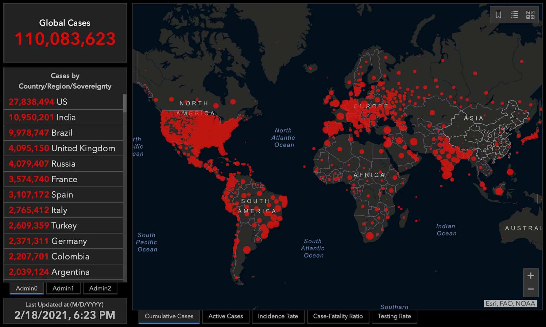
It has been almost three years since the first COVID-19 cases appeared, and institutions still collect data to make them publicly available for reuse (Wilkinson et al. 2016). For example, Johns Hopkins University’s contribution was commendable: they established an information system collecting information on many aspects of COVID-19, including an extensive dataset of scientific literature (Wang et al. 2020). They also designed many data visualizations to grasp the phenomenon’s complexity from a visual perspective. Among these data visualizations, the best-known representation is undoubtedly the map of infections, which is still present in our minds today (see Figure 1).
One First Response to COVID-19
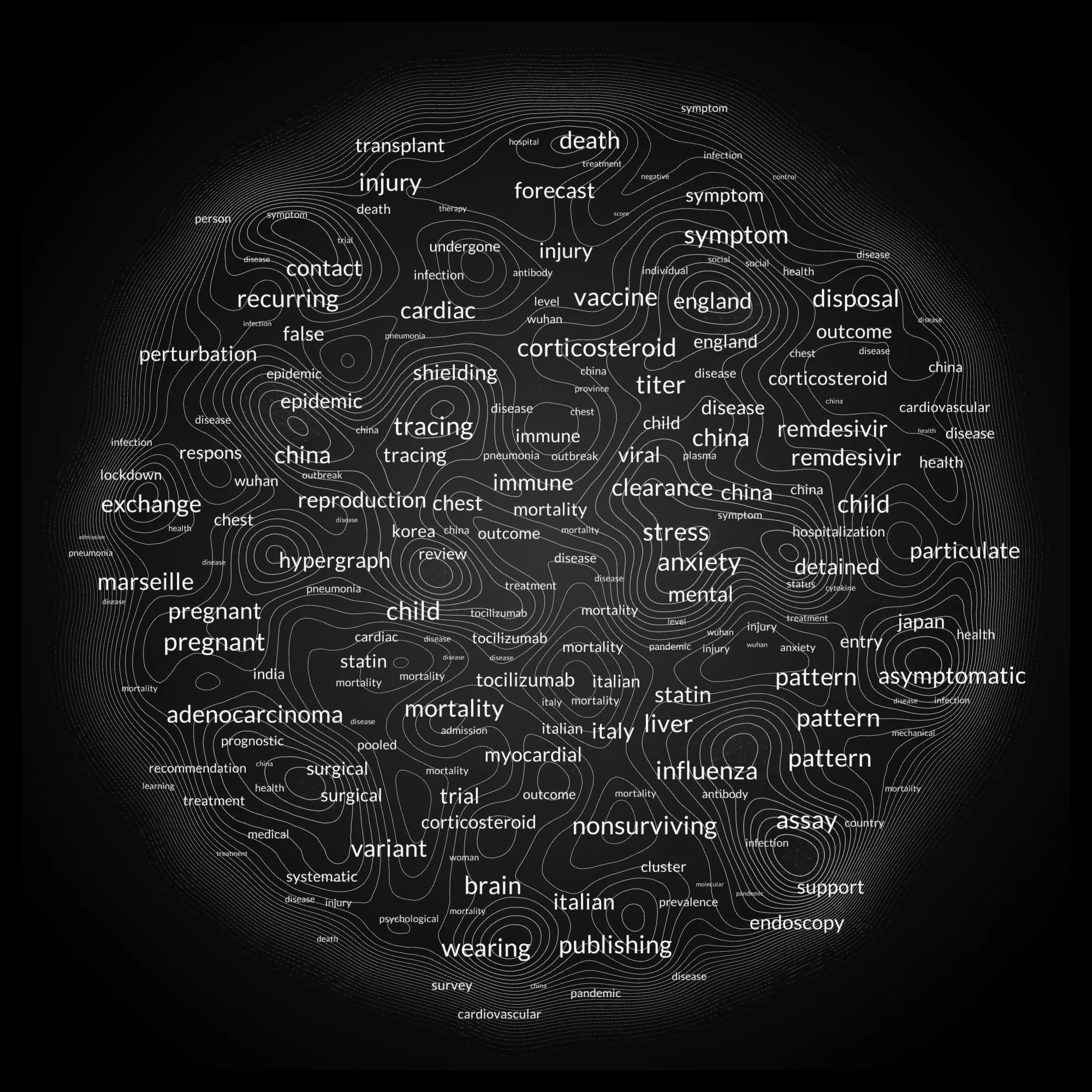
During the first lockdown, as designers, we posed the question of how to help citizens through this difficult time using data visualization expertise and toolkits. Since our research domain intersects with Science and Technology Studies (Sismondo [2004] 2010) and the Mapping of Science (Börner 2010; Petrovich 2020), we endeavored to map the scientific literature collected by Johns Hopkins University (Wang et al. 2020) to show the effort made by scientists to cope with the pandemic. The Johns Hopkins University dataset of scientific articles was analyzed with advanced techniques of Natural Language Processing (Manning and Schütze 1999) and mapped using a model of network visualization (Moon and Rodighiero 2020; Rodighiero and Romele 2022) to represent the most active researchers. The result was a network visualization entitled the Cartography of COVID-19, which presents about 5,000 researchers according to their lexical similarity (see Figure 2). In the visual, keywords work as orientation points on the topics covered by the articles, and the topographical overlay indicates the activity level of researchers; a more detailed explanation of the data visualization is provided by Rodighiero, Wandl-Vogt, and Carsenat (2022).
Despite some distinction gained in 2020 through DH Awards, which honored the project as the best data visualization in digital humanities, the visual method still demonstrated limitations in displaying large datasets. Although today’s browsers can handle increasingly complex interfaces, the Cartography of COVID-19 revealed speed constraints in graphic rendering, even when using advanced video game techniques such as WebGL (Van der Spuy 2015). Limiting the network to 5,000 researchers was not a design choice but a measure necessary to reduce the computational load: the original idea was to display more than 80,000 researchers to make visible the vast scientific community coping with the pandemic. Although the Cartography of COVID-19 had made possible the identification of the most active researchers and the most trending topics, the scientific community was not represented in its entirety, reducing the sense of sublime that can be conveyed through complex visualizations (Manovich 2008).
A Successive, More Complex Response to COVID-19
The opportunity for the second response to COVID-19 was provided by a generous grant awarded by DARIAH, the Digital Research Infrastructure for the Arts and Humanities, which was interested in funding “specific responses to the pandemic that engage arts and humanities.” Our proposal was entitled Making the Pandemic Understandable Using Public, Hi-resolution Screens and put forward data visualization as a way to fight the fear of the invisible, as stated in the original abstract:
According to social psychology, individuals experience fear when they do not understand a phenomenon. This is also the case of the current pandemic: coronavirus is something that is invisible to the eyes, especially during its transmission. One way to deal with this fear is to make tangible a phenomenon that is invisible. The project aims to reveal the massive scientific work that doctors, researchers, and academics are doing to fight the illness provoked by COVID-19 by making use of data visualization in public spaces to foster understanding and conversation among viewers. (Papaki 2020)
The idea was elegantly simple: to visualize the scientific literature on coronavirus to make people aware of the collective effort made by doctors, researchers, and academics. However, 600,000 scientific articles were collected by Johns Hopkins University when the proposal was accepted, a number which greatly exceeded the 5,000 researchers previously displayed.
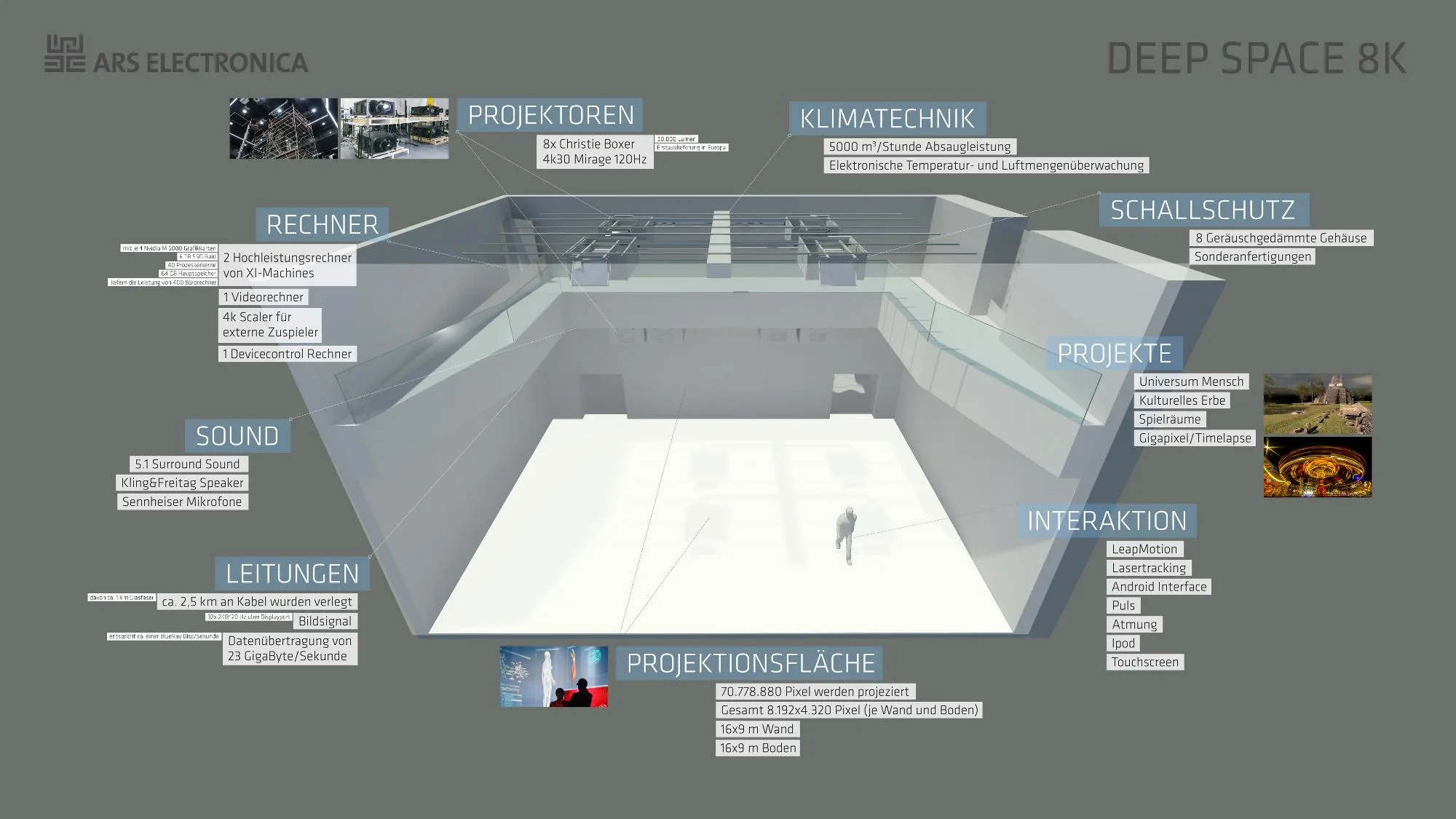
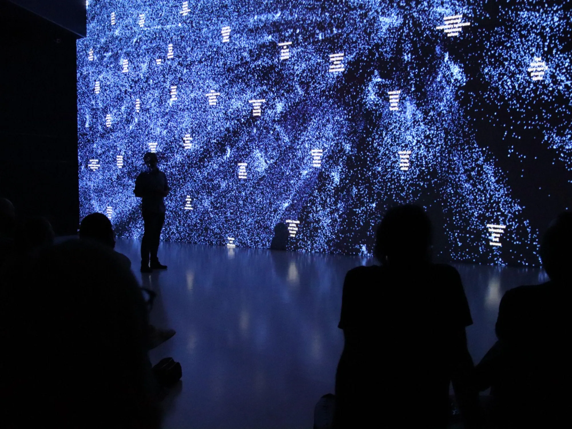
The plan was to overcome the computational limit through the technology provided by Ars Electronica, an Austrian institute active in the field of new media art that organizes a festival in Linz every year. The institute houses the Ars Electronica Center, a museum whose primary function is to offer visitors interactive experiments at the intersection of art, technology, and society. The Ars Electronica Center operates the Deep Space 8K, an interactive theater which can accommodate spectators in an immersive space. Two 16-by-9-meter projections create a feeling of immersion by merging on the stage, as described in Figure 3 (Sick-Leitner 2015). Such a projection system extends a computer equipped with powerful graphics cards capable of handling heavy graphics rendering in a resolution of 8,192 by 4,320 pixels. As a result, the advanced technology of Deep Space 8K was the only way at our disposal to render 600,000 coronavirus-related publications in a unique and complex data visualization.
Design Process
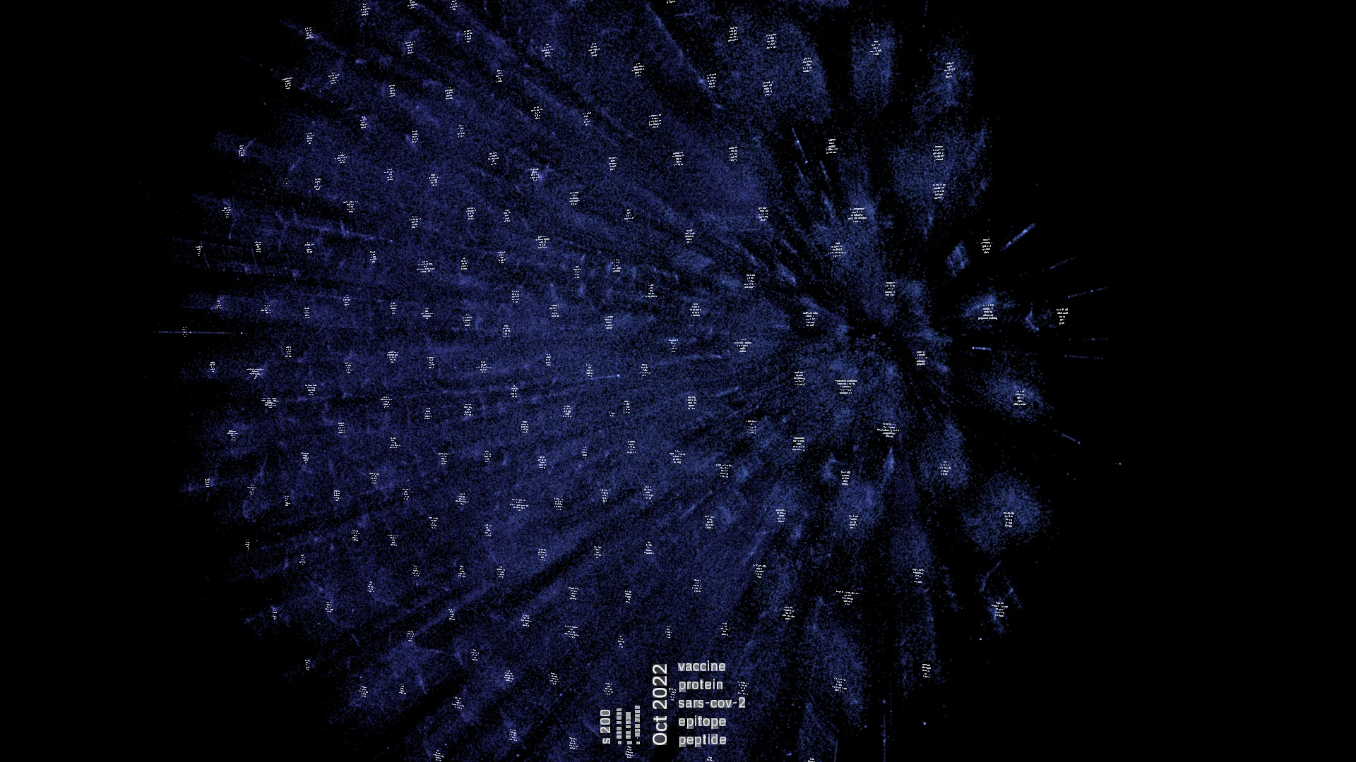
Although 600,000 graphic elements exceed the computational capacity of Internet browsers, Deep Space 8K’s hardware enabled us to overcome this technical limit using Unity, a game engine widely employed for iOS and Android (Hocking and Schell 2022). The data handling process was similar to the Cartography of COVID-19, although the code was rewritten in Python, a programming language suitable for data science (Vanderplas 2016). Natural Language Processing techniques were used to extract lemmas from titles, abstracts, and keywords. Then, all publications were analyzed by their lemmas’ frequency via TF-IDF statistical method (Manning and Schütze 1999). Afterward, the multiple dimensions of TF-IDF output were reduced through t-SNE, an algorithm of dimensionality reduction capable of spacing out a high number of elements (Van der Maaten and Hinton 2008), especially when compared to force-directed graph drawing systems (Bostock, Ogievetsky, and Heer 2011) already employed in the Cartography of COVID-19. The use of t-SNE is recognizable by the pattern of clusters typically associated with such an algorithm: the network visualization is organized by clusters composed of scientific articles referring to the same topic.
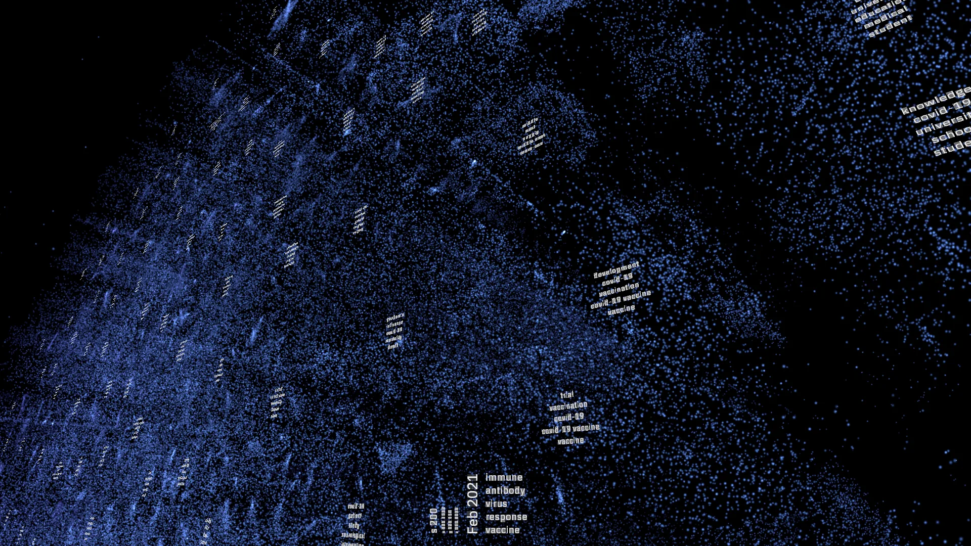
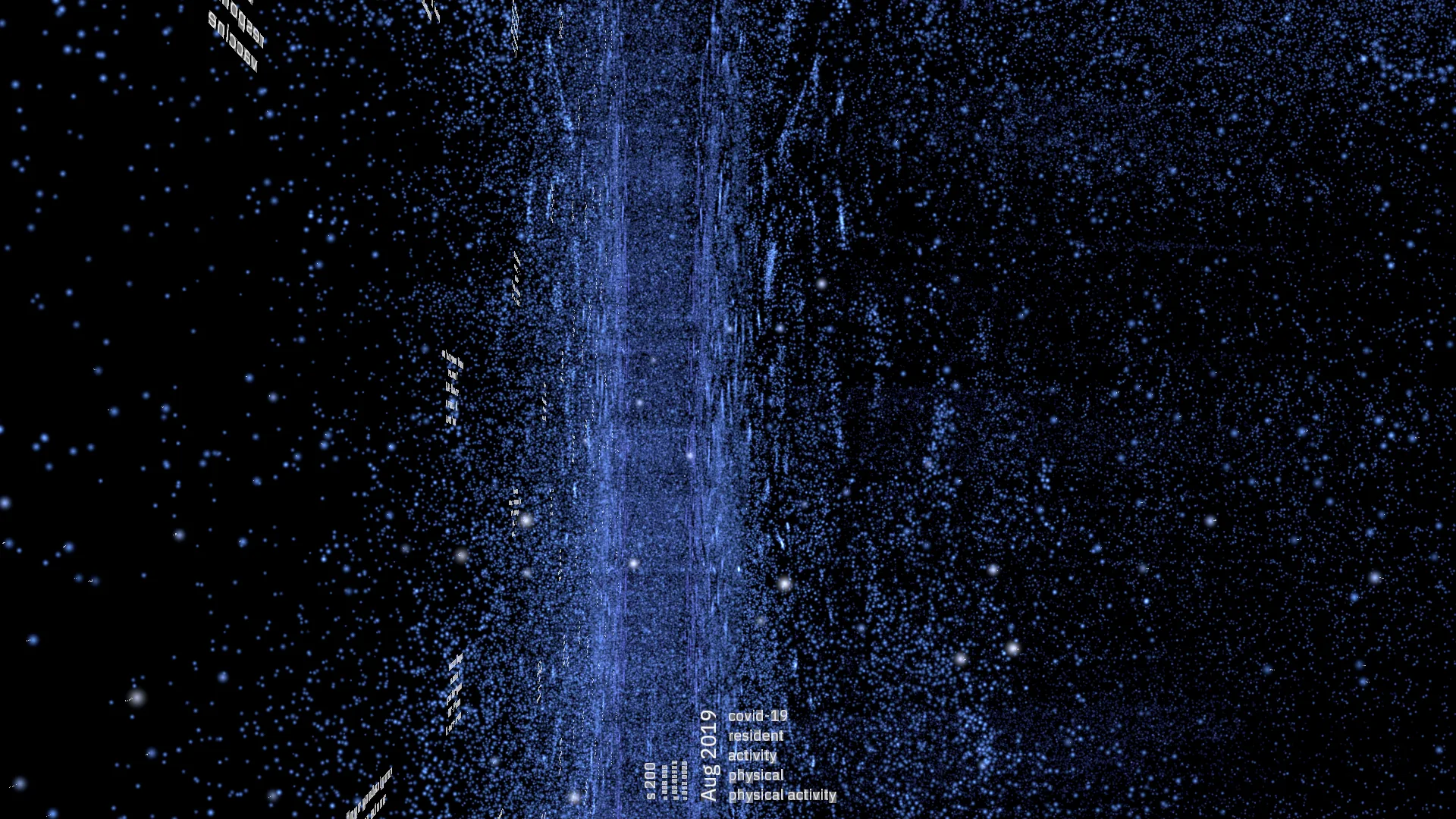
From an aesthetic point of view, the most significant difference between the first and the second response is the Unity feature to display elements in three-dimensional space. In this regard, the additional dimension was used to illustrate the temporal evolution of scientific literature, like a timeline. This expedient was particularly useful for emphasizing those articles published before the pandemic, as the coronavirus was also studied during the SARS epidemic in 2002 (Feng et al. 2009).
The Unity environment also transformed the graphic design by substituting vector graphics usually employed in HTML5 canvas with three-dimensional computer graphics. For example, if the Cartography of COVID-19 represented researchers as circles, the Unity environment used bright points for scientific publications. Similar to the maps that allow astronomers to identify star formations (Kanas 2012), the 3D Cartography of COVID-19 reveals thematic clusters and the evolution of scientific literature.
Figures 4, 5, and 6 show three screenshots of the 600,000 scientific publications collected by Johns Hopkins University until June 2021, mapped in the 3D Cartography of COVID-19. The three-dimensional model is rotated from figure to figure to simulate the transition from the front view, organized by language similarity, to the side view working as a timeline.
In continuity with the previous work, such a network visualization was later called 3D Cartography of COVID-19 Research (Ars Electronica 2021; Jandsl and Stocker 2021). The fascination with displaying large datasets in public spaces is gaining momentum in digital humanities, Sarah Kenderdine being among its leading representatives (Kenderdine et al. 2021). Kenderdine is a professor of Digital Museology at École polytechnique fédérale de Lausanne, where she directs the laboratory for experimental museology (eM+) and the exhibition space EPFL Pavilions. In the paper Immersive Visualization Architectures and Situated Embodiments of Culture and Heritage, Kenderdine presents five immersive architectures to show heritage sites through large-scale digital environments (Kenderdine 2010). In these case studies, Kenderdine uses immersive architectures to situate visitors in faraway places, allowing them to admire cultural sites that no longer exist but which have been preserved digitally. A key feature of 3D environments is the ability to recontextualize the visitor’s point of view into a modeled digital space.
The experimentation on immersive architectures can be further enriched by accommodating multiple visitors who can simultaneously engage in conversation. This model of collective consumption is linked to Bruno Latour’s pioneering work, described in the article From Realpolitik to Dingpolitik: Or How to Make the Things Public (Latour 2005), which opens the catalog of the ZKM exhibition Making things public: atmospheres of democracy (Latour and Weibel 2005). Using the term gathering to translate Heidegger’s German concept of ding, Latour illustrates a new way of seeing politics, no longer organized by political alignment but by subjects of interest. In the text, Latour puts forward two questions with relation to this model, “The first question draws a sort of place, sometimes a circle, which might be called an assembly, a gathering, a meeting, a council; the second question brings into this newly created locus a topic, a concern, an issue, a topos” (Latour 2005: 6). So, while the first question refers to a space where individuals can get together, the second empowers the same place with the representation of a subject matter. In the context of this article, Latour’s model can be seen even more dramatically when a particular subject matter is brought into the gathering via immersive architectures, bringing to the audience a more vivid perception. By joining Kenderdine’s and Latour’s points of view, the image that emerges corresponds to a gathering place where a subject matter is presented through immersive data visualization. Such an immersive architecture hosts people as both contemplators and debaters to call attention to a specific subject and stimulate public discussion.
For the 3D Cartography of COVID-19 Research, Deep Space 8K was decorated using scientific publications’ metadata. There, visitors were confronted with the massive work of scientists to cope with the pandemic, usually invisible to their eyes. Like Rudolf Arnheim saw reasoning and visual perception as intimately related (Arnheim 1969: v), immersive architectures extend the sensory experience of information in a place where visitors are invited to think collectively.
Data Literacy
The concept of data literacy stresses how deeply rooted in text and writing education systems are, and that new skills to understand data are urgently needed (D’Ignazio 2017; D’Ignazio and Bhargava 2015). In this moment of information explosion (Balazka and Rodighiero 2020; Gray et al. 2018; Kaplan and Lenardo 2017; Kitchin 2014; Van Dijck 2014), a novel educational approach concerning information would be valuable, especially in visual terms as already pointed out by László Moholy-Nagy (Cooper 1989: 14). Indeed, everyone should look at data visualization with critical eyes to grasp insights and patterns, questioning how the visual has been created. This ability would help understand global phenomena which are mainly perceived through data, such as the spread of COVID-19 (Rodighiero, Wandl-Vogt, and Carsenat 2022). In this sense, the definition of data literacy should be extended to visual literacy, a concept developed in the 1970’s by Boston University Professor Donis Dondis ([1973] 1975) and more recently reprised by Isabel Meirelles (2013: 9). László Moholy-Nagy, Dondis, and Meirelles pointed out the necessity for education in graphic design at different moments, and there is the opportunity today to combine visual pedagogy with critical data in what can be referred to as visual data literacy.
When writing about literacy, Catherine D’Ignazio frequently quotes Paulo Freire and his pioneering model of popular education, which aims at an “emancipation achieved through the literacy process” (D’Ignazio 2017). Freire advocates the dialogic practice that involves teachers and students in an open discussion and maintains that we can change society through conversation. He writes,
In order to understand the meaning of dialogical practice, we have to put aside the simplistic understanding of dialogue as a mere technique. Dialogue does not represent a somewhat false path that I attempt to elaborate on and realize in the sense of involving the ingenuity of the other. On the contrary, dialogue characterizes an epistemological relationship. Thus, in this sense, dialogue is a way of knowing and should never be viewed as a mere tactic to involve students in a particular task. We have to make this point very clear. I engage in dialogue not necessarily because I like the other person. I engage in dialogue because I recognize the social and not merely the individualistic character of the process of knowing. In this sense, dialogue presents itself as an indispensable component of the process of both learning and knowing. (Freire [1970] 2000: 17)
The dialogic practice plays a significant role in immersive architectures, where exhibited information is not left to the visitors but requires a pedagogical activity. For example, the 3D Cartography of COVID-19 Research was not only a technical installation but primarily an event in which spectators acquired knowledge for interpreting data, giving them the essential tools to form their own opinions.
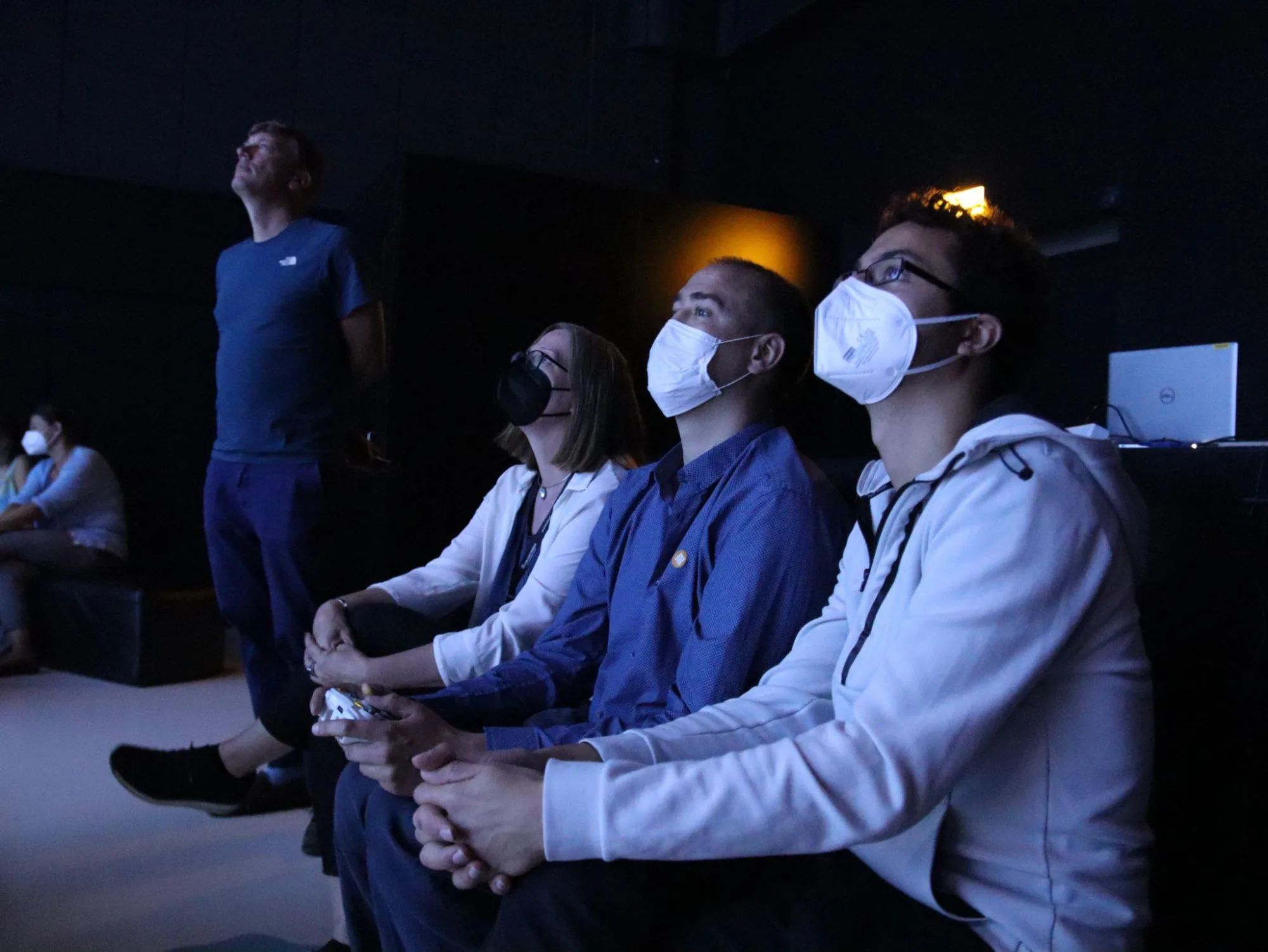
The Cartography of COVID-19 Research was presented during Ars Electronica 2021. On September 9, at 10am, the visitors at Ars Electronica Center entered the Deep Space 8K. The event started with a brief presentation by project partners, followed by a 20-minute description of the data visualization. While the presenter was speaking, a collaborator with a gamepad navigated the three-dimensional space (see Figures 7, 8, and 9). Firstly, the spectators were introduced to the central role that Johns Hopkins University played in collecting data related to the coronavirus. Then, the data visualization was shown from a distant point of view, from which 600,000 scientific articles were visible at once. By zooming in, viewers were accompanied on a visual journey from full view to detail, characterized by a narrative based on short stories. For example, the SARS epidemic between 2002 and 2004 was used to introduce the timeline: the disproportion of scientific literature between the epidemic and the pandemic was immediately evident to the audience, helping viewers to understand the impact of COVID-19 on the research environment. Finally, the frontal lesson was followed by a discussion in which spectators raised a wide range of questions, most of which related to artificial intelligence and the future of immersive architecture. Such a moment of confrontation was in line with Freire’s dialogic practice, which maintains that it is vital for society to discuss and understand. The concept of visual data literacy relying on this pedagogical approach should not be confined to schools and universities, but should be extended to public spaces, of which museums are an excellent example.

Conclusions
This article summarizes the efforts made to make visible the invisible work of scientists by visualizing COVID-19 scientific publications to the general public during an art festival which took place in September 2021. Museum visitors still struggle to read data visualizations when not engaged in dialogic practice (Börner et al. 2016), and the most relevant output of the 3D Cartography of COVID-19 Research lies at the intersection of immersive architectures and visual data literacy. Considering the complexity of the work, the idea of guiding visitors through data-driven immersive spaces was invaluable. Similar to museum guides who provide the most relevant concepts to understanding art, data-driven guides can indicate the crucial keys to understanding facts and therefore, are worth further exploring. In addition, data-driven places for gathering are essential not only for the subject per se but rather for their capacity to promote visual data literacy and stimulate conversations among citizens.
Acknowledgments
This article was submitted after revisions on October 9, 2022, when Bruno Latour sadly passed away. Bruno was a scientific reference to many of us, and his work partly inspired this article. We want to thank him for his guidance and dedication over the years.
References
- Arnheim, Rudolf. 1969. Visual Thinking. Berkeley: University of California Press.
- Ars Electronica. 2021. “3D Cartography of COVID-19 Research.” Ars Electronica, a New Digital Deal, September 9. ars.electronica.art/newdigitaldeal/en/cartography-covid-19-research.
- Balazka, Dominik, and Dario Rodighiero. 2020. “Big Data and the Little Big Bang: An Epistemological (R)evolution.” Frontiers in Big Data 3: 31. doi:10.3389/fdata.2020.00031.
- Börner, Katy. 2010. Atlas of Science: Visualizing What We Know. Cambridge, MA: MIT Press.
- Börner, Katy, Adam Maltese, Russell Nelson Balliet, and Joe Heimlich. 2016. “Investigating Aspects of Data Visualization Literacy Using 20 Information Visualizations and 273 Science Museum Visitors.” Information Visualization 15 (3): 198–213. doi:10.1177/1473871615594652.
- Bostock, Michael, Vadim Ogievetsky, and Jeffrey Heer. 2011. “D3: Data-Driven Documents.” IEEE Transactions on Visualization and Computer Graphics 17 (12): 2301–9. doi:10.1109/TVCG.2011.185.
- Coleman, Nancy. 2021. “On the Front Page, a Wall of Grief.” The New York Times, February 21. nytimes.com/2021/02/21/insider/covid-500k-front-page.html.
- Cooper, Muriel. 1989. “Computers and Design.” Design Quarterly, no. 142: 4–31. doi:10.2307/4091189.
- D’Ignazio, Catherine. 2017. “Creative Data Literacy: Bridging the Gap between the Data-Haves and Data-Have Nots.” Information Design Journal 23 (1): 6–18. doi:10.1075/idj.23.1.03dig.
- D’Ignazio, Catherine, and Rahul Bhargava. 2015. “Approaches to Building Big Data Literacy.” In Bloomberg Data for Good Exchange 2015. New York.
- Dondis, Donis A. (1973) 1975. A Primer of Visual Literacy. Cambridge, MA: MIT Press.
- Feng, Dan, Sake J. de Vlas, Li-Qun Fang, et al. 2009. “The SARS Epidemic in Mainland China: Bringing Together All Epidemiological Data.” Tropical Medicine & International Health 14 (November): 4–13. doi:10.1111/j.1365-3156.2008.02145.x.
- Freire, Paulo. (1970) 2000. Pedagogy of the Oppressed. Translated by Myra Bergman Ramos. 30th-anniversary ed. New York: Continuum.
- Galison, Peter, dir. 2020. Black Holes: The Edge of All We Know. Documentary. Netflix. imdb.com/title/tt11863046.
- Gray, Jonathan, Carolin Gerlitz, and Liliana Bounegru. 2018. “Data Infrastructure Literacy.” Big Data & Society 5 (2): 1–13. doi:10.1177/2053951718786316.
- Hocking, Joseph, and Jesse Schell. 2022. Unity in Action: Multiplatform Game Development in C#. 3rd ed. Shelter Island, NY: Manning Publications.
- Huber, Valeska. 2020. “Pandemics and the Politics of Difference: Rewriting the History of Internationalism through Nineteenth-Century Cholera.” Journal of Global History 15 (3): 394–407. doi:10.1017/S1740022820000236.
- Jandsl, M., and Gerfried Stocker, eds. 2021. Ars Electronica 2021: Festival for Art, Technology and Society. Berlin: Hatje Cantz Verlag.
- Kanas, Nick. 2012. Star Maps: History, Artistry, and Cartography. 2nd ed. New York: Springer. doi:10.1007/978-1-4614-0917-5.
- Kaplan, Frédéric, and Isabella di Lenardo. 2017. “Big Data of the Past.” Frontiers in Digital Humanities 4: 12. doi:10.3389/fdigh.2017.00012.
- Kenderdine, Sarah. 2010. “Immersive Visualization Architectures and Situated Embodiments of Culture and Heritage.” In 14th International Conference Information Visualisation, 408–14. doi:10.1109/IV.2010.63.
- Kenderdine, Sarah, Ingrid Mason, and Lily Hibberd. 2021. “Computational Archives for Experimental Museology.” In Emerging Technologies and the Digital Transformation of Museums and Heritage Sites, 3–18. doi:10.1007/978-3-030-83647-4_1.
- Kitchin, Rob. 2014. The Data Revolution: Big Data, Open Data, Data Infrastructures and Their Consequences. London: SAGE Publications.
- Latour, Bruno. 2005. “From Realpolitik to Dingpolitik: Or How to Make the Things Public.” In Making Things Public: Atmospheres of Democracy, edited by Bruno Latour and Peter Weibel, 4–31. Cambridge, MA: MIT Press.
- Latour, Bruno, and Peter Weibel, eds. 2005. Making Things Public: Atmospheres of Democracy. Cambridge, MA: MIT Press.
- Loukissas, Yanni Alexander. 2019. All Data Are Local: Thinking Critically in a Data-Driven Society. Cambridge, MA: MIT Press. doi:10.7551/mitpress/11543.001.0001.
- Manning, Christopher D., and Hinrich Schütze. 1999. Foundations of Statistical Natural Language Processing. Cambridge, MA: MIT Press.
- Manovich, Lev. 2008. “Data Visualization as New Abstraction and Anti-Sublime.” In Small Tech: The Culture of Digital Tools, edited by Byron Hawk, David M. Rieder, and Ollie O. Oviedo. Minneapolis: University of Minnesota Press.
- Meirelles, Isabel. 2013. Design for Information: An Introduction to the Histories, Theories, and Best Practices behind Effective Information Visualizations. Beverly, MA: Rockport.
- Moon, Chloe Ye Eun, and Dario Rodighiero. 2020. “Mapping as a Contemporary Instrument for Orientation in Conferences.” In Proceedings of the IX Annual Conference of the Association for Humanities and Digital Culture (AIUCD), 156–62. doi:10.5281/zenodo.3611340.
- Papaki, Eliza. 2020. “DARIAH Theme Call 2020/2021: Meet the Winning Projects.” DARIAH, December 10. dariah.eu/2020/12/10/dariah-theme-call-2020-2021-meet-the-winning-projects.
- Petrovich, Eugenio. 2020. “Science Mapping.” Encyclopedia of Knowledge Organization. isko.org/cyclo/science_mapping.
- Rigal, Alexandre, and Daniel Joseph-Goteiner. 2021. “The Globalization of an Interaction Ritual Chain: ‘Clapping for Carers’ during the Conflict against COVID-19.” Sociology of Religion 82 (4): 471–93. doi:10.1093/socrel/srab044.
- Rodighiero, Dario, and Alberto Romele. 2022. “Reading Network Diagrams by Using Contour Lines and Word Clouds.” In Proceedings of Graphs and Networks in the Humanities, February 4. doi:10.31235/osf.io/3g7bt.
- Rodighiero, Dario, Eveline Wandl-Vogt, and Elian Carsenat. 2021. “Making Visible the Invisible Work of Scientists during the COVID-19 Pandemic.” Visual Culture Studies (Milano; Udine) 2: 143–65. doi:10.5281/zenodo.5115621.
- Rodighiero, Dario, Eveline Wandl-Vogt, and Elian Carsenat. 2022. “A Visual Translation of the Pandemic.” Leonardo 55 (3): 297–303. doi:10.1162/leon_a_02203.
- Sick-Leitner, Magdalena. 2015. “Deep Space 8K: The Next Generation.” Ars Electronica Blog, August 11. ars.electronica.art/aeblog/en/2015/08/11/deep-space-8k.
- Sismondo, Sergio. (2004) 2010. An Introduction to Science and Technology Studies. 2nd ed. Chichester: Wiley-Blackwell.
- Van der Maaten, Laurens, and Geoffrey Hinton. 2008. “Visualizing Data Using t-SNE.” Journal of Machine Learning Research 9 (86): 2579–2605. jmlr.org/papers/v9/vandermaaten08a.html.
- Vanderplas, Jake. 2016. Python Data Science Handbook: Essential Tools for Working with Data. Sebastopol, CA: O’Reilly Media.
- Van der Spuy, Rex. 2015. Learn Pixi.js. Berkeley, CA: Apress. doi:10.1007/978-1-4842-1094-9.
- Van Dijck, José. 2014. “Datafication, Dataism and Dataveillance: Big Data between Scientific Paradigm and Ideology.” Surveillance & Society 12 (2): 197–208. doi:10.24908/ss.v12i2.4776.
- Wang, Lucy Lu, Kyle Lo, Yoganand Chandrasekhar, et al. 2020. “CORD-19: The COVID-19 Open Research Dataset.” In Proceedings of the Workshop on NLP for COVID-19 at ACL 2020. arxiv.org/abs/2004.10706.
- Wilkinson, Mark D., Michel Dumontier, IJsbrand Jan Aalbersberg, et al. 2016. “The FAIR Guiding Principles for Scientific Data Management and Stewardship.” Scientific Data 3: 160018. doi:10.1038/sdata.2016.18.