Making Visible the Invisible Work of Scientists during the COVID-19 Pandemic
@article{rodighiero2021making,
  author      = {Dario Rodighiero and Eveline Wandl-Vogt and Elian Carsenat},
  title       = {Making Visible the Invisible Work of Scientists during the COVID-19 Pandemic},
  journal     = {Visual Culture Studies},
  year        = {2021},
  number      = {2},
  pages       = {143–165},
  doi         = {10.5281/zenodo.5115621}
}
Despite the perceptibility of the effects they impart on their hosts, the most incredible capacity of viruses is in their invisibility. Invisibility is the most frightening side of the current pandemic, and invisible is also the work of the scientists striving to find a solution. This proposal presents a data visualization that aims to give visibility to those scientists working on COVID-19. Their scientific publications have been computationally analyzed and transformed into a relational structure based on lexical similarity. The result is a network of scientists whose proximity is given by their closeness in writing. An innovative visual method that hybridizes network visualizations and word clouds shows the scientists in a deep space, explorable through keywords. In such a space, individuals are situated according to their lexical similarity, and keywords are used to clarify their proximity. By zooming, the visualization reveals more information about scientists and their clusters. While a lot of visualizations during the pandemic focused on showing the spread of infection, causing anxiety among the readers, this visualization reveals the efforts of science in eradicating the virus. Making visible the enormous number of scientists working on COVID-19 research will contribute to coping more positively with the pandemic.
A Local Perception
Our parents may remind us that during the 1950’s, the Asian flu caused between one and four million deaths, and their parents in turn could recall that the Spanish flu infected one third of the world’s population at the beginning of the twentieth century. Currently, the pandemic caused by the Severe Acute Respiratory Syndrome Coronavirus 2 (SARS-CoV-2) is part of a broader family that includes what has been previously known as SARS. These examples show how the exceptionality of the current pandemic is not in the virus itself, and its novelty is neither in TV broadcasting nor social networks as many can expect. Put simply, this article argues that the current pandemic is visually data-driven.
On September 11, 2001, while one tower of the World Trade Center was burning down, the images of a second airplane striking the twin towers were broadcast by live television. Yet, today’s conflicts are visible in real time not only through television but also through the Internet (Mitchell 2010). As described by Marco Dinoi in the introduction of Lo sguardo e l’evento, if the cinema of Auguste and Louis Lumière was welcomed by the expression “it seems real,” September 11 attacks were commented by saying, “it seems a movie,” underlining the role of television in an unprecedented, collective vision (Dinoi 2008). The role of the media is key to understanding perception at a large scale, especially if images are so persistent that they create a shared imagination capable of becoming part of our visual culture. Eyesight remains one of the most sensitive senses that humans have at their disposal and its stimulus profoundly affects how things are perceived.
Yet the images of the September 11 attacks found a breeding ground for our consciousness because of a pre-existent, accumulated knowledge: New York City is indeed one of the best known and visited places and its skyline has been imitated worldwide, inspiring emerging metropolises in shaping their urban development. The cultural and emotional relationship established by such antecedent knowledge had a crucial role in amplifying the emotions created by the images of the crash.
Contrary to the September 11 attacks, the COVID-19 pandemic is not associated with a specific location that converges media coverage, which is dispersed all over the world. The definition of the term “pandemic” is indeed related to the concept of scale: a pandemic occurs when a virus infects a whole country or the entire world, while smaller infections are otherwise called epidemics. When a pandemic covers the earth, the empathy amplified by the recognition of one central place disappears because of the worldwide spread. If the city of New York was the focus of journalists and the planetary public acted as external viewers of the tragedy, today the dwellers of earth observe themselves from the inside. This change of perspective is similar to the one described by Bruno Latour when he addresses the question of climate change: we humans have to deal with a problem that cannot be considered from the outside because we are part and cause of the climate change; likewise, the idea of living on the Moon or Mars is just a clumsy attempt to externalize our point of view on the earth (Latour 2017).
Human perception of the pandemic is therefore both local and global. It is local because everybody sees what happens around them: the close friends who pass away, the long line for being tested, the local hospital with full capacity, the stress of the lockdown in phone calls, and the anxiety of being infected. If all of these dimensions correspond to what can be called a local perception, a larger and global vision of the pandemic is provided by all the media that extend our understanding to those places that are not accessible within an easy reach.
Yet, staying informed during a pandemic is problematic. The tragedy that touched Bergamo in spring 2020, for instance, was so difficult to understand for non-residents that it took months for journalists to have a clear idea of what happened (Horowitz and Bucciarelli 2020). There is no doubt that, in Italy, the combination of the overwhelming quantity of information and the strict lockdown (Cinelli et al. 2020) created an atmosphere of anxiety (Wurman 2001), which deeply affected personal life in a way that cannot be directly associated with the effects of the virus (De Gaetano and Maiello 2020). The psychological consequences of risk perception have been serious enough to mobilize scientists to study the phenomena through surveys on the Internet (Colombo and Ciuccarelli 2020; Lanciano et al. 2020; Latour 2020).
Extending Awareness Through Visualizing Data
In line with the thought of Marshall McLuhan, the virus has played the role of the medium as well as of the message (Giaccardi et al. 2020; McLuhan 1994). As a medium, it was able to profoundly modify our lifestyle in terms of socialization, mobility, and consumption (Keidl et al. 2020), and, as a message, it became the only topic of discussion in newspapers, social networks, and news broadcasts, making the act of staying informed one obligatory practice that emerged during the lockdown (Lorusso, Marrone, and Jacoviello 2020; Scaglioni and Sala 2020). Confined to their houses, millions of individuals around the world learned about the effects of the virus through the Internet. Yet, like prisoners in a panopticon, we tried to look at our guard without seeing it (Bentham 1995).
As millions of individuals were forced into their houses, the information could circulate freely and effectively through the Internet despite the lockdown. The global infrastructure that links individuals and organizations all over the world made sure to not only deliver news on a real-time basis but enabled the collection of data worldwide, allowing scientists to study the pandemic using large datasets (Anderson 2008; Lazer et al. 2020). In the pandemic context, information about infections, deaths, and variants is collected and analyzed to study the viral spread, offering an unprecedented scenario to monitor and circumscribe the pandemic.
During the last several decades, we witnessed the evolution of visual methods to analyze data, and this pandemic is not an exception. Although data analysis has stemmed from statistics (Hand 2008), the visual study of data has been captured by practitioners in information visualizations such as Edward Tufte (1990, 1997, 2001, 2006) and Ben Shneiderman (Card, Mackinlay, and Shneiderman 1999) who tackled the visual representation of data respectively from historical and computational perspectives.
The visual representation of data rapidly evolved, finding increasing space in scientific publications, newspapers, TV channels, and on the Internet (Unwin 2020). Most advanced newspapers make use of cutting-edge technologies to accompany articles with visual stories and graphics; the New York Times, for example, has an internal unit dedicated to data visualization and storytelling (The New York Times 2020). Furthermore, visual literacy has been a subject of discussion in academic environments since the 1970’s (Dondis [1973] 1975), and today many universities offer courses in data visualization to prepare their students for this new language (Dur 2014). If human minds have been shaped by writing (Goody 1973) and coding (Guichard 2018), there is no doubt that visual reading represents a major impact of human cognition, considering its wide employment in emerging fields like artificial intelligence.
Making the Virus Visible
During the pandemic, our local perception has also been expanded through data visualizations, which acted like external retinas capable of adding visual features to clarify, complete, and extend the original awareness (Lynch 1988). As discussed previously by referring to the September 11 attacks, the capacity of the virus to spread worldwide did not leave room for a precise localization: for example, images of crowded hospitals are always similar despite their provenience. The global scale of the pandemic along with the local perception of what was happening facilitated the visual representation of a virus that is not visible to our very eyes. Such a representation took place in data visualization, exploiting its ability to make visible data through graphic design. If the terrorist attack of the twin towers has been impressed in our retina through television images, the coronavirus has been differently rendered to be finally visible.
Such a process of rendering happened through data, which have been collected from around the world to be successively translated into a visual form as a representation (Casey 2002; Lancioni 2020). Such a visual translation takes place in different ways, which changes according to the visual method and the data employed (Jones and Helmreich 2020) through different media, including social networks (Lee et al. 2021). Among all the data visualizations that characterized the current pandemic, five examples have been identified and classified according to their scope, namely analogy, performance, memory, warning, and awareness.
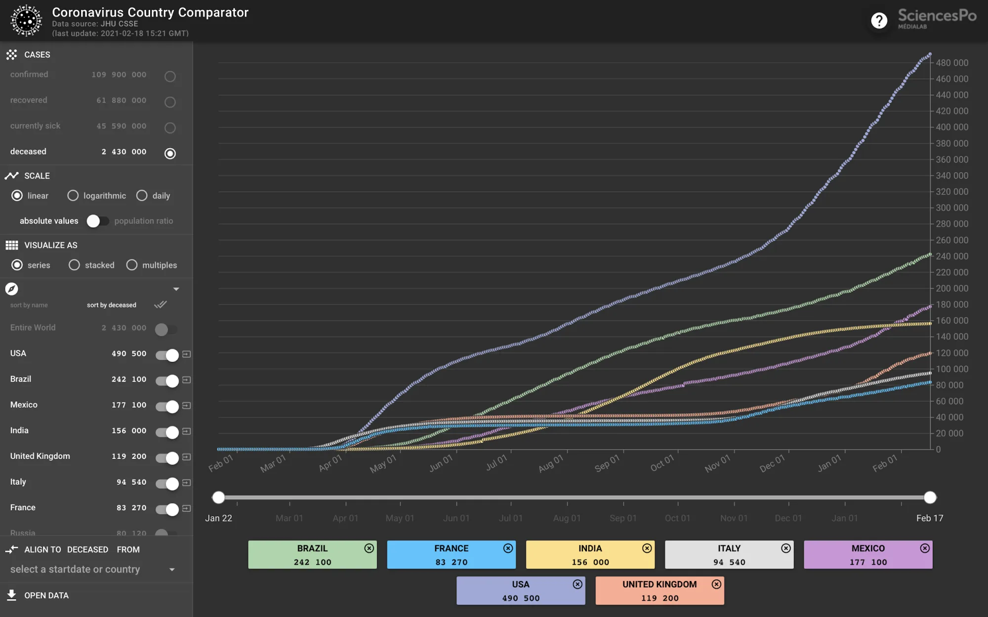
1. Analogy, the Coronavirus Country Comparator
A large group of COVID-19 data visualizations makes use of the analogy to compare the trends from different countries. The Coronavirus Country Comparator released by the Médialab of Sciences Po Paris represents a good example (Ooghe-Tabanou [2020] 2021). Entirely coded by Benjamin Ooghe-Tabanou, the data visualization relies on the dataset shared by Johns Hopkins University. The Coronavirus Country Comparator arranges in time series and small multiples four types of viral cases: confirmed, recovered, currently sick, and deceased; each case can be filtered by country and remodeled according to three different scales: linear, logarithmic, and daily. This set of functions allows the user to compare the impact of the outbreak by country, in some cases by state and region.
The Coronavirus Country Comparator represents one of the multiple examples in which the virus has been made visible for comparison. The difference of spread that can exist between countries has been carefully observed, for example, when Italy was struck by the coronavirus before the other European countries. The time series made visible the pattern that neighboring countries should have dealt with. In addition to this, users are driven to read the graph from a personal perspective by recognizing themselves in it (Rodighiero and Cellard 2019) to bring into immediate juxtaposition the wave of their own country compared to the others. This identification can cause a feeling of distress when one’s curve is worse than others and of relaxation when there is a visible improvement of healing.
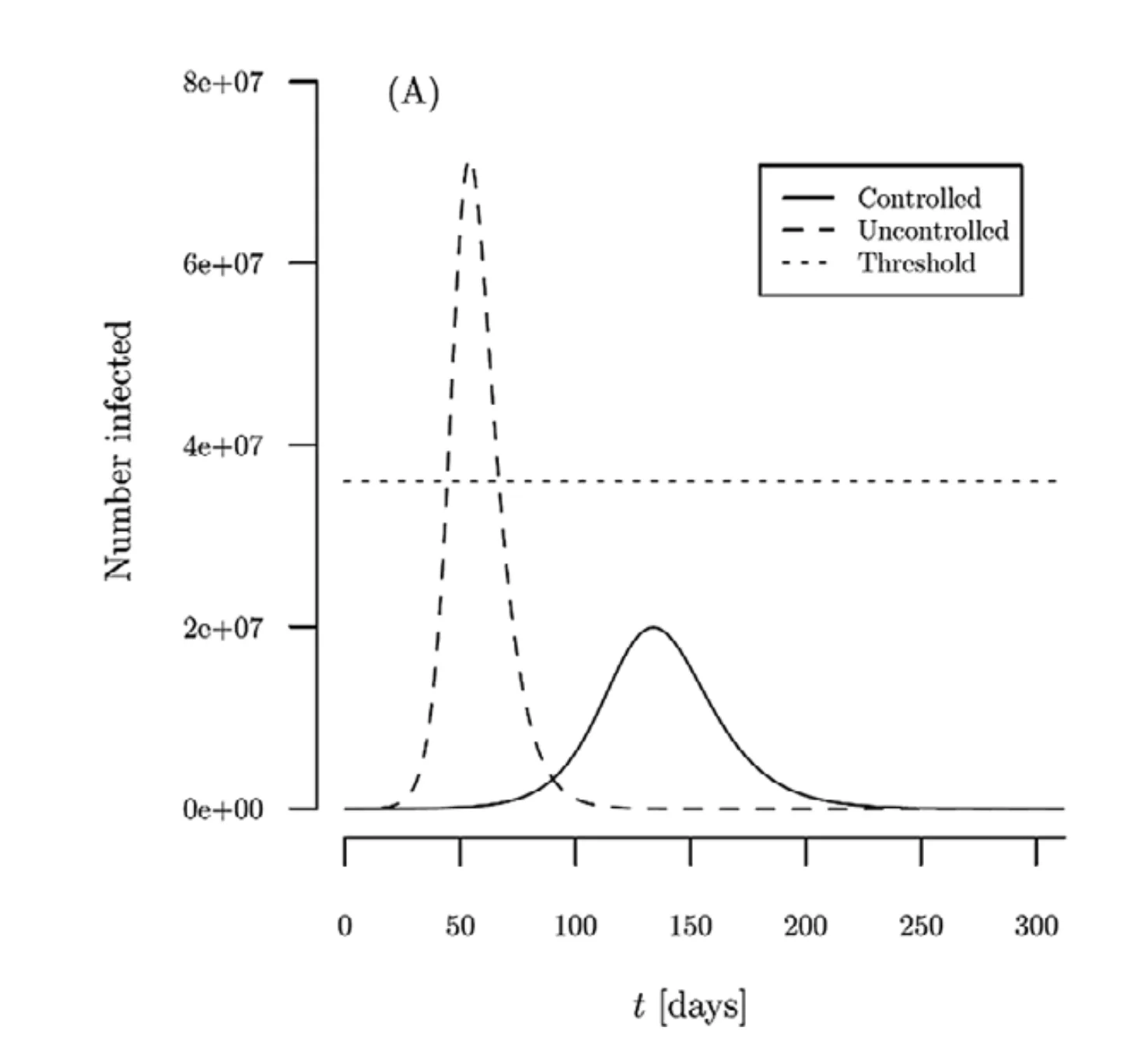
2. Performance, Flattening the Curve
Data visualizations that can be associated with performance are meant to be images capable of producing a reaction in the reader. The well-known mantra to “flatten the curve” has been widely employed to persuade people to pay serious attention to the coronavirus, including Dr. Anthony Fauci, director of the National Institute of Allergy, who stated clearly, “What we need to do is flatten that down” (Roberts 2020). The projection of coronavirus infections clearly shows the threshold beyond which hospitalization cannot be assured to everyone (Thunström et al. 2020). The mechanism of flattening the curve simply says that with social distancing, infections can be distributed in a longer period without overloading hospitals and clinics.
Even if the impact of this specific data visualization has never been verified, there is a good chance that its image is now part of the western culture in the very meaning given by W.J.T. Mitchell. In the book Image Science, Mitchell clearly states, “The picture is a material object, a thing you can burn or break or tear. An image is what appears in a picture, and what survives its destruction—in memory, in narrative, in copies and traces in other media.” (Mitchell 2015) In this sense, flattening the curve becomes part of our visual memory, going beyond the pictorial representation of a pandemic.
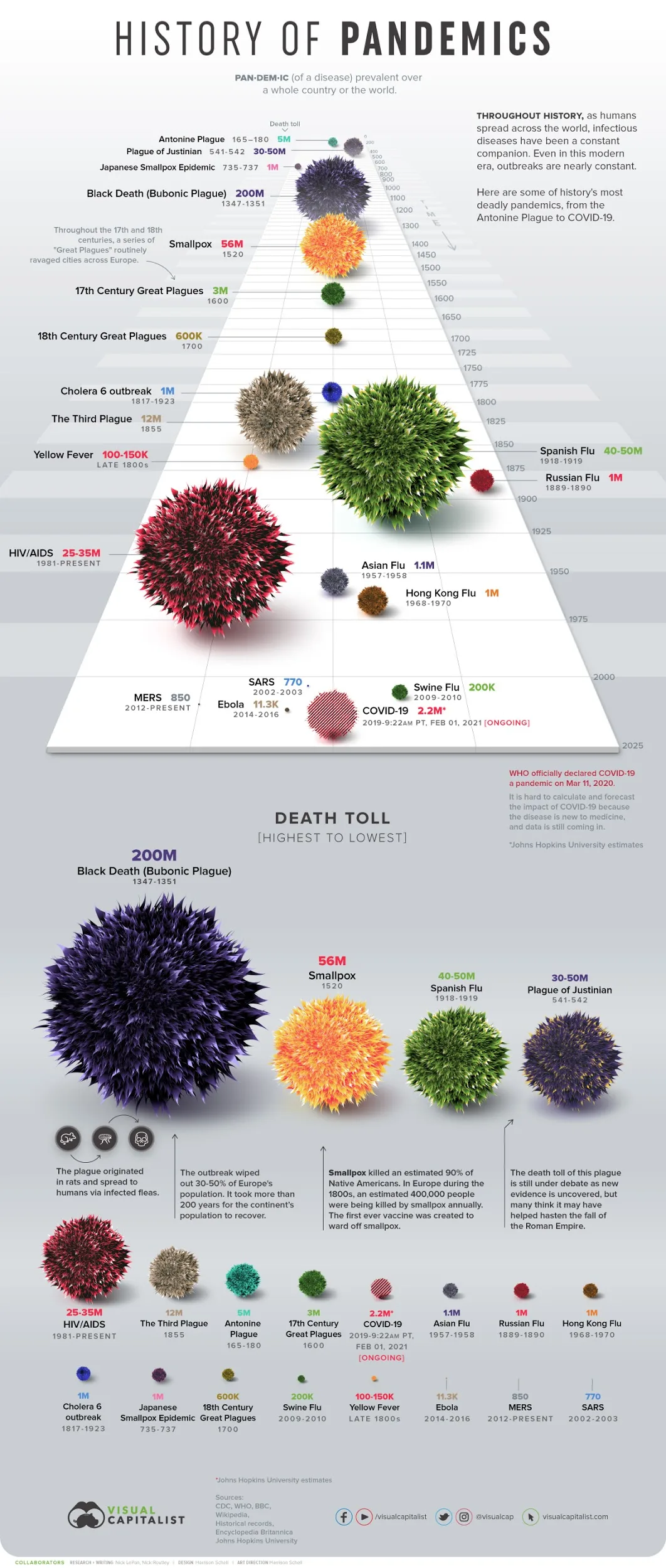
3. Memory, the History of Pandemics
Another type of data visualization that has been shared during the coronavirus pandemic is related to the past. One of the ways to understand the current pandemic is to compare it with the others that happened over the centuries through a timeline. The History of Pandemics (LePan 2020) illustrates a time-based comparison with previous pandemics in terms of the number of deaths. One immediately notes the disproportion between the current pandemic and the majors from the past: the most deadly recent pandemic is represented by the ongoing HIV crisis, and the highest death toll is associated with the Black Death that occurred in the fourteenth century. Respectively, they account for 25–35 and 200 million deaths, whose ratio is 10 and 100 times more than the coronavirus pandemic that counts 2,444,329 deaths on Friday, February 19, 2021 (Johns Hopkins University [2020] 2021).
The attitude of this data visualization can be considered positive, even the text makes clear the situation: while HIV is under control and rarely progresses to AIDS in many parts of the world, the coronavirus has not yet been stabilized, as we are facing an ever-changing situation. It is worth noting that the spherical representation of COVID-19 continues to be updated, making use of transparency to compare the initial value with the original publication dating back to mid-March 2020. Despite this observation, the mindset of the data visualization remains positive, especially considering that these values are absolute and not compared to the global population that has dramatically grown over the centuries, which makes the ratio of deaths much lower in the present.
4. Warning, Mapping the Viral Spread
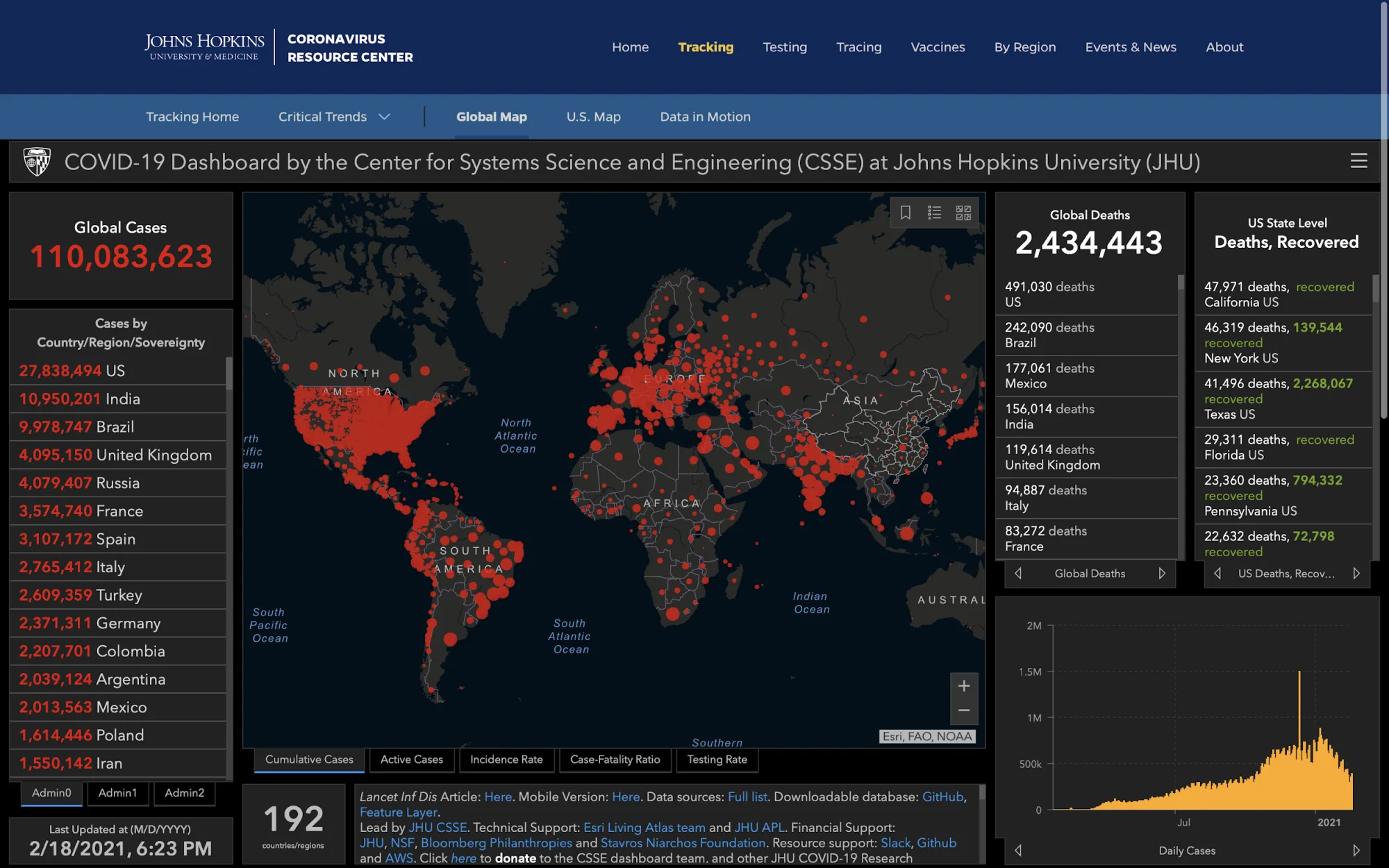
Without a doubt, Johns Hopkins University played a major role in visually mapping this pandemic. Its Center for Systems Science and Engineering created a dashboard to monitor the impact of the coronavirus (Dong, Du, and Gardner 2020), along with an information system capable of collecting data from all over the world (the already mentioned Coronavirus Country Comparator, for example, is based on this information system). The dashboard is composed of different panels hosting counters and rankings, showing global cases in red and global deaths in white. Yet the most visible and retained element of the dashboard is the world map that makes use of red dots to display the cumulative cases of infection (Johns Hopkins University [2020] 2021).
Although the popularity that this map gained during the pandemic, it is impossible not to compare it with the wall projections that appear in the control room of Dr. Strangelove (Kubrick 1964). Indeed, the Johns Hopkins University’s map recalls a style that belongs to the cold war, during which large screens were used to keep track of the ballistic trajectories of nuclear missiles. However, despite the stylistic choices, the map can be criticized on several counts from a data-visualization perspective. First, the whole view does not give any valuable insight as the overlapping of the circles makes reading impossible; seeing that the virus spreads all over the world does not represent a piece of relevant information for a pandemic. Second, there is no relation between one circle size and the number of inhabitants living in that area; when the United States was not divided into single states, the impact of the virus in North America seemed larger compared to the circles associated with European countries. Thinking of the map in these terms makes it appear as a sparkling object rather than an information platform. Red dots do not convey any specific information other than fostering a feeling of danger among their Internet surfers.
5. Awareness, Looking at the Evolution
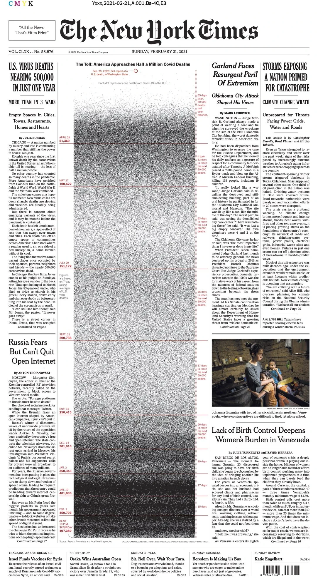
On Sunday, February 21, 2021, the front page of the New York Times hosted a chart showing the number of deaths due to COVID-19 through a timeline (Foley 2021). Such a chart makes use of the density to stress the gravity of the current wave, compared to the same period of the previous year. Each black dot represents a death, and the darker the timeline’s section, the more urgent the viral outbreak should seem. Horizontal red lines indicate the frequency of deaths, which has been set up to 50,000 units. It is clear that the US is facing an increase in deaths in February 2021; the New York Times makes the virus spread visible to their readers.
Unlike the History of Pandemics, this data visualization illustrates the virus spread in a shorter period, allowing readers to compare the two viral waves one year later. It is interesting to observe how the newspaper goes straight to the point, making the readers aware of the gravity of the situation. Compared to the Johns Hopkins University’s dashboard, whose point of view is timeless, the NY Times amplifies the local perception through a simple message: “Do you remember what you experienced last year? Well, the current situation is worse.” However, even though the seriousness of the situation cannot be silenced, referring to what readers experienced previously makes this data visualization graspable. Fears are generated by the invisible; making visible the invisible operations of the virus has a healing power, which is dramatically needed at this moment.
Making Visible the Invisible Work of Science
The COVID-19 virus is an infectious agent that is difficult to face because of its invisibility, which makes it impossible to understand with our own eyes alone whether an individual is infected or not (Shaw 2020). This limit of perception obliges us to practice the so-called social distancing, whose principle is to stay at a safe distance from anyone that can be potentially infected. However, our perception can be expanded by using electronic instruments that indicate the presence of the virus, such as termoscanners, swabs, or microscopes (Wise 2006). But the viral infection is not the only dimension that should be revealed to understand the complex situation created by the pandemic. There is, for instance, a social dimension that energetically revolves around the virus: plenty of specialists work without pause to solve the situation; doctors and health professionals are among them, along with politicians and scientists. This article draws attention to a specific class of these specialists, the scientists working on the COVID-19 virus, trying to make visible their effort through the visualization of scholarly articles.
In reaction to the pandemic, the White House and a federation of research groups created the CORD-19, an open research dataset aimed to collect all the scientific articles related to the COVID-19 virus (Wang et al. 2020). The dataset counts more than 400,000 scientific articles published in about fifty years of research, including all the works regarding the coronavirus that have been published before the discovery of COVID-19. These articles are composed of full texts when available, and standard metadata such as titles, authors, keywords, abstracts, identifiers, etc. This resource allows researchers to investigate the scientific research of COVID-19 through a homogeneous corpus of documents, which can be analyzed using natural language processing, a branch of artificial intelligence interested in the analysis of written language (Manning and Schütze 1999).
This dataset represented a unique opportunity to test the Lexical Cartography on a larger corpus of documents (Moon and Rodighiero 2020). Lexical Cartography is a data visualization designed to explore conferences from a linguistic perspective, making use of text analysis and network visualization. The visual method has been inspired by the Actor-network Theory created by Bruno Latour and Michel Callon (Callon and Latour 2017) who see society as a tangled network composed of relationships between human and non-human actors. With this respect, Lexical Cartography looks at the research environment like a network composed of scientists whose relationships are defined by the words they employ in writing. Words are therefore seen as non-human actors that define the similarity of scientists: the more two scientists share a common vocabulary, the greater their proximity in a spatial representation.
The high number of records allowed us to clean the CORD-19 dataset by excluding the articles without authors or DOI along with the articles that do not mention the string “COVID-19.” This selection reduced the analysis to nearly 34,000 articles signed by 190,000 authors, which is a reasonable number to run text analysis. The textual data coming from the selected articles are successively grouped by authors, excluding the authors that published fewer than five articles, circumscribing the selection to 3,297 authors. This second selection has been made necessary by the current constraints given by the CPU computation, which limit the number of visual elements that can be rendered simultaneously on the browser. Finally, the texts associated with each author have been analyzed using the TF-IDF algorithm, which returns the frequency of each word compared to the frequency of the entire corpus (Luhn 1957; Spärck Jones 1972). As a result, each author is associated with the list of the most relevant words that define his writing to the entire collection.
The network, first of all, is a relational dataset in which nodes are connected through links. In this specific context, nodes correspond to authors, and links represent shared words between them. Each author’s word comes with a value that represents its relevance, and the strength of a specific link is given by the total of all the values of the words two authors share. The result is a dataset composed of humans (speakers) and non-humans (words), which summarizes the most active scientists working on COVID-19 research along with their lexicon. The idea behind this data structure is that two authors are similar when they share the same dictionary, or they speak in the same way. Similar to the Actor-network Theory (Latour 2005), the human language becomes the metric that defines the distance between individuals, in science as well as in daily life. Also, inspired by the representational structure of Thomas Hobbes, it can be argued that individuals are represented by the words they employ, transforming language into a machine that regulates our social life.
The relational structure of nodes and links is successively translated into graphics (Rodighiero, Wandl-Vogt, and Carsenat 2022) using a very simple visual grammar composed of circles and lines. Network visualizations are powerful systems of simplification that organize nodes in a two-dimensional space according to a given set of forces of attraction and repulsion. They are usually employed in social analysis to spot behavioral patterns (Scott 2000) and in arts to represent the complexity of the world (Lima 2011). Despite the diversified use of network visualizations in different disciplines, their form is relatively standardized, even though some innovations have been introduced for large datasets. Some new approaches remove the links that create the background noise by adding categories on the side (Noichl 2019) or by transforming the overall layout into a heatmap (Venturini 2011). Likewise, lexical cartography is a visual method that aims to eliminate the noise from links, which are countless in the case of words, by replacing them with keywords situated in the hexagonal space between the nodes (Moon and Rodighiero 2020).
The development of the Cartography of COVID-19 began in 2020 from a collaboration between the Massachusetts Institute of Technology (MIT), the Austrian Academy of Sciences, and Namsor, under the intellectual umbrella of the knowledge-design laboratory Metalab (at) Harvard. The outcome is a data visualization visitable at https://rodighiero.github.io/COVID-19/, and an open-source code accessible at https://github.com/rodighiero/COVID-19 (Rodighiero, Wandl-Vogt, and Carsenat [2020] 2021). The work has been presented for the first time at Ars Electronica in September 2020 within the roundtable Garden of Knowledge for Humanity, organized by Eveline Wandl-Vogt.
At first sight, the Cartography of COVID-19 looks like a dense tag cloud (see Figure 6). All the visible words are shared between scientists in the hexagonal grid, which can be revealed later through zooming, enabling the identification of the most significant words in a triangular space whose edges are given by the authors’ position. At this distance, words are visualized in order of importance from the most relevant one, stressing the word’s relevance through the size of the font. Also, the words are situated on an elevation map with contours that indicate the densest areas, which represent those scientists that published more than others. The attention of readers is therefore captured by the peaks and words that drive the map’s interpretation. Figure 7 shows three examples that might draw the reader’s attention, identifying areas of research that investigate (a) viral spread in Italy, (b) feeling of anxiety caused by the lockdown, and (c) issues of transmitting the virus in childbirth.
![Figure 6. The Cartography of COVID-19 (Rodighiero, Wandl-Vogt, and Carsenat [2020] 2021) represents the most active scientists working on coronavirus pandemic research. Their arrangement is based on lexical similarity: the more two scientists are close, the more the language employed in their articles is similar. The network invites zooming in a specific area, which attracts readers through their keywords. The elevation contours show the density of scientific articles, inviting readers to zoom to the most prolific writers. The data visualization is available on the Internet at https://rodighiero.github.io/COVID-19/.](/images/making-visible-the-invisible-work-of-scientists-during-the-covid-19-pandemic/fig_006.webp)
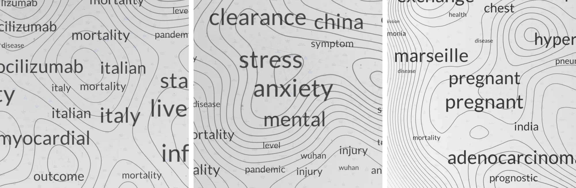
When zooming, words and contours leave room for another information layer that fades in with authors and a more exhaustive terminology. Looking at Figure 8, it is now visible how nodes are arranged according to a hexagonal pattern, allowing for a regular space that can host the words. The three most relevant keywords are displayed in the center of each triangle delimited by three scientists so that a semantic background integrates the network. By looking at the area related to viral spread in Italy (see Figure 3), the terms listed are “death,” “italy,” and “mortality.” Also, a side panel appearing in the web interface gives further words associated with individual scientists; among them, “transplantation,” “cardiology,” and “biomarker.”
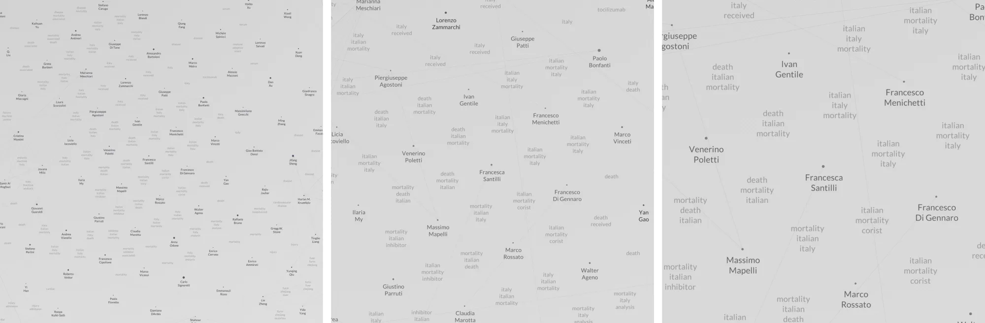
Looking in detail at the Cartography of COVID-19, we realize how a scientific community is composed of clusters that work together on different subjects. The web-based data visualization allows users to interact with some elements, as is the case of the nodes. Selecting a node with the mouse highlights the co-authors, and makes visible the extension of a certain scientific community. Furthermore, individual information is enriched by data about ethnicity for a deeper look into the diaspora (Brubaker 2005). These data are generated through the NamSor algorithm whose accuracy ranges between 85% and 95%; a higher precision is impossible as the CORD-19 dataset does not provide information such as the country of origin nor the affiliation to the institution. Although the algorithm is not entirely accurate and might introduce potential bias and errors, the data visualization makes use of aggregate data to preserve the privacy of each individual.
All the information displayed is not analyzed using statistical methods, as the Cartography of COVID-19 aims to be an exploratory tool and not an instrument of evaluation. However, two insights strike the eye just by browsing around: (a) despite the virus is not confined to China anymore, about half of the scientists displayed in the data visualization are Chinese, which underlines how this country has been struck by the infection; and (b) despite science relying on a global network of scientists, often the research is local: the cluster regarding the viral spread in Italy is mostly composed by Italians; more rarely it happens to find international profiles such Alessandro Vespignani one, whose research network covers a wide variety of ethnicities probably due to his international experience.
Conclusion
Data visualization is a powerful resource not only for scholars and scientists, but also for newspapers, governments, and organizations to convey a message more directly and broadly. However, this channel requires attention from both the receiver and the sender. Receivers have to understand that data visualization can be misleading when poorly used, and they have to develop the appropriate critical skills for a proper interpretation. On the other hand, senders have to be as honest as possible in using data visualizations as their message can be easily misinterpreted.
Reflecting on how the virus has been made visible in the past year, it is particularly valuable to consider how citizens have been invited to maintain social distancing by using a visual. The necessity of flattening the curve has been extensively shared through TV broadcasts, newspapers, and social networks with the images of overcrowded hospitals. This global perception of the visual circulating on the communication channels was associated with the local perception of nearby hospitals operating at the very limit, inviting readers to take action.
Also, the example given by the History of Pandemics was instructive. It helps us to realize that our present state of health is much better compared to the past, meaning that the ratio of individuals in danger of death is much lower than the previous pandemics. Furthermore, the effort of keeping the data visualization updated over time is notable because it would be misleading otherwise.
Visual instruments such as the Coronavirus Country Comparator are more difficult to understand for the general public and their use can generate distress in the wrong context. For example, absolute values make large countries like the United States appear more affected than Europe, while the population ratio reveals that Italy and the United Kingdom are experiencing worse conditions compared to the US. Furthermore, data visualizations like the Coronavirus Country Comparator rely on external datasets, which are based on information provided by countries with different criteria. Two good examples of how these criteria can differ are represented by the overcounting controversy of Belgian deaths (Lee 2020) and the higher coronavirus death toll of Lombardy (Zampano 2020). A more ideal condition to interpret data visualizations is to carefully consider all the steps that contribute to their creation, including data and design process.
In this sense, the data visualization that appeared on the front page of the New York Times is a good example (Foley 2021). Criticisms like the one made by Francis Gagnon can result offensive out of a formal debate (Gagnon 2021). Saying that representing one death with one dot is unmoral, it would be like to blame John Snow for plotting the cholera cases (Tufte 2001). The New York Times aimed to point out the increasing frequency of deaths in the United States through a data visualization capable of visualizing the size of the pandemic. Furthermore, it is arguably unfounded to comment on the severity of the pandemic to the newspaper of one of the most affected areas in the world.
Making visible the impact of the pandemic was also the purpose of the Johns Hopkins University’s dashboard, whose map represents one of the most widespread images of the COVID-19 virus. But what is the information that this map brings to the reader? When the viral spread was still circumscribed to some regions, the map was meaningful because both North and South Americas had not yet been infected. However, when the epidemic broke out into a pandemic, the map was not useful anymore; having red dots all over the world adds a sense of fear in the reader without providing any valuable insight. Furthermore, the current map represents absolute values of deaths, which means that the map will show a pandemic vision of the world even when the disease is eradicated by the vaccine. Again, even though Johns Hopkins University’s contribution to the pandemic has been significant, the university should also consider the impact of its images in the collective culture; when misunderstood, the scientific pictures can be seen as images of terror (Mitchell 2010).
The Cartography of COVID-19 situates itself among this landscape of data visualizations. The idea behind this visual method, which was initially conceived to map conference speakers, is to display all the individuals that are part of a scientific community. With the CORD-19 dataset, the data visualization has been applied to a larger community to represent the scientists who are struggling to find a solution for the COVID-19 pandemic. The first goal of the Cartography of COVID-19 was to give a name to those scientists who work on the pandemic that is currently affecting the world. Successively, the integration of information concerning scientists’ ethnicity was meant to be a way to look at how different countries are working towards a unique goal. It is important to know that the United States, China, Europe, and all the other countries are working at a global scale to return to normal life. This information is too often forgotten, and the cartography is intended to give some recognition to a category of people whose work is often hidden.
The cartography of COVID-19 is an ongoing project, which will find a new form during 2021. Besides being regularly updated with new releases of the CORD-19 dataset, a collaboration with the Austrian cultural, educational, and scientific institute Ars Electronica has been established to bring the cartography in a new form. One of the current limits of the cartography of COVID-19 is given by the programming language: even though JavaScript enabled accessibility through the Internet, the Unity environment will allow us to draw every single scientist in a star map. Indeed, the current version of the map can represent only around 5,000 scientists out of 190,000. Unity is a language for video games and a three-dimensional environment that allows for higher performance. Furthermore, this upgrade will allow room for different devices such as smartphones or immersive environments like the Deep Space 8K, a multifunctional presentation room in which twelve projectors compose a dynamic image with dimensions of 16:9 meters by projecting on both the floor and the wall (Ars Electronica 2021).
Among many data visualizations that are scaring the world, the cartography of COVID-19 is intended to give a positive message by showing the scientists working to end the pandemic. Looking at how data and their visual representation are increasingly used by the media, it is important to develop visual literacy for properly reading visual information. As society has been shaped first by writing and later by coding, it is now the time to develop a new literacy that may encompass the later generations. Developing such knowledge is extremely important to understand all these phenomena that are not visible to our own eyes and pass through several transformations before being readable. The current pandemic is an opportunity to develop such expertise and scholars from all over the world can contribute to improving the interpretation of the visualization of data, including those belonging to visual cultural studies.
References
- Anderson, Chris. 2008. “The End of Theory: The Data Deluge Makes the Scientific Method Obsolete.” Wired, June 23. wired.com/2008/06/pb-theory.
- Ars Electronica Futurelab. 2021. “Deep Space 8K.” Ars Electronica. ars.electronica.art/futurelab/en/projects-deep-space-8k.
- Bentham, Jeremy. 1995. The Panopticon Writings. Edited by Miran Božovič. London: Verso.
- Brubaker, Rogers. 2005. “The ‘Diaspora’ Diaspora.” Ethnic and Racial Studies 28 (1): 1–19. doi:10/c2zt6r.
- Callon, Michel, and Bruno Latour. 2017. “Unscrewing the Big Leviathan: How Actors Macro-Structure Reality and How Sociologists Help Them to Do So.” In Advances in Social Theory and Methodology: Toward an Integration of Micro- and Macro-Sociologies, edited by Karin Knorr-Cetina and Aaron Victor Cicourel, 277–303. Abingdon: Routledge.
- Card, Stuart K., Jock D. Mackinlay, and Ben Shneiderman. 1999. Readings in Information Visualization: Using Vision to Think. The Morgan Kaufmann Series in Interactive Technologies. San Francisco: Morgan Kaufmann Publishers.
- Casey, Edward S. 2002. Representing Place: Landscape Painting and Maps. Minneapolis: University of Minnesota Press.
- Cinelli, Matteo, Walter Quattrociocchi, Alessandro Galeazzi, et al. 2020. “The COVID-19 Social Media Infodemic.” Scientific Reports 10 (1): 16598. doi:10/ghhx8d.
- Colombo, Sara, and Paolo Ciuccarelli. 2020. “Design for Emergency: An Open Design Platform to Face Emerging Issues, Together.” Design for Emergency. designforemergency.org.
- De Gaetano, Roberto, and Angela Maiello, eds. 2020. Virale: Il presente al tempo dell’epidemia. Cosenza: Pellegrini Editore.
- Dinoi, Marco. 2008. Lo sguardo e l’evento: i media, la memoria, il cinema. Firenze: Le Lettere.
- Dondis, Donis A. (1973) 1975. A Primer of Visual Literacy. Cambridge, MA: MIT Press.
- Dong, Ensheng, Hongru Du, and Lauren Gardner. 2020. “An Interactive Web-Based Dashboard to Track COVID-19 in Real Time.” The Lancet Infectious Diseases 20 (5): 533–34. doi:10/ggnsjk.
- Dur, Banu İnanç Uyan. 2014. “Data Visualization and Infographics in Visual Communication Design Education at the Age of Information.” Journal of Arts and Humanities 3 (5).
- Foley, Becca. 2021. “Becca Foley on Twitter.” Twitter, February 21. twitter.com/beccapfoley/status/1363338950518206472.
- Gagnon, Francis. 2021. “Voilà: Francis Gagnon on Twitter.” Twitter, February 21. twitter.com/chezVoila/status/1363530540092186627.
- Giaccardi, Chiara, Jérôme Bourdon, Nico Carpentier, et al. 2020. “Learning from the Virus: The Impact of the Pandemic on Communication, Media and Performing Arts Disciplinary Fields. A Round-Table.” Comunicazioni Sociali, no. 2: 157–69. doi:10/ghqvkd.
- Goody, Jack. 1973. “Evolution and Communication: The Domestication of the Savage Mind.” The British Journal of Sociology 24 (1): 1. doi:10/bkrfgs.
- Guichard, Eric. 2018. “Linux.” In Abécédaire des mondes lettrés.
- Hand, D. J. 2008. Statistics: A Very Short Introduction. Very Short Introductions 196. Oxford: Oxford University Press.
- Hobbs, Robert Carleton. 2004. Mark Lombardi: Global Networks. New York: Independent Curators International.
- Horowitz, Jason, and Fabio Bucciarelli. 2020. “The Lost Days That Made Bergamo a Coronavirus Tragedy.” The New York Times, November 29. nytimes.com/2020/11/29/world/europe/coronavirus-bergamo-italy.html.
- Johns Hopkins University. (2020) 2021. “Johns Hopkins Coronavirus Resource Center.” coronavirus.jhu.edu.
- Jones, David S., and Stefan Helmreich. 2020. “The Shape of Epidemics.” Boston Review, June 26. bostonreview.net/science-nature/david-s-jones-stefan-helmreich-shape-epidemics.
- Keidl, Philipp Dominik, Laliv Melamed, Vinzenz Hediger, and Antonio Somaini. 2020. Pandemic Media: Preliminary Notes toward an Inventory. Lüneburg: Meson Press.
- Kubrick, Stanley, dir. 1964. Dr. Strangelove or: How I Learned to Stop Worrying and Love the Bomb. Columbia Pictures.
- Lanciano, Tiziana, Giusi Graziano, Antonietta Curci, et al. 2020. “Risk Perceptions and Psychological Effects During the Italian COVID-19 Emergency.” Frontiers in Psychology 11: 580053. doi:10/gh2dz2.
- Lancioni, Tarcisio. 2020. E inseguiremo ancora unicorni: alterità immaginate e dinamiche culturali. Insegne 26. Milano: Mimesis.
- Latour, Bruno. 2005. Reassembling the Social: An Introduction to Actor-Network-Theory. Clarendon Lectures in Management Studies. Oxford: Oxford University Press.
- ———. 2017. Où atterrir? Comment s’orienter en politique. Paris: La Découverte.
- ———. 2020. “Immaginare gesti-barriera contro il ritorno alla produzione pre-crisi.” Translated by Daniele Guido, Donato Ricci, Dario Rodighiero, and Giulia Taurino. Antinomie: Scritture e Immagini, April 9. antinomie.it/index.php/2020/04/09/immaginare-gesti-barriera-contro-il-ritorno-alla-produzione-pre-crisi.
- Lazer, David M. J., Alex Pentland, Duncan J. Watts, et al. 2020. “Computational Social Science: Obstacles and Opportunities.” Science 369 (6507): 1060–62. doi:10/ghg7nj.
- Lee, Crystal, Tanya Yang, Gabrielle Inchoco, et al. 2021. “Viral Visualizations: How Coronavirus Skeptics Use Orthodox Data Practices to Promote Unorthodox Science Online.” arXiv:2101.07993, January 20. doi:10.1145/3411764.3445211.
- Lee, Gavin. 2020. “Coronavirus: Why so Many People Are Dying in Belgium.” BBC News, May 2. bbc.com/news/world-europe-52491210.
- LePan, Nicholas. 2020. “Visualizing the History of Pandemics.” Visual Capitalist, March 14. visualcapitalist.com/history-of-pandemics-deadliest.
- Lima, Manuel. 2011. Visual Complexity: Mapping Patterns of Information. New York: Princeton Architectural Press.
- Lorusso, Anna Maria, Gianfranco Marrone, and Stefano Jacoviello. 2020. Diario semiotico sul coronavirus. Associazione Italiana Studi Semiotici.
- Luhn, Hans Peter. 1957. “A Statistical Approach to Mechanized Encoding and Searching of Literary Information.” IBM Journal of Research and Development 1 (4): 309–17. doi:10/ds9qfr.
- Lynch, Michael. 1988. “The Externalized Retina: Selection and Mathematization in the Visual Documentation of Objects in the Life Sciences.” Human Studies 11 (2/3): 201–34. jstor.org/stable/20009026.
- Manning, Christopher D., and Hinrich Schütze. 1999. Foundations of Statistical Natural Language Processing. Cambridge, MA: MIT Press.
- McLuhan, Marshall. 1994. Understanding Media: The Extensions of Man. Cambridge, MA: MIT Press.
- Mitchell, W. J. T. 2010. Cloning Terror: The War of Images, 9/11 to the Present. Chicago: University of Chicago Press.
- ———. 2015. Image Science: Iconology, Visual Culture, and Media Aesthetics. Chicago: University of Chicago Press.
- Moon, Chloe Ye Eun, and Dario Rodighiero. 2020. “Mapping as a Contemporary Instrument for Orientation in Conferences.” In Atti del IX Convegno Annuale AIUCD. La svolta inevitabile: sfide e prospettive per l’informatica umanistica. Zenodo. doi:10.5281/zenodo.3611340.
- Noichl, Maximilian. 2019. “Modeling the Structure of Recent Philosophy.” Synthese, October 26. doi:10/ghp7f4.
- Ooghe-Tabanou, Benjamin. (2020) 2021. Boogheta/Coronavirus-Countries. JavaScript. github.com/boogheta/coronavirus-countries.
- Roberts, Siobhan. 2020. “Flattening the Coronavirus Curve.” The New York Times, March 27. nytimes.com/article/flatten-curve-coronavirus.html.
- Rodighiero, Dario, and Loup Cellard. 2019. “Self-Recognition in Data Visualization.” EspacesTemps.net: Electronic Journal of Humanities and Social Sciences, August 8. doi:10/ghmsrc.
- Rodighiero, Dario, Eveline Wandl-Vogt, and Elian Carsenat. (2020) 2021. Cartography of COVID-19. JavaScript. doi:10.5281/zenodo.3940636.
- ———. 2022. “A Visual Translation of the Pandemic.” Leonardo 55 (3): 297–303. doi:10.1162/leon_a_02203.
- Scaglioni, Massimo, and Marianna Sala, eds. 2020. L’altro virus: comunicazione e disinformazione al tempo del Covid-19. Milano: Vita e Pensiero.
- Scherlis, Lily. 2020. “Distantiated Communities.” Cabinet Magazine, April 30. cabinetmagazine.org/kiosk/scherlis_lily_30_april_2020.php.
- Scott, John. (1991) 2000. Social Network Analysis: A Handbook. 2nd ed. London: SAGE Publications.
- Shaw, D. M. 2020. “Invisible Enemies: Coronavirus and Other Hidden Threats.” Journal of Bioethical Inquiry 17 (4): 531–34. doi:10/gh4d26.
- Spärck Jones, Karen. 1972. “A Statistical Interpretation of Term Specificity and Its Application in Retrieval.” Journal of Documentation 28 (1): 11–21. doi:10/fjhg7g.
- The New York Times. 2020. “2020: The Year in Visual Stories and Graphics.” The New York Times, December 30. nytimes.com/interactive/2020/12/30/us/2020-year-in-graphics.html.
- Thunström, Linda, Stephen C. Newbold, David Finnoff, et al. 2020. “The Benefits and Costs of Using Social Distancing to Flatten the Curve for COVID-19.” Journal of Benefit-Cost Analysis 11 (2): 179–95. doi:10/ggwj48.
- Tufte, Edward R. 1990. Envisioning Information. Cheshire, CT: Graphics Press.
- ———. 1997. Visual Explanations: Images and Quantities, Evidence and Narrative. Cheshire, CT: Graphics Press.
- ———. 2001. The Visual Display of Quantitative Information. Cheshire, CT: Graphics Press.
- ———. 2006. Beautiful Evidence. Cheshire, CT: Graphics Press.
- Unwin, Anthony. 2020. “Why Is Data Visualization Important? What Is Important in Data Visualization?” Harvard Data Science Review, January 31. doi:10/ggjvhr.
- Venturini, Tommaso. 2011. “What Is Second-Degree Objectivity and How Could It Be Represented.” medialab.sciencespo.fr/publications/Venturini-Second_Degree_Objectivity_draft1.pdf.
- Wang, Lucy Lu, Kyle Lo, Yoganand Chandrasekhar, et al. 2020. “CORD-19: The COVID-19 Open Research Dataset.” In Proceedings of the Workshop on NLP for COVID-19 at ACL 2020. Association for Computational Linguistics. arxiv.org/abs/2004.10706.
- Wise, M. Norton. 2006. “Making Visible.” Isis 97 (1): 75–82. doi:10/cn9m9f.
- Wurman, Richard Saul. 2001. Information Anxiety 2. Indianapolis, IN: Que.
- Zampano, Giada. 2020. “Italy’s Coronavirus Death Toll Could Be 19,000 Higher than Official Total, According to Experts.” The Telegraph, May 22. telegraph.co.uk/news/2020/05/22/italys-coronavirus-death-toll-could-19000-higher-official-total.