Surprise Machines: Revealing Harvard Art Museums’ Image Collection
@article{rodighiero2022surprise,
  author      = {Dario Rodighiero and Lins Derry and Douglas Duhaime and Jordan Kruguer and Maximilian C. Mueller and Christopher Pietsch and Jeffrey T. Schnapp and Jeff Steward and metaLAB.},
  title       = {Surprise Machines: Revealing Harvard Art Museums’ Image Collection},
  journal     = {Information Design Journal},
  year        = {2022},
  doi         = {10.1075/idj.22013.rod}
}
Surprise Machines is a project of experimental museology that sets out to visualize the entire image collection of the Harvard Art Museums, intending to open up unexpected vistas on more than 200,000 objects usually inaccessible to visitors. Part of the exhibition Curatorial A(i)gents organized by metaLAB (at) Harvard, the project explores the limits of artificial intelligence to display a large set of images and create surprise among visitors. To achieve such a feeling of surprise, a choreographic interface was designed to connect the audience’s movement with several unique views of the collection.
Introduction
Although “the humanities so far has focused on literary texts, historical text records, and spatial data,” as stated by Lev Manovich in Cultural Analytics (Manovich 2020, 10), the recent advancements in artificial intelligence are driving more attention to other media. For example, disciplines such as digital humanities now embrace more diverse types of corpora (Champion 2016). Yet this shift of attention is also visible in museums, which recently took a step forward by establishing the field of experimental museology (Kenderdine et al. 2021).
This article illustrates the visualization of an extensive image collection through digital means. Following a growing interest in the digital mapping of images – proved by the various scientific articles published on the subject (Bludau et al. 2021; Crockett 2019; Seguin 2018), Ph.D. theses (Kräutli 2016; Vane 2019), software (American Museum of Natural History [2020] 2022; Diagne et al. 2018; Pietsch [2018] 2022), and presentations (Benedetti 2022; Klinke 2021) – this text describes an interdisciplinary experiment at the intersection of information design, experimental museology, and cultural analytics.
Surprise Machines is a data visualization that maps more than 200,000 digital images of the Harvard Art Museums (HAM) and a digital installation for museum visitors to understand the collection’s vastness. Part of a temporary exhibition organized by metaLAB (at) Harvard and entitled Curatorial A(i)gents, Surprise Machines is enriched by a choreographic interface that allows visitors to interact with the visualization through a camera capturing body gestures. The project is unique for its interdisciplinarity, looking at the prestigious collection of Harvard University through cutting-edge techniques of AI.
The text structure illustrates to the reader the museum and its collection, the curatorship philosophy behind the exhibition, the technical solutions adopted for the visualization, the software for touchless interaction, and how the team coped with technical drawbacks.
Harvard Art Museums
The story of the Harvard Art Museums starts in 1891 with a generous donation by Mrs. Elizabeth Fogg to establish an art museum in memory of her husband, William Hayes. A few years later, the architect Richard Morris Hunt built the Fogg Art Museum at the heart of Harvard University, which witnessed its opening to the public in 1895. On its hundredth anniversary, Director James Cuno describes the rapid growth of art collections by reporting that “more than 450 new art museums were built and more than 100 existing museums added over ten million square feet of new space” (Cuno 1996). Cuno also writes that Harvard University was not an exception, raising new spaces for the Arthur M. Sackler Museum and the Busch-Reisinger Museum to host an extensive collection of 150,000 works. This collection is now part of the Harvard Art Museums, which integrated the three museums into a unique institution in 1983.
Since the publication of James Cuno’s volume in 1996, Harvard Art Museums has exceeded the number of 200,000 works. Although the several extensions of the landmark Fogg building, the collection’s continuous growth led to a complete restoration, completed in 2014 by the architect Renzo Piano. After the demolition of post-1925 expansions, an entirely new section facing Prescott Street integrated the original building of Quincy Street. In addition, a new glass rooftop structure brought natural light into the galleries, the laboratories, and the original courtyard in Travertine marble (Jodidio 2014).
Around the same time, the digital turn entered the world of museums favoring archival work but also a further expansion of archival capacity. Haidy Geismar describes this transformation through the term contact zone, “where old museum collections and new technologies come together, tracing the translation and extension of collections from card catalogues, storerooms and display cases into digital websites, imaging platforms and collection management systems” (Geismar 2018). In this twist, the Harvard Art Museums created an information system that counts almost 240,000 digital objects, composed of high-resolution images and metadata containing titles, descriptions, attributions, dates, classifications, credits, authors, subjects, media, dimensions, and provenances. All these objects are publicly accessible online (Harvard Art Museums 2012) through the International Image Interoperability Framework (IIIF), which provides a web protocol for image and metadata delivery (Snydman et al. 2015).
In the Harvard Art Museums, the contact zone between physical and digital collections materializes in the multimedia space called Lightbox Gallery. Situated on the top floor, the gallery receives its name from the diffused light that comes from the glass rooftop structure. Conceived by metaLAB and HAM to bring visitors digitally in contact with the collection, the gallery features a large wall screen composed of nine interconnected monitors. As stated on the HAM website, “The Lightbox Gallery is a venue for digital experimentation – a space for projects that respond to museums’ collections through new media and emerging technologies.” This definition perfectly fits the domain of experimental museology in which immersive visualization and cultural data are crucial today (Kenderdine et al. 2021).
Can Machines Curate?
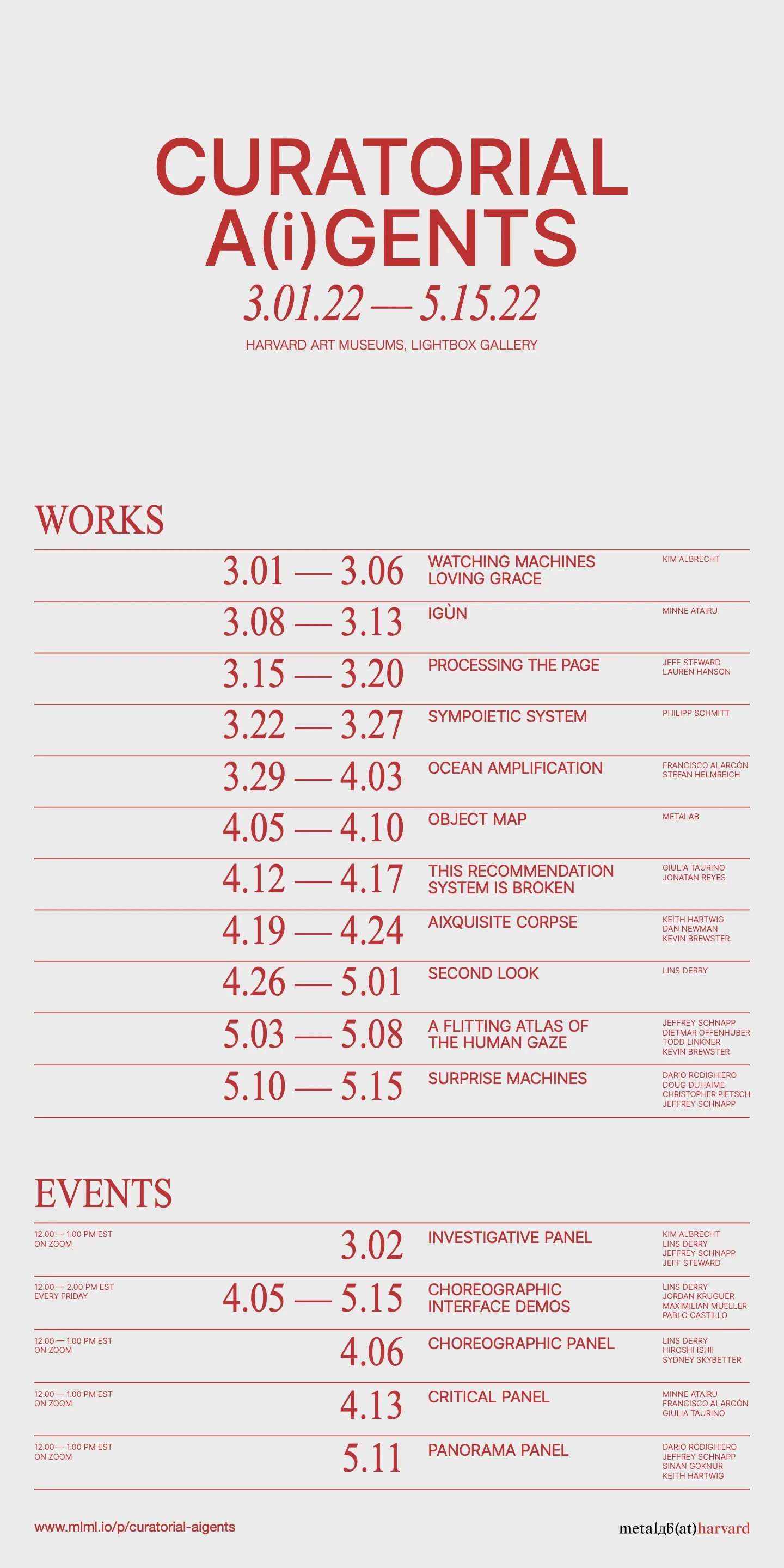
The Curatorial A(i)gents exhibition took place at the Harvard Art Museums in spring 2022; the poster in Figure 1 shows the richness of the exhibition’s program. The exhibition presented a series of machine-learning digital installations by metaLAB (at) Harvard, a laboratory described as “an experimental platform that seeks to model new forms of cultural communication, creative practice, and scientific knowledge production” (Birkle and Däwes 2019, 112; metaLAB 2022). The curatorial philosophy of the exhibition appeared in a pamphlet edited by Mike Maizels and designed by Chelsea Qiu, which collects short essays by authors and guests (Maizels and Qiu 2020). In his article entitled iQueries, the metaLAB founder Jeffrey Schnapp discloses the meaning of Curatorial A(i)gents. He alludes to the curator as the figure “who serves as a relay between museum collections and museum programming,” in combination with the neologism a(i)gent, “as the mark of an encroachment on a terrain […] now carried out via the forms of […] ‘artificial intelligence’” (Maizels and Qiu 2020). Then Schnapp gets to the heart of the matter by formulating the question: can machines replace human curators? The provocative approach usually employed to point out digital inequalities (DiMaggio and Hargittai 2001) and technology biases (Crawford and Paglen 2019) is here shifted to investigate innovative curatorial practices through AI techniques.
Surprise Machines owes its name to Alan Turing’s imitation game, described in the pioneering article “Computing Machinery and Intelligence” (Turing 1950). Can machines think? Turing answered using an experiment in which an examiner tries to distinguish between humans and machines while communicating via a typewriter; the machine is understood as engaged in thought when the responses appear indistinguishable. In the article, Turing develops an argument about AI from multiple perspectives, one of which was inspired by the mathematician Ada Lovelace (McCully 2019). When Lovelace argued that machines are incapable of thought due to their inability to take us by surprise, Turing countered by stating that machines are a frequent source of astonishment due to their unpredictable behavior – thereby generating surprises.
Surprise Machines thus aims to surprise visitors by showing them about 213,000 digitized images from the Harvard Art Museums’ collection (a number that is slightly smaller than the entire collection as not all the objects went through digitalization). On the one hand, visitors are amazed by the size of the collection; on the other hand, they are astonished by the small number of objects showcased in the HAM building (a quick estimate from the website proves that less than one percent of the objects have been made visible to visitors over the years). In addition, an experienced eye may be surprised by more specific cues, such as the considerable number of Bauhaus drawings or the unique assortments of powdered pigments.
How to Map 200,000 Images
From the very first moment, there was no doubt that Curatorial A(i)gents needed one project to reveal the entirety of the HAM collection. As Norman Foster’s glass-domed Reichstag plays with the analogy of political transparency (Foster 2011), we imagined Renzo Piano’s glass rooftop structure as the way to shed light on the HAM collection by using data visualization.
Data visualization is a computational and design practice aimed at revealing insights by translating tabular data into visual information. In a recent interview, Manuel Lima articulates the translation process through Nathan Shedroff’s diagram (Rodighiero 2021b). Yet this process is more technically and intellectually challenging when the dataset’s richness has to be represented in its integrity, introducing a high level of complexity in the visual outcome. Lima is probably among the first authors to tackle this subject by creating an archive of network visualizations. Ten years after the publication of Visual Complexity (Lima 2011), the landscape of network visualization has changed considerably thanks to scientists such as Albert-László Barabási (Barabási et al. 2020) who has played a central role in retracing the epistemic trajectory of complexity (Weaver 1948). Among new algorithms, the replacement of force-oriented layouts (Bostock et al. 2011; Jacomy et al. 2014) with dimensionality reduction (Maaten and Hinton 2008; McInnes et al. 2018) is key to handling larger relational datasets. The complexity of mapping extensive collections of images stems from the problem of computing and interacting with a considerable number of elements simultaneously.
For Surprise Machines, a local dataset of images was created by downloading the IIIF manifests and their files. This operation was possible through the Application Programming Interface served by the Harvard Art Museums (Steward [2015] 2021), which provided about 213,000 JSON and JPG files by taking up 50 GB of disk space. Unfortunately, the first attempt to compute lexical metrics from text annotations was proved unsuccessful for two reasons: on the one hand, the high number of elements undermined the computation time of the force-directed graph layout (Bostock et al. 2011); on the other hand, many objects poorly annotated were unconnected to the network visualization. Although this method previously led to promising results (Moon and Rodighiero 2020; Rodighiero 2021a; Rodighiero et al. 2021, 2022), this was not the case. The solution came through a computational study of Aby Warburg’s Atlas Mnemosyne (Impett and Moretti 2017), which led to a collaboration with the Yale University Digital Humanities Laboratory (DHLAB).
The Yale University DHLAB supports scholars interested in digital methods. Among the digital tools provided by the library unit, the PixPlot tool was a significant breakthrough for Surprise Machines. PixPlot is a software composed of two parts, one in Python for processing and one in JavaScript for displaying (Duhaime [2017] 2021). Python code initially processes a set of bitmap images with Inception Convolutional Neural Network (O’Shea and Nash 2015) trained on ImageNet 2012 (Russakovsky et al. 2015). This code transforms JPG files into vectors consisting of numbers. These numbers are successively computed using a technique of dimensionality reduction called UMAP (McInnes et al. 2018) to create a metric of image similarity. This algorithm returns a list of two-dimensional coordinates through a process that may seem opaque to many but that can be explained (Karjus et al. 2022). Finally, JavaScript code creates a web-based, zoomable interface that employs WebGL to speed up the rendering (Danchilla 2012).
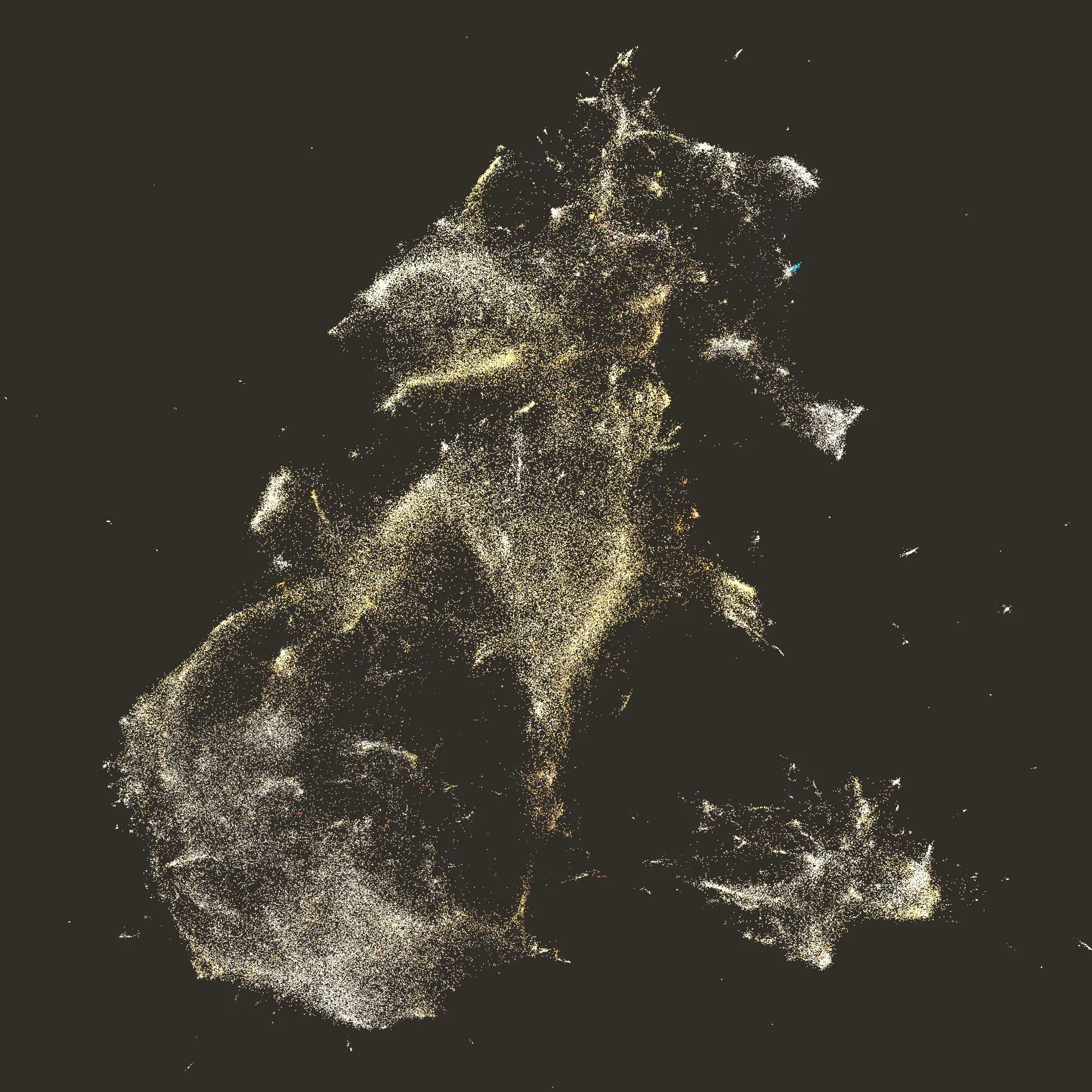
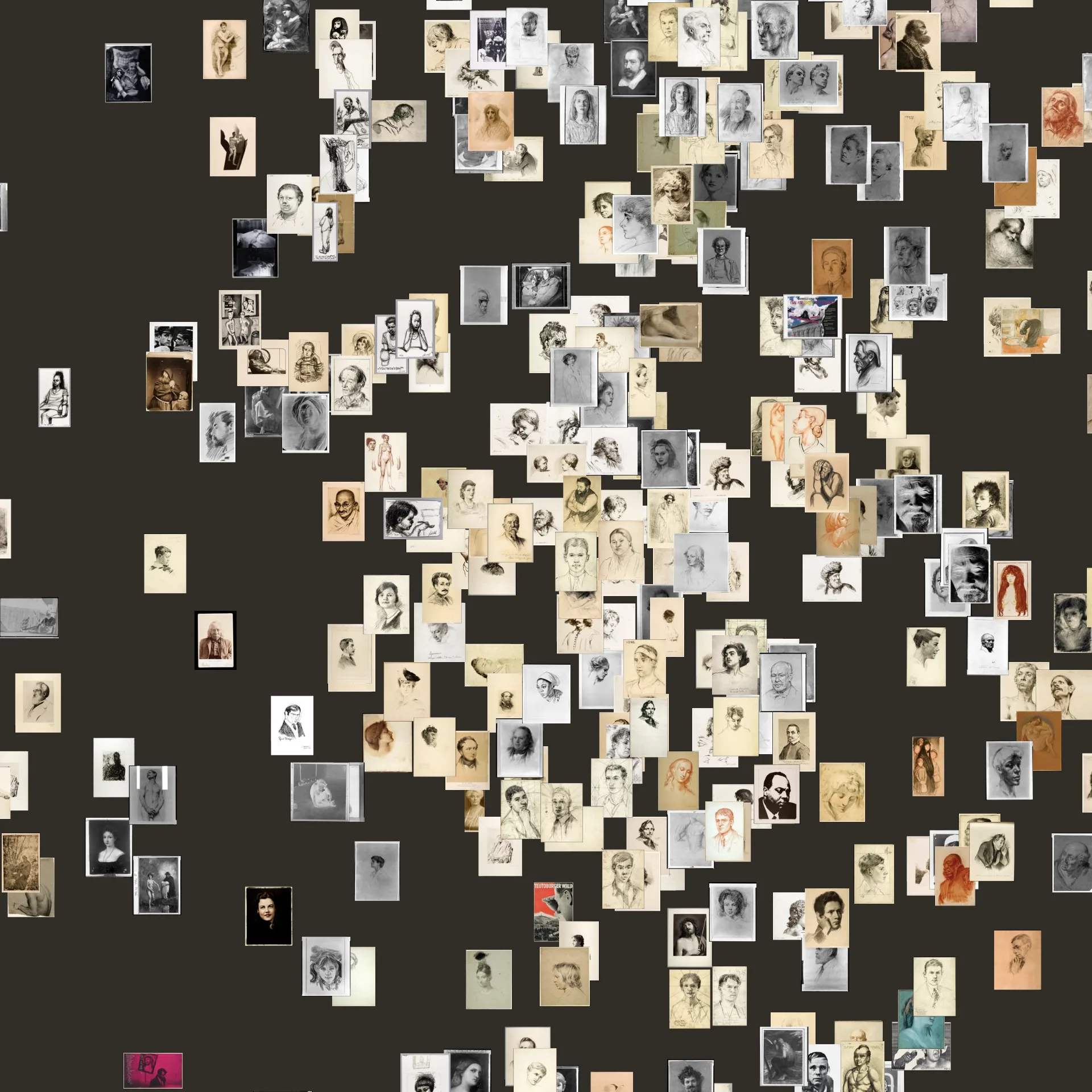
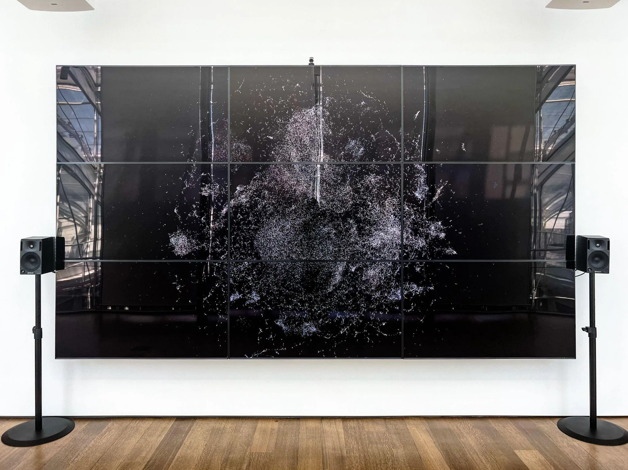
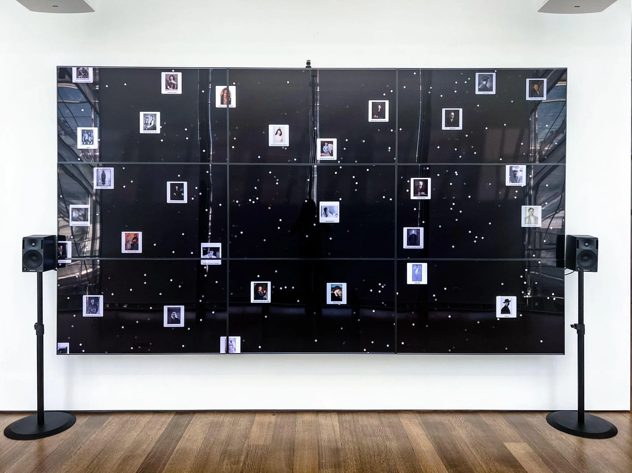
The results coming from PixPlot for visualizing the HAM collection were satisfying: the network visualization was balanced and evenly distributed on the screen; more than 200,000 images were spaced out in clusters by visual similarity (see Figure 2). The effect looked like a nebula of points, ready to be explored by zooming through the web interface. Figure 3 enlarges one area of Surprise Machines, revealing a cluster of handmade portraits in which Mahatma Gandhi and Albert Einstein can be recognized just to the top left of the center.
Using a concept developed by Lev Manovich, the fascination of visualizing extensive collections is purely sublime (Manovich 2008), but zooming into details brings information. The attentive use of the interface enables the discovery of specific clusters such as the already-mentioned Bauhaus drawings or powdered pigments. The designers who created the visualization leave room for viewers whose performative insights change from person to person (Drucker 2013).
Designing a Post-Pandemic, Choreographic Interface
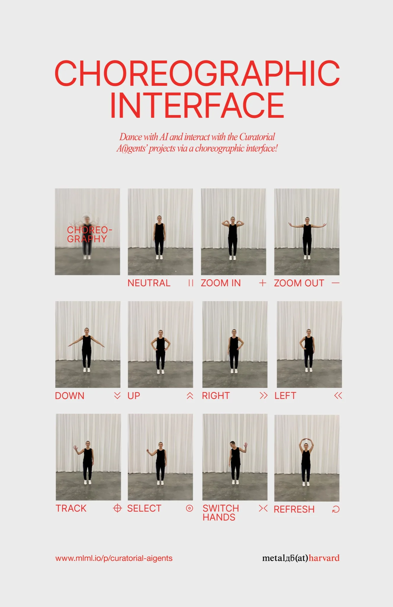
Curatorial A(i)gents was slated to open in 2020 but was postponed by two years due to the pandemic. The 11 projects comprising the show were all screen-based, with about half requiring conventional mouse and keyboard interactions like clicking and scrolling. Uncertain about the health protocols in place when the show opened, metaLAB proactively sought a solution for touchless interfacing with the projects. The assembled team saw this as an opportunity to research and develop a “choreographic interface” that would enable museum visitors to use a gestural vocabulary for exploring the projects.
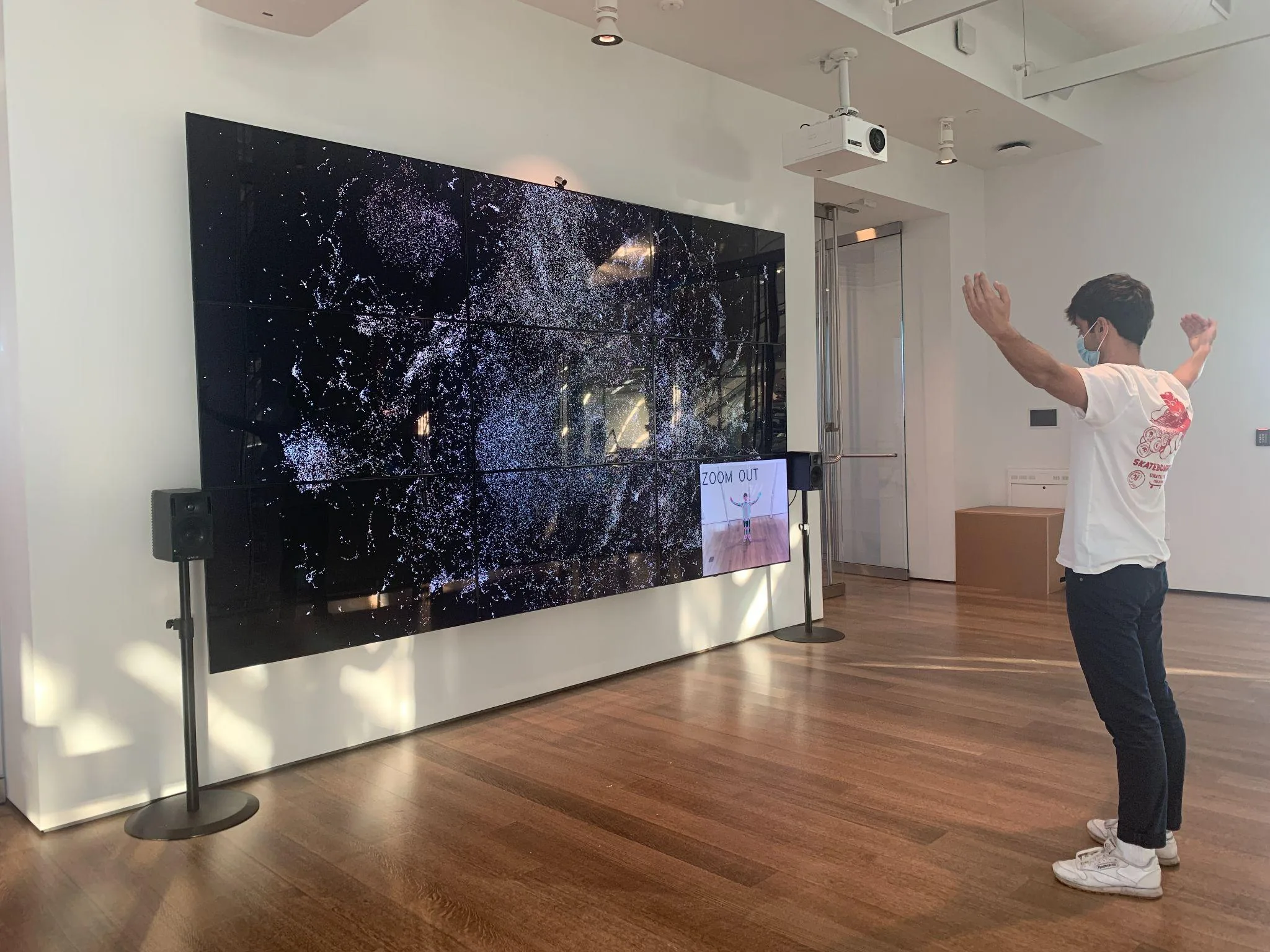
Conceptually, the choreographic interface is a “human-computer interface that increases the kinetic and spatial interactivity between humans and computers through integrating choreographic thinking into the design process” (Derry et al. 2022). Compositional models pertaining to movement, space, and time were used to develop a full-torso gestural vocabulary specific to the projects’ interaction needs. These included tracking, selecting, dragging, zooming, scrolling, right/left advancement, hand-switching, and browser refresh behaviors (see Figure 4). To interpret the choreographed gestures, we used open-source machine vision and machine learning tools such as OpenCV, TeachableMachine, and MediaPipe. Significant iterations were made in response to these technologies’ constraints; these tools are limited to only processing static positions that are extremely distinct from one another. This led us to choreograph torso gestures that are highly geometric and dissimilar, and that sculpt the negative space about the body to make the limbs always visible. Over many iterations, we developed a vocabulary that balances choreographic interest and computational legibility. Much of the prototyping affected Surprise Machines because it included the most challenging pack of interactions. For example, managing the choreography of hand tracking, selecting, dragging, and switching without one method being misinterpreted as another is difficult since all these gestures center on the hand.
Surprise Machines requires simultaneous tracking and identification of the hand position and torso gestures. Our early solutions were computationally heavy and practically non-performing, especially when running the earlier version of Surprise Machines that used PixPlot. We eventually achieved faster performance by using MediaPipe’s Holistic model for pose estimation and a logistic regression model for the classifier; Surprise Machines’ shift to Trails, which is a lighter application, also boosted performance.
Prototyping for Surprise Machines also helped us think through the intuitiveness and relationships of the gestures. For example, we settled on hands-to-shoulders for zooming in; and arms outstretched in a “T” shape for zooming out to echo the sensation of bringing the visualization into the body and away from the body while interacting. Finding it awkward to move one’s dominant hand across the body to the upper corner on the opposite side of the screen, we implemented a simple method for switching dominant hands by looking at the passive hand. Wishing to provide visitors with a performative experience while using the choreographic interface, we added sonification as our last embellishment.
The sonification applies and modulates subtle audio textures in response to the gestures, providing a dynamic score for the dance and reinforcing the interface actions. The body’s position and acceleration drive changes to the sound in service of marrying physical and digital movement. While the choreographic interface includes visual feedback on the screen (see Figure 5), aural feedback frees the visitor’s visual attention allowing them to concentrate more fully on the projects.
A Substantial Drawback
Testing was a delicate phase of the project, especially considering that Surprise Machines was developed by a team whose members were based in different parts of the world. Thankfully, some of us were at the Harvard Art Museums when lockdown measures against COVID-19 were less strict, which made testing possible.
When the first test for data visualization took place, the team had mixed feelings. Although the visual was incredibly captivating, the hardware did not support the computation load because of the high number of images shown simultaneously. As a result, another software called Trails – conceived by DHLAB for large screens – was adopted to create a lighter version of Surprise Machines. Even though the back ends of PixPlot and Trails were similar, the front end’s computational load was reduced by replacing the images with distributed samples (see Figures 6 and 7). The new interface was less sophisticated but way faster and more reactive, a relevant feature considering that the Lightbox Gallery’s hardware also managed the choreographic interface’s load.
When part of the team was working on the visualization between the U.S. and Europe, another part was dispersed across U.S. states designing the choreographic interface. While fortunate to run a few remote and in-person tests at HAM, problem-solving for the Lightbox Gallery’s system was challenging as the team was developing Surprise Machines on different hardware setups. The operating system, hardware age, and hardware setup that included the camera, speakers, and nine interconnected monitors were significantly different. Although a choreographic interface for Surprise Machines was fully functional, it was not robust enough to be left installed for the exhibition’s 11-week duration. Since public health protocols did not inhibit the use of shared devices in spring 2022, the final installation featured an air mouse to interact with the projects. Nonetheless, we look forward to including the choreographic interface for future Surprise Machines renditions when the tech driving the system can be managed more closely.
The Lightbox Gallery finally hosted Surprise Machines during the week of May 17–22, 2022. An air mouse was at visitors’ disposal to move the cursor as if it were running on a standard personal computer, featuring dragging and dropping as well as zooming in and out. While most experienced visitors interacted with the digital installation without help, some had difficulty due to limited literacy, as previously discussed in a scientific article by Katy Börner and her colleagues (Börner et al. 2016).
Even with the increase in data literacy, new technologies still struggle to enter museum spaces. The Harvard Art Museums transformed a part of the building Piano envisioned as a meeting room into a laboratory dedicated to experimental museology. However, Curatorial A(i)gents and Living by Protocol, the two back-to-back exhibitions curated by metaLAB, were the penultimate programming in the Lightbox Gallery. Conceived in July 2012 and opened in November 2014, the Lightbox Gallery was converted into a quiet lounge for visitors in summer/fall 2022. The reason for this second conversion was twofold: on the one hand, the Lightbox Gallery was seen as a space with a cycle predestined to end; on the other hand, there was a lack of support within the museum, whose funding for staffing and maintenance ceased in 2018. The lack of funding was the primary reason for the closure of the director’s office in July 2021. Although the detachment of the Lightbox Gallery from the main exhibition stories gave great freedom of planning, the truth is that Renzo Piano’s restoration did not consider the presence of digital devices within the museum at all, and the result is a building extraordinarily crafted but classically designed. It means that the Harvard Art Museums may still live without any digital faculty but also that the digital turn has still to reach its full potential in museums. The experience Lightbox Gallery leaves is an increased understanding of experimental museology for the staff and the authors who exhibited in the gallery and new knowledge for designing future spaces.
Conclusions
Beyond the technical merits, Surprise Machines is a collective project developed in a stimulating research community above all. Resting on a solid curatorship philosophy, the project embraces a collaborative spirit that finds its most prominent expression in the choreographic interface. Although the latter was not part of the exhibition due to technical limitations, it is valuable to look at failures from a future perspective. Failures are indeed necessary sources of knowledge, as was the case with the closure of the Lightbox Gallery after a life cycle of about ten years. When thinking about a project such as Surprise Machines, it is necessary not to isolate the data visualization from the context. Authors, organizations, buildings, and technologies are among the human and non-human actors that provide extraordinary richness and unpredictability to the outcome. In a research environment where works become increasingly sectoral and specific, it is essential to consider multidisciplinarity as one of the most noteworthy qualities of a laboratory (Manzini 2016), and irreductionism as an inexhaustible source of creativity and inspiration (Latour 1988).
References
- American Museum of Natural History. (2020) 2022. Collectionscope. github.com/amnh-sciviz/collectionscope.
- Barabási, Albert-László, Mónica Bello, Julia Kluge-Fabényi, et al. 2020. Hidden Patterns: Visualizing Networks at BarabásiLab. Edited by Alanna Stang and Peter Weibel. Berlin: Hatje Cantz Verlag.
- Benedetti, A. 2022. “Browsing and Visualizing Collections of Images.” YouTube, January 5. youtube.com/watch?v=bprSgiqZj00.
- Birkle, Carmen, and Birgit Däwes. 2019. “‘Old Media Don’t Go Away, They Mutate’: An Interview with Jeffrey Schnapp.” Amerikastudien/American Studies 64 (1): 111–25. doi:10.33675/AMST/2019/1/10.
- Bludau, Marian-Jakob, Marian Dörk, and Frank Heidmann. 2021. “Relational Perspectives as Situated Visualizations of Art Collections.” Digital Scholarship in the Humanities 36 (Supplement 2): ii17–ii29. doi:10.1093/llc/fqab003.
- Börner, Katy, Adam Maltese, Russell Nelson Balliet, and Joe Heimlich. 2016. “Investigating Aspects of Data Visualization Literacy Using 20 Information Visualizations and 273 Science Museum Visitors.” Information Visualization 15 (3): 198–213. doi:10.1177/1473871615594652.
- Bostock, Michael, Vadim Ogievetsky, and Jeffrey Heer. 2011. “D3: Data-Driven Documents.” IEEE Transactions on Visualization and Computer Graphics 17 (12): 2301–9. doi:10.1109/TVCG.2011.185.
- Champion, Erik Malcolm. 2016. “Digital Humanities Is Text Heavy, Visualization Light, and Simulation Poor.” Digital Scholarship in the Humanities: i25–i32. doi:10.1093/llc/fqw053.
- Crawford, Kate, and Trevor Paglen. 2019. Excavating AI: The Politics of Images in Machine Learning Training Sets. AI Now Institute. excavating.ai.
- Crockett, Dennis. 2019. “IVPY: Iconographic Visualization Inside Computational Notebooks.” International Journal for Digital Art History 4: 3.60–3.79. doi:10.11588/dah.2019.4.66401.
- Cuno, James B., ed. 1996. Harvard’s Art Museums: 100 Years of Collecting. Cambridge, MA: Harvard University Art Museums.
- Danchilla, Brian. 2012. Beginning WebGL for HTML5. Berkeley, CA: Apress. doi:10.1007/978-1-4302-3997-0.
- Derry, Lins, Jordan Kruguer, Maximilian Mueller, and Jeffrey Schnapp. 2022. “Designing a Choreographic Interface during Covid-19.” Movement and Computing Conference. doi:10.1145/3537972.3538020.
- Diagne, Cyril, Nicolas Barradeau, and Simon Doury. 2018. T-SNE Map. Experiments with Google. experiments.withgoogle.com/t-sne-map.
- DiMaggio, Paul, and Eszter Hargittai. 2001. From the “Digital Divide” to “Digital Inequality”: Studying Internet Use as Penetration Increases. Princeton, NJ: Center for Arts and Cultural Policy Studies, Princeton University.
- Drucker, Johanna. 2013. “Performative Materiality and Theoretical Approaches to Interface.” Digital Humanities Quarterly 7 (1). digitalhumanities.org/dhq/vol/7/1/000143/000143.html.
- Duhaime, Douglas. (2017) 2021. PixPlot. Yale Digital Humanities Lab. github.com/YaleDHLab/pix-plot.
- Foster, Hal. 2011. The Art-Architecture Complex. London: Verso.
- Geismar, Haidy. 2018. Museum Object Lessons for the Digital Age. London: UCL Press. doi:10.2307/j.ctv1xz0wz.
- Harvard Art Museums. 2012. International Image Interoperability Framework at Harvard University. iiif.harvard.edu.
- Impett, Leonardo, and Franco Moretti. 2017. “Totentanz: Operationalizing Aby Warburg’s Pathosformeln.” New Left Review 107: 68–97.
- Jacomy, Mathieu, Tommaso Venturini, Sebastien Heymann, and Mathieu Bastian. 2014. “ForceAtlas2, a Continuous Graph Layout Algorithm for Handy Network Visualization Designed for the Gephi Software.” PLoS ONE 9 (6). doi:10.1371/journal.pone.0098679.
- Jodidio, Philip. 2014. Piano: Renzo Piano Building Workshop, Complete Works, 1966–Today. Cologne: Taschen.
- Karjus, Andres, Mar Canet Solà, Tillmann Ohm, Sebastian E. Ahnert, and Maximilian Schich. 2022. “Compression Ensembles Quantify Aesthetic Complexity and the Evolution of Visual Art.” arXiv. doi:10.48550/arXiv.2205.10271.
- Kenderdine, Sarah, Ingrid Mason, and Lily Hibberd. 2021. “Computational Archives for Experimental Museology,” 3–18. doi:10.1007/978-3-030-83647-4_1.
- Klinke, Harald. 2021. “V-Lab Workshop: Visual Analysis in Cultural Data – Image Plots and t-SNE Maps Made Easy.” History of Art Department, October 28.
- Kräutli, Florian. 2016. Visualising Cultural Data: Exploring Digital Collections through Timeline Visualisations. PhD thesis, Royal College of Art.
- Latour, Bruno. 1988. The Pasteurization of France. Translated by Alan Sheridan and John Law. Cambridge, MA: Harvard University Press.
- Lima, Manuel. 2011. Visual Complexity: Mapping Patterns of Information. New York: Princeton Architectural Press.
- Maaten, Laurens van der, and Geoffrey Hinton. 2008. “Visualizing Data Using t-SNE.” Journal of Machine Learning Research 9 (86): 2579–605. jmlr.org/papers/v9/vandermaaten08a.html.
- Maizels, Mike, and Chelsea Qiu, eds. 2020. Curatorial A(i)gents. Cambridge, MA: metaLAB (at) Harvard. printedmatter.org/catalog/57243.
- Manovich, Lev. 2008. “Data Visualization as New Abstraction and Anti-Sublime.” In Small Tech: The Culture of Digital Tools, edited by Byron Hawk, David M. Rieder, and Ollie O. Oviedo. Minneapolis: University of Minnesota Press.
- ———. 2020. Cultural Analytics. Cambridge, MA: MIT Press. doi:10.7551/mitpress/11214.001.0001.
- Manzini, Ezio. 2016. “Design Culture and Dialogic Design.” Design Issues 32 (1): 52–59. doi:10.1162/DESI_a_00364.
- McCully, Emily Arnold. 2019. Dreaming in Code: Ada Byron Lovelace, Computer Pioneer. Somerville, MA: Candlewick Press.
- McInnes, Leland, John Healy, and James Melville. 2018. “UMAP: Uniform Manifold Approximation and Projection for Dimension Reduction.” arXiv. doi:10.48550/arXiv.1802.03426.
- metaLAB. 2022. metaLAB (at) Harvard & FU Berlin. mlml.io.
- Moon, Christy Y. E., and Dario Rodighiero. 2020. “Mapping as a Contemporary Instrument for Orientation in Conferences.” Atti del IX Convegno Annuale AIUCD. La svolta inevitabile: sfide e prospettive per l’informatica umanistica. doi:10.5281/zenodo.3611340.
- O’Shea, Keiron, and Ryan Nash. 2015. “An Introduction to Convolutional Neural Networks.” arXiv. arxiv.org/abs/1511.08458.
- Pietsch, Christopher. (2018) 2022. VIKUS Viewer. github.com/cpietsch/vikus-viewer.
- Rodighiero, Dario. 2021a. Mapping Affinities: Democratizing Data Visualization. Open-access English edition. Geneva: Métis Presses. doi:10.37866/0563-99-9.
- ———. 2021b. “Ars Memorativa as the Genesis of Information Design: A Conversation with Manuel Lima.” Nightingale, August 18. nightingaledvs.com/ars-memorativa. doi:10.31235/osf.io/k5unq.
- Rodighiero, Dario, Eveline Wandl-Vogt, and Elian Carsenat. 2021. “Making Visible the Invisible Work of Scientists during the Covid-19 Pandemic.” Visual Culture Studies 2. doi:10.31235/osf.io/m4uht.
- ———. 2022. “A Visual Translation of the Pandemic.” Leonardo 55 (3). doi:10.1162/leon_a_02203.
- Russakovsky, Olga, Jia Deng, Hao Su, et al. 2015. “ImageNet Large Scale Visual Recognition Challenge.” arXiv. doi:10.1007/s11263-015-0816-y.
- Seguin, Benoit. 2018. “The Replica Project: Building a Visual Search Engine for Art Historians.” XRDS: Crossroads, The ACM Magazine for Students 24 (3): 24–29. doi:10.1145/3186653.
- Snydman, Stuart, Robert Sanderson, and Tom Cramer. 2015. “The International Image Interoperability Framework (IIIF): A Community & Technology Approach for Web-Based Images.” Archiving Conference 2015: 16–21. doi:10.2352/issn.2168-3204.2015.12.1.art00005.
- Steward, Jeff. (2015) 2021. API Documentation. Harvard Art Museums. github.com/harvardartmuseums/api-docs.
- Turing, Alan M. 1950. “Computing Machinery and Intelligence.” Mind LIX (236): 433–60. doi:10.1093/mind/LIX.236.433.
- Vane, Olivia. 2019. Timeline Design for Visualising Cultural Heritage Data. PhD thesis, Royal College of Art.
- Weaver, Warren. 1948. “Science and Complexity.” American Scientist 36 (4): 536–44. jstor.org/stable/27826254.