Reading Network Diagrams by Using Contour Lines and Word Clouds
Rodighiero, Dario, and Alberto Romele. 2022. “Reading Network Diagrams by Using Contour Lines and Word Clouds.” In Proceedings of Graphs and Networks in the Humanities. Amsterdam: Royal Netherlands Academy of Arts and Sciences. https://doi.org/10.31235/osf.io/3g7bt.
Network diagrams have met frequent improvements in terms of computing time and layout algorithms, but the same cannot be said for their graphic design and aesthetics. Taking the Cartography of SPT2021 as a case study, this article discusses how alternative visual grammars—removing links, and adding contour lines and word clouds—can make dense relational structures more readable by shifting the reader’s focus from nodes to clusters.
Introduction
Network diagrams have met frequent improvements in terms of computing time (Sapio et al. 2017) and layout algorithms (Jacomy et al. 2014), but the same cannot be said for the graphic design and aesthetics. In fact, the traditional network visualization style dates back about 85 years, and is attributed to Jacob L. Moreno’s influential book Who Shall Survive? (Moreno 1934). Developed in order to make readable social relations, observed during his fieldwork, Moreno introduced simple diagrammatic representations called sociograms. The sociogram’s visual grammar was indeed composed of circles, lines, and labels, which still represent the graphic elements employed to draw networks almost one century later.
Although the computational turn transformed network diagrams into objects capable of presenting incredibly complex structures and high levels of connectivity (Lima 2011), the network’s visual grammar is still based on circles, lines, and labels in their simplest, immediately recognizable form. The research lab led by Albert-László Barabási at Northeastern University is a prime example of visualizing complex networks, especially for its capacity to bring designers within the research environment. In a recent solo exhibition at the ZKM Center for Art and Media in Karlsruhe (Barabási et al. 2020), the lab’s production perfectly illustrates the marriage between graphic design and network science, along with a historical evolution that covers approximately two decades. Barabási’s intuition to bring design expertise within the lab was a winning strategy, which demonstrated the importance of involving talented designers in the scientific production of visuals by the significant number of citations and by the several covers of scientific magazines. The designers working with Albert-László Barabási molded network aesthetics out of colors, transparencies, and space. They brought networks to their upper levels by drawing edges with different intensity (Coutinho et al. 2016), by elaborating visual organization and style (Albrecht and Yucesoy 2016; Kosack et al. 2018), and by exploring three-dimensional representations (Gates et al. 2019; Schich et al. 2014). These network diagrams demonstrated that we can stray from the traditional representation of network diagrams, by omitting links and amplifying nodes’ positions and weights, without compromising insights.
Removing Links
Although simplicity is a great quality to properly address messages through visuals, the incredible work of Albert-László Barabási and his peers at Northeastern University supports alternative paths led to exploring innovative ways to present network diagrams (Rodighiero et al. 2018). This text aims to discuss the problem of scalability that severely affects networks that are characterized by millions or even billions of nodes and edges, producing what is commonly known as the spaghetti effect (Börner 2015; Venturini 2011). The idea hereby presented is simple and can be summarized by the question, “do we really need to visualize links to make network diagrams meaningful?”
The answer to the question of whether links are needed is equally simple, working by subtraction. No doubt removing links implies a loss of information, but circles, and eventually their labels, remain. Getting rid of the spaghetti effect created by high connectivity allows us to remove background noise and increase the visual readability, and then to focus with more attention on circles and their characteristics. Circles, indeed, usually come with additional information that can be differently amplified such as position and weight. The position is the result of the arrangement produced by balancing the whole set of forces that attracts or keeps apart a given network element, while the weight is an arbitrary value that corresponds to the relevance of the same element.
It is also worth noticing that an increasing group of scholars (Crockett 2019; Lee et al. 2021; Noichl 2019; Schmidt 2018) prefer techniques of dimensionality reduction such as UMAP (McInnes et al. 2018), rather than force-directed algorithms such as D3.js (Bostock et al. 2011). Dimensionality reduction is a machine-learning method used in statistics to reduce many variables to smaller numbers, while force-directed algorithms work with relational datasets in which two elements are connected by a weighted tie. The famous sociologist Pierre Bourdieu used the former method for mapping a large set of interviews on two dimensions (Blasius and Schmitz 2014), while Bruno Latour’s laboratory widely invested in the latter that is often associated with the software Gephi (Bastian et al. 2009). The reason for choosing dimensionality reduction is related to the use of large datasets or by the programming language employed for the analysis. In relation to the aesthetical change, and one of the major visual results of using techniques of dimensionality reduction is the loss of link drawing also caused by the interchangeability of the two techniques. As stated by Venturini, Jensen, and Jacomy, “dimensionality reduction algorithms […] are implicitly building networks and spatializing them” (Venturini 2011). Consequently, scientific visuals are facing a technology-driven aesthetical turn (Romele and Rodighiero 2020).
Adding Contour Lines and Word Clouds
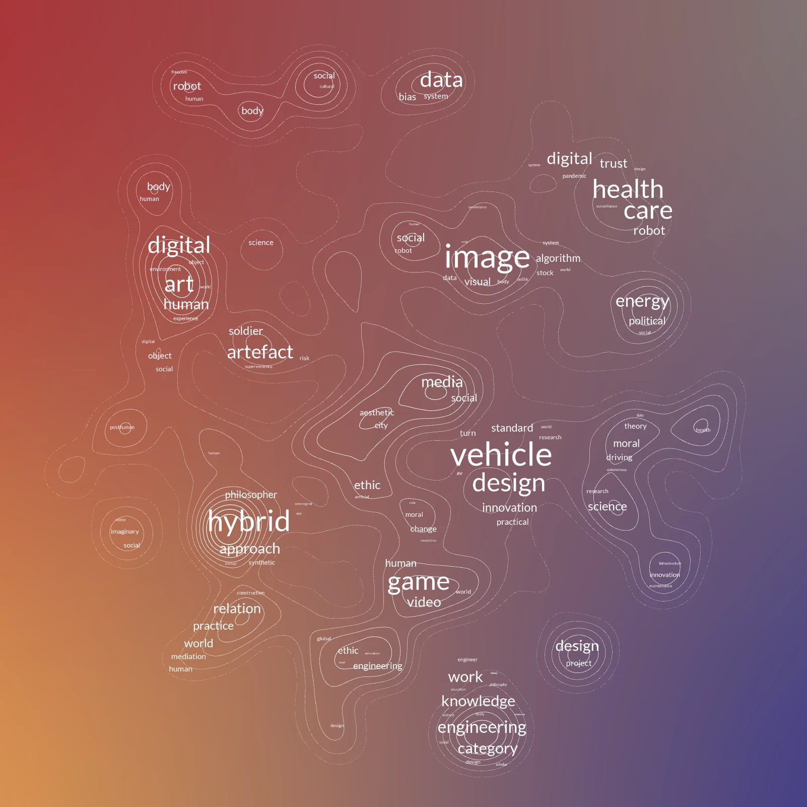
Innovative visual tools, such as the Cartography of SPT2021 (see Figure 1), can be used as a case study for alternative network diagram visualizations. This tool was developed during the pandemic to orientate attendees in the annual conference organized at the Catholic University of Lille by the Society for Philosophy and Technology (SPT) in 2021. The conference proved an ideal occasion to showcase a tool for conference mapping already developed for the Italian community of digital humanities the previous year (Moon and Rodighiero 2020) because on this occasion the program map was published a week before the start of the conference. By analyzing the speakers’ abstracts with the Python library spaCy for Natural Language Processing (NLP), the vocabulary employed in each text could be cleaned and transformed into a vector in which the single frequency of each term, divided by the total frequency given by the TF-IDF algorithm (Spärck Jones 1972). The resulting matrix of lexical vectors was finally reduced to two dimensions using UMAP (McInnes et al. 2018) in order to draw speakers on the Cartesian plane. Each pair of speakers in close proximity is further enriched by displaying the most relevant terms the two share, making visible the lexical context between them.
The TF-IDF values were further added up to quantify each speaker’s relevance according to the specificity of their vocabulary with respect to the entire conference, drawing attention to the most fine-grained conference’s topics. While traditional network diagrams might express this value as a circle’s area, here it is diversely represented through contour lines, commonly employed by cartographers in topographical maps to show the territory’s elevations. The use of contour lines is twofold: on one hand, it unifies the speaker’s relevance, and on the other hand, it helps to identify clusters of speakers at a glance.
In addition, the speakers’ terms associated with each cluster were collected and visualized through a word cloud, also called weighted list, a visualization technique that shows the most relevant keywords by composing a sort of textual collage. The idea was to summarize the clusters to give the viewers a preview of the content.
All of these graphical elements are finally organized through two layers of zooming, revealing detail according to Ben Shneiderman’s renowned mantra, “overview first, zoom and filter, then details on demand” (Shneiderman 1996). In the beginning, the viewer sees contour lines and a word cloud. One potential scenario is that the viewer notices a familiar word that encourages them to zoom into a specific cluster. After zooming in, contour lines and word clouds fade out to leave room for speakers’ names and their contextual lexicon. At this point, the viewer might click on a specific author for further details associated with them, such as their own terms, or the number of publications.
A Way of Seeing
For those who are familiar with the field of philosophy of technology, it is interesting to observe how the SPT2021 map provides three insights: 1) Overcoming the divide between humanities-oriented and engineering-oriented approaches, which seem to share contours except for the “engineering” cluster at the bottom of the map. 2) The emergence of new trends such as “energy and politics” and “data and bias” as respectively illustrated at the middle right and the upper right, while a common topic such as “posthuman” disappears probably due to its popularization. 3) The propensity of philosophy of technology for other disciplines and objects, as is the case with the “media” cluster in the middle and the “image” cluster a bit higher up. These insights are helpful in understanding emerging and disappearing subjects in the field of philosophy and technology, revealing the orientation of the scientific community.
The SPT2021 conference was dedicated to the theme of “technological imaginaries.” As is often the case for large conferences, finding a topic wide enough to gather different trends in the same discipline is always challenging. The concept of “technological imaginary” responds well to this need, capable of designating many things at the same time as a vague notion, which represents a risk of dispersion. The scholar who attends this type of event, especially online, might feel lost before such a multiplicity of presentations and panels that seem similar, but far different from each other. During conferences, scholars put considerable effort into designing their program with pertinent sessions. This activity is not easy if we consider that the sessions are manually organized following not only thematic requirements but also timing, availability, and other factors. While planning can be particularly time-consuming if the attendee chooses to read all the abstracts, the SPT 2021 map, on the other hand, made the identification of emerging themes easier, offering an orientation tool to attendees (Moon and Rodighiero 2020). Furthermore, it is interesting to notice how the map also helped the organizers to build the SPT 2021 program, as panels were inferred from clustering, while the proximity between speakers helped complete panels. Nevertheless, the SPT 2021 map invites us to do this in the last instance: the personal affinities that lead us to attend certain sessions and panels, are secondary to thematic affinities so that new relationships between researchers can be fostered, as it happens in university faculties (Rodighiero 2021).
Compared to traditional network visualizations, the visual method that has been called lexical cartography, offers a clearer way to identify the most interesting conference clusters to the reader. The intermediary level of reading composed of contour lines allows for a better identification of clusters, while word clouds present a lexical information that belongs neither to the whole structure nor to a single speaker. Introducing an intermediary information layer, such as word clouds, is one technique of making complex networks more readable and therefore accessible by manipulating its traditional design.
Conclusions
This visual model based on contour lines and word clouds is not intended to be a replacement for a more standard visual network graph with links and nodes, but as an alternative to it. In particular, this linkless network design seems particularly suitable for social structures with high connectivity, as in the case of word-frequency-based networks. The idea of focusing on clusters rather than nodes or the entire structure is valuable and moreover easy to implement. In the context of conferences such as SPT 2021, for example, attendees are more interested in identifying the most trends with a secondary interest in the speakers, which is achieved by zooming in on the interface.
In conclusion, the approach to relational data has always been critical for the digital humanist. Their study is heavily driven by how data is presented, and a critical approach to data visualization is needed to avoid being stuck in the same visual models, which can narrow down how we look at corpora. By using a novel design, such as in this case study, we can see how an intermediary level of data interpretation can be achieved by reorienting the focus onto clusters, rather than the overall network. As clearly stated in Digital_Humanities (Burdick et al. 2012), scholars of digital humanities must think like the designers of their tools, including visualization, to get more understanding of the information they are working with. While computational improvements are indeed important for furthering novel ways of manipulating and working with data, it is fundamental to bring design into scientific structures and think of how viewers experience data. By doing this, designers do not simply assume the role of collaborators, but they have to be employed as scientists, and professors. The digital renaissance of digital humanities will come only when humanists, designers, and computer scientists have interchangeable roles, moving from one domain to another naturally. This change of paradigm can and should be instigated by universities who, equipped with education programs and research facilities, can pave the way for innovations that naturally come about with interdisciplinary teams.
References
- Albrecht, Kim, and Burcu Yucesoy. 2016. “Designing for Insight: A Case Study from Tennis Player Analysis.” IEEE Computer Graphics and Applications 36 (4): 102–108.
- Barabási, Albert-László, Mónica Bello, Julia Kluge-Fabényi, K. Forde, J. Készman, Isabel Meirelles, C. G. Ratti, M. Ritchie, and A. Szántó. 2020. Hidden Patterns: Visualizing Networks at BarabásiLab. Edited by Alanna Stang and Peter Weibel. Berlin: Hatje Cantz Verlag.
- Bastian, Mathieu, Sebastien Heymann, and Mathieu Jacomy. 2009. “Gephi: An Open Source Software for Exploring and Manipulating Networks.” In Proceedings of the Third International ICWSM Conference.
- Blasius, Jörg, and Andreas Schmitz. 2014. “Empirical Construction of Bourdieu’s Social Space.” In Visualization and Verbalization of Data, 205–222. Boca Raton, FL: CRC Press.
- Börner, Katy. 2015. Atlas of Knowledge: Anyone Can Map. Cambridge, MA: MIT Press.
- Bostock, Michael, Vadim Ogievetsky, and Jeffrey Heer. 2011. “D3: Data-Driven Documents.” IEEE Transactions on Visualization and Computer Graphics 17 (12): 2301–2309.
- Burdick, Anne, Johanna Drucker, Peter Lunenfeld, Todd Presner, and Jeffrey Schnapp. 2012. Digital_Humanities. Cambridge, MA: MIT Press.
- Coutinho, Bruno C., Sungryong Hong, Kim Albrecht, Arjun Dey, Albert-László Barabási, Paul Torrey, Mark Vogelsberger, and Lars Hernquist. 2016. “The Network Behind the Cosmic Web.” Preprint, arXiv:1604.03236.
- Crockett, Damon. 2019. “IVPY: Iconographic Visualization Inside Computational Notebooks.” International Journal for Digital Art History 4: 3.60–3.79.
- Gates, Alexander J., Qing Ke, Onur Varol, and Albert-László Barabási. 2019. “Nature’s Reach: Narrow Work Has Broad Impact.” Nature 575 (7781): 32–34.
- Jacomy, Mathieu, Tommaso Venturini, Sebastien Heymann, and Mathieu Bastian. 2014. “ForceAtlas2, a Continuous Graph Layout Algorithm for Handy Network Visualization Designed for the Gephi Software.” PLoS ONE 9 (6): e98679.
- Kosack, Stephen, Michele Coscia, Evan Smith, Kim Albrecht, Albert-László Barabási, and Ricardo Hausmann. 2018. “Functional Structures of US State Governments.” Proceedings of the National Academy of Sciences 115 (46): 11748–11753.
- Lee, Crystal, Tanya Yang, Gabrielle Inchoco, Graham M. Jones, and Arvind Satyanarayan. 2021. “Viral Visualizations: How Coronavirus Skeptics Use Orthodox Data Practices to Promote Unorthodox Science Online.” Preprint, arXiv:2101.07993.
- Lima, Manuel. 2011. Visual Complexity: Mapping Patterns of Information. New York: Princeton Architectural Press.
- McInnes, Leland, John Healy, and James Melville. 2018. “UMAP: Uniform Manifold Approximation and Projection for Dimension Reduction.” Preprint, arXiv:1802.03426.
- Moon, Chloe Ye Eun, and Dario Rodighiero. 2020. “Mapping as a Contemporary Instrument for Orientation in Conferences.” In Proceedings of the IX Annual Conference of the Association for Humanities and Digital Culture (AIUCD), 156–162.
- Moreno, Jacob L. 1934. Who Shall Survive? Washington, DC: Nervous and Mental Disease Publishing Co.
- Noichl, Maximilian. 2019. “Modeling the Structure of Recent Philosophy.” Synthese.
- Rodighiero, Dario. 2021. Mapping Affinities: Democratizing Data Visualization. Open-access English edition. Geneva: Métis Presses.
- Rodighiero, Dario, Frédéric Kaplan, and Boris Beaude. 2018. “Mapping Affinities in Academic Organizations.” Frontiers in Research Metrics and Analytics 3 (4).
- Romele, Alberto, and Dario Rodighiero. 2020. “Digital Habitus or Personalization Without Personality.” HUMANA.MENTE Journal of Philosophical Studies 13 (37): 98–126.
- Sapio, Amedeo, Ibrahim Abdelaziz, Abdulla Aldilaijan, Marco Canini, and Panos Kalnis. 2017. “In-Network Computation Is a Dumb Idea Whose Time Has Come.” In Proceedings of the 16th ACM Workshop on Hot Topics in Networks, 150–156. Palo Alto, CA: ACM.
- Schich, Maximilian, Chaoming Song, Yong-Yeol Ahn, Alexander Mirsky, Mauro Martino, Albert-László Barabási, and Dirk Helbing. 2014. “A Network Framework of Cultural History.” Science 345 (6196): 558–562.
- Schmidt, Benjamin. 2018. “Stable Random Projection: Lightweight, General-Purpose Dimensionality Reduction for Digitized Libraries.” Journal of Cultural Analytics.
- Shneiderman, Ben. 1996. “The Eyes Have It: A Task by Data Type Taxonomy for Information Visualizations.” In Proceedings 1996 IEEE Symposium on Visual Languages, 336–343. Boulder, CO: IEEE Comput. Soc. Press.
- Spärck Jones, Karen. 1972. “A Statistical Interpretation of Term Specificity and Its Application in Retrieval.” Journal of Documentation 28 (1): 11–21.
- Venturini, Tommaso. 2011. “What Is Second-Degree Objectivity and How Could It Be Represented.”