A Visual Translation of the Pandemic
Rodighiero, Dario, Eveline Wandl-Vogt, and Elian Carsenat. 2022. “A Visual Translation of the Pandemic.” Leonardo 55 (3): 297–303. https://doi.org/10.1162/leon_a_02203.
In 1923, Walter Benjamin published translations of Baudelaire’s poetry with a prefatory essay developing the idea that translation is not only the practice of addressing foreign readerships, but rather a process of authorship in which the original text is amplified with further significance. The authors use the term translation with a meaning that is not only linguistic but also visual. They analyze the coronavirus pandemic by translating scientific literacy through the techniques of natural language processing and data visualization. The Cartography of COVID-19 results from a visual translation that invites readers to explore the current pandemic from a different point of view that extends their perception.
While content and language form a certain unity in the original, like a fruit and its skin, the language of the translation envelops its content like a royal robe with ample folds.
— Walter Benjamin ([1923] 2007)
Mapping the Coronavirus Pandemic
This article confronts the coronavirus pandemic to demonstrate the value of data visualization. The situation’s impact on society and the lifestyle of human beings in the first half of 2020 is difficult to understand because of its extension: although the virus has infected millions of individuals all over the world, our perception remains local due to humanity’s limited capacity to analyze large amounts of information. To solve this problem, many data visualizations have been published regarding the pandemic (Lee et al. 2021; Jones and Helmreich 2020).
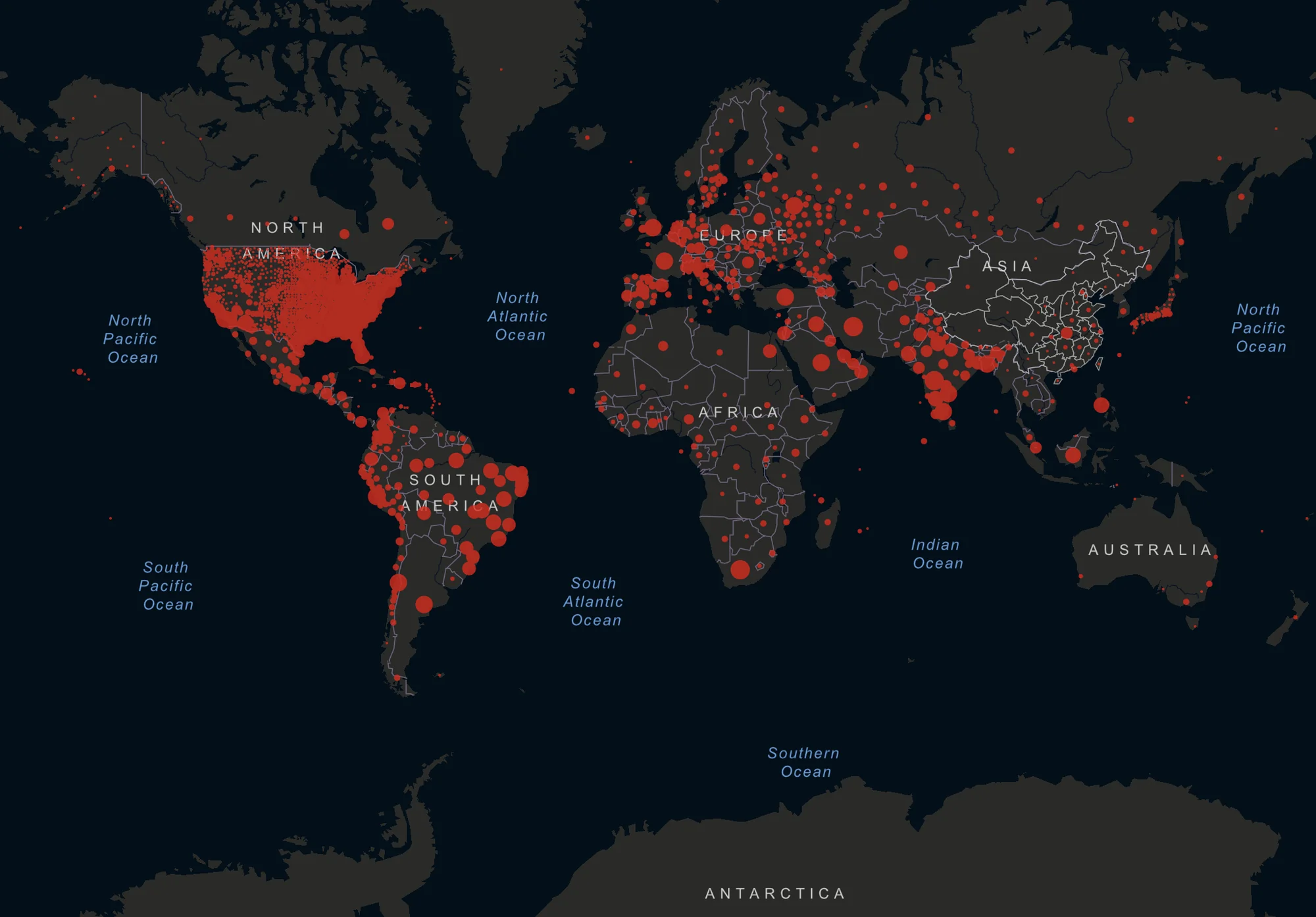
Among these data visualizations, it is worth citing the COVID-19 Dashboard created by the Center for Systems Science and Engineering at Johns Hopkins University (Dong, Du, and Gardner 2020). The dashboard provides insights on viral spread through rankings and time series of deaths, infections, tests and hospitalizations. The world map at the center of the dashboard is one of the most iconic images of the pandemic (Fig. 1). It displays confirmed cases of COVID-19 with red dots, using a style that recalls the war room in Dr. Strangelove (Kubrick 1964).
Mapping the COVID-19 Scientific Literature
The cumulative map of infections by Johns Hopkins University is as impressive as the information overload of the pandemic. The volume of news, posts and articles is difficult to grasp due to its excessiveness. This article specifically focuses on the literature that overwhelms the scientific environment. The Cartography of COVID-19 (Rodighiero, Wandl-Vogt, and Carsenat [2020] 2021) is a data visualization that combines techniques of text analysis and network visualization to display the phenomenon from a socio-technical perspective (Fig. 2).
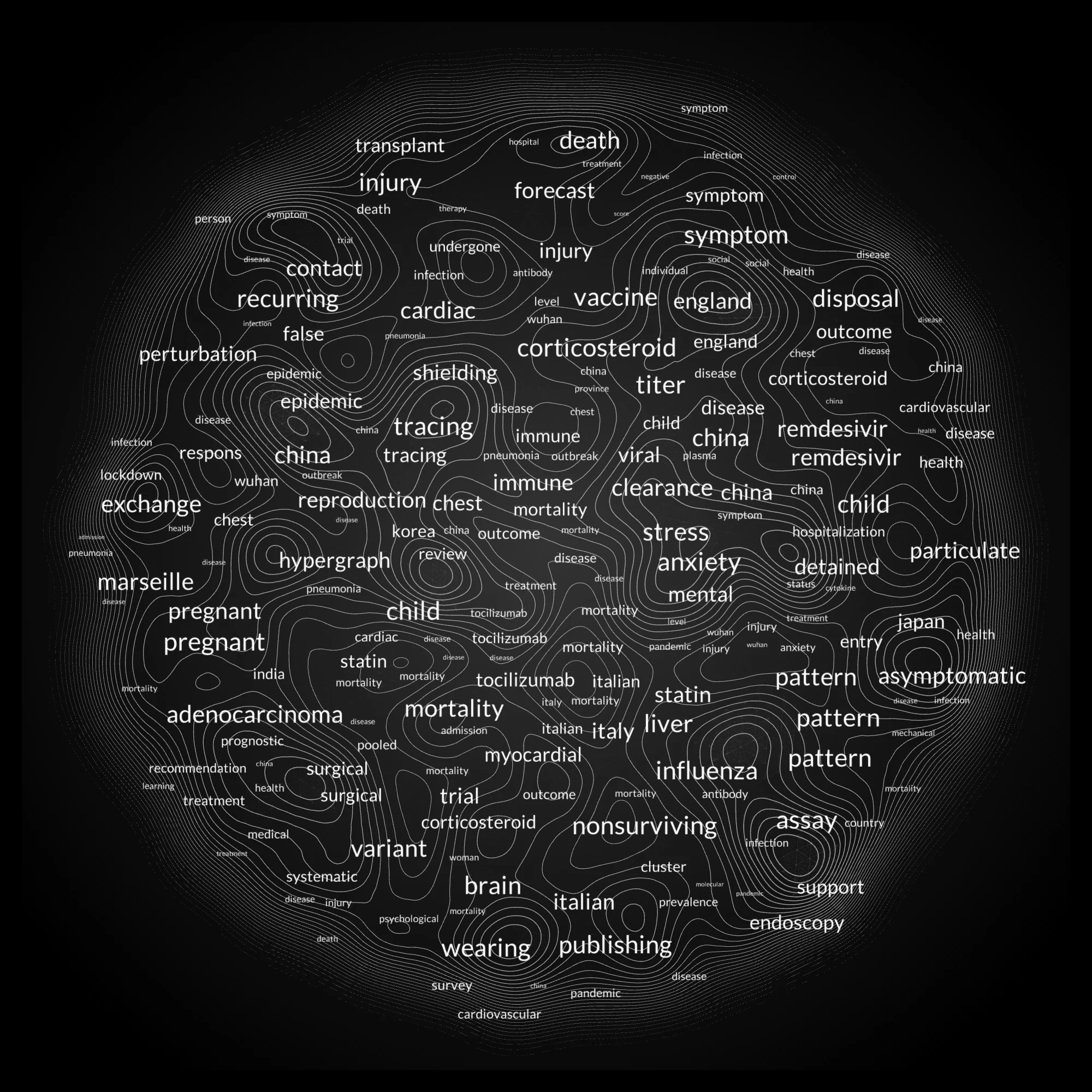
The cartography relies on the COVID-19 Open Research Dataset (CORD-19) distributed by the Allen Institute for AI (Wang et al. 2020). On 1 December 2020, the dataset comprised more than 370,000 scientific articles about COVID-19, severe acute respiratory syndrome coronavirus (SARS) coronavirus 2, and related coronaviruses published over about 50 years. As its records include pre-pandemic publications—for example, regarding SARS—we filtered the dataset down to those records that contain the acronym “COVID-19” and have a digital object identifier (DOI).
Despite the short period and the filtering of records, the amount of scientific literature is still substantial: nearly 34,000 articles have been signed by 190,000 authors. Due to the system load that affects Internet browsers, the cartography can only display the most active COVID-19 researchers by selecting those who have published at least five articles. The final version of the work nonetheless counts more than 3,000 authors.
The Sociology of Translation
Michel Callon and Bruno Latour made use of the term translation when they established the Actor-Network Theory, also known as the sociology of translation (Callon and Latour 2017). Largely inspired by Thomas Hobbes’s Leviathan, Callon and Latour state that society is based on a system of representation in which organizations are representatives for many individuals. This one-to-many system of representation at its most extreme extends the definition of actors to nonhuman beings such as institutions, economies or technologies. This method is employed to investigate complex systems in which nonhumans cover crucial roles, as in the case of laboratories (Latour and Woolgar [1979] 1986), automated vehicles (Latour 1996), or the Earth (Latour 2018).
The Cartography of COVID-19 brings attention to a specific nonhuman actor, the word. Words are the smallest element of significance in writing and the tools in the practice of translation. Yet words do not bring significance per se: according to W. Nelson Francis, “Words do not have meanings; people have meanings for words” (Francis 1967). This apparently naive statement—explored for decades by linguists, semioticians and philosophers such as Charles Sanders Peirce, Ferdinand de Saussure and Ludwig Wittgenstein—clearly draws an intimate connection between words and individuals.
Words and individuals are central to The Cartography of COVID-19, which makes use of a method that applies a translation both linguistic and visual (Moon and Rodighiero 2020). First, the translation is linguistic, because it makes use of artificial intelligence techniques for textual analysis. The idea behind it, inspired by the sociology of translation, is that scientific communities can be represented by the words their members employ in writing. Second, the translation is visual because it relies on the pictorial representation of writing, which usually arranges words in sentences, paragraphs and chapters through typographic layouts. Yet words can be organized differently from books: the sociology of translation suggests that society can be seen as a dense network of relationships in which, for instance, writers can be related to each word they use.
Linguistic Translation
At this point, it is rather clear that our article does not concern a standard linguistic translation but rather a computational one. Recent advances in artificial intelligence have made text analysis not only reliable but also accessible to anyone equipped with a personal computer. Large collections of documents can be analyzed using techniques of natural language processing to help navigate large corpora of documents (Manning and Schütze 1999).
According to the representational structure of the sociology of translation, The Cartography of COVID-19 assumes that scientific collectives are represented by their researchers; the results of these researchers are spread through their scientific articles, which are composed, in turn, of sections, paragraphs, sentences and therefore of words. Retracing this path, scientific communities can be represented by the words their members employ, or by the lexicon they use, to put it more simply.
We start computation grouping by author the publications of CORD-19. Each author is characterized by a text body that is composed of titles, keywords and abstracts collected from the dataset. We then tokenize these text bodies, singularize them when needed and clean them using stop words. Finally, we analyze the resulting set of tokens associated with each author in terms of frequency, using the term frequency-inverse document frequency algorithm (Luhn 1957; Spärck Jones 1972). This algorithm, also called TF-IDF, produces lists of tokens that describe each author with respect to the entire corpus. We multiply the frequency of each token by the inverse of its global frequency to remove the most common words and associate each with a value that corresponds to its relevance. At this point, the intersections of tokens between authors return the structural relations that regulate the network, which is composed of researchers (nodes) and tokens (edges).
Visual Translation
Visual translation is the practice of creating intelligible objects by transforming a certain subject of matter in a visual form that is different from the previous one. When the subject of matter corresponds to digital information, the resulting object is called data visualization. Data visualization is a medium that “allows graphic depictions that automatically assemble thousands of data objects into pictures, revealing hidden patterns” (Card, Mackinlay, and Shneiderman 1999, 1), allowing “a moment in the process of decision-making” (Bertin 1981, 16), and “clarify, complete, extend, and identify conformations latent in the incomplete state of the original specimen” (Lynch 1988, 229). One of the most representative characteristics of data visualizations is the capacity to represent large amounts of information by making use of graphic design. Such a characteristic is especially appreciated in the field of digital humanities, in which the practice of close reading—the act of browsing a collection—is enriched by the capacity to see the entire collection in so-called distant reading (Moretti 2005).
The Cartography of COVID-19 is a network visualization that is part of the broader family of data visualizations. Network visualizations are fundamental instruments in social network analysis, a discipline aimed to decipher social behaviors through statistical and visual means (Scott [1991] 2000). We intend the cartography to be a visual rendering that relies on linguistic translation. Nodes represent researchers, and tokens define the forces of attraction and repulsion between them. The network arrangement is regulated according to such a metric: the closer two researchers are, the more they speak the same language.
The visualization results from the combination of graphic design and web-based programming, which enables accessibility and intelligibility on the Internet. We implemented JavaScript using two libraries that are crucial in visualization design. The first is d3.js, which is essentially used to plot from data (Bostock, Ogievetsky, and Heer 2011); we used its force layout algorithm to space out the nodes according to Verlet integration (Verlet 1967). The second library, called PixiJS, speeds up the graphic rendering; the large number of graphical elements obliged us to discard web technologies such as HTML5 in favor of WebGL, which is commonly used in video games for the graphics processing unit acceleration (Van der Spuy 2015).
Operating Instructions
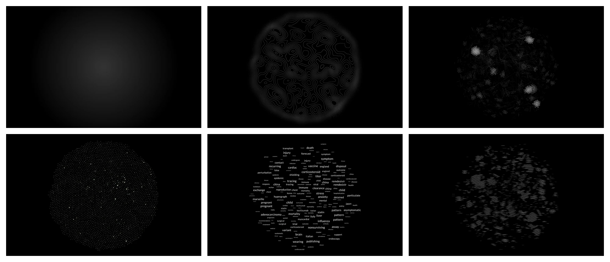
The Cartography of COVID-19 is composed of six information layers. Figure 3 breaks down these layers, which are described below:
- Background. It sets the scene with a radial gradient.
- Contours. Token weights associated with authors are visualized as an elevation map that draws a digital terrain in which peaks point out areas of high relevance.
- Edges. They embody the network structure that connects nodes.
- Nodes. They represent the researchers through their names and circles, whose size is equal to the number of articles authored.
- Distant keywords. When three close authors share tokens, the most relevant token is shown in the distant view, offering a semantic affordance to zoom in on a specific area.
- Close keywords. When three close authors share tokens, the three most relevant tokens appear between them during the close reading to enrich it with details.
Interaction follows the visual information-seeking mantra of overview first, then details on demand (Shneiderman 1996). At first glance, the network is entirely visible, with cartographic peaks and distant keywords which, like spatial affordances, allow readers to identify interesting areas to examine (Gibson 2015). These initial layers fade out by zooming in, leaving room for more specific information such as nodes and close keywords (Fig. 3), hosted in the hexagonal tiling (Rodighiero, Kaplan, and Beaude 2018). Furthermore, moving over one researcher with the cursor reveals their tokens and coauthors.
Translatability
When we interact with data visualizations that are composed of information layers, zooming allows the reader to navigate between the detail and the whole picture. In The Cartography of COVID-19, these two extremes are identified with the individuals and the entire scientific community. The zoom allows us to combine these layers in a single assemblage, exactly as Google Earth merges satellite images of different scales by fading (Latour 2014).
Yet the interpretation of the cartography is based on another movement of zooming, which occurs between the original and its translation. Walter Benjamin refers to this movement as translatability: “To comprehend [the translation] one must go back to the original, for that contains the law governing the translation: its translatability” (Benjamin [1923] 2007, 70). Translatability is therefore the intrinsic capacity of a text to go back and forth between the original and its translation. Concerning the close and distant readings employed by digital humanists, translatability can be seen as the feature that allows the reader to go back and forth between the original texts and their visual abstraction.
The zoom is therefore the gesture the reader uses to understand the translation. Recalling that visualization reading is a subjective performance (Drucker 2014), the reader’s understanding is developed by the movement between the original text and its translation. Yet the same gesture exists between the texts and their visual translation. Data visualizations are not tools to replace close reading, but rather instruments to invite the reader to explore both textual and visual dimensions. Despite the kind of translation, the understanding remains in the space between the original and the translated.
Conclusions
What kind of translation does The Cartography of COVID-19 provide? It provides a computational visual translation to explore research subjects from a different perspective. If, in the 1970s, Jack Goody stated that the invention of writing was fundamental to driving the intellectual development of human beings (Goody 1973), and if programming languages drastically changed our way of approaching a problem (Guichard 2018), today the visual dimension covers the important role of making large amounts of information intelligible (Manovich 2008; Wurman 2001).
What critical analysis does it contribute? Network visualizations are visual models that allow great flexibility in displaying information. They are not instruments meant to replace original sources but rather forms of translation to support visual thinking along with the original sources. As clearly stated by W. J. T. Mitchell, “One of [Charles S.] Peirce’s deepest insights, often forgotten, was that the algebraic equation is no less an icon than its diagrammatic rendering in two-dimensional space” (Mitchell 2015). The importance of the correspondence between the original and its visual translation was already recognized by Peirce to solve the same problem from two different perspectives.
Why be aware of the lexical distance between scholars? The Cartography of COVID-19 represents a different point of view on the pandemic, whose general assumption is that lexical similarity represents a proper way to explore scientific communities. Ernst von Glasersfeld was both inspirational and enlightening when he recognized in language the cybernetic model that regulates the relationship between individuals (Von Glasersfeld 1992). Likewise, the scientific community can be imagined as a chaotic mass of scholars regulated by its lexicon: the more similar their vocabulary, the more meaningful the closeness between individuals. Words come from our innermost thoughts and represent the very essence of our culture.
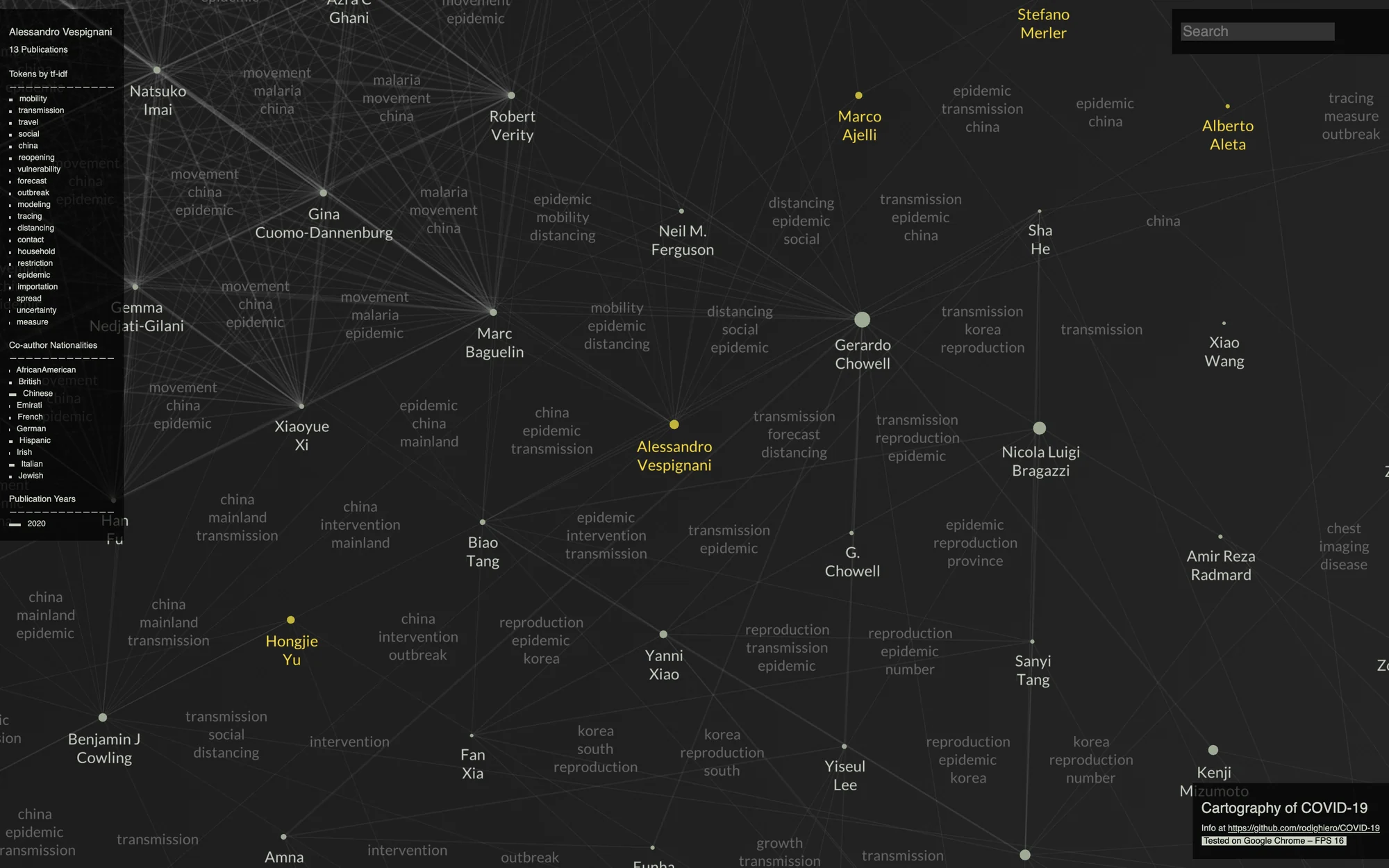
What kind of new knowledge emerges from this visual method? The Cartography of COVID-19 clearly shows insights that would not be visible otherwise. At first glance, the number of scholars and diversity of subjects related to the coronavirus overwhelms the viewer, but on closer inspection other details emerge. For instance, even though the virus has been a matter of worldwide interest for over a year, half of the scholars are Chinese, which underlines China’s effort in tackling the problem. Furthermore, in considering the clusters, it can be noticed that clusters are mainly composed of scientists of the same ethnicity, while some highly connected individuals like Alessandro Vespignani work in an international environment, probably as a result of their multicultural background (Fig. 4).
Some data visualizations are created to prove facts, others to allow exploration. The Cartography of COVID-19 is designed to make viewers aware of the complexity of science through a linguistic perspective. However, each reading is a unique performance that requires time, and the diversity of human perspectives gives room to conversations as the main way to create knowledge. According to its use, The Cartography of COVID-19 can be both a scientific instrument for observation and a device for fostering conversations, exactly like the lemon squeezer designed by Philippe Starck, which is more useful as a conversation trigger than as a kitchen utensil (Heskett 2005).
References
- Benjamin, Walter. (1923) 2007. “The Task of the Translator.” In Illuminations, edited by Hannah Arendt. Reprint. New York: Schocken Books.
- Bertin, Jacques. 1981. Graphics and Graphic Information-Processing. First American edition. Berlin and New York: De Gruyter.
- Bostock, Michael, Vadim Ogievetsky, and Jeffrey Heer. 2011. “D3: Data-Driven Documents.” IEEE Transactions on Visualization and Computer Graphics 17 (12): 2301–9. doi:10/b7bhhf.
- Callon, Michel, and Bruno Latour. 2017. “Unscrewing the Big Leviathan: How Actors Macro-Structure Reality and How Sociologists Help Them to Do So.” In Advances in Social Theory and Methodology: Toward an Integration of Micro- and Macro-Sociologies, edited by Karin Knorr-Cetina and Aaron Victor Cicourel, 277–303. Abingdon: Routledge.
- Card, Stuart K., Jock D. Mackinlay, and Ben Shneiderman. 1999. Readings in Information Visualization: Using Vision to Think. The Morgan Kaufmann Series in Interactive Technologies. San Francisco: Morgan Kaufmann Publishers.
- Dong, Ensheng, Hongru Du, and Lauren Gardner. 2020. “An Interactive Web-Based Dashboard to Track COVID-19 in Real Time.” The Lancet Infectious Diseases 20 (5): 533–34. doi:10/ggnsjk.
- Drucker, Johanna. 2014. Graphesis: Visual Forms of Knowledge Production. Cambridge, MA: Harvard University Press.
- Francis, W. Nelson. 1967. The English Language: An Introduction. 2nd ed. London: English Universities Press.
- Gibson, James J. 2015. The Ecological Approach to Visual Perception. Classic Editions. New York and London: Psychology Press.
- Goody, Jack. 1973. “Evolution and Communication: The Domestication of the Savage Mind.” The British Journal of Sociology 24 (1): 1. doi:10/bkrfgs.
- Guichard, Eric. 2018. “Linux.” In Abécédaire des mondes lettrés.
- Heskett, John. 2005. Design: A Very Short Introduction. Very Short Introductions. Oxford: Oxford University Press.
- Kubrick, Stanley, dir. 1964. Dr. Strangelove or: How I Learned to Stop Worrying and Love the Bomb. Columbia Pictures.
- Latour, Bruno. 1996. Aramis, or the Love of Technology. Translated by Catherine Porter. Cambridge, MA: Harvard University Press.
- ———. 2014. “Anti-Zoom.” In Olafur Eliasson: Contact. Paris: Flammarion and Fondation Louis Vuitton.
- ———. 2018. Down to Earth: Politics in the New Climatic Regime. Translated by Catherine Porter. Cambridge: Polity Press.
- Latour, Bruno, and Steve Woolgar. (1979) 1986. Laboratory Life: The Construction of Scientific Facts. Princeton: Princeton University Press.
- Luhn, Hans Peter. 1957. “A Statistical Approach to Mechanized Encoding and Searching of Literary Information.” IBM Journal of Research and Development 1 (4): 309–17. doi:10/ds9qfr.
- Lynch, Michael. 1988. “The Externalized Retina: Selection and Mathematization in the Visual Documentation of Objects in the Life Sciences.” Human Studies 11 (2/3): 201–34. jstor.org/stable/20009026.
- Manning, Christopher D., and Hinrich Schütze. 1999. Foundations of Statistical Natural Language Processing. Cambridge, MA: MIT Press.
- Manovich, Lev. 2008. “Data Visualization as New Abstraction and Anti-Sublime.” In Small Tech: The Culture of Digital Tools, edited by Byron Hawk, David M. Rieder, and Ollie O. Oviedo. Minneapolis: University of Minnesota Press.
- Mitchell, W. J. T. 2015. Image Science: Iconology, Visual Culture, and Media Aesthetics. Chicago: University of Chicago Press.
- Moon, Chloe Ye Eun, and Dario Rodighiero. 2020. “Mapping as a Contemporary Instrument for Orientation in Conferences.” In Atti del IX Convegno Annuale AIUCD. La svolta inevitabile: sfide e prospettive per l’informatica umanistica. Zenodo. doi:10.5281/zenodo.3611340.
- Moretti, Franco. 2005. Graphs, Maps, Trees: Abstract Models for a Literary History. London and New York: Verso.
- Rodighiero, Dario, Frédéric Kaplan, and Boris Beaude. 2018. “Mapping Affinities in Academic Organizations.” Frontiers in Research Metrics and Analytics 3 (4). doi:10.3389/frma.2018.00004.
- Rodighiero, Dario, Eveline Wandl-Vogt, and Elian Carsenat. (2020) 2021. Cartography of COVID-19. JavaScript. doi:10.5281/zenodo.3940636.
- Scott, John. (1991) 2000. Social Network Analysis: A Handbook. 2nd ed. London: SAGE Publications.
- Shneiderman, Ben. 1996. “The Eyes Have It: A Task by Data Type Taxonomy for Information Visualizations.” In Proceedings 1996 IEEE Symposium on Visual Languages, 336–43. Boulder, CO: IEEE Computer Society Press. doi:10/fwdq26.
- Spärck Jones, Karen. 1972. “A Statistical Interpretation of Term Specificity and Its Application in Retrieval.” Journal of Documentation 28 (1): 11–21. doi:10/fjhg7g.
- Van der Spuy, Rex. 2015. Learn Pixi.js. Berkeley, CA: Apress. doi:10.1007/978-1-4842-1094-9.
- Verlet, Loup. 1967. “Computer ‘Experiments’ on Classical Fluids. I. Thermodynamical Properties of Lennard-Jones Molecules.” Physical Review 159 (1): 98–103. doi:10.1103/PhysRev.159.98.
- Von Glasersfeld, Ernst. 1992. “Why I Consider Myself a Cybernetician.” Cybernetics and Human Knowing 1 (1): 21–25.
- Wang, Lucy Lu, Kyle Lo, Yoganand Chandrasekhar, et al. 2020. “CORD-19: The COVID-19 Open Research Dataset.” In Proceedings of the Workshop on NLP for COVID-19 at ACL 2020. Association for Computational Linguistics. arxiv.org/abs/2004.10706.
- Wurman, Richard Saul. 2001. Information Anxiety 2. Indianapolis, IN: Que.