Mapping as a Contemporary Instrument for Orientation in Conferences
Moon, Chloe Ye Eun, and Dario Rodighiero. 2020. “Mapping as a Contemporary Instrument for Orientation in Conferences.” In AIUCD. https://doi.org/10.5281/zenodo.3611340.
This article presents a case study analyzing submissions from the Digital Humanities 2019 conference by visualizing a network of authors situated according to their shared lexicon. This new form of summarizing a conference is an effective way to grasp the whole conference at once. The hope is that this method of visualization will not be employed merely as a retroactive way to reflect on past events, but rather as an instrument to prepare the visit and orientate the attendees during the conference.
Introduction
Maps are formidable instruments for abstracting territory and travels. Centuries of cartographic mapping marked the evolution of world history, and today’s technological innovation has opened a new paradigm of mapmaking (Dodge, Kitchin, and Perkins 2011; Lévy 2016). Maps are no longer static; instead, they can change dynamically given external inputs. For instance, users can zoom into the map to obtain detailed information, and they can choose to filter selected information. Due to the big data technology, maps are now able to represent larger and larger datasets (Kitchin 2014). Moreover, maps now have a new level of abstraction not only for the territory but also for individuals; unlike before, visualizing social relationships became a common practice since Jacob Moreno’s work in social relationships (1934).
This article presents a case study of human mapping, specifically of scholars and their scientific productions, focusing on the Digital Humanities Conference 2019 that took place in Utrecht, the Netherlands in July 2019. Such a case study develops the previous work of Rodighiero (Rodighiero 2015, 2018; Rodighiero, Kaplan, and Beaude 2018), demonstrating how a map can be a powerful instrument of reduction not only for territory but also for individuals. The cartography of DH20191 is intended to be a generic tool for mapping scientific communities, in the form of an open-source project.2 The article will present the result of such cartography by discussing the following four sections: 1) Documentality as a way human activity is regulated through textual inscriptions; 2) Lexical Analysis as the way documents can be automatically analyzed under human supervision; 3) Graphic Design as a visual translation that makes a conference attended by a thousand authors wholly graspable; 4) Reading as a form of user interaction through which the map reader acquires information from the visual media.
Documentality
A series of social rules govern human behaviors (Kaplan 2012), and scholars are no exception. Their activities follow specific rules when they attend a conference; submitting articles, waiting for reviews, attending the conference, and presenting their work are the steps they are required to complete in order to be a part of an academic field. Such behaviors are auto-regulated by the scientific community itself, which gives a structure to the research domain.
Articles play a significant role in this process as they are an extension of their authors. They convey different types of information, such as collaboration, affiliation, scientific interests, and the writing proficiency of the authors. Therefore, articles are valuable as they portray the authors’ values and social relevance. We hypothesize that documents embody textual information, which can be used to measure the proximity between scholars most effectively. As individuals express themselves through their language, authors can be described through their writing. Terms are not a barrier, nor they are private. Everyone can choose and use preferred words and speech styles according to their taste, and the choice is profoundly affected by social and cultural environments, such as their education level and location. Nonetheless, there is complete freedom in the selection of language, and this freedom goes beyond any collaboration or citation. Just like how Pierre Bourdieu used personal interviews to classify individuals (Blasius and Schmitz 2014; Romele and Rodighiero 2019), the goal here is to map scholars using scientific articles.
Lexical Analysis
Natural Language Processing (NLP) is a branch of artificial intelligence that aims to process and analyze large amounts of text (Manning and Schütze 1999). Since humans’ natural language has no structured rules computers can understand, NLP is especially challenging; therefore, the techniques in NLP are significant as they derive meaningful insights from texts written in such a language. In order to profile the authors who attended the Digital Humanities 2019 conference, we performed a lexical analysis to map the distance from one author to another.
First, the XML data of DH2019 were cleaned for a more accurate analysis utilizing JavaScript programming language and the Cheerio library.3 From each article are extracted authors, title, and text body. Since multiple authors can co-author a paper, the text body is grouped by authors, allowing multiple occurrences of the same publication if a paper is co-authored. Each text is then tokenized using a lexical analyzer provided by the Natural library4 for NLP. Successively, tokens are singularized and filtered by a list of stopwords in various languages, including Brazilian, English, French, German, Italian, and Portuguese.
The arrays of tokens associated with authors are then computed via the Term Frequency – Inverse Document Frequency algorithm, also known as TF-IDF (Luhn 1957; Sparck Jones 1972). TF-IDF extracts the most relevant terms for each author by counting the frequency of each term with respect to the inverse frequency of the entire collection of words. The list of terms for each author is then shortened to the fifteen most relevant terms in order to simplify the visual computation. Table 1 shows a sample concerning the scholar Frédéric Kaplan.
| Token | Value |
|---|---|
| Parcel | 156.29 |
| Amsterdam | 147.92 |
| Street | 97.37 |
| City | 78.99 |
| Cadastre | 68.97 |
| Rue | 64.53 |
| Neighbourhood | 62.45 |
| Urban | 61.73 |
| Century | 52.24 |
| Bottin | 51.62 |
| Transcription | 51.59 |
| Geometrical | 44.74 |
| Extraction | 43.90 |
| Geographical | 41.92 |
| Geometry | 39.82 |
| Wine | 38.72 |
| Activity | 37.67 |
| Dialect | 37.53 |
| Cinema | 34.19 |
| Time | 33.67 |
Graphic Design
Data analysis is followed by the creation of a network, in which each author forms a node, and the shared tokens are transformed into weighted edges. The resulting visual rendering does not recall a classic network visualization, such as Gephi’s (Bastian, Heymann, and Jacomy 2009), but rather a cartographic projection. It is a hybrid form that combines the characteristics of networks and maps.
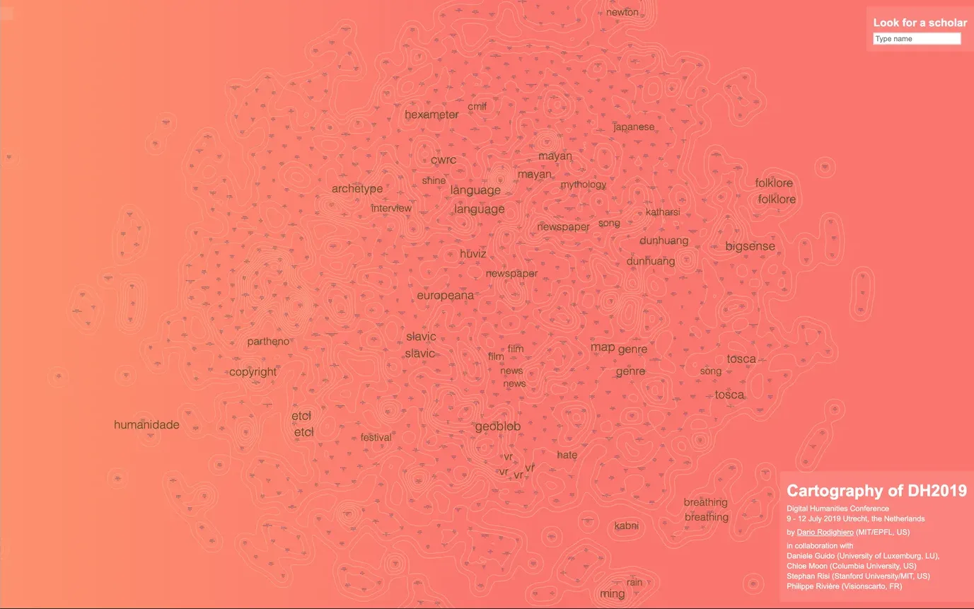
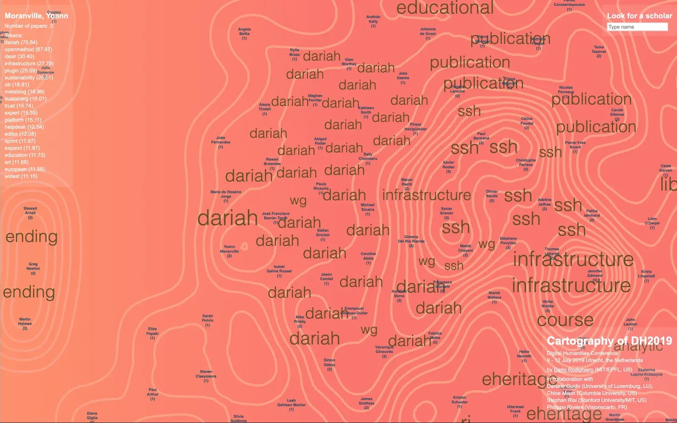
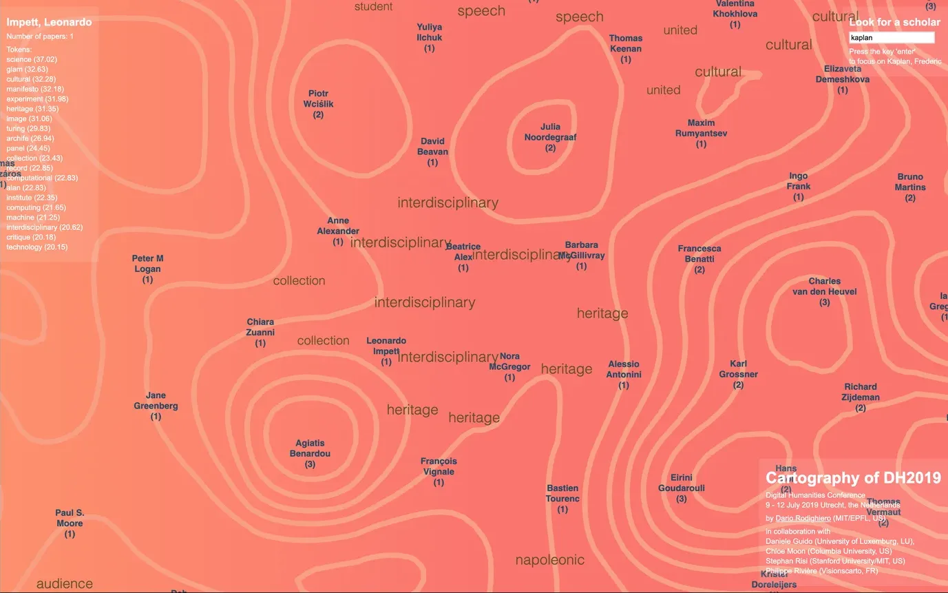
Authors are placed on the map using the Simulation function5 from the d3.js library (Bostock, Ogievetsky, and Heer 2011). Then, between each pair of authors, is displayed the most relevant token whose size corresponds to the TF-IDF value; a high TF-IDF value corresponds to a high degree of relevance in the whole collection. The elevation contours (Monmonier 1991) displayed at the end of the simulation due to computation limits make the density of documents visible; as a result, an author who authored many articles is placed at a peak. The result is an elevation map that shows the most relevant tokens, such as languages, music, newspapers, and films. When zoomed in, the map can be enlarged to display the details, and the user will notice the tokens changing. The reason is that the tokens are selected according to the zoom level; when the map is utterly visible, the user can see the most relevant tokens with high-frequency values, and by zooming he will see the most generic ones. This choice makes the view more specific and less generic, while a zoom-in allows viewing the complete gradient of tokens (see Figures 1, 2, and 3).
Reading
In cartography, the reader is the individual who interacts with the map (Dodge, Kitchin, and Perkins 2011; Lévy 2016). Readers interpret the cartographic visualization differently depending on their knowledge and culture. In front of the DH2019 visualization, the reader identifies a configuration of scholars who attended the conference with an article. When authors share the same text because they co-authored a paper, they appear to be close on the map, and the most relevant token between them appears (Figure 1). When there is a continuity of tokens, it indicates an area of particular interest (Figure 2). When the density of individuals is visible, there is a high chance that it represents a collective work (Figure 3).
The map offers a novel point of view on the conference, which is a different approach from the proceedings or the website. It makes all the authors and their work graspable at the same time, while also allowing the readers to navigate through individual authors.
When a reader starts to explore a specific part of the map by zooming in, the interaction becomes personal and unique. Therefore, readers play an active role while putting an interpretation on the map; their pathway influences what they see. Furthermore, if a reader who participated in the conference recognizes her identity in the map, the reading validates the reader’s representation by evaluating the correctness of the map and the neighborhood where the reader is placed (Rodighiero and Cellard 2019).
Conclusion
Language is not only a means to convey one’s ideas, but also to express interest and background. If a conference forms a scientific community by attendance, the articles presented at the conference shape the specific language of such a community with a delicate balance of different voices (Glasersfeld 1992).
Lexical analysis of terminologies is an effective means to study the community. Thanks to the current technology and visualization techniques, we are now able to create a dynamic, interactive map of the community, which is dense and rich in information. From this new form of data visualization, readers can interpret the lexical proximity of all the authors at a glance, both the distance and placement.
Now the question is, why don’t we use the map as an instrument during the conference? It would undoubtedly be a much more contextually rich and visually intriguing way of understanding the conference, instead of merely using statistics to summarize the event.
Acknowledgements
We want to thank Kurt Fendt for his constant support and supervision, and the MIT Literature section for hosting us, in particular Shankar Raman, Diana Henderson, and Alicia Mackin. Thanks also to Jeffrey Schnapp and the laboratory members of Harvard MetaLab.
Acknowledgement also goes to Stephan Risi for developing the search function and Philippe Rivière for his priceless collaboration, which was fundamental for recent projects. A special mention to Daniele Guido, an inseparable friend and colleague whose design capacities are stimulus for doing better; the grapefruit color palette is his merit.
This article is part of the grant Early Postdoc.Mobility P2ELP1_181930 Worldwide Map of Research funded by the Swiss National Science Foundation.
References
- Bastian, Mathieu, Sebastien Heymann, and Mathieu Jacomy. 2009. “Gephi: An Open Source Software for Exploring and Manipulating Networks.” In Proceedings of the Third International ICWSM Conference.
- Blasius, Jörg, and Andreas Schmitz. 2014. “Empirical Construction of Bourdieu’s Social Space.” In Visualization and Verbalization of Data, 205–222. Boca Raton: CRC Press.
- Bostock, Michael, Vadim Ogievetsky, and Jeffrey Heer. 2011. “D3: Data-Driven Documents.” IEEE Transactions on Visualization and Computer Graphics 17 (12): 2301–2309.
- Dodge, Martin, Rob Kitchin, and Chris Perkins, eds. 2011. The Map Reader: Theories of Mapping Practice and Cartographic Representation. Chichester: John Wiley & Sons.
- Glasersfeld, Ernst von. 1992. “Why I Consider Myself a Cybernetician.” Cybernetics and Human Knowing 1 (1).
- Kaplan, Frédéric. 2012. “How Books Will Become Machines.” In Lire demain: Des manuscrits antiques à l’ère digitale, 27–44. Lausanne: PPUR.
- Kitchin, Rob. 2014. The Data Revolution: Big Data, Open Data, Data Infrastructures and Their Consequences. London: SAGE Publications.
- Lévy, Jacques, ed. 2016. A Cartographic Turn. Lausanne: EPFL Press.
- Luhn, Hans Peter. 1957. “A Statistical Approach to Mechanized Encoding and Searching of Literary Information.” IBM Journal of Research and Development 1 (4): 309–317.
- Manning, Christopher D., and Hinrich Schütze. 1999. Foundations of Statistical Natural Language Processing. Cambridge, MA: MIT Press.
- Monmonier, Mark. 1991. How to Lie with Maps. Chicago: University of Chicago Press.
- Moreno, Jacob L. 1934. Who Shall Survive? A New Approach to the Problem of Human Interrelations. Washington, DC: Nervous and Mental Disease Publishing Co.
- Rodighiero, Dario. 2015. “Representing the Digital Humanities Community: Unveiling the Social Network Visualization of an International Conference.” Parsons Journal for Information Mapping 7 (2).
- Rodighiero, Dario. 2018. “Printing Walkable Visualizations.” In Transimage Conference 2018, 58–73. Edinburgh: University of Edinburgh.
- Rodighiero, Dario, and Loup Cellard. 2019. “Self-Recognition in Data Visualization.” EspacesTemps.net.
- Rodighiero, Dario, Frédéric Kaplan, and Boris Beaude. 2018. “Mapping Affinities in Academic Organizations.” Frontiers in Research Metrics and Analytics 3 (4).
- Romele, Alberto, and Dario Rodighiero. 2019. “Digital Habitus, or Personalization without Personality.” Forthcoming.
- Sparck Jones, Karen. 1972. “A Statistical Interpretation of Term Specificity and Its Application in Retrieval.” Journal of Documentation 28 (1): 11–21.
-
The cartography of DH2019 is accessible at rodighiero.github.io/DH2019. ↩
-
The open-source project is available at github.com/rodighiero/DH2019. ↩
-
Cheerio is an open-source library available at cheerio.js.org. ↩
-
Natural is an open-source library available on GitHub at github.com/NaturalNode/natural. ↩
-
Simulation runs to place the nodes in a proper way; more information is available at github.com/d3/d3-force. ↩