Weather Map: A Diachronic Visual Model for Controversy Mapping
@incollection{rodighiero2023weather,
  author      = {Dario Rodighiero and Jean Daniélou},
  editor      = {Florentina Armaselu and Andreas Fickers},
  title       = {Weather Map: A Diachronic Visual Model for Controversy Mapping},
  booktitle   = {Zoomland: Exploring Scale in Digital History and Humanities},
  publisher   = {De Gruyter},
  address     = {Berlin},
  year        = {2023},
  pages       = {449–466},
  isbn        = {978-3-11-131777-9},
  doi         = {10.1515/9783111317779-017}
}
The Weather Map is a visual model to investigate public debates on media. Relying on the Media Cloud archives, the visual model transforms a simple query into a sophisticated visualization by employing the visual grammar of synoptic weather charts. Peaks of pressure and clashes between airmasses are used to describe the conflicts in media through the temporal dimension, diving into the human and non-human dynamics that make the controversy alive. The Weather Map was conceived as a digital tool to help students and scholars analyze public debates, according to the controversy mapping field founded by Bruno Latour. In particular, the visual model pushes the boundaries of network visualization, exploring advanced techniques of graphic design. The outcome is a web-based application developed in JavaScript and Python at the disposal of education and research.
Representing time using a single static image is one of the most challenging exercises in visual arts. An excellent example of this gesture comes from the photographer Etienne Jules Marey whose “photographic gun” captured living beings’ movements in controlled environments. Such a photographic technic gave life to a series of shots that followed one another in a linear narrative, revealing the complexity and elegance of motion (see Figure 1). Similarly visual, the Futurist movement represented technical progress by depicting the mechanics and dynamics of locomotives, airplanes and cars. One of its representatives, Umberto Boccioni, was ambitious enough to imagine the human body as a mechanical system in motion, molding one of the most famous sculptures of all time, titled Unique Forms of Continuity in Space (see Figure 2). Exhibited in New York by MoMA and the Met, Boccioni’s sculpture portrays all potential athlete’s movements over time through the static materiality of bronze. These two artists represent time differently: while Marey breaks down the motion linearly into an interpolated sequence of images, Boccioni’s artistic gesture molds time by composing a multifaceted form nonlinearly. This latter vision by Umberto Boccioni inspires this text in representing information through nonlinear forms (Flusser 2014), with close attention to the temporal dimension.


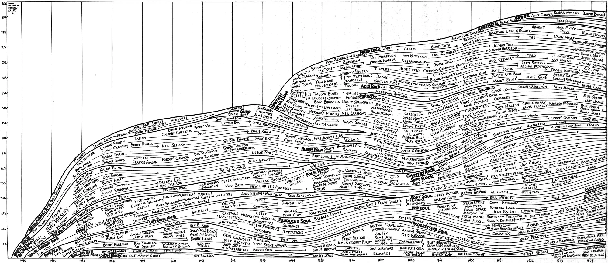
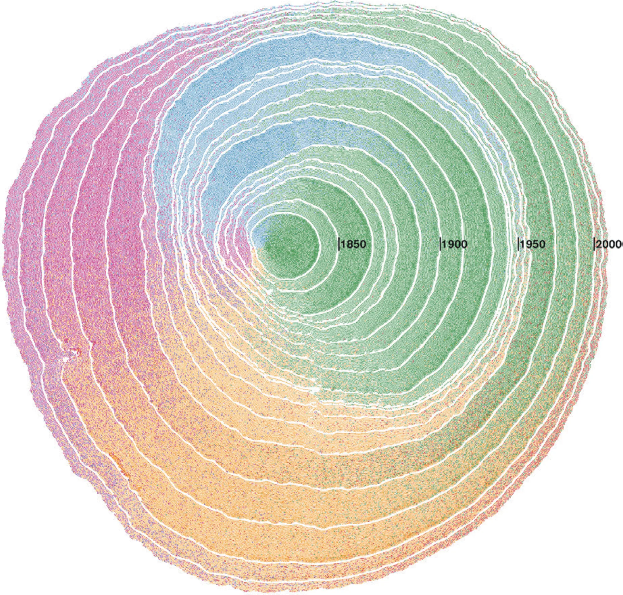
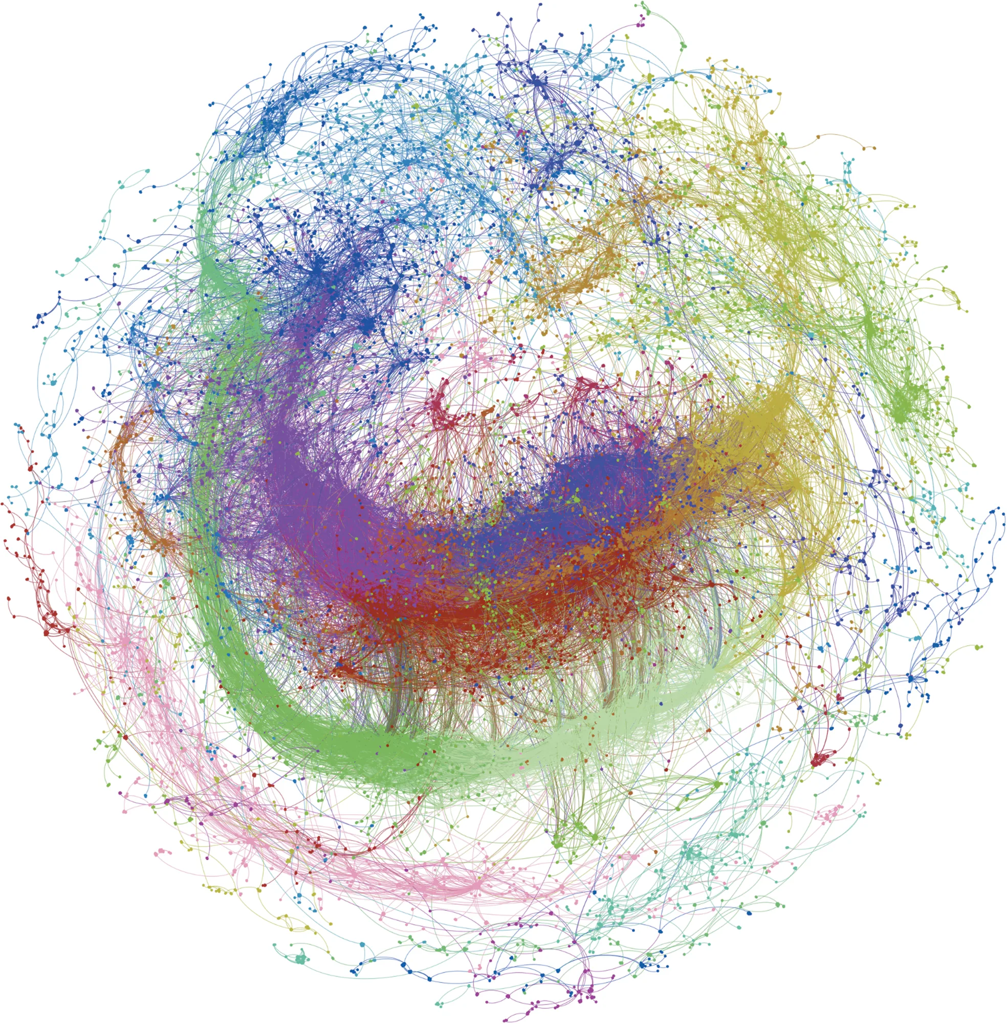
The representation of time is a challenge that attracted not only artists over time but also designers who deal with temporal information. In much the same way as the artworks by Marey and Boccioni, data visualizations can portray time through linear or nonlinear representations (Rosenberg and Grafton 2010). While the timeline (see Figure 3) is an established linear model investigated in different doctoral theses (Huron 2014; Kräutli 2016; Vane 2019), nonlinear representations are considerably less frequent. Among these, two examples (see Figures 4 and 5) provide a more accurate picture of the nonlinear interpretation of time. Inspired by tree-ring dating, Pedro Cruz’s diagram of U.S. immigration uses radius for time and direction for provenance (Cruz et al. 2022), while Kirell Benzi’s network shows the spread of CERN’s original tweet to illustrate the Higgs boson’s discovery (Benzi 2017). The data visualizations by Cruz and Benzi are pertinent for two reasons. The first reason is formal: the visual compactness prevents any readability issues created by wide-image linearity; the second is practical: representing time in a nonlinear way is a less intuitive and more challenging intellectual exercise. These reasons make the premises present a new visual model.
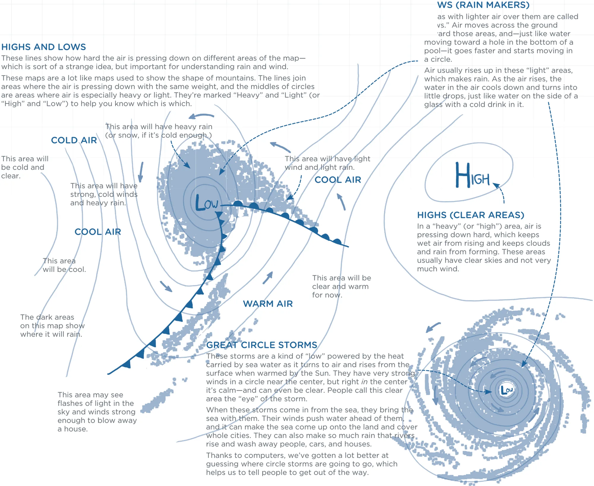
This text further investigates the nonlinear representation of time by using weather maps as metaphors to draw diachronic network visualizations. Also known in meteorology as synoptic weather charts, these maps are visual instruments to predict weather changes. Their accuracy is high in the hours following computation, but the precision decreases over prolonged periods. Although we all are accustomed to seeing them in newspapers and television, their interpretation is so complex that experts often need to illustrate the meaning. One reason for such complexity is the multiple information levels that compose weather maps, which will be more understandable with a brief explanation of their visual grammar.
This section is an introduction to the graphic design of synoptic weather charts. Many experts in the field published comprehensive books on this subject (Ahrens and Henson 2019; Pearce 2002), but the illustration by the cartoonist Randall Munroe (see Figure 6) is sufficient for our purposes (Munroe 2015). The most noticeable layer of information in weather maps probably corresponds to elevation lines, usually employed in topographic maps to indicate altitude. Meteorologists use elevation lines to represent air pressure, the primary measurement to forecast weather conditions. When the pressure is high, the sky is clear; when it is low, the weather is rainy. Like topographical maps, the number of lines indicates intensity. Unlike topographical maps that use colors to distinguish between land and sea, weather maps’ elevation lines are uncolored but mark the peaks of high and low pressure with the letters H and L, which might be colored in red and blue to increase readability. Although these graphic elements already give a static image of weather conditions, a further layer of information enriches pressure with dynamism by marking air collisions with front lines. Front lines draw attention to the friction between different pressures by tracing a thick curve. While elevation lines form a pattern all over the map, front lines indicate precise areas of interest by marking the movement with a thicker line. When the cold air gains ground, the front line features a series of triangles, substituted by semicircles when the warm air advances; both are aligned along the front line to indicate the direction of movement.
As already mentioned, the central idea is to design a diachronic visual method inspired by weather maps’ visual grammar, but diving deeper into the cultural context will help to understand the primary purpose. The visual method finds its practical use in controversy mapping, a pedagogical method created by the philosopher Bruno Latour from the analysis of scientific controversies.
The analysis of scientific controversies origins in Science and Technology Studies to investigate the necessary conditions for scientists and engineers to recognize their work (Latour 2021). When teaching at École des mines, only then did Latour transform it into a pedagogical method to study public controversies. While the analysis of scientific controversies focused on science, the controversy mapping shifted the method’s attention to public debates external to the scientific world (Venturini and Munk 2022; Gray et al. 2022; Latour 2021). In Latour’s course, students were encouraged to investigate scientific debates starting from public broadcasting. For example, during the online course Scientific Humanities, given in the fall of 2014 through the platform France Université Numérique, students were asked to analyze a debate of their choice starting from a newspaper article. Following the Actor-Network Theory (Latour 2005), the initial analysis aimed to identify in the article the human actors (i.e., politicians, journalists and scientists) as well as the non-humans (i.e., innovative technologies, information systems and political organizations). The identified actors were later divided into two factions according to their standpoint on public debate, trying to delve into the subject by mapping oppositions. This diagrammatic representation was the basis for the investigation’s backbone on which to add further information, such as hierarchical structures, verbatim quotations and relationships between actors in a sort of ontological scheme. Although many of Latour’s pupils are today concerned with climate change (Baya-Laffite and Cointet 2014; Pryck 2022; Venturini et al. 2014), the controversy mapping covers a large variety of subjects (Seurat and Tari 2021). This great diversity reminds us how controversy mapping is not aimed at achieving specific knowledge but rather at learning a method of analysis with a wide range of applications and use cases.
A set of digital tools were at students’ disposal to integrate their inquiry. When Sciences Po’s curriculum included controversy mapping, the médialab supported institutional pedagogy by working on open-access software to explore public debates. The list of digital tools included Gephi to analyze networks (Jacomy et al. 2014), Sigma.js to visualize networks (Jacomy [2012] 2022), Hyphe to trace Web hyperlinks (Jacomy et al. 2016) and Seealsology to reveal Wikipedia connectivity (Density Design [2014] 2022). It is interesting to notice that all these tools represented an effort not only to collect and analyze but also to visualize data. Indeed, the visual form of information enhances the process of interpretation and provides evidence to support arguments during presentations. When visual expertise was increasingly valuable for data analysis, the médialab was probably one of the first laboratories in the world to recognize the importance of visual tools for students and scholars.
The theory and practice of médialab found common ground in networks, which acted as boundary objects between different application domains (Bowker and Star 1999): on the one hand, the Actor-Network Theory was interested in the complexity of social relations in technological discourses (Akrich, Callon and Latour 2006); on the other hand, social network analysis was emerging with more intensity in the scientific environment (Lazer et al. 2009; Scott [1991] 2000). In addition, networks’ popularity increased through the advancements in data visualization, as confirmed by books (Lima 2011), visual models (Rigal and Rodighiero 2017; Windhager et al. 2020) and retrospective exhibitions (Barabási et al. 2020). The Weather Map described in these pages is precisely situated at the intersection of controversy mapping and network visualization, focusing on the lack of relational time-based visual models. Although innovative algorithms advanced the computational load of networks, leading to the analysis of complex structures, visual grammar barely evolved from the drawings made by Jacob Moreno almost one century ago (Moreno 1934). The Weather Map, in this sense, represents an effort to fill this gap by developing a new aesthetic metaphor for network visualization, in line to what Johanna Drucker teorized a few years ago (2010: 72–73).
The back end of the Weather Map finds its foundation in the Media Cloud, an open-source platform to analyze media ecosystems through millions of newspaper articles (Roberts et al. 2021). The platform allows users to make different requests, including queries on specific subjects treated in media. Even though mainly related to American culture, its collection was perfect for examining public debates from a temporal dimension—information rarely accessible online in newspaper archives. When the project started, the Media Cloud covered around ten years of online newspapers, a perfect time window to investigate the subject of biomass energy. The choice of mapping biomass energy for a case study had many reasons: among them, it was considered the involvement of private and public actors, the growing visibility in public broadcasting and the presence of technology as one of the non-human actors.
The Weather Map visual model answers questions related to the public debate on biomass. Who are the individuals and the organizations involved in the discussion? What are the specific topics of discussion to which they are committed? Who and what is emerging from this discussion? Who are the actors leaving the debate? Moreover, where are the frictions between opponents? Compared to other network visualizations, the insights that the Weather Map can provide are more multifaceted because of the different layers of information. However, as explicitly described in this text, temporality covers a central role in the diachronic visual model.
The creation process starts from Media Cloud with data extraction. After refinement, the most appropriate query to cover the subject of biomass was “(biomass OR ‘bio-energy’ OR ‘bio energy’ OR ‘bio-economy’ OR ‘bio economy’) AND language:en” for English-speaking collections including United States, India, Russian Federation, France, United Kingdom and Ghana. The request returned 20,000 articles published between 2011 and 2020 as a list of JSON files downloaded via API (Rodighiero 2021). Each file contained metadata and the outcomes of text analysis to avoid copyright infringements for sharing full texts. Metadata such as title, source, date and URL came along with extracted entities generated from Natural Language Processing techniques to identify people, organizations and places mentioned in the full-text body. In addition, Media Cloud’s topic modeling provided a list of keywords from the New York Times’ classification, which is valuable for pairing specific topics with individuals and organizations. For Weather Map, entity extraction is a key computational technique to identify and space out actors on the Cartesian plane, facilitating the distant reading of hundreds of thousands of documents.
Individuals, organizations and keywords were selected to draw the network visualization. Each entity was profiled by collecting name, type, frequency and co-occurrence by processing the downloaded JSON files. It is essential to keep in mind from the beginning that frequency is used to measure the trend of every entity, while the co-occurrence of entities is fundamental to arranging network visualization. The latter is processed first via UMAP dimensionality reduction that spaces out individuals, organizations and keywords (McInnes, Healy and Melville 2018). Word embedding, usually employed in digital humanities to visualize corpora by word frequency (Berger, McDonough and Seversky 2017), organizes entities in the bi-dimensional space: the more two entities are mentioned in the same article, the closer they appear on the map. Such a spatial organization of individuals, organizations and keywords makes possible the identification of thematic clusters, which are critical to divide the biomass debate into subcategories for better understanding.
As with many algorithmic outputs, the Weather Map undergoes a process of parametrization. Entities, for example, are manually filtered to limit the number of elements and reduce visual complexity. For biomass energy, the entity’s threshold of visibility was set to 50 mentions over ten years. In addition, UMAP hyperparameters must be tested to find a proper arrangement for the network. Within data selection and treatment, parametrization covers a necessary procedure in the design process, affecting the final result through subjective configurations.
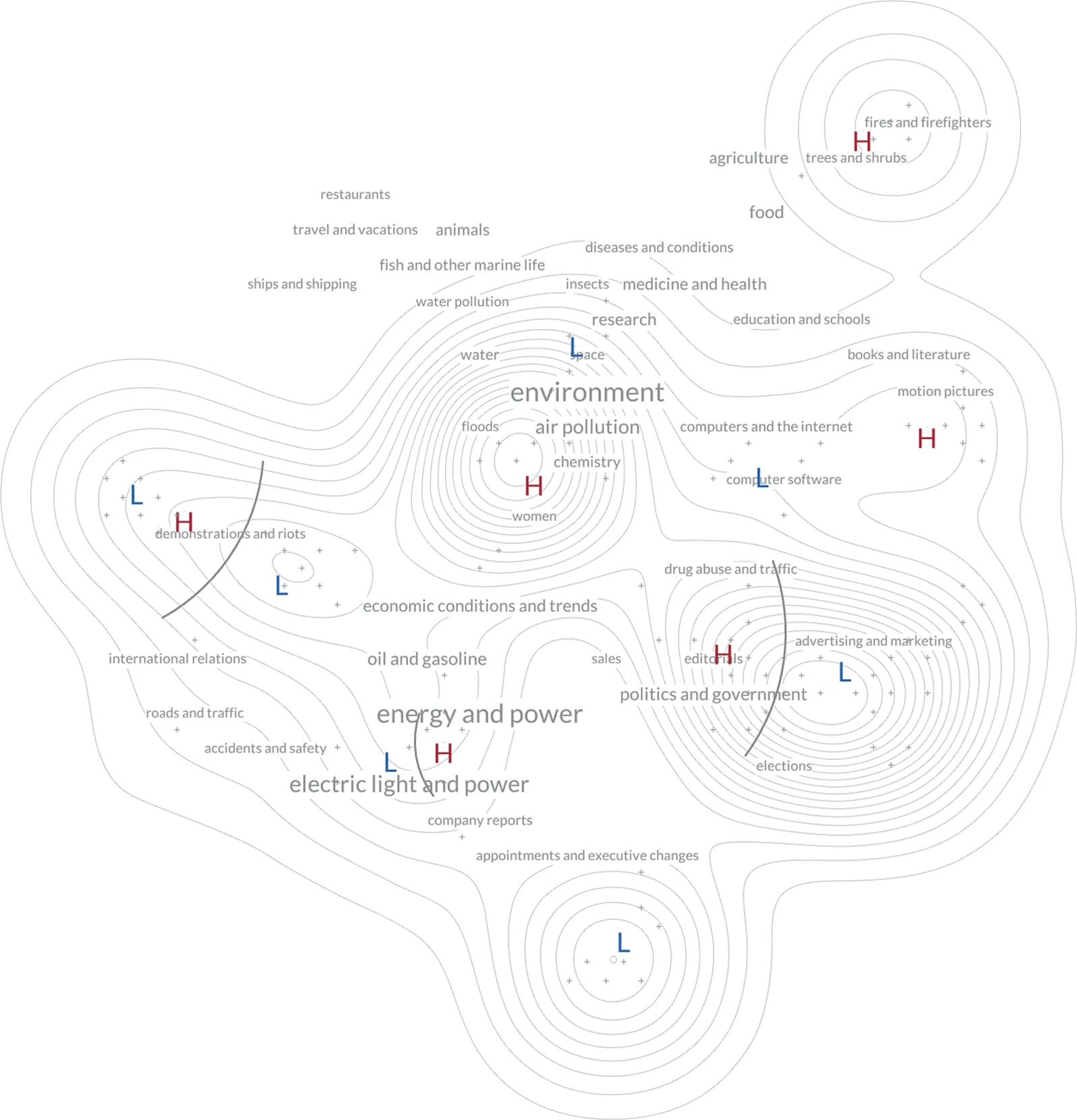
Another critical element of Weather Maps concerns how actors’ activity is measured, which is correlated to the frequency of entities’ appearance in newspapers. The meteorological pressure is used as a metaphor to show whether an entity is taking up space in the public debate. Pressure measurement results from simple linear regression applied to each entity according to their yearly frequency of appearance in newspapers. When the line’s inclination results are positive, mentions have grown over the years and the entity has become visible in public debates. Then, inclinations are normalized by subtracting the public debate’s average trend. The resulting frequency and arrangement are visualized during the design process for intermediary inspections (see Figure 7). Finally, high- and low-pressure clusters of entities are recognized using HDBSCAN (McInnes, Healy and Astels 2017), allowing the identification of collisions between warm and cold air when they overlap (see Figure 8). One of the most exciting outcomes of this process is the decomposition into subcategories, demonstrating that more specific controversies give form to the whole public debate.
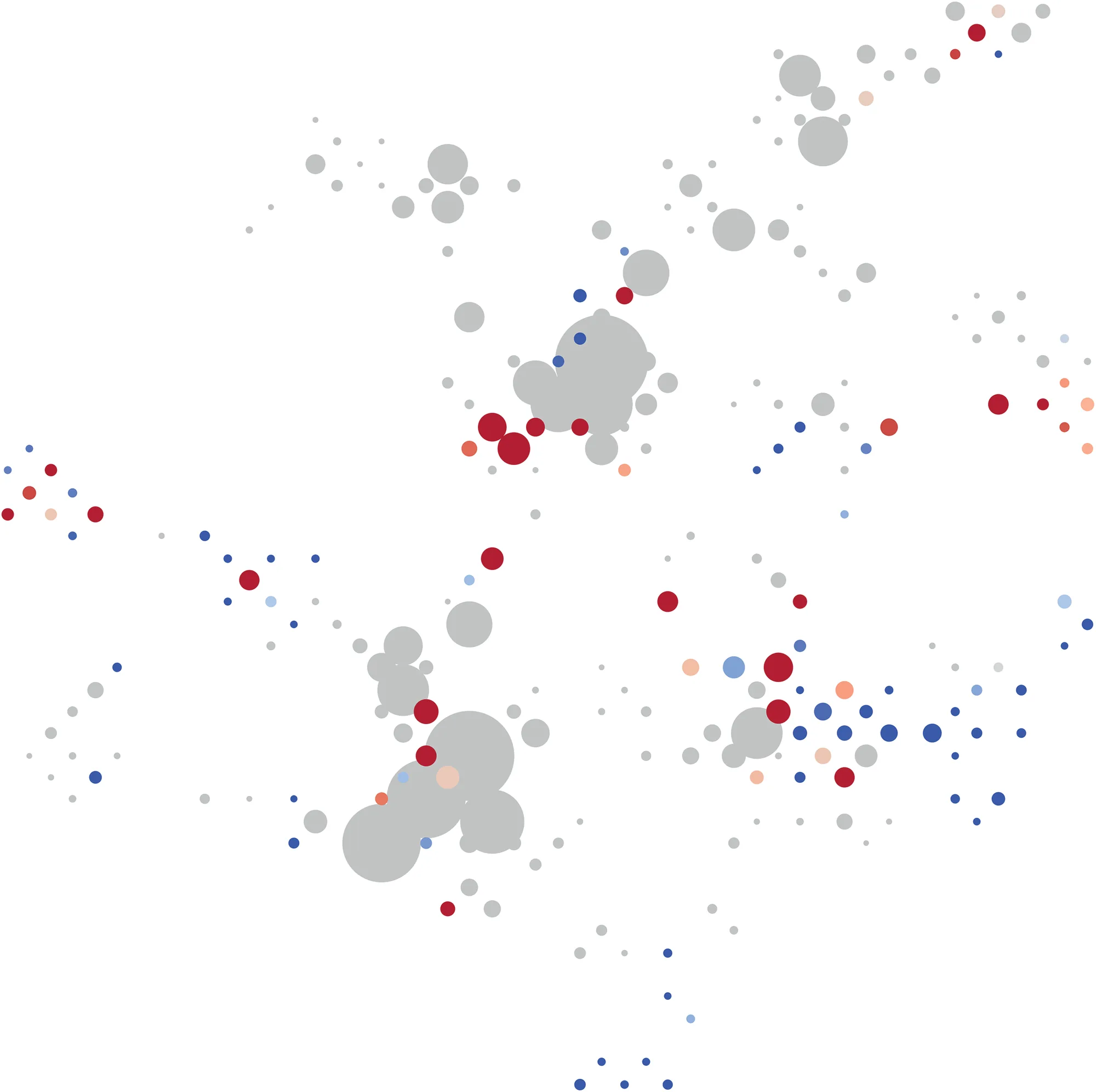

The computed data were then exported in CSV files, ready to be integrated into a web-based interface offering an advanced level of interactivity. The functions of zooming or selecting, for example, permit the distribution of information on different layers (Shneiderman 1996). Indeed, the Weather Map is a data visualization embedded into a web-based interactive interface composed of different layers and panels (see Figure 9). The entities’ frequency gives form to elevation lines by molding “peaks” over the network visualization, indicating the most active clusters of debate that would be harder to recognize otherwise (Rodighiero and Romele 2022). Its graphic rendering relies on d3-contour, made available by the well-known library for data visualization d3.js (Data-Driven Documents [2017] 2023; Bostock, Ogievetsky and Heer 2011). This topographical background is then enriched by keywords, which orientate viewers by showing different topics treated in clusters. The size differs according to frequency, so the most used keywords are more visible than others. Entities at this level of zoom are represented by placeholders with the sign “+” to leave more visibility to keywords and contours at the forefront. Then, emerging and disappearing clusters are indicated by letters H and L, situated at the center of the polygons introduced in Figure 8. The front lines represent the most valuable graphic element that enriches the distant view by marking the antagonisms between opposing groups of actors. They are geometrically generated starting from the average point between two centers of opposed clusters, accentuating the curve’s convexity toward the emerging actors. The result of such a mapping differs from Latourian controversy mapping, in which two factions usually represent the entire public debate. Indeed, the Weather Map proves that public debates are not composed of two fronts but multiple. Figure 9, for example, shows how the general discussion on biomass is multifaceted, identifying three more prominent topics: climate change, energy production and national politics.
When exploring the concept of Anti-Zoom, Bruno Latour correctly concluded that the optical zoom in digital maps is still a myth. Maps of one territory change according to scale and zooming is necessary to glue to connect them in a continuous visual effect (Latour 2014). In the Weather Map, elevation lines, keywords and front lines offer different affordances that invite readers to zoom into specific areas. Figure 10, for example, shows the area associated with politics where some notable actors can be identified. After zooming, the “political cluster” reveals in red the actors entering the public debate and in blue the ones leaving it. Among them are Barack Obama and Donald Trump, with the former leaving room for the second—it is essential to remember that this map is updated to December 2020. In addition, the left panel allows users to access more detailed information: clicking on Trump’s icon activates a contextual panel containing the Wikipedia link, some statistics of frequency, the general trend and a random selection of ten hyperlinks to newspaper articles used as sources of information. The contextual panel complements the network visualization, offering additional insights to readers and developers.
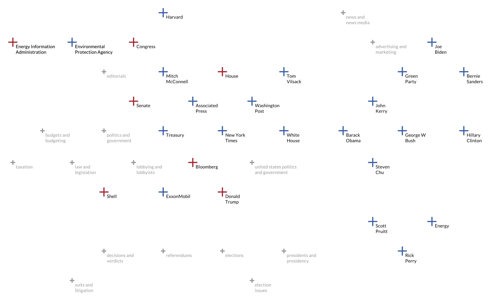
An example of navigation can start from this area (see Figure 10). Looking for companies involved in U.S. politics, a reader might click on Shell, a multinational active in oil and gas. From the contextual panel, the reader might successively open a newspaper article describing how Shell is interested in reusing coffee beans to create biofuel. This simple example also shows how instruments like the Weather Map are not intended to provide proof but rather exploratory systems to delve into complexity (Klein 2022).
Weather Map’s visual grammar transforms the heuristic scope of controversy mapping by modifying the conditions of the representation. At Sciences Po and École des Mines, the field of controversy mapping uses static networks of actors or event-based chronologies. According to this methodology, the relations that articulate networks remain invariably inert. The lines connecting the different points harden, reduce and immobilize the social game of friction (Tsing 2005), enrolment tactics (Callon 1986) and alliance strategies (Callon and Latour 2017). A static representation prevents viewers from seeing lines’ whole life, including the passage into new arenas of debate (Dodier 2003). The same is true for the chronological frieze, which reframes the past into a dot alignment whose relational logic is summarized in a game of successions and accumulations: this event + this event + this event = the controversy. Like entomologists killed and pinned butterflies on blank sheets of paper to observe them, controversy mapping is currently equipped with tools that kill the controversy to study it.
Faced with these challenges, the Weather Map offers an alternative. First, it uses thermal semiotics polarized between warm and cold to approach the controversy in the making by mapping the formation of fronts where the debate crystallizes. This visual method opens the way to studying multi-positional movements through the plurality of actors that shape controversial events. Instead of re-examining once it occurred, the controversial event is captured in statu nascendi before becoming an event. In addition, the whole logic of visualization is turned upside down. To put it with an image, it is no longer a question of waiting for the rain to fall but of considering the clouds announcing its coming. Technically, the Weather Map promises a shift in observing controversies’ emergence and growth by placing the inquiry’s standpoint one step ahead of their institutionalization and public recognition. This shift brings the controversy studies closer to social life in motion. It makes it possible to return to the initial program expressed by Bruno Latour, which consisted of looking at science and society in the process of being made rather than already made (Latour 1999).
References
- Ahrens, C. Donald, and Robert Henson. 2019. Meteorology Today: An Introduction to Weather, Climate, and the Environment. 12th ed. Boston, MA: Cengage.
- Akrich, Madeleine, Michel Callon, and Bruno Latour. 2006. Sociologie de la traduction: textes fondateurs. Paris: École des mines de Paris.
- Barabási, Albert-László, Mónica Bello, Julia Kluge-Fabényi, et al. 2020. Hidden Patterns: Visualizing Networks at BarabásiLab. Edited by Alanna Stang and Peter Weibel. Berlin: Hatje Cantz Verlag.
- Baya-Laffite, Nicolas, and Jean-Philippe Cointet. 2014. “Cartographier la trajectoire de l’adaptation dans l’espace des négociations sur le climat.” Réseaux 188 (6): 159–198.
- Benzi, Kirell Maël. 2017. “From Recommender Systems to Spatio-Temporal Dynamics with Network Science.” PhD diss., EPFL. doi:10.5075/EPFL-THESIS-7428.
- Berger, Matthew, Katherine McDonough, and Lee M. Seversky. 2017. “Cite2vec: Citation-Driven Document Exploration via Word Embeddings.” IEEE Transactions on Visualization and Computer Graphics 23 (1): 691–700. doi:10.1109/TVCG.2016.2598667.
- Bostock, Michael, Vadim Ogievetsky, and Jeffrey Heer. 2011. “D3: Data-Driven Documents.” IEEE Transactions on Visualization and Computer Graphics 17 (12): 2301–9. doi:10/b7bhhf.
- Bowker, Geoffrey C., and Susan Leigh Star. 1999. Sorting Things Out: Classification and Its Consequences. Cambridge, MA: MIT Press.
- Burdick, Anne, Johanna Drucker, Peter Lunenfeld, Todd Presner, and Jeffrey Schnapp. 2012. Digital_Humanities. Cambridge, MA: MIT Press.
- Callon, Michel. 1986. “Élements pour une sociologie de la traduction: La domestication des coquilles Saint-Jacques et des marins-pêcheurs dans la baie de Saint-Brieuc.” L’Année sociologique 36: 169–208.
- Callon, Michel, and Bruno Latour. 2017. “Unscrewing the Big Leviathan: How Actors Macro-Structure Reality and How Sociologists Help Them to Do So.” In Advances in Social Theory and Methodology: Toward an Integration of Micro- and Macro-Sociologies, edited by Karin Knorr-Cetina and Aaron Victor Cicourel, 277–303. New York: Routledge.
- Chapple, Steeve, and Reebee Garofalo. 1977. Rock ’n’ Roll Is Here to Pay: The History and Politics of the Music Industry. Chicago: Nelson-Hall.
- Cruz, Pedro, John Wihbey, Avni Ghael, Felipe Shibuya, and Stephen Costa. 2022. “Dendrochronology of U.S. Immigration.” Information Design Journal 25 (1): 6–20. doi:10.1075/idj.25.1.01cru.
- Data-Driven Documents. (2017) 2023. “D3-Contour.” Version 3.0.1. GitHub. github.com/d3/d3-contour.
- De Pryck, Kary. 2022. GIEC: la voix du climat. Paris: Presses de Sciences Po.
- Density Design. (2014) 2022. “Strumentalia-Seealsology.” GitHub. github.com/densitydesign/strumentalia-seealsology.
- Dodier, Nicolas. 2003. Leçons politiques de l’épidémie de sida. Paris: Éditions de l’École des hautes études en sciences sociales. doi:10.4000/books.editionsehess.1760.
- Drucker, Johanna. 2010. Subjective Meteorology. Graphical Pamphlet Series 3. Los Angeles, CA: Druckwerk.
- Flusser, Vilém. 2014. “Crisis of Linearity.” Translated by Adelheid Mers. Boot Print: 19–21. monoskop.org.
- Gray, Jonathan, Liliana Bounegru, Richard Rogers, et al. 2022. “Engaged Research-Led Teaching: Composing Collective Inquiry with Digital Methods and Data.” Digital Culture & Education 14 (3): 55–86.
- Huron, Samuel. 2014. “Constructive Visualization: A Token-Based Paradigm Allowing to Assemble Dynamic Visual Representation for Non-Experts.” PhD diss., Université Paris-Sud. tel.archives-ouvertes.fr/tel-02924469.
- Jacomy, Alexis. (2012) 2022. “Sigma.js.” Version 3.0.0. GitHub. github.com/jacomyal/sigma.js.
- Jacomy, Mathieu, Paul Girard, Benjamin Ooghe-Tabanou, and Tommaso Venturini. 2016. “Hyphe, a Curation-Oriented Approach to Web Crawling for the Social Sciences.” In Proceedings of the Tenth International AAAI Conference on Web and Social Media (ICWSM 2016).
- Jacomy, Mathieu, Tommaso Venturini, Sebastien Heymann, and Mathieu Bastian. 2014. “ForceAtlas2, a Continuous Graph Layout Algorithm for Handy Network Visualization Designed for the Gephi Software.” PLoS ONE 9 (6): e98679. doi:10.1371/journal.pone.0098679.
- Klein, Lauren. 2022. “What Data Visualization Reveals: Elizabeth Palmer Peabody and the Work of Knowledge Production.” Harvard Data Science Review 4 (2). doi:10.1162/99608f92.5dec149c.
- Kräutli, Florian. 2016. “Visualising Cultural Data: Exploring Digital Collections through Timeline Visualisations.” PhD diss., Royal College of Art.
- Latour, Bruno. 1999. Pandora’s Hope: Essays on the Reality of Science Studies. Cambridge, MA: Harvard University Press.
- ———. 2005. Reassembling the Social: An Introduction to Actor-Network-Theory. Oxford: Oxford University Press.
- ———. 2014. “Anti-Zoom.” In Olafur Eliasson: Contact. Paris: Flammarion and Fondation Louis Vuitton.
- ———. 2021. “Préface.” In Controverses mode d’emploi, edited by Clémence Seurat and Thomas Tari, 11–21. Paris: Presses de Sciences Po.
- Lazer, David M. J., Alex Pentland, Lada Adamic, et al. 2009. “Computational Social Science.” Science 323 (5915): 721–23. doi:10.1126/science.1167742.
- Lima, Manuel. 2011. Visual Complexity: Mapping Patterns of Information. New York: Princeton Architectural Press.
- McInnes, Leland, John Healy, and Steve Astels. 2017. “HDBSCAN: Hierarchical Density-Based Clustering.” The Journal of Open Source Software 2 (11): 205. doi:10.21105/joss.00205.
- McInnes, Leland, John Healy, and James Melville. 2018. “UMAP: Uniform Manifold Approximation and Projection for Dimension Reduction.” arXiv. doi:10.48550/arXiv.1802.03426.
- Moreno, Jacob L. 1934. Who Shall Survive? Washington, DC: Nervous and Mental Disease Publishing Co.
- Munroe, Randall. 2015. Thing Explainer: Complicated Stuff in Simple Words. Boston: Houghton Mifflin Harcourt.
- Pearce, Robert P., ed. 2002. Meteorology at the Millennium. International Geophysics Series 83. London: Academic Press.
- Rigal, Alexandre, and Dario Rodighiero. 2017. “Méduse, vers des visualisations plus complexes que le réseau.” In Chronotopies: lecture et écriture des mondes en mouvement, edited by Guillaume Drevon, Luc Gwiazdzinski, and Olivier Klein, 136–47. Grenoble: Elya Éditions. doi:10.5281/zenodo.3516222.
- Roberts, Hal, Rahul Bhargava, Linas Valiukas, et al. 2021. “Media Cloud: Massive Open Source Collection of Global News on the Open Web.” In Proceedings of the Fifteenth International AAAI Conference on Web and Social Media (ICWSM 2021), 1034–45.
- Rodighiero, Dario. 2021. “Weather Map.” Version 1.0.0. GitHub. github.com/rodighiero/weather-map.
- Rodighiero, Dario, and Alberto Romele. 2022. “Reading Network Diagrams by Using Contour Lines and Word Clouds.” In Proceedings of Graphs and Networks in the Humanities, 1–7. Amsterdam: Royal Netherlands Academy of Arts and Sciences.
- Rosenberg, Daniel, and Anthony Grafton. 2010. Cartographies of Time. New York: Princeton Architectural Press.
- Scott, John. (1991) 2000. Social Network Analysis: A Handbook. 2nd ed. London: SAGE Publications.
- Seurat, Clémence, and Thomas Tari. 2021. Controverses, mode d’emploi. Paris: Presses de Sciences Po.
- Shneiderman, Ben. 1996. “The Eyes Have It: A Task by Data Type Taxonomy for Information Visualizations.” In Proceedings 1996 IEEE Symposium on Visual Languages, 336–43. Boulder, CO: IEEE Computer Society Press. doi:10/fwdq26.
- Tsing, Anna Lowenhaupt. 2005. Friction: An Ethnography of Global Connection. Princeton, NJ: Princeton University Press.
- Vane, Olivia. 2019. “Timeline Design for Visualising Cultural Heritage Data.” PhD diss., Royal College of Art. researchonline.rca.ac.uk/4325.
- Venturini, Tommaso, Nicolas Baya-Laffite, Jean-Philippe Cointet, et al. 2014. “Three Maps and Three Misunderstandings: A Digital Mapping of Climate Diplomacy.” Big Data & Society 1 (2). doi:10.1177/2053951714543804.
- Venturini, Tommaso, and Anders Kristian Munk. 2022. Controversy Mapping: A Field Guide. Cambridge: Polity.
- Wikimedia Commons contributors. 2015. “Umberto Boccioni’s Unique Forms of Continuity in Space.” Wikimedia Commons. commons.wikimedia.org.
- ———. 2021. “Étienne-Jules Marey’s Pelican.” Wikimedia Commons. commons.wikimedia.org.
- Windhager, Florian, Saminu Salisu, Roger A. Leite, Velitchko Filipov, and Silvia Miksch. 2020. “Many Views Are Not Enough: Designing for Synoptic Insights in Cultural Collections.” IEEE Computer Graphics and Applications: 58–71.