Advanced Interface Design for IIIF: A Digital Tool to Explore Image Collections at Different Scales
Rodighiero, Dario, Alberto Romele, José Higuera Rubio, Celeste Pedro, Matteo Azzi, and Giorgio Uboldi. 2023. “Advanced Interface Design for IIIF: A Digital Tool to Explore Image Collections at Different Scales.” Umanistica Digitale. https://doi.org/10.6092/ISSN.2532-8816/17230.
This article introduces a proposal for an experimental interface design that uses the International Image Interoperability Framework (IIIF) to facilitate the exploration of image collections, relying on the relationships created by the scholarly practice of annotation. Within the project “From Data to Wisdom,” an innovative digital tool was designed by harnessing IIIF resources and leveraging close and distant reading on three levels of connectivity: micro, meso, and macro. The proposed tool integrates annotation features that enable scholars to analyze individual images as well as interpret broader connections and patterns across image sets. This article outlines the interface’s theoretical framework and design principles, highlighting the potential to support interdisciplinary research and advance digital art tools.
Introduction
The International Image Interoperability Framework (IIIF) initiated a transformative phase for cultural institutions and scholarly research, revolutionizing the way experts interact with visual materials (Snydman, Sanderson, and Cramer 2015). By enabling the smooth exchange and integration of image repositories, IIIF has significantly improved close reading practices through features like zooming and retrieval, allowing for detailed examination and scholarly annotation.
These IIIF features do not just enhance individual studies; they foster community engagement and cross-institutional collaboration. Experts now enjoy access to image collections from diverse sources, paving the way for the design of innovative digital tools that heighten research capabilities. These tools span a wide range of collections and uses, such as for manuscripts (Van Zundert 2018), geolocations (Agostini and Beneš 2021), newspapers (Romanello et al. 2020), curation (Branco, Aversa, and Venticinque 2023), museology (Emanuel 2018), and visualization (Rodighiero et al. 2022b).
However, despite this extensive variety, there remains an unexplored gap in the field of multidimensional interface navigation. This article aims to bridge that gap, introducing a IIIF digital tool offering an advanced user experience to navigate image collections at various levels of detail. This pioneering digital tool emerged from the project titled “From Data to Wisdom” (FDTW), funded by the Fundação para a Ciência e a Tecnologia — Portugal 2020. FDTW sought to explore and philosophize about the practices of data treatment and visualization from the Middle Ages to Early Modernity (13th–17th century). By investigating the historical roots of these techniques, the research illuminated the epistemological challenges addressed (Higuera Rubio et al. 2022).
During the Middle Ages, scholars devised an array of tools and techniques to efficiently transmit and organize knowledge across disciplines. They commonly employed visualizations like circular diagrams and trees to structure and visualize information (Lima 2014, 2017). These diagrams played an essential role in scholarly works like encyclopedias, aiding in the categorization and alignment of concepts by elucidating the purpose of each discipline (Obrist 1996).
However, what sets medieval visualizations apart is their functionality that extends beyond mere organization. In certain instances, they were used to process data, generate fresh insights and reveal previously unknown solutions. These diagrams were intimately tied to both imagination and logical demonstration, involving the collection and rational categorization of perceptual information from external objects. When integrated into books, medieval visualizations became dynamic tools for asynchronous knowledge sharing. They served as immutable mobiles that facilitated universal education and invigorated scientific discourse (Latour 1986).
Project’s Image Corpus
The interpretation of medieval visualizations is largely anchored in texts and their traditions (Esmeijer 1978; Murdoch 1984; Salonius and Worm 2014; Sicard 1993). Images functioned as vehicles to convey knowledge to those without formal education or those unfamiliar with Latin. This continued into the Renaissance when the advent of printed texts nurtured a burgeoning reading culture. Yet, the interpretation of images continued to revolve around their utility as instruments. Representations were often studied to enrich the dissemination of textual ideas. Diagrams, for example, were seen as visual aids to ease teaching and comprehension.
It is complex to identify the precise moment when these visualizations began to be used independently, coexisting with images and texts (Carruthers [1990] 2008). This shift might have been prompted by a will to “imitate” natural and intellectual processes (Emanuel 2018; Meirinhos 2005) rather than strictly by textual interpretation or specific traditions (Obrist 1996). However, the link to texts remains significant. There are instances where the conventional hierarchy is inverted, and the image serves to elucidate the text. In some scientific and philosophical works, the structure is formed around representations, with the text explicating the image’s content and unearthing its meanings. This can be seen in fields such as astronomy, physics, or geometry, where diagrams symbolize natural phenomena or intellectual processes, with further details provided in the text.
The initial stage of this research involved constructing an image database to categorize various visual representations — such as diagrams, graphs, and trees — based on their connection with specific disciplines. Questions were raised about how each representation adhered to a discipline’s core concepts and objects of study. This was akin to the medieval Divisio Scientiarum (Figure 1), where a “diagrammatic division” mirrored the distinct knowledge requirements of each scientific field. This division was essentially tripartite: firstly, encompassing the compilation, division, hierarchization, and juxtaposition of notions, concepts, or categorizations (Figure 2); secondly, visualizing intellectual processes like demonstration, deduction, and induction (Figure 3); thirdly, imitating nature and natural objects by representing natural phenomena (Figure 4 and Figure 5).
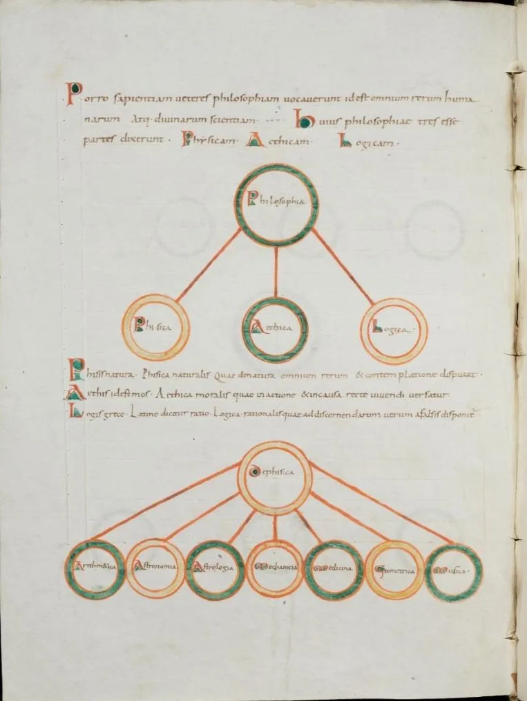
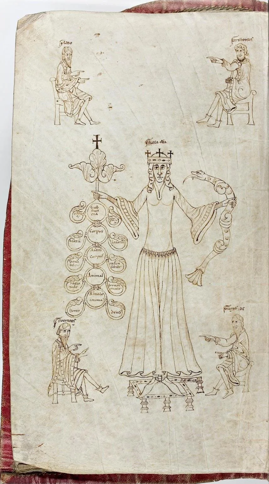
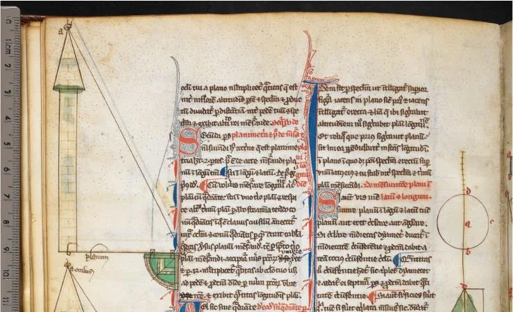
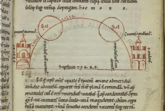
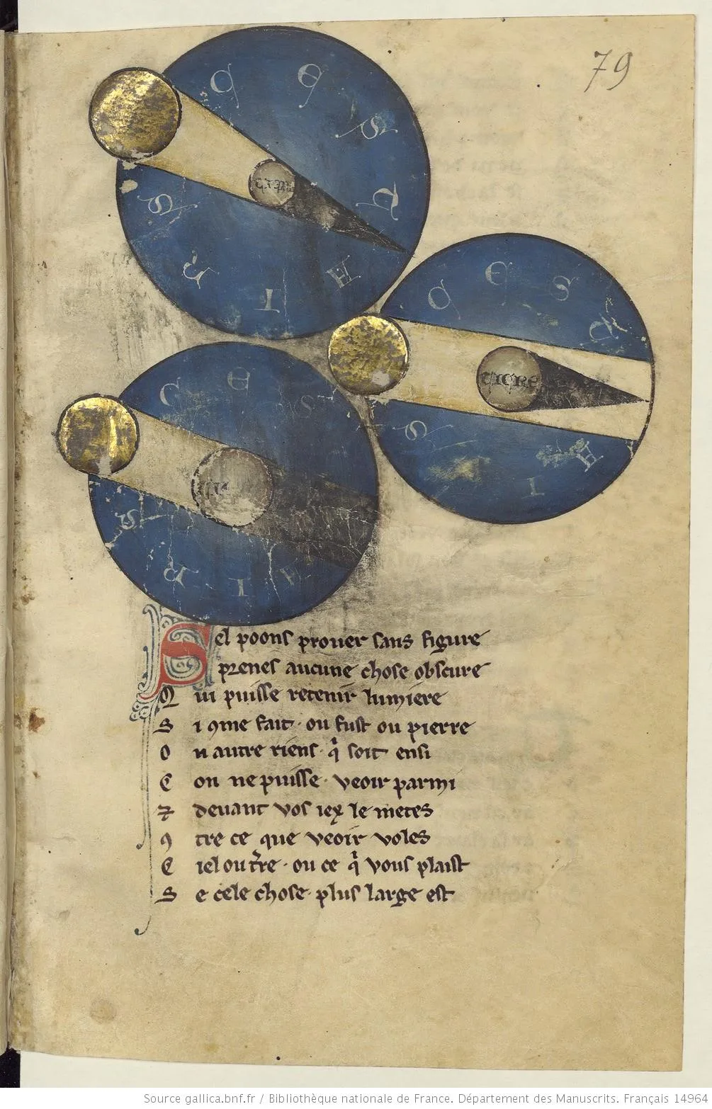
The database consists of a collection of images, collectively referred to as the project’s corpus; it offers a preliminary overview of medieval visualizations within the above-mentioned “diagrammatic division.” These are successively classified into six subcategories: relational schemes and data storage, text diagrams and demonstrative graphics, and knowledge-experience simulations and elemental schemes, encompassing nearly three hundred items.
Establishing clear criteria for what constitutes a diagram or data visualization during the Medieval and Early Modern periods was vital. This required sourcing diverse materials from various periods, locations, and contexts, considering aspects like visual composition, style, and semiotics. Most images were freely acquired from libraries, archives, and other institutions, with original bibliographic details used when available. From this collection, a custom IIIF repository was created containing details on items’ descriptions, attributions, authors, centuries/dates, titles, languages, manuscript references, libraries/collections, origins, countries, themes, bibliographies, archetypes, and mise en page. The selection and arrangement of metadata in the database were periodically revised as the collection grew and evolved, reflecting its significance and relevance to the interface design.
A Design Concept for Multiscale Interaction
The web-based application was developed within the FDTW project and connected to a singular IIIF repository, enriched with functionalities to heighten user engagement. What distinguishes this digital interface is its focus on multiscale interactivity, encompassing micro, meso, and macro navigation levels (Rodighiero et al. 2022a), using pioneering techniques for both close and distant reading.
Micro Level. Here, users can zoom in on specific parts within one image, facilitating close reading practices. This allows them to analyze artistic techniques, scrutinize minute details, and explore the subtleties of the materials. Annotations added to sections enhance relationships within the dataset, fostering a deeper connection to the image collection.
Meso Level. This level expands the functionality to cover images in their entirety. Users can navigate and juxtapose images related by attributes or historical periods. This exploration aids in understanding visual materials on a broader scale, permitting the recognition of contextual relationships, common themes, and variations within the collection.
Macro Level. At this overarching level, users can interact with the complete repository using advanced distant reading techniques (Moretti 2005). Visual methods aid in the identification of image clusters, shifting from simple one-to-one relationships to a multifaceted connectivity that encompasses sets of images. The relational aspects of the IIIF collection might be unveiled through network visualizations (Lima 2011), while the temporal characteristics can be elucidated with timeline models (Romanello et al. 2020). This sweeping analysis grants scholars the ability to obtain profound insights into the extensive range of the collection, fostering interdisciplinary studies and inventive methodologies.
By unifying the micro, meso, and macro levels of interaction, the digital tool transcends the traditional concept of interaction within the context of IIIF datasets. It presents users with a multifaceted interface supporting the comprehensive exploration of image collections, furnishing a thorough toolkit for both close and distant reading practices. Far more than a mere enhancement of accessibility, this tool unlocks the immense capabilities of digital resources, igniting novel pathways for research, analysis, and the pursuit of knowledge.
Image-Annotation Workshop
Following the creation of the project’s corpus, a study was conducted to determine the most effective approach for organizing annotations. This initial process involved systematically exploring the repository and harnessing the diverse inputs of the research team through a dedicated workshop. The workshop aimed to create a taxonomy to establish a relational image model tailored to data visualizations. The inspiration for this approach partially stemmed from Manuel Lima’s visual taxonomy of networks, trees, and spheres (Lima 2011, 2014, 2017), and it was further contextualized within the broader historical discourse on information organization (Svenonius 2000).
Building upon this foundation, the research team identified several critical dimensions to provide readers with a comprehensive understanding of the visual content and knowledge organization within the collection, explicitly focusing on visualizations from the Middle Ages. These dimensions were refined through a second collaborative workshop involving the entire research team under the guidance of the Milan design studio Calibro, which was involved in the digital work package of the project. The meeting was facilitated by Figma, a web tool that allowed the team to annotate 50 images extracted from the collections through an interactive artboard (Figure 6).
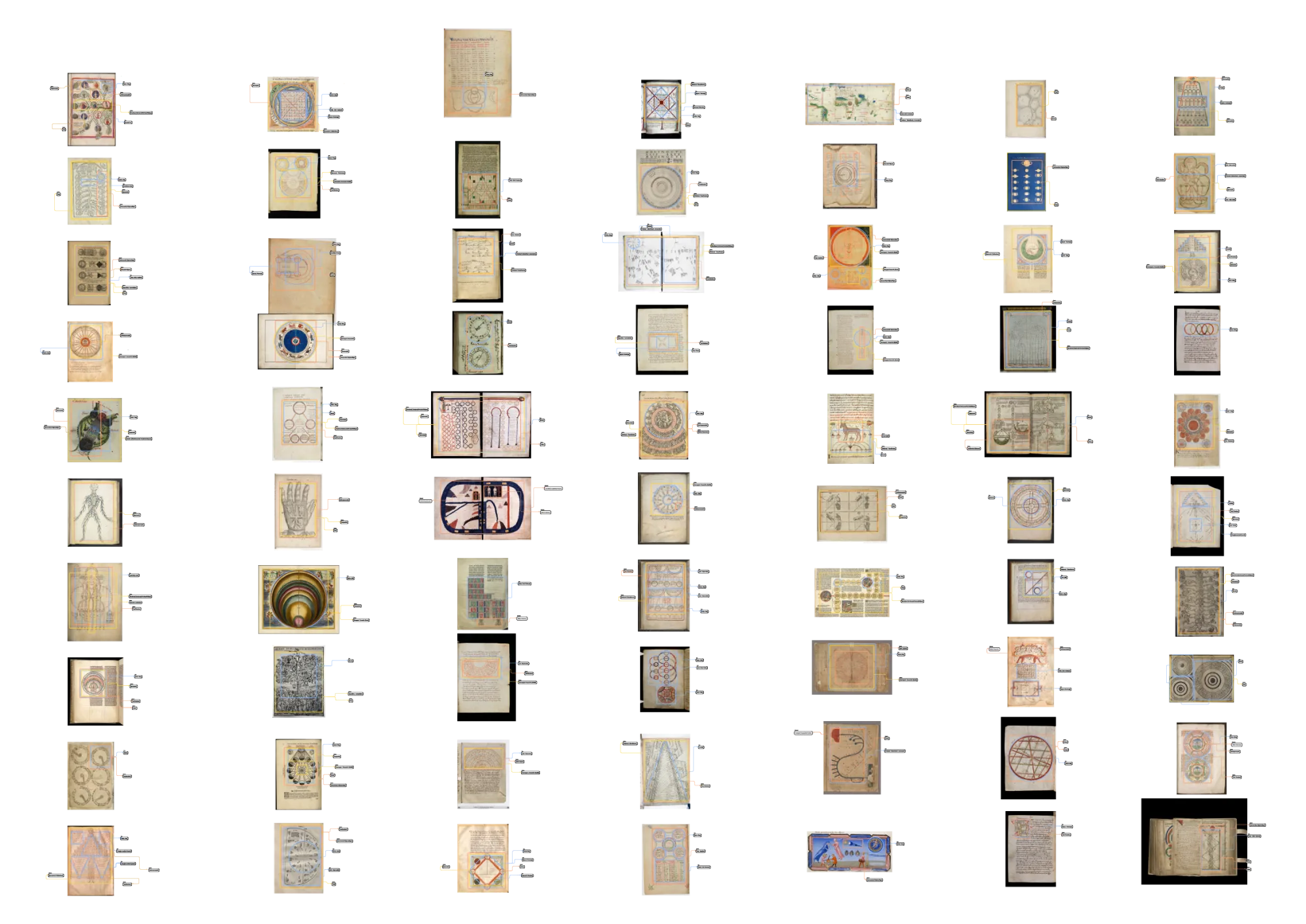
During the workshop, the team was encouraged to zoom in on specific areas of the artboard and annotate the images using drawing tools and a tentative taxonomy. This process allowed the team to assign dimensions to drawn areas to reflect taxonomy usage in a practical exercise. The resulting work was an extensive artboard of annotations, with distinct colors used to indicate different semantic dimensions. This joint exercise provided valuable insights into the usage and distribution of annotations, allowing for the identification of the most relevant characteristics (Figure 7, Figure 8, and Figure 9).
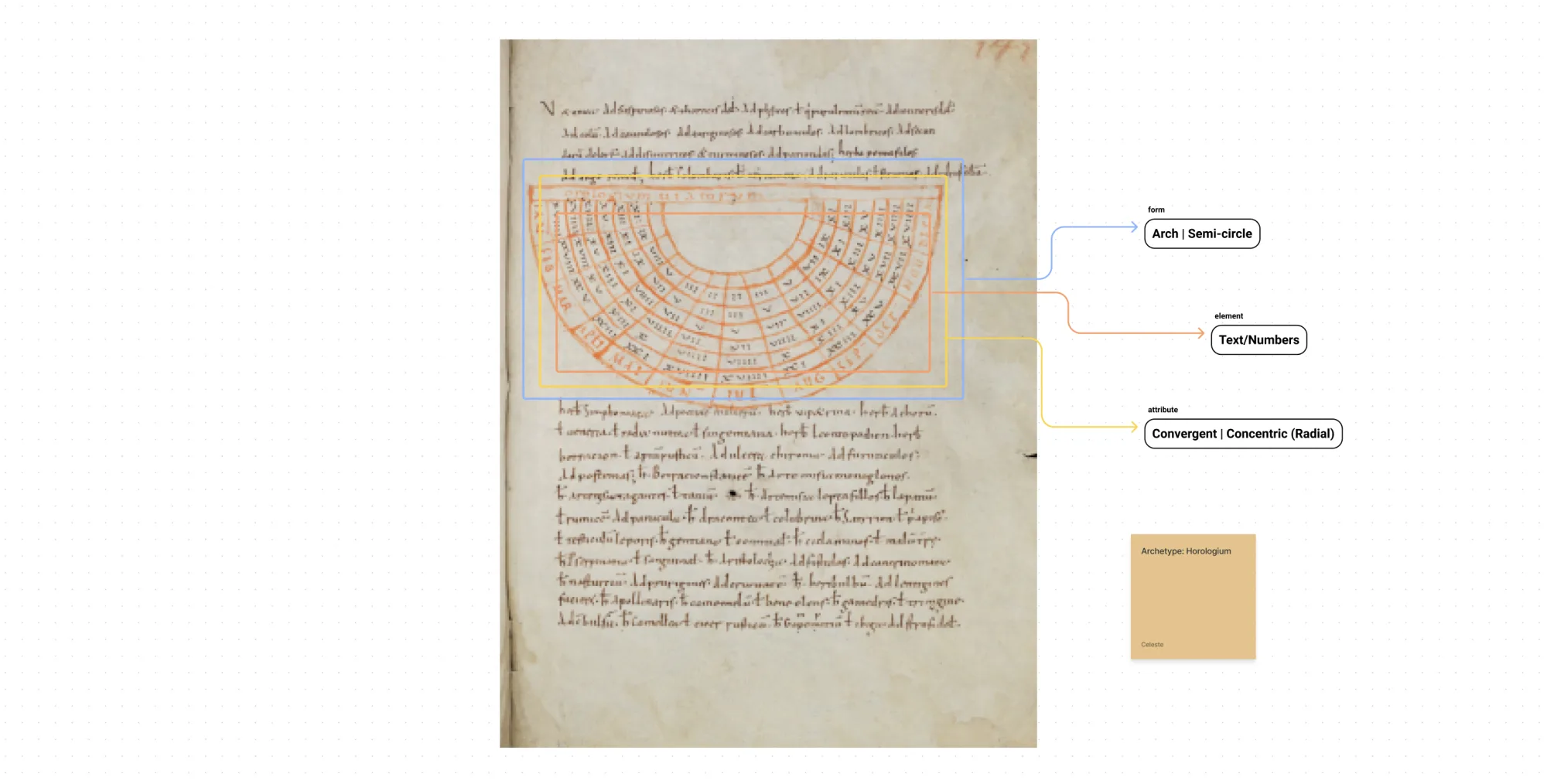
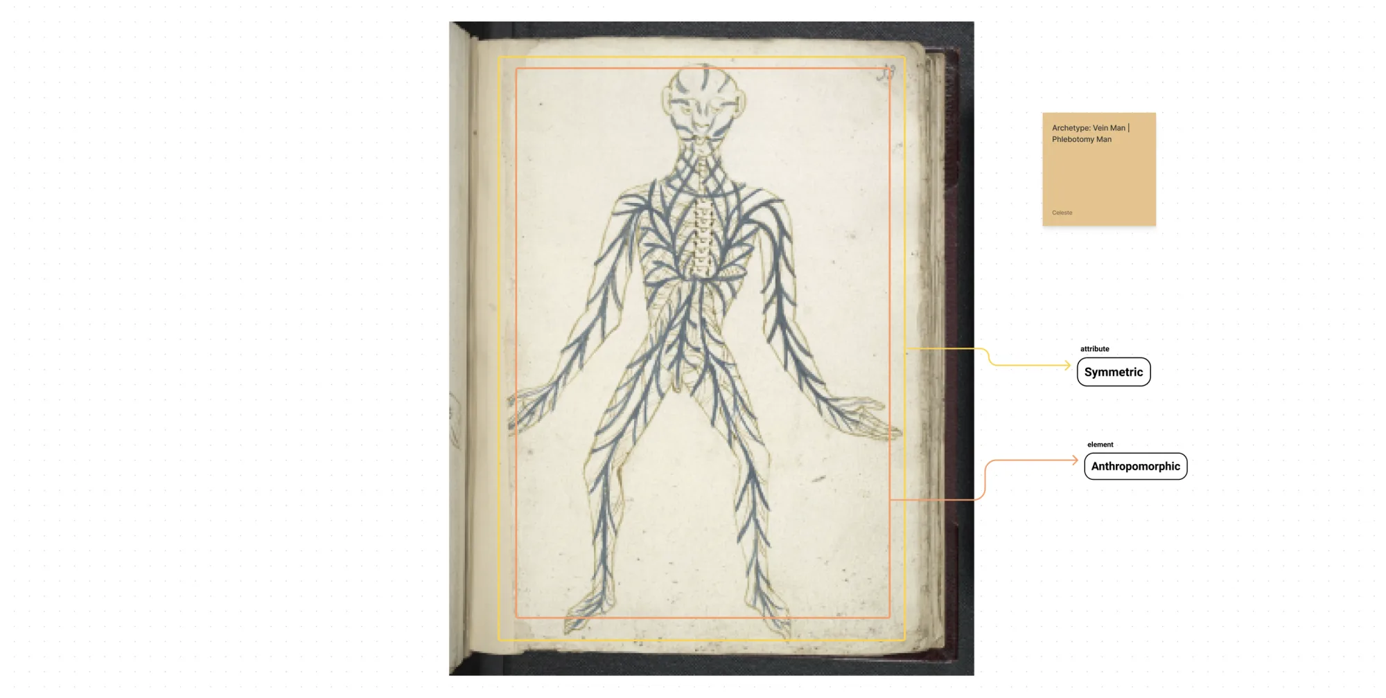
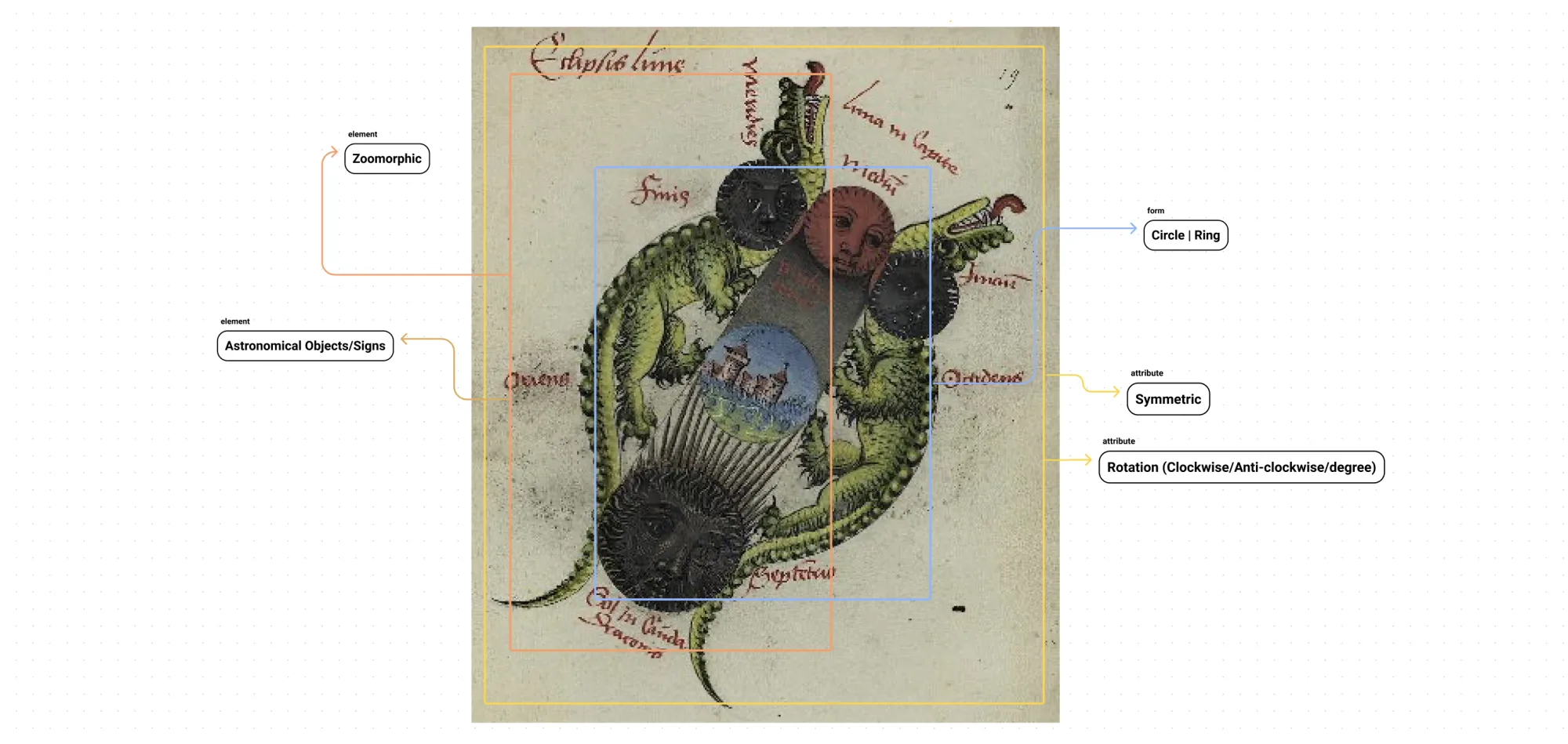
During the workshop, the team collectively engaged in the annotation process following a specific workflow provided by Calibro. They were presented with various options within Figma’s interface to add annotations to the images. The following operational tasks were assigned to each researcher, ensuring a consistent and organized approach:
- Choose annotation type from form, attribute, and element.
- Copy the graphic element from the right panel.
- Paste the graphic element on the desired part of the image.
- Double-click to enter the group for further editing.
- Click on the square to create an area corresponding to the annotation.
- Click on the text element to reveal additional icons and options for customization.
By using the intuitive features of Figma, the team actively contributed with their annotations to the collection, resulting in a comprehensive and well-integrated dataset (Azzi et al. 2021). The process helped the team to better align the expectations of designers, historians, and philosophers with the potential of digital interfaces, ensuring these expectations were rooted in realistic goals. Simultaneously, as the dataset was being expanded, efforts were made to ensure that users could accurately comprehend the organization of the vocabulary.
Taxonomy for Middle-Ages Visualizations
The workshop contributed to creating a specific taxonomy to annotate visualizations from the Middle Ages; its final version focuses on three dimensions: form, attribute, and element. The “form” dimension captures different shapes and appearances, while the “attribute” dimension encompasses composition characteristics. The “element” dimension identifies different symbolic elements present in the visualizations. These dimensions provide information about the pictorial structure and symbolic representation to create connectivity between parts of different images, which is valuable for close reading (Table 1).
| Form (single) | Attribute (multiple) | Element (multiple) |
|---|---|---|
| Circles/Rings Wheels Spheres (3D) Triangles Lambdas Pyramids (3D) Squares Rectangles Diamonds/Rhombuses Cubes (3D) Quincunxes Crosses Spirals Arches/Semi-circles Branches Tables/Grids/Graticules Freehand/Raised Hand/Anamorphic |
Symmetric/Reflectional Asymmetric Directional (Horizontal/Vertical/Oblique) Rotation (Clockwise/Anti-clockwise/Degree) Divergent/Eccentric (Burst) Convergent/Concentric (Radial) Reticulate (Nodal) Perspective Hierarchical Opposition/Contradiction Divisional/Classificatory Manuscript |
Anthropomorphic Zoomorphic Phytomorphic Color Text/Numbers Vector Pattern Mark/Symbol Geometric Figures Geological/Geographical Features Astronomical Objects/Signs Biblical Characters |
During the workshop, the team recognized that visualizations from the Middle Ages often revolved around specific themes and “medieval archetypes.” The themes include law, theology, Christian doctrine, pedagogy, music theory, mathematics, and more. They also identified medieval diagrammatical archetypes like the Tree of Virtues, the Ladder of Jacob, or the Tree of Life. Categorizing the visualizations based on these themes and archetypes provided a comprehensive overview of the subject matter and symbolic representations prevalent in Middle Ages visualizations that will be valuable for distant reading (Table 2).
| Themes (multiple) | Medieval Archetypes (single) |
|---|---|
| Law Theology Christian Doctrine Pedagogy Music Theory Mathematics Geometry Computistics Literature Philosophy Logic Dialectic Ethics Science Natural Philosophy Genealogy Astronomy Astrology Prognosis Numerology Geomancy Cartography Cosmography Cosmology Alchemy Metallurgy Physics Optics Medicine Agriculture Zoology Botany Architecture |
Tree of Virtues | Tree of Vices Ladder of Jacob | Ladder of Divine Ascent Tree of Life Tree of Jesse Porphyrian Tree | Scala Praedicamentalis Tree of Science | Tree of Knowledge Liberal Arts Genealogy/Consanguinity/Kinship/Affinity Tree/Pyramid/Chart Micro/Macro Cosmos | Imago Mundi Harmony (World Soul) Harmony of the Spheres Square of Opposition Four Elements Tetragonus Mundus | Annus Mundus Homo T-O Map Classical Winds | Wind Rose Five Circles | Climate Zones Latitudes Apsides Aratea | Zodiac Zodiac Man Vein Man | Phlebotomy Man Volvelle | Rotae Canon Tables Horologium Carmina figurata | Carmina cancellata Tetragrammaton Scutum Fidei | Shield of Trinity — Trinity Diagrams Finger Reckoning | Mnemonic Hand | Guidonian Hand Solomon Throne |
The IIIF Tool
The web-based tool developed by Calibro as part of the FDTW project builds upon the previous workshop and leverages the capabilities of the IIIF repository, offering a range of functionalities for annotation and exploration. These powerful features are accessible from the splash page, where users can enter either the annotation or exploration modes (Figure 10).
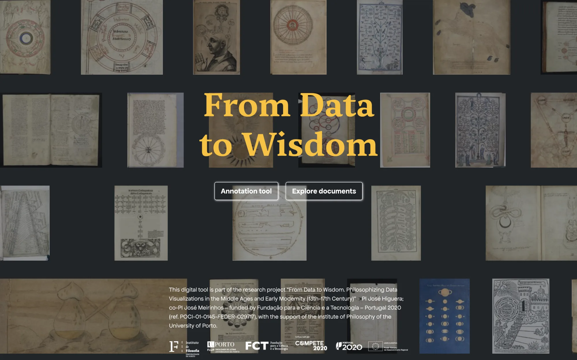
In the annotation mode, users are provided with a dedicated space to actively engage with the images and contribute with meaningful annotations based on the identified dimensions of the taxonomy. This mode resembles the Figma workshop in terms of functionality but with a more structured interface that aligns the taxonomy with the internet browser’s affordances (Norman 2013). By selecting this option, users are encouraged to delve deeper into the visualizations, analyze their shapes, attributes, and elements, and annotate them to enrich the knowledge base with valuable relational information.
Likewise, the exploration mode offers users a rich and immersive experience that allows them to navigate the relationships established through annotation. This interactive feature enables users to discover connections, patterns, and clusters that may not be immediately visible. They can delve into specific images, zoom in on intricate details, and zoom out to comprehensively view the whole collection. The exploration mode serves as a visual journey through the interconnected web of annotations, providing a unique perspective and facilitating new insights.
It is essential to highlight that changes made in the annotation mode instantly influence the relational navigations and data visualizations in the exploration mode. As users modify or add annotations, they actively shape the interactivity and enhance their ability to discover meaningful insights during exploration. This dynamic interplay between annotation and exploration creates a symbiotic relationship, where the annotations serve as the foundation for uncovering connections and enriching the overall understanding of the collection.
Providing distinct paths for annotation and exploration reflects the project’s commitment to user-centered design and flexibility. The tool accommodates users’ diverse interests and goals, whether researchers, students, or individuals curious about medieval visualizations. By empowering them to actively engage with the visualizations, contribute to annotations, and easily navigate the collection, the tool fosters a comprehensive approach that enriches our understanding of medieval visualizations and opens avenues for multidimensional exploration in data visualization during the Middle Ages and Early Modernity.
Annotation Mode
The annotation mode is a key feature for annotating images and enhancing the relational knowledge base. This mode follows IIIF standards and offers a smooth user experience with high-resolution zoom and annotation capabilities (Campagnolo 2020). When users visit the splash page, they see a list of items from the associated IIIF collection, as illustrated in Figure 11.
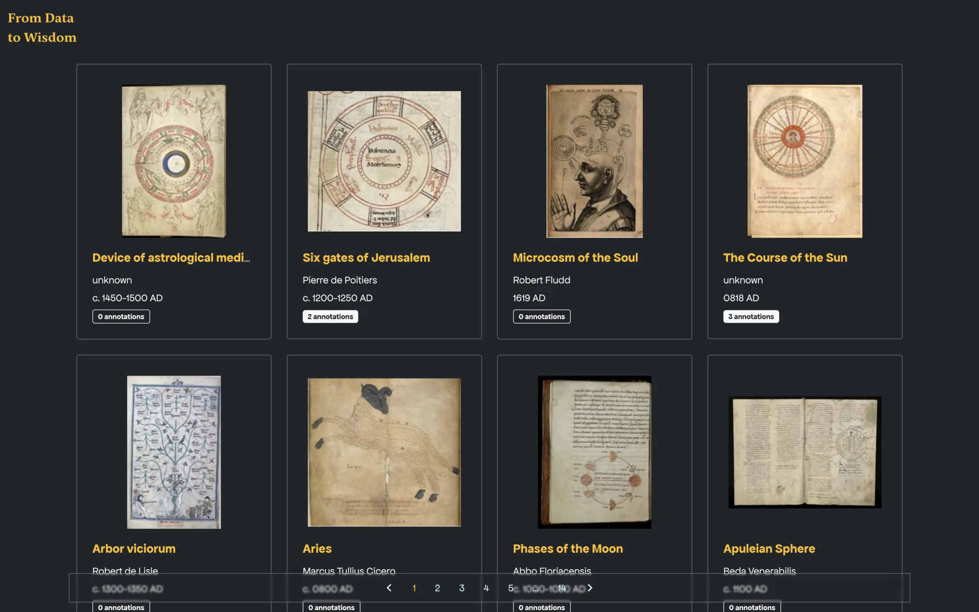
Each image comes with basic metadata: title, author, and creation date. The layout also indicates whether annotation notes are present or absent. Selecting an item opens the annotation interface, where the image is displayed centrally. Users can navigate multiple-page items using the page panel on the left, while the right side offers metadata and annotation editing tools.
Figure 12 shows how to add metadata or annotations. At the micro level, the annotation process is made easier by design tools at the top of the interface: users can select from rectangular, polygonal, or round shapes to mark areas on the image, linking them to taxonomy’s form, attribute, and element classes. At the meso level, images are categorized by themes and medieval archetypes, allowing annotations to integrate taxonomy and create granular relational information.
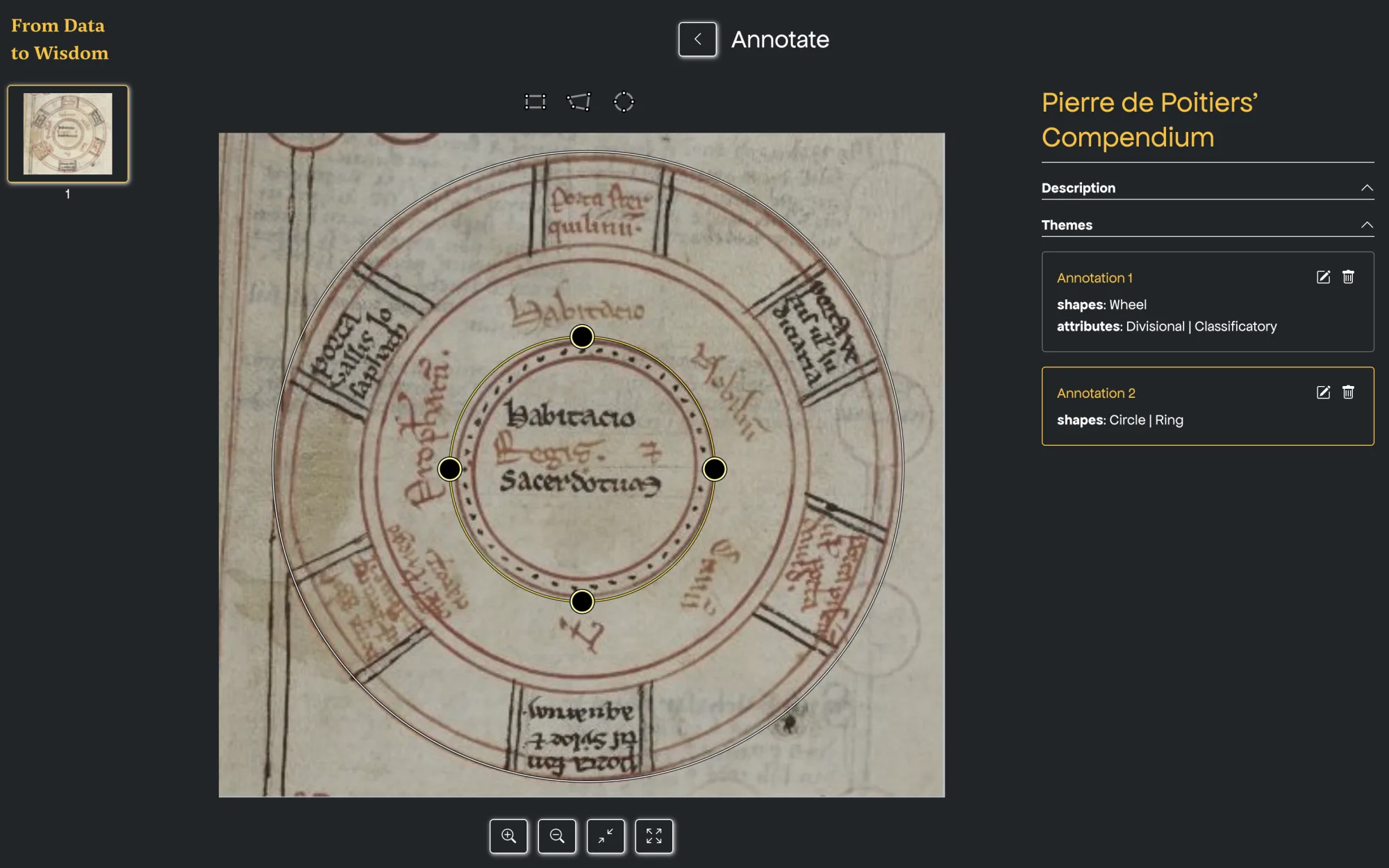
The annotation mode prioritizes basic options over advanced interfaces at both micro and meso levels. The metadata generated here enhances both close and distant reading, contributing significantly to the relational knowledge base.
Distant Reading Mode
In the exploration mode, users are immersed in the reading part, which encompasses both distant and close reading. This section will focus on distant reading, a widely recognized practice in cultural heritage research (Windhager et al. 2019) that users can engage in, leveraging the multi-relational approach of the digital tool (Bludau, Dörk, and Heidmann 2021) and diving into the IIIF repository.
The first visual encounter in the exploration mode is a comprehensive display of the complete collection, as depicted in Figure 13. This panoramic view gives an overall perspective, allowing users to grasp the sheer magnitude and diversity of the image collection. This view serves as a starting point for further interaction and sets the stage for a rich and immersive journey into the depths of Middle Ages’ visualizations.
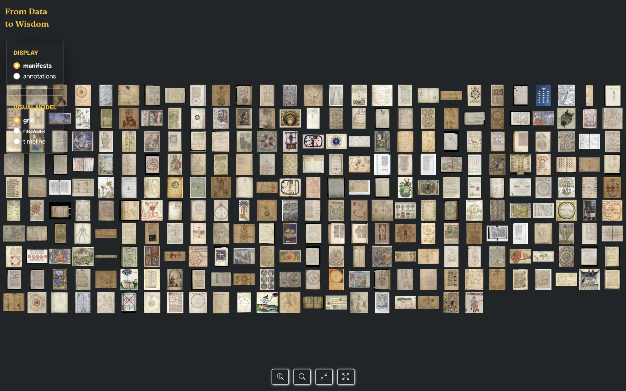
What distinguishes distant reading is its capacity to offer not just a single visualization but a range of visual representations that allow users to grasp information from different angles. The initial visualization takes the form of a list, wherein items are arranged based on their creation dates, effectively capturing the chronological evolution of the collection (Rosenberg and Grafton 2010). This chronological arrangement enables scholars to discern temporal patterns, identify artistic style shifts and trace visual narrative development at the macro scale. In addition, by zooming, users can select a specific item and enter the close reading mode.
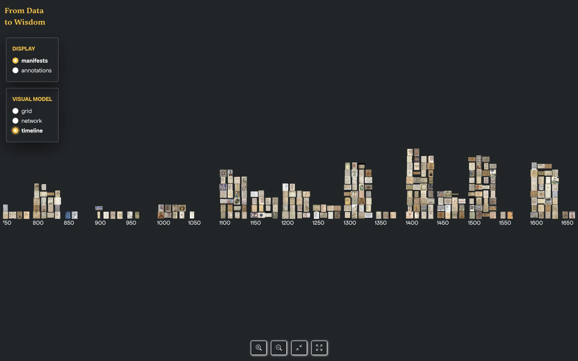
In addition to the list view, users can access alternative modalities of distant reading through a convenient menu on the left side of the interface. One such modality is the timeline visualization, displayed in Figure 14. Inspired by the pioneering VIKUS Viewer by Christopher Pietsch (Pietsch [2018] 2023), this visualization enables users to explore the distribution of items across time. By interactively zooming and panning within the timeline, scholars can focus on specific periods and gain insights into the historical context surrounding the visual materials.
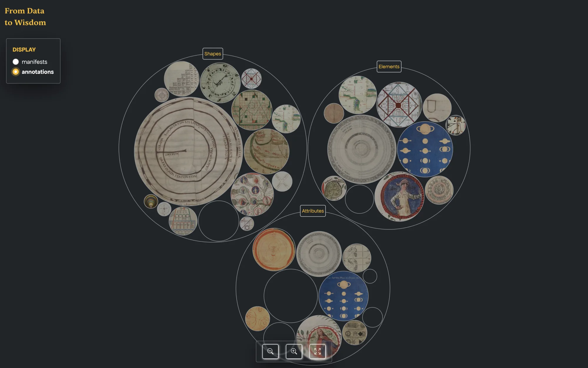
Another effective modality within distant reading is the thematic arrangement, exemplified in Figure 15. Based on the Circle Packing for displaying values of leaf nodes of a hierarchical structure by using circles included in RAWGraphs (Mauri et al. 2017), this visualization offers a quantitative display that reveals the quantity of annotated items by theme. The size of the circles corresponds to the frequency of the main themes and the frequency of types within them. By observing these spheres’ varying sizes and spatial distribution, scholars can discern the prevalence of specific subjects, motifs, or iconographic elements within the visual materials.
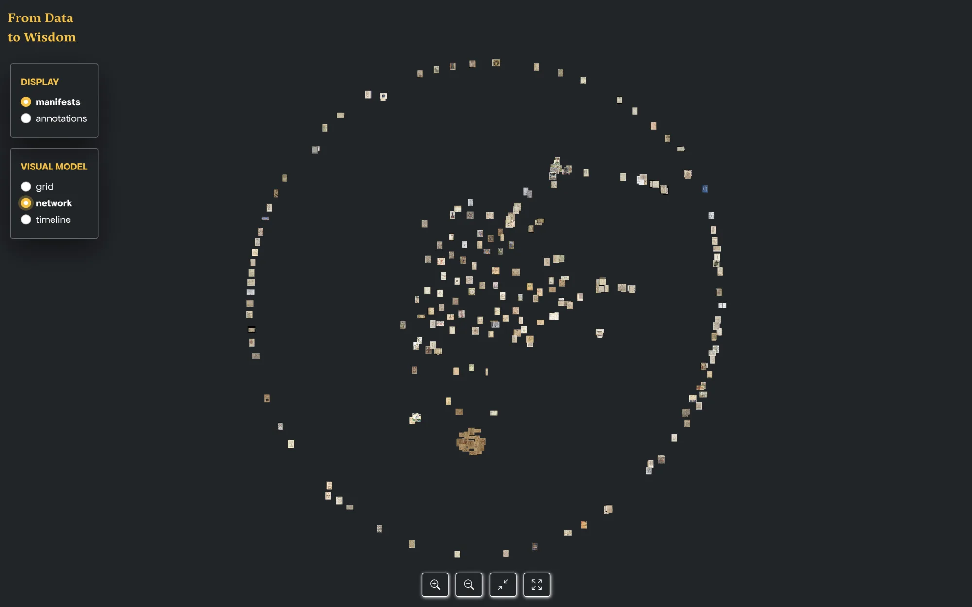
A particularly compelling visualization within distant reading is the network visualization, presented in Figure 16. This visualization can unveil the intricate web of relationships among the collection’s visual elements based on metrics like, for example, image similarity (Karjus et al. 2022; Rodighiero et al. 2022b). In this context, the interconnectedness of metadata is represented through the D3 force diagram (Bostock, Ogievetsky, and Heer 2011), an open-access tool that guaranteed the needed technical flexibility and accessibility for experimental mapping. By analyzing clusters, examining proximity, and exploring the patterns of annotation connections, scholars can unravel hidden associations, identify thematic clusters, and delve into the underlying structures that shape the visual landscape. In addition, it is worth mentioning Figure 17, which provides an example of a potential cluster of images. This captivating zoom displays related images with common characteristics, thematic elements, or stylistic attributes. Such clusters allow scholars to investigate cohesive visual narratives, study stylistic trends within specific contexts, and gain a deeper understanding of the interplay between visual elements.
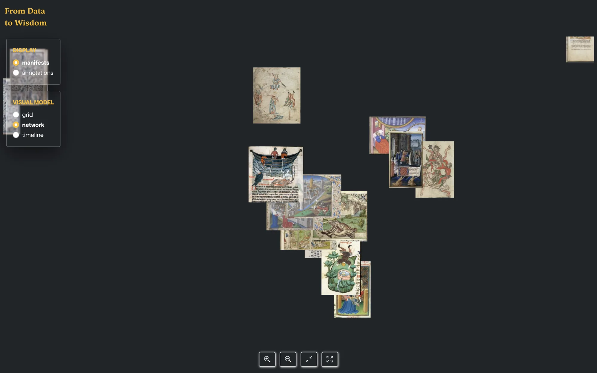
These visualizations facilitate the uncovering of the broader relationships and patterns that emerge when examining the collection. The combination of distant reading techniques and interactive interfaces opens new avenues for scholarly inquiry and fosters a deeper understanding of the rich visual heritage encapsulated within the IIIF repository.
Close Reading Mode
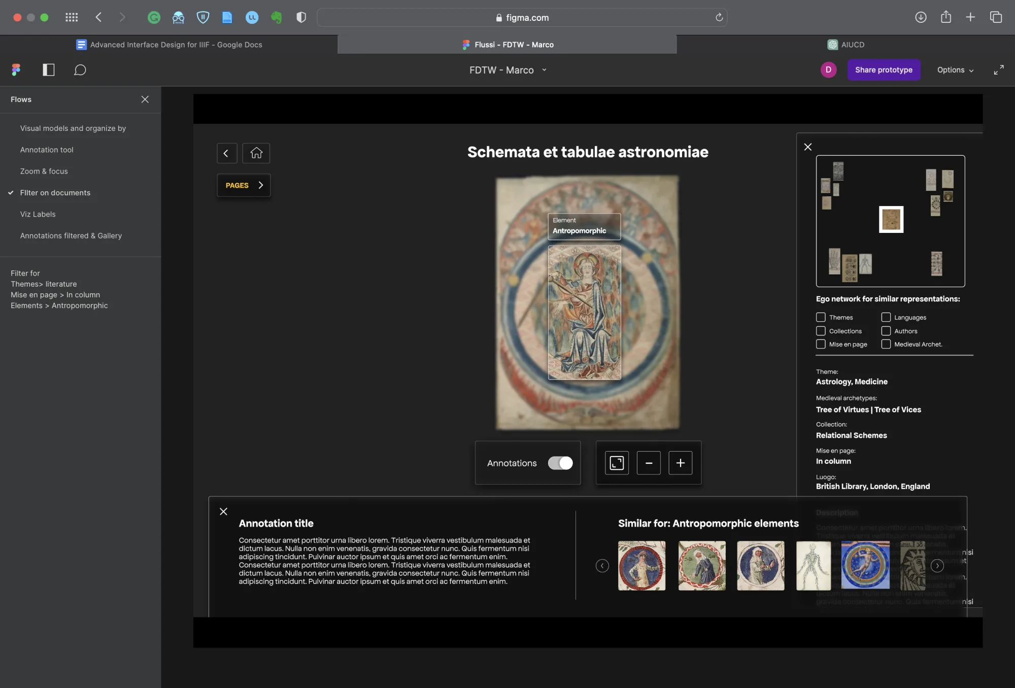
The closing section of the exploration mode is dedicated to close reading, which focuses on detailed analysis at micro and meso levels. This section allows users to transition from the multiple-item view to a single-item mode, where they encounter an interface designed specifically for navigation starting from a single image.
The central part of the interface is dedicated to the image under examination, providing scholars with a closer look at its visual details. Leveraging IIIF’s zooming capabilities, users can explore the image at different magnification levels and select specific areas for closer inspection, revealing related annotations.
One intriguing aspect of the close reading interface is the side navigation, which enables scholars to explore similar visual material based on their relationships. The ego network (Scott [1991] 2000, 69–81) is a notable addition to the right panel that presents a curated selection of related images, offering a meso-level understanding of the selected image by highlighting its connections.
At the bottom, there is another navigation panel dedicated to micro-level exploration. After selecting an annotated part of the image, this menu displays details from images with similar annotations. While the right panel focuses on image-to-image connections at the meso level, the bottom panel allows scholars to navigate at the micro-scale, examining similar parts. Integrating multiple levels of detail and context provides users with a comprehensive exploration experience.
An intriguing observation is how the interface seamlessly interweaves different zoom levels (micro, meso, and macro) rather than treating them as distinct silos. Although the emphasis is primarily on the micro and meso levels, elements like the ego network blur the boundaries with the macro levels.
Figure 18 is an example that highlights the possibilities of the close reading interface. The close reading interface empowers scholars to navigate between diverse levels of detail and context. Starting from a single image, they can traverse various levels of analysis, exploring the image’s broader context among other images at the macro level. Simultaneously, they can delve into the micro level, examining visually similar details and focusing on specific parts of the selected image. This seamless transition between levels enhances the depth of examination and enables scholars to uncover intricate relationships and nuances within the visual materials.
Conclusion and Future Directions
Instead of summarizing the main results of this article, in this conclusion, we would like to revisit the theoretical foundations of developing the digital tool, whose development led to the compilation of a taxonomy of Middle Ages data visualization and the design of a IIIF multi-level navigation that can potentially be reused in further software applications. As previously mentioned, at the core of the FDTW project was not only the idea of collecting and classifying Medieval and Early Modern diagrams but also the idea of “philosophizing” about them. What does this mean? What interested us in particular was the idea of comparing these diagrams with contemporary data visualizations.
First, we wanted to consider the differences between them, which we believe can be primarily categorized into three aspects: (1) the quantity and type of data, (2) the use of advanced tools for an increasingly delegated analysis, and (3) the emergence of networks as a privileged mode of visualization. Secondly, we aimed to explore the similarities among them, particularly that in both cases we can speak of alternative paths to graphocentrism, which refers to the centrality of text writing and text-based knowledge that characterizes Western cultures (and beyond).
Diagrams and data visualizations, including networks, certainly have order and hierarchization at their core. However, they also show us alternative possibilities of order and hierarchization. We believe that these alternatives represent an exceptional potential for new pattern detection and, therefore, for advancing knowledge. Diagrams and data visualizations are alternatives to our usual schemata; like any good schematism, it is not an “art hidden in the depths of the human soul” but an activity chronically dependent on the available techniques and technologies.
Creating the tool presented here has allowed us to put this reflection into practice. In particular, it has enabled us to overcome an oversimplified dichotomy that places medieval visualizations on the side of qualitative and microanalysis and contemporary visualizations on the side of quantitative and macroanalysis. According to this simplistic distinction, wisdom (with little or no data) could be associated with the former, and data (with little or no wisdom) with the latter. Critical literature exists against contemporary dataism and the resulting “end of theory.” The idea of a tool that operates at three levels of analysis (within images, between images, and a proper distant reading on large groups of images treated as data) demonstrates how these approaches can and should intersect. According to the team, the greatest theoretical achievement of this project is that there is no need to choose between data and wisdom. Against what is often argued by the literature, there is also no scale ranging from data to wisdom — think of the famous DIKW (data, information, knowledge, wisdom) pyramid. Instead, it can be said that there is a possibility of oscillation, back and forth, between these dimensions. The workshops we organized showed that a user, whether expert or non-expert, does not necessarily choose a level or proceed linearly in their research.
The main purpose of our future research will precisely be to use these empirical foundations (the tool and the analysis of its actual uses) to establish a new theoretical and historical framework regarding the role of information and data visualizations (and the associated tools) in shaping knowledge. Moreover, we were interested in exploring an alternative history of philosophy, theology, and thinking based on the non-textual practices of the representation of knowledge. This could involve conducting experimental analyses to examine these practices’ cultural embeddedness and usage patterns. For example, cultural dataism often emphasizes macro-level analysis while neglecting other levels. Additionally, a theoretical reflection on the materiality of human schemata, built upon the work of authors like Jack Goody and Bernard Stiegler, could provide valuable insights. These are broad ideas that require further exploration and investigation. By delving into these areas, we aim to develop a more comprehensive understanding of the materiality of knowledge representation (Lowe 2020) and its impact on various disciplines. Through this future research, we hope to uncover new insights, challenge existing paradigms, and suggest alternative ways of conceptualizing and advancing human understanding.
References
- Agostini, Caterina, and Carrie Beneš. 2021. “A Geospatial La Sfera: Navigating the Renaissance in the Mediterranean.” In Proceedings of the 5th ACM SIGSPATIAL International Workshop on Geospatial Humanities, 22–27. Beijing: ACM. https://doi.org/10.1145/3486187.3490207
- Azzi, Matteo, José Higuera Rubio, Celeste Pedro, Dario Rodighiero, Alberto Romele, and Giorgio Uboldi. 2021. “FDTW Annotation Workshop.” Figma. https://www.figma.com/community/file/1249266100858895417
- Bludau, Mark-Jan, Marian Dörk, and Frank Heidmann. 2021. “Relational Perspectives as Situated Visualizations of Art Collections.” Digital Scholarship in the Humanities 36 (Supplement 2): ii17–29. https://doi.org/10.1093/llc/fqab003
- Bostock, Michael, Vadim Ogievetsky, and Jeffrey Heer. 2011. “D3: Data-Driven Documents.” IEEE Transactions on Visualization and Computer Graphics 17 (12): 2301–9. https://doi.org/10.1109/TVCG.2011.185
- Branco, Dario, Rocco Aversa, and Salvatore Venticinque. 2023. “A Tool for Creation of Virtual Exhibits Presented as IIIF Collections by Intelligent Agents.” In Advanced Information Networking and Applications, edited by Leonard Barolli, 655:241–50. Lecture Notes in Networks and Systems. Cham: Springer. https://doi.org/10.1007/978-3-031-28694-0_22
- Campagnolo, Alberto. 2020. “Thematic Pathways on the Web: IIIF Annotations of Manuscripts from the Vatican Collections.” Renaissance and Reformation 43 (2): 322–26. https://doi.org/10.33137/rr.v43i2.34824
- Carruthers, Mary J. (1990) 2008. The Book of Memory: A Study of Memory in Medieval Culture. 2nd ed. Cambridge Studies in Medieval Literature. Cambridge: Cambridge University Press.
- Emanuel, Jeffrey P. 2018. “Stitching Together Technology for the Digital Humanities with the International Image Interoperability Framework (IIIF).” In Digital Humanities, Libraries, and Partnerships, 125–35. Elsevier. https://doi.org/10.1016/B978-0-08-102023-4.00009-4
- Esmeijer, Anna C. 1978. Divina Quaternitas: A Preliminary Study in the Method and Application of Visual Exegesis. Assen: Van Gorcum.
- Higuera Rubio, José, Alberto Romele, Dario Rodighiero, and Celeste Pedro, eds. 2022. From Wisdom to Data: Philosophical Atlas on Visual Representations of Knowledge. Coleção Transversal. Porto: Porto University Press. https://www.up.pt/press/books/978-989-746-315-0
- Karjus, Andres, Mar Canet Solà, Tillmann Ohm, Sebastian E. Ahnert, and Maximilian Schich. 2022. “Compression Ensembles Quantify Aesthetic Complexity and the Evolution of Visual Art.” arXiv. https://doi.org/10.48550/ARXIV.2205.10271
- Latour, Bruno. 1986. “Visualisation and Cognition: Thinking with Eyes and Hands.” Edited by Henrika Kuklick. Knowledge and Society: Studies in the Sociology of Culture Past and Present 6: 1–40.
- Lima, Manuel. 2011. Visual Complexity: Mapping Patterns of Information. New York: Princeton Architectural Press.
- ———. 2014. The Book of Trees: Visualizing Branches of Knowledge. New York: Princeton Architectural Press.
- ———. 2017. The Book of Circles: Visualizing Spheres of Knowledge. New York: Princeton Architectural Press.
- Lowe, Adam, ed. 2020. The Aura in the Age of Digital Materiality: Rethinking Preservation in the Shadow of an Uncertain Future. Cinisello Balsamo: Silvana Editoriale.
- Mauri, Michele, Tommaso Elli, Giorgio Caviglia, Giorgio Uboldi, and Matteo Azzi. 2017. “RAWGraphs: A Visualisation Platform to Create Open Outputs.” In Proceedings of the 12th Biannual Conference on Italian SIGCHI Chapter, 28:1–28:5. New York: ACM. https://doi.org/10.1145/3125571.3125585
- Meirinhos, J. F. 2005. “Dessiner le savoir. Un schéma des sciences du XIIe siècle dans un manuscrit de Santa Cruz de Coimbra.” In Itinéraires de la raison, edited by J. F. Meirinhos, 32:187–204. Textes et Études du Moyen Âge. Turnhout: Brepols. https://doi.org/10.1484/M.TEMA-EB.4.00202
- Moretti, Franco. 2005. Graphs, Maps, Trees: Abstract Models for a Literary History. London: Verso.
- Murdoch, John Emery. 1984. Album of Science: Antiquity and the Middle Ages. New York: Scribner.
- Norman, Donald A. 2013. The Design of Everyday Things. Rev. ed. New York: Basic Books.
- Obrist, Barbara. 1996. “Le diagramme isidorien des saisons, son contenu physique et les représentations figuratives.” Mélanges de l’École française de Rome 108 (1): 95–164. https://doi.org/10.3406/mefr.1996.3481
- Pietsch, Christopher. (2018) 2023. “VIKUS Viewer.” GitHub. https://github.com/cpietsch/vikus-viewer
- Rodighiero, Dario, José Higuera, Alberto Romele, Celeste Pedro, Matteo Azzi, Christopher Pietsch, Christoph Sander, Stephanie J. Lahey, and Benjamin Kozlowski. 2022a. “From Data to Wisdom IIIF Reader: Multilevel Visualization Research.” Workshop, Bibliotheca Hertziana, Rome, Winter. https://vimeo.com/711138374
- Rodighiero, Dario, Lins Derry, Douglas Duhaime, Jordan Kruguer, Maximilian C. Mueller, Christopher Pietsch, Jeffrey T. Schnapp, Jeff Steward, and metaLAB. 2022b. “Surprise Machines: Revealing Harvard Art Museums’ Image Collection.” Information Design Journal 27 (1): 21–34. https://doi.org/10.1075/idj.22013.rod
- Romanello, Matteo, Maud Ehrmann, Simon Clematide, and Daniele Guido. 2020. “The Impresso System Architecture in a Nutshell.” https://infoscience.epfl.ch/record/283595
- Rosenberg, Daniel, and Anthony Grafton. 2010. Cartographies of Time. New York: Princeton Architectural Press.
- Salonius, Pippa, and Andrea Worm, eds. 2014. The Tree: Symbol, Allegory, and Mnemonic Device in Medieval Art and Thought. International Medieval Research 20. Turnhout: Brepols.
- Scott, John. (1991) 2000. Social Network Analysis: A Handbook. 2nd ed. London: SAGE Publications.
- Sicard, Patrice. 1993. Diagrammes médiévaux et exégèse visuelle: le “Libellus de formatione arche” de Hugues de Saint-Victor. Bibliotheca Victorina 4. Paris: Brepols.
- Snydman, Stuart, Robert Sanderson, and Tom Cramer. 2015. “The International Image Interoperability Framework (IIIF): A Community & Technology Approach for Web-Based Images.” In Proceedings of the IS&T Archiving Conference, 16–21. Los Angeles.
- Svenonius, Elaine. 2000. The Intellectual Foundation of Information Organization. Digital Libraries and Electronic Publishing. Cambridge, MA: MIT Press.
- Van Zundert, Joris. 2018. “On Not Writing a Review about Mirador: Mirador, IIIF, and the Epistemological Gains of Distributed Digital Scholarly Resources.” Digital Medievalist 11 (1): 5. https://doi.org/10.16995/dm.78
- Windhager, Florian, Paolo Federico, Günther Schreder, Katrin Glinka, Marian Dörk, Silvia Miksch, and Eva Mayr. 2019. “Visualization of Cultural Heritage Collection Data: State of the Art and Future Challenges.” IEEE Transactions on Visualization and Computer Graphics 25 (6): 2311–30. https://doi.org/10.1109/TVCG.2018.2830759