Super-Vision: Tracing EPFL History through 8,000 Doctoral Theses
@article{rodighiero2024super,
  author      = {Dario Rodighiero and Philippe Rivière and Sarah Kenderdine},
  title       = {Super-Vision: Tracing EPFL History through 8,000 Doctoral Theses},
  journal     = {Journal of Digital History},
  year        = {2024},
  doi         = {10.1515/JDH-2023-0004}
}
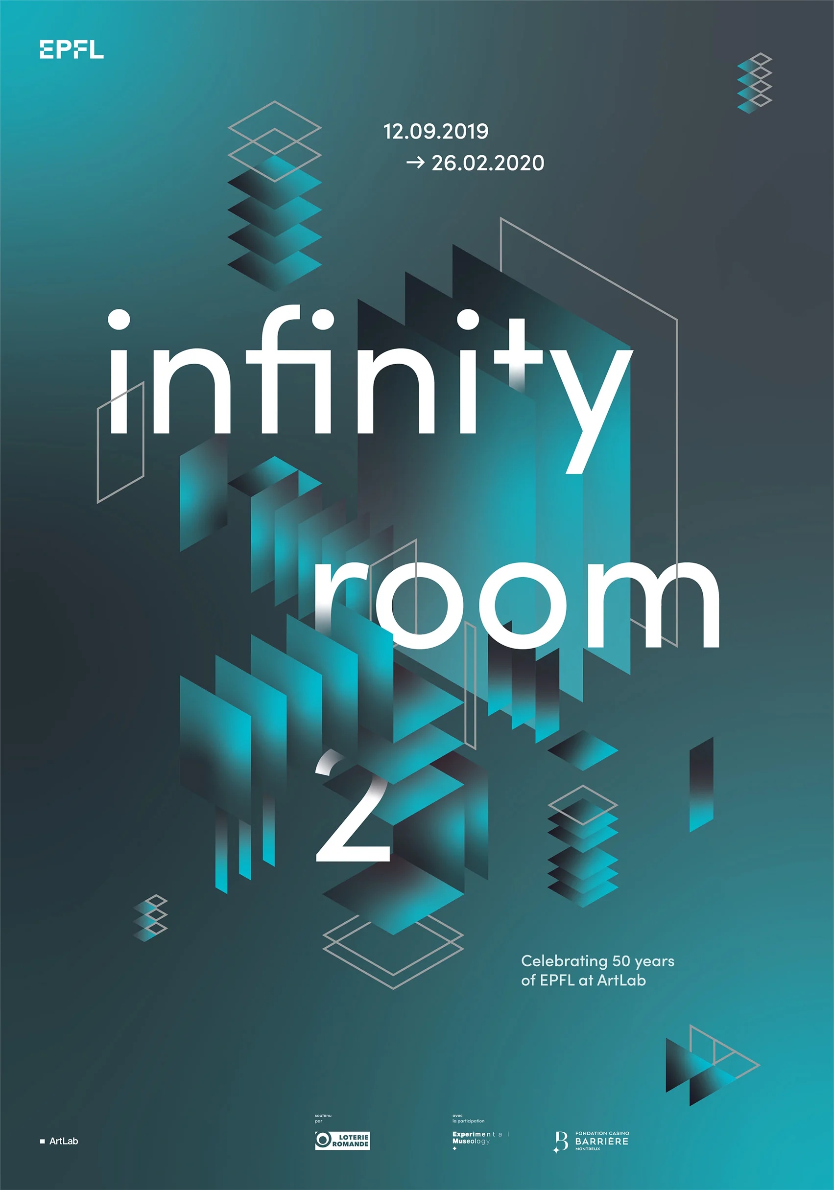
The fiftieth anniversary of EPFL (École Polytechnique Fédérale de Lausanne) offered the opportunity to retrace its history through the digital archives housed by the institute itself. Part of the exhibition Infinity Room 2, the Super-Vision project investigates the practice of academic advising by visualizing 8,000 doctoral theses in a work at the intersection of art, science, and technology. Inaugurated in September 2019 at EPFL Pavilions, Super-Vision presents a diachronic mapping that uses artificial intelligence to shed light on an institutional dataset that would be unobservable otherwise. To achieve such a goal, 8,000 doctoral theses are analysed with natural language processing and mapped with techniques of dimensionality reduction, combining language and time within in an interactive visualization accessible to the public. The project title has a twofold meaning: on the one hand, it refers to the educational practice that connects doctoral students to supervisors; on the other hand, it employs information design like a macroscope to grasp complex phenomena from a distant standpoint. The result offers EPFL employees and museum visitors an original perspective to look at the institute with different eyes.
Introduction
The Swiss Federal Institute of Technology in Lausanne (École Polytechnique Fédérale de Lausanne, or most commonly EPFL) is a young university that celebrated its fiftieth anniversary in 2019 (Leutenegeer, Konopka, and Christinat 2021). For this occasion, the EPFL campus hosted celebrations and events, including a special exhibition to chronicle its history via digital archives, organized by the director of the Laboratory of Experimental Museology Plus, Prof. Sarah Kenderdine. The Infinity Room 2 exhibition was inaugurated in September 2019 at the EPFL Pavilions, the wooden museum designed by the acclaimed architect Kengo Kuma.
Like organizations transitioning towards digital technology, EPFL puts into operation different information systems collecting and storing some aspects of local culture and academic activity. Among them, one of the most known offers support to the Montreux Jazz Festival, a renowned music event preserving high-quality audiovisual material from the 60s (Kenderdine, Mason, and Hibberd 2021). Despite the popularity of this example, it is essential to bear in mind that every single archive takes a unique perspective on the institution, which can be revealed through recent techniques of storytelling (Krzywinski and Cairo 2013).
This article investigates the art of storytelling for academic digital archives. Since the advent of information systems, the wide-ranging practice of researchers, teachers, and professors (DeNeef and Goodwin 1995) has been increasingly collected, stored, and shared for administrative purposes in a progressive process of datafication (Van Dijck 2014; Beaulieu and Leonelli 2021). As a part of the Infinity Room 2 exhibition, the Super-Vision project aims to shed light on the academic practice of academic advising, defined as those “situations in which an institutional representative gives insight or direction to a college student about an academic, social or personal matter” (Gordon et al. 2008). Specifically, the project narrows down to a particular type of advising that concerns graduates who aspire to an academic career. On the occasion of the fiftieth anniversary, Super-Vision retraces EPFL’s footsteps by visualizing the records of doctoral theses to offer museum visitors an overview of the journey the institute made to take first place in the academic ranking of young universities (Hertig 2016; Mediacom 2016).
Exhibiting Science in the Making
Before illustrating the design process, this section introduces the reader to the interdisciplinary context, which situates the Super-Vision project at the convergence among Experimental Museology, Science, and Technology Studies (STS) and Information Design, foregrounding the transition of museum space to digital and visual literacy (Paul 2015; Rodighiero, Wandl-Vogt, Carsenat, et al. 2022).
The Infinity Room 2 exhibition was conceived at a time when cultural institutions are establishing cross-disciplinary collaborations under the acronym of GLAM, which stands for “galleries, libraries, archives, and museums” (Australian Society of Archivists 2003). Empowered by digital technology, this initiative increasingly invests time and energy in digitalization, preservation, and visualization of archives and collections (Cameron and Kenderdine 2007). In this context, Super-Vision takes shape as a work of experimental museology situated at the intersection between STS (Sismondo 2010) and the mapping of science (Börner 2010; 2015). These two apparently distant disciplines find common ground in understanding the making of science, referring to the ongoing and ever-evolving process of scientific discovery (Shapin 1992; Gorman 2020). While STS reinterprets museums like observatories from which visitors can understand the scientific output, science-mapping scholars use information design to extract organizational patterns from laboratories and scientific communities.
With respect to the practice of supervision, it can be said that STS is interested in looking at doctoral theses as a sociotechnical object in the academic environment. On the other hand, the science-mapping perspective is more attracted by the techniques of mapping to reveal scientific organization. With a digital installation in the public setting of the campus, the Super-Vision project not only enhances the vision capacity of the broader public on the making of science (Lynch 1988; Rosnay 2014) but also reveals the hidden organizational structure, reinforcing the imperative for public institutions to be open and accountable (Cellard and Masure 2018; Crawford and Joler 2018).
Such a convergence finds its origins in STS, which has always been interested in the many aspects of science from historical, cultural, and social perspectives. In 1986, Bruno Latour and Steve Woolgar published a groundbreaking book titled Laboratory Life (Latour and Woolgar 1986). This publication disclosed for the first time the hidden process of science-making by observing scientists in the offices of the Salk Institute for Biological Studies. This unusual perspective drastically changed the public perception of science, which was previously based on publications, conferences, and awards only. Latour and Woolgar looked at scientists in their working environment, like animals were studied in their natural habitat by biologists. As pointed out in the book’s preface by the institute’s founder Jonas Salk, although scientists felt uncomfortable being observed, the study provided valuable information to understand the scientific practice. The investigation of Latour and Woolgar introduced an innovative way to look at science, contributing to develop the concept of “science in the making,” which aims to disclose science through social and technological relationships (Bijker and Law 1992).
A few years later, in 1999, when curators Barbara Vanderlinden and Hans Ulrich Obrist curated an exhibition at the Fotomuseum Antwerpen, probably no one expected such a fruitful collaboration between STS and museology (Obrist and Vanderlinden 2001). The Laboratorium exhibition prompted questions related to the perception of science, investigating “the gap between the specialized vocabulary of science, art, and the general interest of the audience” by using the museum gallery as a laboratory for experiments (Obrist and Vanderlinden 2001). In the exhibition, the process of science in the making was presented to a broader audience by bringing the scientific practice into museums for public consumption. At that time, Bruno Latour and Peter Galison were put in touch with Caroline Jones and Peter Weibel, generating a spark that led to four exhibitions organized at ZKM, the Zentrum für Kunst und Medien (Latour and Weibel 2002; 2005; Latour and Leclercq 2016; Latour and Weibel 2020) — as recently described by Giulia Bini (Bini 2022). This encounter between academics and curators represents a landmark in the collaboration between science and museums, giving fresh perspectives on how museums can establish a dialogue with visitors on scientific matters.
Simultaneously, as mentioned in the book Museum Object Lessons for the Digital Age, “old museum collections and new technologies c[a]me together, tracing the translation and extension of collections […] into digital websites, imaging platforms and collection management systems” (Geismar 2018). Cultural institutions have digitalized and published their collections online (Suber 2012; Manovich 2018), and the exhibition space has been populated by digital devices (Isaac 2008). Along with digital devices, data visualizations also entered exhibitions (Lupi and Posavec 2016). As early as 2008, Paola Antonelli featured data visualizations in the exhibition Design and the Elastic Mind (Antonelli 2008) and included some of them in the MoMA permanent collection (Cogdell 2009). Since then, cultural institutions have increasingly embraced data-driven objects as centerpieces in their exhibitions.
Data Investigation and Analysis
The initial idea was to design a visualization capable of representing the EPFL community through scientific literature, drawing on the experience of the Affinity Map project (Rodighiero 2021b). One of the most interesting outcomes of this project was to represent the scientific community in a more democratic way, preferring a more-equitable metric of linguistic similarity to a quantitative analysis that foregrounds the most cited scholars (Rodighiero, Kaplan, and Beaude 2018; Moon and Rodighiero 2020). This approach leads to network visualizations in which all individuals occupy the same space, aiming at a more balanced representation and a more proper image of the entire organization.
The investigation started with Infoscience, the repository of EPFL research based on CERN’s open-source software Invenio (Caffaro and Kaplun 2010). Maintained by the library, the Infoscience repository collects, stores, and shares institutional scientific and gray literature, including around 8,000 doctoral theses. Whereas the Affinity Map project was exclusively relying on the analysis of article abstracts, the idea with Super-Vision was to advance the methodology by applying text analysis to full texts. However, to experiment this, a homogeneous corpus of scientific literature was necessary, which was identified in the doctoral theses. Unlike journal articles often affected by copyright restrictions (Suber 2012), doctoral theses feature the rare qualities of being publicly available and having consistency over time. The accessibility of both metadata and full texts in PDF format makes the corpus of doctoral theses an ideal solution for visualization. In addition, the opportunity to look at a scientific organization from an original dataset, situated between academic education and research career, represents a barely explored area of mapping that diverges from the current institutional perception.
Technically speaking, the collection of doctoral theses enables a twofold navigation relating to textual information (Berger, McDonough, and Seversky 2017) and temporal dimension (Rosenberg and Grafton 2010). On the one hand, body texts offer the opportunity to explore techniques of natural language processing (Manning and Schütze 1999) and dimensionality reduction (Bingham and Mannila 2001; Schmidt 2018). On the other hand, metadata enables the temporal analysis of publications through techniques of data visualization (Friendly 2021; Meirelles 2013; Rodighiero, Wandl-Vogt, and Carsenat 2022). Both data dimensions can provide interesting insights on institutional evolution by visually reproducing the EPFL trajectory.
The entire data analysis and development was facilitated by Observable (Bostock 2017), a digital platform to treat and plot data by making use of real-time programming through an interface that recalls Jupyter Notebooks. Founded by Mike Bostock, who earned its reputation by working at the New York Times, such a platform makes advanced data visualization techniques accessible to a broad audience by using the d3.js library (Bostock, Ogievetsky, and Heer 2011).
The first attempt at exploring the dataset is represented by the scatter plot below, which organizes doctoral theses in a timeline. Despite its simplicity, this visual tells much information about the collection. At first glance, the horizontal axis organizes the publication by year, which increases as the time goes by: the more space between ticks, the higher the number of doctoral theses in the specific time window. On the vertical dimension, distribution is aleatory but necessary to untangle the dot overlapping. In terms of precision, it is interesting to observe the temporal classification: the full date is part of the metadata except for the dissertations defended before 1999, and for unclear reasons, a time window between 2008 and 2012. Diversely, colors reveal some characteristics to consider carefully: in gray are doctoral theses not associated with any faculty, probably because of the institute’s reorganization; in orange and gray are those doctoral theses without abstract, whose absence affects in part the text analysis; in green are doctoral theses with a complete metadata set.
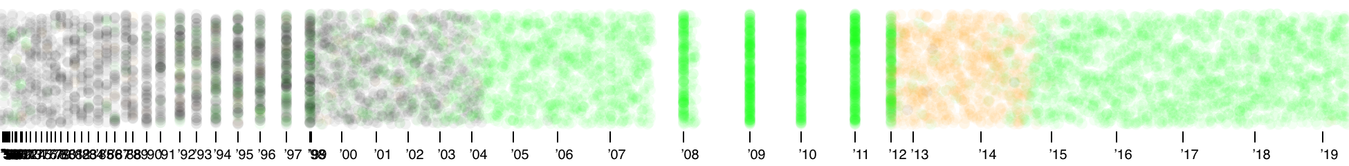
This initial overview proves the steady growth of doctoral theses but also reveals something unexpected: considering that EPFL was celebrating its fiftieth anniversary, how was it possible that a consistent number of publications could date back to the beginning of the twentieth century? After a brief investigation, we realized that EPFL was previously integrated into the University of Lausanne and only in 1969 was transformed into an independent institute, bringing with it a selection of doctoral theses. The detachment was due to a political choice to balance the linguistic predominance of ETH Zürich in favor of the French-speaking part of Switzerland (Leutenegeer, Konopka, and Christinat 2021).
Although doctoral theses’ increasing frequency represented a valuable insight for museum visitors, there was a more complex research question to address in the project: what kind of organizational structure could be extracted from doctoral supervision? Embracing the idea that scientific communities should be represented by all individual members (Rodighiero, Kaplan, and Beaude 2018; Rodighiero, Wandl-Vogt, and Carsenat 2021), it was decided to avoid any kind of quantitative analysis by focusing on doctoral students instead of their advisors. Representing a social network of both would have led the readers to identify the most central individuals, overshadowing everyone else. With the Super-Vision project, there was a general intention to give prominence to the individuality of the whole organization to present EPFL not as a hierarchical institute but as an extensive network of international scholars.
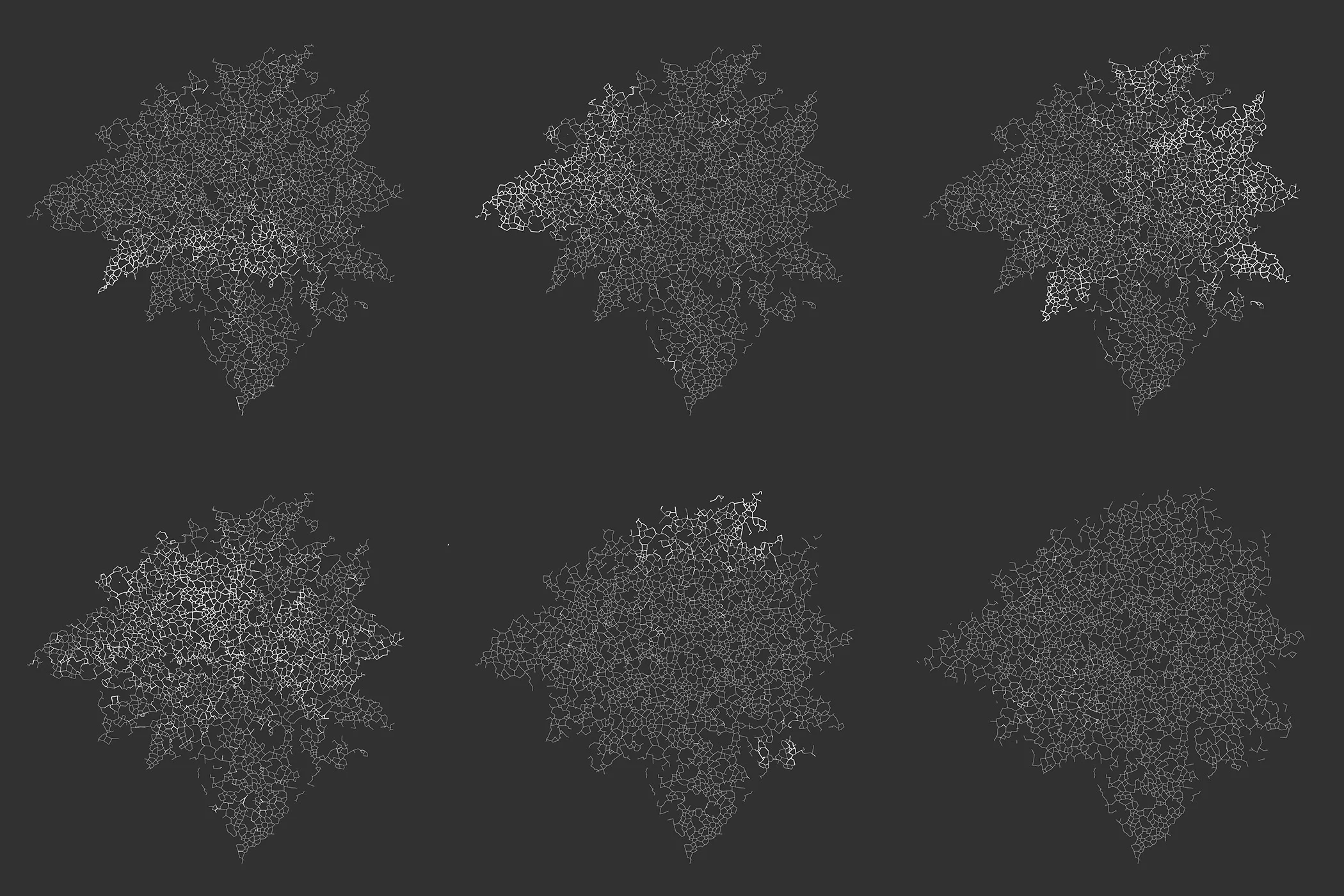
The basic idea was revealing EPFL’s structure through a network of doctoral students arranged according to a metric of textual similarity. Titles, abstracts, and the first ten pages of 8,000 doctoral theses were analyzed to extract the most used terms for each publication, using the spaCy library for Python (Honnibal et al. 2024). The number of pages was limited due to the computational load of machines at disposal. Successively, the algorithm TF-IDF — which stands for term frequency–inverse document frequency — identified the most relevant words for each doctoral thesis with respect to the entire corpus (Salton, Wong, and Yang 1975). Such a step is helpful to get rid of the most common terms of the corpus, which are not relevant to developing a metric of similarity. The resulting dataset was then processed through an algorithm of dimensionality reduction to create the mapping. The UMAP algorithm (McInnes, Healy, and Melville 2018) can be indeed used to reduce the highly complex lexical dimensionality into two dimensions, enabling the mapping on the Cartesian plane in what is commonly known as word embedding (Berger, McDonough, and Seversky 2017).
The result of this process is visible in the figure below, where the network structure is created by using Urquhart, an algorithm that draws connectivity between near nodes to avoid line overlapping (Urquhart 1980). The figure shows how doctoral theses/students are clearly grouped in specific areas, confirming the initial hypothesis that lexical information can reveal the overall organizational structure of the EPFL. A scattered structure, on the contrary, would have proved the presence of a non-uniform linguistic corpus, indicating a potential risk of inconsistency in data or methodology.
Looking at the figure below, we can easily see where the faculties are positioned. Assuming a faculty numbering on two lines, respectively A, B, C, and C, D, E, we can infer some information about the general interdisciplinary structure by looking at this small multiple. The School of Architecture, Civil and Environmental Engineering (A) and the School of Computer and Communication Sciences (B) are characterized by a well-defined lexical structure, which confines them to specific regions of the map. The School of Basic Sciences (C) and the School of Engineering (D) spread horizontally, suggesting the use of a lexicon that overlaps other disciplines. The School of Life Sciences (E) proves to have a strong identity despite its young age, and the College of Management of Technology has not enough doctoral students to delineate a clear border.
Graphic and Interaction Design
While the data investigation was active, provisional results underwent a design process to give them a form to advance understanding through visual and interactive means (Meirelles 2013).
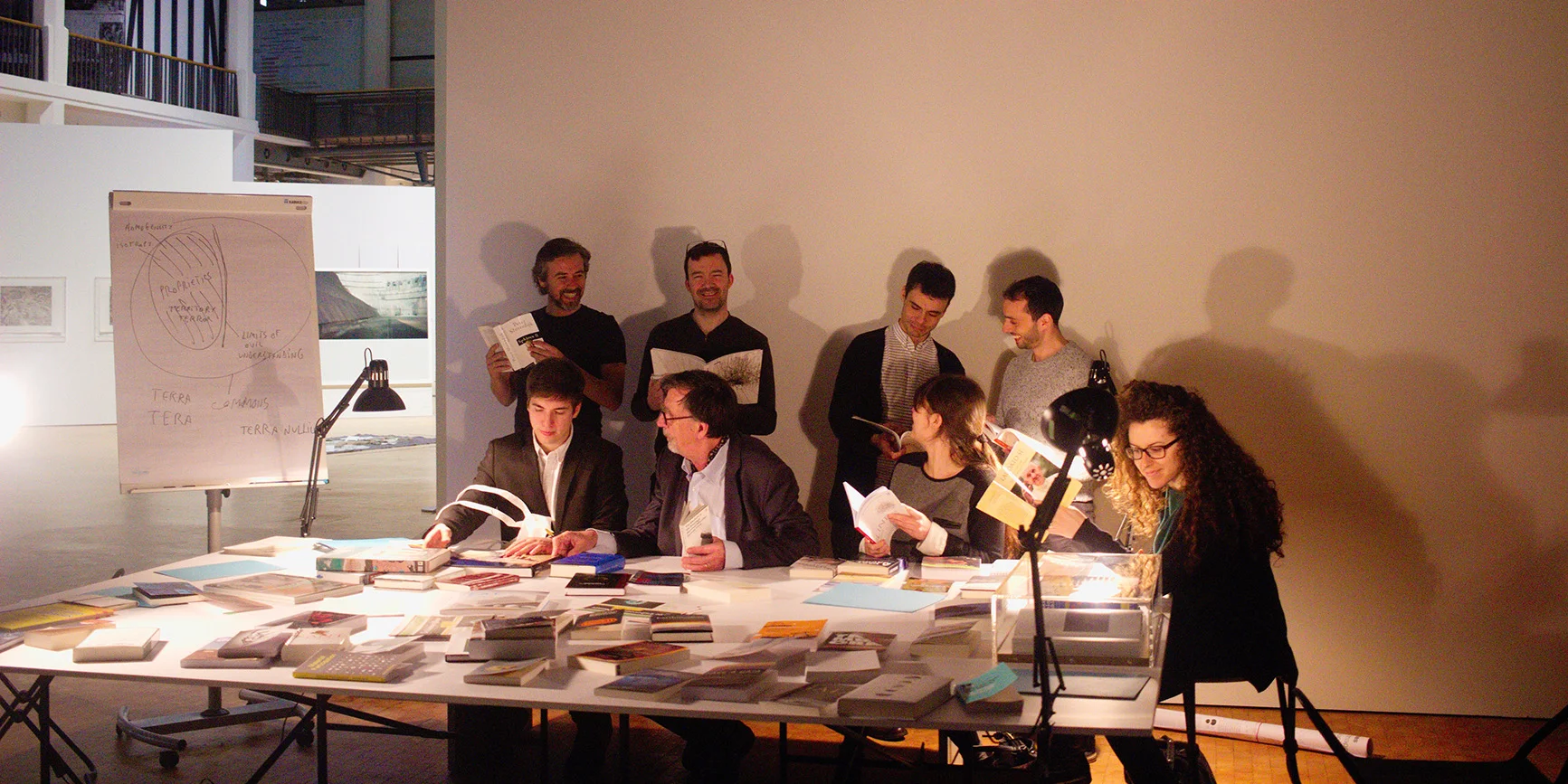
The Super-Vision project resulted from a participatory design (Bannon, Bardzell, and Bødker 2018) that involved expertise from data science, information design, experimental museology, and academic research. Dario Rodighiero (MIT) oversaw the general concept and the data collection, Philippe Rivière (Visionscarto) the data analysis and visualization, Patrick Donaldson (EM+) the graphic design, and Sarah Kenderdine (EM+) the museum installation. It is worth noting that most of the development was carried out with collaborators from Switzerland, France, and the United States who could collaborate through Slack, Observable, and Dropbox. However, it is important to stress that a consistent part of the project budget was used to meet in person two months before the exhibition to take a look at the gallery space and adjust the graphic layout. Indeed, the calibration of colors, fonts, and shapes, and the testing of technical devices are operations that have to be scrutinized by everyone in the exhibition location. Although the design process moved online smoothly, the opportunity to meet in person accelerated the finalization of the project.
The idea of a timespan- and structure-based data visualization representing EPFL evolution inspired the general concept of the digital installation. As a result, the Super-Vision project was created as a compound of two distinct but complementary visualizations representing time and space respectively. As visible in the figures below, the screenshots show how the center of this compound visualization hosts a network visualization arranging doctoral theses according to their lexical similarity: the more two theses are nearby in the Cartesian plane, the greater their similarity (Rodighiero, Kaplan, and Beaude 2018; Rodighiero and Romele 2022). The network visualization draws an image of 8,000 doctoral theses, which allows the viewer to observe a visual classification by faculty of the entire corpus of doctoral theses, enabling spatial exploration. Around this network, a line chart marks an outer circle that works as an enclosing frame, showing the increasing frequency of doctoral defenses. The network visualization and the line chart offer two complementary perspectives of the same dataset, creating a novel compound that can be described as an intermediary object between a dashboard and a basic visualization. In the tentative to imitate the incomparable Charles Joseph Minard’s infographic presenting Napoleon’s defeat (Rendgen 2018), Super-Vision’s visualization guides the viewer through historical data through a multidimensional instrument to look into the institutional dimensionality of doctoral advising.
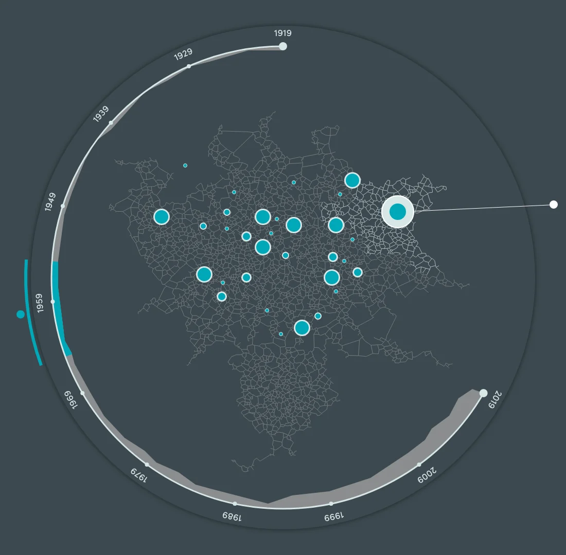
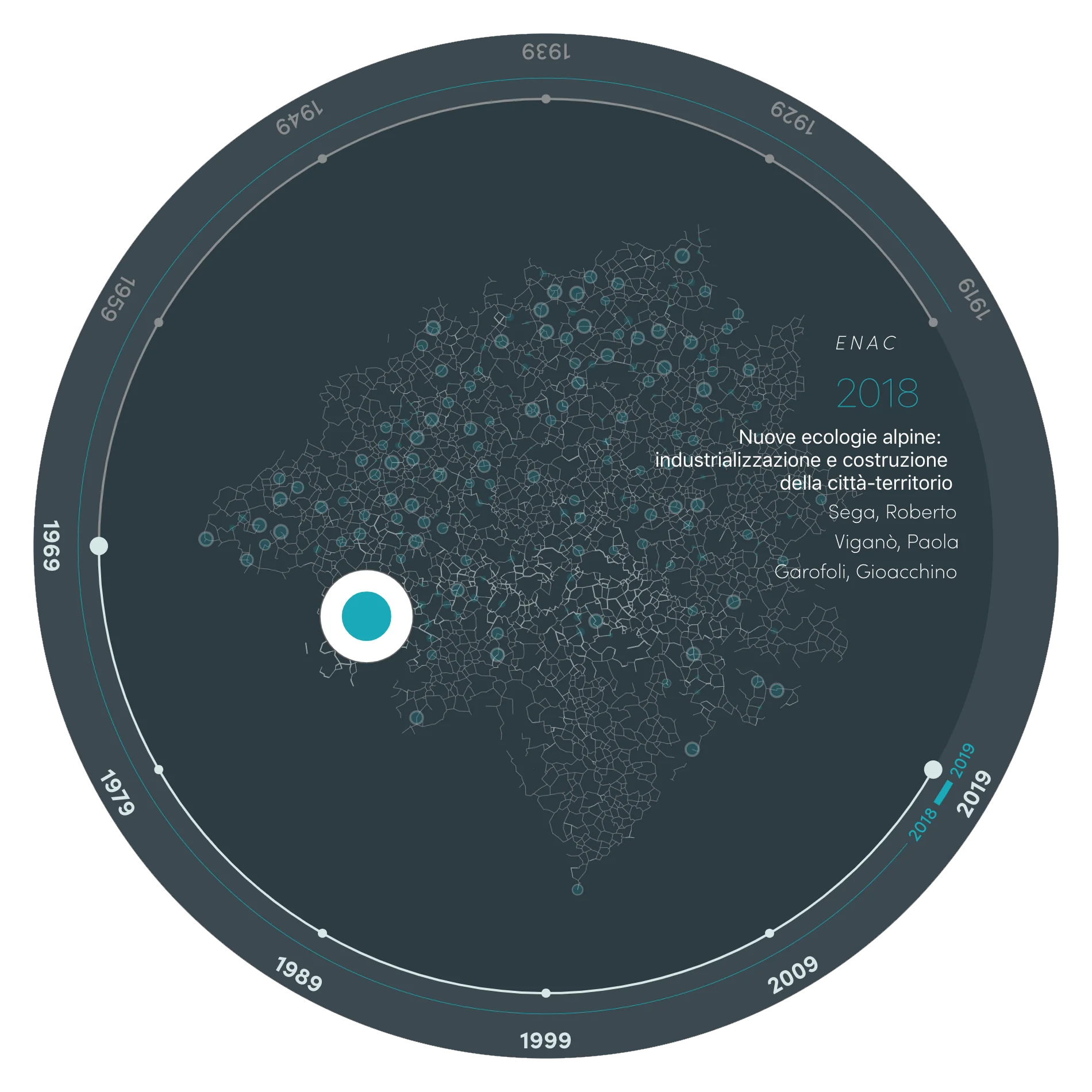
An additional level of information is given by interactivity, which allows users to explore the dataset in detail. The figures above show how the compound visualization is characterized by cyan graphic elements indicating selections. One user can navigate through time on a laptop by scrolling the trackpad, which moves the selection bar. In response to this input, some graphic elements start bumping to bring out from the intertwined tissue the doctoral theses defended in the selected period. From this central space, the user is invited to select one bouncing dot to get further information: on click, the interactive interface will show the title, candidate, directors, and faculty of the selected doctoral thesis, accompanied by a background effect showing the relative faculty’s extension. Only at this point the user is offered to explore the neighborhood by navigating transversally similar works. This combination shows us how information and interaction design are intimately connected by their shared goal of understanding data, as recently discussed by Manuel Lima in a recent interview (Rodighiero 2021a).
In the timeline, the selection bar progressively diminishes its length when going forward. This solution was necessary because the corpus’s density would not otherwise enable neat navigation in the most recent years. Despite this visual limitation that prevents overwhelming information, the user can still perceive the deluge of doctoral theses by scrolling forward the time bar. When the timeline is scrolled quickly, the animation accumulates hundreds of bouncing dots from the scrolled period. Such a feeling of being overwhelmed is usually avoided in information design because it generates unreadable, chaotic visuals. However, the same experience of surprise (Rodighiero et al. 2022; Willett et al. 2022) or sublime (Manovich 2008) can help the user to realize the vast number of elements in their wholeness, which are typically difficult to grasp.
A copy of the interactive interface of Super-Vision can be used on the Visionscarto website at https://visionscarto.net/maps/super-vision/, while the code is openly accessible on https://observablehq.com/@fil/epfl-super-vision.
Physical Installation
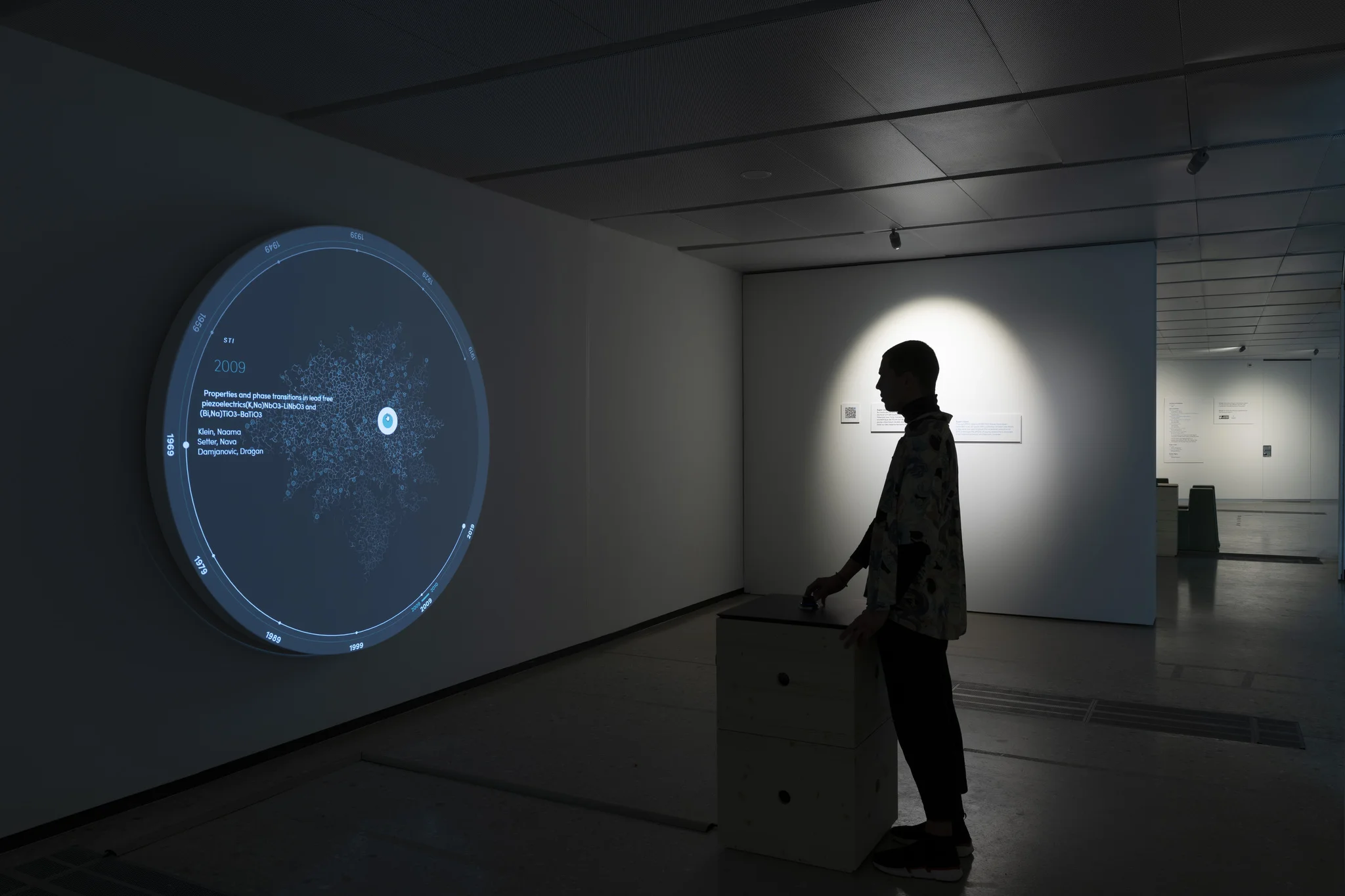
Super-Vision was explicitly designed for Infinity Room 2, and some adopted solutions were offered by the exhibition space and the technical material at disposal. For example, the choice of a circular projection was not only suggested by the form of the UMAP algorithm but also because of the availability of a round-shaped projection surface already employed in another exhibition. The surface measuring one meter and a half, previously used on the floor, this time was hung on the gallery’s wall to maintain the verticality of the textual information (see figure below).
The projection surface also represented a constraint to space out the projector. The two-meter distance from the wall balances the spectator’s view, the projector’s resolution, and the luminosity contrast between the projection screen and gallery illumination. The installation was thus completed with a one-meter column capable of hosting the projector and a device to interact with the data visualization. The chosen device was a three-dimensional mouse that allowed the visitor to browse the doctoral theses on the Cartesian plane and move throughout the timeline by rotating the wheel in clockwise or counterclockwise directions. The rotation characteristic was particularly relevant for the final choice because it recalls the visualization’s rounded shape, creating a cognitive correspondence between shape and functionality.
The Super-Vision digital installation was positioned in a niche of the long hall of EPFL Pavilions during the exhibition, where the illumination was softer because of the video projection. The visitor was naturally invited to enter the dedicated space, finding immediately the controller placed on the column that implicitly suggested the preferred standpoint. In addition, an idle function that animated the data visualization by automatically advancing the timeline selector captured the audience’s curiosity by showcasing the system’s interactivity. Such an animation was frozen when the visitor took control of the mouse and reverted to idle mode after a short period of inactivity.
Conclusion
Digital archives are valuable information sources to retrace the most recent history of institutions. Leading scientists can use data analysis and visualization techniques to investigate historical records, obtaining unique perspectives that would be difficult to read otherwise.
This article addresses the potential of collaboration, especially for experimental museology and, more extensively, for digital humanities. In a moment in which interdisciplinarity seems to be struggling to establish itself in academia, museums represent ideal experimental platforms for pioneering at the intersection of data, art, and science.
Observing how data visualization runs across disciplines and professionals is engaging. Its transversality allows scholars to cover the distance between academia and the private sector, as computer science did in the last few decades. The subsequent developments must be followed closely, especially when focusing on public spaces where information can be addressed to a larger public than the academic one. Museums offer physical space for data visualization and blur the borders between art and science more freely than academia. As Hans Ulrich Obrist and Barbara Vanderlinden mentioned, museums can be considered scientific laboratories where scholars can experiment more freely by conveying critical thoughts to museum visitors.
In particular, the most critical thought in the Super-Vision project raises concerns about the university’s fast-growing model. The data visualization clearly shows how there was roughly one doctoral defense per month during the 1960s, while EPFL today exceeds one thesis per day. To a keen eye, this stunning insight not only represents a statistical increase but also reveals more-hidden institutional regulations. Indeed, this university model prefers to invest money in doctoral students rather than intermediary research positions like researchers and senior researchers, which are disappearing from the organizational chart, obliging many scholars to move out of the institute or accept administrative employment. On the one hand, the increase in doctoral students represents a more significant opportunity to pursue doctoral studies, but on the other hand, it makes the academic career more difficult than before because of the higher number of potential candidates for professorships.
The insights of Super-Vision let the museum visitor thoughtfully look at institutions from an innovative perspective while maintaining a critical eye on data and society. Digital archives already show the potential for future inquiries, and the field of contemporary history needs to be revised through digital means.
References
- Antonelli, Paola, ed. 2008. Design and the Elastic Mind. New York: Museum of Modern Art.
- Australian Society of Archivists, ed. 2003. GLAM: Galleries, Libraries, Archives and Museums: Conference Proceedings. Australian Society of Archivists.
- Bannon, Liam, Jeffrey Bardzell, and Susanne Bødker. 2018. “Reimagining Participatory Design.” Atlantic Monthly 26 (1): 26–32. https://doi.org/10/ghm6c6.
- Beaulieu, Anne, and Sabina Leonelli. 2021. Data and Society: A Critical Introduction. Preprint Edition. London: Sage Publications.
- Berger, Matthew, Katherine McDonough, and Lee M. Seversky. 2017. “cite2vec: Citation-Driven Document Exploration via Word Embeddings.” IEEE Transactions on Visualization and Computer Graphics 23 (1): 691–700. https://doi.org/10.1109/TVCG.2016.2598667.
- Bijker, Wiebe E., and John Law, eds. 1992. Shaping Technology / Building Society: Studies in Sociotechnical Change. Cambridge, MA: MIT Press.
- Bingham, Ella, and Heikki Mannila. 2001. “Random Projection in Dimensionality Reduction: Applications to Image and Text Data.” In Proceedings of the Seventh ACM SIGKDD International Conference on Knowledge Discovery and Data Mining, 245–50. https://doi.org/10.1145/502512.502546.
- Bini, Giulia. 2022. Media spazio display: ZKM Zentrum für Kunst und Medien, HFG Hochschule für Gestaltung. Milan: Mimesis.
- Börner, Katy. 2010. Atlas of Science: Visualizing What We Know. Cambridge, MA: MIT Press.
- Börner, Katy. 2015. Atlas of Knowledge: Anyone Can Map. Cambridge, MA: MIT Press.
- Bostock, Mike. 2017. “A Better Way to Code.” Medium. https://medium.com/@mbostock/a-better-way-to-code-2b1d2876a3a0.
- Bostock, Mike, Vadim Ogievetsky, and Jeffrey Heer. 2011. “D³: Data-Driven Documents.” IEEE Transactions on Visualization and Computer Graphics 17 (12): 2301–9. https://doi.org/10/b7bhhf.
- Caffaro, Jérôme, and Samuele Kaplun. 2010. “Invenio: A Modern Digital Library for Grey Literature.” CERN-OPEN-2010-027. CERN. https://cds.cern.ch/record/1312678.
- Cameron, Fiona, and Sarah Kenderdine, eds. 2007. Theorizing Digital Cultural Heritage: A Critical Discourse. Cambridge, MA: MIT Press.
- Cellard, Loup, and Anthony Masure. 2018. “Le design de la transparence: une rhétorique au cœur des interfaces numériques.” Multitudes 73 (4): 100. https://doi.org/10.3917/mult.073.0100.
- Cogdell, Christina. 2009. “Design and the Elastic Mind, Museum of Modern Art (Spring 2008).” Design Issues 25 (3): 92–101. https://doi.org/10/cqct95.
- Crawford, Kate, and Vladan Joler. 2018. “Anatomy of an AI System: The Amazon Echo as an Anatomical Map of Human Labor, Data and Planetary Resources.” SHARE Lab and AI Now Institute. https://anatomyof.ai.
- DeNeef, A. Leigh, and Craufurd D. W. Goodwin, eds. 1995. The Academic’s Handbook. 2nd ed. Durham: Duke University Press.
- Friendly, Michael. 2021. A History of Data Visualization and Graphic Communication. Cambridge, MA: Harvard University Press.
- Geismar, Haidy. 2018. Museum Object Lessons for the Digital Age. London: UCL Press. https://doi.org/10.2307/j.ctv1xz0wz.
- Gordon, Virginia N., Wesley R. Habley, Thomas J. Grites, and Associates, eds. 2008. Academic Advising: A Comprehensive Handbook. 2nd ed. San Francisco: Jossey-Bass.
- Gorman, Michael John. 2020. Idea Colliders: The Future of Science Museums. Cambridge, MA: MIT Press. https://doi.org/10.7551/mitpress/11019.001.0001.
- Hertig, Hans-Peter. 2016. Universities, Rankings, and the Dynamics of Global Higher Education: Perspectives from Asia, Europe, and North America. London: Palgrave Macmillan.
- Honnibal, Matthew, Ines Montani, Sofie Van Landeghem, and Adriane Boyd. (2014) 2024. “spaCy: Industrial-Strength Natural Language Processing in Python.” https://doi.org/10.5281/zenodo.1212303.
- Isaac, Gwyneira. 2008. “Technology Becomes the Object.” Journal of Material Culture 13 (3): 287–310. https://doi.org/10/btgw3r.
- Kenderdine, Sarah, Ian Mason, and Lily Hibberd. 2021. “Computational Archives for Experimental Museology.” In Emerging Technologies and the Digital Transformation of Museums and Heritage Sites, edited by Maria Shehade and Theopisti Stylianou-Lambert, 3–18. Cham: Springer International Publishing. https://doi.org/10.1007/978-3-030-83647-4_1.
- Krzywinski, Martin, and Alberto Cairo. 2013. “Storytelling.” Nature Methods 10 (8): 687. https://doi.org/10.1038/nmeth.2571.
- Latour, Bruno, and Christophe Leclercq, eds. 2016. Reset Modernity! Karlsruhe: ZKM, Center for Art and Media; Cambridge, MA: MIT Press.
- Latour, Bruno, and Peter Weibel, eds. 2002. Iconoclash. Karlsruhe: ZKM, Centre for Art and Media; Cambridge, MA: MIT Press.
- Latour, Bruno, and Peter Weibel, eds. 2005. Making Things Public: Atmospheres of Democracy. Cambridge, MA: MIT Press.
- Latour, Bruno, and Peter Weibel, eds. 2020. Critical Zones: Observatories for Earthly Politics. Cambridge, MA: MIT Press.
- Latour, Bruno, and Steve Woolgar. (1979) 1986. Laboratory Life: The Construction of Scientific Facts. Princeton: Princeton University Press.
- Leutenegeer, Christophe, Bohumil Konopka, and Olivier Christinat. (2019) 2021. Perspective on EPFL: Science, Architecture, People. Chicago: University of Chicago Press.
- Lupi, Giorgia, and Stefanie Posavec. 2016. Dear Data. New York: Princeton Architectural Press.
- Lynch, Michael. 1988. “The Externalized Retina: Selection and Mathematization in the Visual Documentation of Objects in the Life Sciences.” Human Studies 11 (2/3): 201–34. https://doi.org/10.1007/BF00177304.
- Manning, Christopher D., and Hinrich Schütze. 1999. Foundations of Statistical Natural Language Processing. Cambridge, MA: MIT Press.
- Manovich, Lev. 2008. “Data Visualization as New Abstraction and Anti-Sublime.” In Small Tech: The Culture of Digital Tools, edited by Byron Hawk, David M. Rieder, and Ollie O. Oviedo. Minneapolis: University of Minnesota Press.
- Manovich, Lev. 2018. “Artistic Visualization.” In A Companion to Digital Art, edited by Christiane Paul. Hoboken: Wiley Blackwell.
- McInnes, Leland, John Healy, and James Melville. 2018. “UMAP: Uniform Manifold Approximation and Projection for Dimension Reduction.” arXiv. https://arxiv.org/pdf/1802.03426.pdf.
- Mediacom. 2016. “EPFL Keeps the Lead of ‘THE Young Universities Ranking.’” EPFL Website. https://actu.epfl.ch/news/epfl-keeps-the-lead-of-the-young-universities-rank/.
- Meirelles, Isabel. 2013. Design for Information: An Introduction to the Histories, Theories, and Best Practices Behind Effective Information Visualizations. Beverly: Rockport.
- Moon, Christine Yein Eun, and Dario Rodighiero. 2020. “Mapping as a Contemporary Instrument for Orientation in Conferences.” In Proceedings of the IX Annual Conference of the Association for Humanities and Digital Culture (AIUCD). The Inevitable Turning Point: Challenges and Perspectives for Humanistic Informatics, edited by Marco Passarotti, Eleonora M. G. Litta Modignani Picozzi, Greta Franzini, and Cristina Marras. Associazione per l’Informatica Umanistica e la Cultura Digitale. https://doi.org/10.5281/zenodo.3611340.
- Obrist, Hans Ulrich, and Barbara Vanderlinden. 2001. Laboratorium. Antwerp: Dumont.
- Paul, Christiane. 2015. Digital Art. 3rd ed. London: Thames & Hudson.
- Rendgen, Sandra. 2018. The Minard System: The Complete Statistical Graphics of Charles-Joseph Minard. New York: Princeton Architectural Press.
- Rodighiero, Dario. 2021a. “Ars Memorativa as the Genesis of Information Design: A Conversation with Manuel Lima.” Nightingale. https://nightingaledvs.com/ars-memorativa-as-the-genesis-of-information-design-a-conversation-with-manuel-lima/.
- Rodighiero, Dario. 2021b. Mapping Affinities: Democratizing Data Visualization. Open-Access English Edition. Geneva: Métis Presses. https://nrs.harvard.edu/URN-3:HUL.INSTREPOS:37368046.
- Rodighiero, Dario, Lins Derry, Douglas Duhaime, Jordan Kruguer, Maximilian C. Mueller, Christopher Pietsch, Jeffrey T. Schnapp, Jeff Steward, and metaLAB. 2022. “Surprise Machines: Revealing Harvard Art Museums’ Image Collection.” Information Design Journal 27 (1): 21–34. https://doi.org/10.1075/idj.22013.rod.
- Rodighiero, Dario, Frédéric Kaplan, and Boris Beaude. 2018. “Mapping Affinities in Academic Organizations.” Frontiers in Research Metrics and Analytics 3 (4). https://doi.org/10.3389/frma.2018.00004.
- Rodighiero, Dario, and Alberto Romele. 2022. “Reading Network Diagrams by Using Contour Lines and Word Clouds.” Proceedings of Graphs and Networks in the Humanities. https://doi.org/10.31235/osf.io/3g7bt.
- Rodighiero, Dario, Eveline Wandl-Vogt, and Elian Carsenat. 2021. “Making Visible the Invisible Work of Scientists during the COVID-19 Pandemic.” Visual Culture Studies 2: 143–65. https://doi.org/10.5281/zenodo.5115621.
- Rodighiero, Dario, Eveline Wandl-Vogt, and Elian Carsenat. 2022. “A Visual Translation of the Pandemic.” Leonardo 55 (3): 297–303. https://doi.org/10.1162/leon_a_02203.
- Rodighiero, Dario, Eveline Wandl-Vogt, Elian Carsenat, Jörg Döring, Olga Elias, Mariia Fragner, and Sára Farkashazy. 2022. “Immersive Architectures for Visual Data Literacy.” Information Design Journal 27 (3): 295–308. https://doi.org/10.1075/idj.22016.rod.
- Rosenberg, Daniel, and Anthony Grafton. 2010. Cartographies of Time. New York: Princeton Architectural Press.
- Rosnay, Joël de. 2014. Le macroscope: vers une vision globale. Paris: Éd. Points.
- Salton, Gerard, A. Wong, and C. S. Yang. 1975. “A Vector Space Model for Automatic Indexing.” Communications of the ACM 18 (11): 613–20. https://doi.org/10/fw8vv8.
- Schmidt, Benjamin. 2018. “Stable Random Projection: Lightweight, General-Purpose Dimensionality Reduction for Digitized Libraries.” Journal of Cultural Analytics. https://doi.org/10.22148/16.025.
- Shapin, Steven. 1992. “Why the Public Ought to Understand Science-in-the-Making.” Public Understanding of Science 1 (1): 27–30. https://doi.org/10.1088/0963-6625/1/1/006.
- Sismondo, Sergio. (2004) 2010. An Introduction to Science and Technology Studies. 2nd ed. Hoboken: Wiley-Blackwell.
- Suber, Peter. 2012. Open Access. Cambridge, MA: MIT Press.
- Urquhart, R. B. 1980. “Algorithms for Computation of Relative Neighbourhood Graph.” Electronics Letters 16 (14): 556. https://doi.org/10.1049/el:19800386.
- Van Dijck, José. 2014. “Datafication, Dataism and Dataveillance: Big Data between Scientific Paradigm and Ideology.” Surveillance & Society 12 (2): 197–208. https://doi.org/10/gd84d9.
- Willett, Wesley, Bon Adriel Aseniero, Sheelagh Carpendale, Pierre Dragicevic, Yvonne Jansen, Lora Oehlberg, and Petra Isenberg. 2022. “Perception! Immersion! Empowerment! Superpowers as Inspiration for Visualization.” IEEE Transactions on Visualization and Computer Graphics 28 (1): 22–32. https://doi.org/10.1109/TVCG.2021.3114844.