Drawing Network Visualizations on a Continuous, Spherical Surface
@inproceedings{rodighiero2020drawing,
  author      = {Dario Rodighiero},
  title       = {Drawing Network Visualizations on a Continuous, Spherical Surface},
  booktitle   = {Information Visualisation},
  year        = {2020},
  url         = {https://hdl.handle.net/11370/33d1eac9-ce4d-4417-98d8-bea7abdfbbf2}
}
Despite the great literature regarding network visualizations, their graphic representation is hardly an object of investigation. Sometimes it deserves more attention, especially when individuals are represented. Visually translating communities in networks, for example, implies that some individuals are always situated at the borders of the representation. This assumption is clearly unfair, especially if each individual in the community is connected with everybody else. To address this lack of design justice, the community is represented on a spherical network where the surface is continuous. In that space, individuals can be situated in a sparse area, but never on the edges. The spherical network is then projected onto a flat surface to improve readability by making use of cartographic projections.
Introduction
Data visualization was born during the 20th century. Although its history dates back to a more ancient time when diagrams, drawings, and maps were handmade, practitioners do not appear to appreciate this legacy. Despite the separation from historical roots, there is nevertheless no doubt that looking back at its history would be a benefit. Cartography, for example, is one of the disciplines that contributed to shaping the visual language of data. This article investigates the heritage of cartography to improve network visualizations.
Network visualizations are usually drawn on a flat surface (Abbott 2006), which makes them printable and portable like maps. Despite the advantages of flatness, a major drawback occurs when communities are represented as a network: a part of them is predestined to be at the edges. This physiological characteristic of networks is commonly related to the metric of centrality.
It is noticeable how centrality is one of the major metrics that affect interpretation of network visualizations. Viewers are pleased when they appear at the center, but discontent when their name is placed on the borders. Beyond any metric, it is unfair to predestinate a few individuals on the borders. A network in which all the nodes are connected to each other, for example, should not have borders.
Weighing the idea to draw a network without centrality, it was evident that the spherical surface offered what was needed. Indeed, a sphere like the Earth has a surface to draw a network without edges.
This article proves how a continuous surface can be a more democratic space for visualizing communities. Then, to increase readability, spherical networks are unfolded using techniques of geographical projection such as the Mercator or the quincuncial ones. The variety of such techniques are then applied to a dataset representing the digital humanities community.1 The lexical distance between authors is so translated into pictures in which functionality fades into a sense of aesthetic and sublime (Manovich 2008).
Being a Flat Networker
Last year, Netflix released a documentary about the Flat Earth Society, titled Behind the Curve (Clark 2018). This society argues that the Earth’s sphericity is not perceivable by humans, whose point of view cannot realize the planet’s sphericity. The government, for them, brewed a plot to keep citizens docile and ignorant (Richardson 2019).
Although science provides enough information to contradict them (Eratosthenes 2010), the Flat Earthers can be considered thought-provoking at least. The fascination for them does not originate from eccentricity, but rather from the audacity in questioning an assumption taken for granted.
At school, children learn many truths such as human evolution or the Big Bang theory. But only over the years, they understand these theories in depth, developing a critical method to evaluate truthfulness. Critical thinking is a valuable means to question every kind of knowledge and form an opinion. Sometimes it can be tortuous and tricky, especially in the scientific community (Kuhn 1962). It was the case for Galileo Galilei who, in front of the Inquisition, was forced to recite the abjuration about something that was empirically proven (Fahie 2005).
Opening the black box like the Flat Earthers can show a problem from a different angle. Reframing this approach to data visualization, we can imagine a Flat Network Society whose only aim is keeping networks flat because of a scientific conspiracy. The article’s goal is demystifying such flatness widely employed by scientists (Barabási and Pósfai 2016; Latour et al. 2012), arguing that thinking in three dimensions sometimes can lead to more appropriate network visualizations.
Portraying Winston Churchill
Painters, photographers, and illustrators know that portraying someone is not an easy task. It requires a mix of abilities such as taste, delicacy, and technical ability. Even when these qualities excel, it might happen that the subject does not agree with the representation as it was the case for Winston Churchill.
Last century Graham Sutherland portrayed Churchill at the age of eighty. The artwork to celebrate Churchill’s 80th anniversary was commissioned by the House of Commons and House of Lords, which named the most famous English painter of that time. However, considering Churchill’s temper, it was not a surprise that something went wrong. His disappointment was so bitter that the portrait disappeared in his country house (Clubbe 2005) and, years later, it seems that the painting was destroyed by his wife Lady Spencer-Churchill.
This story shows the complexity of representing personal identity, which is also true in contemporary media. With the recent, massive quantification operated by personal devices (Rodighiero and Rigal 2019), large datasets bring into question the way in which individuals are represented, as well as the perception of their own self (Rodighiero and Cellard 2019). Severe ethical issues relate to the problem of self-representation, as it intimately concerns all human beings. Nevertheless, although the scientific debate on personal data is going on (Floridi 2019), the discussion about the ethics of visualizing individual information is still in an embryonic state.
The Issue of Network Centrality
During the Digital Humanities Conference in 2014, when speakers were invited to recognize themselves in a network visualization representing them, reactions were different. Someone was offended for not being part of the visualization and someone was pleased to be there, sharing portraits on social media (Rodighiero 2018a). The ENAC Research Day caused the same reactions in a similar setting: when faculty members were invited to recognize themselves in a data visualization, responses ranged from engagement to indifference.
Although most of the complaints were related to technical problems easy to solve, something else was not completely focused. After a period of reflection, it was evident that the reactions that originated from self-recognition were influenced by network centrality. Different interviews clearly indicated that the satisfaction was proportional to the closeness to the center: the more a person was placed in the middle of the network, the more the self-perception was flattering.
The origin of centrality lies in the concept of being the “star” of a social group, which is being popular and worthy of attention. But in network analysis, centrality also determines the node’s relevancy (Scott 2000). Such a measure can be not only mathematically calculated but also diagrammatically interpreted, as in networks it is rather easy to see whether a node is central or not.
Looking for a Continuous Space
At the time of these events, placing individuals at the edges of networks appeared a reasonable choice. But that cannot be really defined as a choice since it relies on a physiological characteristic of network visualizations. Putting some nodes at the margins is a convention that the majority of software and libraries follows.
When network entities are non-humans, there is no significant impact. But when entities are individuals, being on the edge can generate a state of discontent. As in real society individuals might feel discouraged when marginalized, something similar happens in visual representations. Placing someone at the edge of a network corresponds to a form of exclusion, and the cause of this marginalization is identified as centrality, since visual discrimination is observed at its presence. Unfortunately, there is no way to get rid of centrality until networks are drawn on a flat surface. Thus, the question to ponder is, “would it be possible to design space without centrality?” In our own humble opinion, the answer is yes.
Discharging the space from the centrality inherited from planar media, such as painting or photography, implies getting rid of frames that impose a drawing limit. A space without frames is potentially a continuous plain with no interruptions.
The simplest manifestation of the contiguous space belongs to geometry and cartography — it is the sphere. Like the planet Earth, the sphere’s surface represents a continuous, non-infinite space where a line can be drawn endlessly. The hypothesis of this article is that mapping a network on the sphere makes the human representation more democratic.
The Inclusivity of Language
The problem of centrality is stronger in the presence of two conditions: (1) nodes correspond to individuals and (2) a high degree of connectivity exists between these individuals. These conditions often take place in relatively small communities like the scientific communities.
Scientific communities are built on social ties whose multidimensional complexity is proportional to the diversity of practices (Rodighiero, Kaplan, and Beaude 2018; Rodighiero 2018b). Among all the potential metrics that can be employed to represent scientific communities, language represents one of the most interesting ones.
Language is egalitarian, transversal, and inclusive of all communities. It differs from the citation system because language is shared beyond any role or seniority and is not subject to any copyright. A network visualization based on such a metric is then an index of democracy, equality, and impartiality.
In particular, a scientific conference is a specific setting that fulfills the two conditions: (1) a conference is a group composed of individuals and (2) their writing gives life to a dense structure of lexical connections. Conference papers can be analyzed in terms of frequency to create a metric. Text analysis can help to compute a lexical similarity, which can be successively translated into a network where individuals are connected by their words.
The Case Study of DH2019
Attendees usually orientate themselves in conferences using digital and printed programs. Although these programs represent the standard, information is fragmented in pages. More recent approaches aim to describe the conference as a whole, as in the case of lexical cartography created by Moon and Rodighiero (2020).
The lexical cartography is based on vocabulary similarity, inferred from papers. This metric is based on the statistical method called TF-IDF, which computes the term frequency of each speaker according to the entire corpus. The result is a list of the most relevant words for each speaker. Words are then used to create the network links by computing the common dictionary that every pair of speakers share.
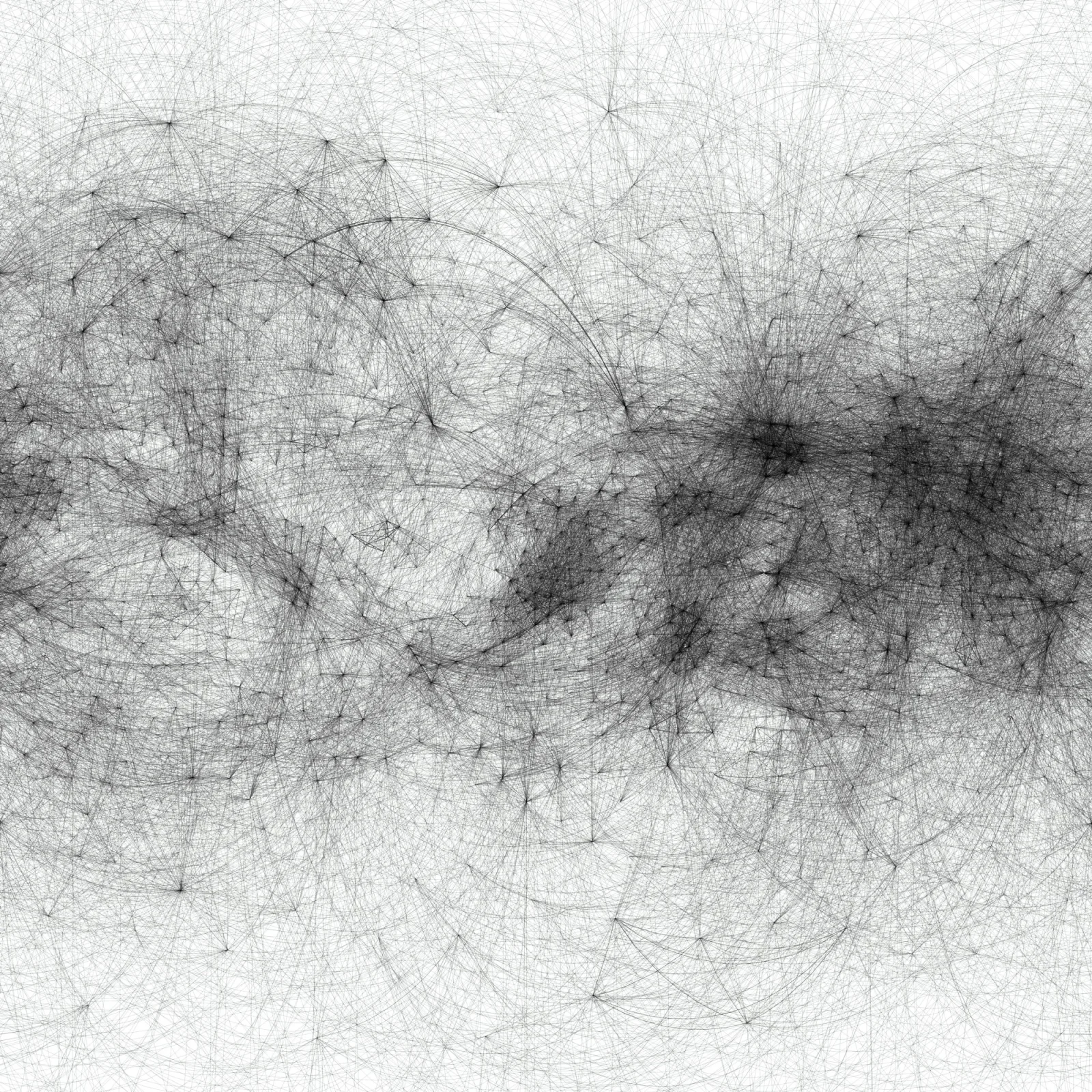
The case study of the Digital Humanities Conference (DH2019) confirms the issue of centrality raised in these pages. Despite the high connectivity of lexical ties, a set of authors is always confined towards the network’s borders (see Figure 1). The rich connectivity of DH2019 makes the conference a perfect example to demonstrate the efficacy of the spherical layout.

Drawing on the Spherical Surface
Network arrangement is based on mathematical methods that simulate the molecular dynamics. Verlet integration is a method that Isaac Newton used to integrate the equations of motion, but today is employed in the force-directed graph layout.2 Using a relational dataset where weighted edges connect nodes, the network can be represented on a two-dimensional surface, making its structure readable. D3.js is one of the free libraries available to draw networks using JavaScript (Bostock, Ogievetsky, and Heer 2011).
Network visualizations are the result of a process of stabilization in which edges use their force in a process of spatial negotiation. Unlike the force layout applied to obtain a flat network, designing a three-dimensional network requires a modified system of forces3 able to plot the network in a three-dimensional space. Furthermore, drawing on a spherical surface requires an additional force to the system, acting similarly to gravity. Such a force makes sure that nodes, which are bouncing in the space during the arrangement (see Figure 2), are attracted by an imaginary spherical surface around a hypothetical center. The sum of these forces magically stabilizes the nodes on the spherical surface, but this is not the sole condition.
Parameters play an important role in spherical networks. The optimal coverage of the surface derives from a delicate balance of two parameters that operate on the system: the link strength4 and the many-body forces.5 When the forces are not correctly balanced, the risk is that of obtaining a roundish, slightly curved flat network like Antarctica. If this were to happen, the link strength would be loosened to slide the network gently over the sphere until it is entirely covered. Likewise, the many-body force has to be increased to untwist any eventual cluster of nodes, which might make the visualization unreadable.
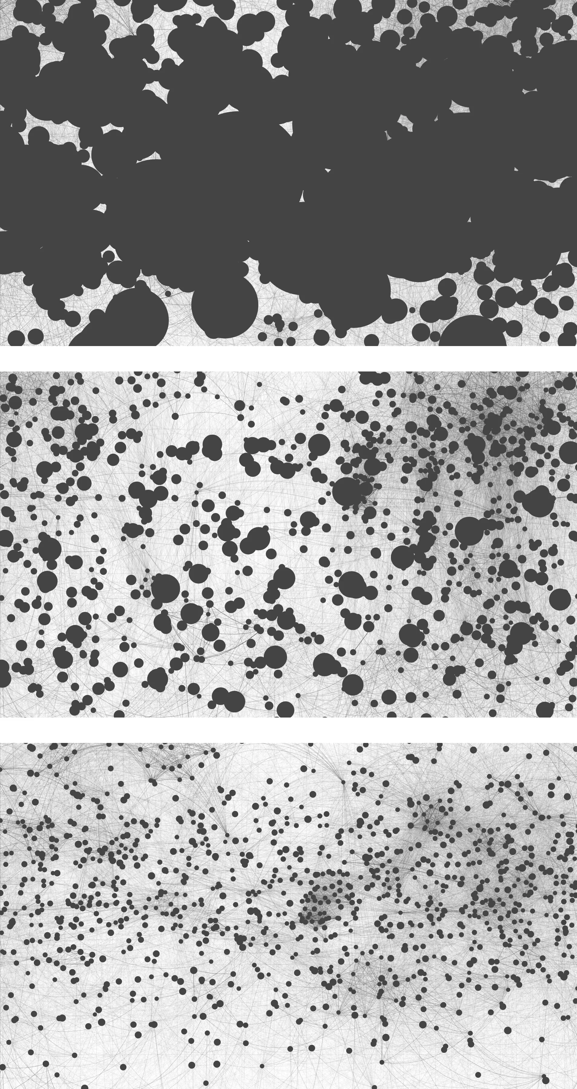
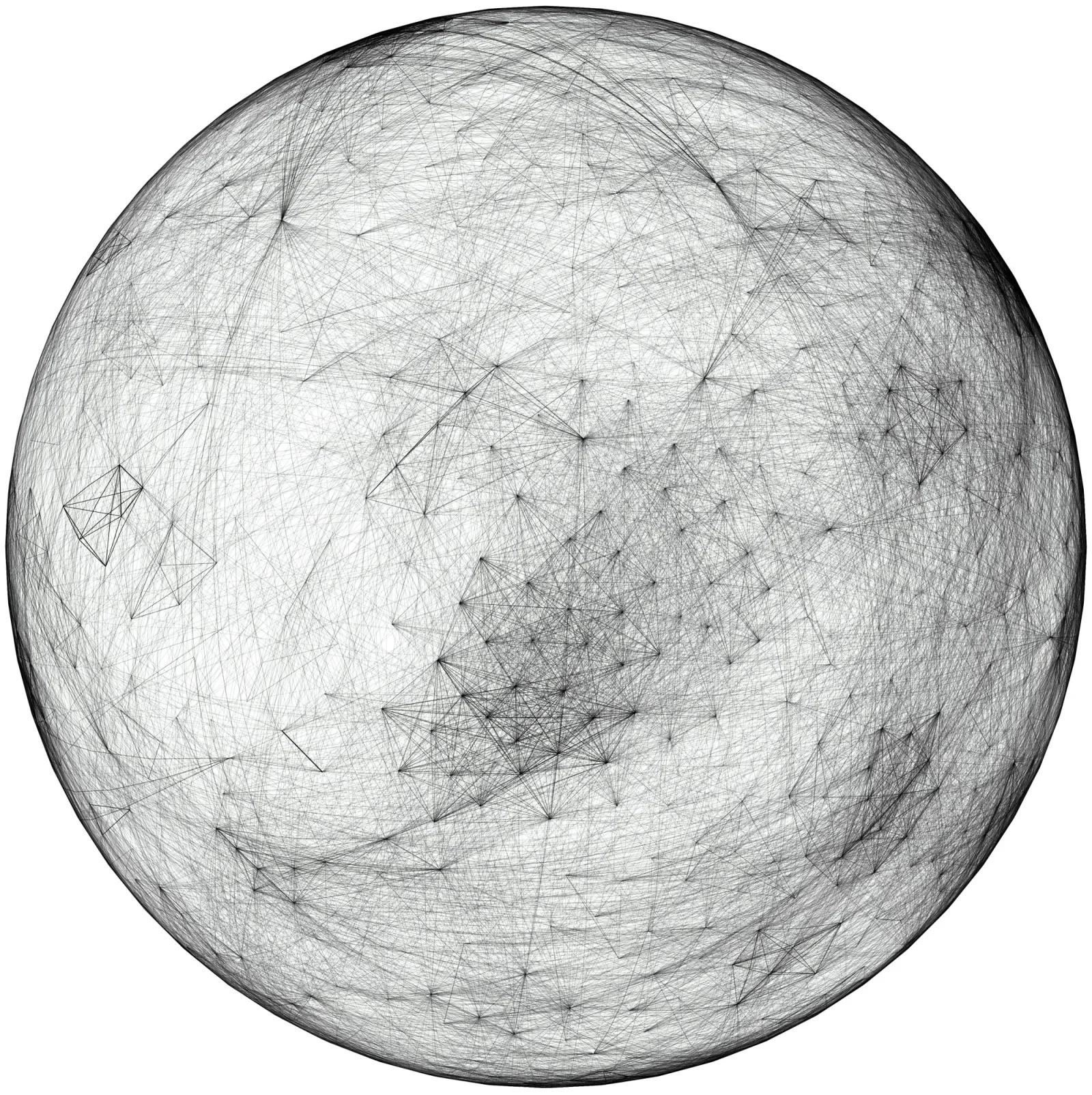
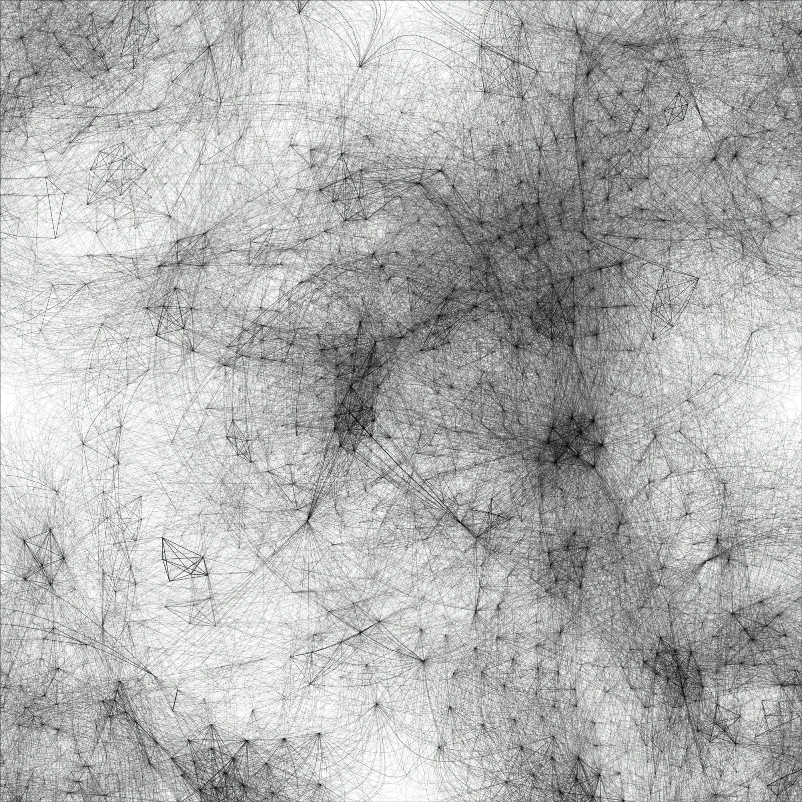
The result of the agency is a node arrangement that looks like a sphere (see Figure 3). The likeness to a globe is further reinforced by curved lines that stand for edges. The number of authors (around 1,000) and the number of links (around 140,000) shape a dense network that leads to results favorable to a spherical arrangement.
It is noticeable how the network cannot be read in terms of centrality. Such a measure is absent in favor of another one, density. The network density is defined as the number of nodes in a given area that describes a local neighborhood. When a lot of nodes are condensed, it is an index of a highly shared vocabulary, as in the case of a co-authored conference paper. When single authors are situated in rarefied areas, they are still in a contextual neighborhood despite the distance from the others. In any case, every author always belongs to a 360-degree contextual area.
The Origins of Cartographic Projection
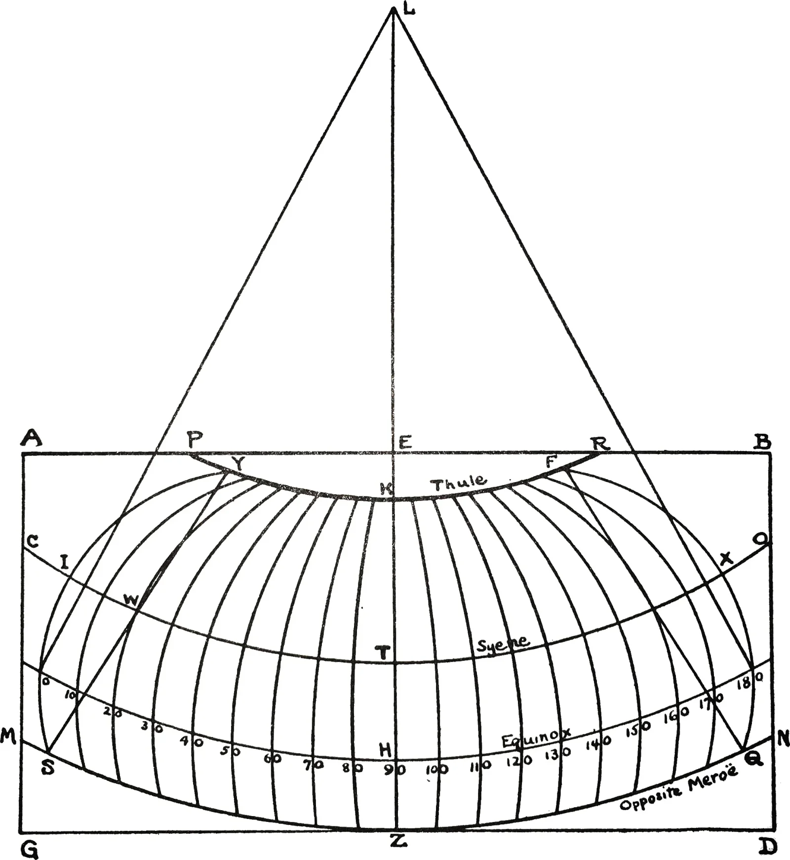
To contradict the flat-Earth arguments, it can be said that our planet’s sphericity was already known before the Common Era. The first text of history on this subject comes from Strabo, a philosopher of Hellenistic Greece who lived between 64–63 BCE and 24 CE. Strabo gives us some interesting information about the Earth’s sphericity and the origin of cartography, collected by Duane W. Roller (Strabo 2014).
Strabo’s pupils were well aware of the planet’s sphericity; they had to know notions like equator and the tropics to attend his class (Strabo 2014). Pupils were also used to studying large wooden globes of statuary dimensions. The need for moving these globes to share knowledge represents the origin of cartographic projection (Latour 1986), which Strabo dates back to the 2nd century BCE (Strabo 2014).
Maps, over time, were printed and drawn on papyrus, textiles, vellum, paper, plastic, etc. Today, however, they are mainly displayed on smartphones or personal computers in what was defined as a cartographic turn (Lévy 2016). This digitalization modified the perception of territory, especially through zooming, a gesture that allows the reader to increase and decrease the point of view rapidly. But zooming is not a mere function; it connects worlds in two and three dimensions, the map and the globe. Maps’ bi-dimensionality is thus connected to the globe’s three-dimensionality like in Google Earth, which merges different levels of detail through interaction (Latour 2014).
The hypothesis of this article is that this connectivity between dimensions is still missing for network visualizations, and one potential gateway is represented by the cartographic projection (Dilke 1987). The cartographic projection, indeed, has the ability to flatten the globe without losing the space’s continuity. If you consider the standard European world map, the distance between the USA and Japan is apparently misleading; but once the viewer understands that the left side continues to the right one, everything is clearer. As a result, the geographic projection unrolls the sphere’s surface, making it readable on a flat surface and preserving the spatial continuity. Furthermore, this spatial continuity allows for remodeling the map, according to the focus that might be on Japan or the USA; the rotation of the sphere, associated with the cartographic projection, lets us think of space without centrality in which every state can be placed at the center of the map.
Cartographic Projection of Spherical Networks
The cartographic projection is one of the most ambitious human gestures. It embodies the gigantic effort to grasp and represent the volume of the Earth. This article presents how it is possible to apply this projection to network visualization and what advantages that operation entails. That operation was technically achievable through the d3-geo component6 that extends the d3 library with different projection techniques.
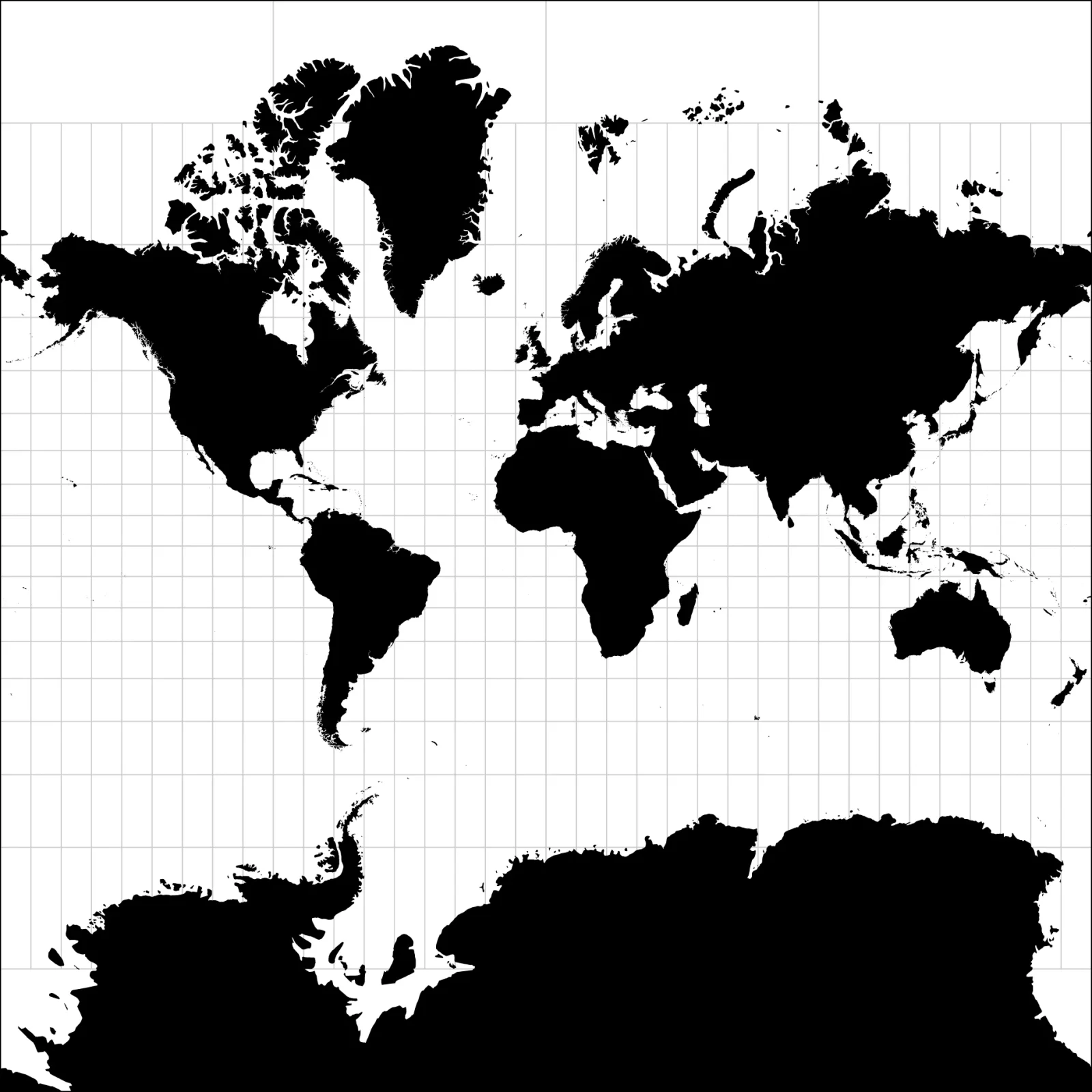
The advantages that characterize the cartographic projections are balanced by inconveniences, as it happens in many processes of transformation. The major trouble is the deformation of the distances between the nodes, which is clearly visible in Figure 5. The Mercator projection (Monmonier 2004) clearly shows a deformation that is proportional to the distance from the equator. The Mercator is one of the major projections as it maintains the correct proportion in numerous populated areas. However, the distortion of Norway is clearly noticeable compared to the grid as well as the false magnitude of Antarctica.
Network projections thus have to be interpreted carefully as, like a map, the distances can be represented deceitfully. In general—this is valid for all data visualizations—it is necessary to have a general awareness of the creation process to understand every outcome. Such knowledge will allow the reader to read the media with the necessary precautions.
The results of applying the Mercator projection to DH2019 are shown in Figure 6. The comparison between Figures 5 and 6 gives us an idea of the network deformation, in particular at the top and the bottom of the image where connections are rather sparse. It also has to be considered that these margins are defined by manual intervention as the Mercator projection goes to infinity towards north and south. Furthermore, there is another difference from a standard geographical projection: territory doesn’t have any regular geometrical shape. The lines that are straight on the spherical surface give a sense of the deformation of the plane. Figure 5 shows how lines, which are carefully distributed on the spherical surface, tend to be more curved by moving away from the equator.
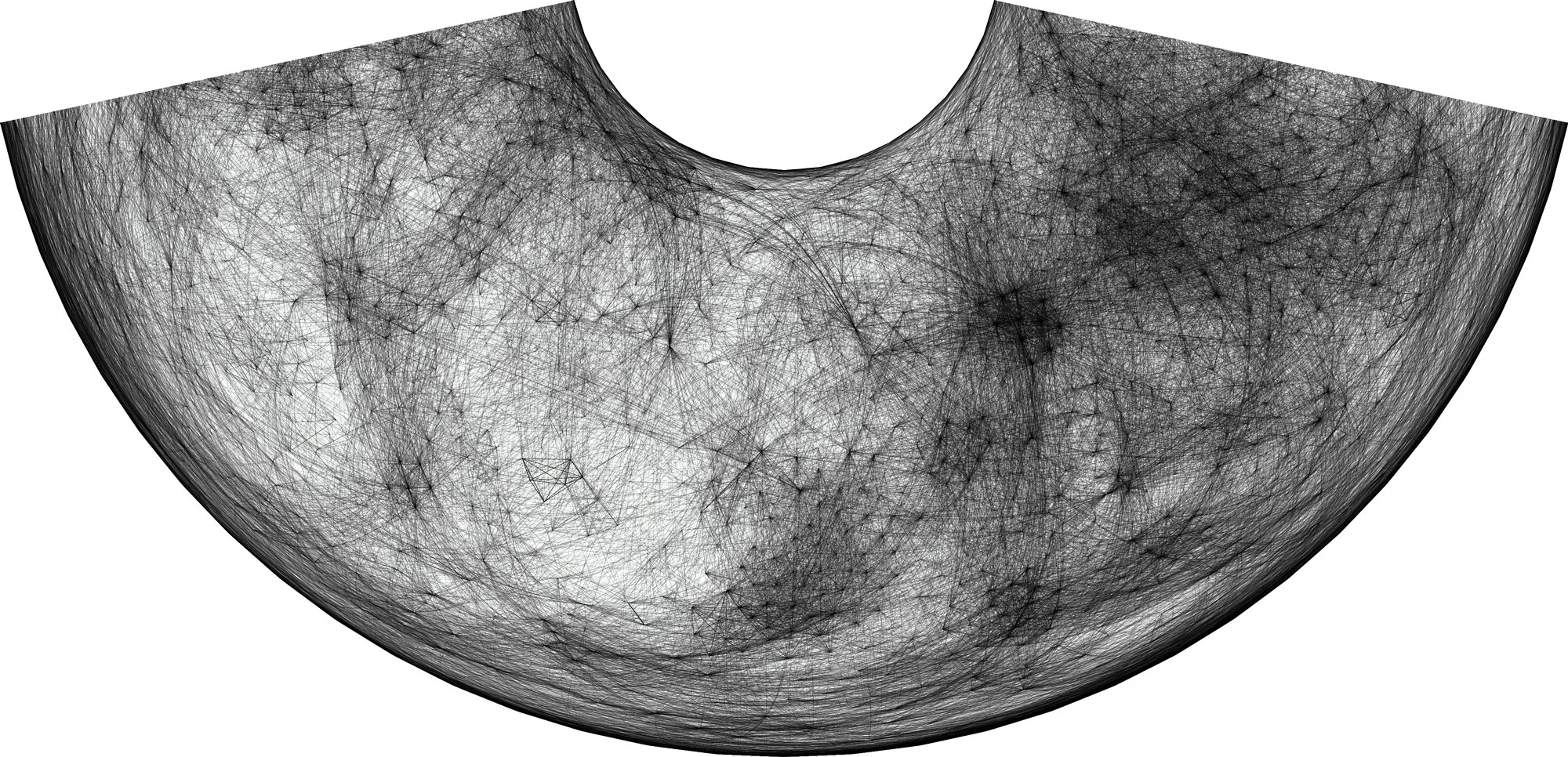
The darkened zone of the Mercator projection (see Figure 6) shows how the network mainly occupies the area corresponding to the Equator, which enables a horizontal continuity. However, other projections have different characteristics, as is the case with Charles Peirce’s quincuncial projection (Krämer and Ljungberg 2016). In the 18th century, it was pretty common for students and scholars to practice with cartography; Charles Peirce, who is internationally known for his studies in pragmatism, also contributed to cartography with his own projection. The quincuncial projection is particularly relevant in this context as it can be tiled in every direction (see Figure 7). Its continuity extends in both horizontal and vertical directions, creating a space that is continuous to the north, east, south, and west. Contrary to the Mercator projection, the quincuncial one keeps a great precision at the poles making it a perfect tool for Arctic expeditions cruising in the Northern Hemisphere. The North Pole is, indeed, exactly at the map’s center while the South Pole is distributed to the four corners. Looking at Figure 7, it is easy to notice how nodes are massed on the diagonals of the image. More difficult to read, in the same figure, is the deformation of the space which is indicated by the curving lines that draw a double-s shape on the diagonals. As noted earlier, these lines are straight on the spherical surface; keeping this in mind will help to perceive the spatial deformation of the globe.
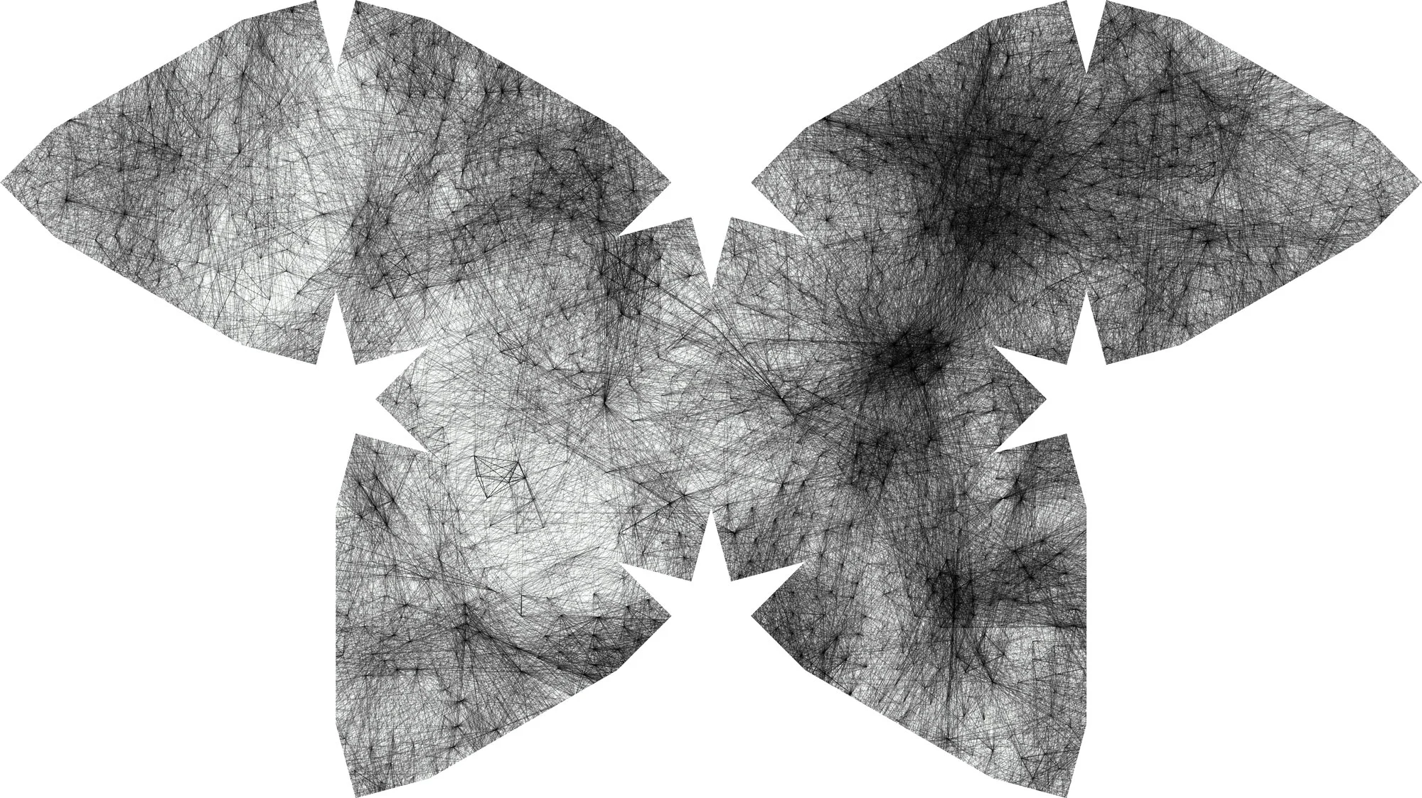
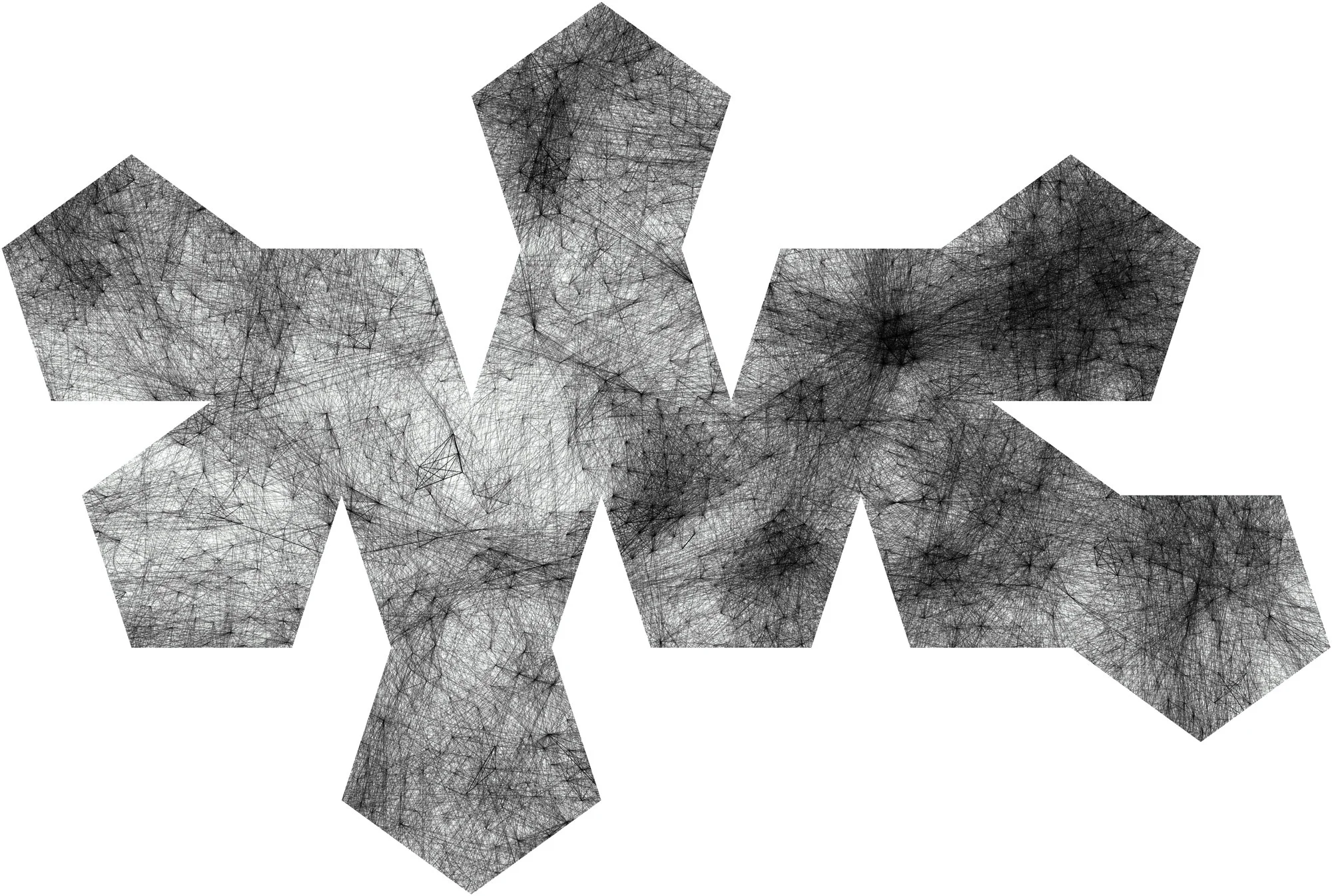
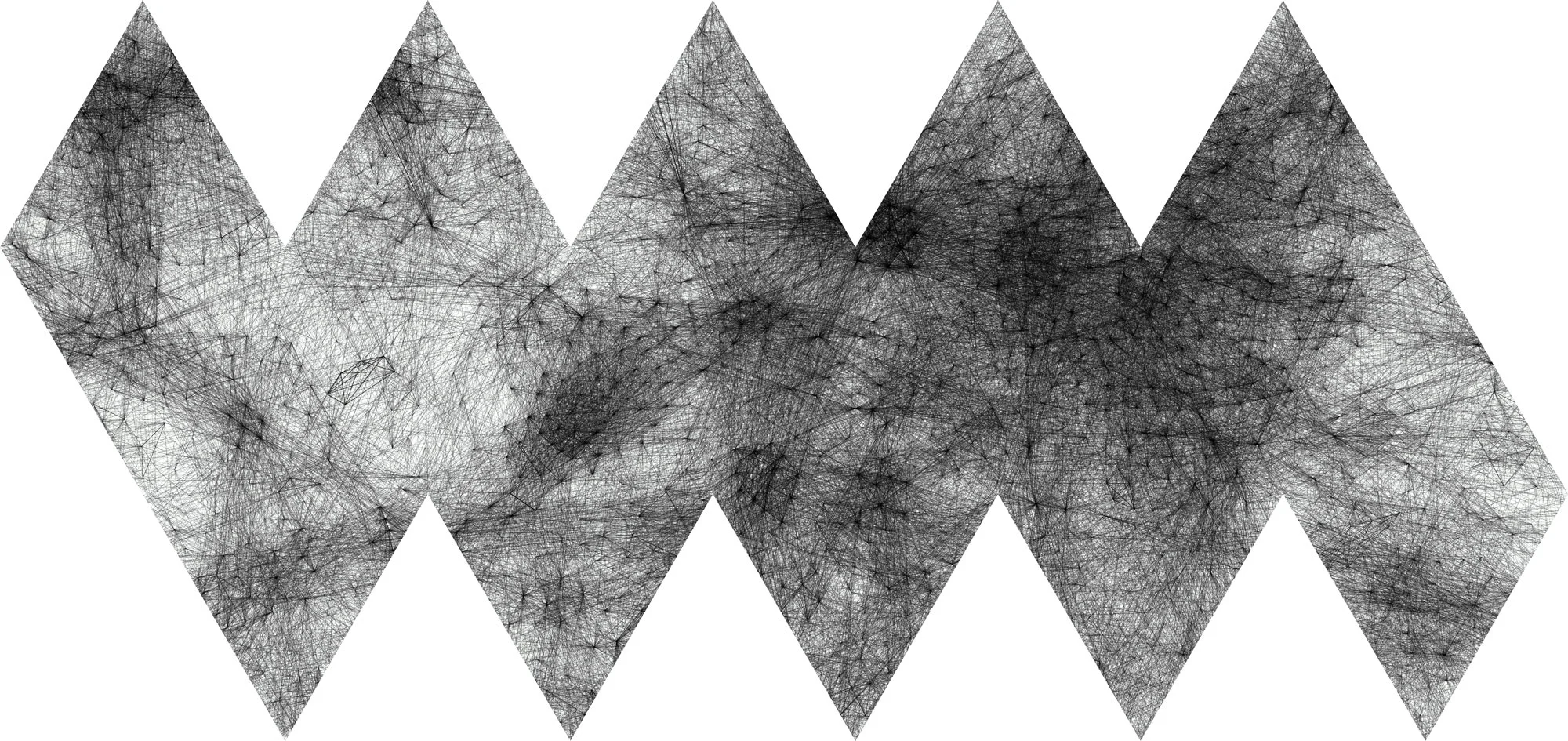
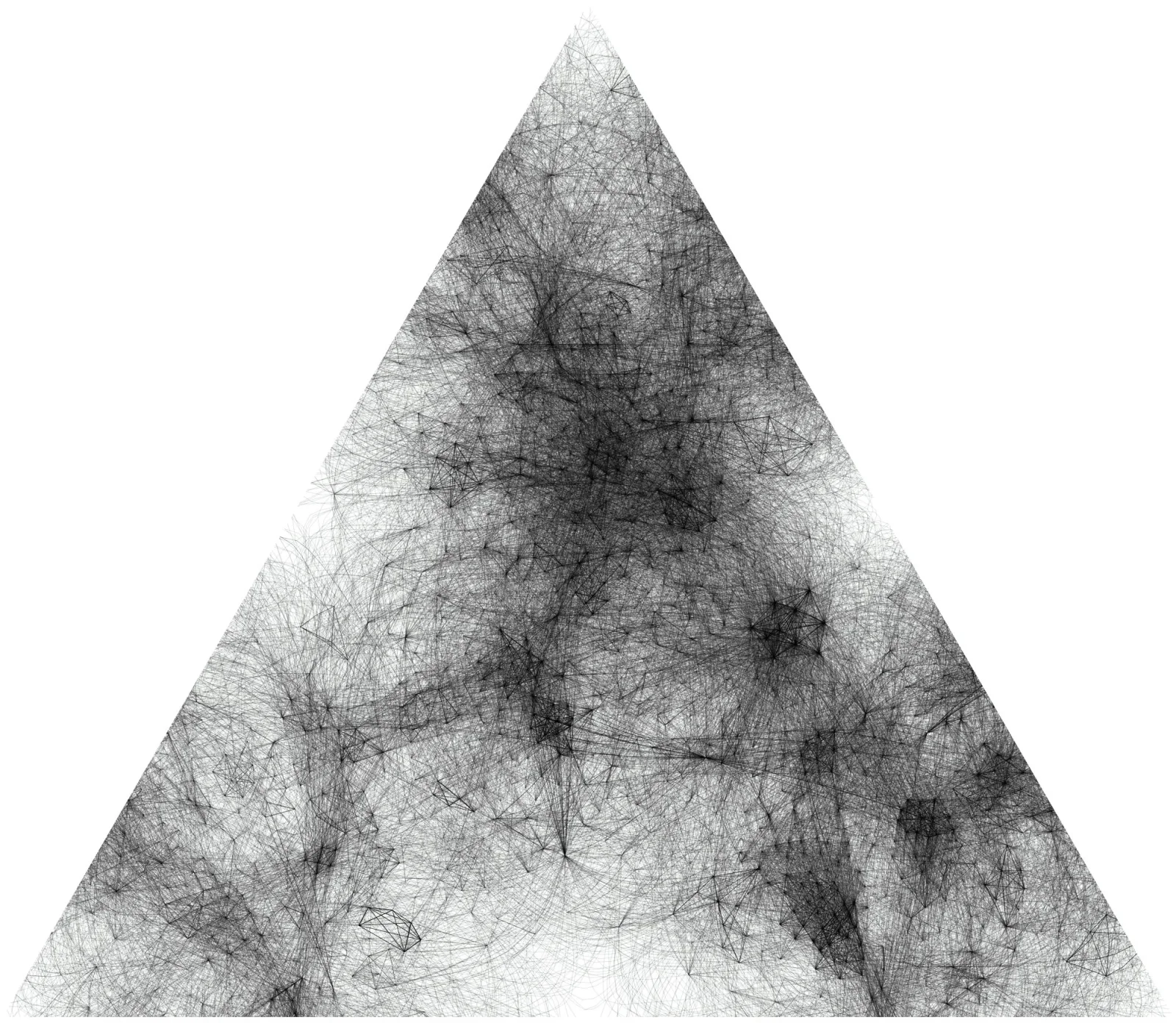
Many are the cartographic projections that have been conceived over time. Each of them allows the viewer to see different aspects of the Earth, which also means exploring different forms in this context. The orthographic (Figure 3), the Mercator (Figure 6), and the quincuncial (Figure 7) projections are the most relevant ones in terms of spatial transformation and continuity. However, the d3 library allowed us to explore more unusual projections, which are hereinafter presented in a showcase that is intentionally more aesthetic than rational. These projections are called Waterman’s Butterfly (Figure 8), Conic Equal-Area (Figure 9), Dodecahedral (Figure 10), Icosahedral (Figure 11), and Lee’s Tetrahedral (Figure 12). By a fortunate coincidence, this selection made on personal taste represents a series of geometrical volumes. That means that, potentially, these network visualizations can be printed and mounted with glue.
Conclusions
Our fictional critique of the Flat-Network Conspiracy is a way to point out how network visualizations can further progress in terms of graphic design since their first appearance in Jacob L. Moreno’s sociograms (Moreno 1934). Although many attempts have been made in the three-dimensional space (Fu et al. 2007; Kwon et al. 2015; Sangole and Knopf 2003; Shelley and Gunes 2012), nobody had ever tried to shape the drawing space in terms of continuity.
Even though today the scientific discussion is mainly aimed at data in terms of ethics and privacy, the group of scholars concerned by the way in which data are presented is still too small. Mark Monmonier (1991) and Alberto Cairo (2012), for example, published two works about the way in which graphics can convey false meanings. In a historical moment in which the personal quantification is growing exponentially, it is necessary to take care not only of the data treatment but also of the way in which information is presented.
The case study of the Digital Humanities Conference is an example of how data visualizations created from personal data can create biases and lead to discrimination. Today more than before, designers have the responsibility to present personal data in the most appropriate way. The aim of this article is finally to foster the discussion among designers and scholars, making them aware of the responsibility to develop guidelines to display individuals and communities fairly, working on simple experiences and observations like this one.
References
- Abbott, E. A. 2006. Flatland: A Romance of Many Dimensions. Oxford: Oxford University Press.
- Barabási, A.-L., and M. Pósfai. 2016. Network Science. Cambridge: Cambridge University Press.
- Bostock, M., V. Ogievetsky, and J. Heer. 2011. “D3: Data-Driven Documents.” IEEE Transactions on Visualization and Computer Graphics 17 (12): 2301–2309. https://doi.org/10.1109/TVCG.2011.185
- Cairo, A. 2012. The Functional Art: An Introduction to Information Graphics and Visualization. Berkeley: New Riders.
- Clark, D. J. 2018. Behind the Curve. Documentary film. Delta-v Productions.
- Clubbe, J. 2005. Byron, Sully, and the Power of Portraiture. Aldershot: Ashgate.
- Dilke, O. A. W. 1987. “The Culmination of Greek Cartography in Ptolemy.” In The History of Cartography, Volume 1, edited by J. B. Harley and D. Woodward, 177–200. Chicago: University of Chicago Press.
- Eratosthenes. 2010. Eratosthenes’ Geography. Princeton: Princeton University Press.
- Fahie, J. J. 2005. Galileo: His Life and Works. Replica Edition. Adamant Media: Elibron Classics.
- Floridi, L. 2019. The Logic of Information: A Theory of Philosophy as Conceptual Design. Oxford: Oxford University Press.
- Fu, X., S.-H. Hong, N. Nikolov, X. Shen, Y. Wu, and K. Xuk. 2007. “Visualization and Analysis of Email Networks.” In 2007 6th International Asia-Pacific Symposium on Visualization, 1–8. https://doi.org/10.1109/APVIS.2007.329302
- Krämer, S., and C. Ljungberg, eds. 2016. Thinking with Diagrams. Berlin: De Gruyter.
- Kuhn, T. S. 1962. The Structure of Scientific Revolutions. Chicago: University of Chicago Press.
- Kwon, O.-H., C. Muelder, K. Lee, and K.-L. Ma. 2015. “Spherical Layout and Rendering Methods for Immersive Graph Visualization.” In 2015 IEEE Pacific Visualization Symposium, 63–67. https://doi.org/10.1109/PACIFICVIS.2015.7156357
- Latour, B. 1986. “Visualisation and Cognition: Thinking with Eyes and Hands.” Knowledge and Society: Studies in the Sociology of Culture Past and Present 6: 1–40.
- ———. 2014. “Anti-Zoom.” In Eliasson: Contact. Paris: Flammarion and Fondation Louis Vuitton.
- Latour, B., P. Jensen, T. Venturini, S. Grauwin, and D. Boullier. 2012. “‘The Whole Is Always Smaller than Its Parts’—A Digital Test of Gabriel Tardes’ Monads.” The British Journal of Sociology 63 (4): 590–615. https://doi.org/10.1111/j.1468-4446.2012.01428.x
- Lévy, J., ed. 2016. A Cartographic Turn. Lausanne: EPFL Press.
- Manovich, L. 2008. “Data Visualization as New Abstraction and Anti-Sublime.” In Small Tech: The Culture of Digital Tools. Minneapolis: University of Minnesota Press.
- Monmonier, M. 1991. How to Lie with Maps. Chicago: University of Chicago Press.
- ———. 2004. Rhumb Lines and Map Wars: A Social History of the Mercator Projection. Chicago: University of Chicago Press.
- Moon, C. Y.-E., and D. Rodighiero. 2020. “Mapping as a Contemporary Instrument for Orientation in Conferences.” In Atti del IX Convegno Annuale AIUCD. La svolta inevitabile: sfide e prospettive per l’Informatica Umanistica. Milan: Università Cattolica del Sacro Cuore.
- Moreno, J. L. 1934. Who Shall Survive? Washington, DC: Nervous and Mental Disease Publishing Co.
- Richardson, G. 2019. “It’s a Flat Earth.” The New Yorker, April 1.
- Rodighiero, D. 2018a. “Printing Walkable Visualizations.” In Proceedings of the 5th Biennial Research Transdisciplinary Imaging Conference, 58–73. https://doi.org/10.6084/m9.figshare.6104693
- ———. 2018b. Mapping Affinities: Visualizing Academic Practice Through Collaboration. PhD diss., École polytechnique fédérale de Lausanne.
- Rodighiero, D., and L. Cellard. 2019. “Self-Recognition in Data Visualization.” EspacesTemps.net, August. https://doi.org/10.26151/espacestemps.net-wztp-cc46
- Rodighiero, D., F. Kaplan, and B. Beaude. 2018. “Mapping Affinities in Academic Organizations.” Frontiers in Research Metrics and Analytics 3 (4). https://doi.org/10.3389/frma.2018.00004
- Rodighiero, D., and A. Rigal. 2019. “The Daily Design of the Quantified Self.” Swiss Informatics Digital Magazine, February 12.
- Sangole, A., and G. K. Knopf. 2003. “Visualization of Randomly Ordered Numeric Data Sets Using Spherical Self-Organizing Feature Maps.” Computers & Graphics 27 (6): 963–976. https://doi.org/10.1016/j.cag.2003.08.012
- Scott, J. 2000. Social Network Analysis. London: SAGE Publications.
- Shelley, D. S., and M. H. Gunes. 2012. “GerbilSphere: Inner Sphere Network Visualization.” Computer Networks 56 (3): 1016–1028. https://doi.org/10.1016/j.comnet.2011.10.023
- Strabo. 2014. The Geography of Strabo. Edited and translated by D. W. Roller. Cambridge: Cambridge University Press.
-
The accompanying software lays out a network on a sphere with
d3-force-3dand unfolds it onto the plane through a dozen geographic projections — Mercator, Orthographic, Equal Earth, and others — rendered live with PIXI.js. Source code at https://github.com/rodighiero/spherical-projection; live demo at https://rodighiero.github.io/spherical-projection/. ↩ -
The D3 force layout is available at https://github.com/d3/d3-force. ↩
-
Asturiano’s three-dimensional model is downloadable at https://github.com/vasturiano/d3-force-3d. ↩
-
Link strength is defined at https://github.com/d3/d3-force#link_strength. ↩
-
Many-body force is illustrated at https://github.com/d3/d3-force#many-body. ↩
-
More information about the D3 geographic projections at https://github.com/d3/d3-geo-projection. ↩