Ethical and Aesthetical Questions on Stock Images: The Case of AI's Depictions
@article{romele2024ethical,
  author      = {Alberto Romele and Sabina Rosenbergova and Dario Rodighiero},
  title       = {Ethical and Aesthetical Questions on Stock Images: The Case of AI's Depictions},
  journal     = {Lessico Di Etica Pubblica},
  year        = {2024},
  url         = {https://www.eticapubblica.it/alberto-romele-dario-rodighiero-sabina-rosenbergova-ethical-and-aesthetical-questions-on-stock-images-the-case-of-ais-depictions/}
}
In this article, the authors deal with stock images depicting AI as a face or a body that undergoes a process of fragmentation into particles, pixels, or voxels. These images, they contend, are the symptoms of a datafied worldview. In the first section, the authors discuss stock images of AI and account for their qualitative-quantitative analyses of about 7,500 images from the online catalog of Shutterstock. These analyses have brought out datafied faces and bodies as one of the main themes among stock images of AI. In the second part, the authors elaborate on the notion of datafication of the worldview and offer some examples from architecture and design. This second section includes a methodological detour, in which the authors propose articulating Panofsky’s iconology and Didi-Huberman’s “symptomatic” perspective. In conclusion, the authors reflect on an apparently marginal aspect of stock images of AI: the abundant use of blue.
Introduction
Stock images are pre-produced images, available for purchase on agency websites like Getty Images and Shutterstock, which provide financial compensation to the creators upon acquisition. Often dismissed by both public discourse and academic literature as the “wallpaper” of our consumer culture (Frosh 2013, 145), stock images are typically derided for their overtly stereotypical representations of reality. For instance, there are stock images of women inexplicably laughing while eating salad1 or seemingly unable to drink from a water bottle without spilling it2. Nonetheless, stock images pervade our visual landscape: college brochures feature beaming, successful students; magazines are replete with images of busy yet cheerful businesspeople, and so forth. Notably, many of these clichés have facilitated the importation of aspects and practices intrinsic to North American society into other cultures. It could be argued that stock imagery holds nearly as much sway in our lives as Hollywood cinema. Therefore, despite their banality and pronounced kitschiness, stock images warrant our full attention — akin to the scrutiny philosophers like Adorno and Horkheimer applied to the Hollywood studio film system.
It is worth noting that we are not pioneers in recognizing the significance of stock images. Although still somewhat peripheral, literature on the topic is expanding, particularly within the realms of media studies and social semiotics (Frosh 2003; Aiello and Woodhouse 2016; Thurlow et al. 2020). In this instance, our focus is not on generic stock images but rather on those illustrating Artificial Intelligence (AI). More precisely, we are examining stock images in which AI is depicted as a face or body undergoing a process of composition and decomposition into particles, pixels, or voxels (in other terms, depictions of data), a phenomenon we refer to as “face and body fragmentation.” We perceive these images as symptomatic of a “datafication” of the worldview, or Weltanschauung, as conceptualized by Dilthey and Mannheim. The “datafied” worldview represents a contemporary manner of perceiving, reasoning, acting, and desiring in the world, emerging as an alternative to previously dominant worldviews (Romele 2020).
Consider the impact of utilizing self-tracking technologies, which has fostered a datafied comprehension of the self, or how the quantity of friends and followers translates into a measurable reputation. For instance, Fourcade and Healy introduced the term Übercapital to describe the emergence of a new form of capital that surpasses those previously identified by Bourdieu, such as economic, cultural, and social capital. They define Übercapital as the “long history of a person’s recorded actions, built up from traces left on everything from social media to credit bureaus, shopping websites, loyalty programs, courthouses, pharmacies, and the content of emails and chats” (Fourcade and Healy 2017, 18). However, the phenomenon under discussion extends beyond merely the datafication of the self; it also encompasses the datafication of others and the environment, resonating with the Heideggerian distinction between Selbstwelt, Mitwelt, and Umwelt. It is not only technological but also artistic, cultural, and epistemological — consider, for example, the rise of data-driven research (Leonelli 2020). This article will delve into the aesthetics of such a phenomenon.
The article is structured into two main sections. The initial section delves into stock images of AI, presenting our qualitative-quantitative analyses. These investigations highlight the fragmentation of faces and bodies as a predominant theme in AI stock images. Additionally, this section offers insights into the visual representability of AI. The subsequent section interprets these images as indicative of a transformative shift, specifically, the rise of a datafied worldview. Within this section, we discuss our methodological approach, drawing inspiration from Erwin Panofsky’s iconology and Georges Didi-Huberman’s critique of Panofsky’s framework. In our concluding remarks — which we believe transcend a traditional conclusion — we engage with Didi-Huberman’s reflections on Fra Angelico, focusing on a nuanced aspect of these images: the prevalent use of the color blue.
Facial and Body Datafication
Disciplines such as science and technology studies have long demonstrated an interest in images for two compelling reasons. Firstly, emphasizing the role of images inherently underscores the role of technology in the development of scientific knowledge. Succinctly, exploring images illustrates how science has become progressively and persistently reliant on technical instruments, including those technologies that generate images of objects and phenomena that might otherwise remain elusive. Secondly, this focus aligns with the imperative to transcend certain excesses of the logocentrism and textocentrism that permeated much of the human and social sciences in the twentieth century.
However, despite a heated interest in imagery on the part of these disciplines, it is noteworthy that there is also a great void here. On the one hand, scholars have been interested in images produced by scientists for other scientists via technical instrumentation (Lynch and Woolgar 1990; Coopmans et al. 2014). On the other, they have been interested in scientific images produced by artists, mostly in collaboration with scientists (Galison and Jones 1998). In short, it seems that the attention of researchers goes towards those images of science and technology under the aegis of two regimes of truth: the regime of scientific reference and the regime of aesthetic taste. It does not matter if the reference is accepted in a naïve way or if it is criticized; it does not matter if the aesthetic taste, when applied to science and technology images, can still be disinterested (as the Kantian tradition would like) or not. In both cases, discussion and interest remain within these two regimes of truth. In this way, navigating between the Scylla of technical images and the Charybdis of artistic images, we overlook a category of science and technology images that are neither produced by scientists nor boast artistic claims. These images, more artisanal than artistic, find their pinnacle in today’s proliferation of stock images related to science and technology.
In this context, our discussion centers around AI-related stock images. However, before delving into our primary subject, we wish to briefly explore the concept of AI’s representability. Presently, when we refer to AI, we predominantly allude to machine learning algorithms. We posit that there are three potential methods to describe today’s AI: 1) through the algorithm, which can be embedded in various forms in the computer code. This approach, however, is unsatisfactory for two main reasons: it is not comprehensible to non-experts, and representing the algorithm does not equate to representing AI — akin to equating the representation of the brain with intelligence; 2) through the technologies in which AI is embedded, such as drones, autonomous vehicles, and humanoid robots. However, depicting AI through these technologies does not genuinely represent it, as nothing indicates that this technology is AI-driven rather than merely an empty shell; 3) by foregoing the representation of the “thing itself” and focusing instead on expectations or imaginaries. The majority of stock images and other popular AI representations fall into this category. This threefold distinction is idealtypical (in the vein of Weber’s ideal types) as these three levels often intermingle. For instance, lines of code are colored, drones fly over verdant meadows, robots exhibit a flawless white surface, and even the most abstract images subtly allude to what exists or is being developed — a touch screen, a neural network, and so forth.
Currently, researchers tend to evaluate images of AI — and technology in general — based on their ability to represent the “thing itself” from ontological, ethical, and aesthetic perspectives. Consequently, there is a preference for the first method of representation over the second, and the second over the third. An image is deemed more “true,” “good,” and “aesthetically appreciable” the closer it is, and thus, the more faithful it is, to the entity it intends to represent — a phenomenon we term “referentialist bias.” However, given the aforementioned considerations, referentialism proves ineffective in the context of AI images, as none can accurately or faithfully approach AI. Our proposition is not to condemn AI images but to redeem them by eschewing referentialism. Conversely, if an aesthetics, which encompasses ethics and ontology, of AI images exists, its objective is not to portray AI technology per se. Rather, its aim, a concept we will elaborate upon in the conclusion, is to “give rise to thought.”
Enter “Artificial Intelligence” into any search engine and select the “Images” option. This action will yield a variety of images: half-flesh, half-circuit brains; humanoid robots interacting with touch screens; lines of code wafting through space; and variations of Michelangelo’s The Creation of Adam, reimagined with human-robot interactions.
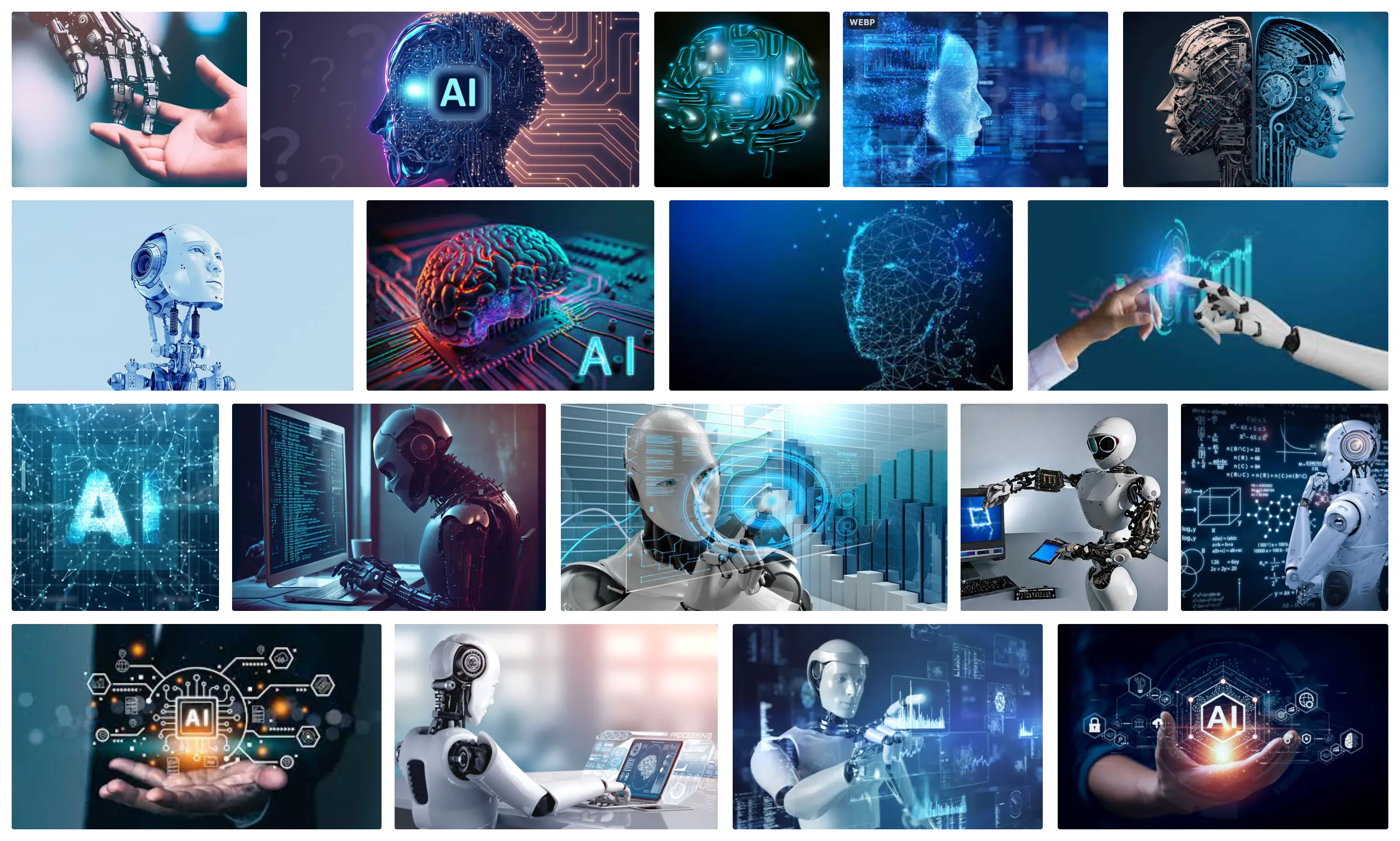
Stock images depicting AI are widely used not only in popular contexts but also in science communication contexts by research organizations and institutions. Particularly striking are instances where the ethics of AI is discussed, yet the ethics of visual science communication on AI is seemingly disregarded.3
The sheer volume of AI-related stock images is staggering; for instance, a July 2025 search for “artificial intelligence” on Shutterstock yields 435,672 results. To navigate beyond a mere qualitative analysis of a modest subset of these images in our research, we employed automated methods. Initially, we utilized the web crawler ShutterScrape (Lin 2018), enabling the massive download of images and videos from the American provider, thereby acquiring approximately 7,500 AI-related stock images. Subsequently, we employed PixPlot (Duhaime 2017), a tool developed within the Digital Humanities Lab (Yale University), to visualize extensive image collections within an interactive WebGL scene. Each image undergoes processing with an Inception Convolutional Neural Network, trained on ImageNet 2012, and is projected into a two-dimensional manifold using the UMAP algorithm of dimensionality reduction (McInnes et al. 2018), ensuring similar images are proximate to each other. The resultant visualization can be seen below and accessed via the link in the references to zoom into detailed areas (Romele 2020).
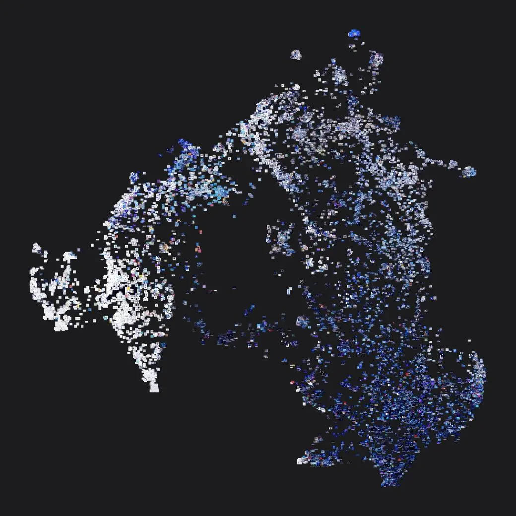
The AI stock images were systematically divided into ten clusters, each manually labeled as follows: 1) background, 2) robots, 3) brains, 4) faces and profiles, 5) labs and cities, 6) line art/line drawing, 7) Illustrator, 8) people, 9) fragments, and 10) diagrams. PixPlot neither suggests automatic labeling for clusters nor provides explanations for the specific groupings of images. Consequently, the labeling work was deductively executed manually, guided by insights collected through careful observation. Interestingly, an AI algorithm undertakes the task of recognizing and categorizing images related to artificial intelligence. This technology increasingly self-selects its visual representations: stock images are procured through search engines on stock imagery agency websites. The most purchased images appear as first-page results, adhering to the algorithmic logic of Google’s PageRank. This logic compels image producers to create visuals with the potential for success, elucidating the recurrence of specific themes despite the abundance of images (Romele 2020). Notably, PixPlot discerns similarities between images by reducing them to a pixel vector, serving as a quintessential example of the datafication process under scrutiny in this article. Images exist not qua images but as aggregates of pixels. Digital images are data, and all digital imaging, whether consciously or not, constitutes an act of data processing; the visual surface of digital images reveals nothing about their nature. Indeed, “[digital] images are far more closely related to spreadsheets and statistical formulas than to photographs” (May 2019, 50).
Quantitatively speaking, the “fragmentation” was one of the clusters automatically identified by PixPlot. This is particularly noteworthy given that existing literature and critical discussions on AI’s visual representations have predominantly centered on different types of images, especially those depicting AI through humanoid robots, chatbots, and virtual assistants (Cave and Dihal 2020). Turning our attention to this cluster composed by fragments, we delve into these visual “dispersions” by selecting three representative images illustrated below. These images exude ambiguity, concurrently evoking two notions: the emergence of a machine transitioning into a quasi-conscious, quasi-human state, and the fragmentation of the human into a quasi-digital machine. A face or a body, often androgynous or female, materializes, constructed from particles, pixels, or voxels. The gaze, often averted, usually to the right, implies a future unfolding, while in instances where the gaze meets the viewer, the tone shifts to something more ominous, presenting a machine that directly challenges the observer. The colors tend to be sterile, oscillating between white and blue, a common palette for stock images of artificial intelligence and other emergent technologies like cloud and quantum computing. These visuals subtly allude to a transition, a metamorphosis from human to machine, and vice versa.4
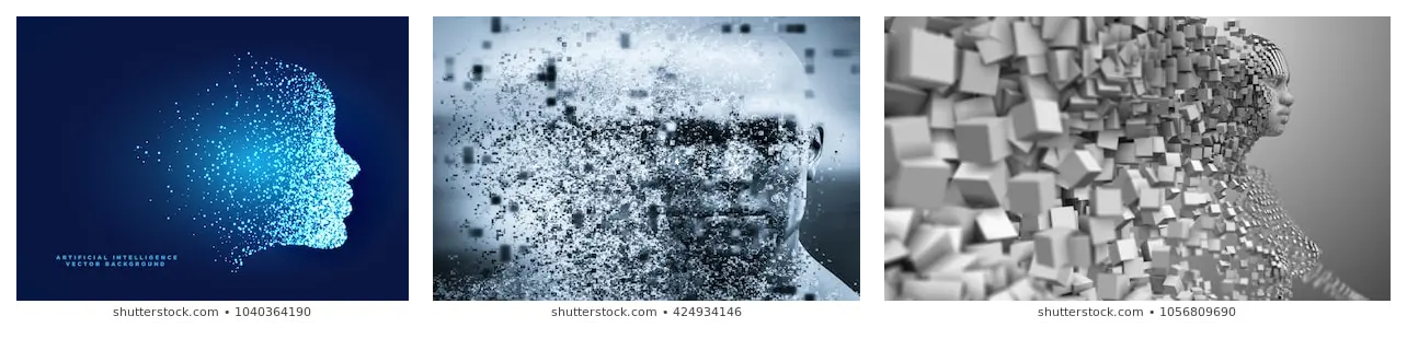
Our thesis posits that images illustrating the transition from human to machine — and conversely — from machine to human, through processes of datafication (fragmentation or defragmentation), imply that these fragments or data form the commonplace reality of both humans and machines and, ultimately, of the world itself. This perspective also substantiates why the cluster of fragments encompasses more than just faces and bodies. In their stark simplicity and kitschness, these stock images become vessels for a world picture or worldview, which we specifically term a “data-driven” or “datafied” worldview.
Datafication of the World
A methodological detour is requisite before delving into the discussion on the datafication of the world. The thesis of the “data-driven” or “datafied” worldview draws inspiration from Erwin Panofsky’s work in iconology and his theses on habitus or “mental habit” from the twelfth–thirteenth century. In the introduction to one of his books, Panofsky utilizes the well-known example of a man lifting his hat to greet an acquaintance (Panofsky 1972). This example serves to delineate three levels of observation and interpretation of a work of art: 1) a perceptual level, where one identifies a simple series of colors, lines, and shapes in the gesture; 2) a social level, where one recognizes the gesture as a greeting, necessitating familiarity with the practical world of objects and events, and the “more-than-practical” world of customs and cultural traditions characteristic of a specific civilization; and 3) an “intrinsic” or “content” level that transitions from iconography to iconology, where both specific elements (how exactly did the man raise his hat?) and more general ones are considered. At the third level, art history reaches its terminus, aiming to perceive in a single work of art the style and habit of a time, and the underlying principles that dictate its existence.
Panofsky’s iconology transcends the boundaries of art history, extending to all cultural expressions of an epoch. For instance, in Gothic Architecture and Scholasticism (Panofsky 2005), he posits a hypothesis that, during the twelfth and thirteenth centuries, the connection between Gothic art and Scholastic philosophy was more tangible than mere parallelism, yet also more general than a direct influence that scholastic thinkers might have exerted on artists and craftsmen. Between scholastic intellectuals and artists, Panofsky argues, there existed not a cause-and-effect relationship (which might suggest, for example, that architects were avid readers of scholastic treatises) but one of diffusion. This diffusion is precisely what Panofsky terms habitus or “mental habit.” The mental habitus shared by Gothic architects and scholastic philosophers, as well as their respective works, is grounded in a rejuvenated trust in reason, perceived as capable of substantiating anything that can be deduced from principles distinct from faith. Specifically, Panofsky identifies three elements or principles of similarity between Gothic architecture and scholastic texts: 1) totality or sufficient numbering, 2) arrangement according to a homologous system of parts and subparts, and 3) distinctiveness and deductive power. Exemplary is the analogy between the micro-architectonic division into logical and determined levels at the Portal of the Last Judgment of Notre Dame Cathedral in Paris and the text structure — the uniform division and subdivision of the logical sections — of Thomas Aquinas’s Summa.
A potent critique of the Panofskian method, particularly in relation to art and images more broadly, was formulated by Didi-Huberman. He posits that the predominant history of art, which was indebted mainly to Panofsky’s method developed after his refuge from Germany for the United States, is largely neo-Kantian in its inspiration. Didi-Huberman scrutinizes the two versions of Panofsky’s work, one from 1932 in German and the other, an English article from 1939, in which the example of the gentleman raising his hat is introduced — an example sourced from Mannheim.5 Didi-Huberman notes the presence of terms in the 1932 version, influenced also by Mannheim, such as “supreme region” and “sense of essence” to denote the ultimate objective of art history. However, the approach to realizing this synthesis project was markedly different in 1932. In Didi-Huberman’s words: “This project was radical, it was different: uneasy, traversed by a force that, far from being pedagogical, was questioning, almost convulsive […] and quite authentically philosophical” (Didi-Huberman 2005, 98). Transitioning from Germany to the United States, what perishes from Panofsky’s method is the antithesis, supplanted by an optimistic, positive, and even positivistic synthesis.
Panofsky was part of an intellectual movement that sought to historicize, socialize, and culturalize Kant’s schematism in 20th-century Germany, reminiscent of the works of Ernst Cassirer, and similarly in France, akin to the approaches of Émile Durkheim and Marcel Mauss. Didi-Huberman posits that the efforts of Panofsky, as well as those of Cassirer, Durkheim, Mauss, and extending to Bourdieu, to historicize, socialize, and culturalize the Kantian schematism were insufficient to transcend the synthetic temptation intrinsic to Kant’s thought (Didi-Huberman 2005, 168). While Didi-Huberman acknowledges the distinction between Panofsky’s historicism and Kantian apriorism and a psychologizing interpretation of Kant, he contends that Panofsky merely substituted one form of universalism (the transcendental or psychologizing kind) with another, rooted in historical context. Panofsky’s iconology, in Didi-Huberman’s view, is as much a transcendental synthesis as Kant’s transcendentalism. In a footnote, while discussing Panofsky’s renowned interpretation of Titian’s Allegory of Prudence, Didi-Huberman notes, “he was (they were) looking not at the painting itself — with its dark, evenly colored focal mass — but rather at a black and white photograph of it” (Didi-Huberman 2005, 293). Furthermore, he cites a passage from Panofsky’s 1932 article, which states, “the greatness of an artistic production is ultimately dependent upon the quantity of ‘Weltanschauung-energy’ that is incorporated into the worked material and radiates back from it to the spectator” (Didi-Huberman 2005, 126).
If Didi-Huberman’s critique holds merit, then any endeavor to extrapolate an entire worldview from a handful of images, such as those discussed in the previous section, would amount to a synthetic act as problematic as Panofsky’s. This would be further exacerbated by the lack of nuance compared to Panofsky’s analyses. However, a solution to this methodological dilemma is offered by Didi-Huberman himself. In the concluding section of his book, he emphasizes the role of “the negative” in imagery, advocating for a focus on the symptom — or lapsus — over the sign and the affirmative narrative that a work of art presents. Didi-Huberman argues for concentrating not on the synthesis but on the elements that render such synthesis incomplete, and ultimately, unattainable. While he acknowledges Panofsky’s pioneering role in introducing the concept of the symptom at the level of iconology, he criticizes him for immediately closing off this new avenue. According to Didi-Huberman, Panofsky did not treat symptoms as irreducible entities but rather reduced them to documents of a “homogeneous” worldview.
That said, however, we believe that Didi-Huberman’s perspective is not as far removed from Panofsky’s, or from others who have engaged in the historicization, socialization, and culturalization of Kantian transcendentalism, as he might suggest. The key difference between the two lies in their respective emphases: Didi-Huberman focuses on the impossibility of synthesis (though he synthesizes by making symptoms and lapsus foundational elements of a method, much like Freud), while Panofsky, along with Cassirer, Durkheim, and Bourdieu, emphasizes the potential for synthesis, albeit one that is always constrained by cultural, temporal, and social factors.
Instead, our methodological approach aims to navigate between Panofsky and Didi-Huberman, employing the concept of the symptom — as well as the notions of trace and remainder (or “reste” in French) — to advocate for a “fragile epistemology.” This would be a synthesis that is neither absolute nor unattainable, but rather perpetually open-ended. In this vein, our approach aligns with the evidential paradigm (Ginzburg 1989), which emphasizes the importance of traces and clues. While we use a select number of images to illustrate a broader worldview, we remain open to the inclusion of other images and cultural productions, as well as alternative interpretations of these traces or clues. To elucidate our concept of a “data-driven” or “datafied” worldview, we turn to the book The Second Digital Turn (Carpo 2017). His approach is particularly compelling because it echoes Panofsky’s method to some extent, drawing its validation from a cross-disciplinary comparison that includes fields like industrial design, architecture, and philosophy.6 Mario Carpo argues that the essence of this second digital turn can be encapsulated in the phrase “Search, Don’t Sort.” This was the tagline beneath Gmail’s logo when the service debuted in 2004, emphasizing its revolutionary feature: the ability to search the full text of all email messages, whether sent or received, by words or numbers. Carpo suggests that this automated full-text search capability on a corpus of unsorted data is a more effective retrieval tool than the traditional method of first categorizing items by topic and then searching within those categories. In essence, given the vast amount of data available to us, it is more efficient to entrust the task of finding a personalized, temporary, and context-specific order and meaning to a machine or algorithm. Unlike the tree-like structures designed for human cognition and memory, computers operate differently.
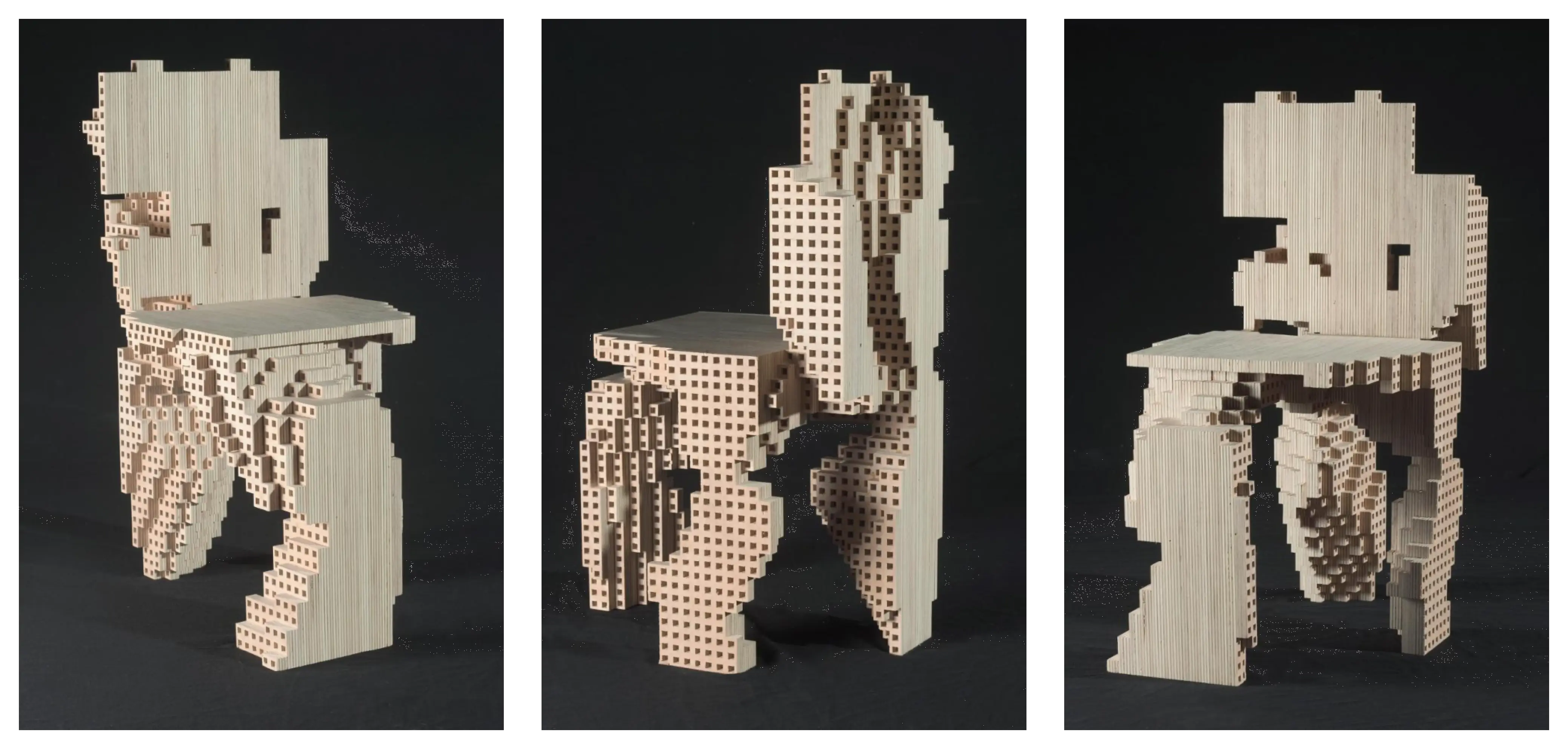
Carpo contends that this emerging preference for rawness and disorder is evident in modern design and architecture. He points to the spline curve, a feature of early CAD/CAM technology, as an exemplary manifestation of the “small data logic” — which could be described as both informational and linear — that characterized the digital style of the early 1990s. Carpo also acknowledges the influence of Deleuze’s concept of the “fold” in shaping this curvilinear aesthetic. Deleuze’s fold is a mathematical curve that he likened to continuous functions and Leibniz’s development of differential calculus. In a similar vein, spline modelers are capable of converting any arbitrary set of points into seamlessly curved lines, making a spline the smoothest possible line that can connect multiple fixed points. These spline modelers found their way into architecture through the work of Pierre Bézier and Paul de Casteljau for Renault and Citroën, and subsequently into the designs of Frank Gehry and his Los Angeles studio. Iconic works like the Fish sculpture in Barcelona and the Guggenheim Museum in Bilbao stand as testaments to this early digital-driven architectural style. According to Carpo, this kind of
“small data-oriented architecture” and design has already been overcome by the use of big data and algorithms of artificial intelligence to engage the messy discreteness of nature as it is, in its pristine, raw state — without the mediation or the shortcut of elegant, streamlined mathematical notations. The messy point clouds and volumetric units of design and calculation that result from these processes are today increasingly shown in their apparently disjointed and fragmentary state; and the style resulting from this mode of composition is often called voxelization, or voxelation. (Carpo 2017, ch. 2.7)
Carpo cites a range of examples to illustrate this trend, including the Computational Chairs Design studies by Philippe Morel of EZCT Architecture & Design, which were created using genetic algorithms. First showcased at the 2013 ArchiLab exhibition in Orléans, France, these studies were among the earliest expressions of this new design philosophy. This approach has since been adopted by a diverse group of architects, designers, and artists, including Alisa Andrasek and Jose Sanchez, Marcos Cruz and Marjan Colletti, Andrew Kudless, David Ruy and Karel Klein, as well as Jenny Sabin and Daniel Widrig.
We can draw an analogy to Panofsky’s three-step method of visual interpretation by suggesting that a “data-driven” or “datafied” worldview also rests on three foundational elements: 1) a principle of emergence, positing that meaning arises from an emergent, partial order rather than a rigid structure that excludes exceptions; 2) a principle of instability, which acknowledges that the relationships between data points are in constant flux due to the ongoing influx of new data and evolving algorithms; and 3) a principle of deduction that operates without a clear understanding of underlying causes or rules. For instance, consider machine learning algorithms like PixPlot, which reduce high-dimensional data to a two-dimensional Cartesian plane. In this process, humans play no active epistemological role, which accounts for the difficulty in comprehending the mechanics of the operation.
More than a Conclusion: Nel Blu Dipinto di Blu
In conclusion, we would like to return to the specific issue of stock images of AI. It is a common idea that we must have “more accurate” images of AI. We hypothesize that today, concerning AI, we are very much in need of “pensive” images. The term is taken from Jacques Rancière (Rancière 2008), according to whom an image is pensive to the extent that it can bring together different regimes of expression without ever synthesizing them. In other words, an image is pensive insofar as it forms metaphors that are always open and never exhausted according to different spatial and temporal planes. For example, rephrasing Didi-Huberman, AI stock images do not give rise to thought as their meanings are so simplistically precise that there is no margin left for a remainder, trace, or symptom. The display is absolute, and nothing is denied to viewers; however, in this way, nothing is given to viewers to think about. In other words, the display distinguishes between the visual regimes of erotism and pornography — for a deeper discussion on this topic in a different context (see Leone 2014, 603–604). The visual regime of erotism can be summarized by the formula “to know how (or be able) not to look at.” The visual regime of pornography can be resumed instead in the formula “to not know how (or not be able to) not to look at.” It means that while erotism is based on the persistence of a gap between the visible and the invisible, pornography is the apotheosis of visibility that annihilates invisibility. We argue that stock images of AI are pornography of AI depiction.
The visual allure of AI stock imagery is evident, for instance, in the fact the color blue is far the most frequently used color among these images. This evident preference deserves further consideration. Here, again, Didi-Huberman’s opening pages of Confronting Images can be inspirative of how we can frame this question. In these, the philosopher discusses Fra Angelico’s Annunciation and the surprising omnipresence of white color that is diffused throughout the space of the fresco. He states that a Panofskian iconological interpretation of this artwork falls short as his narrative is conveyed in a sparse and unembellished manner. Fra Angelico appears ill-suited to capture the essence of fifteenth-century Italian painting, which is known for its rich variety — encompassing everything from apocryphal details and illusionist elements to complex spatial configurations and everyday objects. Didi-Huberman contends that the alternative “is based on the general hypothesis that the efficacy of these images is not due solely to the transmission of knowledge — visible, legible, or invisible — but that, on the contrary, their efficacy constantly operates in the intertwining, even the imbroglio, of transmitted and dismantled bits of knowledge, of produced and transformed not-knowledges” (Didi-Huberman 2005, 16).
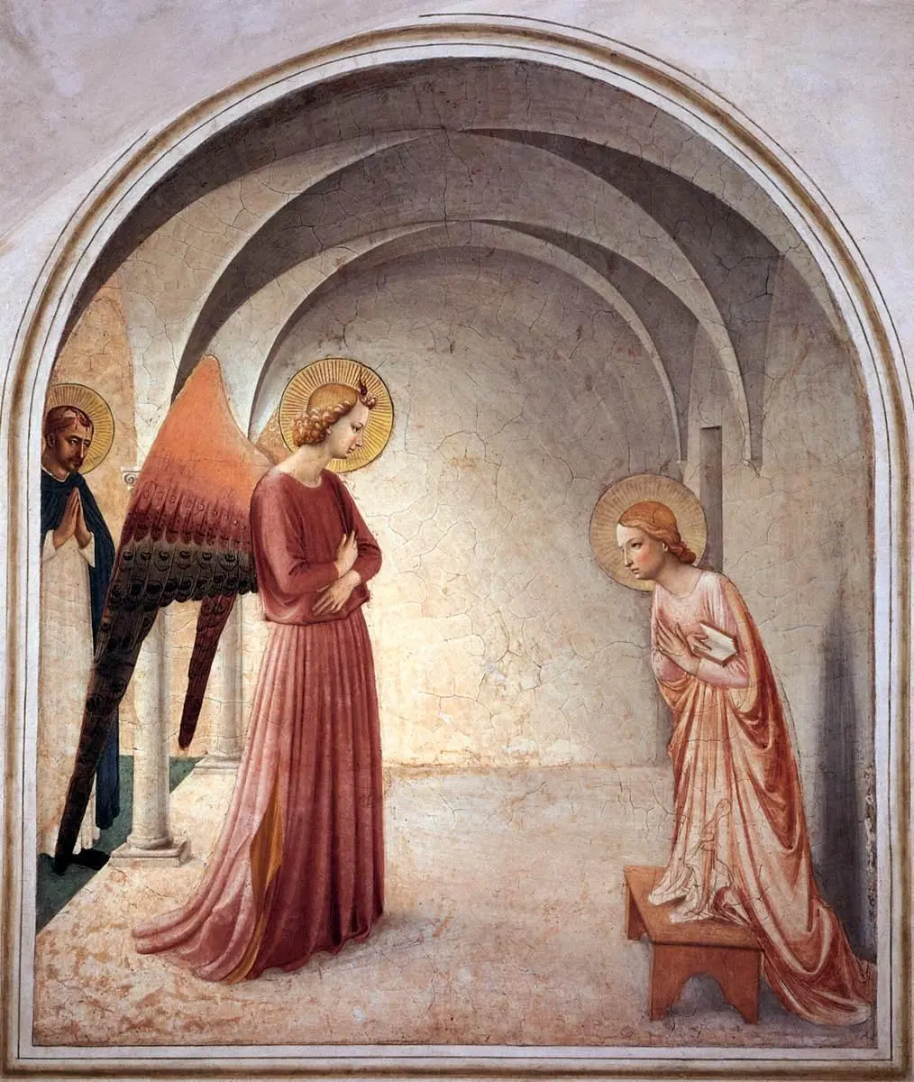
On the question of the white color in the fresco, which extends throughout the cell where the Archangel meets the Virgin Mary, the French philosopher and art historian asks: “what to make of this white?” And he argues that this white is not a void or lack (manque in French); rather, it is substantive:
“It is not visible in the sense of an object that is displayed or outlined; but neither is it invisible, for it strikes our eye, and even does much more than that. It is material. It is a stream of luminous particles in one case and a powder of chalky particles in the other. It is an essential and massive component of the work’s pictorial presentation. Let us say that it is visual.” (Didi-Huberman 2005, 17)
Didi-Huberman unhesitatingly labels this white a symptom, defining it as “the suddenly manifested knot of an arborescence of associations or conflicting meanings” (Didi-Huberman 2005, 19). Finally, the white in Fra Angelico’s work is far from representing a void; rather, it catalyzes contemplation. Specifically, the white in the fresco speaks to the theological interpretation of the Annunciation, which the Dominican Albert the Great and those who followed his spiritual tradition as Fra Angelico, viewed not merely as a singular event, but as an “absolutely extravagant efflorescence of inclusive or associated meanings, of virtual connections, of memories, of prophecies […]” (Didi-Huberman 2005, 22).
As previously noted, the problematic nature of these AI images becomes evident in the pervasive use of blue in stock pictures. Unlike the color white in Fra Angelico’s work, which invites contemplation and opens up multiple avenues of interpretation, the use of blue tends to limit and confine meaning (Cave and Dihal 2020). This is akin to what sociologists of science and technology refer to as “lock-in.” However, in this context, “lock-in” is not merely a technical, economic, or material concept; it extends to the realm of imagination and symbolism. When these symbolic forms are embedded in cultural expressions, they significantly influence both societal expectations and the trajectory of innovation.
Significantly, in the cultural context of Europe, the blue color is of the utmost importance. Its prominent position, often intertwined with spiritual dimension, is clear when looking at the artistic production from Antiquity, through its usage in the sacred spaces of apsidal mosaics of early medieval churches, its prominence in the stained glass windows of the Gothic cathedrals and its migration on the garment of Virgin Mary becoming its topical color as well as its association with the kings of France. In the secularized world, then, the popularization of blue starts with Young Werther and Madame Bovary and ends with the Levi’s blue jeans industry and IBM, referred to as the Big Blue. To this day, blue is the statistically preferred color in the world. According to the French historian Pastoureau’s book Blue: The History of a Color, the success of blue is not the expression of some impulse, as could be the case with red; instead, one gets the impression that blue is loved because it is peaceful, calming, and anesthetizing. It is no coincidence that blue is the color used by supranational institutions such as the United Nations, UNESCO, and the European Community. In Italy, the police force is blue, which is why policemen are disdainfully called “Smurfs.”
Considering the anesthetizing effect of blue and its overabundance in AI, we can argue that the problem with stock AI images is that, instead of provoking debate and “disagreement,” they lead the viewer into forms of acceptance and resignation. Rather than equating experts and non-experts, encouraging the latter to influence innovation processes with their opinions, they are “screen images” — following the etymology of the word “screen,” which means “to cover, cut, and separate.” The notion of “disagreement” or “dissensus” (mésentente in French) is taken from Jacques Rancière (Rancière 1999), according to whom disagreement is much more radical than simple “misunderstanding (malentendu)” or “lack of knowledge (méconnaissance).” As the words indicate, these latter notions are failures of mutual understanding that knowledge can overcome if treated correctly. Interestingly, much of the literature interprets science communication precisely to overcome misunderstanding and lack of knowledge. Instead, we propose an agonistic model of science communication, particularly in the use of images. These images should not calm down but flourish in an agonistic conflict (i.e., a conflict that acknowledges the validity of the opposing positions but does not want to find a definitive and peaceful solution to the conflict itself) — this point has been fully developed by Romele (Romele 2020).
Stock images of AI are “anaesthetical,” a term combining “aesthetics” and “anesthetics.” By “anaesthetical,” we mean that AI stock images do not promote primary forms of participation but rather “put them to sleep.” Just as Fra Angelico’s white expanded throughout the fresco and, beyond the fresco, it is possible to think that the anesthetizing effects of blue expand to the subjects and the entire media communication environment in which these AI images proliferate.
Moving from the figure of the images (the face and body fragmentations) to an element of the background (the blue), we are making a gesture similar to Didi-Huberman (Didi-Huberman 2009), who looks at some red blotches in the painted garden in his analysis of Fra Angelico’s fresco Noli me tangere. According to Didi-Huberman, these red blotches are not simple flowers because they are drawn in the same way Fra Angelico draws the stigmata on Christ’s feet and hands. The red blotches are an extension of Christ’s stigmata: “Christ is here represented in the emblematic act of ‘sowing’ his stigmata in the garden of the earthly world, just before going to rejoin the right hand of his father in Heaven” (Didi-Huberman 2009, 20–21). For Didi-Huberman, the background contains the real message of Fra Angelico’s painting, which is none other than the mystery of the incarnation — and this also justifies the white used in the painting we discussed above.
As far as we are concerned, however, we do not want to absolutize the background. Instead, we contend that the background grants a new strength to the figure — again, it is a sort of equilibrium between Panofsky and Didi-Huberman. So those stock images, which represent AI and its relation to us and the world in terms of fragmentation, end up seeming obvious: the worldview’s datafication appears ineluctable. In conclusion, we argue that stock images of AI do not limit themselves to embedding a datafied worldview from elsewhere — e.g., from the minds of Google’s and Meta’s engineers. Through their anesthetics, stock images actively contribute to its development and success.
References
- Aiello, Giorgia, and Alison Woodhouse. 2016. “When Corporations Come to Define the Visual Politics of Gender: The Case of Getty Images.” Journal of Language and Politics 15, no. 3: 352–368.
- Carpo, Mario. 2017. The Second Digital Turn. Cambridge, MA: MIT Press.
- Cave, Stephen, and Kanta Dihal. 2020. “The Whiteness of AI.” Philosophy & Technology 33, no. 4: 685–703.
- Coopmans, Catelijne, et al., eds. 2014. Representation in Scientific Practice Revisited. Cambridge, MA: MIT Press.
- Didi-Huberman, Georges. 2005. Confronting Images: Questioning the Ends of a Certain History of Art. University Park: Pennsylvania State University Press.
- Didi-Huberman, Georges. 2009. Fra Angelico: Dissemblance and Figuration. Chicago: University of Chicago Press.
- Duhaime, Douglas. 2017. PixPlot. Yale Digital Humanities Lab. https://github.com/YaleDHLab/pix-plot.
- Fourcade, Marion, and Kieran Healy. 2017. “Seeing Like a Market.” Socio-Economic Review 15, no. 1: 9–29.
- Frosh, Paul. 2003. The Image Factory: Consumer Culture, Photography, and the Visual Content Industry. Oxford: Berg.
- Frosh, Paul. 2013. “Beyond the Image Bank: Digital Commercial Photography.” In The Photographic Image in Digital Culture, edited by Martin Lister, 131–148. London-New York: Routledge.
- Galison, Peter, and Caroline A. Jones, eds. 1998. Picturing Science, Producing Art. London-New York: Routledge.
- Ginzburg, Carlo. 1989. “Clues: Roots of an Evidential Paradigm.” In Clues, Myths, and the Historical Method, 96–125. Baltimore: Johns Hopkins University Press.
- Kress, Gunther, and Theo van Leeuwen. 2020. Reading Images: The Grammar of Visual Design. 3rd ed. London-New York: Routledge.
- Leone, Massimo. 2014. Annunciazioni: Percorsi di semiotica della religione. Roma: Aracne.
- Leonelli, Sabina. 2020. “Scientific Research and Big Data.” Stanford Encyclopedia of Philosophy. Stanford: Stanford University.
- Lin, Chuan-En. 2018. ShutterScrape. GitHub. https://github.com/chuanenlin/shutterscrape.
- Lynch, Michael E., and Steve Woolgar, eds. 1990. Representation in Scientific Practice. Cambridge, MA: MIT Press.
- May, John. 2019. Signal. Image. Architecture. New York: Columbia Books on Architecture and the City.
- McInnes, Leland, et al. 2018. “UMAP: Uniform Manifold Approximation and Projection for Dimension Reduction.” arXiv:1802.03426.
- Panofsky, Erwin. 1972. Studies in Iconology: Humanistic Themes in the Art of Renaissance. Boulder: Westview Press.
- Panofsky, Erwin. 1997. Perspective as Symbolic Form. New York: Zone Books.
- Panofsky, Erwin. 2005. Gothic Architecture and Scholasticism. Latrobe: Archabbey Publications.
- Rancière, Jacques. 1999. Disagreement: Politics and Philosophy. Translated by Julie Rose. Minneapolis: University of Minnesota Press.
- Rancière, Jacques. 2008. The Emancipated Spectator. London-New York: Verso.
- Romele, Alberto. 2020. Digital Hermeneutics: Philosophical Investigations in New Media and Technologies. London-New York: Routledge.
- Thurlow, Crispin, et al. 2020. “Visualizing Teens and Technology: A Social Semiotic Analysis of Stock Photography and News Media Imagery.” New Media & Society 22, no. 3: 528–549.
-
The phenomenon of women laughing alone with salad in stock images has been notably highlighted and satirized in various platforms. For a humorous take on this peculiar trope, see “Women Laughing Alone With Salad” on The Hairpin, https://www.thehairpin.com/2011/01/women-laughing-alone-with-salad/. ↩
-
The trope of women seemingly struggling to drink water without spilling it in stock images has also been humorously explored and critiqued. See “Women Struggling to Drink Water” on The Hairpin, https://www.thehairpin.com/2011/11/women-struggling-to-drink-water/. ↩
-
Examples of this discrepancy in ethical consideration can be seen in various images: the cover of the Oxford Handbook of Ethics of AI, https://www.instagram.com/p/CPH1wmr216/, the now-obsolete EU page featuring the Ethical Guidelines for Trustworthy AI, https://www.instagram.com/p/CPH8xoCLTm7/, and the site of the SHERPA project, an “EU-funded project analyzing how AI and big data analytics impact ethics and human rights,” https://www.instagram.com/p/CVA9Y-dIoRv/. ↩
-
Visual social semiotics offers a set of tools for analyzing the internal dynamics of images and their effects. The relationship between gazes is only one among them. The use of colors is another. Added to this are vectors and directions, framing, exploitation of depth, etc. See Kress and van Leeuwen 2020. ↩
-
The 1939 version, which underwent subsequent transformations in 1955 and 1962, is featured in the introduction to Studies in Iconology (see Panofsky 1972). The 1932 version was initially published in the journal Logos 21 with the title “Zum Problem der Beschreibung und Inhaltsdeutung von Werken der bildenden Kunst,” and was later incorporated into Panofsky 1997. ↩
-
While Carpo often interprets changes in architecture and design as direct outcomes of specific technical advancements — particularly digital ones — in the practices of architects and designers, his argument can sometimes come across as deterministic. We lean more towards a Panofskian approach, which focuses on identifying “family resemblances” among various elements without necessarily attributing them to a cause-and-effect relationship. ↩