Guidelines to Visualize Vessels in a Geographic Information System
Rodighiero, Dario. 2010. “Guidelines to Visualize Vessels in a Geographic Information System.” In 2010 14th International Conference Information Visualisation, 455–459. London: IEEE. https://doi.org/10.1109/IV.2010.70.
In information systems the data representation covers a great importance. In fact the visualization of information is the last point of contact between the user and the information system. This is the space where the communication takes place. In real-time monitoring systems, this passage covers a great importance, especially for reasons related to the time and the transparency of relevant information. These factors are fundamental to vessel monitoring systems. This is the beginning where we start to define a guidelines manual, act to help specialists of information visualization in the vessel monitoring field, and in the GIS field more in general.
Introduction
The Vessel Monitoring System (VMS) is used by fisheries authorities all over the world for fisheries control and surveillance, based on GPS-derived positions transmitted regularly from the fishing vessels having transponders on-board (bluebox) to their flag state Fisheries Monitoring Centre (FMC). Currently, all European Union member states (MS) fishing vessels over 15 length are subject to VMS.
Although VMS is a powerful tool, there are some problems to overcome, like satellite communications errors, bluebox malfunctioning and fishermen switching off or manipulating-spoofing their position. For those reasons, JRC developed in-house software satellite-based, the Vessel Detection System (VDS), in order to support inspections to improve fisheries compliance (Kourti et al. 2005), cross-checking with VMS positions. Satellite detected targets are also integrated with Automatic Identification System (AIS) positions from transponders on-board of certain vessels (mainly commercial cargo and tankers) for safety navigation.
The purpose of this paper is not to go into details of these signals, but to define a language act to visualize these kinds of data. In particular we would like to stress the visualization of vessels, considering the principles of order introduced by Ranganathan (1967).
In this paper we define a set of guidelines to be employed as a manual, to help people involved in vessel monitoring system in exploring the potentiality of this particular kind of communication.
Principles of Visualization
When he was conceiving his classification system, Ranganathan wondered what could be the better way to arrange subjects. The question brought him to write the Principles for an helpful sequence. Our work extends these principles to GIS visualization. With such as approach, it will be possible to get an objective and fresh overlook on all details needed for a geographic visualization.
Imagine to be in front of your laptop, the screen is showing you a geographic interface focused on the Mediterranean basin. On the surface there’s an information layer populated with icons. Each icon is a vessel and from here we start to apply principles in order to obtain guidelines.
Increasing Quantity
We assume that each vessel is profiled by a set of quantitative measurements, aimed to describe the object. Having a very simple symbol — the icon — to bring information, it’s useful to know which are the characteristics that can be manipulated.
In vessel monitoring systems, size, color, shape, transparency, orientation are all characteristics which can be manipulated. Size can represent the length of the vessel, color a classification, shape the kind of object (vessel, cage, etc.), transparency the reliability of its position, orientation the course of the vessel [Fig. 1].
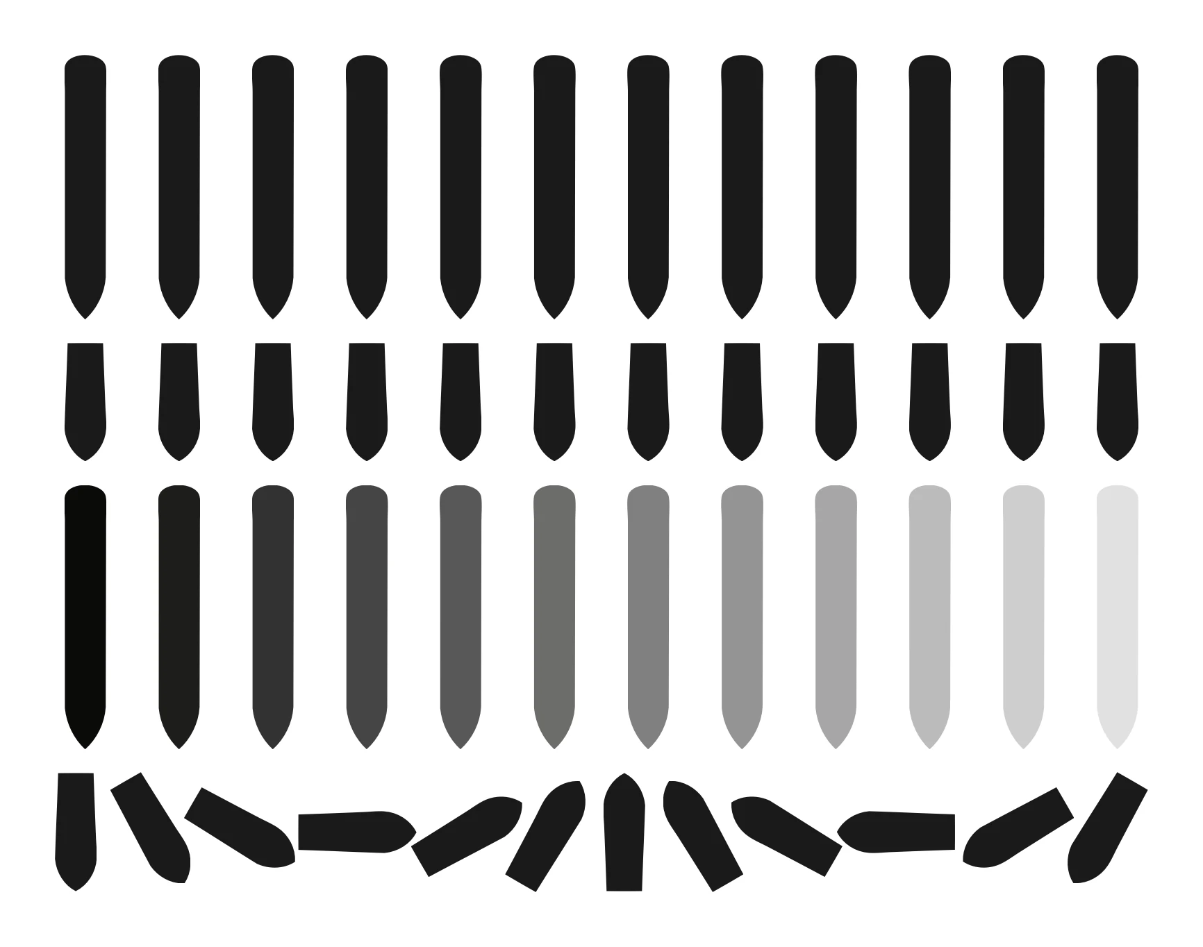
The characteristics employ the principles by linking to the metadata and conveying the most information in as few expressions as possible (Lambert et al. 2001). In the field of information visualization Otto Neurath proved the power of communication throughout symbols simplicity (Vossoughian 2008). He teach that this part deserves attention, because this is the basic design. An error in this part could compromise the following, so to decide these fundamental concepts requires time.
Spatial Continuity
Latitude and longitude describe the vessels position on the map. For vessels height need not to be considered, anyway in land visualization it offers useful prospective views, especially in mountain terrains.
Simplifying the concept, we can reduce the latitude as a sequence from bottom to up or from top to down, and the longitude as left to right and right to left. However the Earth can not be compared to a Cartesian coordinate system, because its shape is more complex. To use an ellipsoid is more correct, but it must be considered that different types of ellipsoid exists, some are more correct that others depending on the area to be focused on (Crossley 1999).
Visualizing data on a 2D or 3D model is really different. If one has ever traveled by plane from Europe to USA, he has surely seen these geographical views of the flight path on screens and he probably asked himself the reason for that funny curved trajectory of the flight [Fig. 2]. Why to cover the longest way? The point is that the airplane trajectory is distorted by the geographical flat representation. If he see the same path in a 3D model, maybe he could be surprised by seeing the same trajectory exactly straight.
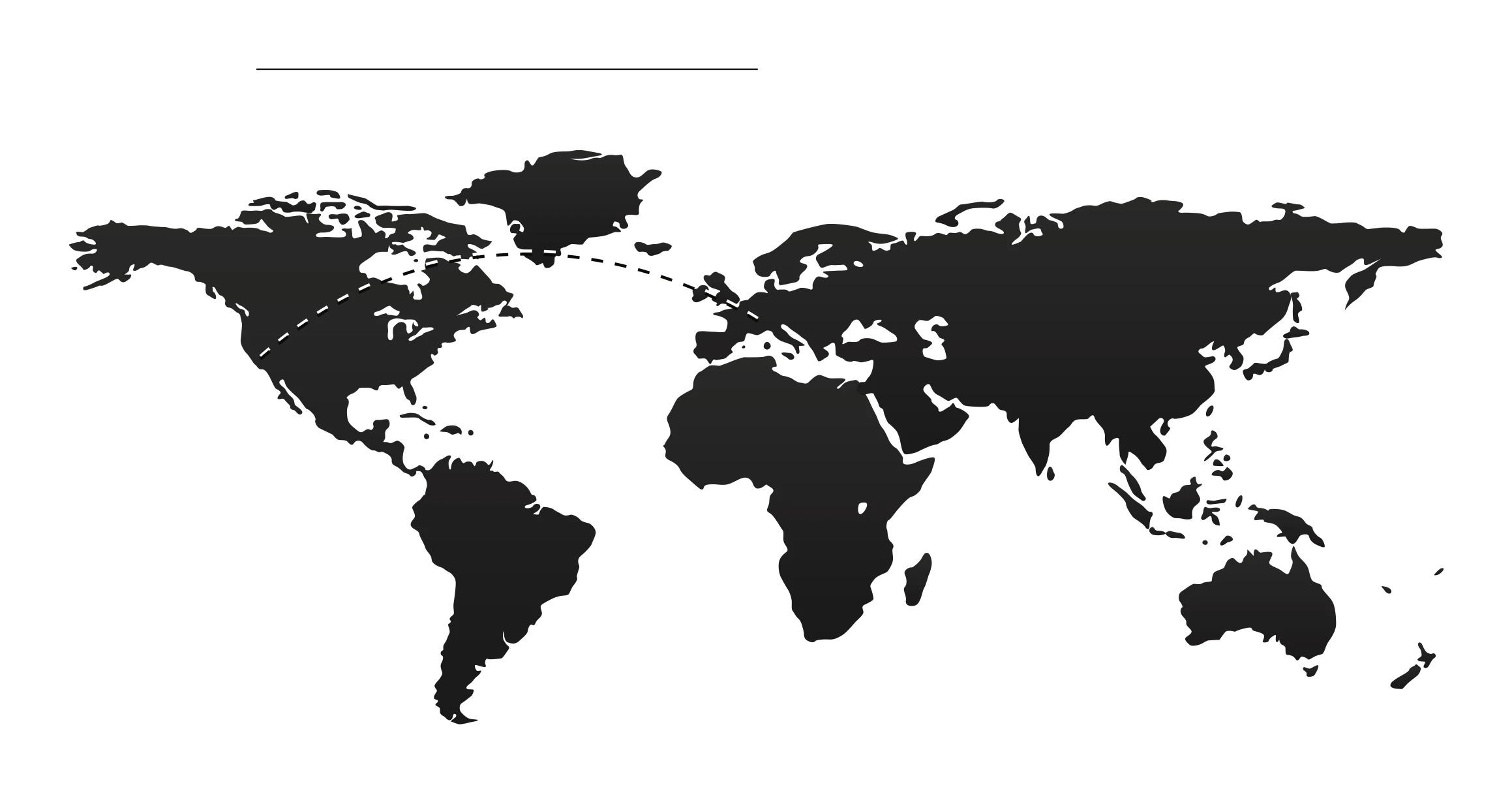
The described fact is fundamental even for another kind of spacial sequence, the distance. In fact, in a flat representation, the distance between two objects is quite faithful if your position is close to the equator, but the closer vessels are to the poles more the perception of distances is distorted. This issue covers a great importance in vessels monitoring systems, especially when distance is relevant. For example, when different signals are overlapped and elaborated to point out the position of a vessel in a fixed time, by observing the distance from supposed position to the relative signals it is possible to evaluate the information reliability.
This reason should bring us to reflect on how is important to work on a 3D environment, especially for application for which distance is fundamental. To have the support of applications like Google Earth is important as such applications put the user in relation not simply with a representation, but with a simulation. It is comparable with having object in one’s hand which can be grasped, rotated, shifted, and zoomed as a real object. Furthermore the perception of spacial measures is a real experience (Jones 2007).
Later-in-Time
Each single vessel position is related to a time-sequence. The time is the third dimension in the visualization and we are going to see how can be important and how it can change the representation.
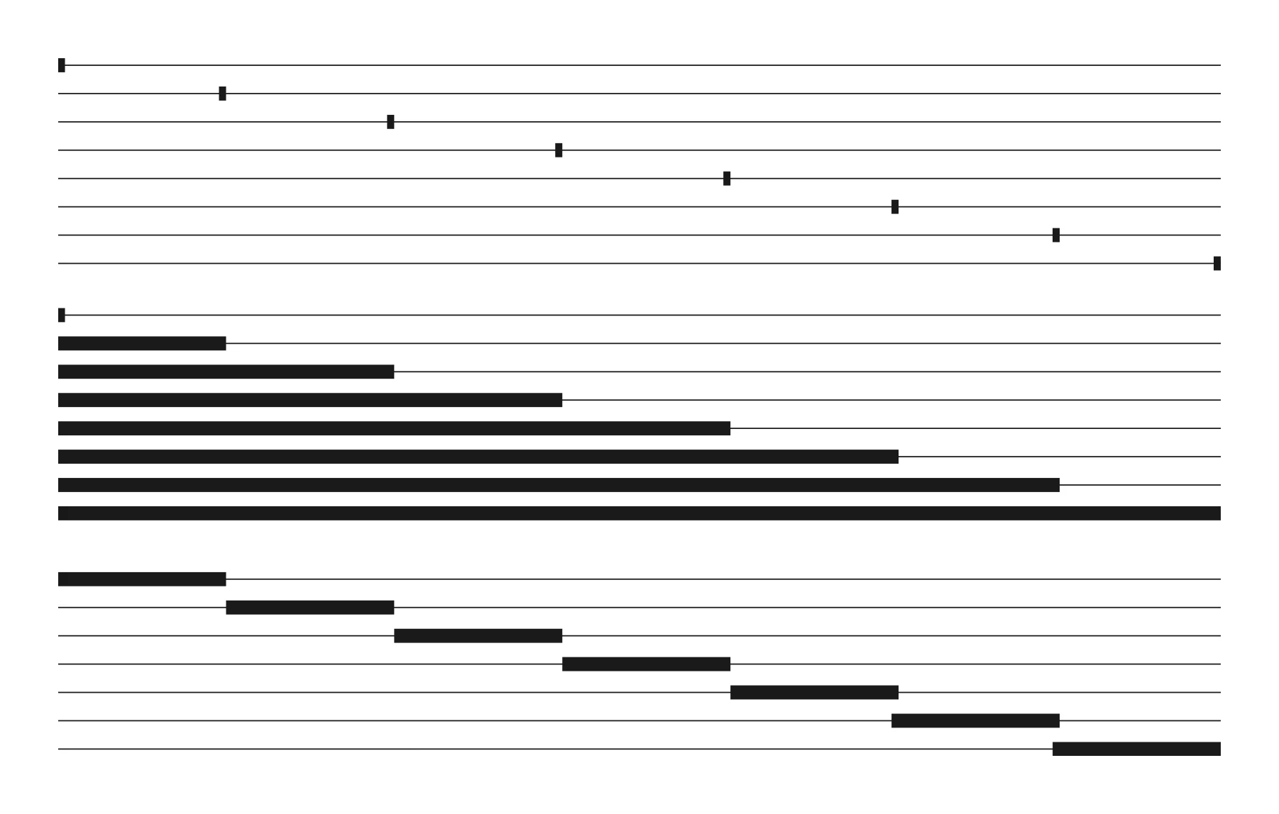
Initially we divide time in two moments: still time and moving time. Still time is a fixed, snap-shot in time. In this case all the data are relative to a time zero. The moving time is a time series visualization. The connection between these two moments is like a record player needle. The needle indicates the point, that is where a fixed visualization takes place, then it can be decided to play the sequence and the visualization changes according to the time. One can control the time trough a time bar by which it’s possible to pause or skip. These two moments are powerful models, but the proper one has to be thoughtfully chosen.
For example, to communicate the most populated sea area in a precise moment of the day, the still time will be the correct way to display data. Alternatively to show the change of vessels density through the day, the moving time would be better suited.
But if I introduce a new quest, for example what areas are not occupied in the first four hours just after the dawn, I will have to introduce a new measure: the span time. The span time can be seen as an extension of the still time and it represents the sum of several still time data. It’s particular useful because it reveals an unreal situation, that is a configuration of vessels not available in the reality [Fig. 3].
Later-in-Evolution
The evolution is the order where space and time go together. This solution is well described by Scott McCloud when he introduces the concept of closure for comics (McCloud 1993). Closure is the panel-to-panel transition. It is the act made by the reader, aimed to fill the gap between two panels in sequence. For comics closure is the concept one step before the movement, for vessels monitoring systems it is the track.
The vessel track is a sequence of positions in time. The perception of a sequence is communicated by the frequency. In fact, radio signals are timed. This means that different positions must be merged to obtain the track [Fig. 4].
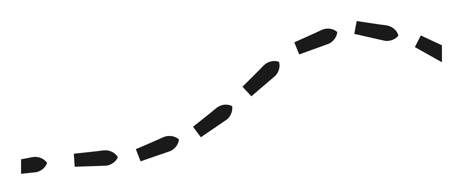
In the visualization phase, one can choose between still time and moving time to display the tracks. This choice is related to the frequency of signal. In fact if the frequency of data is not enough dense, it will not be possible to visualize tracks as a movie clip and the use of still time representations will be the only solution. Instead if the frequency of data is high a moving-time visualization can be created, which is very easy to understand by playing. In such a case, one can choose between the still-time and the motion-time representation.
At this point it is also interesting to observe how these principles work among them. It is easy to figure out how the direction of vessels could be integrated with a still-time or a moving-time representation, or to notice how the size of a vessel influences its speed, intended as frequency of sampling.
Increasing Complexity
Complexity is a very interesting fashion to show information if you need to have a perspective to the whole data. Obviously people using monitoring systems are not interested in visualizing the data complexity, because it enables a loss of information. They are rather more interested in how to manage complexity to let data become more comprehensive [Fig. 5].
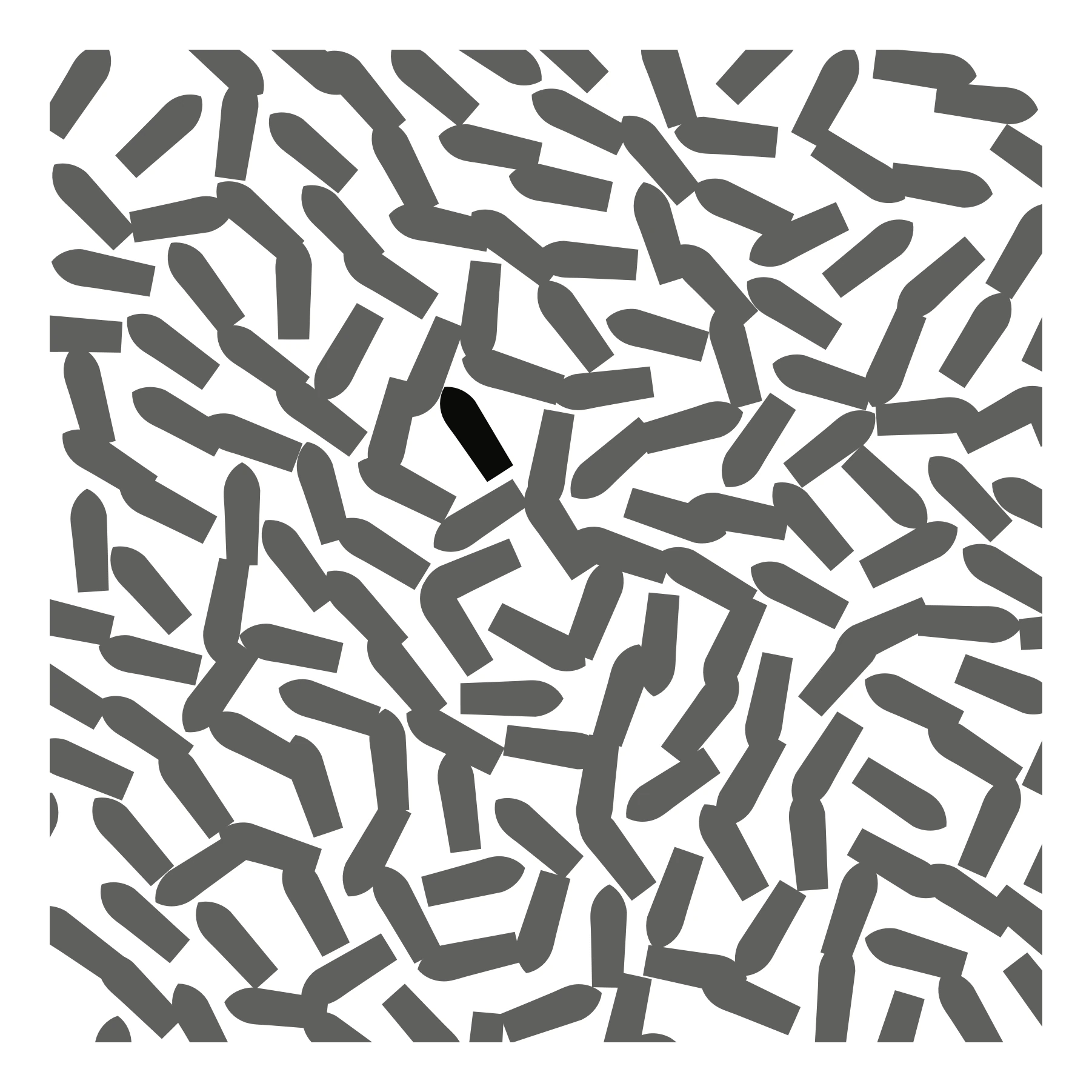
Inspired by the facets theory of Ranganathan (1963), we would like to introduce facets for our purposes. Vessels can be classified in three different kinds of classes: signals, size and area. Signals can be classified by sources: VDS, VMS and AIS. Size kind has three groups: small, medium and large. Finally areas are two: inside or outside of defined borders. We can add as many facets as necessary, three different divisions are enough to explain how to work with. By them, we can visualize all the vessels available in a precise area where the signal is equal to AIS. We can also obtain all the big vessels outside a delimited area. Or we can visualize inside the area all vessels whose size is small or medium but only belonging to the VDS signal.
In Google Earth for example the data are set up in a taxonomy. However taxonomy is not enough sophisticated to manage complexity because it does not allow data intersection between folders. A new approach based on facets, where each vessel can be shared among categories, could be a drastic improvement for an interface like Google Earth. Moreover, if facets approach makes librarians able to manage big libraries, why shouldn’t this method work for vessel monitoring systems?
Canonical Sequence
In vessels monitoring systems it is difficult to talk about traditional sequence, probably we can not talk about tradition because the field is so recent. It is useful to intend the canonical adjective as the tradition of the previous technology in monitoring field, in other words the interface people were used to work with, the radar systems.
What is different in the actual monitoring systems, compared with the radar visualization, is the absence of origin. Consider an old war film, one can easily figure out the radar display of a naval vessel [Fig. 6]. This round-shaped monochrome display, characterized by a radial refresh, has the vessels itself as origin. The center was the reference for all objects in the radar, so the system was absolutely relative, while the new monitoring systems are absolute. This difference between relative and absolute influences relative measures: the first uses distance and degree, the latter latitude and longitude of a geographic system.
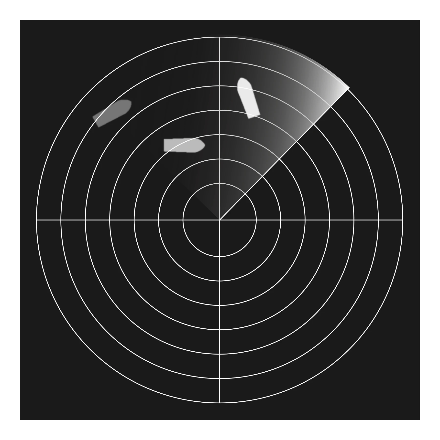
So the canonical sequence can be interpreted as the point of view. If our tasks are based on the comprehension of distances referred to a single point in a relative system, the relative approach is what we need. If our view needs to be more complete and general, probably the absolute visualization will be the right solution.
Favored Categories and Alphabetical Sequence
All the sequences introduced are arranged from the most to the less useful according to the Ranganathan thought (1967). These two last arrangements should be used only if all other sequences are not available, but we would introduce them as a fashion to support information displayed to this point. All the previous sections have introduced concepts relative to a bi-dimensional visualization. Latter two instead are related to a single dimensional list and this is a good point to begin with. For the demonstration purposes, the sequences meanings are not required, so we skip it and go to the example.
Consider the display of one dimensional and two dimensional views side by side. Vessels are represented in both ways: as an alphabetical list first, as geographical view second. Since the objects are shared in both visualizations, it is important to notice that the two representations are connected each other by a mapping relation: each vessel on the list corresponds to a vessel to the geographical view and vice versa [Fig. 7]. Imagine how this double visualization works. If you select a vessel from the list, the same will be highlighted on the geographic view. If you focus on a vessel on the geographic view instead, you will see it also on the list.
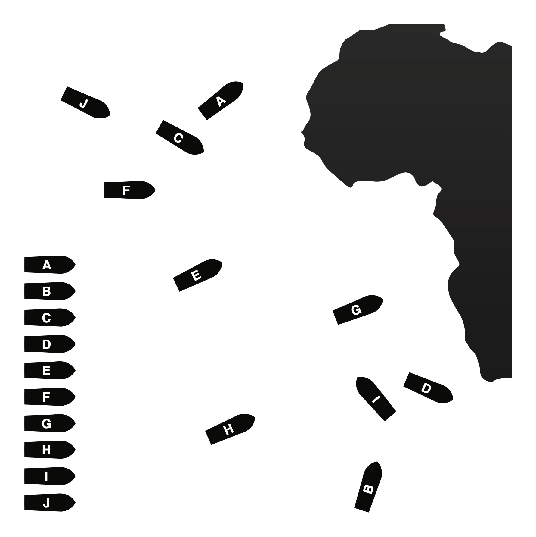
The mapping between different visualizations could be interesting and it could involve more views. We must think of this method as a way to improve comprehension.
Visualization as a Language
In conclusion Ranganathan makes librarians reflect, but his thought is relevant also in other disciplines. All principles enumerated in library science are referable to information visualization, probably because they share some characteristics as creativity, order, thinking and even both study a field tuned toward to the people use. However, besides the concept of orders, in this digression we find the fundamental principles of a GIS visualization.
When a person interacts with a computer through an interface, data has to be completely available and reachable. People should feel in complete control on all information. Only in this way a dialog between the human and the machine can take place. Computers have to offer informations and tools act to work with data, users — manipulating them — have to be able to obtain answers to their questions.
This language between humans and computers has to be based on a controlled vocabulary, whose concepts are the constituents of information. If the concepts are used by both sides, then the interactions happens: only by a two-way communication based on a language users can manipulate information — working on filters, orders, positions, direction, etc. — to finally arrive to a clearness of visualization. A moment in which computer data are transparent and readable to humans.
Conclusions
Information visualization specialists are not only responsible for comprehensive visualizations, but are responsible to build with users a language act to exchange information. Moreover we have to take in account that this language has a lot of dialects, as many as spoken technical languages. So this paper is an effort to go into detail of a particular one, the vessels visualization language.
In recent decades visual information has gained weight. Bertin (1983), Spence (2001), Shneiderman (1996) and Tufte (1997) all made significant contributions. In recent years more specialized languages have been deconstructed, among them geographic information is increasing in popularity (Longley et al. 2005; Dodge, McDerby, and Turner 2008). In this field more work is needed, because the language needs to be fed.
This paper would be the preamble to a work. In fact, at the Joint Research Centre in Ispra, we are carrying out a system act to monitor vessels behaviors. Even though the software has been used in several campaigns with success, we believe that a real improvement in data visualization could be still realized. So the paper represents a compulsory passage to the next phase, where all principles will be applied in order to obtain an improved visualization.
References
- Bertin, Jacques. 1983. Semiology of Graphics. Madison: University of Wisconsin Press.
- Crossley, M. 1999. A Guide to Coordinate Systems in Great Britain. Southampton: Ordnance Survey.
- Dodge, Martin, Mary McDerby, and Martin Turner. 2008. Geographic Visualization: Concepts, Tools and Applications. Chichester: Wiley.
- Jones, Michael T. 2007. “Google’s Geospatial Organizing Principle.” IEEE Computer Graphics and Applications 27 (4): 8–13.
- Kourti, N., I. Shepherd, H. Greidanus, M. Alvarez, E. Aresu, T. Bauna, J. Chesworth, G. Lemoine, and G. Schwartz. 2005. “Integrating Remote Sensing in Fisheries Control.” Fisheries Management and Ecology 12 (5): 295–307.
- Lambert, Phyllis, Werner Oechslin, Detlef Mertins, Peter Eisenman, Rem Koolhaas, K. Michael Hays, and Ludwig Mies van der Rohe. 2001. Mies in America. Montreal: Canadian Centre for Architecture.
- Longley, Paul, Michael Goodchild, David Maguire, and David Rhind. 2005. Geographical Information Systems and Science. Chichester: John Wiley and Sons.
- McCloud, Scott. 1993. Understanding Comics: The Invisible Art. Northampton, MA: Kitchen Sink Press.
- Ranganathan, S. R. 1963. Colon Classification: Basic Classification. Bombay: Asia Publishing House.
- Ranganathan, S. R. 1967. Prolegomena to Library Classification. Bombay: Asia Publishing House.
- Shneiderman, Ben. 1996. “The Eyes Have It: A Task by Data Type Taxonomy for Information Visualizations.” In Proceedings of the 1996 IEEE Symposium on Visual Languages, 336–43. Washington, DC: IEEE Computer Society.
- Spence, Robert. 2001. Information Visualization. Harlow: Addison-Wesley.
- Tufte, Edward R. 1997. Visual Explanations: Images and Quantities, Evidence and Narrative. Cheshire, CT: Graphics Press.
- Vossoughian, Nader. 2008. Otto Neurath: The Language of the Global Polis. Rotterdam: NAi Publishers.