The Homer’s List or How Classifications Can Be Displayed on Tablets
Rodighiero, Dario, and Giorgio De Michelis. 2013. “The Homer’s List or How Classifications Can Be Displayed on Tablets.” In Classification & Visualization: Interfaces to Knowledge, edited by Aida Slavic, Almila Akdag Salah, and Sylvie Davies. Nomos Verlag. https://doi.org/10.5281/zenodo.3522207.
In the Iliad, Homer wrote a list of the scenes presented on Achilles’ shield. A list so long that many artists have attempted to create the shield, triggering a creative process to find a solution. In the same way librarians have been struggling for years to present knowledge classifications. A structure that has transmigrated from paper book to tablet computer following technological developments. The paper describes the results of an innovative research to display and interact with classifications using tablet computers. Since these mobile devices force the designer to keep things simple, the classification will be displayed as a list, one of the simplest ways of presenting information. Later the list will be enriched with its semantic structure to propose an application able to manage the screen rotation and the classification manipulation.
Introduction
In a passage of the Iliad, Homer describes the shield of Achilles which, the story says, was stolen by Patroclus to fight Hector (Eco 2009). In the text, the list of the scenes presented on the surface of the shield is so long and detailed that it is difficult to imagine its real form. The legend fascinated many artists of different epochs who measured themselves against solving the problem: how to arrange all the facts to make them discernible on a single surface?
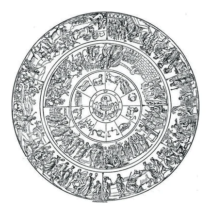
Quatremère de Quincy1 and others tried to solve the problem producing, as a result, fascinating pieces of art. Each of them went through a creative process working on dimension, detail, grouping, simplification, etc. All of these solutions attempted to re-create the form of the shield as described by Homer.
Inspired by this tradition, we started our own design experiment in order to solve a similar problem of presenting a large amount of information in a small space. We are intrigued by the possibility of displaying a complex library knowledge classification on mobile computers and demonstrating how simplicity and a thoughtful design (Löwgren and Stolterman 2004) on the one hand, and putting users at the center of our attention on the other hand (De Michelis 2003), can support organization, discovery and, ultimately, the creation of knowledge.
With respect to this second point let us underline two relevant facts: first, digital technology modifies the way users interact with classifications, allowing them to do it as part of the task they are engaged in, and not as a separate, off-line, duty; second, as a consequence of the previous point, users have a multiplicity of approaches to classifications, and they switch among them freely.
The actions users do with and on classification, and that are relevant for our discussion, could be summarized as follows: a) navigating its objects, b) changing objects and/or criteria, c) seeing objects in a context, d) switching between contexts. In this paper we describe our experiment on giving a different form to classifications by proposing an approach to visualize and maintain them on a tablet device.
The solution described here is part of a larger research project looking into how we can overcome the gap between paper and digital forms of classifications (Rodighiero 2011). Since it is impossible to deny the long and well-established tradition of classifications in book form, we try to transpose this knowledge to the digital form, focusing on typography (Bringhurst 2004). We believe that an understanding of the transfer from paper to digital media may help improve the understanding of classification structures as we use them today.
List
We propose to solve the problem of displaying classifications on tablet computers by using the form of a list. By a list we mean an ordered series of terms or subjects, which can change according to its ordering: by alphabet, by use, by categories, etc. (Svenonius 2000). Moreover the list can assume sophisticated forms when the relationships are shown. In this case relationships, as documents, describe the context where the subjects are defined as a meaning and consequently as their use (Wittgenstein 2001). The idea to present the classification as a list is motivated by two reasons:
First, lists occupy an important place in the printing tradition, especially so in the bibliographic domain. Examples include systematic listing of subjects and topics in Dewey Decimal Classification or the Roget’s Thesaurus, but in general we can also find well-known lists such as the Yellow Pages or the dictionaries. We can easily think of books as widespread objects, which follow the natural reading direction from left to right typical for all European writing systems. The subjects are disposed in columns, arranged in pages that can be turned over through a horizontal directionality.
Second, handheld computer devices and in particular tablet computers which are designed to be easily carried and have relatively small screens, have become ubiquitous technology and part of our daily lives. In spite of the constant developments of the interfaces, they already have some aspects that are well-established and the list is one of them. In digital environments the list is a common way to display information like e-mails, reminders or phone contacts because of its simplicity. In smartphones and tablets the list is usually presented as an upright sequence characterized by vertical scrolling.
The idea is to propose a list that integrates horizontal directionality and vertical scrolling to allow users to navigate the classification in both ways. This concept offers the opportunity to think of a digital interface which meets with the books heritage in an attempt to create a new hybrid interface.
Navigation
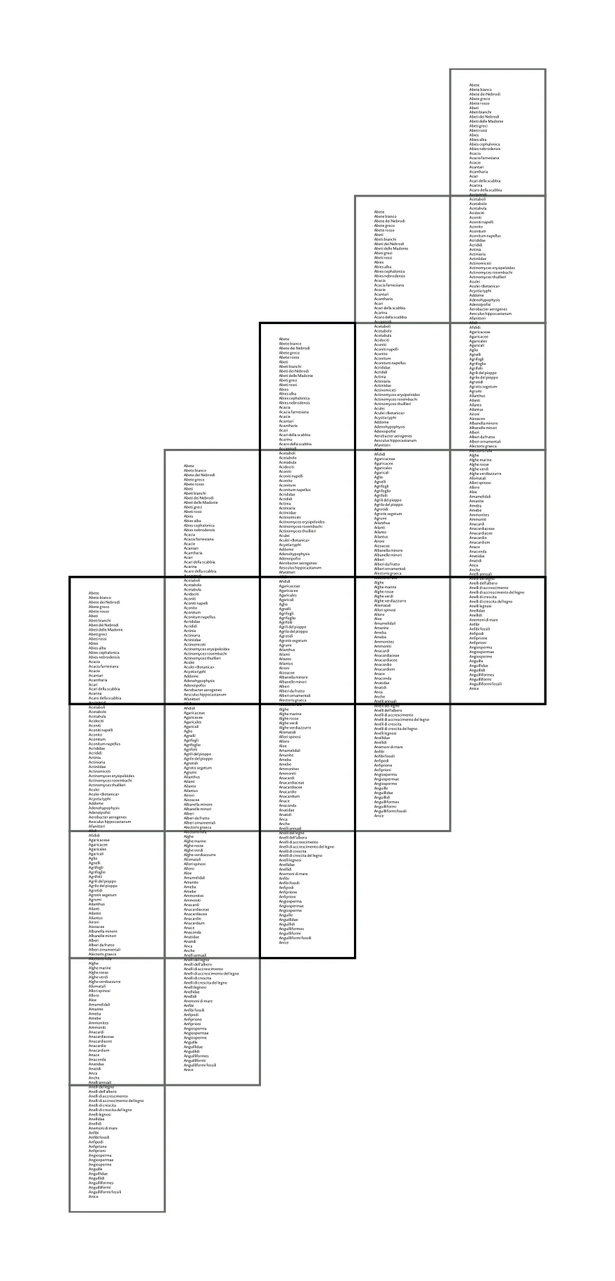
The approach we propose is to interact with the classifications by offering vertical and horizontal navigation at the same time; this would give the opportunity to users to move through the content in two directions, according to the needs of the moment.
According to Latour et al. (2012) we can differentiate between two interface levels that can be deployed to explore subjects: micro and macro. These levels—accessible throughout the vertical and horizontal navigation—allow us to explore the subjects in two different ways.
Horizontal directionality has the important ability to maintain the page content while users swipe from context to context. This is a heritage of the book layout where the content of each page is fixed and the readers can recover an element on the same page at the same position. This movement in a horizontal direction, also called micro navigation (horizontal swiping), provides a way of step-by-step movement, apt to thinking and to refining the search.
On the opposite side we have macro navigation (vertical scrolling) which is a more modern type of navigation and standard feature in modern technology. Although it is well-accepted as a faster way to interact with lists, its fulfillment is known to be less precise, or it does not offer the same affordance2 i.e. the ability of knowing what to do next. The micro navigation, on the other hand, can be exploited to provide static pages whose static layout helps the sense of direction and makes the navigation easier (cf. Warr and Chi 2013).
A hybrid navigation shares the characteristics of horizontal and vertical navigations: it offers the opportunity to browse the classification in two different ways, one apt to view the full classification (vertical scrolling) and the other specific to exploring single pages (horizontal swiping).
Figure 2 illustrates one way in which we can implement the hybrid navigation: the active page stays at the center, in the column where the vertical scrolling occurs. On both sides, the column is duplicated to allow the horizontal swiping. These columns do not show on screen, they appear on touch. The shifting is due to the necessity to navigate among pages: for example, if the user swipes right, the previous page will be displayed. The left swipe is used to open the next page.
Horizontal Orientation
Tablet computers have screen-rotation, which was an inconceivable feature before their introduction. For designers this is an interesting quality, because it forces them to think of the same application in different ways.
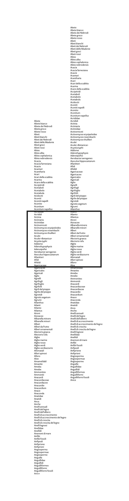
By rotating the tablet, we have thought to clone the column, offering to users the ability to navigate not only one single column, but two columns: one on the left and one on the right part of the screen.
The idea of the two-column view consists in disposing of two different and independent representations of a single classification. This dual-view approach offers the opportunity to explore new methods of interacting with classification and discovering interesting paradigms of navigation (see Figure 3).
Double Scroll
If the horizontal orientation introduces two different instances of the same classification, each independent from the other, the first issue to resolve is interaction. Since the introduction of a second column adds complexity to our application and it may be desirable to keep things simple, the rotated-screen configuration will be able to navigate classifications by vertical scroll only. This approach may be viewed as a difficult way of interaction with classification structure as will be explained further in the text.
To leave columns independent gives the users a great opportunity: to use one column as a pivot and continue navigation on the other. For example, if we search for a subject and we have found a possible choice, but we want to explore further possibilities, we can leave the subject visible in the left column and start to explore options in the second column. In this way, the left column will work as a master, keeping the focus, while the second—a slave column—will be available to explore relationships or scroll the list. This approach gives the users the chance to manage independently the columns, which assume alternatively the role of master or slave. This means that while the left column is used to navigate, the other remains static. And when navigation takes place in the right columns the situation is reversed (cf. Ricci 2013).
Exploring Associative Relationships
The two-column view facilitates also the identification of classification relationships. For example, by selecting a subject of the left column, therefore called the master, we can see all the related subjects in the second column, the slave column. If this configuration has the selected subject on the left column and the related subjects on the right column, the users can now select a related element on the right column. This triggers a change of focus: the master column will become slave, and the slave master. Consequently, the selected subject on the right column will be connected to a set of subjects on the left columns leaving to the users the possibility to continue navigation through the relationships.
This way of browsing the classifications allows movements from left column to right column and from right column to left column, enabling a kind of navigation comparable to a tennis match.
Multi-Relationship View
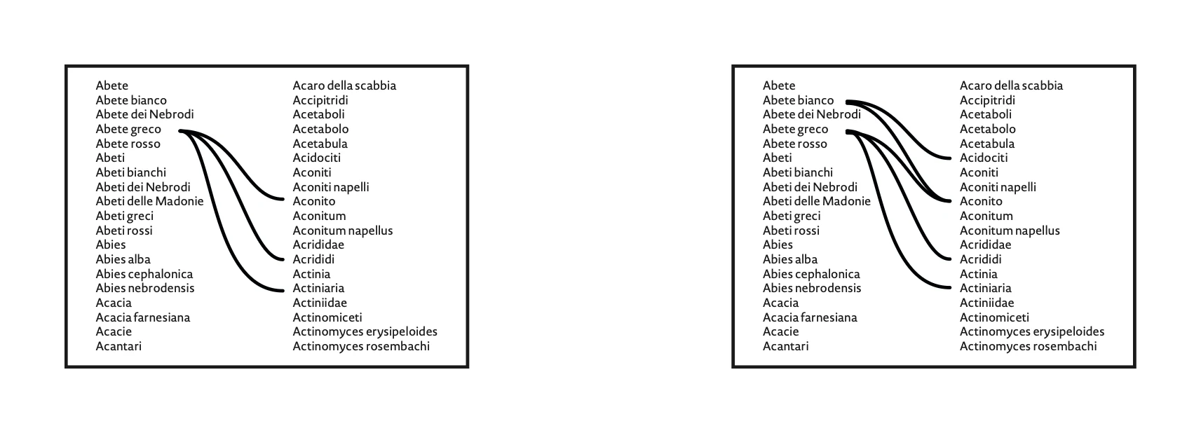
What if we want to compare the relationship between two subjects? In a traditional application you have to navigate to the first subject, to note information about relationships in some ways, saving a file or making a screenshot. With the two-column solution, one can select two subjects in the same column whose relationships can be displayed in the second column. Thus in a single view, the interface shows selected subjects, their related subjects, their relative relationships and consequently the related subjects that the two subjects may share.
An interface that displays all related information in a single view is not common in bibliographic databases or library systems. In this paper we argue that it would be beneficial to compare the relationships between different subjects, because being able to explore their similarities would enhance classification exploration.
Creating Relationships
The double-column view can be useful not only to browse relationships, but also to create them. Traditional interfaces allow users to select one subject at a time. The two-column view allows users to select two subjects to be related at the same time, with no specific order: one on the left side and one on the right. But the selection is not just a time-related fact, it is a functionality that gives users a higher degree of flexibility. For example, changing the first selected subject, after having selected the second, normally implies going back in the browser’s history. With the two-column view this time-consuming operation is not necessary anymore, it is sufficient to change the selection of the first subject to get the same result.
Two Different Classifications
The approach of managing and navigating independently two separate columns leads us naturally to consider the possibility of using this option to display simultaneously two different data sets. Up until this point we discussed the navigation of a single classification scheme. Since the two columns we proposed are independent, it is equally possible to consider that each of them could host a different classification scheme. This opens a possibility for a great variety of scenarios which would be worth thinking about (Ferigato et al. 2009).
In bibliographic domain and bibliographic control, many efforts have been made toward improving interoperability. One important aspect of interoperability in cross-collection information discovery consists of alignment or mapping between subject vocabularies such as classification (Rodighiero and Halkia 2009).
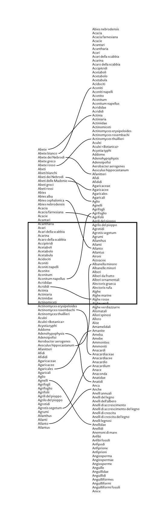
Simultaneous visual display of two different classifications creates an opportunity for comparison and the creation of alignments between the two structures. Users are allowed to scroll each classification independently. They can select a subject in the first classification and see, for example, if it is available on the second classification. With interface features described here the comparison and mapping between two subjects of different classifications becomes remarkably easier.
In this context we can also consider the option of navigating subjects by relationships in two classification schemes. In such a case, the related subjects would not be visible in the opposite column, rather they would appear in the same column shown as a simple hyperlink navigation. In this way, two independent columns lead us toward a multi-navigation environment.
The same functionality of two separated views that allow us to navigate two classifications independently and simultaneously allows us to manage and establish relationships between two datasets. An important advantage of such an interface design is that there are no limits in the sequence in which we create relationships: it is possible to proceed from left to right or vice versa.
The single-classification view shares the same positive aspects with the double-classification view, but there is still a missing feature that could help users create a mapping. Conventionally, in a classification, each subject is structured with relationships to a group of other subjects. If in classifications this approach is standard, it does not happen in a mapping between classifications because the mapping may not be complete or simply because two classifications could be so different that complete mapping becomes impossible. So having the opportunity to view all the relationships between two classifications is useful to see the status of a mapping.
The easy way to view the mapping status is to display all the relationships at the same time. In information visualization, the entire view is a common presentation of information, which allows the analysis of large data sets at a glance (Fry 2009).
Conclusions
The work of a designer is to invent objects that could be helpful or to redefine objects to improve their shape. The Achilles’ shield is a metaphor to describe how difficult this work could be or how all efforts can lead to a situation without solution. After classifications have been adapted to the digital media, we just try to imagine their next form. We don’t want to impose a standard, we show a possible path to follow, to provide the readers with a new germ that could guide them to a brilliant idea.
To propose a classification on a tablet computer could be the next step that will influence a classification’s shape that will keep evolving. In this paper we argued in favor of two new paradigms: the hybrid navigation and the two-column view. We hope this could be inspiring, and that at least one of these will be used as a new form of navigation throughout classifications.
Knowledge classifications are widespread tools and needed in many disciplines, they have existed for centuries because they had the ability to change according to time and technology. We are sure that at this moment classifications are living through another evolution that will allow them to be used in new environments and configurations. The authors have attempted to put forward some ideas and considerations of the ways in which classification applications may evolve.
References
- Aitchison, Jean, Alan Gilchrist, and David Bawden. 1997. Thesaurus Construction and Use: A Practical Manual. 3rd ed. London: Aslib.
- Baeza-Yates, Ricardo, and Berthier Ribeiro-Neto, eds. 1999. Modern Information Retrieval. Harlow: Addison-Wesley.
- Bertin, Jacques. 1983. Semiology of Graphics. Madison: University of Wisconsin Press.
- Bringhurst, Robert. 2004. The Elements of Typographic Style. 3rd ed. Point Roberts, WA: Hartley & Marks.
- Broughton, Vanda. 2006. Essential Thesaurus Construction. London: Facet.
- De Michelis, Giorgio. 2003. “The Design of Interactive Applications: A Different Way—First Notes.” In Proceedings of the International Workshop on Ambient Intelligence Computing, edited by Paul Spirakis, Achilles Kameas, and Sotiris Nikoletseas, 101–14. Athens: CTI Press.
- Eco, Umberto. 2009. Vertigine della lista. Milan: Bompiani.
- Ferigato, Carlo, et al. 2009. “Role of Thesauri in a Scientific Organisation.” In Networks of Design: Proceedings of the 2008 Annual International Conference of the Design History Society, edited by Jonathan Glynne, Fiona Hackney, and Viv Minton, 301–9. Boca Raton: Universal Publishers.
- Fry, Ben. 2009. On the Origin of Species: The Preservation of Favoured Traces. https://benfry.com/traces/.
- Gibson, James J. 1986. The Ecological Approach to Visual Perception. Hillsdale, NJ: Lawrence Erlbaum.
- Lancaster, Frederick Wilfrid. 1972. Vocabulary Control for Information Retrieval. Washington, DC: Information Resources Press.
- Latour, Bruno, et al. 2012. “The Whole Is Always Smaller Than Its Parts: A Digital Test of Gabriel Tarde’s Monads.” The British Journal of Sociology 63 (4): 590–615. https://doi.org/10.1111/j.1468-4446.2012.01428.x
- Löwgren, Jonas, and Erik Stolterman. 2004. Thoughtful Interaction Design: A Design Perspective on Information Technology. Cambridge, MA: MIT Press.
- Ricci, Donato. 2013. “Documenti di scena: assemblare una ricerca di metafisica empirica.” Progetto Grafico 23: 102–3.
- Ridi, Riccardo. 2010. Il mondo dei documenti: cosa sono, come valutarli e organizzarli. Rome: Laterza.
- Rodighiero, Dario. 2011. “Il tesauro non è un dinosauro.” Master’s thesis, University of Milano-Bicocca. https://eprints.rclis.org/15427/.
- Rodighiero, Dario, and Matina Halkia. 2009. “Mapping for Multi-Source Visualization: Scientific Information Retrieval Service (SIRS).” In Human-Computer Interaction. Interacting in Various Application Domains, edited by Julie A. Jacko, 597–605. Lecture Notes in Computer Science 5613. Berlin: Springer.
- Svenonius, Elaine. 2000. The Intellectual Foundation of Information Organization. Cambridge, MA: MIT Press.
- Warr, Andrew, and Ed H. Chi. 2013. “Swipe vs. Scroll: Web Page Switching on Mobile Browsers.” In Proceedings of the SIGCHI Conference on Human Factors in Computing Systems (CHI ’13), 2171–74. New York: ACM.
- Wittgenstein, Ludwig. 2001. Philosophical Investigations: The German Text, with a Revised English Translation. Oxford: Blackwell.
-
Quatremère de Quincy (1751–1849), French archaeologist, philosopher and theorist of art and architecture. ↩
-
The “affordance” is the term introduced by J. J. Gibson (1986) to describe the relationships between the possible actions and the environments, i.e. actions possible by a specific agent in a specific environment. ↩