Representing the Digital Humanities Community: Unveiling the Social Network Visualization of an International Conference
Rodighiero, Dario. 2015. “Representing the Digital Humanities Community: Unveiling the Social Network Visualization of an International Conference.” Parsons Journal for Information Mapping VII (2). https://doi.org/10.5281/zenodo.3464433.
This paper deals with the sense of representing both a new domain such as Digital Humanities and its community. Based on a case study, in which a set of visualizations was used to represent the community attending the international Digital Humanities conference of 2014 in Lausanne, Switzerland, the meaning of representing a community is investigated in the light of the theories of three acknowledged authors: Charles Sanders Peirce, for his notion of the interpretant; Ludwig Wittgenstein, for his insights on the use of language; and finally Bruno Latour, for his ideas on representing politics. The result is a proposal for designing and interpreting social network visualizations in a more thoughtful way, while remaining aware of the relation between objects in the real world and their visualizations. As this type of work pertains to a wider scope, we propose bringing a theoretical framework to a young domain such as data visualization.
Information Design and Data Visualization
In Valcamonica, a valley close to Brescia in the north of Italy, there is the largest number of prehistoric petroglyphs in the world. Here, UNESCO identified about 140,000 different drawings. But the actual number is likely twice as much, because some of them are still covered by vegetation. All these incisions date back to different ages—Epipaleolithic, Neolithic, Copper Age, and so on, until the Middle Ages—corresponding to a long period, about six or eight millennia, in which people used this kind of visual communication.
Historical information has been deduced from these drawings: people living in that area practiced agriculture, fought to protect their community, hunted wild animals, and prayed according to their religious beliefs. For thousands of years, people living there represented their world through visualization.
Today the scientific community refers to this practice as Information Design. Robert Jacobson, one of the pioneers in this field, defines Information Design as the discipline whose “purpose is the systematic arrangement and use of communication carriers, channels, and tokens to increase the understanding of those participating in a specific conversation or discourse” (Jacobson 1999). The conceptualization of this domain was first introduced in the 1970s and became official with the publication of the Information Design Journal in 1979. However, important thinkers such as Charles Joseph Minard, John Snow, Florence Nightingale, and Otto Neurath had previously carried out significant works in this field.
In recent years, other areas of study entered Information Design under different denominations. One of these is Data Visualization, a recent domain that explores how digital data can be portrayed. “Data Visualization” as a term is now in widespread use all over the world; it is common to come across writings, courses, and websites related to this domain—FlowingData is one of them, a web magazine whose payoff is “Data Visualization, Infographics and Statistics.”
This article expands on the notion that it can be reductive to speak only about visualization. In the past, the people who lived in Valcamonica were not simply drawing what they saw; rather, they used images to represent their community and their lives. What they drew was not just a sign—they also implied a behavior beyond that sign. Illustrations are meaningful because they represent something important to the community; consequently, it is fundamental that those who observe them also detect the object indicated, so as to hear the voice of the community who drew the sign. To investigate this theme, the argument should be built by examining the relationship between visualization and representation, as can be shown by a practical example of design: the brand image of DH2014, the Digital Humanities conference that took place at the EPFL and UNIL campus in Lausanne, Switzerland.
The Brand Image of DH2014
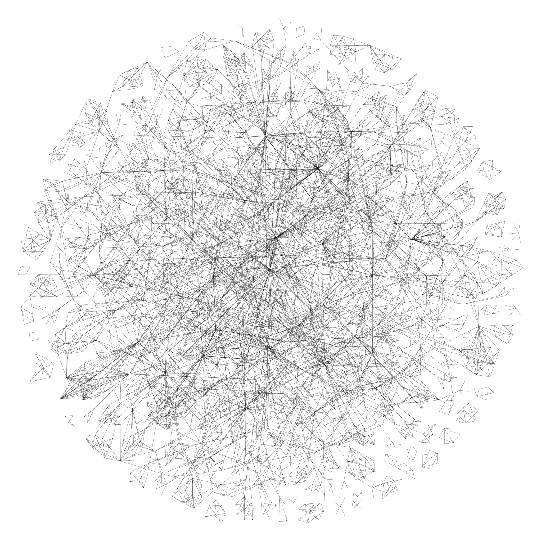
The idea was to represent the Digital Humanities (DH) domain as a pattern that could be beautiful and ductile, allowing it to be used as a brand image for producing posters, covers, banners, and so on. The DHLAB, the laboratory in Digital Humanities at EPFL and one of the organizers of the conference, accomplished this task by using the conference data set—in particular the submission information. By analyzing this data it was possible to create a network visualization based on authors and keywords derived from the metadata found in all papers and posters accepted for the conference. All the keywords of each document were linked, as well as all the authors of each document. Then the authors and keywords of each document were linked. The three sets of links were merged to form a unique network that provided a representation of the DH community’s complexity (see Figure 1).
The Authors Network
Subsequently the original network was split in two: the first representing the authors, the second the keywords. The purpose was to simplify the visualization in order to make it more comprehensible.
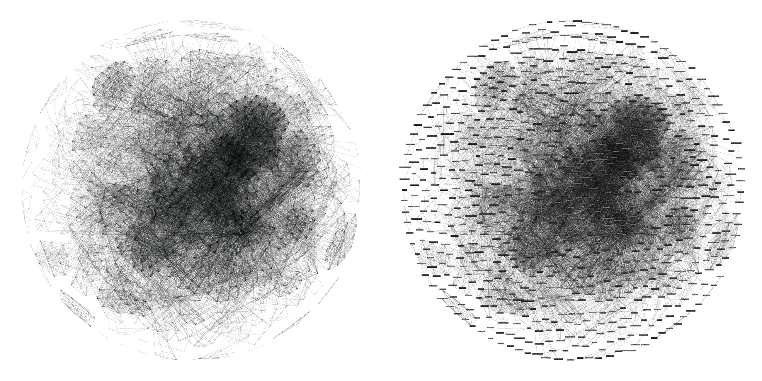
This network represents all the authors attending the conference who had entered at least one submission. The authors in the middle of the network are the most linked, both because of their co-authoring and because of common keywords. In fact, this is not just a network showing who published with whom, but also a network displaying authors with shared keywords—in other words, who worked on the same theme (see Figure 2).
The force-directed graph, arranged by combining the ForceAtlas 2 and Fruchterman–Reingold algorithms, makes the identification of author clusters easy. Because of these algorithms, the spatial disposition is not based on coordinates; rather, its relevance is in terms of proximity: the closer two authors are, the more documents or interests they share. The same network is shown both without and with labels (see Figure 5).
The social network of authors was printed and placed in front of the conference’s entrance (see Figure 3). Because of its large size, this visualization, reified in a carpet, gave participants a clear invitation to exploration. As shown in the photograph, authors attempted to locate themselves on the map. What soon became a game was a perfect mix of entertainment and examination: each person followed a personal path within the social network.
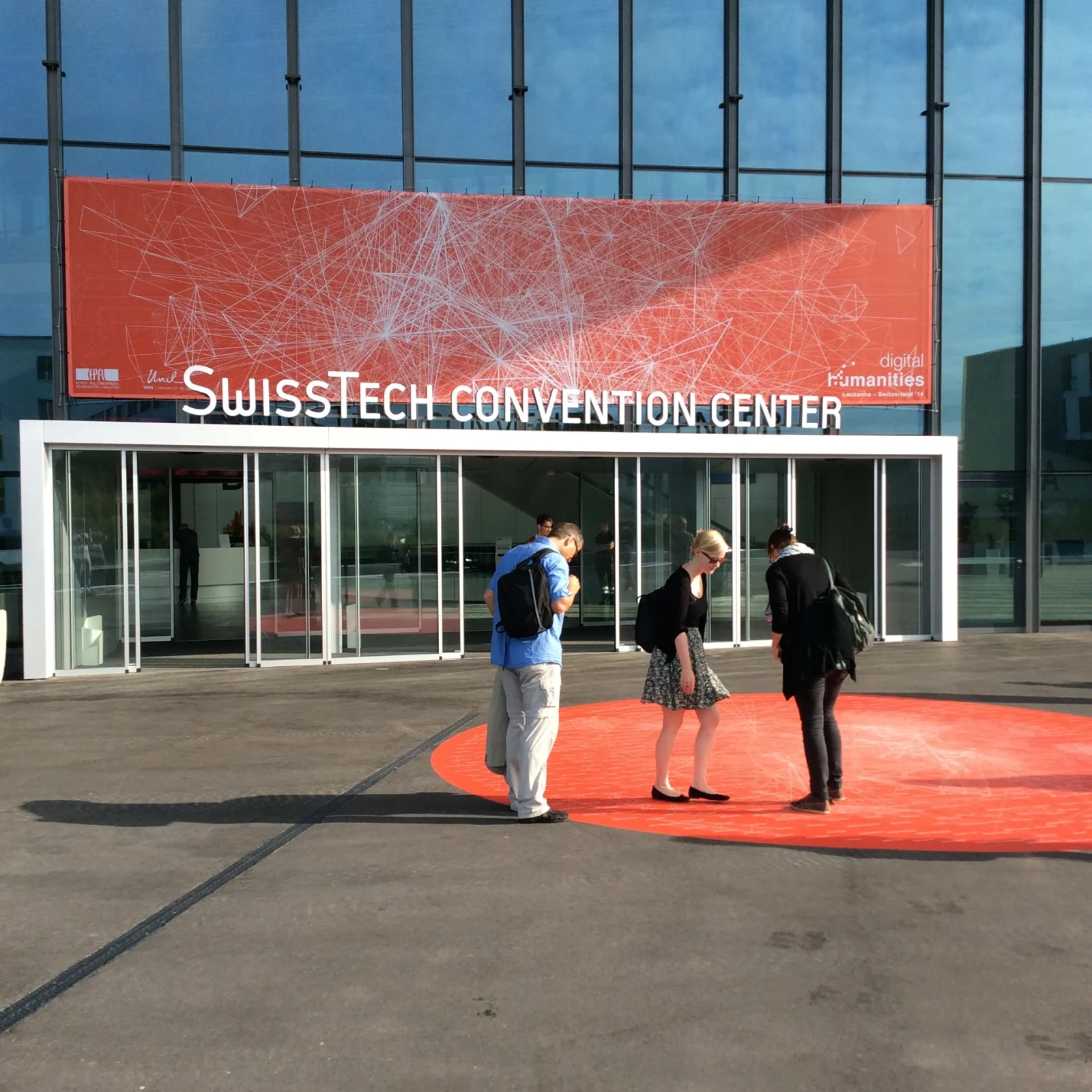
Such a search generally led them first to spotting authors well-known to them, then to finding their own colleagues, and finally themselves. Finding one’s own name was a kind of success that triggered different behaviors, often shared on social networks such as Twitter. Among the actions identified were: a) a portrait, when authors asked to have a picture taken of them; b) a postcard, when they found a friend or close colleague and sent them a message; c) an invitation to play the game, when they invited other people to find themselves; or d) a selfie.
This active interaction with the carpet was not mere engagement, since any form of data visualization can only be considered successful when it creates comprehension and knowledge among its viewers. Complex data visualizations require time to be understood; the aspects of entertainment, the exceptionality of the medium, and the social interaction involved at the 2014 Digital Humanities Conference made the process of understanding easier. Interaction with the carpet was not a solitary experience but a collective one, in which authors improved their comprehension of a way of describing a collective domain—the representation of Digital Humanities.
The Keywords Network
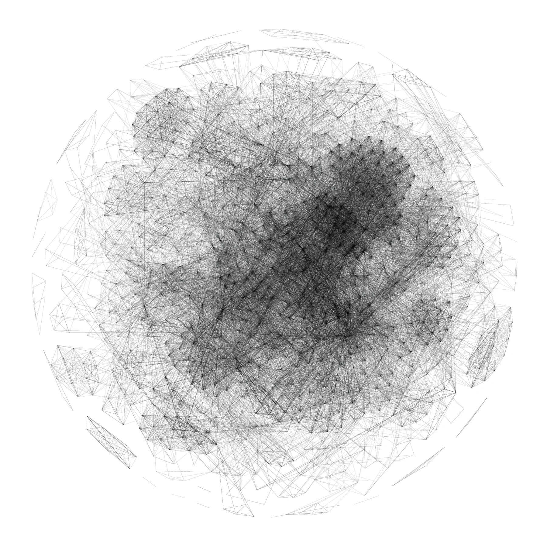
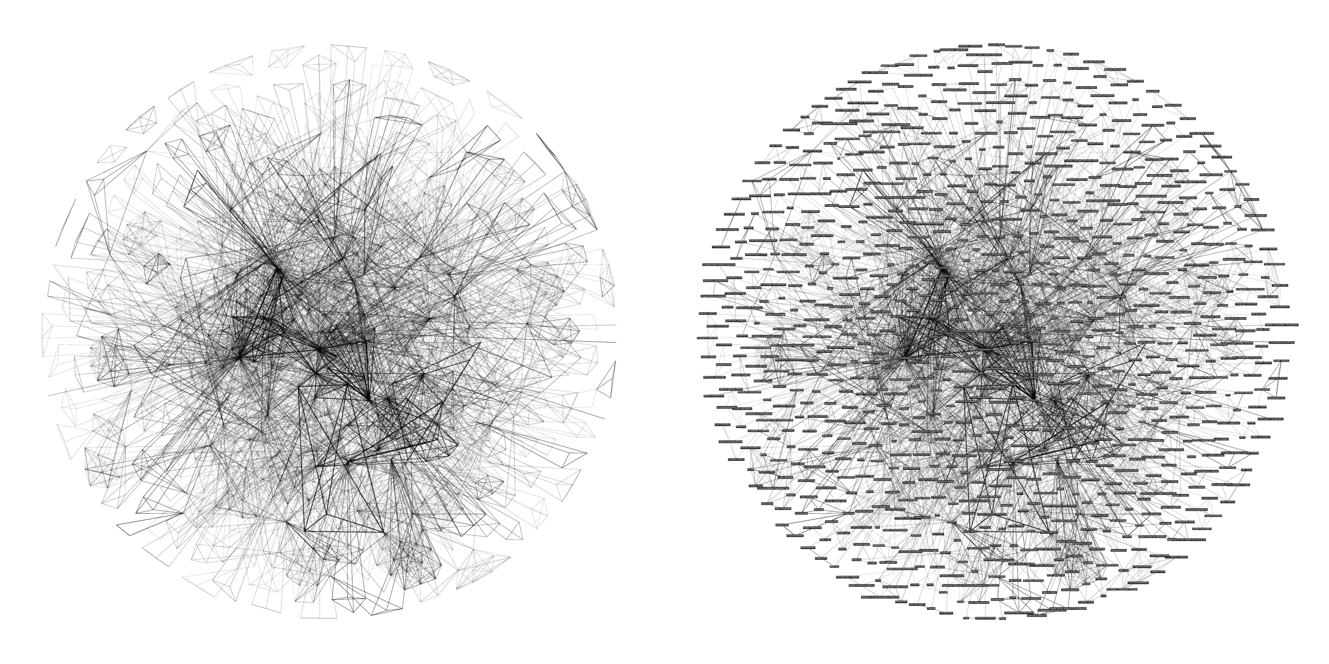
The network of keywords is probably the most interesting one. As the Digital Humanities community shows uncertainty in defining its very domain, this visualization is intended as a representation of the documents presented at the conference, of the authors attending it, of the conference itself, and—last but not least—of the domain of Digital Humanities (see Figure 4).
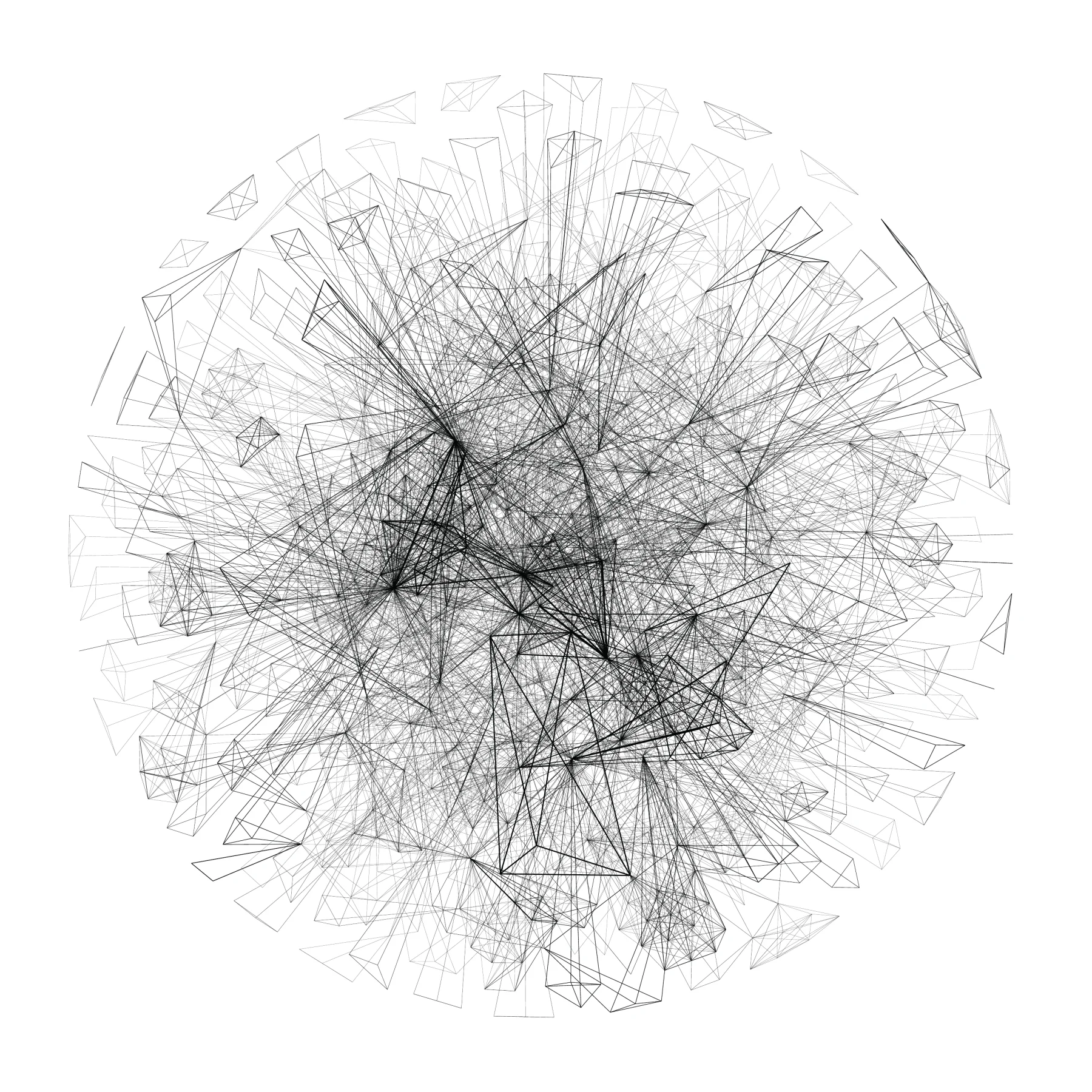
The edges signify that two keywords are used in the same document, while the thickness of the lines is given according to the frequency of the connection. This thickness increases the depth of the layers—about twelve measures are used in the current network—thereby enriching the reading with a sense of depth and highlighting the most used connections. As with the authors, the keywords network is also shown both without and with labels (see Figure 6).
Peirce and the Interpretant
Charles Sanders Peirce was a prolific mathematical logician and the founder of American pragmatism. Peirce, together with Ferdinand de Saussure and Charles W. Morris, was one of the most prominent theorists in semiotics, and is famous for his contributions to the theory of signs, an approach based on the dyadic relationship between sign and object, where the sign is something that can be interpreted and the object is the target of the sign’s meaning. If a reader looks at the word “dog” in a book, he automatically transforms the word into the concept of a dog—that is, the meaning of the word in that context. In this example the sign is the word “dog” and the object is the concept of the dog, precisely the meaning of “dog” for the reader, which should be the common comprehension of the word.
Peirce, during his life, wrote many definitions of the theory of signs, such as the following: “I define a sign as anything which is so determined by something else, called its Object, and so determines an effect upon a person, which effect I call its interpretant, that the latter is thereby mediately determined by the former” (Atkin 2013).
Unlike the others, according to Peirce the theory of signs is based not just on a dyadic relationship between signs and objects, but also on the interpretant—a fundamental point of his approach, which introduces an interpretation between the object and the sign. In the example above, the interpretant is the person reading the word “dog.” Consequently the basic structure becomes a triple, comprising the sign, the object, and the interpretant.
Peirce used to refer to the signifying element in different ways: sign, representamen, or representation. Contrary to the meaning of the word “sign,” “representation” bears a wider sense: while “sign” refers just to a visual element, “representation” encloses the sign and the object together.
Applying the theory of signs to Information Design could be inspiring. Thanks to that theory, the authors’ network of DH2014 can be interpreted in two ways. Assuming that the network node is the sign, and that the label—the nominal data associated with the node—is a sign extension, the object could consequently be 1) the author, whose interpretant is his written document, or 2) the document, whose interpretant is the author who wrote it. Taking the interpretant as the determinant of the sign/object relation, both versions are appropriate: 1) in the first case the document describes the relation between the node and the author, and 2) in the second case the author is the key to understanding that relation, since by asserting his fatherhood he takes on the responsibility of being associated with a certain scientific document. The act of authoring denotes the relationship sign/object. Both choices are reasonable, but by considering the keywords’ network we obtain further insights that help identify the right interpretation.
The interest of a second attempt rests in the meaning of keywords. In this visualization, nodes represent keywords—accurate words chosen by their respective authors and appearing as the documents’ metadata. The nodes are extended with nominal data, exactly as was done for the authors’ network. In this case there are three plausible ways to apply Peirce’s thought: 1) the object is the meaning of the keyword and the interpretant is the document; 2) the object is the use of the term and the interpretant is the document—as an object authored by the writer; or 3) the object is the document and the interpretant is the meaning given by the author.
Wittgenstein and the Use of Language
Evaluating the best interpretant is not an easy task, but the thinking of Ludwig Wittgenstein can help pursue this aim. Wittgenstein said: “For a large class of cases of the employment of the word ‘meaning’—though not for all—this word can be explained in this way: the meaning of a word is its use in the language” (Wittgenstein 2003). This statement suggests that scientific publications embody the specialists’ language. In Philosophical Investigations, from which this statement is extracted, Wittgenstein does not quote Peirce—and, to be honest, Wittgenstein never quoted Peirce in any document. However, Charles Sanders Peirce was such a prominent figure that everybody could agree that Wittgenstein must have read him. If we consider Wittgenstein’s statement through the eyes of Peirce, “the meaning of a word is its use in the language” appears incredibly close to what Peirce defined as the interpretant. Were he to shift his attention to visualization, Wittgenstein would have interpreted the keywords network in this way: a) the sign is the node with the nominal data, b) the object is the meaning of the word, and c) the interpretant is what makes the sign/object relation understandable to the community—the use of the language indicates the meaning of a certain word, or simply the document intended as a medium of communication.
Considering this meditation on the theory of signs, we can claim that data visualizations sometimes reveal a deeper meaning. Behind the visual apparatus there is a projection that connects the visual part to something represented—a projection from signs to objects. Visualization has a reductive meaning when something is represented. In the DH2014 visualizations, the authors and keywords networks are specific representations of the Digital Humanities community at a particular moment. Behind the visual display there is a real network composed of people and research themes. The connection between their representation and the community’s words is provided in the conference documents and in the language used by professionals to describe their work.
Latour and the Politics of Representation
In “From Realpolitik to Dingpolitik,” the first text in Making Things Public, Bruno Latour discusses the way of doing politics; what is useful to the argument here is how politics and the topics of interest in politics are represented in public spaces.
Latour describes his interpretation of “object-oriented democracy” by bringing together two different meanings of the word representation: the first “designates the ways to gather the legitimate people around some issues,” while the second “represents what is the object of concern to the eyes and ears of those who have been convened” (Latour 2005). It is possible to compare politics with a conference. For the DH2014 conference, one representation is given by all the authors attending the meeting, which is the definition of Digital Humanities as a discipline. If the comparison between politicians and authors is explicit, the representation of the DH definition deserves clarification: as Digital Humanities is quite a new domain, it is controversial to represent it, because of its diversity. As opposed to an authors network, the keywords network produces a special result—it assembles all of the documents’ keywords into a lexical representation of the domain. This representation, albeit highly unstable in time, is a steady image of the DH community in the summer of 2014.
In the conference context, the object of interest is the definition of the community itself, a definition that was represented by means of a data visualization based on keywords. These keywords—the signs—are extended to the meaning of the words—the objects—whose understanding is given in the documents written by authors—the interpretants; this triple confers on the visualization the authority of a representation.
Since the assembly is composed of the same authors who contributed to the conference, the keywords representation could be viewed as a loop. But it is not a loop reflecting the thoughts of each participant: the definition arises from the documents as a sum of voices, one for each author, and the object of concern is not a sum but a whole in which each voice has the same dignity. Thus an author, whose voice is part of the chorus, could disagree with a definition to which he has contributed.
Conclusion
To conclude, Latour asks, “How to represent, and through which medium, the sites where people meet to discuss their matters of concern?” (Latour 2005). The answer is data visualization. As discussed, data visualizations could sometimes be better defined as visual representations, because of what they represent. In the example of DH2014, the data visualizations are designated as a representation of a community, of a definition, and of the central topic of interest to be discussed at a meeting—one that can be criticized and modified according to the forces that drive the domain of Digital Humanities.
References
- Atkin, Albert. 2013. “Peirce’s Theory of Signs.” In The Stanford Encyclopedia of Philosophy, Summer 2013 ed., edited by Edward N. Zalta. https://plato.stanford.edu/archives/sum2013/entries/peirce-semiotics/.
- Jacobson, Robert, ed. 1999. Information Design. Cambridge, MA: MIT Press.
- Latour, Bruno, and Peter Weibel, eds. 2005. Making Things Public: Atmospheres of Democracy. Cambridge, MA: MIT Press; Karlsruhe: ZKM/Center for Art and Media.
- Wittgenstein, Ludwig. 2003. Philosophical Investigations: The German Text, with a Revised English Translation. Translated by G. E. M. Anscombe. 3rd ed. Malden, MA: Blackwell.