Printing Walkable Visualizations
@inproceedings{rodighiero2018printing,
  author      = {Dario Rodighiero},
  title       = {Printing Walkable Visualizations},
  booktitle   = {Biennial Research Transdisciplinary Imaging Conference},
  year        = {2018},
  doi         = {10.6084/m9.figshare.6104693.v2}
}
This article concerns a specific actor in the actualization process, the media. The conventional media for visualizations is the computer screen, a visual device that supports the practices of design and reading. However, visualizations also appear in other ways, for example as posters, articles, books, or projections. This article focuses, in particular, on a pretty unusual medium called floor or walkable visualization.
Introduction
Visualizations are created through the process of actualization, which transforms ideas into tangible artifacts ready to be used. Actualizing a data visualization, hereinafter referred to as visualization for the sake of brevity, is a complex process that requires the contribution of several actors. To get a real sense of its complexity, it should be remembered that actual visualizations cannot exist without all of their possible variations. This fascinating picture was conceived by Gilles Deleuze to describe the sense of multiplicity that is hidden behind each artifact (Deleuze and Parnet 2007, 148). This multiplicity relies on the contribution of human and non-human actors such as the author, the client, the data, and the media. All of them contribute in different ways to actualize a visualization by making it an interactive object.
Walkable visualizations correspond to a specific type of actualization, or physicalization (Jansen et al. 2015). They take the form of a large print laid on the ground in order to invite people to be part of a collective reading. This article deals with this subject matter through two empirical case studies, which will now be illustrated and discussed in more depth.
Digital Humanities 2014
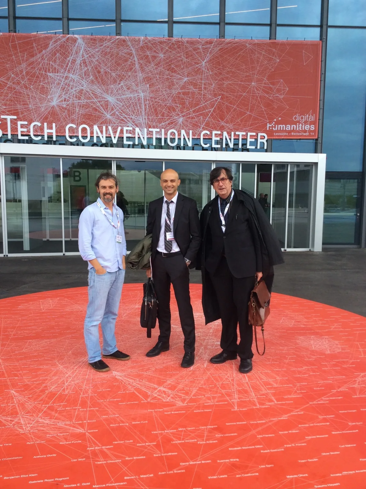
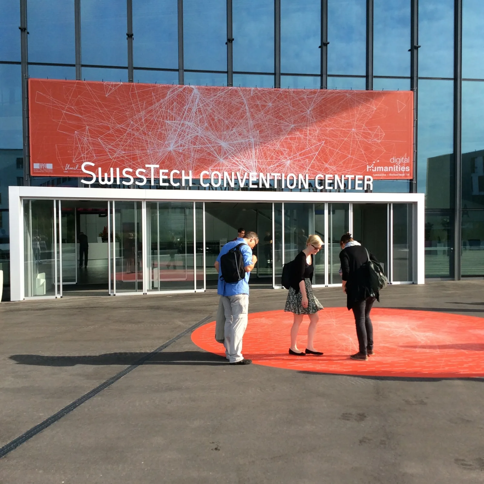
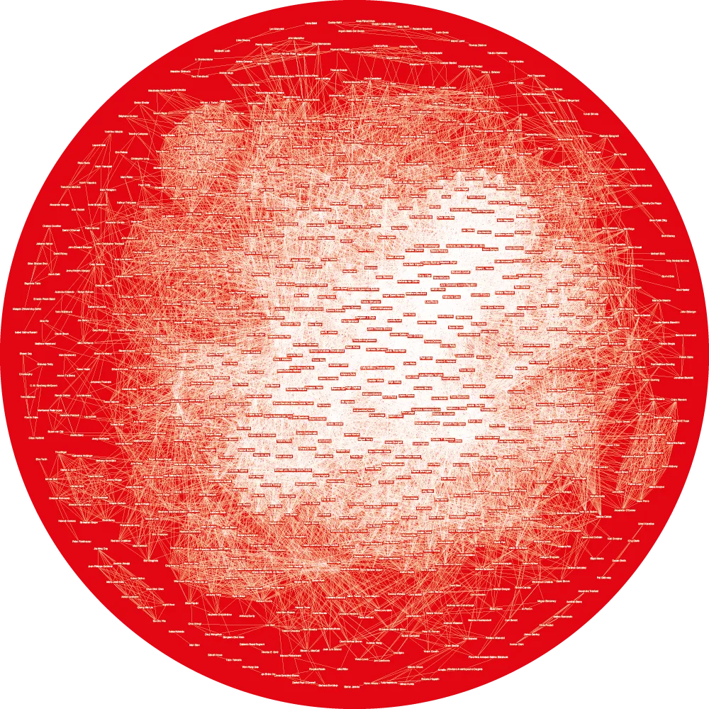
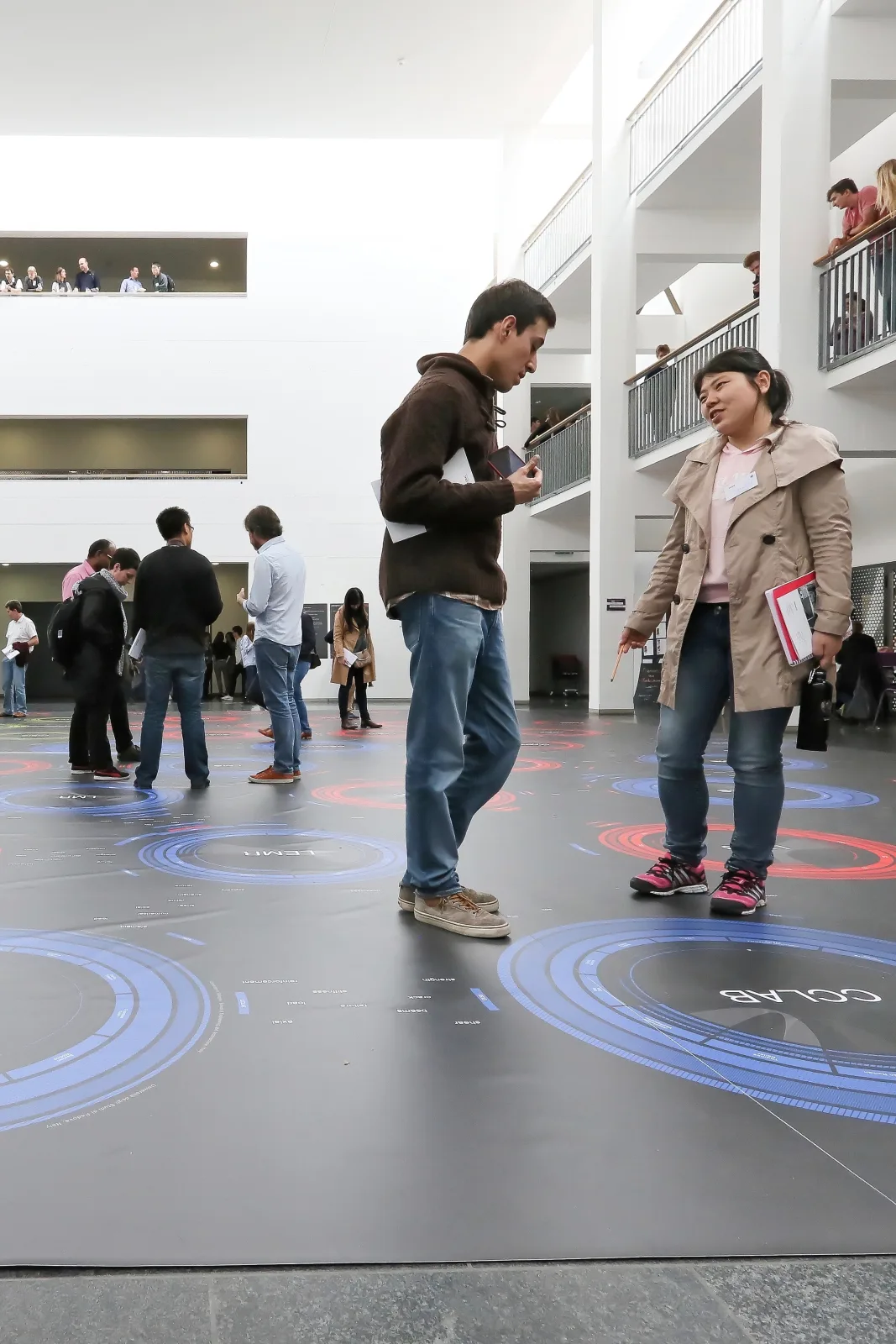
The first case study took place in 2014, during the Digital Humanities conference. A round sticker six meters in diameter was printed and stuck to the ground in front of the entrance to the SwissTech Convention Center in Lausanne (figure 1). Its surface showed a network visualization of all the authors who had contributed to the conference. The nodes of the network represented these authors, who were linked and situated according to their co-authorship and publication keywords (Rodighiero 2015). The idea was to brand the conference with this network of around eight hundred highly connected nodes using different media: social networks, posters, websites, email messages, mugs, t-shirts, and so on (Rigal and Rodighiero 2015). For the opening, another very special medium was created in order to welcome the conference attendees: the network was actualized as a walkable visualization. In other words, attendees were invited to explore it by walking directly on it. Although they were initially afraid to do so because the sticker was brand new, after a while the instinct of exploration guided them to walk on it.
Before printing the sticker, there was a discussion about the network model. Doubt still lingered over whether it would be better to use keywords or the names of individuals to represent the nodes. Which type would be better for grabbing the interest of the attendees? Keywords would have provided a map of the discipline, which might have depicted the identity of Digital Humanities and the role of the digital humanist within its community (Gold and Klein 2016). On the other hand, individuals would have represented the authors of the conference, helping to remind attendees that a discipline is pursued by a community and its members. The final choice was to use individuals instead of keywords. Individuals were considered more appropriate in order to celebrate the scientific collective that has been building little by little.
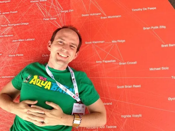
It was a great pleasure to see the attendees enjoying the walkable visualization. Their comprehension of what the visualization represented was immediate. After a brief moment of studying it, attendees were engaged in searching for themselves, in a sort of gamification of social networks. Portraits and selfies posted to Twitter by attendees were used to celebrate the successful discovery of themselves on the visualization (figure 2). The browsing also led attendees to find their acquaintances by retracing the social ties that define the community structure. The search in the walkable visualization was not only an operation of self-recognition, but also a way to understand the diversity of individuals contributing to the Digital Humanities community.
Displaying a public visualization of the Digital Humanities community members was a way to welcome attendees to the conference. However, from the beginning of the conference we realized how strong the message of the visualizations was. Members of the discipline were proud to be publicly represented, as was the case with the distribution of the conference proceedings. Authors were happy to be shown in the visualization, but at the same time some people were excluded, such as the attendees without a publication. For instance, a complaint was made by a member of the organizing committee, who asked us to modify the visualization to add all of them. Of course, that was impossible, since the branded object—including the walkable visualization—had been produced the previous week. The complaint was nevertheless very interesting. It was proof of people’s attachment to the community as well as to its representation, and it turned us toward a general reflection on the difficulty of creating a public representation of individuals.
Creating a walkable visualization requires a lot of preparation. The first thing to do is to check the budget, as large-format printing can be very expensive. Then it is necessary to find a professional in large-format printing. The sticker for the first case study was sponsored by the conference, and the work was commissioned to a company based in Lausanne that specialized in visual communication for public events. This company could print on slip-resistant surfaces especially conceived for outdoor use.
The visualization of the Digital Humanities conference was initially created with Gephi, a tool for network analysis (Bastian, Heymann, and Jacomy 2009). All the relevant data concerning the conference publications were processed and imported into this software through an algorithm written in R. The nodes were then situated using the Fruchterman–Reingold algorithm, which optimizes the use of circular space, providing a pleasant geometrical arrangement (Fruchterman and Reingold 1991). The network was exported as vector graphics and modified in Adobe Illustrator in order to customize colors and ensure its readability (figure 3). As floor visualizations have no standards indicating an appropriate typography, the layout was based on tests performed by reading the network from the distance of a standing person, which is around 1.70 meters. Finally, the labels of the nodes were set at 56 points in the Myriad Pro font on a neutral background color, while the thickness of the links was balanced to reduce visual noise.
Visualizations in the Environment
The case study of the Digital Humanities conference allowed for the identification of three qualities that make visualizations walkable: orientation, location, and size. This section introduces these qualities, which were then used to define the environment, a concept used to make the complexity of visualizations visible.
The orientation of computer screens, for example, highly typifies visualizations. These devices, usually upright, face the readers in front of them and hide whoever is behind them. A horizontal orientation, on the contrary, avoids exclusions and invites readers to access the visualization from any direction.
Making a visualization accessible from any direction means that an appropriate location must be chosen. In many war movies, for instance, the military intervention is planned around a table where a map lies horizontally. This location greatly encourages social interaction, but at the same time it limits the size of the map. The information at the center of the map has to be readable from the borders; thus, the map cannot exceed a given dimension. If it does exceed a certain dimension, then the readers should be able to enter the map.
Indeed, entering the map becomes necessary when its size oversteps the limits of table-location readability. During the seventeenth century, the astronomer Giovanni Domenico Cassini directed the drawing of a planisphere on the floor of the Parisian observatory (Jacob 2006, 94). Centered on the North Pole, the planisphere represented the known world with a new technique of measurement. Cartographers were invited to walk on it to assess the precision of the new measure, which was meant to produce improvements in the longitudinal projection. The Cassini drawing substantially exceeded the usual size of maps, occupying a larger surface area. Such a size drastically changed the behavior of the readers. They were no longer forced to stay outside the map; rather, they were invited to enter it and walk on a cartographic version of the world. From this example, it can be observed that size is an essential consideration for visualizations in order to create enough space for walking, which ensures the simultaneous interaction of the readers.
Orientation, location, and size are thus fundamental qualities for characterizing the environment, or the space where the reading of the visualization occurs. Environment is a term that belongs to ecological psychology, a visual theory introduced by James J. Gibson to describe a closed system in which human and non-human actors mutually interact (Gibson 1979). For him, each human has its surroundings, which correspond to its individual perspective on the environment. Humans interact through their own surroundings, which make visible and invisible the affordances that the environment can offer. Affordance is a term commonly used in different scientific disciplines to refer to the general interaction between two actors. More precisely, it refers to all the opportunities that a thing, a person, or a space makes available to others. Donald Norman, for instance, uses the concept of affordance when referring to the opportunities for interaction that everyday objects offer to users (Norman 2013).
The concepts of environment, surroundings, and affordance help to define more precisely the interaction with a visualization. The visualization is not a mere object related to its reader; it is part of a system—that is, the environment—which is composed of different actors such as the reader. Visualization and reader are the basic pairing that makes the interaction possible. However, with respect to the first case study, the reader is not alone: several readers can interact simultaneously with the same visualization, within the same environment. In addition, orientation, location, and size are all elements that characterize the environment and encourage certain interactions over others. Large floor visualizations, for instance, invite exploration by walking instead of by using a mouse. As a result, the reading of the visualization becomes a more complex system to which many actors, human and non-human, contribute.
ENAC Research Day 2016
The second case study was organized in collaboration with ENAC, the school that groups together the institutes of architecture, civil engineering, and environmental engineering within EPFL. Each year the ENAC deanship organizes a Research Day event to which all its scholars are invited. This event is a time to foster new synergies through different activities such as conferences, workshops, and showcases. The ENAC Research Day of 2016 was the ideal opportunity to share a visual representation of the school itself, entitled Affinity Map, in the form of a walkable visualization. The idea was to stimulate a public debate about the organization of the school and to sensitize its members to the issue of visual self-representation.
The Affinity Map was a sophisticated visualization that presented the general organization of ENAC scholars through their affinities. But what exactly is an affinity? The term affinity describes the intellectual and operational closeness that may bring, or has brought, people to work together. And what exactly is a map? The term map indicates that the visualization is an instrument for a specific use. For example, large organizations are difficult to grasp in their wholeness, and data visualization can help for this purpose; the Affinity Map is thus a possible solution to the problem of governance in large academic organizations such as ENAC.
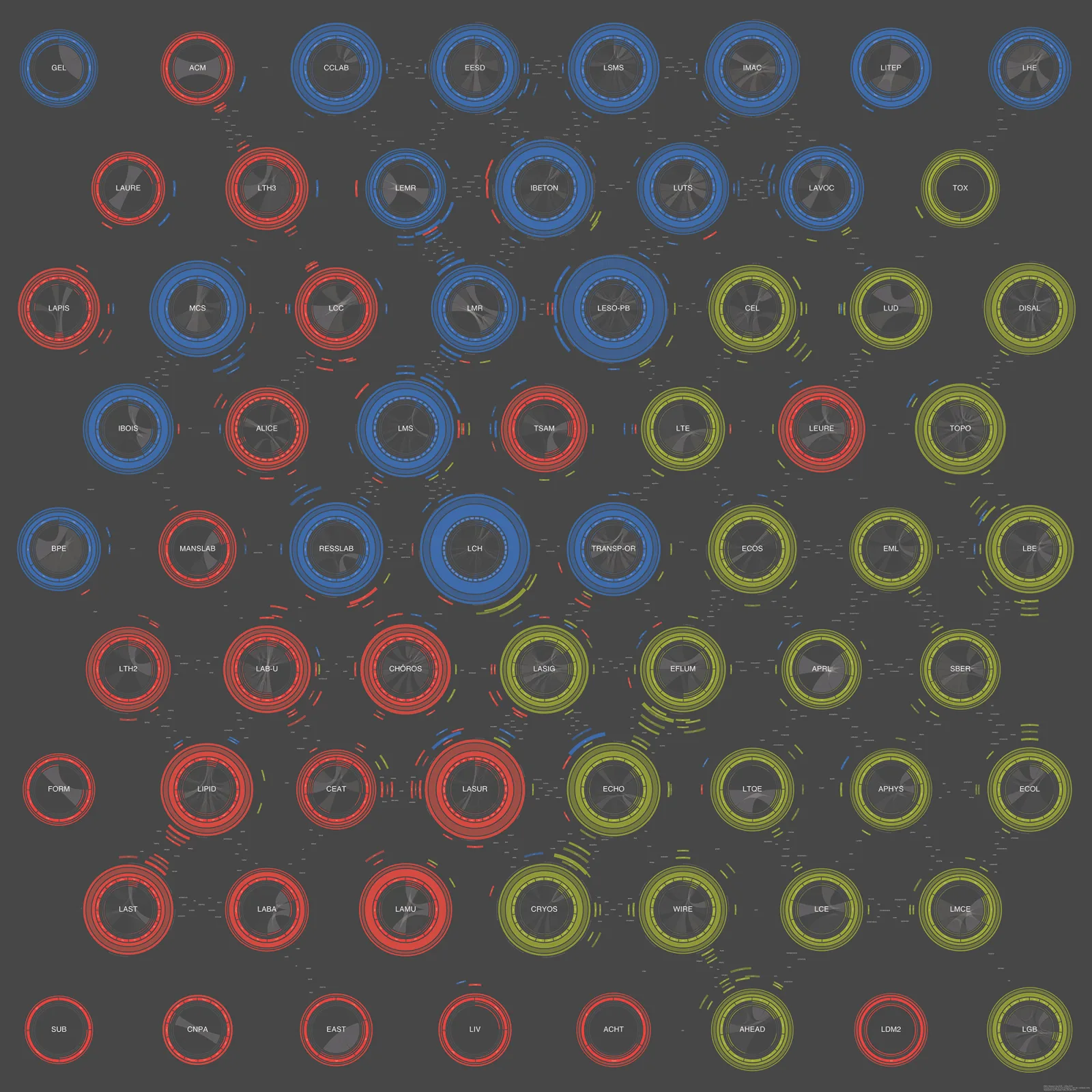
The Affinity Map followed the relational model of networks, arranging the nodes according to the strengths of their ties. The Affinity Map was, however, an unusual network in that its one thousand scholars were grouped by laboratories through a double structure of links: several chord diagrams constituted a larger hexagonal network (figure 4). In addition, the type of the link relation was made visible. The result was a visualization able to represent the complexity of an academic organization through a multi-level and multidimensional network (Rodighiero, Kaplan, and Beaude 2018; Rodighiero 2018).
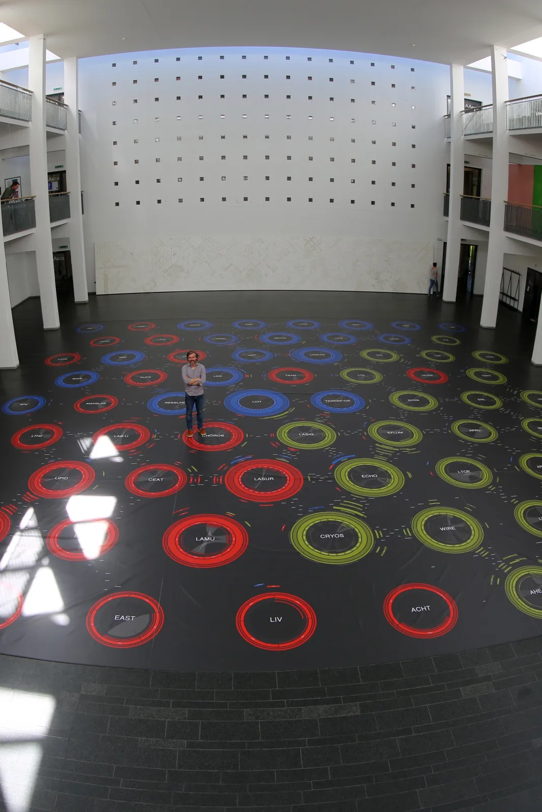
The location chosen for the installation was the architecture building, whose center hosted a large foyer that served as a way station for many students and scholars. That foyer was an ideal spot to situate the visualization, as its location ensured that a high volume of people would pass through. A search was run to find a cheaper material for printing, because the available space allowed the creation of a walkable surface larger than that of the first case study. During the search, another company offered to print on tarpaulin, a heavy waterproof covering usually used in truck trailers. The cost estimate was lower not for the material price but rather for the laying, as it did not require a specialist whose hourly labor cost would be high. According to the budget restrictions, the foyer’s square footage, and the printer’s size limits, a visualization encompassing 250 square meters was finally produced (figure 5). Three surfaces measuring 5 by 15 meters were printed, making the most of the machinery’s maximum width. A truck then carried these prints from Lucerne to Lausanne, where they were laid side by side.
Contemplators and Participants
The ENAC Research Day was a pretext to go one step further, experimenting with a more complex environment. Indeed, the foyer was characterized by a much larger walkable space, as well as by the presence of two levels of balconies that allowed readers to step ten meters away from the visualization. As a result, the map could be read from either a close or a distant point of view—in other words, from either a close or a distant reading. Although these terms represent an abstraction of the digital humanist’s approach to the study of a corpus of documents (Moretti 2007), their meaning is here brought back to the physical sense of distance, which might recall the tension that exists between the overview and the details of the visual information-seeking mantra (Shneiderman 1996). What might be referred to as close reading happened by walking on the visualization. That action was similar to the interaction of the first case study, where readers accessed the details of visual information up close. On the other hand, distant reading occurred when the readers overlooked the visualization from the balconies. That behavior resembled the bird’s-eye view typical of cartographic projections, which gives an expansive view of the whole map. The two affordances offered readers access to different information: close reading was appropriate for looking inside the laboratories to the level of individuals and their affinities, while distant reading was suitable for looking at laboratories as basic elements. Although Rudolf Arnheim thought floor visualizations discouraged the detached contemplation that cartography usually provides (Arnheim 1982, 13), in this case study the balconies offered a solution to the problem of closeness by regulating the distance of the reading.
Upon reflection, however, it is interesting to note that this double distance of reading was effective because of the multiple levels of the map; without them, the experiment would not have been successful. The Affinity Map was indeed designed to display different levels of information corresponding to the school hierarchy: namely scholars, laboratories, institutes, and the whole organization. These levels of information were blended into a single visualization using different sizes: scholars as small typographical elements, and institutes as colors characterizing the large laboratory circles. Whereas topographic representation relies on a reduction of information according to the mapping scale, the Affinity Map yields a continuity that integrates visual elements of different sizes. This continuity is not simulated through images of different resolutions, as in the case of Google Maps, but is real, as its focus is based on an optical zoom (Latour 2014). The readers can decide what information they wish to see by moving back and forth from the visualization.
The human movement of zooming by walking suggests a fictional comparison. Jonathan Swift wrote a book about the travels of his character Lemuel Gulliver, first a surgeon and then a captain of several ships (Swift 1800). In his exploration of imaginary worlds, Gulliver visited two places of different scales: an island called Lilliput, where the inhabitants were much smaller than him, and the land of Brobdingnag, populated by giant-sized people. He learned what it meant to be smaller and bigger, like the readers during the ENAC Research Day. But what exactly did it mean to be smaller and bigger for the readers? Readers can be either contemplators or participants. The small reader was a participant, walking around to discover the smallest pieces of information. Its trajectory was a line that creates a further level of information on the visualization, indicating the areas of interest. The position of the readers varied inversely when they were on the balconies, from which they were contemplators. They were able to observe the other participants, who were decoding not only the map but also its usage (figure 6).
The public presentation of the Affinity Map was a time for getting to know one another, but it was also a time to make the work of the ENAC scholars publicly viewable. Making an individual identity public is not an easy task, and neither is having one’s own identity shown publicly. In particular, two situations emerged during the ENAC Research Day. A laboratory director did not receive the invitation to fill out the annual report and, consequently, the corresponding research group’s representation was rather empty. There was no solution for the public visualization, but the relevant data were completed the following week and the online map was updated. Another laboratory director had a completely empty publication index. That was another problem related to the data, which was solved in a few weeks through the identification of its cause, related to data input. Both situations required a certain sensitivity, as the professors were not happy with their public image. However, the operation of revealing data was important for two reasons: spotting the errors, and making individuals aware of the data they enter or, more generally, of their digital identity.
Digital Floor Installations
The two case studies presented in these pages are examples of static images. However, floor visualizations can be dynamic, and this section illustrates the different digital installations recently produced by Obscura Digital and Google.
Obscura Digital created a dynamic floor visualization in 2011, called Connections, for the F8 conference hosted annually by Facebook. Multiple overhead projectors mapped a network visualization onto the floor, while a device identified the few attendees who were equipped with RFID in the projection area (Obscura Digital 2011). The result was a dynamic network of individuals related by their common interests on Facebook. The major feature of this visualization is the identification of the readers and the resulting customization. This customization leads the reader to information more relevant to them through a filter on the data. However, this technology also has some limitations. First, external viewers might not find relevant the information that is being filtered according to the active readers. Second, dynamic visualizations do not offer steady references to guide the readers, as the digital representation is always different.
The same year, Google created another dynamic floor visualization at the Pavillon de l’Arsenal in Paris. The installation was based on Google Maps, the software used to show the city of Paris on 37 square meters of high-resolution screens (Pavillon de l’Arsenal 2011). A control station situated at the base of the visualization allowed the reader to pan or zoom in and out. In addition, viewers could walk around the visualization on the catwalk that surrounded the map. The installation was attractive because it is rare to find a map of such size and detail. Furthermore, the view from the catwalks was impressive, the quality of the image was excellent, and the circulation of the readers gave different points of view (as in the case of the ENAC Research Day, the combination of close and distant reading enriched the reading experience). However, two limitations affected the installation. First, only one person at a time could interact with the map, making the other readers mere passive observers; and second, a close reading was not possible, as the readers could not walk on the visualization.
The potential of these dynamic floor visualizations is significant, especially with the constant evolution of technology that will allow for more seamless use. Some of the current limitations are purely technical, such as the fact that only a few readers are able to interact simultaneously on the map. Other limitations are economic; for instance, the need for screens, projectors, graphic cards, software, and professionals makes the budget of dynamic visualizations very high, largely exceeding the cost of creating a static walkable visualization, which remains more affordable.
Circulation of Readers and Knowledge
As previously written, it is reductive to consider a visualization without its larger context. The reader, in particular, is a necessary actor in this larger context in order to make sense of a visualization. Just as art exists when visitors interact with artworks (Duchamp 1994), the reading exists when a reader interacts with a visualization. In addition, the relationship between reader and visualization is particularly strong when the reader is represented in the visualization itself. The experience of the reader, indeed, relies on the act of self-recognition (Rodighiero and Cellard 2016).
Walkable visualizations are situated in public environments in order to foster participation, making these objects not only shared (Heer, Viégas, and Wattenberg 2009) but, above all, public (Vande Moere and Hill 2012). This specific setting allows for social interaction, making the reading of the visualization collective. Glances move around the visualization as readers search for their own selves in a collective performance carried by many readers. Once a reader finds themselves, the distance between the reader and their representation is equal to zero. What happens next is a transformation from self-recognition into the act of collective recognition: the readers no longer search only for themselves, but also for their peers. Looking at the individuals, the reading appears as a multitude of acts of self-recognition; looking at the whole, the reading seems more like a crowded activity of collective recognition. The visual representation and the individuals are unified through the act of collective recognition.
The collective reading is helped, no doubt, by the size of the visualization. Walkable visualizations are indeed able to gather many readers in the same area in a sort of collective interaction. However, this interaction is not just between the visualization and the readers; it is, above all, among the readers, who are the protagonists of the performance.
The environment that exists around the walkable visualization offers different affordances. The main affordance is the reading itself, in which the visualization offers its information to the readers. However, a specific affordance of the walkable visualization is the movement of the readers within the environment. While visualizations on computer screens oblige the reader to stay still, walkable visualizations encourage the circulation of individuals. The readers have to walk around in order to experience the visualization from different points of view. This movement is similar to the behavior of a sculptor: to understand the volume of their artwork, the sculptor is obliged to look at the statue from every angle. Likewise, the circulation of the reader is a way to assimilate the many facets of information.
However, the movement does not concern a specific reader, but rather the collective. The trajectory that a reader forms through their movement is part of a larger meshwork, similar to the pattern left by animals on the snow (Lefebvre 1991). The meshwork shows the usage of the visualization through the circulation of the readers but, more specifically, it shows how the readers meet one another through interactions (figure 7).
Reading a visualization on the screen of a laptop or a mobile phone is usually an intimate activity that the reader performs alone (Hall 1990). Indeed, small screens favor a one-to-one reading. However, when the size of the medium becomes bigger, as in the case of the walkable visualization, the reading becomes social. This is not just because the size of the screen can host more users at the same time, but also because the size makes the screen content public and visible from longer distances (Rodighiero 2018). The size of the walkable visualization fosters encounters between readers browsing the environment. And encounters stimulate discussion among the readers. Just as Philippe Starck commented on the poor functionality of his beautiful juicer when he claimed that it is an object that would start conversations, walkable visualizations may be considered spaces to start discussions as well. Indeed, the public dimension of the walkable visualization is important because it creates a social space. Reasoning by analogy, it can be said that there exist three spaces: the space of practice, where the daily work takes place; the space of representation, which aims at visually representing the practice; and the space of self-recognition, where the readers meet and discuss both the natural and the represented spaces.
The point of this section is that, if the intimate reading brings new insights, the social reading creates knowledge. Assuming that knowledge is the scientific, literary, and intellectual culture agreed upon between specialists of the same field, the way to improve that knowledge is a constructive discussion between these specialists. During the two case studies, the research collectives were both represented and invited to the reading. It was a moment for them to realize that they were part of a larger collective, through the recognition of the single and the collective self. An open discussion is the basis of every solid community. Data visualization, in such cases, allows the members of a collective to explore the wholeness of their own organization, reflecting on its current state and the following steps toward its future. As Paul Ricoeur wrote, self-recognition brings forth two directions: the past and the future (Ricoeur 2005). The past is represented by the memories of digital traces that have been transformed into the visualization, while the future is represented by the promises readers make to plan a common future.
References
- Arnheim, Rudolf. 1982. The Power of the Center: A Study of Composition in the Visual Arts. Berkeley: University of California Press.
- Bastian, Mathieu, Sebastien Heymann, and Mathieu Jacomy. 2009. “Gephi: An Open Source Software for Exploring and Manipulating Networks.” In Proceedings of the Third International ICWSM Conference.
- Croxall, Brian. 2014. “Found the @serendipomatic team. Need to get @sekleinman and @mia_out in one with me. Alas, @fontnerd. #dh2014.” Twitter. https://twitter.com/briancroxall/status/486167328821088257.
- Deleuze, Gilles, and Claire Parnet. 2007. Dialogues II. New York: Columbia University Press.
- Desargues, Gérard, and Abraham Bosse. 1648. Manière universelle de Mr. Girard Desargues, pour pratiquer la perspective par petit-pied. Paris: Imprimerie de Pierre Des-Hayes.
- Duchamp, Marcel. 1994. The Creative Act. Brussels: Sub Rosa Records.
- Fruchterman, Thomas M. J., and Edward M. Reingold. 1991. “Graph Drawing by Force-Directed Placement.” Software: Practice and Experience 21 (11): 1129–64.
- Gibson, James J. 1979. The Ecological Approach to Visual Perception. Boston: Houghton Mifflin.
- Gold, Matthew K., and Lauren F. Klein. 2016. Debates in the Digital Humanities. Minneapolis: University of Minnesota Press.
- Hall, Edward T. 1990. The Hidden Dimension. New York: Anchor Books.
- Heer, Jeffrey, Fernanda B. Viégas, and Martin Wattenberg. 2009. “Voyagers and Voyeurs.” Communications of the ACM 52 (1): 87–97. https://doi.org/10.1145/1435417.1435439.
- Jacob, Christian. 2006. The Sovereign Map: Theoretical Approaches in Cartography throughout History. Chicago: University of Chicago Press.
- Jansen, Yvonne, Pierre Dragicevic, Petra Isenberg, et al. 2015. “Opportunities and Challenges for Data Physicalization.” In Proceedings of the 33rd Annual ACM Conference on Human Factors in Computing Systems, 3227–36. https://doi.org/10.1145/2702123.2702180.
- Latour, Bruno. 2014. “Anti-Zoom.” In Olafur Eliasson: Contact, edited by Suzanne Pagé, Laurence Bossé, Hans Ulrich Obrist, and Claire Staebler.
- Lefebvre, Henri. 1991. The Production of Space. Oxford; Cambridge, MA: Blackwell.
- Moretti, Franco. 2007. Graphs, Maps, Trees: Abstract Models for Literary History. London; New York: Verso.
- Norman, Donald A. 2013. The Design of Everyday Things. New York: Basic Books.
- Obscura Digital. 2011. “Connections for Facebook.”
- Pavillon de l’Arsenal. 2011. “Paris, a City in the Making.” http://www.parismetropole2020.com/evenement/.
- Ricoeur, Paul. 2005. The Course of Recognition. Cambridge, MA: Harvard University Press.
- Rigal, Alexandre, and Dario Rodighiero. 2015. “Trajectoire d’une représentation cartographique en réseau.” Cartes & Géomatique 225: 33–41.
- Rodighiero, Dario. 2015. “Representing the Digital Humanities Community: Unveiling the Social Network Visualization of an International Conference.” Parsons Journal of Information Mapping VII (2).
- Rodighiero, Dario. 2018. Mapping Affinities: Visualizing Academic Practice through Collaboration. PhD diss., EPFL. https://doi.org/10.5075/epfl-thesis-8242.
- Rodighiero, Dario, and Loup Cellard. 2016. “Self-Recognition in Data Visualization: How People See Themselves in Social Visualizations.” https://infoscience.epfl.ch/record/218454/.
- Rodighiero, Dario, Frédéric Kaplan, and Boris Beaude. 2018. “Mapping Affinities in Academic Organizations.” Frontiers in Research Metrics and Analytics 3: 185. https://doi.org/10.3389/frma.2018.00004.
- Shneiderman, Ben. 1996. “The Eyes Have It: A Task by Data Type Taxonomy for Information Visualizations.” In Proceedings 1996 IEEE Symposium on Visual Languages, 336–43. IEEE Computer Society Press. https://doi.org/10.1109/VL.1996.545307.
- Swift, Jonathan. 1800. Gulliver’s Travels. Philadelphia; New York: J. Wanamaker.
- Vande Moere, Andrew, and Dan Hill. 2012. “Designing for the Situated and Public Visualization of Urban Data.” Journal of Urban Technology 19 (2): 25–46. https://doi.org/10.1080/10630732.2012.698065.