Data Storytelling: A Visual Historiography of Winter Olympic Games
The Data Storytelling project presents a novel approach to visual historiography, using interactive data visualization to reinterpret the history of the Winter Olympic Games. Developed as part of the Performance exhibition at the Gallerie di Piedicastello in Trento, this project transforms historical records into immersive narratives, allowing audiences to explore macro-level patterns alongside micro-level athlete trajectories. By bridging digital curation with historical analysis, Data Storytelling challenges conventional representations of Olympic history, shifting focus from national achievements to personal stories and institutional change. Through two interactive applications, All Together Now and One by One, the project extends the historical exploration into an immersive, spatial experience. The design foregrounds the role of data in structuring historical narratives, making visible the geopolitical, social, and cultural dynamics that shape the winter sports. By embedding curation within visualization, the project also raises critical questions about the inclusivity and selectivity of data-driven storytelling. In doing so, Data Storytelling not only redefines how Olympic records are accessed and understood but also demonstrates the broader potential of digital tools in rethinking historical knowledge and visual historiography.
Introduction
The Milano-Cortina 2026 Winter Olympic Games mark a return of the event to Italy, twenty years after Turin 2006 and seventy years after Cortina d’Ampezzo hosted the Games in 1956. This edition will be unique in its decentralized model, spanning multiple locations across the northern regions of Lombardy, Veneto, and Trentino-Alto Adige/Südtirol (“2026 Winter Olympics” 2025). Milano-Cortina 2026 reflects the evolving priorities of the Olympic Movement, balancing tradition with innovation by utilizing existing infrastructure and embracing a sustainable approach. The Games will feature a mix of historic venues—such as the 50s Olympic Ice Stadium in Cortina—and new locations that expand winter sports into different alpine contexts. With competitions set in cities and mountain valleys, this edition aims at focusing on the role of geography, climate, and regional identity in shaping the contemporary Winter Olympics.
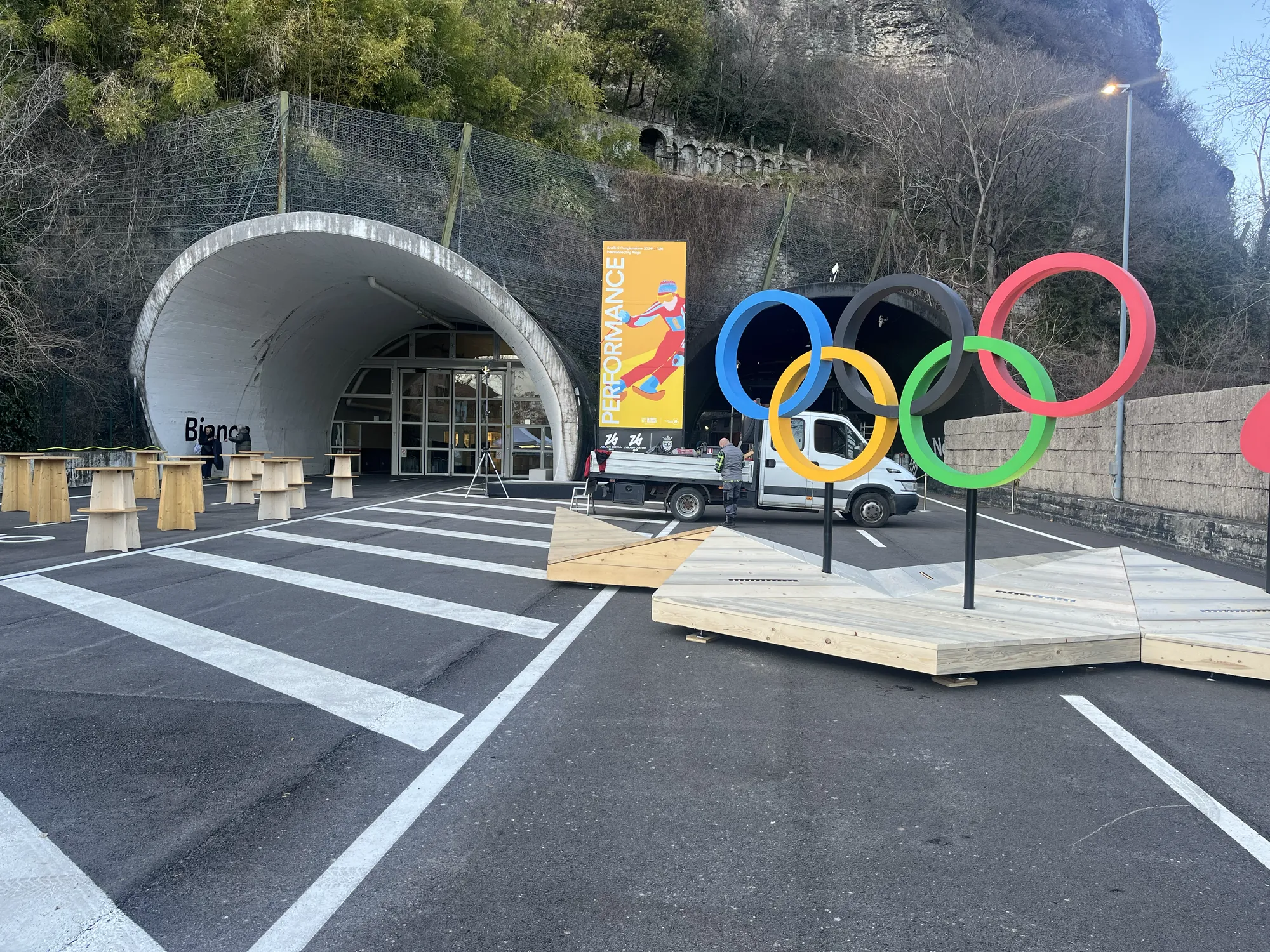
As part of this broader Olympic landscape, Trento—one of the key cities in the Trentino-Alto Adige/Südtirol region—plays a significant role in contextualizing the history and evolution of the Winter Games. The Gallerie di Piedicastello (see Figure 1), a former road tunnel repurposed into a cultural venue (Schnapp 2010), serves as a unique space for exploring the intersections of sport, history, and identity. Managed by the Fondazione Museo Storico del Trentino, the galleries host Performance, the second in a trilogy of exhibitions leading up to Milano-Cortina 2026. This exhibition traces the transformation of winter sports over the past century, reflecting on the social, technological, and institutional shifts that have shaped the Olympics. Situated in a region deeply connected to alpine culture, Performance provides a lens through which audiences can engage with the past while considering how the Games continue to evolve in response to contemporary challenges and aspirations.
Within this context, the Data Storytelling project emerges as a key element of the Performance exhibition, offering a novel way to engage with Olympic records through visual narratives and interactive exploration. Developed by metaLAB (at) Harvard, Berlin, and Basel, an experimental research collective dedicated to the intersections of culture, technology, and knowledge design (metaLAB 2022), Data Storytelling transforms Olympic data into an immersive experience characterized by macro and micro perspectives. On a macro level, the visualization captures large-scale patterns in the evolution of the Winter Games, tracing national teams, disciplines, and participation trends over time. On a micro level, it shifts the focus to individual trajectories, highlighting the personal stories of both renowned and lesser-known athletes. By reimagining archival records through interactive interfaces, metaLAB’s approach challenges traditional methods of historical representation, making complex datasets legible, engaging, and open to new interpretations.
Data Storytelling aligns with the themes explored in Pictologic, particularly in its examination of how data visualization structures historical narratives. By transforming data into interactive visualizations, the project reshapes how historical knowledge is designed and accessed, making historical patterns visible in ways that traditional archival materials do not. The visual narrative serves as a unique observatory of historical events, which become visible through the movement of athletes, the inclusion of new sports, and the participation of emerging nations. Through its curatorial design, Data Storytelling not only reflects how the Games have historically been framed within national discourses but also challenges fixed narratives by foregrounding the fluid and interconnected nature of Olympic history. In doing so, it highlights the power of visual representation in both reinforcing and deconstructing cultural memory, positioning the Olympic Games as a space where histories of sport, politics, and identity continuously intersect.
Building on these perspectives, Data Storytelling raises critical research questions about the role of data visualization in shaping historical understanding. How can visual narratives redefine the way we engage with Olympic history, moving beyond static representations to more dynamic, participatory models? In what ways does the structuring of data-driven storytelling influence which histories are made visible or remain obscured? How does visualizing Olympic data shape our understanding of the connections between sport, identities, and cultural memory? By examining these questions, the project demonstrates how digital tools can expand the historiographical possibilities of major international events, offering new ways to interpret a century of Winter Olympic history.
The Design of Data Storytelling
Historical narratives have always been shaped by choices—what to document, how to interpret, and how to represent the past. Traditionally, this has taken the form of written narratives based on archival research, but the rise of data visualization introduces a new mode of historical inquiry, one that structures knowledge through graphic design. Much like visual historiography, which organizes historical knowledge through images, diagrams, and spatial models, data visualization makes patterns, relationships, and transformations legible in ways that textual records alone cannot. However, just as historiography is never neutral, neither is data visualization—it requires interpretation, selection, and design. The designer plays a crucial role in shaping how historical data is seen, determining what remains visible and what fades into the background. The core idea in Data Storytelling is that visualization represents not simply a means of presenting information but a historiographical tool that investigates Olympic history. The dataset itself lays the foundation for a narrative framework, where decisions about what to include, how to categorize athletes and events, and how to visualize temporal and geopolitical shifts influence the way the past is understood.
The dataset at the core of Data Storytelling is derived from Olympedia (OlyMADMen 2006), one of the most comprehensive digital repositories of Olympic history. Olympedia is developed and maintained by a team of historians and researchers who have spent decades collecting and verifying Olympic data. The project originated with the OlyMADMen, a group dedicated to preserving and organizing the history of the Games, ensuring the accuracy and completeness of its records. This extensive database documents every edition of the Olympic Games, cataloging athletes, events, results, and national representations across time. For the Winter Olympics, the dataset includes detailed records of the 22,560 athletes, along with information on their national affiliations, disciplines, and performances.
Working with such a dataset requires curatorial decisions—what to extract, how to structure the data, and which aspects to prioritize in visualization. Beyond ensuring historical accuracy, Data Storytelling reshapes Olympic history by balancing large-scale trends with individual narratives. To achieve this, the installation employs two complementary visual approaches: one captures the systemic evolution of the Games through aggregated views of national teams, disciplines, and participation patterns, while the other highlights individual athlete trajectories, revealing personal dimensions of Olympic history. These perspectives take shape in All Together Now, which visualizes collective developments, and One by One, which focuses on individual experiences. Together, they offer a layered exploration of Olympic history, allowing visitors to engage with both overarching narratives and the personal stories within them.
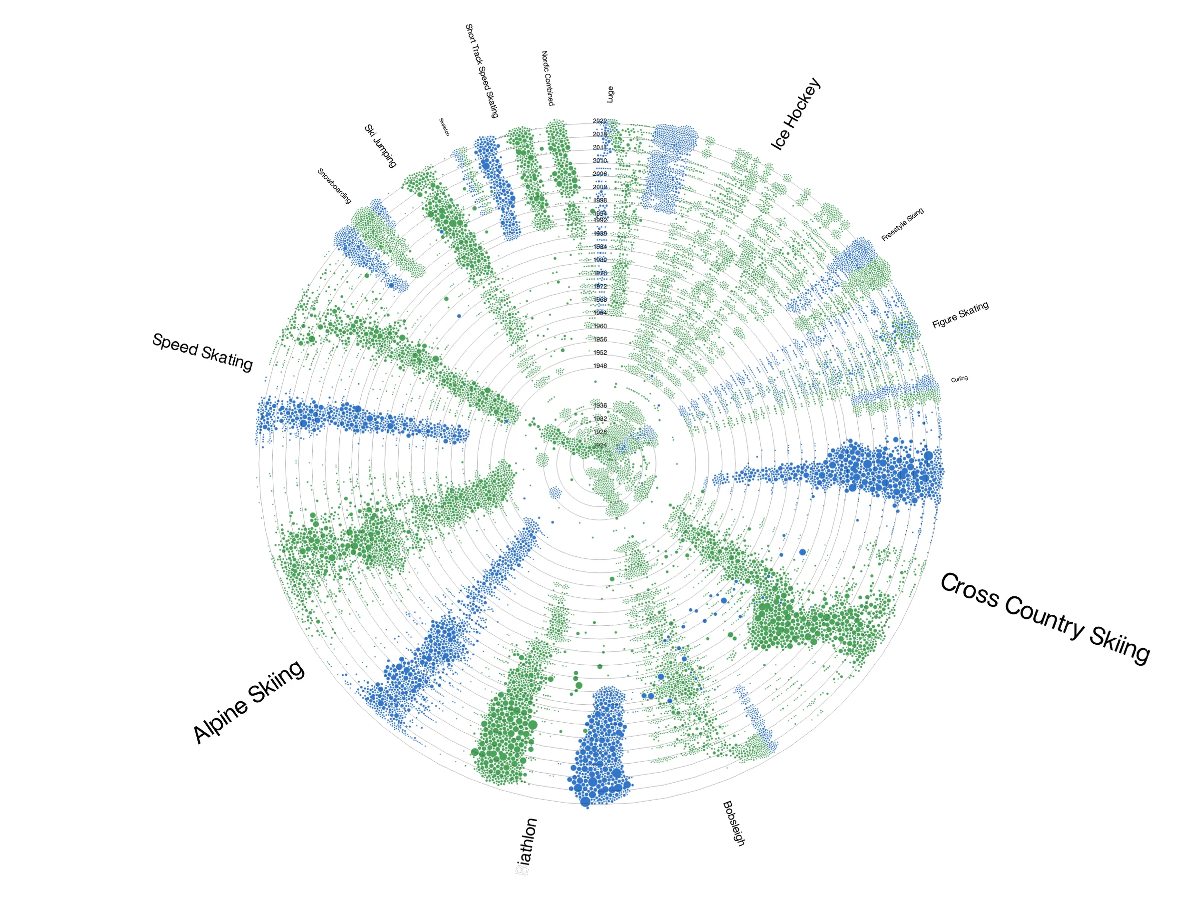
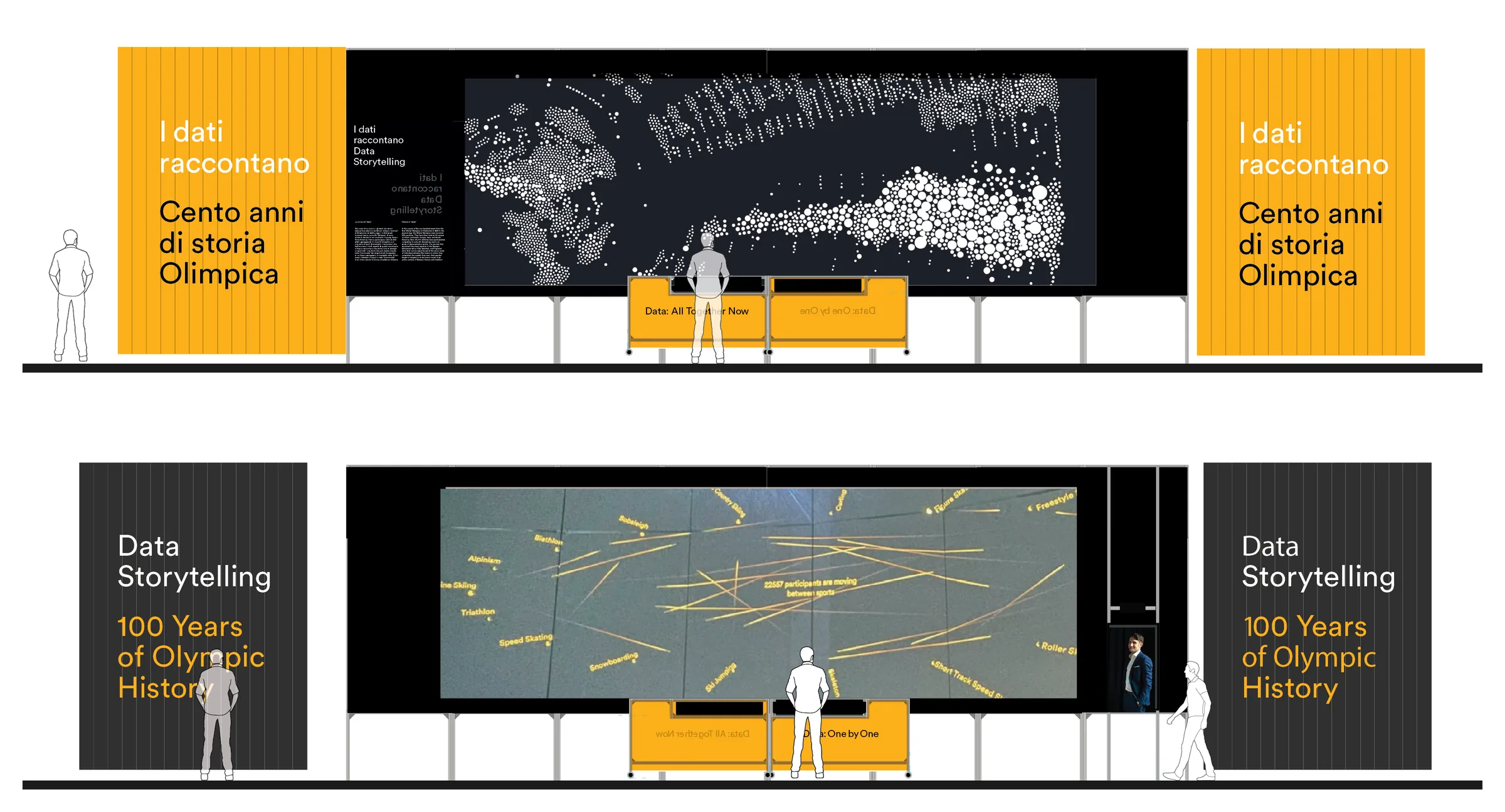
All Together Now, created by Kim Albrecht, represents each athlete as a single data point whose size is determined by the number of Olympic editions attended (see Figure 2). The visualization is built around a system of radial grids (Lima 2017, pp.119–145), composed by two fundamental dimensions: time, represented radially from the center outward, and classification, which organizes clockwise data points based on discipline. The classification is flexible and can be adjusted using the menu panel on the left, allowing visitors to sort the dataset by various attributes such as year, age, height, weight, nationality, and medal status. This adaptability enables a close exploration of Olympic history, revealing how participation patterns, physical characteristics, and competitive outcomes have evolved over time. Each data point is also color-coded to indicate gender—green for male athletes and blue for female athletes—making it easy to observe gender representation across different disciplines and track disparities, trends, and shifts in participation. Some sports exhibit a historically balanced distribution, while others show a clear dominance of one gender over time. The radial structure organizes athletes into distinct clusters, where patterns emerge based on the longevity and popularity of specific events. The outermost rings capture more recent Olympic Games, while the inner circles display earlier competitions, allowing viewers to trace the expansion of winter sports and the introduction of new disciplines. The structured yet dynamic design provides both a macro-level overview of participation trends and a detailed look at individual categories, making it an insightful tool for analyzing the evolution of the Winter Games. By integrating time and classification into a single, visually compelling format, it offers an intuitive and engaging way to compare disciplines while preserving a comprehensive view of the dataset.
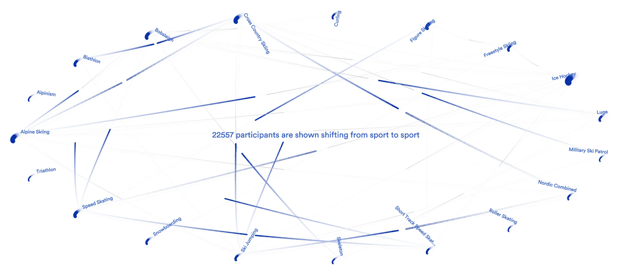
One by One, created by Giacomo Nanni, visualizes the movement of Winter Olympic athletes using a circular network (Lima 2017, pp.229–255), where nodes correspond to specific dimensions of the athletes’ datasets, and transitions between them are represented through wakes (see Figure 3). In the initial configuration, for example, transitions show the athletes who have competed in multiple sports, revealing career shifts, specialization patterns, and interdisciplinary connections within the Winter Games. The visualization is structured around two fundamental dimensions: a radial classification, which arranges network nodes based on the dataset’s attributes, and traces of movement, which tracks athletes’ transitions from one class to another one. The radial classification is adjustable through a panel menu placed at the bottom of the interface, allowing visitors to reconfigure the circular network based on data-dimensions such as sport, city, height, year, team, weight, age, event, sex, and medal status. This flexibility enables an exploration of how athletes navigate their careers, whether through gradual specialization, lateral movement between similar disciplines, or complete shifts into new competitive fields. The thickness and intensity of connecting lines indicate the frequency of transitions between categories, highlighting well-established pathways such as those between biathlon and cross-country skiing or between different skating disciplines, as well as rarer, unexpected movements. By dynamically adapting to different classifications, the network structure transforms Olympic history into a fluid, interactive animation, prompting reflection on how external factors, rule changes, or training practices may influence athlete mobility. The visualization also captures moments of significant career shifts, allowing visitors to see whether transitions are more common at certain points in time, within specific national teams, or among athletes of particular physical characteristics. By combining radial classification with animated movement, One by One offers both a broad perspective on career trajectories and a closer look at individual stories, making it a compelling tool to understand how athletes adapt, evolve, and redefine their paths in the Winter Games.
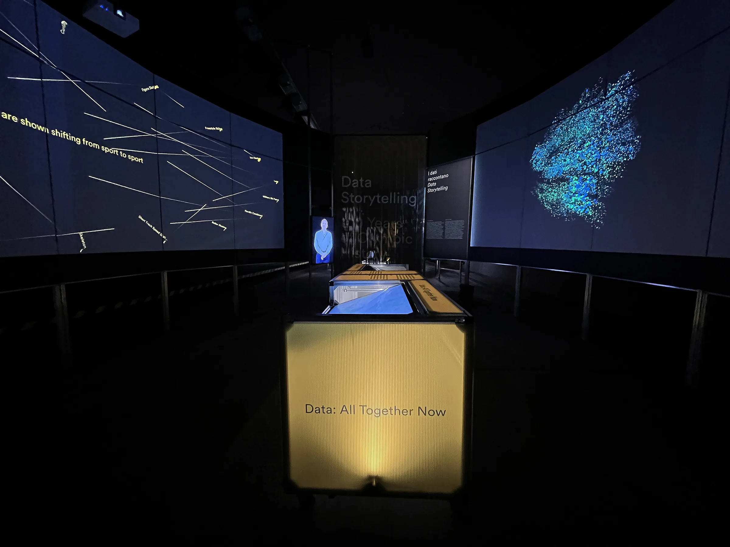
In the Gallerie di Piedicastello, All Together Now and One by One extend their narratives into an immersive space, positioning Data Storytelling at the intersection of experimental museology (Kenderdine 2021) and data physicalization (Huron et al. 2023). The exhibition’s oval layout naturally guides visitors around the central touchscreens, fostering fluid movement between the two visualizations (see Figure 4). Positioned at the core, these interactive stations allow visitors to engage with both the macro-level history of Olympic participation in All Together Now and the micro-level career transitions in One by One. Curved projection screens surrounding the space enhance immersion, extending each visualization beyond the touchscreens (see Figure 5). Upon entering, visitors are welcomed by a recorded introduction from Jeffrey Schnapp, framing the project’s exploration of historical narratives at different scales (Schnapp 2025). This structured circulation encourages an evolving engagement with the data before leading visitors toward the natural exit on the opposite side, completing the exhibition’s space trajectory.
Seeing Data, Telling Stories
One of the challenges of complex data visualizations is the lack of guidance for visitors, who may struggle to interpret patterns, relationships, and significance without contextual framing. Data visualizations excel in providing overviews, such as displaying large datasets, but often require visitors to have prior knowledge—whether for open-ended exploration (Dörk, Carpendale, and Williamson 2011) or for task-oriented interaction (Shneiderman 1996). In the absence of narrative cues or annotations—a note by way of explanation or comment (Kalir and Garcia 2021, p.12)—visitors may overlook key insights or misinterpret trends and reduce visualization’s effectiveness as a storytelling tool. In addition, visualization methods that emphasize overviews and agglomerate sets of data often tend to exclude minorities and marginal elements. We see this specifically in network visualizations, where the elements with the most connections are emphasized, while weaker links are marginalized (Rodighiero 2021, p.138; 2020). This is especially true for Olympic history, where data points such as participation numbers and nationality shifts are rich with historical context but remain fragmented without interpretation. Without embedded guidance, visualizations risk becoming static repositories of information rather than interactive explorations of knowledge.
In this context, the role of the designer extends beyond visual representation to that of a curator of stories. Designing an effective data visualization requires careful selection, structuring, and contextualization of information, ensuring that data serves a narrative purpose rather than merely being displayed. Much like curators in museums, designers must decide which elements to highlight, what historical context to provide, and how to structure user interaction to foster discovery. By integrating narrative layers, designers guide audiences through the visualization, transforming complex datasets into meaningful experiences. This curatorial role is particularly important in historical storytelling, where raw data alone cannot fully convey the social, political, or personal significance of events.
In One by One, the curated stories embedded within the visualization provide this crucial narrative layer, helping visitors connect individual athlete trajectories to broader Olympic history. Each story is selected to highlight a unique aspect of the Games—whether it be sporting excellence, geopolitical transitions, or personal resilience. Alberto Tomba’s journey through multiple Olympic cities showcases the enduring legacy of a charismatic champion, while Alina Zagitova’s victory under the team “Olympic Athletes from Russia” in 2018 reflects the complexities of national representation and reflects how geopolitical decisions shape athlete representation in Olympic history. Shiva Keshavan’s struggle as India’s pioneering luge athlete, training without proper infrastructure, exemplifies perseverance against structural barriers, much like Arturo Kinch, who helped open the Winter Olympics to nations without snow. Meanwhile, the Unified Team narrative explores how athletes from former Soviet-occupied republics competed under a shared designation in 1992, as their nations had not yet formed independent Olympic teams. These annotations transform individual records as windows into larger historical and cultural shifts, allowing visitors to see the Olympics as more than just a collection of statistics.
The stories that emerged from One by One were shaped through a structured workflow that enabled curators to engage dynamically with the code (Nanni 2024). (1) Querying was the first step, allowing curators to browse and filter the dataset through the interactive interface, identifying meaningful patterns, themes, or anomalies that could inform their narratives. Once relevant data points were surfaced, (2) copying became essential, as curators could extract specific queries and frame them within a broader context, ensuring coherence between the selected data and the descriptive text. Finally, (3) annotating played a crucial role in enriching these selections—curators and editors could provide interpretive layers, making the material accessible while still leaving readers the choice to explore selected essays or engage with the entire dataset on their own terms. Through this workflow, One by One facilitated both structured curation and open-ended exploration, balancing editorial direction with user-driven inquiry.
The integration of curated annotations into data visualization offers a powerful model for interactive storytelling, making historical narratives more accessible and engaging. By embedding context directly into the visualization, visitors are encouraged to move beyond surface-level interactions and explore the deeper meanings behind the data. This approach balances openness and interpretation, allowing for visitor-driven exploration while still providing the necessary structure to guide engagement. In historical and cultural datasets, where meaning is often tied to context, curated visualizations bridge the gap between data and narrative, transforming raw information into an interpretative experience. As data visualization continues to evolve as a storytelling medium, the designer’s role as a curator of meaning will become increasingly essential in making complex histories both legible and compelling.
Rethinking Olympic History Through Visual Historiography
The Olympic Games have long been framed through narratives of national achievement and record-breaking individuals, reinforcing a view of the Games as a competition between nations rather than a space of exchange and interaction. Traditional Olympic storytelling—whether in archives, museum displays, or media coverage—often presents a linear, celebratory history that highlights exceptional athletes while overlooking broader patterns of participation, exclusion, and transformation. This perspective tends to obscure the structural forces that shape who competes, under what conditions, and how the Games evolve over time. Data Storytelling offers an alternative perspective by visualizing the Olympics as an evolving system, shifting the focus from isolated moments of triumph to the larger dynamics of movement, inclusion, and institutional change.
Revealing these structural changes is key to understanding the Olympics not as a fixed tradition but as an evolving institution shaped by political, social, and organizational forces. The movement of athletes, the introduction of new disciplines, and changes in eligibility rules have all redefined the Games over time. Some transformations reflect geopolitical shifts, such as the dissolution of the Soviet Union and the temporary creation of the Unified Team in 1992, while others result from evolving regulations, like adjustments to gender categories or the inclusion of professional athletes. The structure of Olympic participation is constantly in flux, responding to broader societal transformations that extend far beyond the competition itself. By visualizing these patterns, Data Storytelling challenges static interpretations of Olympic history and instead highlights the Games as a site of continuous negotiation and redefinition.
A critical aspect of this redefinition is representation—what is counted, who is included, and how history is framed. Olympic data has traditionally reinforced dominant narratives, emphasizing medal counts, national rivalries, and individual athletic success while marginalizing lesser-known sports, underrepresented nations, and cases of exclusion or reclassification. The way data is collected and categorized directly influences the narratives that emerge. Data Storytelling addresses these gaps by shifting attention to athlete migration, gender diversity, and the evolution of disciplines, providing a more inclusive and multifaceted perspective on the Games. However, no visualization is entirely neutral; choices about what to highlight and how to structure information inevitably shape historical understanding. By making these decisions explicit, Data Storytelling functions as a form of visual historiography, foregrounding diversity and transition rather than reinforcing static narratives.
Beyond changing what is represented, Data Storytelling transforms how audiences engage with Olympic history. Unlike static displays or curated accounts that guide viewers through a predetermined narrative, interactive visualizations invite visitors to explore history on their own terms. They can trace athlete trajectories across multiple games, observe shifts in national affiliations, or analyze long-term trends in gender representation and event inclusion. This shift from passive reception to active inquiry enables visitors to uncover patterns and connections that might otherwise remain invisible, turning Olympic history into a dynamic and participatory experience.
Ultimately, Data Storytelling redefines how we perceive the Olympics—not just as a record of past achievements but as an evolving cultural and political phenomenon. By emphasizing movement, identity, and institutional change, it moves beyond documenting results to interrogating the forces that shape them. The Olympics are not a static collection of victories but a constantly shifting space where sports, nations, and athletes negotiate visibility, recognition, and participation. In this sense, visual historiography does more than present data—it reframes Olympic history as an ongoing process of transformation.
Conclusion
The design of Data Storytelling places the individual at the center of the visualization, shifting the focus from national achievements to personal trajectories. This approach reflects a broader democratization of visualization, where visitors actively engage with historical data rather than passively consuming pre-structured narratives. By allowing audiences to explore both macro-historical patterns and micro-histories, Data Storytelling contributes to new modes of visual historiography, demonstrating how digital tools can reshape the way historical narratives are constructed and interpreted.
This project highlights the interplay between technology, cultural memory, and narrative, showing how data visualization can function not just as a means of representation but as a tool for rethinking historical knowledge. By making patterns visible and surfacing overlooked stories, Data Storytelling challenges dominant Olympic narratives, offering a more inclusive and participatory engagement with history.
The possibilities of this approach extend far beyond the Olympics. The same principles of curated data storytelling can be applied to other historical datasets, from migration records to cultural heritage collections, transforming archives into interactive spaces of discovery. As institutions increasingly explore digital historiography, projects like Data Storytelling pave the way for new methods of engaging with the past, bridging data, design, and historical interpretation in ways that make history both accessible and meaningful.
References
- “2026 Winter Olympics.” 2025. In Wikipedia. https://en.wikipedia.org/w/index.php?title=2026_Winter_Olympics&oldid=1280112759
- Dörk, Marian, Sheelagh Carpendale, and Carey Williamson. 2011. “The Information Flaneur: A Fresh Look at Information Seeking.” In Proceedings of the SIGCHI Conference on Human Factors in Computing Systems, 1215–24. Vancouver, BC, Canada: ACM. https://doi.org/10.1145/1978942.1979124
- Huron, Samuel, Till Nagel, Lora Oehlberg, and Wesley Willett, eds. 2023. Making with Data: Physical Design and Craft in a Data-Driven World. First edition. AK Peters Visualization Series. Boca Raton, FL: CRC Press.
- Kalir, Remi, and Antero Garcia. 2021. Annotation. The MIT Press Essential Knowledge Series. Cambridge, MA: MIT Press.
- Kenderdine, Sarah. 2021. “Experimental Museology: Immersive Visualisation and Cultural (Big) Data.” In Experimental Museology: Institutions, Representations, Users, edited by Marianne Achiam, Michael Haldrup, and Kirsten Drotner. London and New York: Routledge. https://doi.org/10.4324/9780367808433
- Lima, Manuel. 2017. The Book of Circles: Visualizing Spheres of Knowledge. New York: Princeton Architectural Press.
- metaLAB. 2022. “metaLAB (at) Harvard, Berlin, and Basel.” https://mlml.io/
- Nanni, Giacomo. 2024. “One by One.” GitHub. https://github.com/sinanatra/olympics
- OlyMADMen. 2006. “Olympedia.” https://www.olympedia.org/
- Rodighiero, Dario. 2020. “Drawing Network Visualizations on a Continuous, Spherical Surface.” In Proceedings of the 24th International Conference Information Visualisation (IV), 573–80. Melbourne and Vienna: IEEE. https://doi.org/10.1109/IV51561.2020.00097
- ———. 2021. Mapping Affinities: Democratizing Data Visualization. Open-Access English edition. Geneva: Métis Presses. https://doi.org/10.37866/0563-99-9
- Schnapp, Jeffrey T. 2010. Tunnel REvision: Le Gallerie di Piedicastello = The Trento Tunnels. Trento: Fondazione Museo storico del Trentino.
- ———. 2025. “Intro to Data Storytelling.” Vimeo. February 11, 2025. https://vimeo.com/1055542440
- Shneiderman, Ben. 1996. “The Eyes Have It: A Task by Data Type Taxonomy for Information Visualizations.” In Proceedings 1996 IEEE Symposium on Visual Languages, 336–43. Boulder, CO, USA: IEEE Comput. Soc. Press. https://doi.org/10/fwdq26